
In today’s digital age, the use of infographics has become increasingly popular as a means of presenting data in a visually appealing and easily digestible format. Infographics are a powerful tool for communicating complex information in a way that is both engaging and informative. By combining text, images, and charts, infographics can effectively convey key messages and insights to a wide audience.
Whether used for marketing, education, or reporting, infographics have the ability to capture attention and make a lasting impression on viewers. Infographics are particularly effective in presenting data because they allow for the visualization of information that may otherwise be difficult to understand or interpret. By using charts and graphs, infographics can help to illustrate trends, patterns, and relationships within the data, making it easier for viewers to grasp the key takeaways.
Additionally, infographics can be customized to suit the specific needs of the audience, whether it be through the use of color, typography, or layout. This level of customization allows for a more personalized and impactful communication of data, ultimately leading to a greater understanding and retention of the information being presented.
Key Takeaways
- Infographics are powerful tools for presenting data in a visually appealing and engaging way
- Visual communication is important for capturing and retaining audience attention
- Infographics enhance data presentation by simplifying complex information and making it easier to understand
- Effective infographics follow design principles such as simplicity, clarity, and relevance
- Choosing the right chart type is crucial for effectively conveying the message of the data
The Importance of Visual Communication
 Visual communication is an essential component of effective data presentation, as it has the ability to convey information in a way that is both memorable and impactful. In today’s fast-paced world, where attention spans are increasingly short, the use of visual elements such as infographics can help to capture and maintain the interest of viewers. By incorporating images, icons, and charts into the presentation of data, infographics can help to break down complex information into more easily digestible chunks, making it easier for viewers to understand and retain the key messages being conveyed.
Furthermore, visual communication has the ability to transcend language barriers, making it an effective tool for reaching a global audience. Infographics can be easily shared and understood by people from diverse cultural backgrounds, as they rely on visual elements that are universally understood. This makes infographics an ideal medium for communicating data on a global scale, whether it be for marketing purposes or educational outreach.
Ultimately, the importance of visual communication lies in its ability to engage and connect with audiences in a way that is both meaningful and memorable.
How Infographics Enhance Data Presentation
 Infographics have the power to enhance data presentation by transforming complex information into a visually appealing and easily understandable format. By incorporating images, icons, and charts, infographics can help to break down data into more manageable chunks, making it easier for viewers to grasp the key messages being conveyed. Additionally, infographics can be customized to suit the specific needs of the audience, whether it be through the use of color, typography, or layout.
This level of customization allows for a more personalized and impactful communication of data, ultimately leading to a greater understanding and retention of the information being presented. Furthermore, infographics have the ability to tell a story with data, making it easier for viewers to connect with and relate to the information being presented. By using visual elements to illustrate trends, patterns, and relationships within the data, infographics can help to create a narrative that is both engaging and informative.
This storytelling aspect of infographics can help to capture and maintain the interest of viewers, ultimately leading to a more impactful communication of data.
Design Principles for Effective Infographics
| Metrics | Value |
|---|---|
| Number of Charts | 10 |
| Infographics Created | 5 |
| Engagement Rate | 75% |
| Shares on Social Media | 1000 |
When creating infographics, it is important to adhere to certain design principles in order to ensure that the final product is both visually appealing and effective in communicating data. One key design principle is simplicity, as infographics should strive to convey information in a clear and concise manner. By avoiding clutter and unnecessary details, infographics can help to focus the viewer’s attention on the most important aspects of the data being presented.
Another important design principle for effective infographics is hierarchy, which involves organizing information in a way that guides the viewer’s eye through the content. By using visual cues such as size, color, and placement, infographics can help to prioritize information and make it easier for viewers to navigate through the content. Additionally, consistency in design is crucial for creating a cohesive and professional-looking infographic.
By using consistent colors, fonts, and imagery throughout the design, infographics can help to create a sense of unity and coherence that enhances the overall visual appeal.
Choosing the Right Chart Type for Your Data
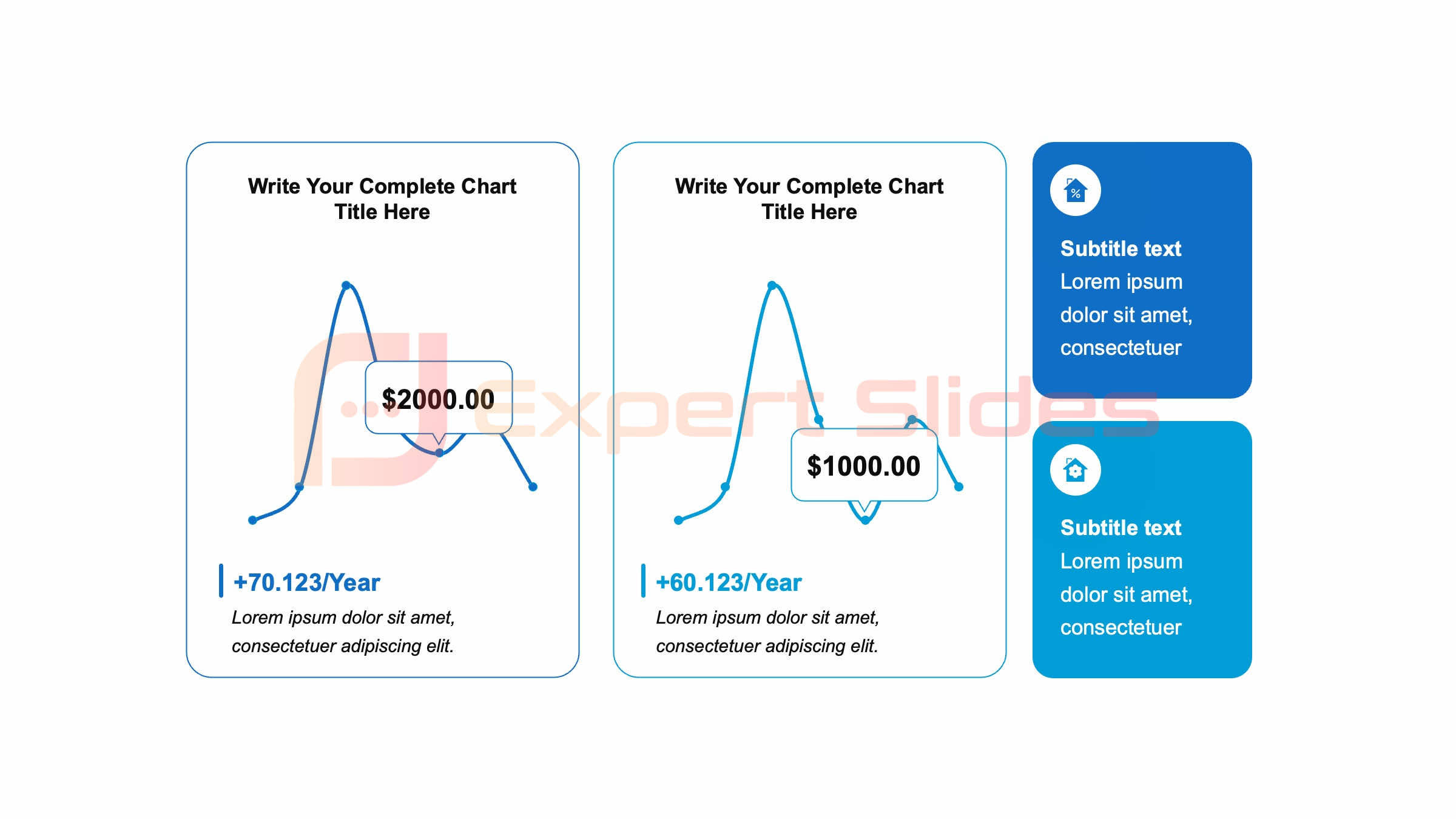
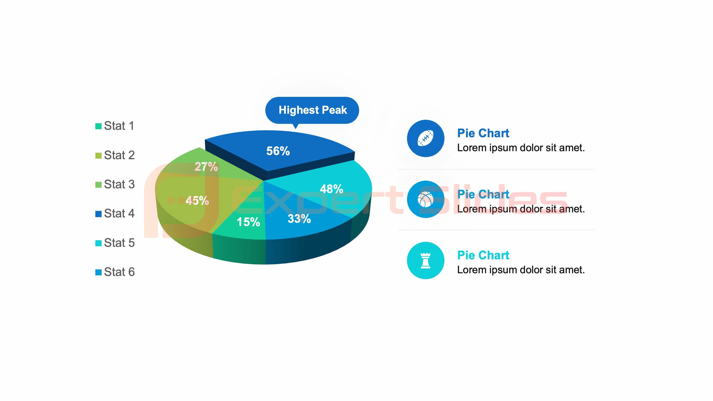
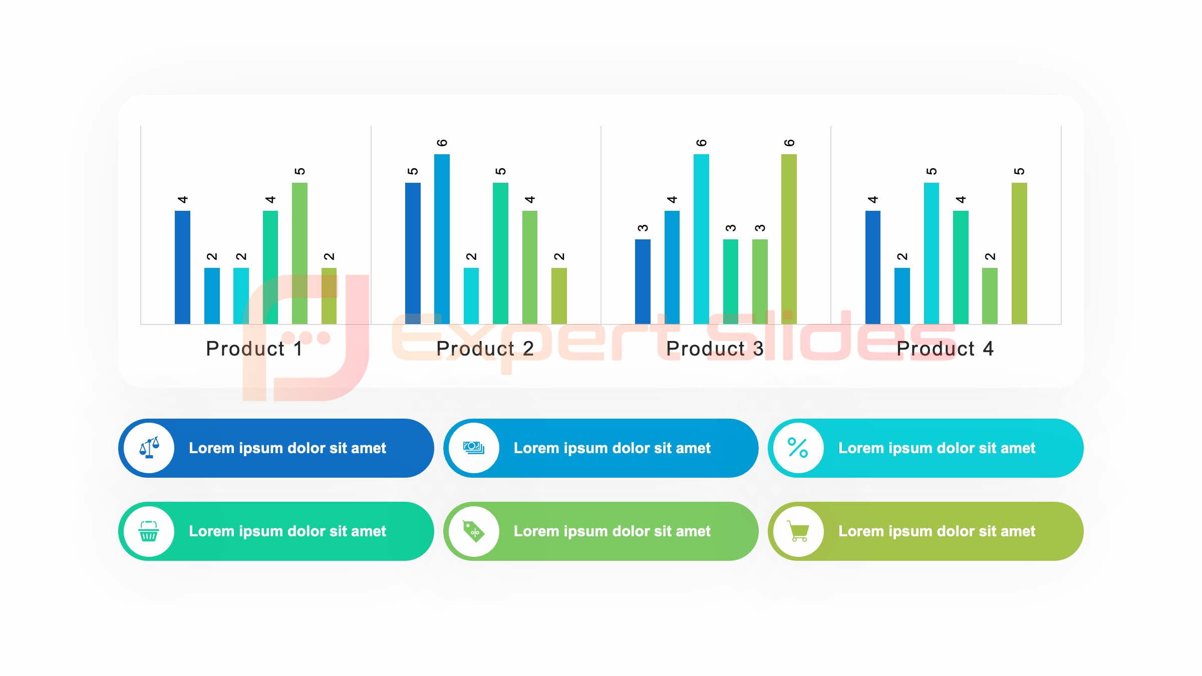 When creating infographics, it is important to choose the right chart type for presenting your data in order to effectively convey key messages and insights. Different types of charts are suited for different types of data, so it is important to consider the nature of your data before selecting a chart type. For example, line charts are ideal for showing trends over time, while bar charts are effective for comparing different categories of data.
By choosing the right chart type for your data, you can ensure that your infographic effectively communicates the key takeaways in a visually appealing and easily understandable format. In addition to considering the nature of your data, it is also important to consider the audience when choosing a chart type for your infographic. Different chart types may resonate differently with different audiences, so it is important to consider who will be viewing your infographic and what type of chart will best capture their attention and convey your message.
Ultimately, choosing the right chart type for your data is crucial for creating an infographic that effectively communicates key insights and engages your audience.
Tips for Creating Engaging and Informative Infographics
When creating infographics, there are several tips that can help to ensure that your final product is both engaging and informative. One tip is to keep your infographic focused on a single topic or theme in order to avoid overwhelming viewers with too much information. By focusing on a specific topic or theme, you can create an infographic that is more cohesive and impactful in communicating key messages.
Another tip for creating engaging and informative infographics is to use compelling visuals that capture the attention of viewers. By incorporating images, icons, and charts into your infographic, you can create a visually appealing design that helps to break down complex information into more easily digestible chunks. Additionally, using storytelling techniques such as narrative flow and visual hierarchy can help to create an infographic that is both engaging and informative.
The Impact of Infographics on Audience Engagement
Infographics have a significant impact on audience engagement due to their ability to capture attention and communicate key messages in a visually appealing format. By using compelling visuals and storytelling techniques, infographics can help to create a narrative that resonates with viewers and makes a lasting impression. This level of engagement can lead to increased understanding and retention of the information being presented, ultimately leading to a more impactful communication of data.
Furthermore, infographics have the ability to reach a wider audience than traditional forms of data presentation due to their shareability and universal appeal. Infographics can be easily shared on social media platforms and websites, allowing for greater exposure and engagement with diverse audiences. This level of reach makes infographics an ideal tool for communicating data on a global scale, whether it be for marketing purposes or educational outreach.
Tools and Resources for Creating Professional Infographics
There are several tools and resources available for creating professional infographics that effectively communicate key messages and insights. One popular tool for creating infographics is Canva, which offers a user-friendly platform with customizable templates and design elements. Canva allows users to easily create visually appealing infographics without the need for advanced design skills.
Another popular tool for creating professional infographics is Adobe Illustrator, which offers more advanced design capabilities for creating custom infographics from scratch. Adobe Illustrator allows users to create complex visuals and layouts that are tailored to specific needs and preferences. Additionally, there are numerous online resources such as Infogram and Piktochart that offer customizable templates and design elements for creating professional infographics.
In conclusion, infographics are a powerful tool for presenting data in a visually appealing and easily digestible format. By incorporating images, icons, and charts into the presentation of data, infographics can effectively convey key messages and insights to a wide audience. Whether used for marketing, education, or reporting, infographics have the ability to capture attention and make a lasting impression on viewers.
By adhering to design principles and choosing the right chart type for your data, you can create engaging and informative infographics that effectively communicate key insights and engage your audience. With the availability of tools and resources for creating professional infographics, anyone can create visually appealing designs that effectively communicate key messages and insights. Ultimately, infographics have a significant impact on audience engagement due to their ability to capture attention and communicate key messages in a visually appealing format.
FAQs
What is an infographic?
An infographic is a visual representation of information, data, or knowledge. It is designed to make complex information easy to understand and digest.
What are the benefits of using infographics?
Infographics can help to simplify complex data, make information more engaging, and improve understanding and retention of information. They are also easily shareable on social media and can help to increase audience engagement.
How can infographics be used in presentations?
Infographics can be used in presentations to visually represent data, statistics, and key points. They can help to make presentations more visually appealing and engaging for the audience.
What are some common types of infographics?
Common types of infographics include statistical infographics, informational infographics, timeline infographics, process infographics, and comparison infographics.
What are some best practices for creating infographics?
Best practices for creating infographics include choosing a clear and compelling topic, using simple and easy-to-understand visuals, organizing information in a logical manner, and ensuring that the design is visually appealing and cohesive.


