How to Make a Presentation Look Good – From Boring to Brilliant
Table of Contents
When crafting an effective presentation, the initial step is to select suitable design elements. This involves choosing a visually appealing and professional template that sets the tone for the presentation. Regardless of the presentation software used, such as PowerPoint or Keynote, numerous templates are available to help create a polished and professional appearance.
When selecting a template, consider the overall theme of the presentation and choose one that complements the content. Additionally, examine the layout and design elements within the template, including the placement of text boxes, image placeholders, and other graphic elements. Furthermore, it is essential to consider the strategic use of white space in the presentation.
White space, also known as negative space, refers to the empty space surrounding and between design elements. Effective use of white space creates a clean and uncluttered appearance, drawing attention to key points and enhancing the visual appeal of the content. When designing the presentation, it is crucial to be mindful of white space usage and avoid overcrowding slides with excessive text or graphics.
Key Takeaways
- Choose design elements that are clean, simple, and visually appealing
- Use engaging visuals and graphics to capture and maintain audience attention
- Incorporate effective typography to enhance readability and visual appeal
- Create a consistent and professional layout for a polished and cohesive look
- Utilize color theory to enhance the overall impact and effectiveness of your presentation
Using Engaging Visuals and Graphics
 Selecting the Right Visuals
When choosing visuals for your presentation, opt for high-quality images, illustrations, and icons that are relevant to your content. Avoid using generic or overused stock photos, as these can make your presentation look unoriginal and uninspired. Instead, look for unique and eye-catching visuals that will help bring your content to life.
Dynamizing Your Slides
In addition to static images, consider incorporating dynamic visuals such as videos or animations into your presentation. These can help add interest and interactivity to your slides, making your presentation more engaging for your audience. When using videos or animations, be sure to use them sparingly and strategically to avoid overwhelming your audience.
Conveying Complex Information
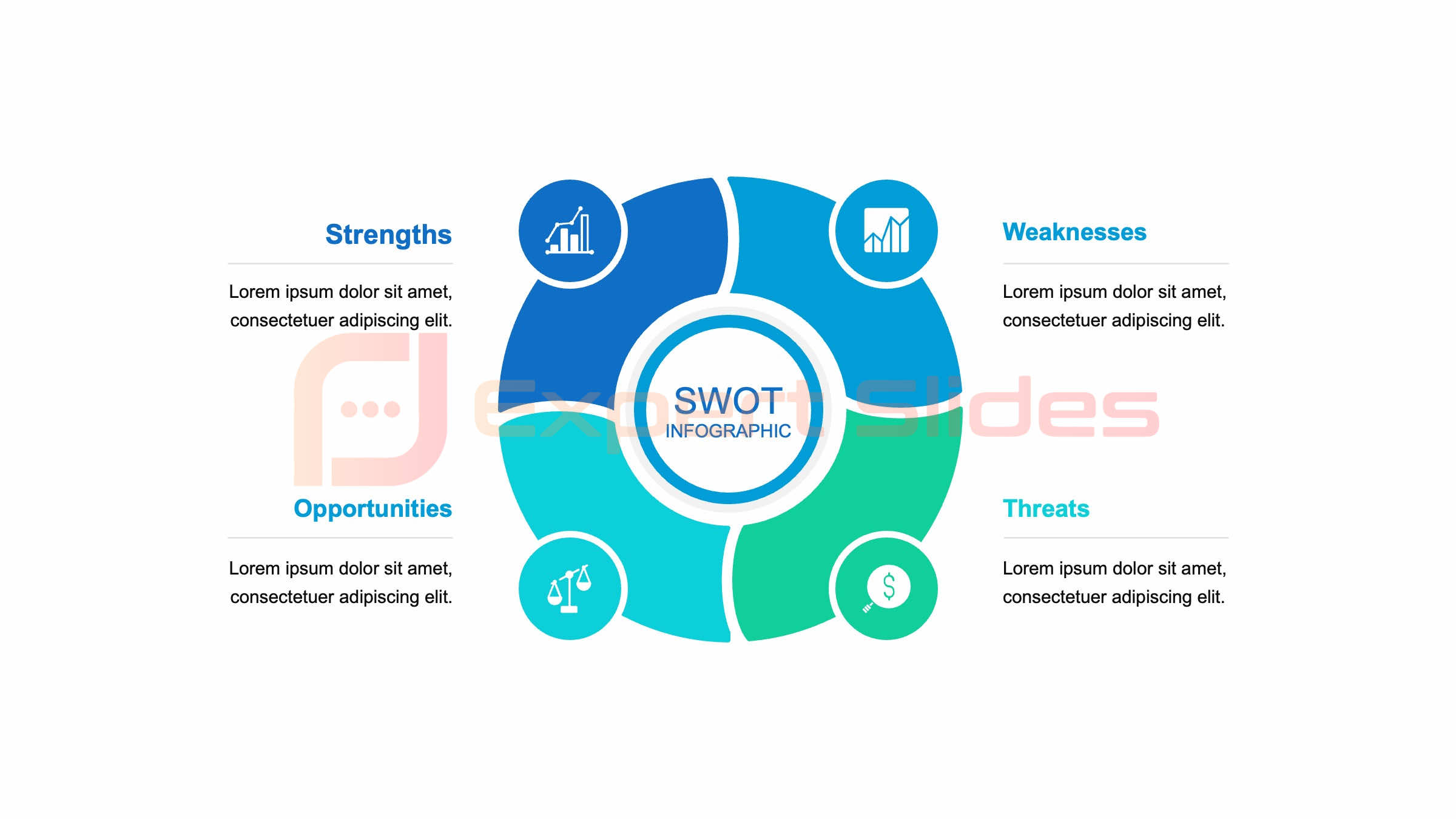
Consider the use of infographics or data visualizations to help convey complex information in a clear and visually appealing way. These can help break up text-heavy slides and make your content more digestible for your audience.
Incorporating Effective Typography
 Typography plays a crucial role in the overall look and feel of your presentation. The fonts you choose can have a significant impact on the readability and visual appeal of your slides. When selecting fonts for your presentation, opt for clean and easy-to-read typefaces that complement your content.
Avoid using decorative or overly stylized fonts that can be difficult to read, especially from a distance. Additionally, consider using a combination of fonts to create contrast and hierarchy within your slides. For example, use a bold sans-serif font for headings and a lighter serif font for body text.
In addition to selecting the right fonts, pay attention to the size and spacing of your text. Ensure that your text is large enough to be easily read from a distance, especially if you’ll be presenting in a large room. Additionally, use line spacing and paragraph spacing to create a comfortable reading experience for your audience.
Avoid overcrowding your slides with too much text, and instead focus on using concise and impactful messaging that will resonate with your audience.
Creating a Consistent and Professional Layout
| Aspect | Metrics |
|---|---|
| Slide Design | Use of color, font, and layout |
| Content | Relevance, clarity, and depth |
| Visuals | Images, graphs, and charts |
| Delivery | Engagement, confidence, and pace |
| Structure | Introduction, body, and conclusion |
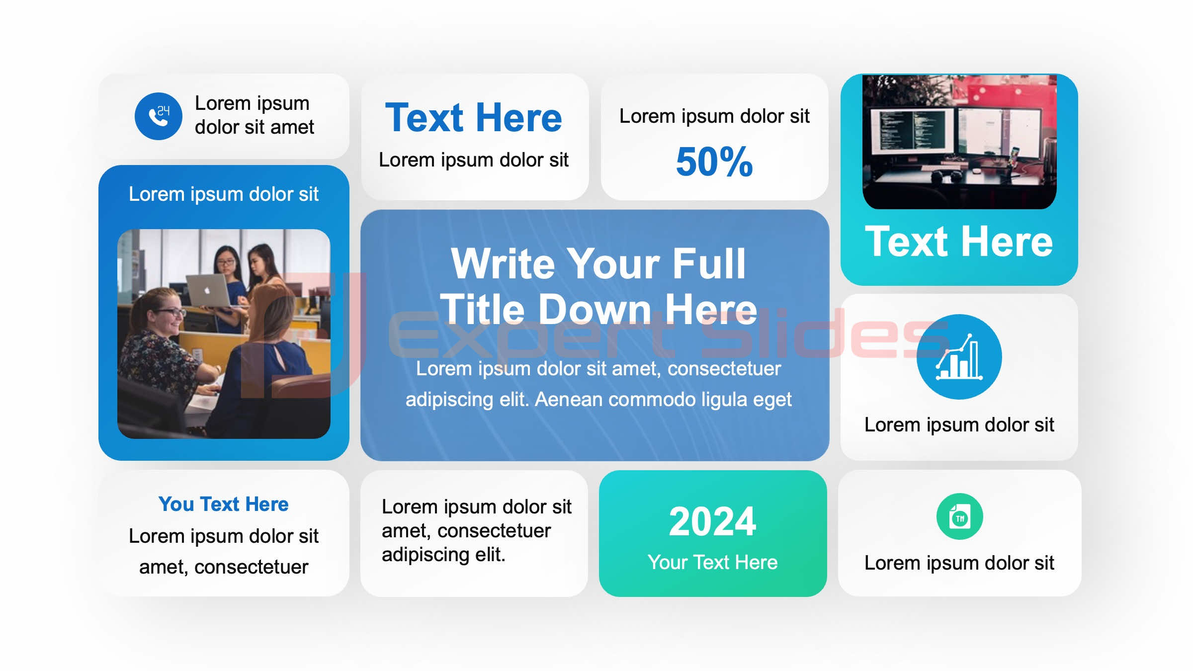
Consistency is key when it comes to creating a professional-looking presentation. This includes maintaining a consistent layout throughout your slides to create a cohesive and polished look. When designing your presentation, establish a grid system to help guide the placement of text and visual elements on each slide.
This can help create a sense of order and organization within your presentation, making it easier for your audience to follow along. In addition to a consistent layout, pay attention to the alignment and spacing of your content. Ensure that text boxes, images, and other design elements are aligned properly to create a clean and professional look.
Use guides and rulers within your presentation software to help maintain consistent spacing and alignment throughout your slides. Additionally, consider using master slides or slide layouts to establish a consistent design structure across all of your slides. This can help save time and ensure that your presentation has a cohesive look and feel.
Utilizing Color Theory to Enhance Your Presentation
Color plays a significant role in the overall visual impact of your presentation. When selecting colors for your slides, consider using a cohesive color scheme that complements your content and reinforces your brand or message. Pay attention to color theory principles such as complementary colors, analogous colors, and color harmony to create a visually appealing and harmonious color palette for your presentation.
In addition to selecting colors that work well together, consider the psychological impact of color on your audience. Different colors can evoke different emotions and associations, so be mindful of the message you want to convey with your color choices. For example, blue is often associated with trust and professionalism, while red can evoke feelings of excitement or urgency.
Use color strategically to enhance the mood and tone of your presentation, but avoid using too many bright or clashing colors that can be distracting or overwhelming for your audience.
Adding Interactive and Dynamic Elements
To take your presentation from boring to brilliant, consider adding interactive and dynamic elements that will captivate your audience. This can include interactive charts or graphs that allow for real-time data manipulation, clickable links or buttons that lead to additional resources or information, or even interactive quizzes or polls that engage your audience in real-time. These interactive elements can help keep your audience engaged and make your presentation more memorable.
In addition to interactive elements, consider incorporating dynamic transitions and animations into your slides to add visual interest and movement. However, use these sparingly and strategically to avoid distracting from your content. When using transitions and animations, be mindful of their purpose and ensure that they enhance rather than detract from the overall message of your presentation.
Tips for Polishing and Perfecting Your Presentation
Once you’ve incorporated all of these design elements into your presentation, it’s important to take the time to polish and perfect every aspect of your slides. This includes reviewing each slide for consistency in design elements such as fonts, colors, and layout. Additionally, proofread all of your text for spelling and grammar errors to ensure that your content is polished and professional.
In addition to reviewing the visual aspects of your presentation, practice delivering your presentation multiple times to ensure that you’re comfortable with the content and flow of your slides. Consider recording yourself giving the presentation or asking for feedback from colleagues or peers to identify areas for improvement. Finally, consider the technical aspects of delivering your presentation, such as ensuring that all multimedia elements are functioning properly and that you have a backup plan in case of technical difficulties.
By taking the time to polish and perfect every aspect of your presentation, you can ensure that it looks good from start to finish and leaves a lasting impression on your audience. In conclusion, making a presentation look good requires careful consideration of design elements such as layout, typography, color theory, visuals, and interactive elements. By incorporating these design principles into your presentation and taking the time to polish and perfect every aspect of your slides, you can transform a boring presentation into a brilliant one that captivates and engages your audience.
With these tips in mind, you can create presentations that not only look good but also effectively communicate your message and leave a lasting impression on your audience.
FAQs
What are some tips for making a presentation look good?
Some tips for making a presentation look good include using a consistent color scheme, choosing readable fonts, incorporating high-quality images, and utilizing white space effectively.
How can I make my slides more visually appealing?
To make your slides more visually appealing, consider using visual aids such as charts, graphs, and infographics, as well as incorporating animations and transitions to add interest and engagement.
What are some common mistakes to avoid when creating a presentation?
Common mistakes to avoid when creating a presentation include using too much text on slides, using distracting backgrounds, and overloading slides with information. It’s also important to avoid using too many different fonts and colors, as this can make the presentation look cluttered and unprofessional.
How can I keep my audience engaged during a presentation?
To keep your audience engaged during a presentation, consider using storytelling techniques, incorporating interactive elements such as polls or Q&A sessions, and using a conversational tone. It’s also important to maintain eye contact and vary your tone and pace to keep the audience’s attention.
Get 15+ Mio. PowerPoint Assets - FREE SIGN-UP

Sign up for free to our PowerPoint extension, ExpertSlides. Everything you need, directly in PowerPoint. No credit card required.
Related Posts
Recent Posts
- How Do You End a Presentation – Mastering the Last Impression
- Good Color Combinations for Presentations – The Science of Color
- Interesting Ideas for PowerPoint Presentation – Captivate Your Audience
- History Presentation Template – Step Back in Time
- Canvas Presentation Template – Unleash Your Creativity
Main Menu
Knowledge base
Useful Links


