Data Representation Examples – Beyond Bar Graphs
Table of Contents
When presenting data, bar graphs are a popular choice for many individuals. Nevertheless, there exist various alternative methods for visualizing data, which can offer a more detailed and perceptive comprehension of the available information. This article aims to examine several of these alternative data representation examples, moving beyond the conventional bar graph to discover innovative and creative approaches to data visualization.
Key Takeaways
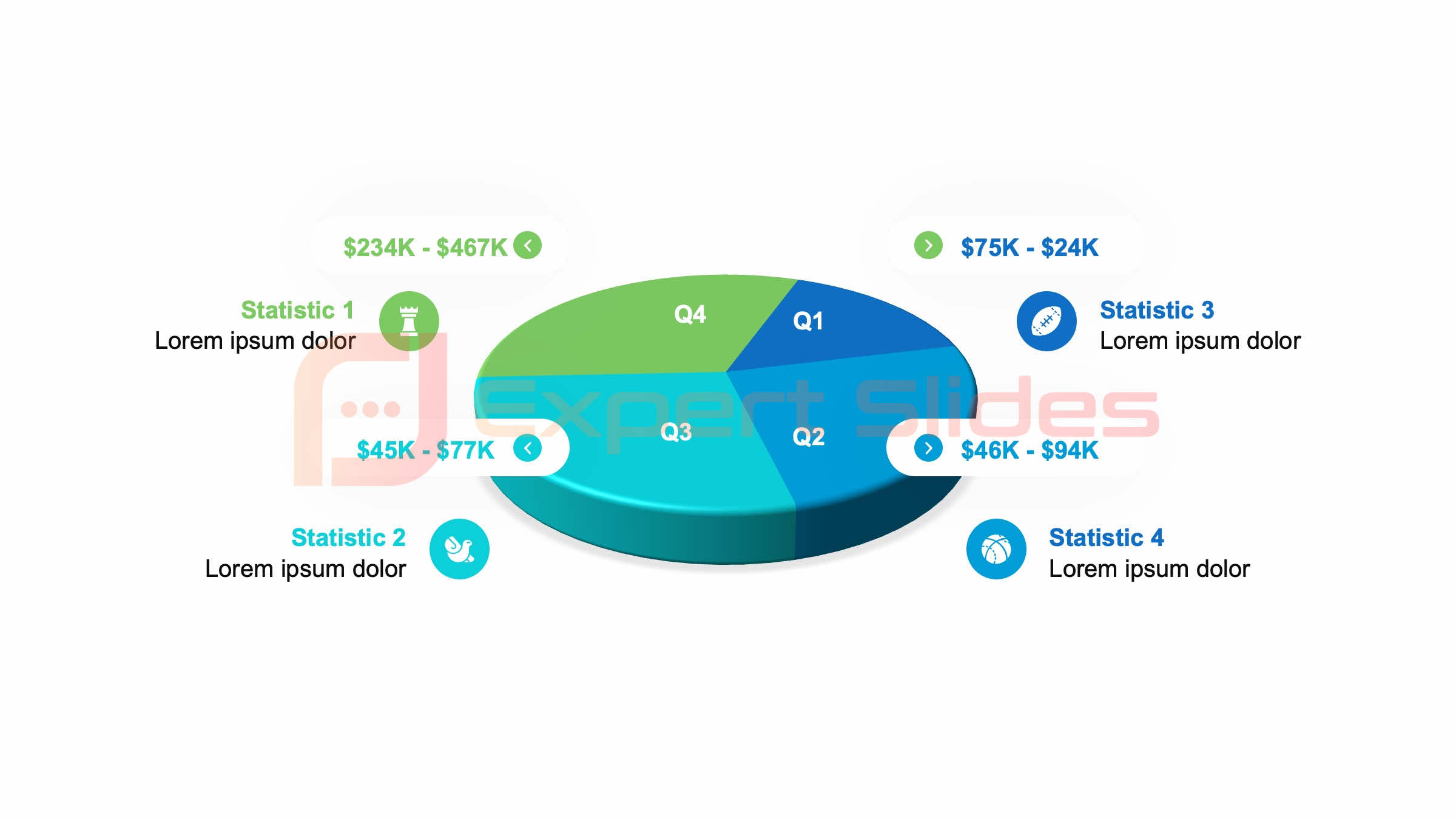
- Pie charts visually represent proportional data by dividing a circle into slices that each represent a proportion of the whole.
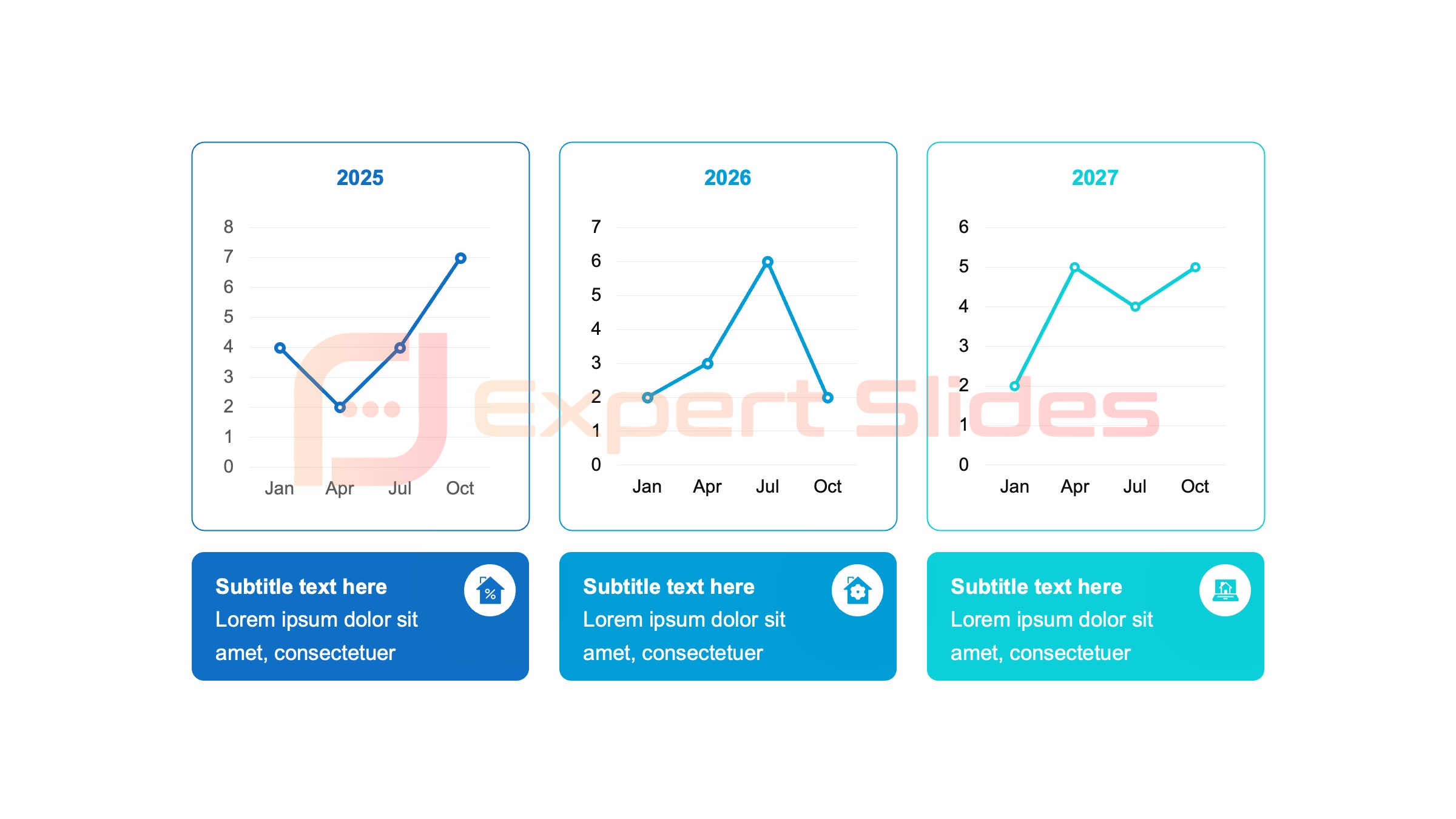
- Line graphs show trends and patterns over time by connecting data points with lines, making it easy to see how values change over a period.
- Scatter plots visualize relationships between variables by plotting data points on a graph, making it easy to see if there is a correlation between the variables.
- Heat maps display data intensity and distribution by using color to represent different values, making it easy to see where the data is concentrated.
- Tree maps provide a hierarchical representation of data by dividing a rectangle into smaller rectangles, making it easy to see the proportions of different categories within a larger category.
Pie Charts: A Visual Representation of Proportional Data
 Understanding Proportional Data
By dividing a circle into segments, each representing a different category, pie charts provide a clear and intuitive way to understand how the parts make up the whole.
A Practical Example
For example, a pie chart could be used to show the distribution of different types of fruits in a fruit basket, with each segment representing the proportion of apples, oranges, bananas, and so on.
Effective Data Visualization
This visual representation allows viewers to quickly grasp the relative abundance of each fruit type, making it an effective tool for conveying proportional data in a simple and straightforward manner.
Line Graphs: Showing Trends and Patterns Over Time
 Line graphs are another powerful tool for visualizing data, particularly when it comes to showing trends and patterns over time. By plotting data points on a graph and connecting them with lines, line graphs allow viewers to see how a particular variable changes over a continuous period. For example, a line graph could be used to show the fluctuation of stock prices over the course of a year, with the x-axis representing time and the y-axis representing the price of the stock.
This visual representation makes it easy to identify trends, patterns, and fluctuations in the data, providing valuable insights into how the variable in question has evolved over time.
Scatter Plots: Visualizing Relationships Between Variables
| Representation Type | Advantages | Disadvantages |
|---|---|---|
| Line Graphs | Shows trends over time, easy to compare multiple data sets | May be cluttered with too much data, not suitable for categorical data |
| Pie Charts | Easy to understand proportions, good for showing parts of a whole | Can be difficult to compare multiple pie charts, not suitable for large number of categories |
| Scatter Plots | Shows relationship between two variables, identifies outliers | May be difficult to interpret without a clear pattern, can be visually overwhelming with too many data points |
Scatter plots are a valuable tool for visualizing relationships between two variables, allowing viewers to see how changes in one variable correspond to changes in another. By plotting individual data points on a graph with one variable on the x-axis and the other on the y-axis, scatter plots provide a visual representation of how the two variables are related. For example, a scatter plot could be used to show the relationship between a person’s height and weight, with each data point representing an individual and their corresponding height and weight.
This visual representation allows viewers to quickly see if there is a correlation between the two variables, making it an effective tool for identifying relationships and patterns in the data.
Heat Maps: Displaying Data Intensity and Distribution
Heat maps are a powerful tool for displaying the intensity and distribution of data across a geographical or spatial area. By using color gradients to represent different levels of intensity, heat maps provide a visual representation of how data is distributed across a given area. For example, a heat map could be used to show the distribution of population density across a city, with darker colors indicating areas of higher population density and lighter colors indicating areas of lower population density.
This visual representation allows viewers to quickly grasp how data is distributed across a geographical area, making it an effective tool for understanding spatial patterns and trends.
Tree Maps: Hierarchical Representation of Data
Visualizing Hierarchical Structures
For example, a tree map could be used to represent the organizational structure of a company, with each rectangle representing a different department and its relative size indicating its level of importance within the organization.
Understanding Hierarchical Relationships
This visual representation allows viewers to quickly understand the hierarchical relationships within the data, making it an effective tool for conveying complex organizational structures in a simple and straightforward manner.
Effective Communication
By using tree maps, complex information can be communicated in a clear and concise way, making it easier for audiences to understand and engage with the data.
Sankey Diagrams: Illustrating Flow and Connections in Data
Sankey diagrams are a powerful tool for illustrating the flow and connections within a system or process. By using arrows to represent the flow of data or resources between different components, Sankey diagrams provide a visual representation of how inputs are transformed into outputs within a system. For example, a Sankey diagram could be used to illustrate the flow of energy within a power plant, with arrows representing how energy is generated, transformed, and distributed throughout the plant.
This visual representation allows viewers to quickly grasp how inputs are transformed into outputs within a system, making it an effective tool for understanding complex processes and systems.
Infographics: Creative and Engaging Data Representation for Visual Storytelling
Infographics are a creative and engaging way to represent data through visual storytelling. By combining text, images, and graphics, infographics provide a visually compelling way to convey complex information in a simple and accessible format. For example, an infographic could be used to tell the story of a company’s growth over time, using images and graphics to illustrate key milestones and achievements along the way.
This visual representation allows viewers to engage with the data in a more interactive and immersive way, making it an effective tool for conveying complex information in a visually compelling manner. In conclusion, there are many alternative ways to represent data beyond traditional bar graphs. From pie charts and line graphs to scatter plots and heat maps, each visualization method offers unique insights into different aspects of the data at hand.
By exploring these alternative data representation examples, we can gain a more nuanced and comprehensive understanding of the information we are working with, allowing us to uncover new patterns, trends, and relationships that may have been overlooked with more traditional visualization methods. Whether it’s through hierarchical tree maps or flow-based Sankey diagrams, these alternative data representation examples offer valuable tools for conveying complex information in a visually compelling and accessible manner.
FAQs
What are some examples of data representation beyond bar graphs?
Some examples of data representation beyond bar graphs include pie charts, line graphs, scatter plots, histograms, and heat maps.
How are pie charts used for data representation?
Pie charts are used to represent data as a circular graph, with each “slice” of the pie representing a proportion of the whole. They are useful for showing the relative sizes of different categories within a dataset.
What is a line graph and how is it used for data representation?
A line graph is a type of graph that displays information as a series of data points connected by straight lines. It is commonly used to show trends and changes over time.
What are scatter plots and how are they used for data representation?
Scatter plots are used to display the relationship between two variables. Each data point in a scatter plot represents the value of two different variables, and the pattern of the points can reveal any correlation between the variables.
How are histograms used for data representation?
Histograms are used to represent the distribution of a dataset. They display the frequency of data within specific intervals, making them useful for visualizing the spread and shape of the data.
What are heat maps and how are they used for data representation?
Heat maps are graphical representations of data where values are depicted using color gradients. They are often used to visualize data in a matrix format, such as geographic data, and can reveal patterns and trends within the data.
Get 15+ Mio. PowerPoint Assets - FREE SIGN-UP

Sign up for free to our PowerPoint extension, ExpertSlides. Everything you need, directly in PowerPoint. No credit card required.
Related Posts
Recent Posts
Main Menu
Knowledge base
Useful Links


