Graph Presentation – From Boring to Brilliant
Table of Contents
 Graph presentations are a potent means of communicating complex data in a visually engaging and easily comprehensible format. However, they often fail to impress, leaving the audience disinterested and disconnected. The secret to transforming an uninspiring graph presentation into a captivating one lies in harnessing the power of visual elements.
By injecting creativity, selecting the appropriate graph type, adding aesthetic appeal, and crafting compelling narratives, you can elevate your graph presentations to new levels and engage your audience. The initial step in creating a compelling graph presentation is to recognize the significance of visual elements. Visuals possess the ability to convey information rapidly and effectively, making them a crucial component of any successful graph presentation.
By incorporating visually appealing elements such as color, design, and imagery, you can capture the attention of your audience and bring your data to life. Furthermore, utilizing the right tools and resources can aid in creating striking visuals that will leave a lasting impression on your audience.
Key Takeaways
- Use visuals to transform boring graphs into engaging and dynamic presentations
- Infuse creativity to make your graphs stand out and capture your audience’s attention
- Choose the right graph to effectively present your data and enhance it with color and design
- Craft compelling narratives through storytelling with data in your graph presentations
- Utilize technology and tools to elevate your graph presentations and make them more impactful
The Power of Visuals: Transforming Graphs from Boring to Brilliant

Captivating Your Audience with Visual Appeal
A visually appealing graph presentation has the ability to capture the attention of your audience and convey complex data in a way that is easily understandable. By infusing creativity into your graphs, you can make them stand out and leave a lasting impression on your audience.
Elevating Your Graphs from Boring to Brilliant
Whether it’s through the use of color, design, or imagery, adding flair to your graphs can elevate them from boring to brilliant. In addition to infusing creativity into your graphs, it’s also important to choose the right type of graph to effectively present your data.
Matching Data with Effective Presentation
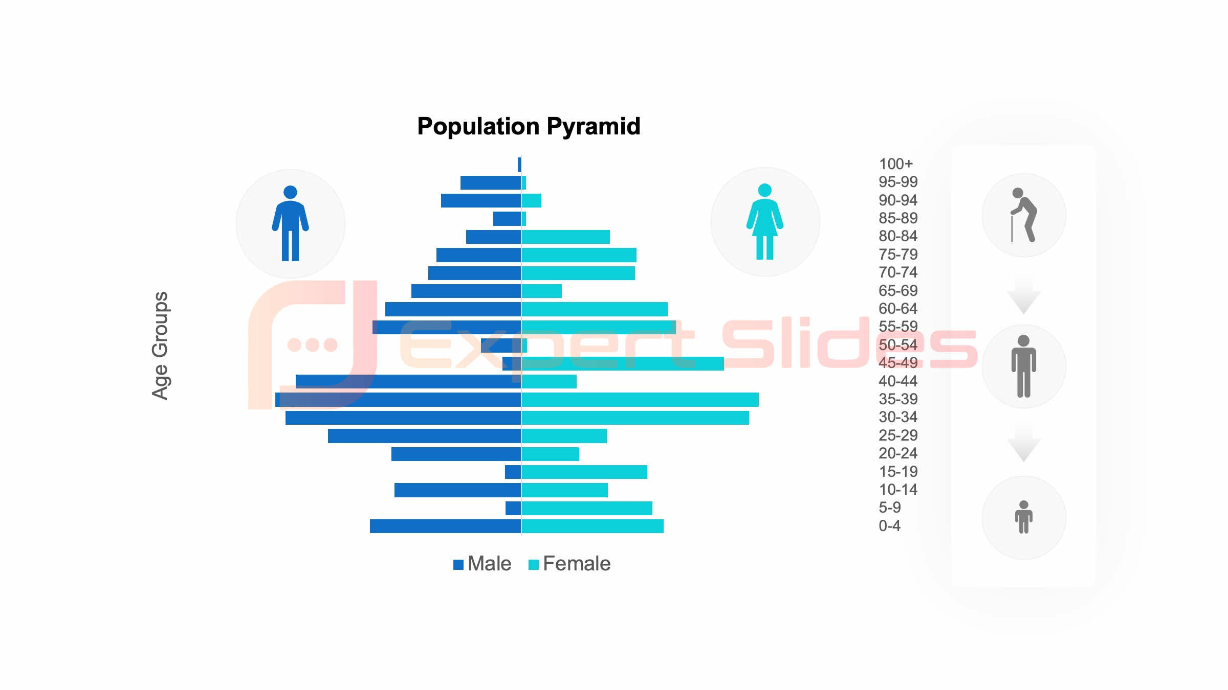
Different types of graphs are suited for different types of data, and selecting the right one can make a world of difference in how your information is perceived. By matching your data with the most effective presentation, you can ensure that your audience is able to easily interpret and understand the information you are presenting. This will not only keep them engaged, but also help them retain the information long after the presentation is over.
 FAQs
FAQs
What is graph presentation?
Graph presentation refers to the visual representation of data using graphs, charts, and other visual aids to help convey information in a clear and concise manner.
Why is graph presentation important?
Graph presentation is important because it allows for the easy interpretation and understanding of complex data. It helps to identify trends, patterns, and relationships within the data, making it easier for the audience to grasp the information being presented.
What are some tips for creating a brilliant graph presentation?
Some tips for creating a brilliant graph presentation include choosing the right type of graph for the data, using appropriate colors and fonts, labeling the axes clearly, and providing a clear and concise title and legend. It’s also important to ensure that the data is accurate and that the graph is visually appealing.
What are some common mistakes to avoid in graph presentation?
Some common mistakes to avoid in graph presentation include using misleading scales, cluttering the graph with unnecessary information, using inappropriate colors or fonts, and not providing enough context or explanation for the data being presented. It’s also important to avoid distorting the data or misrepresenting the information in any way.
Get 15+ Mio. PowerPoint Assets - FREE SIGN-UP

Sign up for free to our PowerPoint extension, ExpertSlides. Everything you need, directly in PowerPoint. No credit card required.
Related Posts
Recent Posts
Main Menu
Knowledge base
Useful Links


