

- Table of Contents
- Introduction: What you’ll build and who created the lesson
- Quick overview: The final 4 Arrow options Slide
- Materials and setup: Fonts, colors, and assets
- Step-by-step build: Creating the base rectangle and arrow pieces
- Fragmenting and shaping arrows for a clean look
- Applying gradients, shadows, and reflections
- Adding icons, numbers, and descriptive text
- Duplicating and recoloring to create the four options
- Animating the 4 Arrow options Slide
- Polish, accessibility, and export tips
- Variations and advanced ideas
- Common mistakes and troubleshooting
- FAQ
- Conclusion and next steps
Introduction: What you’ll build and who created the lesson
This article walks you through how to build a clean, clickable, and animated 4 Arrow options Slide in PowerPoint. The tutorial follows the same practical, hands-on approach used by POWERPOINT UNIVERSITY, giving you a polished layout that reveals one option at a time and is ideal for agendas, multi-step processes, product features, or decision flows.
By the end of this guide you’ll have a reusable slide template that highlights four step options using arrow shapes, a white rectangular content area, iconography, and subtle animations. This 4 Arrow options Slide technique is compact, visually strong, and easy to adapt to your brand or presentation theme.
Quick overview: The final 4 Arrow options Slide
Before we dig into each step, here’s what makes a successful 4 Arrow options Slide:
- One white rectangular content area that anchors the design.
- Four arrow shapes aligned on the right side, each representing an option.
- Icon, option label, number badge, and short descriptive text for each arrow.
- Gradient fills for each arrow to create depth and differentiation.
- Reflection or shadow effects for a polished, photographic look.
- Click-triggered animations so each option appears sequentially during your presentation.
We’ll build this step-by-step, explaining why each choice works and offering alternatives so the slide fits your content and branding. This 4 Arrow options Slide approach keeps your slide organized and focuses audience attention one item at a time.

Materials and setup: Fonts, colors, and assets
Before building the slide, collect your essential assets and set up the slide environment. These preparatory choices make the creation process quicker and help maintain visual consistency.
Recommended assets
- Font family: Open Sans and Open Sans Condensed (used for body and numeric badges respectively).
- Icons: PowerPoint’s built-in icon set (for consistent stroke/shape style).
- Color palette: Four distinct accent colors (orange, purple, teal, blue/pink mix in the example).
- Slide background: A light, neutral color so the white content rectangle stands out.
Tip: If Open Sans is not available on a presenting machine, embed fonts into the presentation (File > Options > Save > Embed fonts in the file) or choose a similar web-safe alternative.
Slide setup
- Insert a new blank slide and apply a soft, light background color.
- Set your slide size if necessary (Design > Slide Size) before adding objects.
- Enable the Rulers and Guides (View > Ruler & Guides) for precise alignment.
Step-by-step build: Creating the base rectangle and arrow pieces
Now we’ll construct the visual building blocks: the white rounded rectangle that anchors content and the arrow element that points visually to the next content area. This is the core of the 4 Arrow options Slide design.
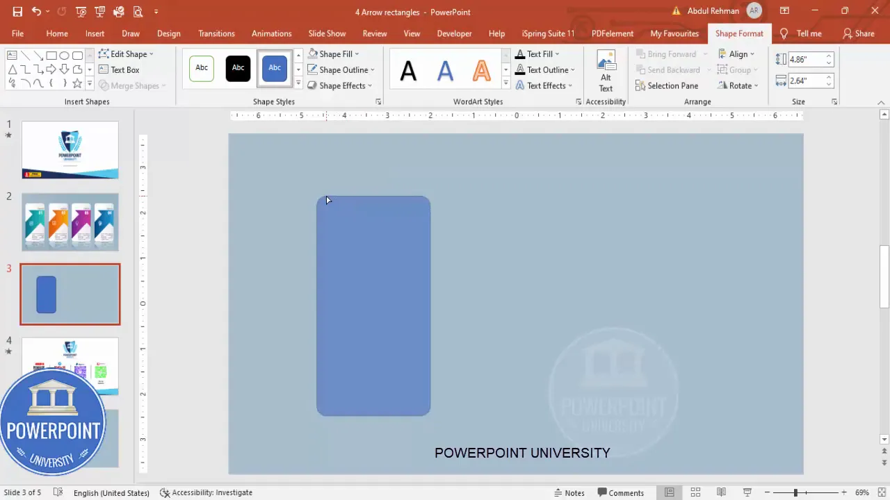
Create the white rounded rectangle
1. Insert > Shapes > Rounded Rectangle. Draw the rectangle to the size you want for your content area. This white box will contain the option label, details, and icon for each arrow option in the 4 Arrow options Slide.
2. With the shape selected, go to Shape Format:
- Shape Fill: White
- Shape Outline: No Outline
- Adjust corner roundness by dragging the yellow control handle to reduce or increase the curve. The example reduces curvature for a cleaner, modern feel.
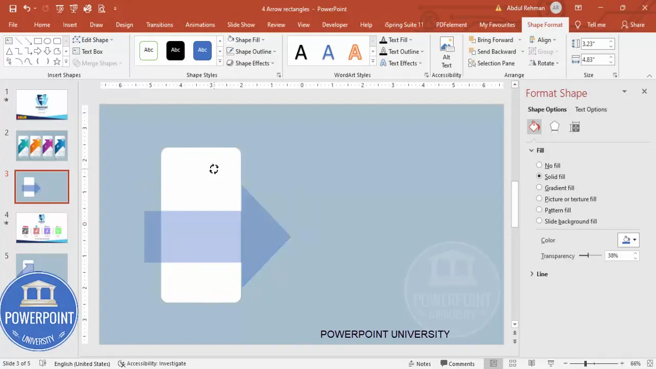
Create the arrow shape
1. Insert > Shapes > Block Arrows > Right Arrow. Draw a right arrow near the rectangle so the arrow overlaps the rectangle edge slightly.
2. With the arrow selected, remove the outline (Shape Format > Shape Outline > No Outline).
3. Format Shape > Fill should be set later; for now make the arrow somewhat transparent using Format Shape > Fill > Transparency. We make it transparent temporarily to help with placement and to ensure it doesn’t visually overpower the base as we fragment it. This is one of the practical steps that makes building the 4 Arrow options Slide easier.
4. Rotate and position: Use the rotate handle or hold Alt + Left/Right Arrow for precise rotation nudges. Ensure the arrow tail does NOT extend beyond the rectangle’s boundary—alignment is crucial.
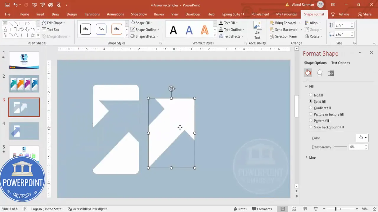
Fragmenting and shaping arrows for a clean look
To integrate the arrow with the rectangle so the shapes are crisp and non-overlapping, we’ll use Merge Shapes > Fragment. This step is essential in creating a professional 4 Arrow options Slide because it produces clean edges and allows you to color only the arrow portion.
How to fragment the shapes
- Select the white rectangle and then Shift+Click the arrow so both are selected.
- Shape Format > Merge Shapes > Fragment. This breaks the overlapping areas into independent pieces.
- Delete the unwanted piece(s) that fall outside the visual boundary so that the arrow appears as a single, continuous shape attached to the rectangle.
After fragmenting, you may notice small gaps—don’t worry. A little nudging or resizing fixes them. This process helps you create the precise arrow edge that will be used across all four options on the 4 Arrow options Slide.
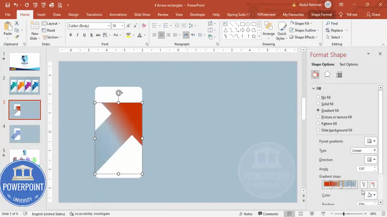
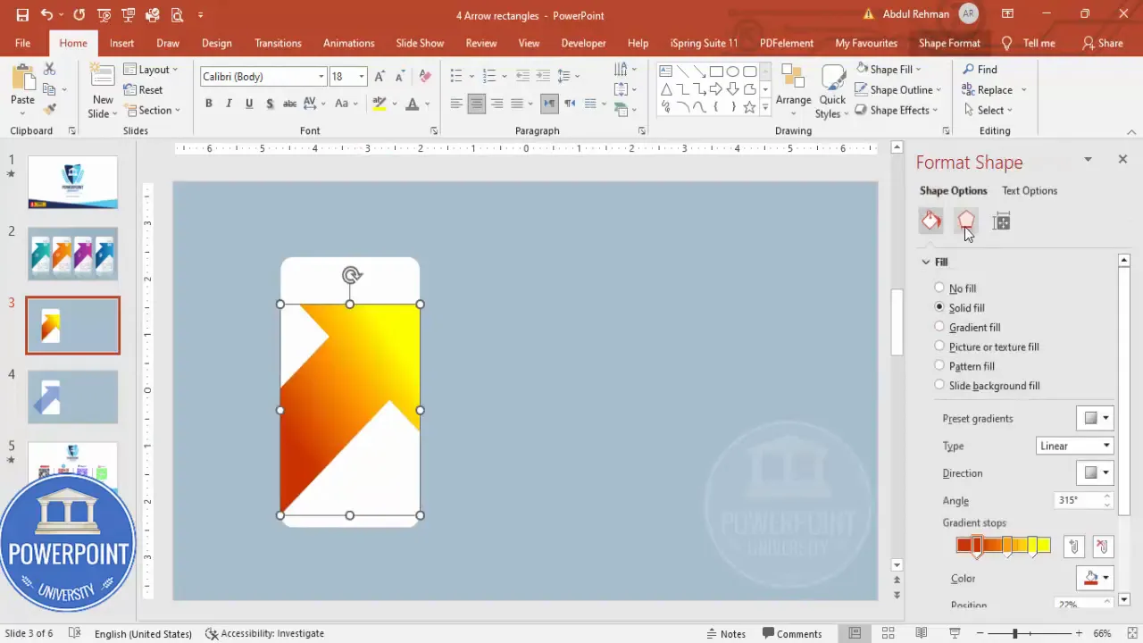
Applying gradients, shadows, and reflections
Visual polish separates beginner slides from professional slides. In this section we’ll add gradient fills, subtle shadows, and a reflection to give the 4 Arrow options Slide a photographic, three-dimensional appearance.
Gradient fills for depth
Select the arrow shape and open Format Shape > Fill > Gradient Fill. The example uses 2–3 gradient stops to create a vibrant arrow:
- Stop 1: A darker shade of your chosen color (e.g., dark orange)
- Stop 2: Middle tone (e.g., lighter orange)
- Stop 3: A highlight (e.g., pale yellow)
Choose a gradient direction (e.g., linear from left to right or diagonal). In the example, the direction creates a subtle light-to-dark flow that reads naturally across the 4 Arrow options Slide.
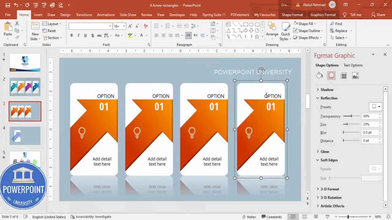
Shadows and reflections
For a professional photographic look:
- Format Shape > Effects > Shadow: Choose a soft outer shadow to lift the arrow slightly from the background.
- Position and blur the shadow so it’s subtle; heavy shadows look dated.
- Reflection: Select the grouped option and Format > Effects > Reflection. Choose a small reflection size and reduce transparency as needed. This reflection anchors the arrow visually and gives the 4 Arrow options Slide a polished feel.
Adjust settings so the reflection does not distract. In the example, reflections are small and slightly blurred for a realistic effect.
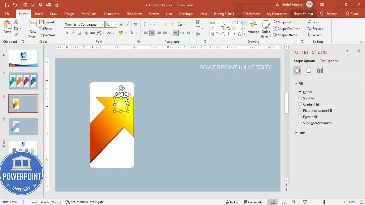
Adding icons, numbers, and descriptive text
Each option on the 4 Arrow options Slide should clearly communicate: option number, a short label, an icon that represents the idea, and a single line or two of descriptive text. Keep text concise and consistent.
Adding the option label and number badge
- Insert a text box for the option label (e.g., “Option”). Use Open Sans, right-aligned, and adjust font weight as needed. For emphasis you can use bold, but keep it subtle.
- Insert another text box for the number badge (e.g., “01”). Use Open Sans Condensed for a compact numeric style, increase font size, center-align, and set font color to white.
- Place the number on the arrow head or overlapping area where it’s clearly visible. If contrast is low, tweak the arrow gradient or change the number color slightly.
Keeping the number white often works well if your gradient darkens near the badge. Otherwise, adjust to maintain legibility.
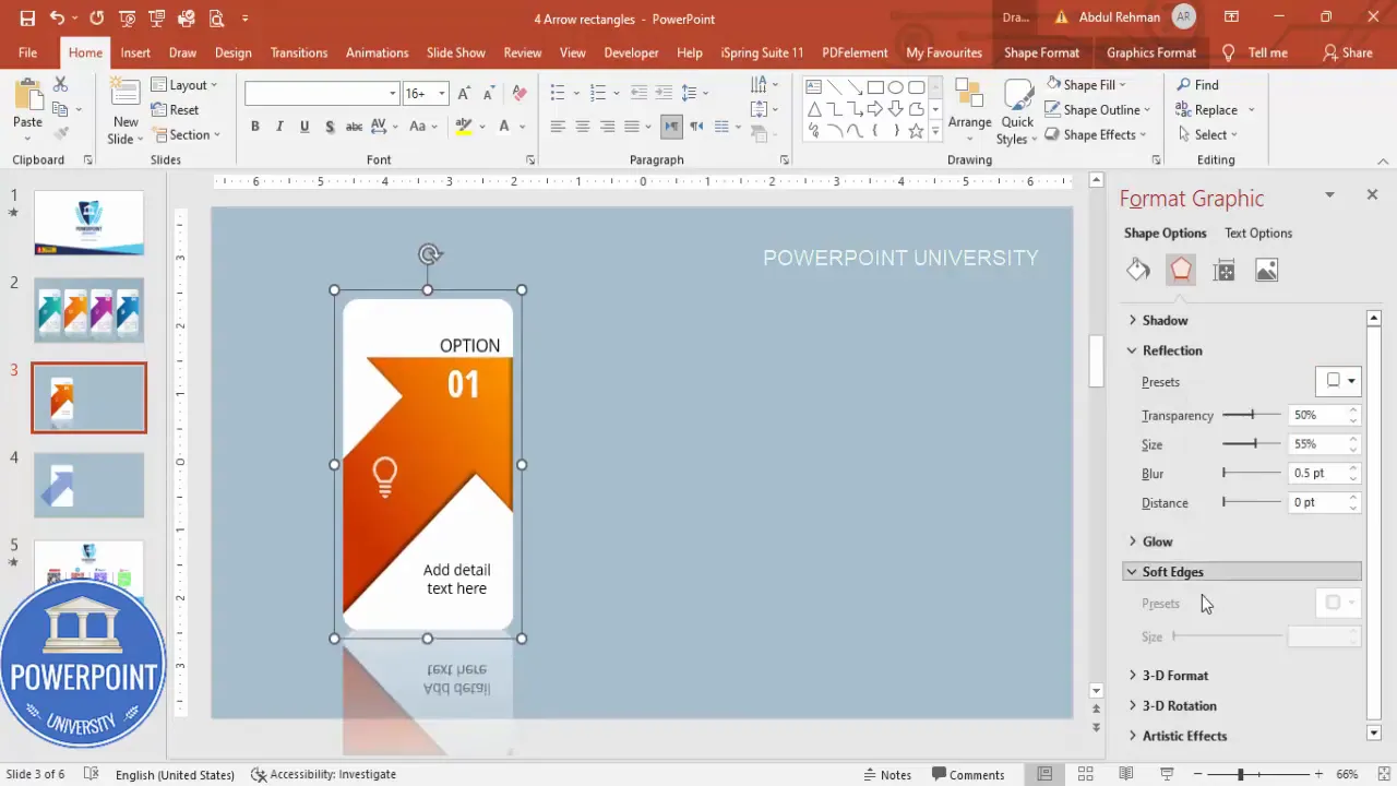
Adding icons and descriptive text
Insert > Icons and choose a simple, recognizable icon (e.g., lightbulb for idea). Resize to around 0.7 height/width in the example and set the icon fill to white so it contrasts with the gradient arrow. Slight transparency creates a softer look.
Below or beside the number and icon, add a short description in Open Sans. Keep copy tight — one to two lines (about 8–20 words). In the 4 Arrow options Slide, concise descriptions work best for readability and on-screen clarity.
Grouping and reflection: Preparing an option block
Once you’ve assembled the arrow, number, icon, and text for the first option, group them into a single object. Grouping makes duplication easier and ensures consistency across the 4 Arrow options Slide.
- Select all elements of the option (arrow piece, number badge, icon, text).
- Ctrl + G to group them.
- With the group selected, add a slight reflection via Format > Effects > Reflection. Keep it subtle — this reflection should feel photographic, not like a mirror.
Grouping the option block means that color changes, animation assignment, and duplication will be much faster and less error-prone when building the entire 4 Arrow options Slide.
Duplicating and recoloring to create the four options
Now replicate the grouped option to build the other three options. This is where speed meets consistency for the 4 Arrow options Slide.
Create Slides in Seconds with ExpertSlides AI |
|
Generate AI Presentations today: |
| TRY NOW! |
Duplicate the grouped option
- Select the grouped option you created.
- Hold Ctrl + Shift and drag to duplicate while keeping alignment locked. Alternatively, use Ctrl + D to duplicate then move into place.
- Repeat until you have four stacked options aligned vertically or horizontally depending on your layout.
Use Guides or Align tools (Shape Format > Align > Distribute Vertically) to keep spacing uniform. Uniform spacing reinforces a professional look on your 4 Arrow options Slide.
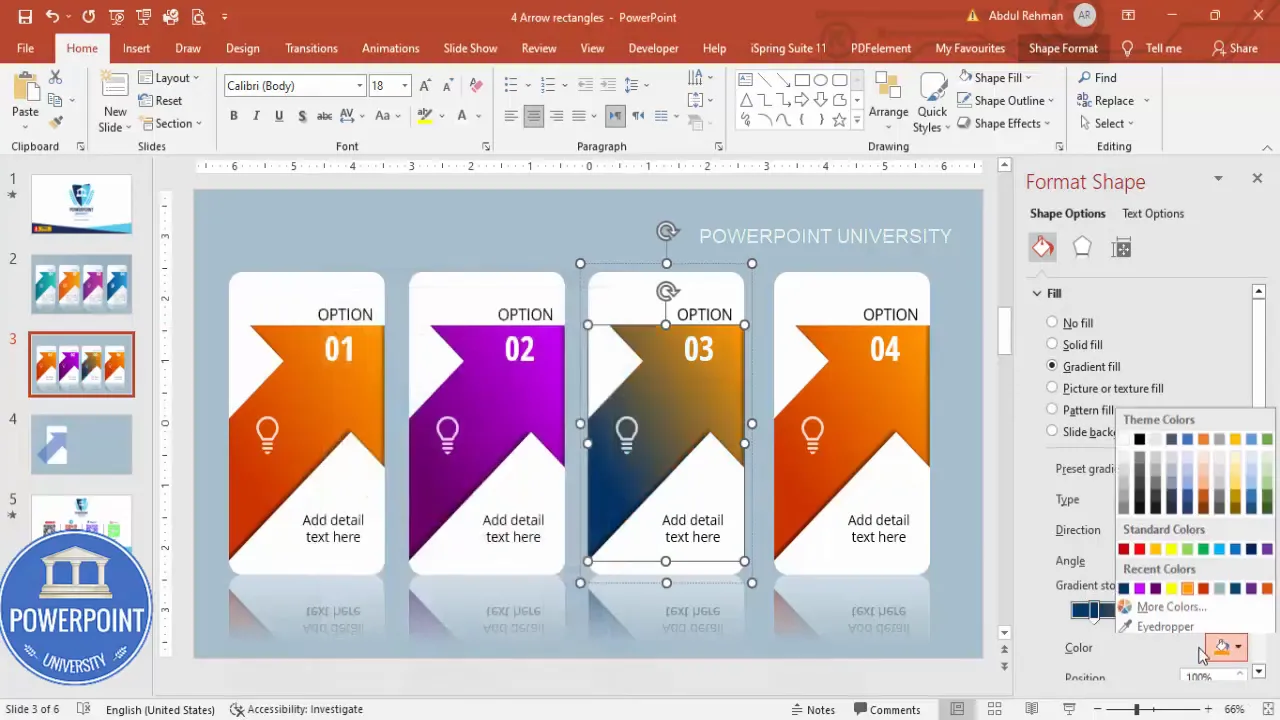
Recolor each arrow
Select each grouped option in turn and change only the arrow fill gradient to a new color. In the example we used:
- Option 01: Dark orange to yellow gradient
- Option 02: Dark purple to lighter purple
- Option 03: Bluish-green to teal gradient
- Option 04: Dark blue with pink highlight
Change icons accordingly to reflect each option’s meaning and keep the typography identical for consistency. This consistent typography and spacing is a hallmark of a strong 4 Arrow options Slide design.
Animating the 4 Arrow options Slide
Animations make the 4 Arrow options Slide interactive. The recommended approach is to reveal each option on click so you control the pace of the presentation.
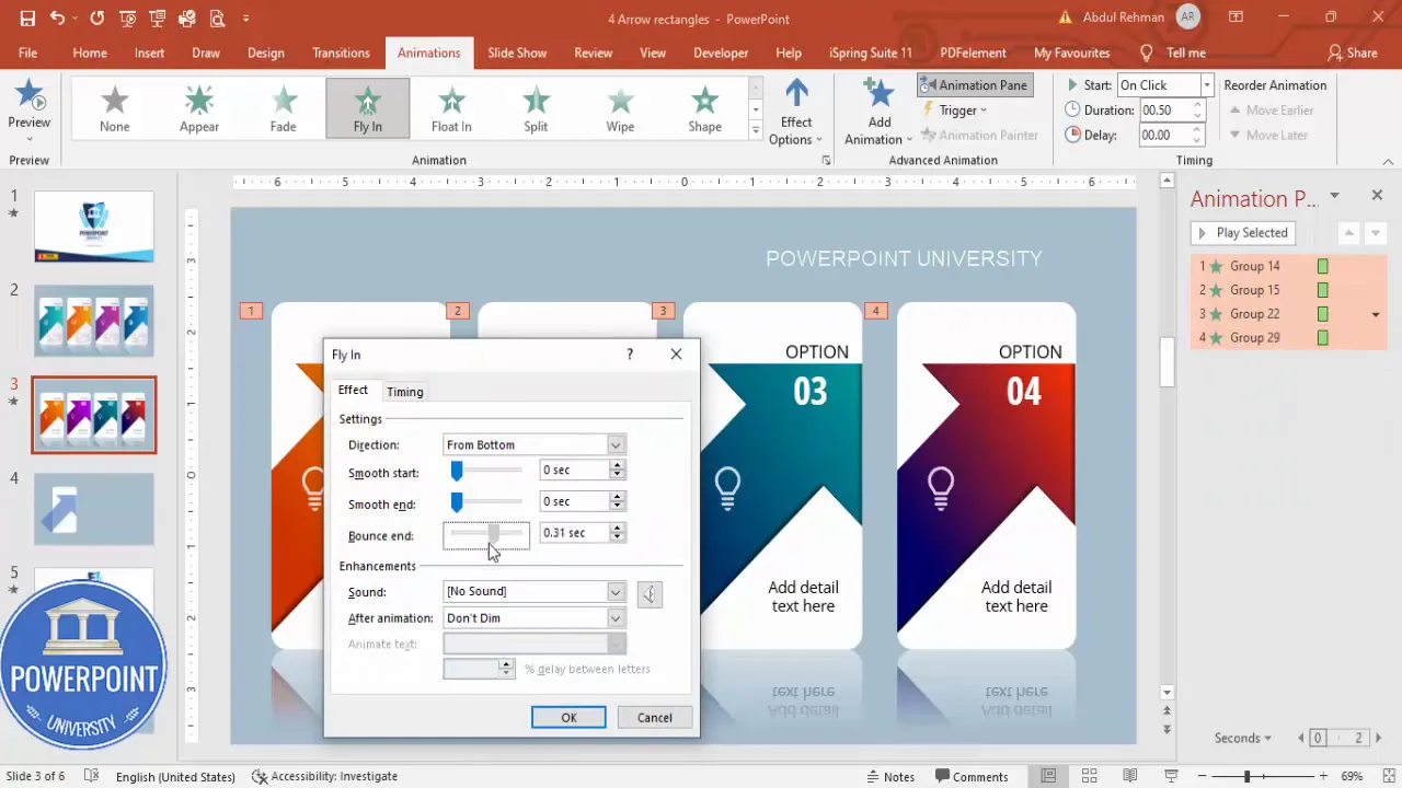
Assigning entrance animations
- Select the first grouped option > Animations > Add Animation > Fly In (or another subtle entrance).
- Open the Animation Pane to manage timing and sequence.
- Set the animation to start On Click.
- Repeat for options 2, 3, and 4 so each one is on click and appears sequentially.
For a little personality, open the effect options of each entrance animation and increase the bounce or smoothness slightly. In the example we increased bounce to add a small, professional bounce on arrival without going overboard. This extra motion helps the 4 Arrow options Slide feel modern and engaging.
Fine-tuning animation timing
- Keep entrance duration short (0.3–0.6s) for snappy delivery.
- Use delay sparingly — the on-click mechanic is your main timing control.
- Consider adding a fade-out or exit only if you plan to re-show options during the same slide.
Remember: Over-animated slides distract. The goal of the 4 Arrow options Slide is clarity; animations should enhance, not overwhelm.
Polish, accessibility, and export tips
After building and animating the 4 Arrow options Slide, review for polish and accessibility so your slide is usable by everyone and looks great in different environments.
Polishing the design
- Consistent spacing: Use Align & Distribute to make sure options are evenly spaced.
- Contrast: Check that text and icons meet WCAG contrast standards against the arrow gradients. If low contrast occurs, add a semi-opaque overlay or switch to bold white text.
- Alignment: Keep numeric badges and icons aligned across the four options for visual rhythm.
Accessibility checks
- Use sufficiently large fonts (20–28 pt depending on content and setup) to ensure readability in presentation settings.
- Add alternative slide notes for presenters describing the sequence and content for those unable to visually perceive the animations.
- Test using a projector or different screen to confirm colors and contrast maintain fidelity.
Exporting and sharing
- If you’ll share the slide as part of a downloadable deck, consider saving a static PNG or PDF for non-PowerPoint users. Note that animations won’t carry to PDF.
- When emailing the presentation, embed fonts or use safe fonts to avoid layout shifting on other machines.
- Save an extra copy of the slide as a template or duplicate the presentation file before making major changes so you can revert.
Variations and advanced ideas for the 4 Arrow options Slide
The core steps produce a flexible template. Here are several variations and advanced ideas to adapt the 4 Arrow options Slide for different use cases.
Layout variations
- Vertical stack: Place the arrow options stacked vertically with arrows pointing right; useful for step-by-step workflows.
- Horizontal row: Use a horizontal arrangement for timelines or linear processes.
- Staggered overlap: Slightly offset each option vertically for a layered look while maintaining click-to-reveal sequencing.
Interactive options
- Add hyperlinks to each grouped option for navigable slides (Insert > Link) if you want to jump to deeper content when an option is clicked.
- Use triggers to show/hide additional details on the same slide based on clicks for true interactive storytelling.
Advanced styling
- Replace reflection with a subtle bevel or inner glow for different photographic feels.
- Animate icon fills or number badges separately for layered entrance effects (but keep it minimal).
- Use picture fills inside the arrows (Format Shape > Picture or texture fill) for a rich, photographic style if you have suitable imagery.
Common mistakes and troubleshooting
While building the 4 Arrow options Slide you might run into a few common issues. Here are solutions to the most frequent problems.
My arrow looks jagged after merging
Solution: After Merge Shapes > Fragment, select pieces and nudge them slightly into place. If a gap persists, enlarge the arrow slightly (shift-scaling) and re-fragment, or recreate the arrow and align it carefully before merging.
The number badge isn’t legible against the gradient
Solution: Adjust contrast by darkening the gradient behind the badge or add a small semi-transparent circle under the number. Alternatively, switch the badge color to a dark color with white stroke if the gradient is light.
Animations won’t run in presenter mode
Solution: Ensure animations are set to On Click and not set to play automatically. Use Slide Show > From Current Slide to test. If using a PDF, animations won’t translate — use the .pptx during the presentation.
The slide looks different on another machine
Solution: Embed fonts or use system-safe fonts. Also check PowerPoint version differences; some shape effects differ across versions. Save a backup with flattened images if necessary.
FAQ
Q: Can I use any font for the 4 Arrow options Slide?
A: Yes, but choose a highly legible font. The example uses Open Sans and Open Sans Condensed for clarity and compact numeric badges. If your audience will view the deck on machines without your font, embed fonts or use web-safe alternatives like Arial or Calibri.
Q: How can I ensure my colors look the same on all devices?
A: Stick to hex/RGB values for consistent color reproduction. Test on multiple screens and projectors. When exact fidelity is critical, export to PDF for static distribution or convert to high-quality PNGs for images. For the animated 4 Arrow options Slide itself, share the .pptx for consistent results.
Q: Will the reflection and shadow effects work on older PowerPoint versions?
A: Most recent versions of PowerPoint (2016 and later) support the reflection and shadow options used here. Older versions may render them differently. If compatibility is a concern, avoid heavy effects or create a flattened image version for older viewers.
Q: Is it possible to make each arrow reveal extra content on the same slide?
A: Yes. Use animation triggers to show additional objects when an option is clicked. Insert the extra content (text box or image), hide it (set to appear With Previous but triggered by the option click), then test thoroughly. This turns the 4 Arrow options Slide into a mini interactive menu.
Q: How many words should each description be?
A: Keep descriptions short — one to two lines, or roughly 8–20 words. The goal of the 4 Arrow options Slide is clarity and quick audience comprehension. Save longer explanations for follow-up slides or speaker notes.
Q: Can I use pictures as the background of arrows on the 4 Arrow options Slide?
A: Yes. Format Shape > Picture or texture fill lets you clip photos into the arrow shape. Use high-quality images and adjust contrast to ensure text and icons remain readable.
Q: Should I group each option before animating?
A: Absolutely. Grouping keeps elements aligned and makes assigning animations easier. Group first, then apply entrance animation to the group so items move together smoothly on the 4 Arrow options Slide.
Conclusion and next steps
Building a polished 4 Arrow options Slide involves attention to structure, consistent styling, and subtle motion to guide your audience through multiple points. Start with a strong base: a white rounded rectangle and a well-constructed arrow. Use Merge Shapes > Fragment for clean edges, apply tasteful gradient fills and shadow/reflection effects, and group each option for fast duplication and animation.
Next steps you can take with your new 4 Arrow options Slide:
- Customize colors and icons to match your brand.
- Add triggers for interactive navigation between slides.
- Create a full deck using this slide as a master template and duplicate it for consistent section intros.
- Share your slide with colleagues and test it in real presentation environments (projectors, remote calls, etc.).
With these steps, you’ll have a flexible, attractive, and functional 4 Arrow options Slide that elevates your presentations and makes multi-option content easier to present and understand.
Tip: Duplicate the completed slide before experimenting with major design changes. This keeps a working version intact and saves time if you need to revert.
Check out the full video: Create 4 Arrow Options Slide in PowerPoint. Tutorial No.: 989


