

Table of contents
- Introduction: what you’ll build and why
- What you need before you start
- Step-by-step: build the 4 options with morph effect slide
- Design tips to make the 4 options with morph effect slide look professional
- Animation and timing: getting the morph effect right
- Common variations and use cases for the 4 options with morph effect slide
- Troubleshooting and frequently seen mistakes
- FAQ
- Conclusion and next steps
Introduction: what you’ll build and why
In this tutorial I’ll walk you through how to create a clean, modern “4 options with morph effect slide” using PowerPoint. The end result is a slide with a device image (like a laptop or tablet) and four rectangular options that appear to pop out of the screen when you click. Each rectangle contains an icon, a title, and a short descriptive sentence. The interaction relies on PowerPoint’s Morph transition so the options look like they come forward from the screen. This layout is ideal for feature summaries, step-by-step processes, product highlights, or any scenario where you want to visually present four choices in a compact, animated format.
The rest of this article breaks the process into a clear, repeatable workflow: gathering assets, building shapes and content, aligning and styling, applying the morph effect, and applying finishing touches so your 4 options with morph effect slide looks polished and professional. I’ll also share design tips, common variations, and troubleshooting advice so you can reuse this technique for all kinds of presentations.
What you need before you start
Before we begin, make sure you have the following:
- PowerPoint 2016 or later (Morph transition is available in newer versions and in Office 365).
- An internet connection if you want to use built-in online images or icons from PowerPoint’s online libraries.
- A laptop/tablet PNG or transparent device mockup (you can use PowerPoint’s Online Pictures and search for “laptop transparent”).
- A color palette and a font choice for consistency — I use Open Sans for readability.
- Optional: the free template download if you want to skip building from scratch (useful for learning by reverse-engineering).
Having these ready will speed up the creation of your 4 options with morph effect slide and keep the focus on layout and animation instead of hunting for assets.
Step-by-step: build the 4 options with morph effect slide
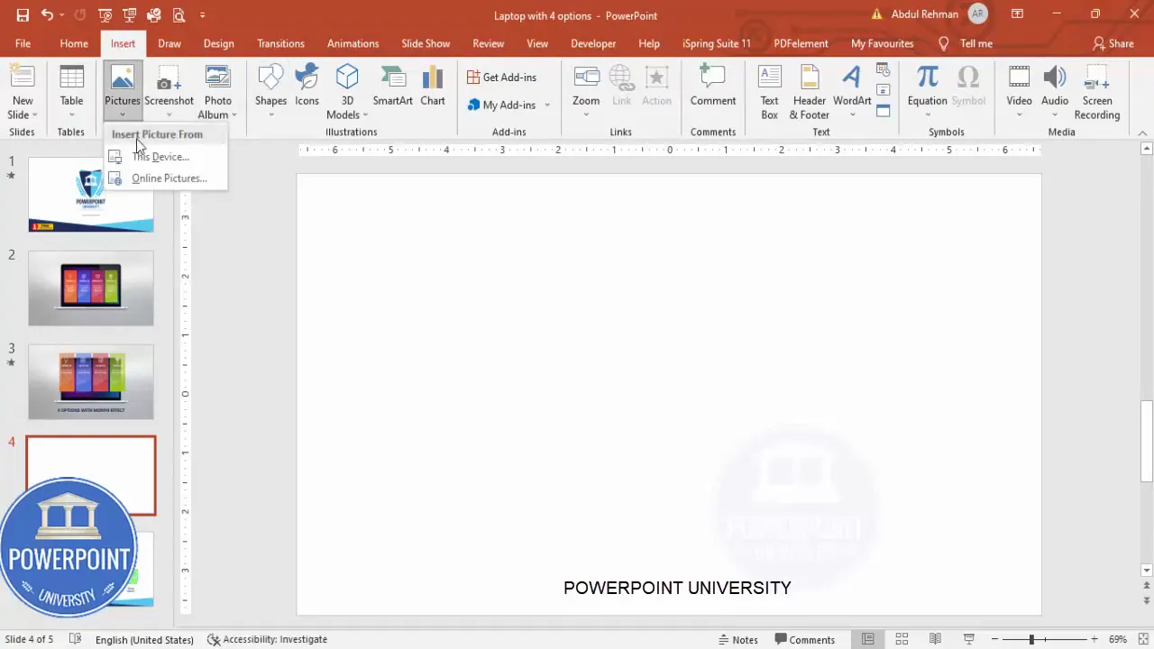
1 — Add a new slide and insert the device image
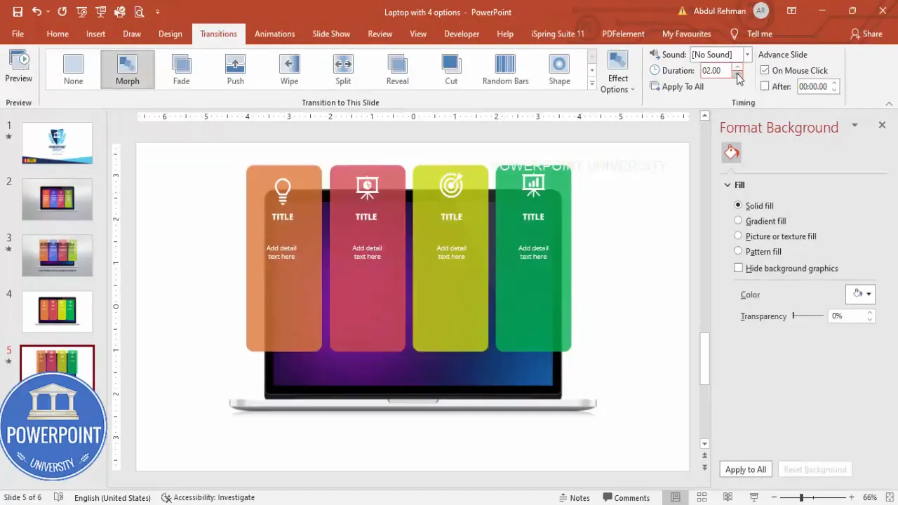
Start with a blank slide. I prefer to use a clean, uncluttered canvas so the device and options stand out. Insert your laptop or tablet image using Insert > Pictures > Online Pictures (or This Device if you have the image locally). Search for “laptop transparent” to find a PNG mockup with a transparent screen area you can place content in front of.
Resize the device image so it sits nicely above center of the slide — not too large, not too small. You want enough room below or beside the device for titles or other labels.
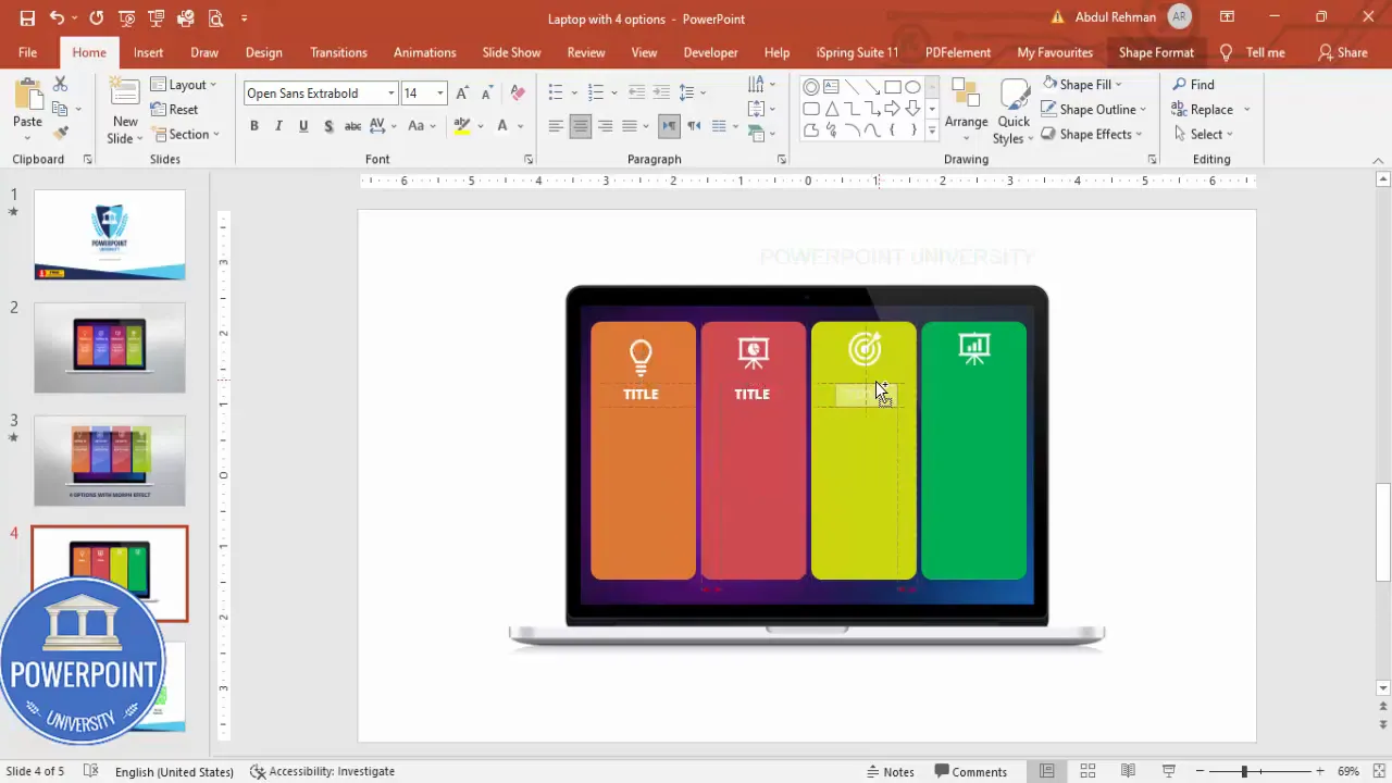
2 — Draw one rounded rectangle (this will be your option template)
Go to Insert > Shapes and choose the rounded corner rectangle. Draw it so the rectangle fits within the device screen area (or overlapping the device if you want it to appear like a floating card). Make the corner radius smaller so the shape is subtle and modern — not too rounded.
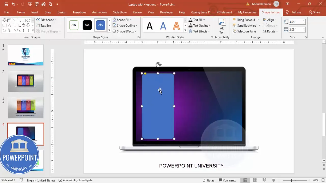
Remove the shape outline (Shape Outline > No Outline) and choose a fill color. For a professional look, use a solid color or a subtle gradient. I usually pick a set of four complementary colors for the options to visually distinguish them.
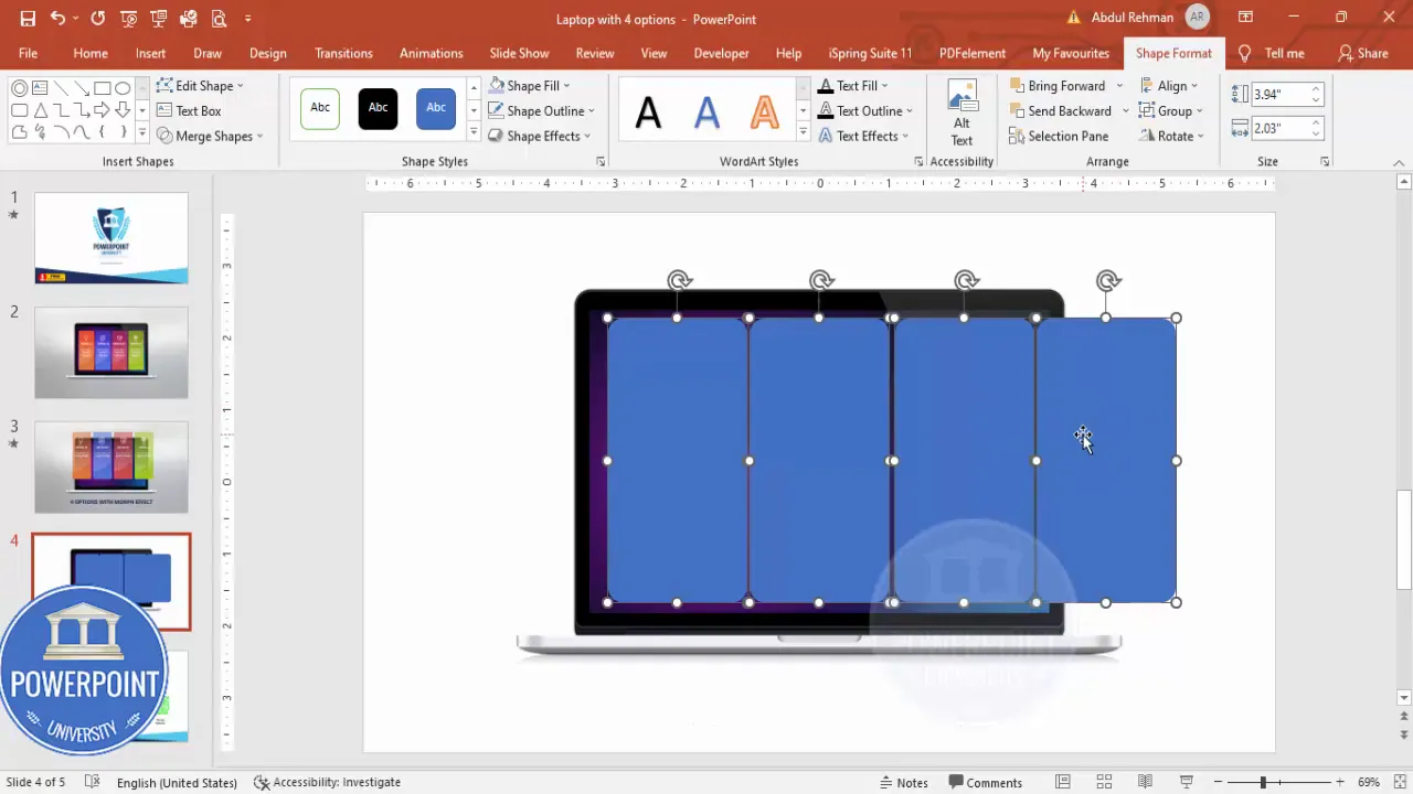
3 — Duplicate the rectangle to create four options and align
With the first rounded rectangle selected, hold Ctrl+Shift and drag to duplicate it. Repeat until you have four copies. If they overflow the screen area a bit, don’t worry — we’ll adjust them in a moment.
Group the four rectangles temporarily (Ctrl+G) so you can scale them together. Hold Shift while resizing to keep proportions. Position the grouped set so it sits where you want the options to emerge — typically centered horizontally within the device screen area.
Ungroup (Ctrl+Shift+G) and then use Align > Distribute Horizontally to give even spacing between the four rectangles. Use Align > Align Middle (and Align > Align Center if grouping needed) to ensure vertical and horizontal precision.
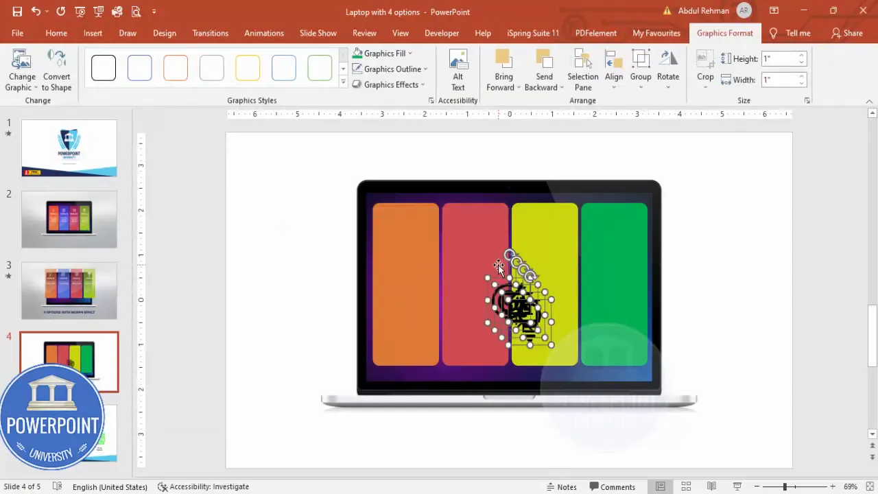
4 — Color and style each option
Select each rectangle and apply your chosen color scheme. You can use solid colors or subtle gradients — gradients add depth and can look more professional when done carefully. Keep contrast in mind: if the text and icons will be white, choose colors that maintain good contrast for legibility.
Remember: color consistency is key. Choose four colors from the same palette or apply different tints of a single color for a more cohesive look.
5 — Add icons to each rectangle
Go to Insert > Icons and pick four icons that match the meaning of each option (e.g., settings, analytics, users, checkmark). Insert them one by one, reduce their size so they sit comfortably above the title inside each rectangle (I often set icon size to around 2.6 cm or scale until visually balanced).
Set icon color to white (or a contrasting color) so it stands out. Center the icon horizontally within each rectangle and maintain consistent top padding so the icons align across all four options.
6 — Add titles and descriptive text
Insert a text box for the title of each option. Use a clear, readable font — I use Open Sans in bold for titles and Open Sans regular for the descriptive text.
Center-align both title and description text. For the title, choose a size that’s large enough to be read quickly (for a slide, usually 14–20 pt depending on slide size and viewing distance). For the description, use a smaller size (10–14 pt) and keep it to one short sentence per option so the slide remains scannable.
Once each rectangle, icon, title, and descriptive text are in place, select the four elements for each option and Group them (Ctrl+G). Now you have four grouped option cards to move, resize, and animate consistently.
7 — Duplicate the slide to prepare for Morph
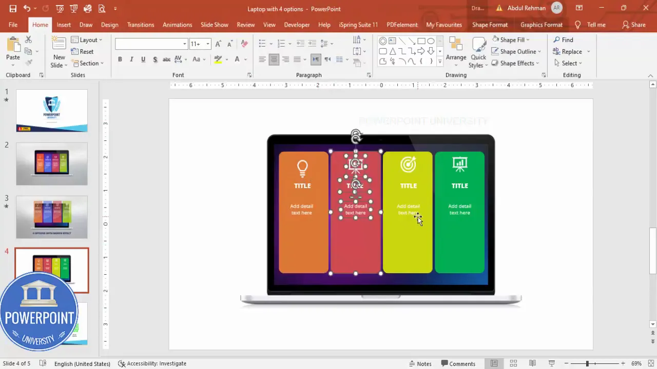
Duplicate the slide that contains the device image and the four grouped options. You’ll use the first slide as the starting point (options “inside” or muted) and the second slide as the final frame where one or more options appear popped out. This two-slide approach is what gives the Morph transition room to animate positions and sizing smoothly and naturally.
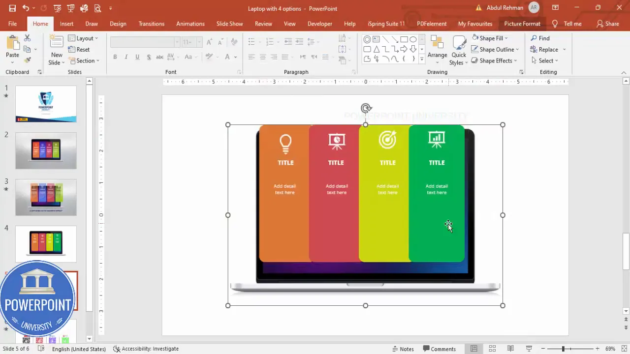
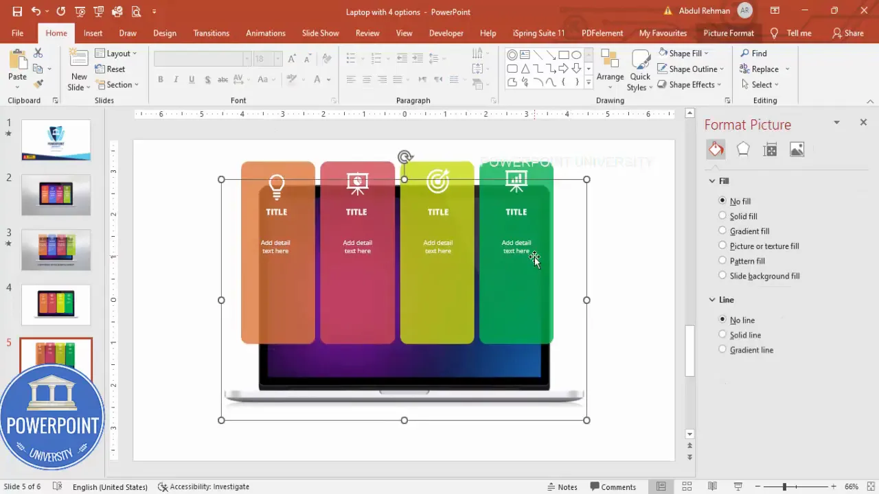
8 — On the duplicated slide, enlarge and shift the options so they sit outside the device
On the duplicate slide, select the four grouped options and use Shift+drag to scale them up slightly (this simulates the “pop out” effect). Then move them slightly forward (i.e., lower on the slide or closer to the viewer) so they look as if they are emerging from the device screen. Make sure at least a portion of each option sits outside the device boundary — this creates the illusion that the options have come forward.
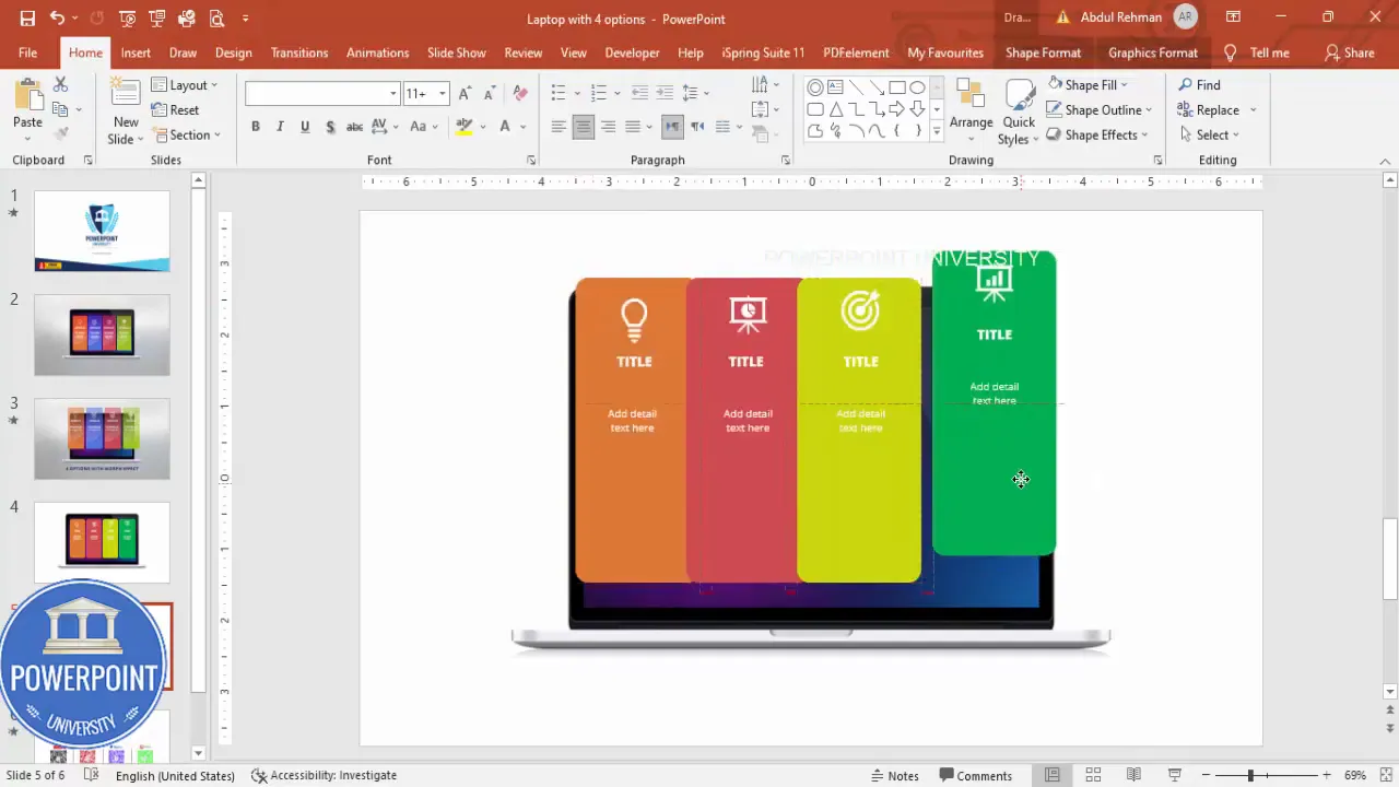
Important: maintain alignment and spacing consistency between the options while moving them. Use Align > Distribute Horizontally again if needed to keep their spacing even.
9 — Add subtle transparency to the background (optional)
If you want depth in the starting slide, you can apply slight transparency to the option cards on the first slide. Select each option on the first slide and set Shape Format > Fill > Transparency to around 20%. This makes the initial state look recessed and helps the popped-out state feel more pronounced when the Morph transition occurs.
10 — Set Morph transition and tweak duration
Select the second slide (the one where the options are moved/enlarged) and open Transitions > Morph. Adjust the duration depending on how fast or slow you want the pop-out to feel. I often use 1 second for a tight, snappy effect. If you need a slower reveal, set duration higher (1.5–2 seconds).
Create Slides in Seconds with ExpertSlides AI |
|
Generate AI Presentations today: |
| TRY NOW! |

Now run the slide show. From the first slide, click to move to the second. The Morph transition will animate the option cards from their initial recessed positions into the popped-out placement, creating the illusion that they emerged from the device screen.
Design tips to make the 4 options with morph effect slide look professional
A clean, usable design lets your audience understand what’s important without being distracted by unnecessary details. Here are practical design tips to improve your 4 options with morph effect slide:
- Limit text per option: Keep the title short (1–3 words) and the description to a single short sentence. Your slide should be scannable.
- Use consistent padding: Align icon, title, and body text consistently across all four options. Use the same top and bottom padding for visual rhythm.
- Contrast for readability: If your option backgrounds are colored, use white or high-contrast text and icons. Check the color contrast for accessibility.
- Choose coherent colors: Pick four colors from one cohesive palette (analogous or monochromatic with tints) to prevent a chaotic appearance.
- Hierarchy and weight: Use font weight to establish hierarchy: bold for titles, regular for descriptions.
- Subtle shadowing and depth: If you add drop shadows, keep them subtle — just enough to separate the card from the background without looking heavy.
- Spacing: Use Align > Distribute Horizontally and Align Middle to ensure even spacing and alignment. This makes the slide look engineered, not accidental.
- Limit animations: The Morph effect is powerful; avoid stacking many additional entrance animations that could compete with it.
Quick checklist before applying Morph
- All four options are grouped separately (icon + title + description).
- Spacing and alignment are even across options.
- Device image is positioned once and identical across both slides.
- Initial state optionally uses slight transparency for a recessed feel.
- Final state has options scaled/moved to appear popped out.
- Morph transition is set on the second slide and duration set (e.g., 1 second).
Animation and timing: getting the morph effect right
The Morph transition animates differences between two slides — position, size, rotation, color, and other properties. For your 4 options with morph effect slide, Morph will interpolate the rectangles from slide 1 positions to slide 2 positions. Here are precise tips to control that interpolation and produce clean-looking motion:
Use two slides as ‘before’ and ‘after’ frames
Don’t try to animate entirely on one slide. Create one slide with the options in the recessed state and duplicate it. Move elements on the duplicate to create the “after” state. Morph will animate between the two states automatically.
Control speed with duration
Duration controls the speed of the interpolation. Shorter durations (0.5–1s) feel snappier and more modern; longer durations (1.5–2s) feel more deliberate and cinematic. For the typical business presentation, 1 second is a strong default.
Use scale + position for stronger pop-out illusion
If the options only move but don’t scale, they can feel flat. Increase the size slightly (5–15%) when moving the cards forward and combine that with a small vertical shift (toward the viewer) to create depth. Keep the scale change subtle to avoid distortion of text readability.
Staggered reveals (optional)
If you want each option to pop out individually, duplicate the slide multiple times and on each duplicate, only modify the position/size of the option you want to pop. Apply Morph between each pair of slides and that will create a sequence where options pop one by one. This is slightly more advanced but very effective for step-by-step explanations.
- Slide 1: all four options recessed.
- Slide 2: option 1 popped out — Morph will animate option 1 only.
- Slide 3: option 1 & 2 popped out — Morph animates option 2 in while preserving option 1.
- Continue for options 3 and 4.
Common variations and use cases for the 4 options with morph effect slide
The structure is flexible — here are practical ways to adapt the layout for different contexts:
- Feature highlights: Use each option to summarize a product feature. Pop each feature in as you explain it.
- Step-by-step guides: Use numbered icons and animate steps one by one with Morph to guide the audience through a workflow.
- Decision options: Present four choices for a decision-making slide, then pop out the recommended choice at the end.
- Service packages: Show four pricing or service tiers; pop each out as you compare them to emphasize differences.
- Onboarding checklist: Use it for user onboarding flows or product setup steps with clear icons and short copy.
For each use case, tailor language, icons, and color to the context. For example, use green for completion steps, blue for information-type options, and orange or red for warnings or attention-grabbing cards.
Troubleshooting and frequently seen mistakes
When building the 4 options with morph effect slide, a few common mistakes come up. Here’s how to avoid them:
- Issue: Morph doesn’t animate an object. Fix: Ensure the object exists on both slides. If an object is present only on the second slide, Morph won’t know how to transition from the first state. Duplicate the object to the initial slide (even if it’s transparent or off-stage) so Morph can interpolate.
- Issue: Text blurs or appears jagged after scaling. Fix: Keep scale increases small (5–15%). Large scaling makes text appear pixelated because PowerPoint rasterizes text during animation. Alternatively, keep text size identical and only move the card to create the pop-out illusion.
- Issue: Misaligned spacing after changing size. Fix: Use Align > Distribute Horizontally and Align Middle after you resize and move elements. This will reestablish even spacing.
- Issue: Morph creates unexpected paths. Fix: If an object unexpectedly takes a curved path, ensure it has the same name on both slides. You can rename shapes in Selection Pane to keep consistent mapping between objects.
- Issue: Icons or fonts look different between slides. Fix: Use the same icon sources and the same font file across slides. If an icon is inserted as a different object type on one slide (e.g., SVG vs. PNG), Morph may not map them smoothly.
FAQ
Q: Which PowerPoint versions support the Morph transition?
A: Morph is available in Office 365 and PowerPoint 2019 and newer versions. If you’re using an older PowerPoint version, you won’t have the Morph option. In that case, you can simulate the effect using motion path animations and carefully timed entrance animations, but the setup is more manual and less smooth.
Q: How do I ensure the Morph transition animates only one option at a time?
A: Duplicate your slide multiple times and on each duplicate only modify the position/scale of the option you want to animate. Apply Morph between each pair of slides. This creates a sequential reveal where each option pops out on its own slide transition.
Q: Can I use images instead of icons inside the options?
A: Yes. You can use small images, illustrations, or logos inside each option. Make sure they are consistent in style and size. If the images are rasterized (PNG/JPG), avoid large scale changes during Morph to prevent pixelation. Prefer vector icons (SVG) or PowerPoint’s icon library for crisp results.
Q: Is it better to scale the whole option or just move it for the pop-out effect?
A: Both approaches work. Scaling gives a stronger three-dimensional illusion but risks text clarity if you scale too much. Moving (position-only) is safer for legibility. A subtle combination — small scale plus slight forward position — often looks best.
Q: How do I make sure the pop-out animation is accessible and not distracting?
A: Keep animations short (0.6–1.2 seconds), avoid flashing or strobing effects, and provide alternative content (e.g., a static version of the slide) if you’re sharing the deck with audiences that may prefer non-animated versions. A simple rule: animation should enhance understanding, not obscure it.
Q: What should the size and font choices be for slide readability?
A: Keep titles readable at a distance — typically 16–28 pt depending on slide canvas and room size; keep body copy at least 12–14 pt. Use clean, sans-serif fonts like Open Sans (which I use) for readability. Maintain consistent font sizes across the four options to preserve visual rhythm.
Q: Can the 4 options with morph effect slide be exported to video?
A: Yes. When you export your PowerPoint to video (File > Export > Create a Video), Morph transitions and slide timings are preserved. This is a great way to create animated product showcases or explainer videos from your slide deck.
Conclusion and next steps
The 4 options with morph effect slide is a versatile, visually engaging way to present choices, features, or steps. With a simple workflow — build four option cards, duplicate the slide, move/scale cards on the duplicate, and apply Morph — you can create a professional animation that feels modern and polished. Remember to:
- Keep text concise and scannable.
- Maintain consistent spacing, padding, and alignment.
- Use small scale changes to avoid text degradation.
- Test the animation in Slide Show mode and adjust duration for pacing.
- Consider sequential Morph slides if you want staggered reveals.
Try building one slide from scratch after following these steps, then experiment with variations: change icon sets, switch the device mockup to a phone for mobile-focused content, or create a vertical column layout instead of horizontal. The method scales well and can be adapted to many presentation needs.
Thanks for reading — now open PowerPoint and create your own 4 options with morph effect slide. If you want to speed up the learning process, duplicate the slide as you work, play with timings, and use the Selection Pane to keep object naming consistent between slides. Happy designing!
Check out the full video: Create 4 Options with Morph Effect Slide in PowerPoint. Tutorial No.: 988


