

Hi — I’m POWERPOINT UNIVERSITY. In this in-depth guide I’ll walk you through how to build a clean, flexible, and interactive 4 Steps Infographic Slide in PowerPoint from scratch. This post expands on the practical, hands-on walkthrough I recorded and includes detailed design reasoning, alternative approaches, troubleshooting tips, and a helpful FAQ so you can build and reuse this layout in your presentations.
The focus of this article is the 4 Steps Infographic Slide — a versatile slide that highlights a process, sequence, product journey, or four distinct points. I’ll cover every single action: drawing shapes, color and gradient choices, precise alignment, icon handling, text styling, grouping, and subtle animation. By the end you’ll be able to craft a polished slide that’s presentation-ready and easy to edit.
Throughout the article I’ll refer to specific moments in the build with screenshots so you can see exactly what I’m doing. If you want to follow along in PowerPoint as you read, prepare a blank slide and let’s get started.
Keyphrase: 4 Steps Infographic Slide
Table of contents
- Introduction: Why a 4 Steps Infographic Slide works
- What you’ll need before you start
- Step-by-step build (detailed)
- Design choices: color, gradient, and typography
- Icons and imagery
- Grouping and reusing the layout
- Simple animation that enhances clarity
- Troubleshooting and common mistakes
- Variations and advanced tips
- Accessibility & export considerations
- FAQ
- Conclusion & next steps
Introduction: Why a 4 Steps Infographic Slide works
The 4 Steps Infographic Slide is a simple, high-impact layout for presenting sequential information. Whether you’re describing a four-phase project plan, a customer journey with four milestones, a short process, or key quarterly goals, this slide helps your audience digest and retain the structure of what you’re explaining.
There are three reasons I like this layout:
- Clarity: Four items are easy to scan and remember without overwhelming the viewer.
- Visual hierarchy: Shapes, color contrast, and icons create immediate focal points for each step.
- Flexibility: The design adapts to corporate branding, educational contexts, and marketing decks.
In this tutorial I focus on a centered, horizontal composition made of stacked rounded rectangles and connecting lines. The final effect is a clean, modern infographic slide that highlights one step at a time when you click — ideal for presenting live or exporting as an animated slide to share with stakeholders.
What you’ll need before you start
Before we jump into the build, collect the following:
- PowerPoint (any modern version: Office 2016, 2019, Microsoft 365, or equivalent).
- A blank slide or a slide with a subtle background. I prefer a lightly textured or tinted background to make white shapes pop.
- The Open Sans font family (Open Sans SemiBold and ExtraBold are used in this guide). If you don’t have it, choose a clean sans-serif like Arial, Roboto, or Calibri.
- A small set of vector icons (white icons on a transparent background work best). You can use PowerPoint’s built-in icons or import SVG/PNG graphics.
- A color palette for your four steps (I’ll show gradient techniques so you can pick pairings that work together).
- Patience — the build is simple, but alignment and color selections take a few minutes for a polished result.
Optional but useful items:
- A downloadable template or sample slide that you can reverse-engineer. (I provide free templates in my materials in other places.)
- A consistent brand palette to keep the slide aligned with your organization’s identity.
Step-by-step build (detailed)
Now let’s walk through how I construct the 4 Steps Infographic Slide, step by step. I’ll explain both the “how” and the “why” behind each action so you can adapt the technique to your needs.
1. Prepare the slide background
Start with a new slide. Consider changing the slide background to something slightly textured or tinted — this helps white shapes and text read clearly on screen. Use a subtle ingredient-filled or soft-patterned background if you want a modern look, but keep it muted so it doesn’t fight the content.
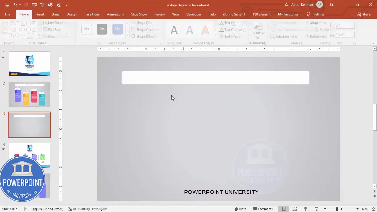
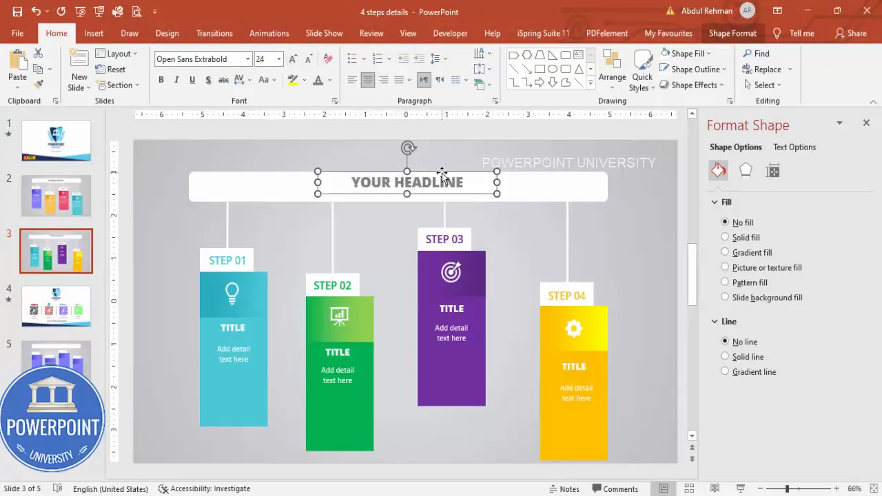
2. Draw the base rounded rectangle
Insert a rounded corner rectangle from Insert > Shapes. This will be the large white container that holds the stacked colored rectangles and text.
How I set it up:
- Draw the rounded rectangle to the desired width (centered on the slide).
- Remove the outline (Format Shape > Shape Outline > No Outline).
- Set the fill to white.
Why: The white outer container provides contrast with the colorful step panels and keeps content areas visually distinct. If you want a different look, a very light gray works as well.
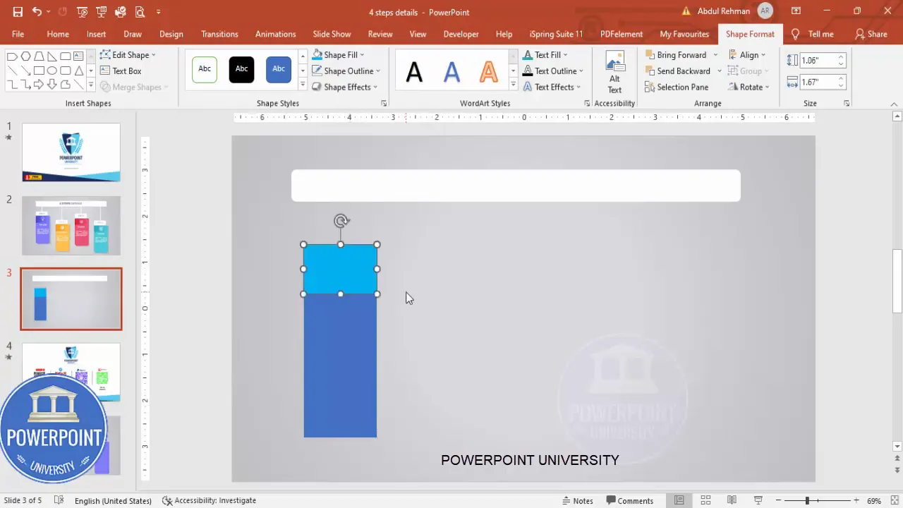
3. Create the stacked colored rectangles
These are the visual step blocks. We’ll make three rectangles for each step layer (a colored background, a slightly smaller darker overlay, and a white top band). The combination creates depth and gives each step a strong, clickable look.
Steps:
- Insert a standard rectangle (Insert > Shapes > Rectangle). Draw it so it sits inside the white rounded container.
- Remove the outline (No Outline).
- Duplicate the rectangle with Ctrl+D and reduce the size slightly. Change its fill color to a slightly darker shade — this creates a layered effect.
- Create one more small white rectangle and place it at the top of the colored rectangle. This white top band is where the step number or caption goes.
Repeat these three-layer stacks for each of the four steps. Keep consistent spacing between stacks for a balanced look. Use Ctrl+D to duplicate elements to speed up the process.
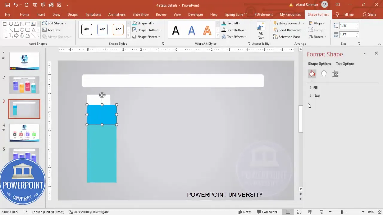
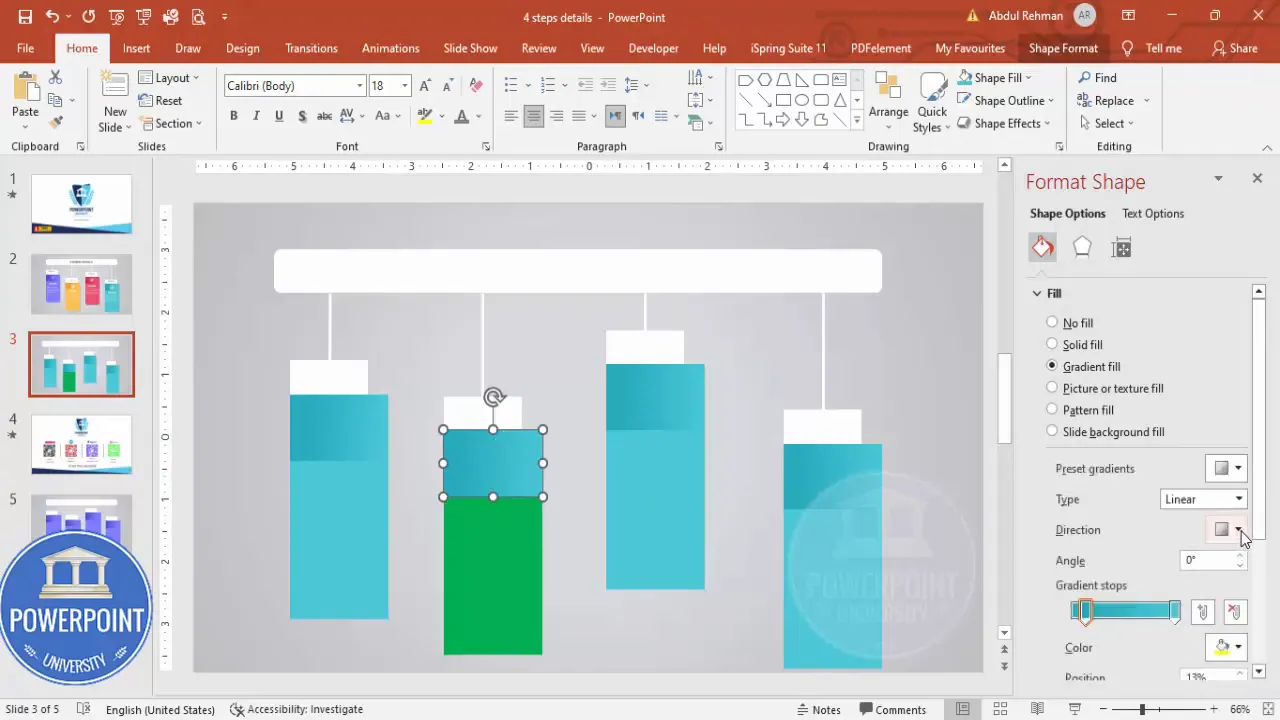
4. Apply gradient fills to the colored rectangles
Gradients add subtle visual interest and make modern slides feel more professional than flat colors. I use a two-stop gradient for each colored rectangle: one darker stop and one lighter stop.
How to set gradients:
- Right-click the shape and choose Format Shape.
- Under Fill choose Gradient Fill.
- Set two stops: a darker color at one stop and a lighter version at the other.
- Choose Linear or Radial direction based on how you want the highlight to fall.
- Drag the gradient handles slightly to position the light source where it looks natural.
Example pairings I used in the build: blue gradient for step 1, green for step 2, purple for step 3, and orange/yellow for step 4. You can try any palette; ensure contrast against the white top band and white icons.
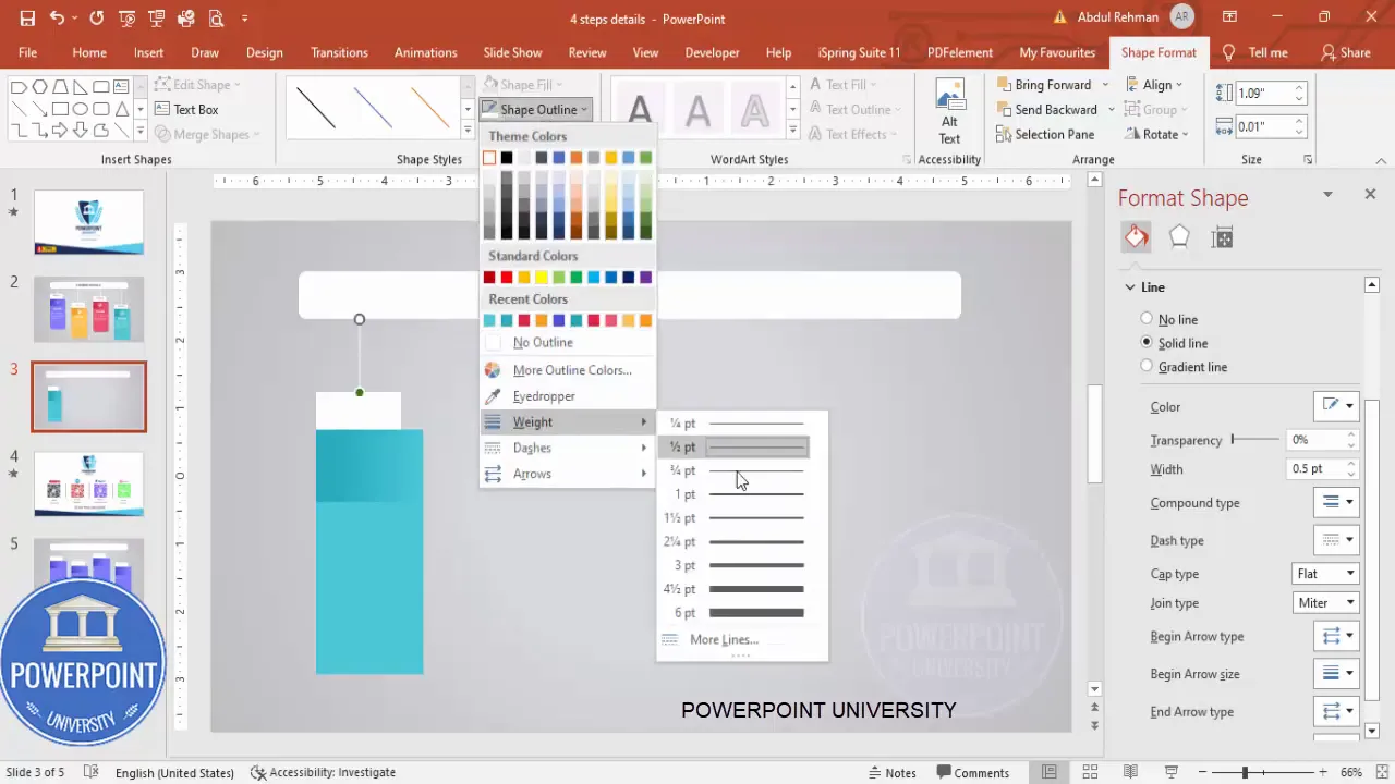
5. Add the connecting lines
To link the steps visually, add simple straight lines connecting each stacked block. These little lines suggest sequence and direction without cluttering the slide.
How I make them:
- Insert a Line shape (Insert > Shapes > Line).
- Hold Shift while drawing to keep it perfectly straight.
- Set the line color to white and increase the weight to 2–3 pt for good visibility.
- Duplicate the line for each connection (Ctrl+D) and place them so the steps appear linked.
Ensure lines are aligned horizontally. If you need micro-adjustments, use the arrow keys to nudge while holding Ctrl for smaller increments.
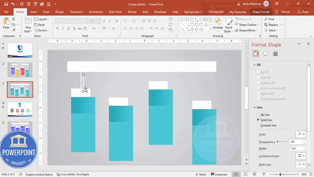
6. Fine-tune sizes and spacing
At this stage you have a set of stacked blocks with gradient fills and connector lines. Now adjust Heights so the look feels balanced — the top white bands should be consistent across steps, and the colored areas should align vertically.
Tips for spacing:
- Use the Align tools (Home > Arrange > Align) to align centers and distribute vertically or horizontally.
- Use equal padding between stacked items to keep rhythm across the slide.
- If something feels off, toggle the Guides (View > Guides) and snap elements to guides for precision.
7. Choose and place step numbers and short labels
Each step needs a clear label. I use a short “STEP 01” format on the white top band to keep it compact and scannable.
Typography choices:
- Font family: Open Sans (SemiBold for small labels, ExtraBold for main titles).
- Color: Use the same hue as the step’s gradient for the step number — this ties the label to the color visually.
- Alignment: Center-align text in the top white band for balanced composition.
Create the text box (Insert > Text Box), type “STEP 01” (or your preferred label), and format. Duplicate across the other three steps and change the numbers and color references to match each step’s palette.
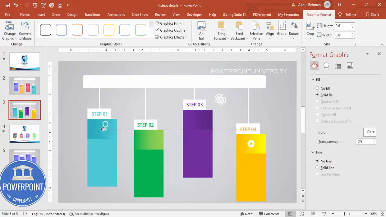
8. Add icons and adjust sizes
Icons are powerful visual shorthand. I recommend using simple, white icons to sit in the colored area of each step. They immediately tell the viewer what to expect and reinforce the step label.
How I add them:
- Insert icons via Insert > Icons or insert PNG/SVG files from your library.
- Set sizes to a consistent height and width (for example, 0.6 to 0.8 inches depending on slide scale).
- Change icon color to white so they pop against the gradient background.
- Center each icon vertically in the colored area and horizontally within the step block.
9. Add the step title and detail text
Each step should have two text levels: a short, strong title and a brief detail line or two. Keep detail text minimal — aim for one short sentence or a 10–15 word summary.
My formatting approach:
- Title font: Open Sans ExtraBold, white, centered.
- Detail font: Open Sans (regular or semi-bold), white, centered, smaller size than the title.
- Line length: Keep detail lines short to maintain legibility (avoid more than two lines).
Place the title in the colored area under the icon and the detail text below the title. Duplicate formatting using Ctrl+D to speed up work across the four steps.
10. Group each step for easy editing
Once text, icon, and shape layers are in place for a step, group them so you can move or duplicate each step as a single object.
How to group:
- Select all elements belonging to a single step (drag a selection box or use Shift+click to select each item).
- Press Ctrl+G to group.
- Repeat for each of the four steps.
Grouping saves time if you need to resize or reflow the layout on other slides or templates.

11. Add a headline and supporting copy
Above the infographic add a short headline describing the process. I set mine to a neutral gray to separate it from the bright step colors.
For the headline I use:
- Open Sans ExtraBold in a larger size.
- Gray color to keep visual hierarchy (white for the step content, gray for the headline).
- Center alignment to match the infographic layout.
12. Final polish: shadows and micro-effects
A subtle shadow on the grouped step elements can add depth and lift the blocks from the background. Avoid heavy shadows — aim for a soft offset with low transparency.
How to add:
- Right-click the group > Format Shape > Effects > Shadow.
- Choose an outer shadow with small blur (4–8px) and low transparency (20–30%).
Less is more — shadows should be gentle and consistent across the steps so the slide reads as intentional and calm.
Create Slides in Seconds with ExpertSlides AI |
|
Generate AI Presentations today: |
| TRY NOW! |
Design choices: color, gradient, and typography
Design choices make the difference between a functional slide and a great-looking slide. Below are the considerations I apply when designing the 4 Steps Infographic Slide.
Color palette strategy
Choose four distinct but harmonious colors. There are two common strategies:
- Monochrome with shades: Use a single hue and vary lightness across steps for a cohesive, calm look.
- Accent palette: Choose four different accent colors (blue, green, purple, orange) for energetic and distinct steps.
Make sure each color has enough contrast with white text. Use the lighter stop for highlights and the darker stop for depth.
Gradient directions and stops
A two-stop gradient (darker + lighter) is sufficient for modern designs. Choose the direction so the light appears to fall naturally (usually top-left to bottom-right or radial from the center). Keep gradient differences subtle to avoid distracting banding.
Typography and hierarchy
Use two font weights to create hierarchy: SemiBold for small labels and ExtraBold for titles. Keep detail text lighter or regular. Maintain consistent sizes across steps so the rhythm is uniform.
Icons and imagery
Icons function as quick visual anchors. Here’s how to choose and handle icons for the 4 Steps Infographic Slide:
- Stick to a single icon style (line, filled, or glyph). Mixing styles reduces cohesion.
- Keep icons white if the background is colorful; adjust size consistently across steps.
- Prefer vector icons (SVG or built-in PowerPoint icons) so they scale crisply.
When placing icons, center them in the colored area and leave breathing room above and below. If you want to emphasize a step, you can increase the icon size slightly or add a thin white border around it, but use sparingly as this can create visual noise.
Grouping and reusing the layout
Group elements per step so you can copy and paste or drag entire steps into other slides or presentations. Grouping also makes it easier to set slide-level animations that target each grouped step as a single object.
To reuse the layout as a template:
- Save the slide as a custom layout in the Slide Master, or
- Duplicate the slide and replace text and icons per new content, or
- Save grouped objects to your Shapes library for quick reuse (right-click > Save as Picture or add to a custom template).
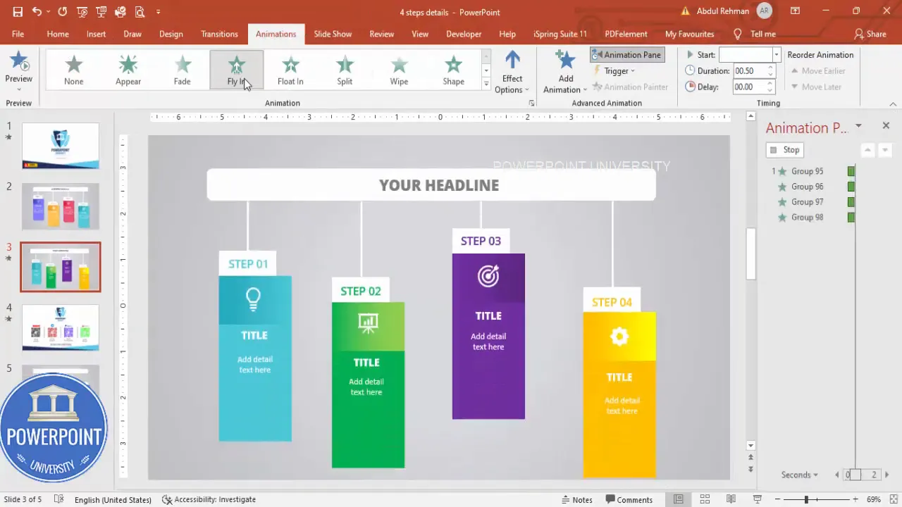
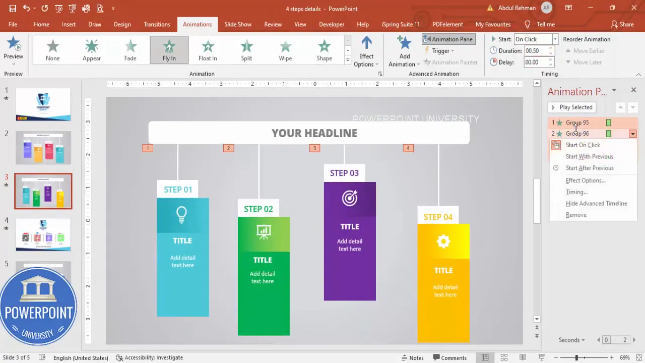
Simple animation that enhances clarity
Animation can help draw attention to one step at a time in a live presentation. I recommend a simple “Fly In” animation on click for each grouped step.
Animation setup:
- Select the grouped step objects in order (use Shift+Click to select multiple).
- Open the Animations tab and add Fly In.
- Set Start to “On Click” and adjust the direction to come from the bottom or side — choose the direction that matches your slide flow.
- Open Effect Options > Timing and increase “Bounce” or add a small Ease for subtle motion.
- Use the Animation Pane to reorder and verify the sequence.
Keep animations consistent and minimal — too many different movement types will distract. The objective is to focus the audience on one step at a time, not to show off motion effects.
Troubleshooting and common mistakes
Here are frequent issues and how to fix them when building the 4 Steps Infographic Slide:
- Shapes misaligned: Use Align tools and Guides; nudge with arrow keys for micro adjustments.
- Gradients look banded: Use subtle gradients and avoid extreme color jumps. Consider linear direction adjustments or using a slightly different tint.
- Icons look pixelated: Use vector icons or insert SVG files. If using PNG, ensure high resolution.
- Text is too small: Test on a projector or export to PDF and zoom to check legibility. Keep detail text under 24–28 pt depending on slide size.
- Animation stutters in presentation mode: Check animation effects and avoid overly complicated motion. Use simple on-click Fly In with minimal duration (0.4–0.6s).
Variations and advanced tips
The base 4 Steps Infographic Slide can be adapted in many ways. Here are some ideas:
- Vertical layout: Stack the step blocks vertically for mobile or portrait-oriented slides.
- Numbered circles: Replace the white top band with circular numbered badges for a different visual aesthetic.
- Icon-first layout: Move icons to the left of each step and set the text to the right for a left-to-right reading flow.
- Progress bar variant: Replace connector lines with a single progress bar to show completion percentage across the four steps.
- Responsive resizing: Group steps and then scale them down to create thumbnail views for agendas or overview slides.
Advanced design techniques:
- Use masks with images behind the colored blocks to create textured backgrounds that peek through.
- Create subtle hover-like effects by duplicating grouped steps with slight size/brightness changes for interactive clickable PDFs (requires external tools).
- Use a blend mode effect in external tools (like Photoshop) to create richer gradients or texture overlays, then import as images.
Accessibility & export considerations
Accessibility ensures everyone can use your slide. Here’s what to check:
- Contrast: Make sure text passes contrast checks against the colored backgrounds. White text on bright gradients usually passes, but verify with a contrast tool.
- Font size: Keep body/detail text large enough to read from a distance — minimum 24 pt recommended for conference presentations.
- Alt text: When exporting to accessible formats (like PDF), provide alternative text descriptions for icons and images.
- Animation fallback: If you’ll distribute the slide as a static PDF, ensure the slide is readable without animation (e.g., show all steps or provide a static overview slide).
When exporting:
- Export to PDF for distribution (File > Save As > PDF) — check layout, embedded fonts, and legibility.
- Export as images for handouts or blog use (File > Export > Change File Type > PNG/JPEG).
- If sharing an animated slide, export to a video or keep the .pptx for interactive use in presentation mode.
FAQ — Everything you want to know about the 4 Steps Infographic Slide
Q: What is the ideal number of words for each step’s detail?
A: Keep details concise. Aim for a single sentence per step or 8–15 words maximum. The purpose is to prompt your spoken explanation, not to replace it.
Q: Can I use other fonts instead of Open Sans?
A: Yes. Use any clean, modern sans-serif. Good alternatives include Roboto, Lato, Helvetica, or Arial. The key is to keep weights consistent (one heavier for headings and one lighter for detail text).
Q: How do I adapt the 4 Steps Infographic Slide for print?
A: Increase font sizes slightly and convert gradient colors to CMYK-safe tones. Export at 300 DPI. Ensure color contrast remains strong on paper.
Q: What if my icons are different sizes after insertion?
A: Select each icon and set a consistent Height or Width (for example, 0.6″) in the Format Picture pane. Use the Maintain Aspect Ratio option so icons scale proportionally.
Q: Is the 4 Steps Infographic Slide suitable for mobile viewing?
A: For mobile, consider stacking steps vertically or creating four separate slides (one per step). If you must preserve the single-slide layout, increase font sizes and spacing to ensure legibility on small screens.
Q: How many times should I use the keyphrase “4 Steps Infographic Slide” in my slide titles and file names?
A: Use the phrase in the slide title or file name once for clarity. In documentation and blog posts, repeat the phrase naturally as needed to support SEO or searchability. On the slide itself, keep text concise and focused on the content, not search keywords.
Q: Can I automate colors across steps with themes?
A: Yes. Use Slide Master and create theme color variants. Then apply theme colors to shapes rather than direct hex values. This makes global color updates easier.
Q: What animation settings produce the cleanest result?
A: Fly In (On Click) with a short duration (0.4–0.6s) and a slight Bounce or Ease is effective. Avoid multiple animation types on the same slide to keep it professional.
Troubleshooting examples (mini-case studies)
Here are a couple of short scenarios you might encounter and how to resolve them:
- Scenario: Your white text appears washed on a light gradient.
- Fix: Darken the gradient’s darker stop or add a very subtle shadow/glow behind the text to increase contrast.
- Scenario: Icons appear slightly off-center after grouping.
- Fix: Ungroup, center the icon inside its colored rectangle using Align > Align Center and Align > Align Middle, then regroup.
Checklist: publish-ready 4 Steps Infographic Slide
- All grouped step objects are aligned and evenly spaced.
- Step labels and numbers are consistent in size and color.
- Icons are uniform in style and size, and set to white for contrast.
- Headline is clear, with appropriate gray tone for hierarchy.
- Animations are simple and tested in Slide Show mode.
- Final slide is exported to the required format (PPTX for interactive, PDF for distribution, PNG/JPEG for images).
Resources and download
If you’d like to build faster, create a template slide in your Slide Master containing the grouped steps so you can reuse this layout across multiple presentations. Save a copy as a template file (.potx) or keep a master deck with the slide already prepared.
Pro tip: When creating templates for a team, include a quick-edit guide on the Master slide noting where to change brand colors, fonts, and icons so others can update the slide without breaking the layout.
Conclusion & next steps
The 4 Steps Infographic Slide is a compact, effective way to present sequential information. It balances clarity, aesthetics, and flexibility. With the approach I outlined — layered rounded rectangles, two-stop gradients, white top bands for labels, consistent icons, and simple on-click Fly In animations — you’ll get a modern, presentation-ready slide every time.
Next steps:
- Recreate the slide in your own deck using your brand palette.
- Save the grouped version to your Slide Master for quick reuse.
- Experiment with the variations listed above (vertical, numbered circles, progress bar).
If you want to practice, open PowerPoint and follow these steps in order. The repetition will help you internalize the sequence and speed up production for future slides.
Extended tips for busy presenters
If you often create process slides, set up a small personal library of “building blocks.” Save grouped step objects, standard icons, and color swatches. Over time you’ll assemble a set of customizable assets that enable you to produce high-quality “4 Steps Infographic Slide” designs in under five minutes.
Additional productivity tips:
- Use Ctrl+D to duplicate grouped objects rapidly.
- Use Format Painter to copy text formatting (font, size, color) across step text boxes.
- Lock proportion with Shift when resizing icons and shapes to avoid distortion.
- Create keyboard shortcuts or macros for repetitive tasks if you work in large volumes.
Final FAQ additions
Q: How can I ensure the slide reads well for non-native English audiences?
A: Use simpler phrasing in the step titles and limit each step to a single, clear verb. Visual cues (icons, numbers) help comprehension across languages.
Q: Should I animate the headline as well as the steps?
A: If you animate the headline, use a very subtle effect (fade or appear) and ensure it appears before the first step. The headline sets context — don’t hide it behind step animations.
Q: How many variations of the 4 Steps Infographic Slide should I maintain?
A: Keep 2–3 saved variations: a horizontal single-slide version (for presentations), a vertical stacked version (for mobile or handouts), and an overview slide (static, shows all steps with short details) for PDFs.
Closing note
This guide covers the full build and design rationale for a clean, modern 4 Steps Infographic Slide. The steps are intentionally practical and repeatable — you’ll find that with a little practice you can customize this layout to fit most presentation contexts, from corporate strategy decks to client onboarding materials.
If you follow the step-by-step instructions, maintain consistent typography, and use subtle gradients and icons, your 4 Steps Infographic Slide will deliver clarity and polish to any presentation.
“Design is not just what it looks like and feels like. Design is how it works.” — Practical guidance applied to the 4 Steps Infographic Slide
Check out the full video: 4 Steps Infographic Slide in PowerPoint .Tutorial No.: 1005


