
- Introduction
- Table of contents
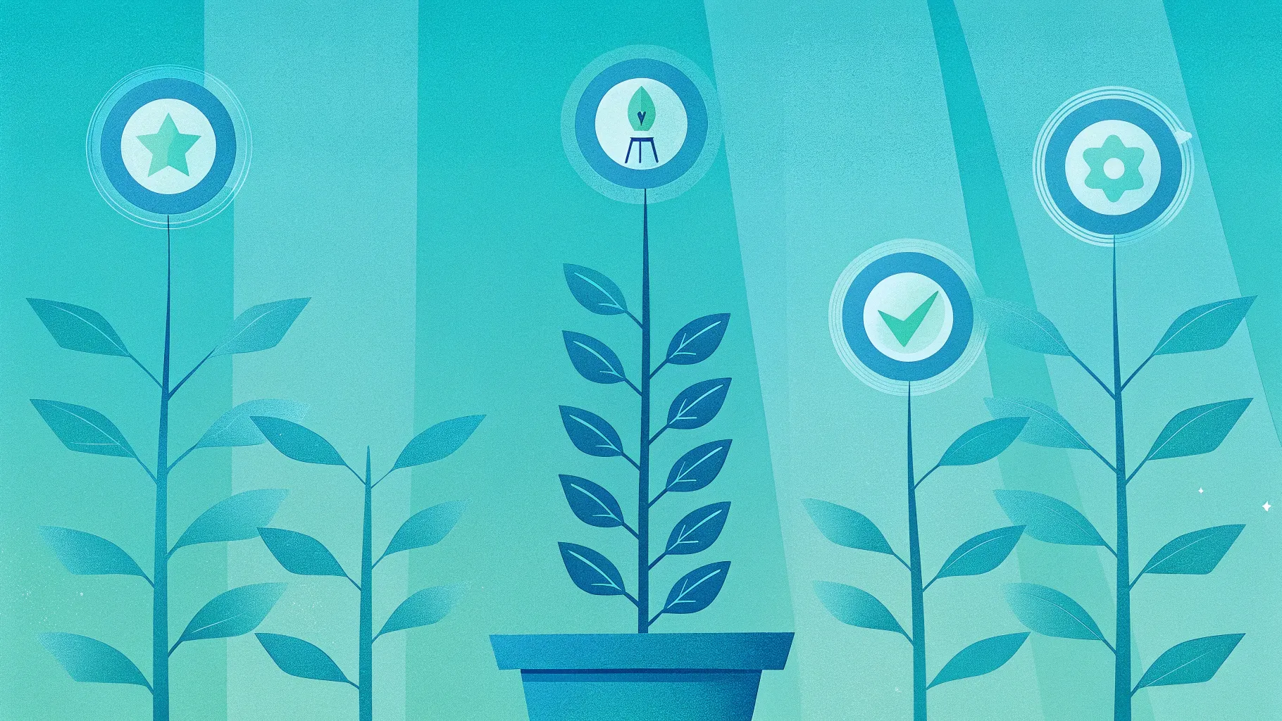
- What you’ll build (visual overview)
- Before you begin — files, assets and quick tips
- Step-by-step build
- Set the slide background
- Add the flower pot base
- Draw the stem (ladder)
- Create soil and blend it into the pot
- Add steps to the ladder
- Apply gradients and shading for realism
- Add leaves and decorative elements
- Insert clouds and a climbing figure
- Create the four step labels (ambition, dedication, success, power)
- Shadow and finishing touches
- Simple animations
- Design tips & variations
- Exporting and sharing your template
- Troubleshooting & FAQs
- Conclusion
Introduction
Hello — I’m the creator behind this walkthrough, and today I’ll guide you through how I create a polished, engaging infographic slide: a 4 Success Steps slide in powerpoint that visualizes progression from ambition through to power using a plant/ladder motif. This design works great for business progressions, learning pathways, employee development plans, or any multi-step process you want to present in a clean, meaningful way.
The goal of this article is to give you an expanded, written guide that mirrors the exact approach I used while making the example slide. You’ll get a full breakdown of every step: what tools and shapes to use, why I make specific styling choices, how to combine shapes for realistic results, and how to add simple but effective animations so your slide feels dynamic without being distracting.
Below you’ll find a single, easy-to-follow Table of contents and an in-depth step-by-step process. I’ll also include practical tips, alternatives, and troubleshooting help so you can adapt the concept to your brand or presentation style.
What you’ll build (visual overview)
At the end of this tutorial you’ll have a single slide that contains:
- An attractive gradient background that supports contrast and readability.
- A decorative flower pot at the bottom as the “origin” of growth.
- A curved stem or ladder rising from the pot that has several steps representing milestones.
- Leaves and small visual accents to reinforce the growth metaphor.
- Four labeled rounded rectangles representing the four success steps (ambition, dedication, success, power).
- Clouds and a small figure image positioned to suggest climbing toward the next step.
- Soft shadows and subtle gradients for depth.
- A set of simple entrance animations for the ladder, figure, and steps.
Before you begin — files, assets and quick tips
Preparation makes the process much faster. Here’s what I recommend you have ready and a few quick tips I use every time I design:
Files & assets
- PowerPoint (desktop app recommended for full editing controls).
- A few royalty-free PNGs for the pot (if you prefer to use a photographic or clip-art pot rather than building it from shapes).
- A PNG image of a person climbing a ladder or generic silhouette (transparent background) — optional but adds narrative.
- Cloud PNGs (transparent background) or use PowerPoint shape tools to construct simple cloud shapes.
Quick tips
- Work on a single slide so you can focus on composition and animation timing.
- Use the grid and guides in PowerPoint to center and align elements precisely.
- Duplicate objects (Ctrl+D) rather than re-creating them — saves huge amounts of time.
- Group related objects before animating; this keeps your animation pane tidy and adjustments easier.
- Save versions as you go (File → Save As …) so you can revert quickly if something gets messy.
Step-by-step build
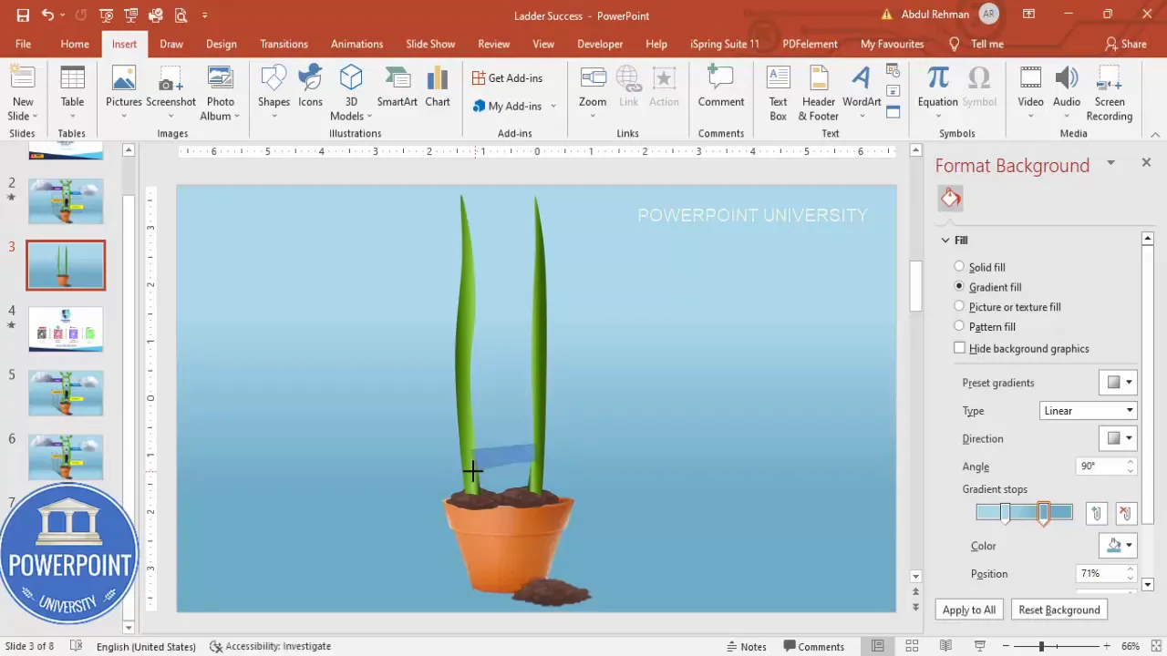
1. Set the slide background
The background sets mood and contrast. I used a blue gradient fill to create a sky-like backdrop that contrasts well with green stems and colorful step labels.
- Right-click the slide background → Format Background.
- Choose Gradient Fill and add two stops: a darker blue at the top and a lighter blue toward the bottom to create a subtle vertical gradient.
- Adjust angle/direction to taste (vertical or slightly diagonal looks natural).
Why a gradient? Gradients provide a visual depth that keeps the slide from feeling flat. They also separate foreground shapes from the background, improving legibility of text and shapes placed on top.
2. Add the flower pot base
Instead of constructing a complex pot from many shapes, you can either craft a simple geometric pot using the Trapezoid shape or insert a downloaded pot PNG for more detail.
- Insert → Shapes → Trapezoid to create a basic pot. Flip vertically if needed (Format → Rotate → Flip Vertical).
- Remove the shape outline and apply a fill that matches your aesthetic.
- If you prefer a photorealistic or decorative pot, search online for a transparent PNG image (e.g., “flower pot transparent”). Insert the PNG and center it at the bottom of the slide.
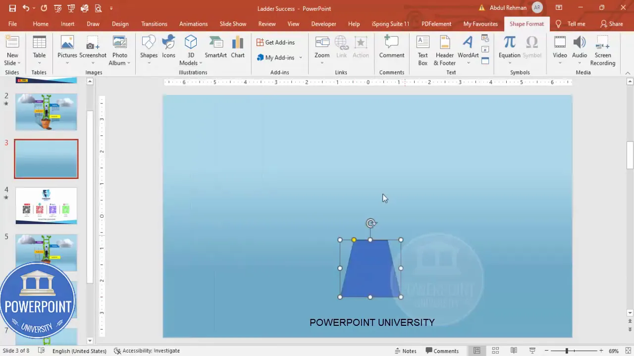
Using a downloaded image is faster and often yields richer detail, but a simple trapezoid shape keeps file size small and is easy to recolor if you need brand consistency.
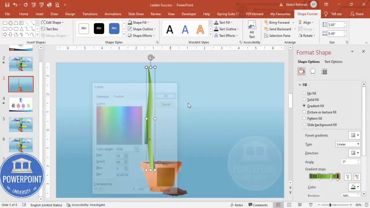
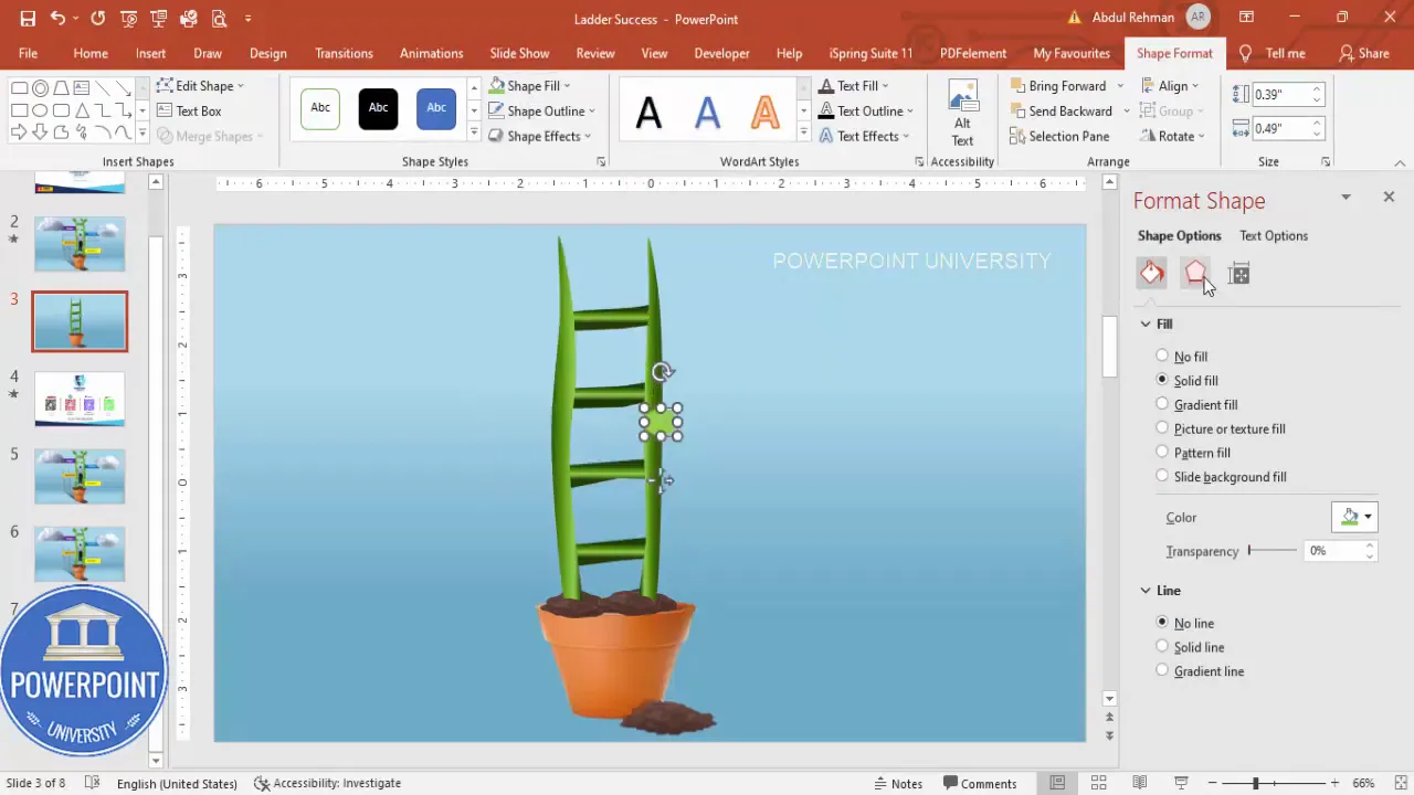
3. Draw the stem (ladder)
To make the main structural element that looks like both a stem and a ladder, I use the Curve tool and apply a gradient fill to give it dimension.
- Insert → Shapes → Curve (under Lines). Click to create anchor points and shape a gentle curved path that rises from the pot where the stem should begin.
- Close the path by returning and clicking on the starting point; this creates a single closed shape. Remove the outline.
- Right-click → Format Shape → Fill → Gradient Fill. By default PowerPoint provides 4 stops — use darker greens on the edges and lighter greens in the middle. Change direction to Linear → Right (or experiment) to add depth.
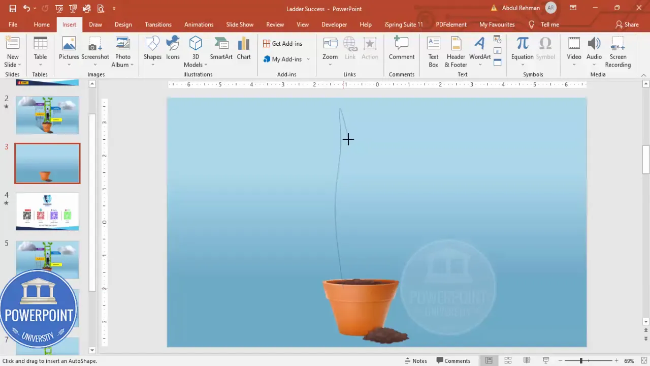
Tip: Small variations in curvature add organic feel. Use Edit Points (right-click → Edit Points) to refine the curve so it looks less mechanical and more like a growing stem.
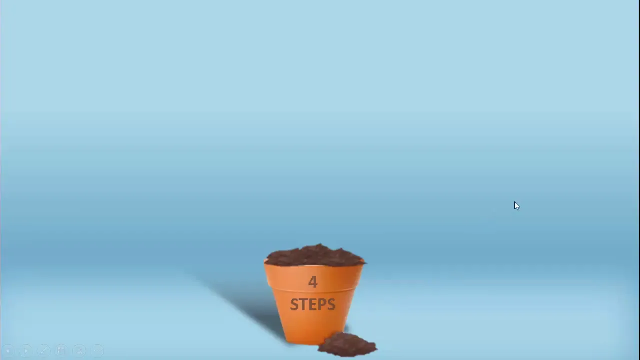
4. Create soil and blend it into the pot
Soil gives the composition a base and helps integrate the stem with the pot image. For a clean, editable approach use shape intersection and duplicate the result to create layered soil clumps.
- Copy the pot shape (Ctrl+C, Ctrl+V) to work from a duplicate area.
- Insert → Shapes → Freeform: Scribble and draw the sleeking top outline of the soil along the pot rim.
- Select the pot duplicate and the freeform soil shape → Shape Format → Merge Shapes → Intersect. This will clip the soil shape to the pot shape.
- Duplicate the resulting soil shape (Ctrl+D) and position duplicates slightly offset and behind the pot to create depth.
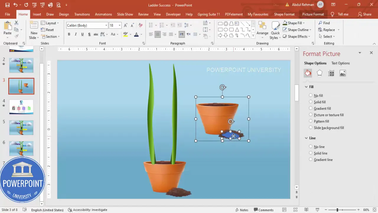
Why intersect? Intersections let you cut shapes precisely to match a complex image boundary (like the rim of a pot). This technique produces clean edges and retains editability.
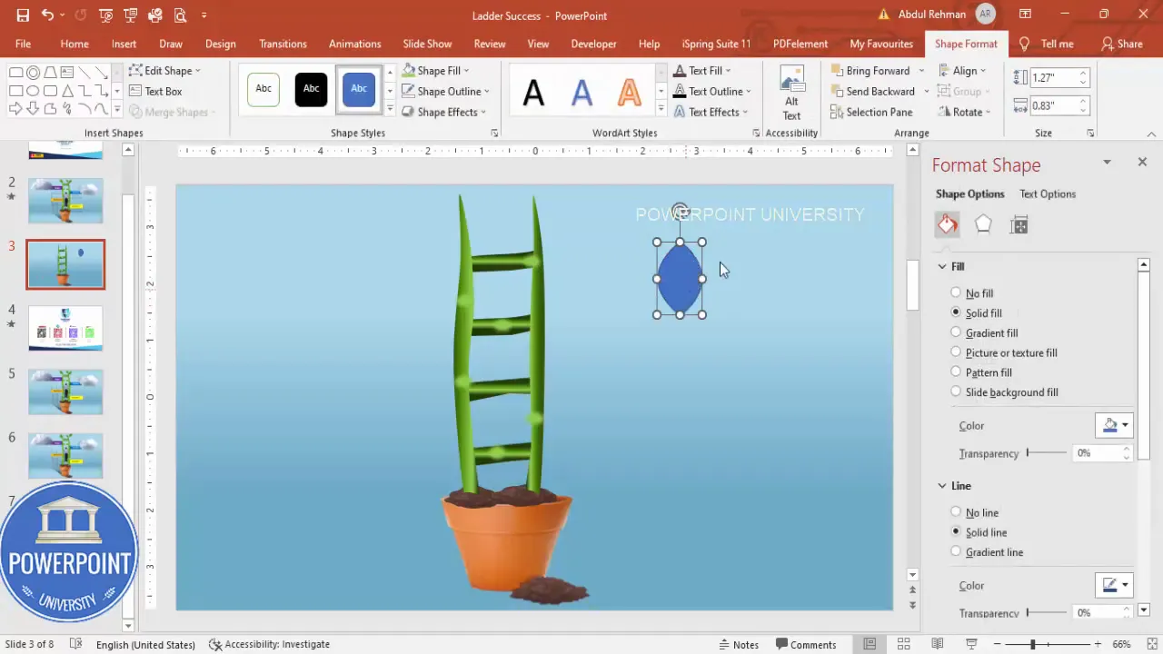
5. Add steps to the ladder
Now that you have the main stem, add horizontal rungs or steps that the climbing figure can use. I use the Freeform shape again and then duplicate and modify to produce multiple steps that follow the stem’s curvature.
- Insert → Shapes → Freeform and draw a horizontal step shape that visually sits across the stem. Be sure endpoints meet the stem so the step looks anchored.
- Remove the outline and apply a fill color consistent with the stem or slightly darker to read as wooden rungs.
- Use Format Painter (Home → Format Painter) to copy the styling to other steps quickly.
- Duplicate (Ctrl+D) several times and place them at different heights along the stem. Use Edit Points on each duplicated step to tweak curvature so every rung follows the stem’s flow.
Make small changes to each step to avoid a repetitive look. Slight angle and curvature deviations make the ladder read as hand-made or organic.
6. Apply gradients and shading for realism
Shading is key to turning flat shapes into believable components. For the stem and steps I recommend multi-stop gradients and soft shadows.
- Stem: Apply a four-stop gradient from dark green to lighter green and back to dark — this gives a subtle cylindrical look.
- Steps: Use slightly darker edges and a lighter center; a linear gradient from left to right usually works well.
- Soft shadows: Insert → Shapes → Oval, remove outline, apply a subtle gray gradient with transparency, and position it under elements to fake a cast shadow.
Tip: Keep shadows soft and low-opacity. Strong shadows often look dated and distract from key content in presentations.
7. Add leaves and decorative elements
Leaves give the stem life and reinforce the growth metaphor. The Ellipse or Tear shape can be converted into a leaf using Edit Points.
- Insert → Shapes → Oval (or use the Tear shape). Draw a leaf. Right-click → Edit Points to pull in the midpoints and shape the leaf tip and base.
- Remove outline and fill with a green gradient slightly different from the stem — contrast helps the leaf stand out.
- Rotate and place a few leaves at natural break points along the stem. Use Ctrl+D to duplicate and vary sizes for realism.
Small clusters of leaves near steps are a nice finishing touch. Avoid overcrowding — 4–6 leaves across the stem are usually enough for a clean, balanced composition.
8. Insert clouds and a climbing figure
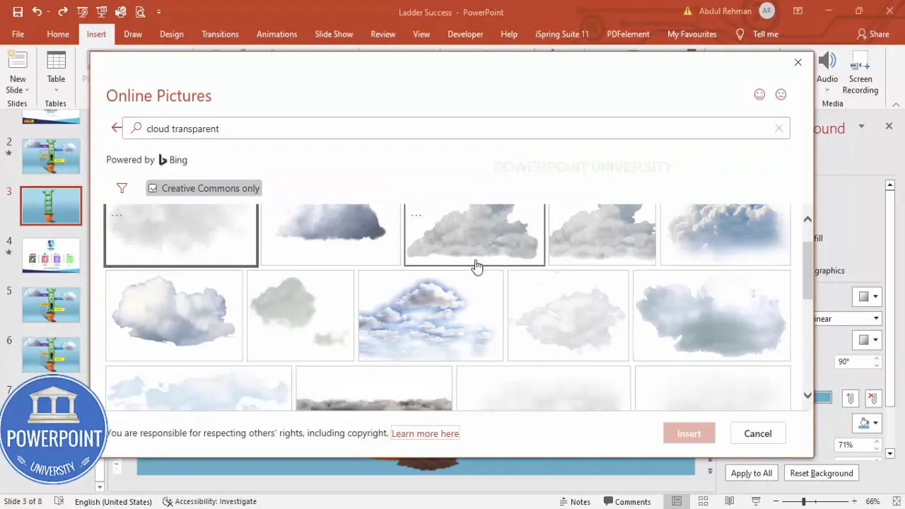
Clouds and a climbing figure add narrative: the hero is ascending toward success. I recommend using transparent PNGs for both to preserve shape edges and drop-in convenience.
- Insert → Pictures → Online Pictures. Search “cloud transparent” to find a simple cloud PNG. Insert and scale to taste.
- Repeat for a second cloud if desired and position them near the top of the slide so they act as visual goals.
- Insert a PNG of a person climbing. Position it on a step or slightly above a rung to suggest motion.
Keep figures simple and silhouette-like if the slide will be used in professional settings; too-detailed characters can be distracting when the audience is focusing on the steps themselves.
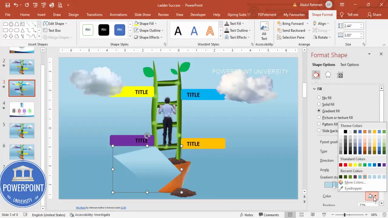
9. Create the four step labels (ambition, dedication, success, power)
This is the information layer: each of the four steps needs a clear label and a short description. I use rounded rectangles for the labels and short body copy beneath each.
- Insert → Shapes → Rounded Rectangle. Remove outline and pick a bold, accessible color for the fill. Duplicate it three times to produce four labels total (Ctrl+D).
- Insert → Text Box. Type each step title (Ambition, Dedication, Success, Power). Bold and increase type size for readability. I prefer sans-serif fonts at 20–30 pt depending on slide size.
- Group the rectangle and text for each label (select both → Ctrl+G) so you can move and align them as a single unit.
- Right-align or center the text depending on your layout — consistency is the key.
Color choices: pick a distinct color for each step to help audiences scan quickly. A simple triadic palette with one neutral works well: green (growth), blue (effort), purple (achievement), yellow (power/peak).
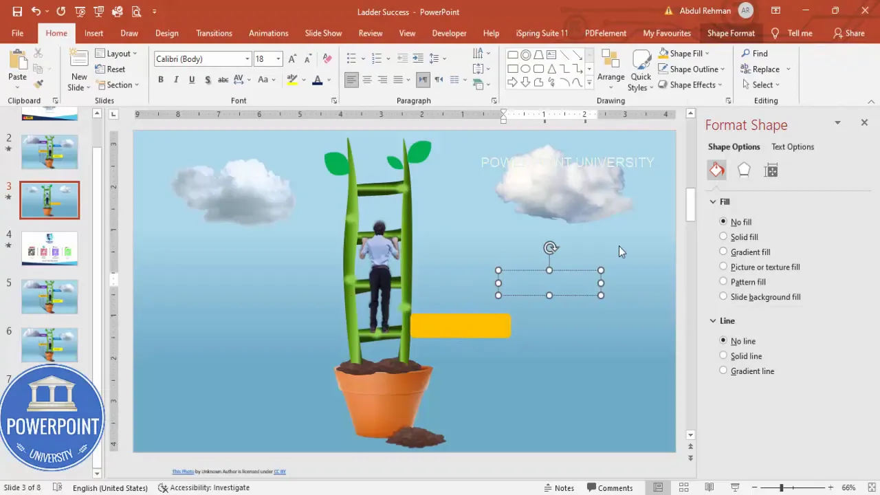
10. Shadow and finishing touches
Shadows, subtle gradients, and small decorative ovals near steps help the composition feel three-dimensional and polished.
Create Slides in Seconds with ExpertSlides AI |
|
Generate AI Presentations today: |
| TRY NOW! |
- Insert → Shapes → Freeform to create small shadow shapes under labels. Remove outline; use gradient fills that fade to transparency to give a soft shadow.
- Place small oval shapes near the base of the stem to create the illusion of grass or ground details.
- Group related elements: pot + soil, stem + steps + leaves. This grouping simplifies animation and alignment.
Grouping is important: put everything that should animate together into a single group so your animation pane doesn’t get messy. But leave the soil or separate foreground elements out of that group if you need them to behave independently under animation.
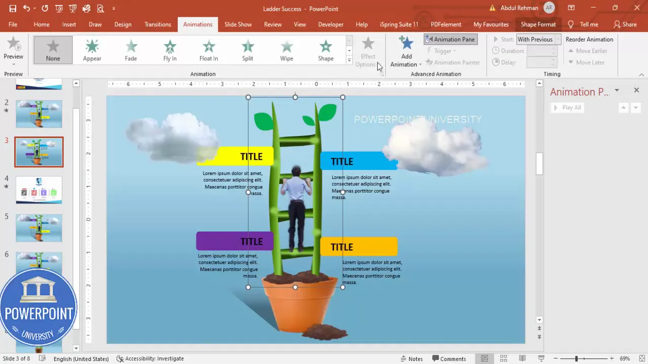
11. Simple animations
A few well-timed entrance animations turn a static slide into a narrative. My approach: bring the ladder (stem) in first, then the climber, then the step labels with a mix of left/right stretch effects.
- Open Animations → Animation Pane so you can sequence and preview animations precisely.
- Select the grouped stem → Add Animation → More Entrance Effects → Stretch. Set the direction to From Bottom so the stem rises from the pot.
- Select the figure → Add Animation → Float In (or similar) and set it to Start After Previous so it follows the stem automatically.
- For the four labels, use Add Animation → Stretch. Stagger their start times: two from left and two from right to create a balanced entrance rhythm. Use After Previous and small delays (0.2–0.5s) between items.
- Preview with Play from Start and adjust timings to keep the animation smooth and not too long. Total entrance sequence around 3–5 seconds is usually sufficient.
Animation tips:
- Avoid long, flashy effects — they’re often distracting.
- Keep transitions consistent: similar objects should have similar easing and durations.
- Test on the actual projector or display to check performance — complex gradients and many PNGs can slow down older machines.
Design tips & variations
Once you’ve built the base slide, you can adapt it for different audiences and uses. Below are practical variations and tips for tailoring the slide:
Color & branding
- Swap the label colors to match your brand palette. Use consistent contrast ratios for accessibility (text should be legible against label fills).
- For corporate audiences, reduce saturation and use muted tones. For marketing or workshops, vivid colors create more energy.
Alternate metaphors
- Instead of a plant, use a staircase, mountain silhouette, or ladder leaning against a building. The approach to drawing and labeling remains the same.
- If you prefer a data-driven narrative, embed a small chart or numeric KPI next to each label for metrics.
Additional visual polish
- Use subtle texture overlays (very low opacity) on the background for tactile depth.
- Apply slight bevel or soft inner shadows on labels for tactile “card” feel.
- Add small iconography inside label rectangles (e.g., icon for ambition = lightbulb) to reinforce meaning visually.
Accessibility considerations
- Maintain sufficient contrast: test label text color vs. label background for compliance with readability standards.
- Don’t rely exclusively on color to communicate — include text labels and simple icons to support color-coded steps.
- Provide slide notes or handouts with step descriptions for screen reader users or attendees who might not be able to see animated content live.
Exporting and sharing your template
Once you’re happy with your slide, you can package it as a reusable template or export it for distribution.
- Save just this slide as a separate file: Right-click slide thumbnail → Duplicate Slide into a new file → Save As (.pptx).
- To create a template file (.potx), move the design into Slide Master with placeholders, then File → Save As → PowerPoint Template.
- Export to PDF for static distribution: File → Export → Create PDF/XPS Document.
- For sharing online, compress media and images: File → Compress Media (if you have video/audio); or compress pictures using Picture Format → Compress Pictures.
Troubleshooting & common tweaks
If something looks off, here are targeted fixes for common problems:
Problem: Shapes look pixelated when resized
Solution: Use vector shapes for key elements (PowerPoint shapes are vector by default). For inserted PNGs, choose a high-resolution PNG. Avoid enlarging small images — replace them with larger source files if needed.
Problem: Animations look choppy on the presentation screen
Solution: Reduce the number of animations, remove heavy PNG drop shadows, and save the file locally rather than using cloud-hosted files. On older machines, avoid animated GIF backgrounds and complex transitions.
Problem: Text is hard to read on colored labels
Solution: Increase font size, use bold, choose a font color with higher contrast, or slightly lighten/darken the label fill. Alternatively place a semi-opaque white or black overlay behind the text.
Problem: Elements don’t align perfectly after grouping
Solution: Ungroup (Ctrl+Shift+G), nudge elements into position with arrow keys, then regroup. Use Replace → Align → Align Center / Align Middle for precise placement.
FAQ
Q: What file format should I use for the climbing figure and clouds?
A: Use PNG with transparent backgrounds. This preserves crisp edges and allows easy layering over the stem and labels. If you need small file sizes, use compressed PNGs but avoid over-compression that introduces artifacts.
Q: Can I make the four step labels clickable to jump to separate slides?
A: Yes — select the label, right-click → Link (Insert Hyperlink) and choose Place in This Document → select target slide. This converts the slide into an interactive hub where each step can link to a deeper-dive slide.
Q: How do I maintain consistent spacing between the four labels?
A: Select all four label groups and use Align → Distribute Horizontally (or Vertically) to ensure even spacing. Use PowerPoint’s guides to place them symmetrically around the stem.
Q: What fonts work best for this slide?
A: Choose clean, legible sans-serif fonts like Arial, Calibri, Segoe UI, or Montserrat. Keep titles bold and 20–32 pt depending on slide size; body text should be no smaller than 18–24 pt for on-screen readability.
Q: How can I adapt this slide for print or handouts?
A: If you intend to print the slide or use it in handouts, increase font sizes slightly, flatten or remove animations, and export as a high-resolution PDF. Check color mode on your print settings if color fidelity is important.
Q: I want to use more than four steps. Is the approach still valid?
A: Yes. The approach scales — simply add more rungs and label rectangles. When adding more steps, consider reducing individual label widths or switching to a vertical sidebar layout to keep the slide readable. Remember to maintain spacing and legibility.
Q: Can I reuse the grouped ladder on other slides?
A: Absolutely. Copy (Ctrl+C) and paste the grouped object into other slides or save it as a slide layout in Slide Master for repeated use. You can also right-click the slide thumbnail → Duplicate to reuse the entire slide.
Checklist: final review before presenting
- All text is readable from the back of the room (font sizes >= 18–24 pt where needed).
- Animation durations are smooth (total entrance sequence roughly 3–5 seconds).
- Color choices meet contrast/accessibility guidelines.
- All groups are organized and named sensibly in the Selection Pane (Home → Select → Selection Pane) for easy future edits.
- File saved locally and a backup copy saved on cloud storage.
Conclusion
Creating a polished 4 Success Steps slide in powerpoint is straightforward when you break the process into focused steps. Start with a clean background, build a convincing stem/ladder using curves and gradients, add organic details like leaves and soil, label your milestones clearly, and finish with subtle animations and shadows for depth. The end result is a visually engaging slide that tells a clear story: growth, progress, and achievement.
Remember: the success of a slide comes from clarity of message as much as visual polish. Use color and animation sparingly to support your story — not overshadow it. If you’d like, export the final slide as a template and reuse it as a framework for other multi-step stories in your presentations.
One final reminder: this same approach is flexible. Whether you keep the plant metaphor or replace it with a staircase or mountain, the core design decisions (contrast, grouping, readable labels, and clean animations) are what make the slide effective.
Additional resources & next steps
- Practice: Duplicate the slide and experiment with color palettes and fonts to fit your brand.
- Expand: Use the label hyperlinks to drill into detailed slides for each of the four steps.
- Share: Save a master template so your team can reuse the layout for consistent messaging.
If you follow this guide step-by-step, you’ll have a professional, communicative 4 Success Steps slide in powerpoint ready to present to any audience.
Further reading
- Design like a pro: focus on hierarchy, contrast, and consistency.
- Animation best practices: minimal, meaningful, and well-timed.
- Accessibility basics: ensure legibility and provide alternative text on exported materials.
Tip: Save multiple versions as you tweak colors and timings. A small change in gradient or duration can dramatically improve perceived quality.
FAQ — quick recap
- What assets do I need? — PNGs for figure/clouds (optional), PowerPoint shapes for everything else.
- How many labels? — Four for this design, but it scales easily.
- Best animation sequence? — Stem first, figure second, then labels staggered with small delays.
- How to keep it accessible? — High contrast and no reliance on color alone; provide handouts for animated content.
Check out the full video: Create 4 Success Steps Slide in PowerPoint Tutorial No 983


