
In this tutorial I’ll walk you, step by step, through creating a polished, professional infographic slide in PowerPoint that features five gradient circular options. I designed this layout to be flexible, easy to edit, and visually striking on a dark background. You’ll learn how to build gradient-filled circles, add subtle shading and glow effects, arrange overlapping shapes, insert titles and descriptions, and prepare the slide for basic animations like a zoom-in reveal.
I’m POWERPOINT UNIVERSITY, and I created this tutorial to help you build reusable templates and beautiful diagrams quickly. Whether you need an options slide for a pitch, roadmap, product comparison, or a team overview, this five-circle layout is a great starting point.
Before we jump into the step-by-step instructions, here’s a quick overview of what you’ll accomplish:
- Create five gradient-filled circular options using PowerPoint shapes and gradient stops.
- Add shading and crescent highlights to give each circle depth.
- Overlay subtle background ovals and dashed rounded rectangles for a refined infographic look.
- Insert titles and supporting text, set type hierarchy, and prepare basic animations.
- Export or reuse the slide as a free template.
Table of contents
- Introduction and design goals
- What you’ll need
- Step-by-step build: creating the five circles
- Adding shading, highlights, and glow
- Arranging supporting shapes and backgrounds
- Adding titles, descriptions, and typographic choices
- Basic animation ideas and export tips
- Design variations and advanced tips
- Accessibility and presentation best practices
- Frequently Asked Questions (FAQ)
- Conclusion and download
Introduction and design goals
This five-circle infographic is ideal when you want to present a short list of options (option one through option five), distinct categories, or step-like content that’s visually connected. The look is modern and colorful—each circle uses a three-stop gradient to achieve a smooth depth, and subtle crescent shapes and glow layers add dimension. The layout works best on a dark background, which makes the gradients pop and improves legibility for white or light-colored text.
Design goals for this slide:
- Clear visual separation between five options while maintaining a cohesive style.
- Simple editing so you can repurpose the slide quickly for multiple topics.
- Subtle 3D feel using gradients and shading, without complex illustrations.
- Ready for basic animations to reveal options one-by-one.
What you’ll need
To follow this tutorial you’ll need:
- Microsoft PowerPoint (2016 or later recommended for the best shape-formatting tools).
- A dark slide background (solid color)
- Familiarity with the Ribbon (Insert > Shapes, Format Shape pane)
- A color palette (I’ll show colors I used, but feel free to substitute brand colors)
- Optional: the free downloadable template if you prefer to start from ready-made assets.
Step-by-step build: creating the five circles
Start by adding a new slide and changing the background to a dark color. A dark background makes gradient colors read stronger and keeps your text legible in white or light shades.
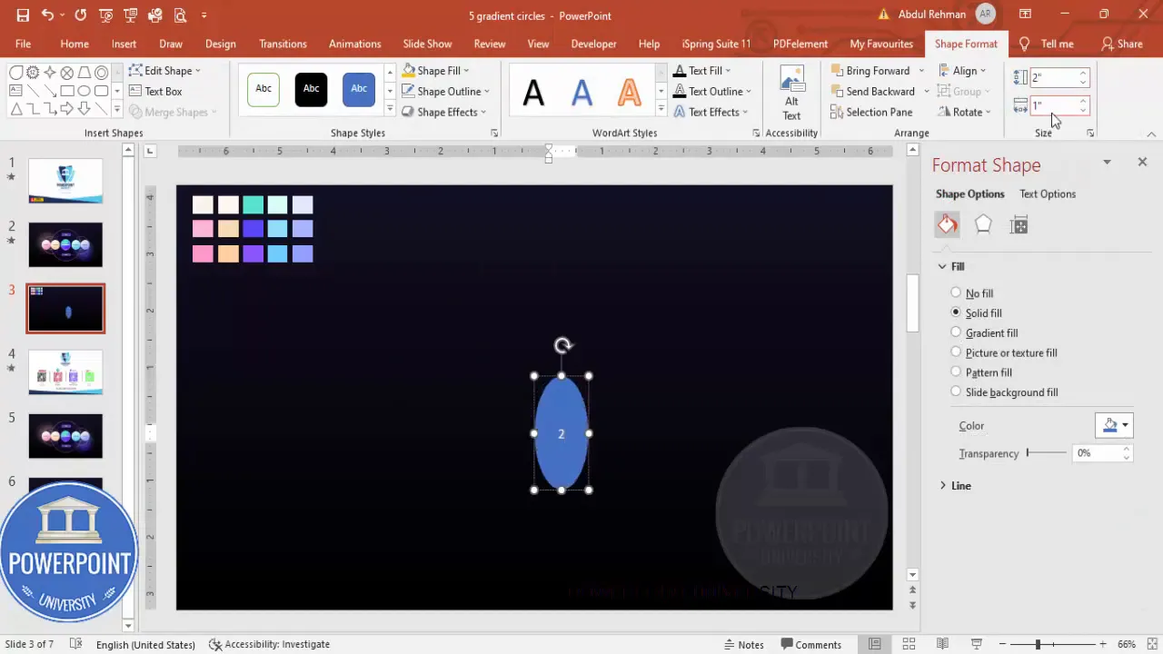
1. Insert the base circle
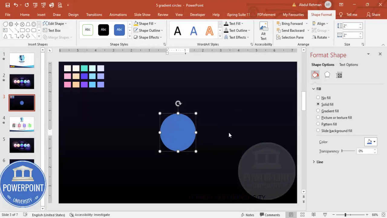
Insert > Shapes > Oval (the basic circle shape). Create a perfect circle by holding Shift as you draw, or set the height and width directly in the Format Shape pane. For my slide I used:
- Height: 2 in
- Width: 2 in
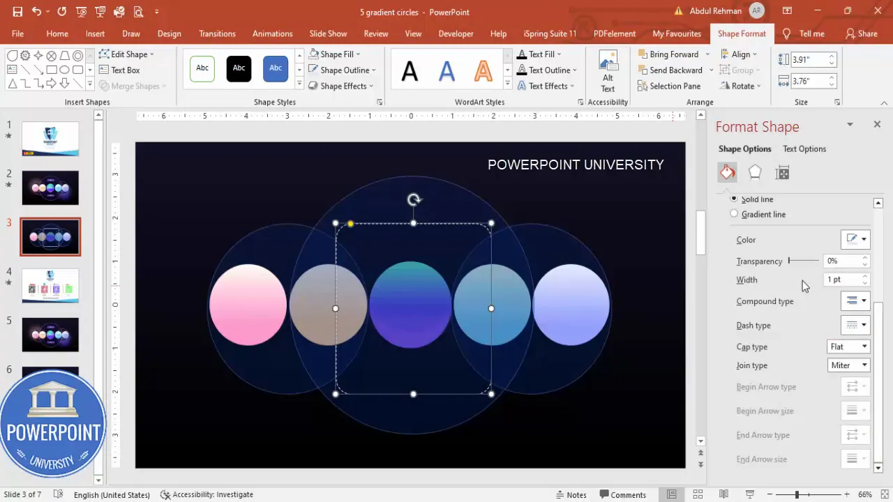
Set the shape outline to “No Outline” so the fill is clean and uninterrupted.
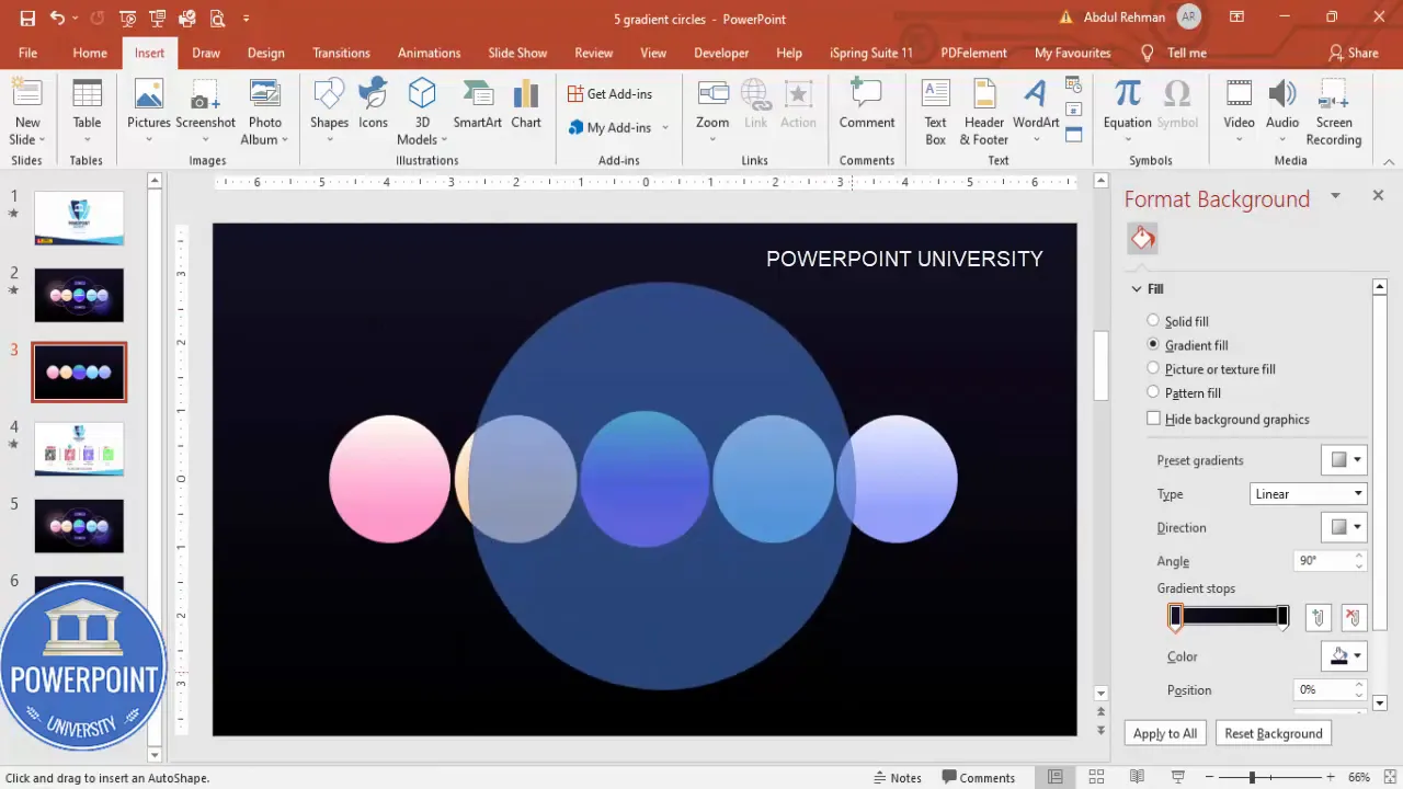
2. Apply a three-stop gradient fill
Open the Format Shape pane (right-click > Format Shape). Under Fill, choose Gradient Fill. I prefer a three-stop gradient to get a gentle color shift with depth. Here’s how I set the stops:
- Stop 1: darker hue (use Eyedropper to pick your primary color)
- Stop 2: medium hue (lighter shade)
- Stop 3: highlight hue (lightest shade)
Set Direction to “Linear Up” to make the highlight appear at the top, and tweak stop positions to taste. If you want fewer stops—use two. If you want smoother transitions—add a fourth stop. The key is to balance contrast: too sharp a change makes the circle look flat; too subtle and it will lose the 3D impression.
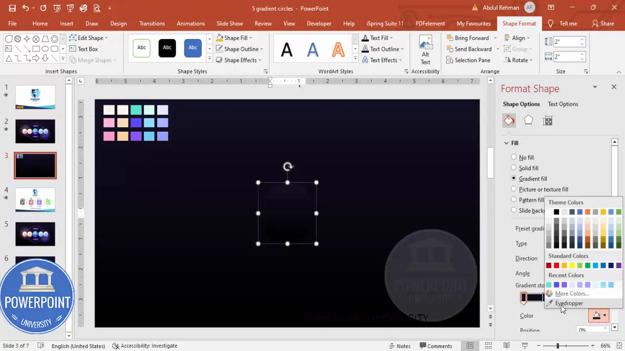
3. Fine-tune gradient stops with the Eyedropper
If you have a color palette on the slide, use the Eyedropper tool for consistent color matching across circles. Click each stop, choose the Eyedropper, and sample from the palette. This keeps the set unified and professional.
Tip: If the default palette contains a previously used color, PowerPoint will show it by default—use that as a starting point and tweak the brightness and positions of stops.
4. Duplicate and resize for the remaining circles
Once you’ve created the first circle, use Ctrl+D (Duplicate) to quickly create copies. Arrange five circles horizontally or in whatever arrangement fits your slide. When duplicating, hold Ctrl+Shift and drag to keep them aligned on a single axis while duplicating. This helps maintain even spacing and alignment.
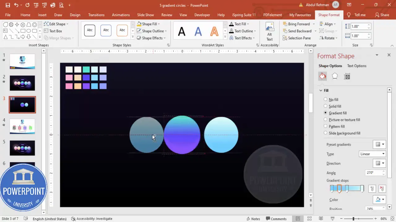
If you need slight size variations (for visual interest), select one duplicate and adjust its size in the Format Shape pane. In my example I used 1.88 in for the smaller variants to create subtle hierarchy.
Adding shading, highlights, and glow
Gradients provide base volume, but small overlay shapes make circles look tangible. I add a crescent-shaped shading and a soft halo glow under some circles to simulate light and depth.
1. Create a crescent highlight
Insert a second oval slightly offset and smaller. This will be used to cut a crescent from the base circle.
- Create the larger oval (same color family but lighter or darker depending on highlight or shadow).
- Create the smaller oval that overlaps—this becomes the subtractor shape.
- Select both shapes, go to Drawing Tools > Merge Shapes > Subtract. The result: a clean crescent.
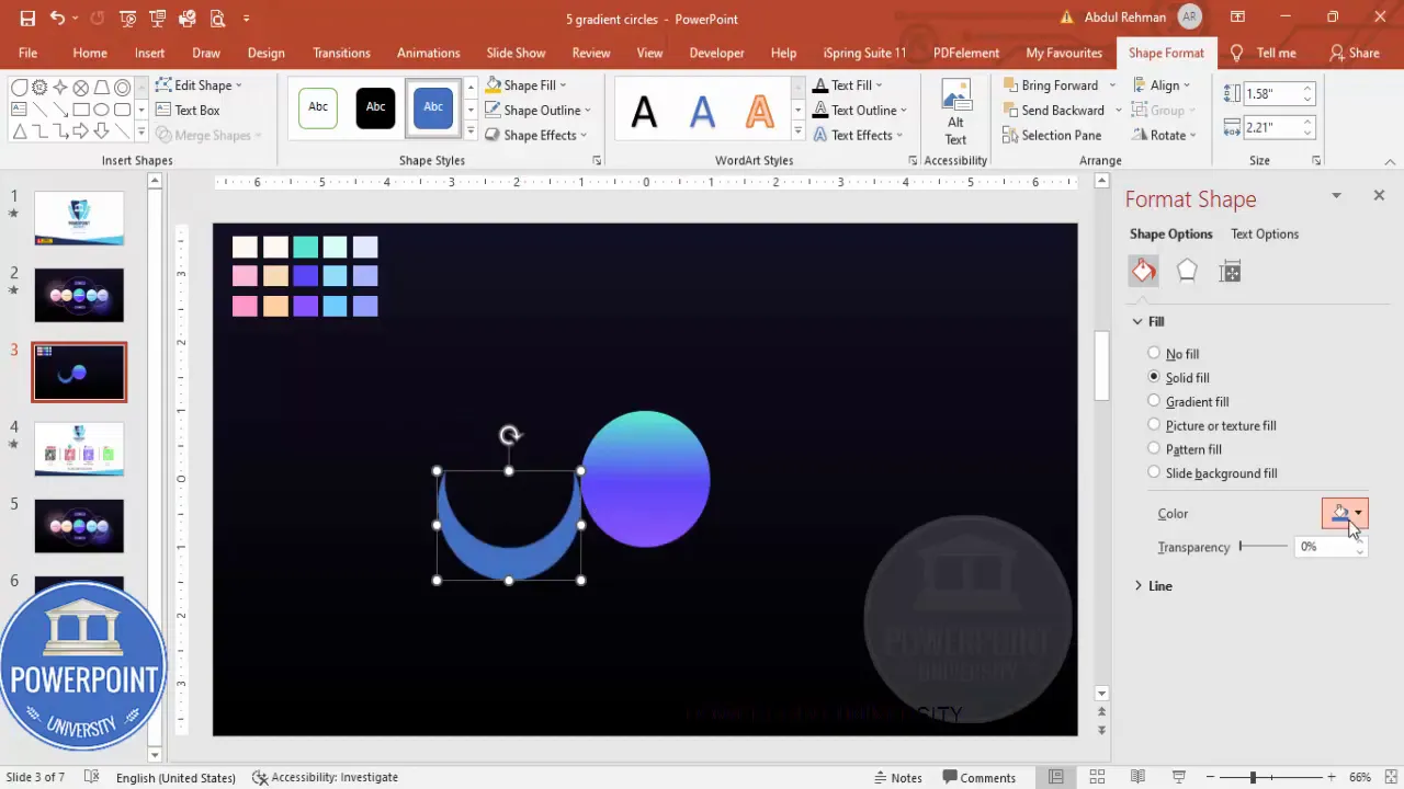
After subtraction, fill the crescent with a complementary color sampled using the Eyedropper. Then, under Effects, apply “Soft Edges” (or Soft Adjust) and increase the size just slightly to make the crescent blend with the circle edge.
2. Add a soft glow (halo)
Insert an additional oval behind the circle and fill it with a turquoise or pale hue. Remove the outline. In Format Shape > Effects > Soft Edges, increase the size so the oval turns into a diffuse glow. Position it behind the circle and adjust transparency to taste.
Make sure this glow layer is “Sent to Back” (right-click > Send to Back) so it’s subtle and doesn’t interfere with text overlays.
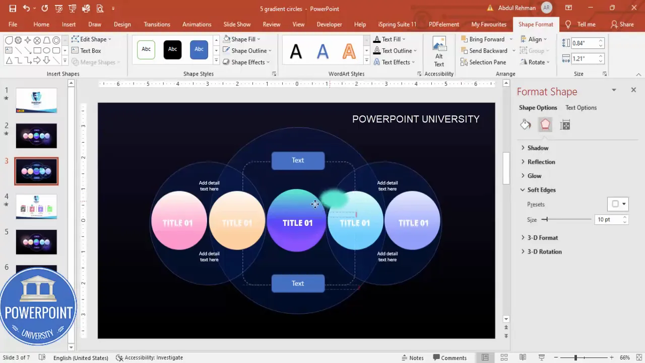
Arranging supporting shapes and backgrounds
To give the cluster of circles more context and a refined look, add intersecting oval backgrounds and a dashed rounded rectangle.
1. Big intersecting ovals
Insert large ovals that cover groups of three circles. These act as soft backplates to anchor the cluster visually. Use a dark color (slightly lighter than the slide background or a dark navy), set no outline or a faint outline for contrast, and increase transparency so the circles remain the focal point.
Duplicate these backplates (Ctrl+D) and overlap them slightly to create unions or intersections. Send these shapes behind the circle group so they don’t block the colorful circles.
2. Rounded rectangle with dashed border
Insert a Rounded Rectangle with a low corner radius. Set Fill to “No Fill” and choose a light dashed border. Make the line semi-transparent so it reads as a subtle guide rather than a strict container. This is a nice framing device for additional text or callouts.
Adding titles, descriptions, and typographic choices
With shapes in place, it’s time to add type. Good typography gives hierarchy and clarity. I use Open Sans ExtraBold for the title inside each circle in white, centered. Then I add descriptive copy below or to the side in regular Open Sans or your brand font.
1. Title inside each circle
Insert a text box on each circle and set:
- Font: Open Sans ExtraBold (or bold sans-serif)
- Color: White
- Alignment: Center
- Size: Depends on circle size—aim for contrast but keep text clearly within the circle.
Use Ctrl+Shift+D or duplicate the text box across the circles to keep consistent formatting. If a title is longer, reduce font size slightly or use a two-line break carefully so the title remains visually balanced.
2. Supporting detail text
For the supporting text (the detailed description for each option), add a separate textbox underneath the group or to the right in a central content area. Use a smaller font size, light gray or white depending on contrast, and keep paragraphs short—ideally 1–2 short sentences per option.

Center-align short descriptions when they occupy a central column. If you place descriptions beside each circle, left-align them for easier scanning.
Create Slides in Seconds with ExpertSlides AI |
|
Generate AI Presentations today: |
| TRY NOW! |
Basic animation ideas and export tips
Once the slide is visually complete, add simple animations to reveal each option in sequence. Basic animations add focus and control the flow during a presentation.
1. Animation choices
- Zoom In: Simple and effective for circle reveals. Works well when each circle appears sequentially.
- Fade: Smooth, unobtrusive. Best for supporting text and backplates.
- Wipe or Float In: Use sparingly for directional motion (e.g., left-to-right sequencing).
To animate: select an object > Animations tab > choose an animation. Use the Animation Pane to sequence objects and set delays. If you want each circle to appear on mouse click, set Start to “On Click” for the first and “After Previous” for subsequent ones with controlled delays.
2. Grouping and preparing for animation
Group elements that should appear together (e.g., circle + title + crescent highlight). Grouping maintains relative positioning and simplifies animation sequencing.
Right-click > Group. Animate the group instead of each individual element when appropriate to reduce animation complexity.
3. Export and sharing best practices
- Save as a regular .pptx if you want future edits.
- Export as PDF if you need a static, shareable version.
- Use File > Export > Create a Video if you want the animated sequence as a video file.
- Embed fonts in File > Options > Save if you plan to share the editable file with others who may not have your fonts installed.
Design variations and advanced tips
This template is flexible. Here are several ideas for variations and ways to scale or adapt the design for different presentations.
1. Use brand colors
Replace the gradient stops with your brand colors. Use the Eyedropper to make sure the highlight and shadow tones are on the same color family for cohesiveness. Keep contrast strong enough to support white text legibility.
2. Vertical or cluster arrangements
Although the default layout aligns circles horizontally, you can position them in a vertical stack, circular cluster, or pentagonal arrangement—perfect for process diagrams, team charts, or equal-priority lists.
3. Iconography inside circles
If you want icons instead of short text labels within the circles, insert PNG or SVG icons centered in each circle. For accessibility, include a short label below the circle in addition to the icon.
4. Interactive slide behavior
For presentations where you want specific content to show for each option (e.g., clicking Option 3 shows a detailed panel), use Hyperlinks or Action settings to jump between slides or to show/hide elements using triggers (available in advanced PowerPoint versions).
5. Exporting multiple color variations
Create multiple versions of the slide with different color schemes on separate slides—duplicate the entire slide and change gradients. This gives you options for A/B testing or matching different brand guidelines.
Accessibility and presentation best practices
Designs are strongest when they are accessible to a variety of viewers. Consider these accessibility tips:
- Contrast: Ensure sufficient contrast between text and background. White text on a dark background works well, but verify contrast ratios using accessibility tools if available.
- Font size: Keep titles within circles large enough to read at a distance; supporting text should be at least 18–24 pt for readability in a live presentation.
- Alternative text: Add alt text to any important images or icons if you export the slide as HTML or upload it to web platforms that use alt text.
- Color blindness: Avoid encoding critical information by color alone. Use icons, labels, or patterns in addition to color to indicate differences.
Detailed step-by-step recap (quick checklist)
Here’s a concise checklist you can use while building the slide:
- Insert a new slide and change the background to a dark solid color.
- Insert an oval: set size to 2 in x 2 in, no outline.
- Format Shape: choose Gradient Fill with three stops; use Eyedropper to pick colors from your palette. Set Direction to “Linear Up”.
- Create a crescent highlight by inserting a second smaller oval, overlapping, then Merge Shapes > Subtract. Fill crescent and apply Soft Edges.
- Duplicate the circle (Ctrl+D) four times. Align horizontally using guides and Ctrl+Shift drag for precise duplication; optionally adjust sizes to 1.88 in for slight variation.
- Add large intersecting ovals as backplates; set no outline and increase transparency.
- Insert a rounded rectangle with no fill and a dashed light border as a subtle frame.
- Add titles inside circles (Open Sans ExtraBold or equivalent) in white; center textboxes and duplicate to keep formatting consistent.
- Insert supporting detailed text below or beside the group; center or left-align depending on layout.
- Group related elements and add simple Animation (Zoom In for circles; Fade for text/backplates).
- Send glow and backplate shapes to back; confirm text layers are above shapes.
- Save as .pptx; export as PDF or video if needed.
Examples of use cases
This five-circle layout can be adapted for many scenarios. Here are specific examples and suggested copy lengths to keep the slide balanced:
- Product Features — Use 4–6 word labels inside circles and 1–2 short bullets under each in the supporting area.
- Roadmap Phases — Label each circle with a quarter or phase title (e.g., Q1, Q2, Q3, Q4, Future). Add one sentence of details in the description area.
- Stakeholder Groups — Place stakeholder titles inside circles (e.g., Sales, Marketing, Product, Operations, Support) and include a 10–12 word role description below.
- Pros & Cons Comparison — Use two colors for pros and cons (e.g., green/orange) and group three pros vs. two cons visually.
Troubleshooting common issues
Here are common problems you might encounter and how to fix them:
- Gradient looks banded/not smooth — Add an additional gradient stop or slightly adjust colors so the shifts are more gradual.
- Circle outlines visible — Set “Shape Outline” to “No Outline” and verify you haven’t accidentally applied a thin outline in Format Shape.
- Glow hides text — Ensure glow shape is sent to back and increase transparency.
- Text too small to read — Increase font size or reduce circle diameter if you need to keep text inside the circle.
- Animations stutter during playback — Simplify animations (use Fade or Zoom) and avoid animating many small objects separately—group when possible.
Screenshots for reference
Below are key process screenshots to help you replicate the steps at each stage. Take them as visual checkpoints as you build the slide.
Frequently Asked Questions (FAQ)
Can I use my brand colors instead of the suggested palette?
Yes—absolutely. Use the Eyedropper tool to sample brand colors and build your gradient stops from darker to lighter shades in the same color family. This maintains cohesion while preserving the gradient depth.
What if my audience views slides on small screens or printed in grayscale?
For small screens, increase font sizes and test the slide on a mobile device. For grayscale printing, remove the glow and ensure contrast between shapes and text remains strong—sometimes replacing gradients with flat color blocks helps with legibility.
How do I make each circle clickable to reveal more details?
Use PowerPoint’s Action settings or hyperlinks to navigate to separate slides with detailed content. For in-slide reveal behavior, advanced users can use “Triggers” in the Animations pane—set a trigger so clicking a specific circle reveals a hidden panel.
Is it better to use PNG icons or vector icons inside the circles?
Vector (EMF/SVG) icons scale without losing quality and are preferable for crispness. If using PNG, ensure the resolution is high and the background is transparent so the icon integrates well with the circle.
How do I ensure consistent spacing between circles?
Use the Align and Distribute tools: select all the circles > Format > Align > Align Middle (or Align Top), then Align > Distribute Horizontally. This evenly spaces shapes and improves visual balance.
Can I animate the crescent highlight separately from the circle?
Yes, you can. If you want the highlight to appear momentarily after the circle (for emphasis), animate the crescent with a subtle Fade or Wipe. Grouping decisions determine whether you animate together or separately; plan your animation sequence in the Animation Pane.
What PowerPoint versions support Merge Shapes?
Merge Shapes is available in modern versions of PowerPoint—PowerPoint 2013 onward typically includes this feature. If your version doesn’t have Merge Shapes, you can overlap and format separate shapes manually, though merging is cleaner.
Conclusion and download
That’s it—you now have a polished five-circle gradient options slide that’s easy to edit and reuse. Small details like consistent gradient stops, soft-edge highlights, and subtle backplate shapes make a huge difference in perceived design quality. Grouping elements and using Ctrl+D to duplicate will save you time and keep your layout consistent across slides.
If you’d like a head start, I offer a free downloadable template that matches this tutorial. Use it as a base and swap in your colors, icons, and copy to produce professional slides rapidly.
If you found this guide useful, please try the template, experiment with the color stops and glow sizes, and tweak typography to match your brand. Little adjustments make big visual impacts.
Happy designing—and if you want more PowerPoint tips and templates, stay creative and keep iterating!
Check out the full video: Create 5 Gradient Circular Options Slide in PowerPoint | Tutorial No.: 1010 | Free Template


