

Table of Contents
- Introduction: What you’ll build and why the 6 Rectangular Options Slide works
- Materials & initial setup
- Step-by-step build: shapes, alignment, and layout
- Merge, fragment and clean up: creating a single reusable shape
- Styling: gradients, transparency, shadows, and icons
- Adding text, numbering, and repeating with duplication
- Making the slide interactive: show options on click (basic animation techniques)
- Tips, best practices, and common mistakes
- Advanced variations and accessibility considerations
- Troubleshooting
- FAQ
- Conclusion
Introduction: What you’ll build and why the 6 Rectangular Options Slide works
If you want a clean, modern layout to present multiple choices, features, or steps on a single slide, this tutorial will teach you how to build a polished and interactive 6 Rectangular Options Slide in PowerPoint. I’ll walk you through each step: from drawing the base shapes to merging fragments, to styling with gradients and shadows, and finally preparing the slide for click-based interaction.
The 6 Rectangular Options Slide pattern is ideal for agenda pages, product comparisons, multi-step processes, or decision trees. It presents information in two mirrored columns — three options on the left and three on the right — with a centered visual anchor. The result is visually balanced, easy to scan, and interactive when you add click-triggered reveals.
Materials & initial setup
Before you start building the 6 Rectangular Options Slide, set up your workspace so you can work precisely and quickly. These preparatory steps save time and prevent alignment issues later.
- PowerPoint: any modern version with Shape Merge (Insert → Shapes and Shape Format → Merge Shapes).
- A dark slide background to make the translucent shapes and gradient fills pop.
- Guides enabled so everything aligns perfectly (View → Guides).
- Desired fonts and icons (I use Open Sans SemiBold for titles and Open Sans regular for body text).
Initial setup steps:
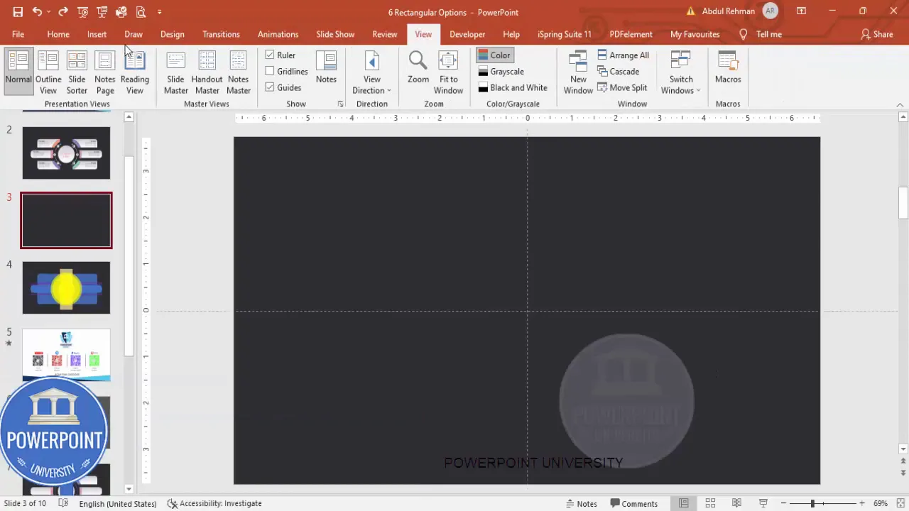
- Insert a new blank slide and change the background to a dark color (deep gray or near-black works well).
- Turn on guides so you can center shapes easily: go to View and enable Guides.
- Set your default font or pick the fonts you’ll use for the layout.
Step-by-step build: shapes, alignment, and layout
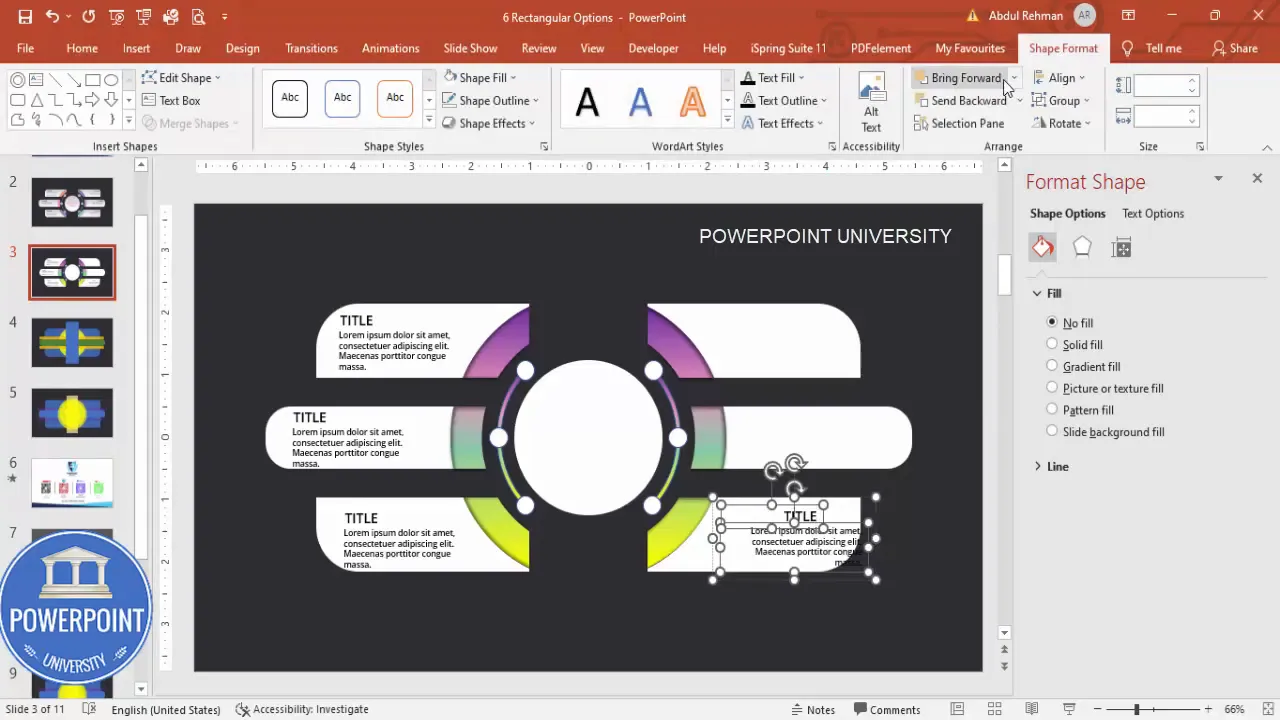
We’ll assemble the 6 Rectangular Options Slide from basic shapes: rounded rectangles, ovals (for soft circular accents), and standard rectangles for dividing parts of the inner circle. Follow these steps precisely to recreate the layout I build.
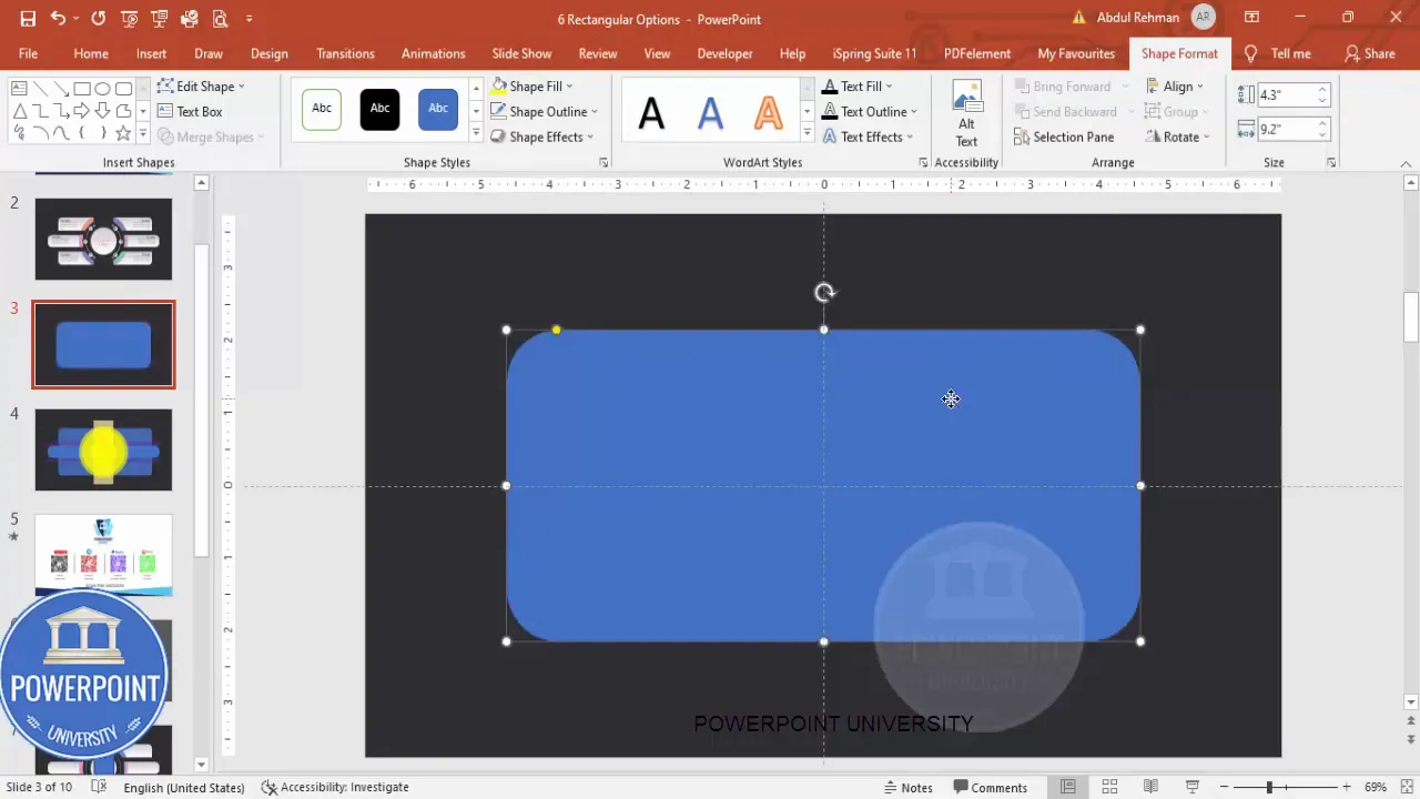
1. Draw the main rounded rectangle
The main rounded rectangle is the outer container that holds all six options and the central visual. To create it:
- Insert → Shapes → Rounded Rectangle.
- Click once on the slide (don’t drag) so PowerPoint inserts a shape you can resize numerically.
- Set the shape size to Height = 4.3 and Width = 9.2 (these dimensions can be adjusted proportionally to your slide size).
- Remove Shape Outline (Shape Format → Shape Outline → No Outline).
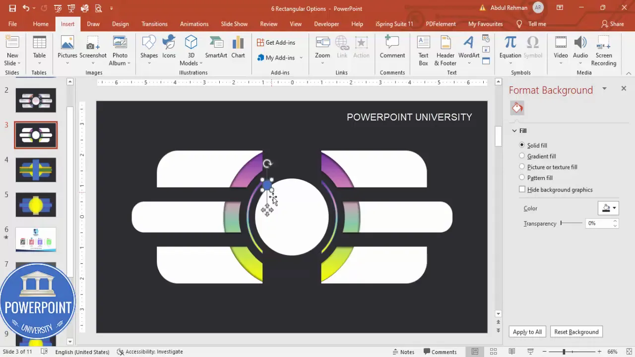
- Align the shape to the center of the slide (Home → Arrange → Align → Align Center / Align Middle) or use guides.
- Right-click → Format Shape → Fill: set Transparency to ~20% to create a translucent container.
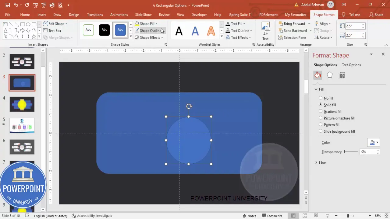
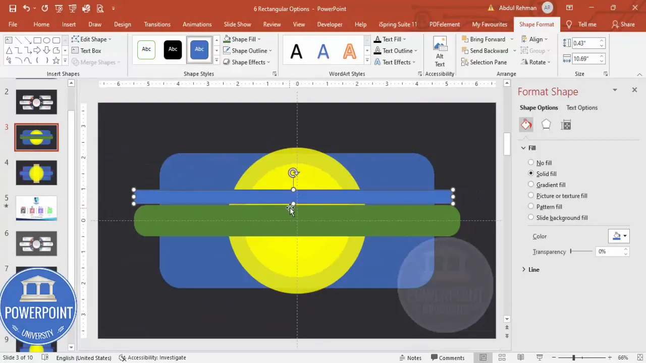
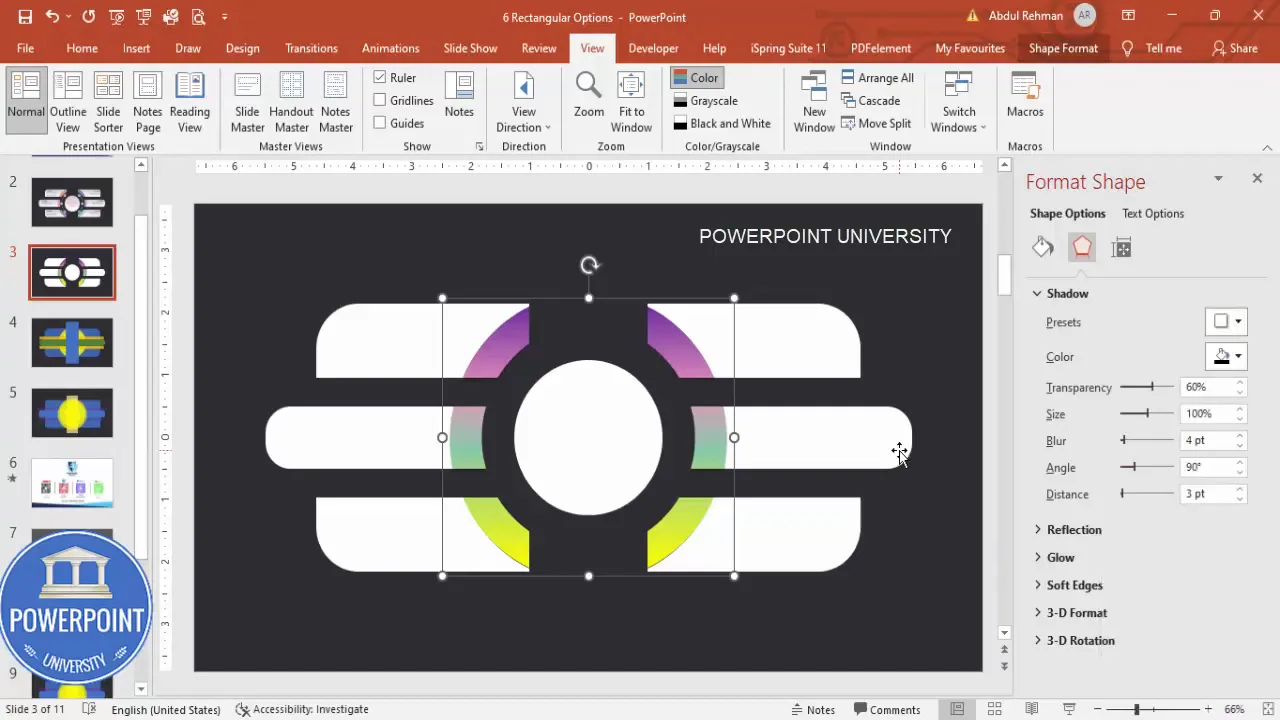
2. Add circular accents (three ovals)
Three softly translucent circles overlaid inside the main container give a photographic, layered feel. They also provide visual weight behind the option cards.
- Insert → Shapes → Oval. Hold Shift while dragging to create a perfect circle.
- Set its Height and Width to approximately 2.5.
- Remove the outline (No Outline) and apply a Shape Fill color of your choice. Set Transparency to around 20%.
- Align the oval to the center vertically and horizontally within the main rectangle.
- Duplicate the oval (Ctrl+D). Use Ctrl+Shift and drag duplicates to scale and position them so you have three overlapping circles — each slightly larger than the previous. It’s okay if they extend outside the rounded rectangle perimeter — this gives a layered photographic effect.
3. Add horizontal rounded rectangles for the options
These will act as the actual option cards: three on the left, three on the right, separated by a central rectangle that acts as a spine or label area.
- Insert a rounded corner rectangle (horizontal). Make it fully curved by increasing the corner roundness to the maximum if needed.
- Remove the outline and apply a light fill with 20% transparency to match the visual style of the circles.
- Duplicate this horizontal rectangle twice to create three aligned left-side cards. Use Alt while dragging to nudge them to maintain an even gap between each card.
- Repeat to create the three right-side cards, mirroring the alignment on the opposite side.
- Finally, insert a thin center rectangle to act as the central spine (this visually separates left and right groups). Remove outline and fill with matching transparency.
4. Fine tune spacing and alignment
Key alignment tips for a balanced 6 Rectangular Options Slide:
- Use Align → Distribute Vertically to ensure equal spacing between the three cards on each side.
- Hold Alt while nudging shapes to make pixel-perfect gaps.
- Keep a small non-overlapping gap between cards and between the cards and the main rounded rectangle boundary.
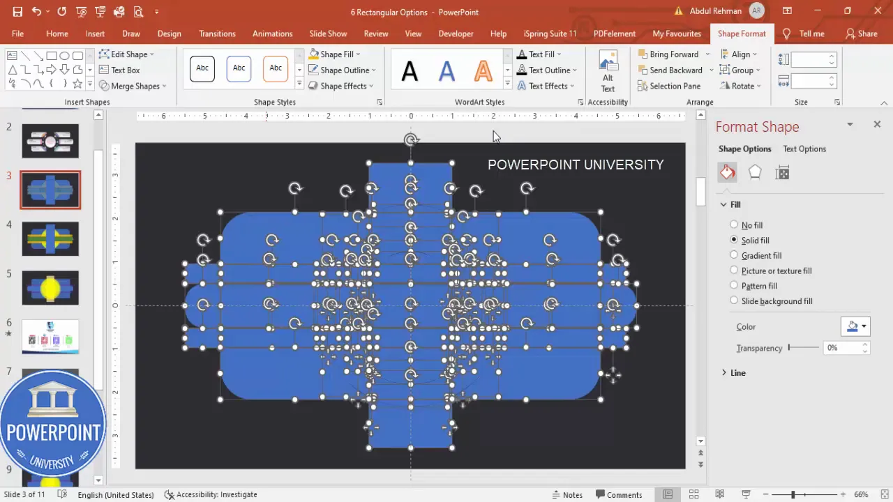
Merge, fragment and clean up: creating a single reusable shape
Once you’ve placed all basic shapes, merge and fragment where necessary to clean up overlapping areas. This creates crisp cutouts and simplifies styling. The process I use is:
- Duplicate the slide (Right-click the slide thumbnail and choose Duplicate Slide). Work on the duplicate so you can revert if needed.
- Select all shapes (Ctrl+A).
- Go to Shape Format → Merge Shapes → Fragment. Fragment breaks overlapping shapes into discrete pieces so you can delete unwanted sections.
- Select and delete the fragment pieces that form unwanted internal borders or overlays. Use Zoom in to carefully remove tiny lines.

Careful deletion is crucial. After Fragment you will have many small pieces — remove internal fragments that break up the clean card shapes. Keep only the parts that define each card and the central visual.
Group and union final shapes
When pieces are cleaned up, group and union shapes to make the final layout easy to manage and style:
- Select each individual option card and press Ctrl+G to group related pieces.
- For shape union where pieces should be a single object (for example when a card should be one continuous shape), select the pieces and choose Merge Shapes → Union.
- Once unioned or grouped, you can apply fills and effects uniformly to each card.
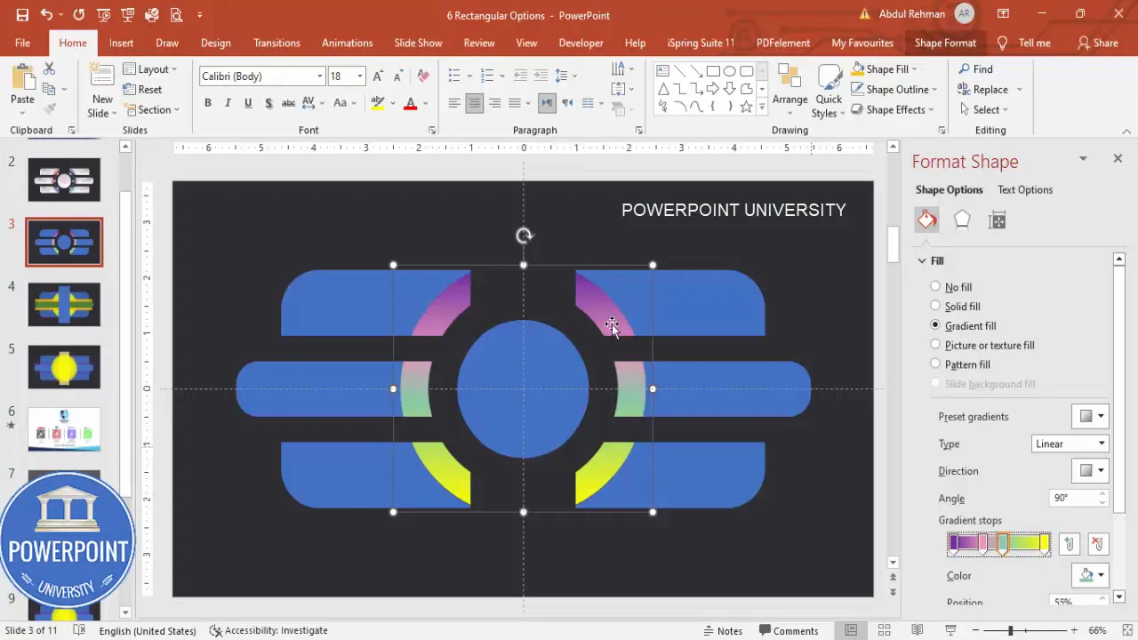
Styling: gradients, transparency, shadows, and icons
Styling is where the 6 Rectangular Options Slide goes from good to great. Use subtle gradient fills, low opacity overlays, and soft shadows to create depth while keeping readability high.
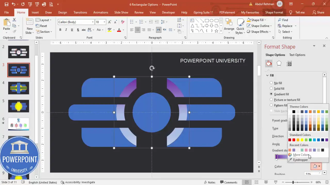
Gradient fills and color choices
Apply a soft gradient to the grouped option cards. I typically use light pastel gradient stops so the cards appear lifted over the dark background.
- Shape Format → Shape Fill → Gradient. Choose a linear gradient running horizontally or vertically depending on the visual direction you want.
- Set the transparency of one stop to 20–30% so you maintain some of the background depth.
- Keep your color palette limited: two or three harmonious colors for the whole slide maintains cohesion.
Shadows and subtle depth
Shadows make each card feel tactile. Apply subtle outer shadows rather than heavy drops:
- Format Shape → Effects → Shadow. Choose an outer shadow preset with small blur and low transparency (20–40%).
- Adjust angle and distance so the shadow consistently appears from the same light source across all cards.
- Avoid heavy shadows that reduce legibility or look like default PowerPoint styling.
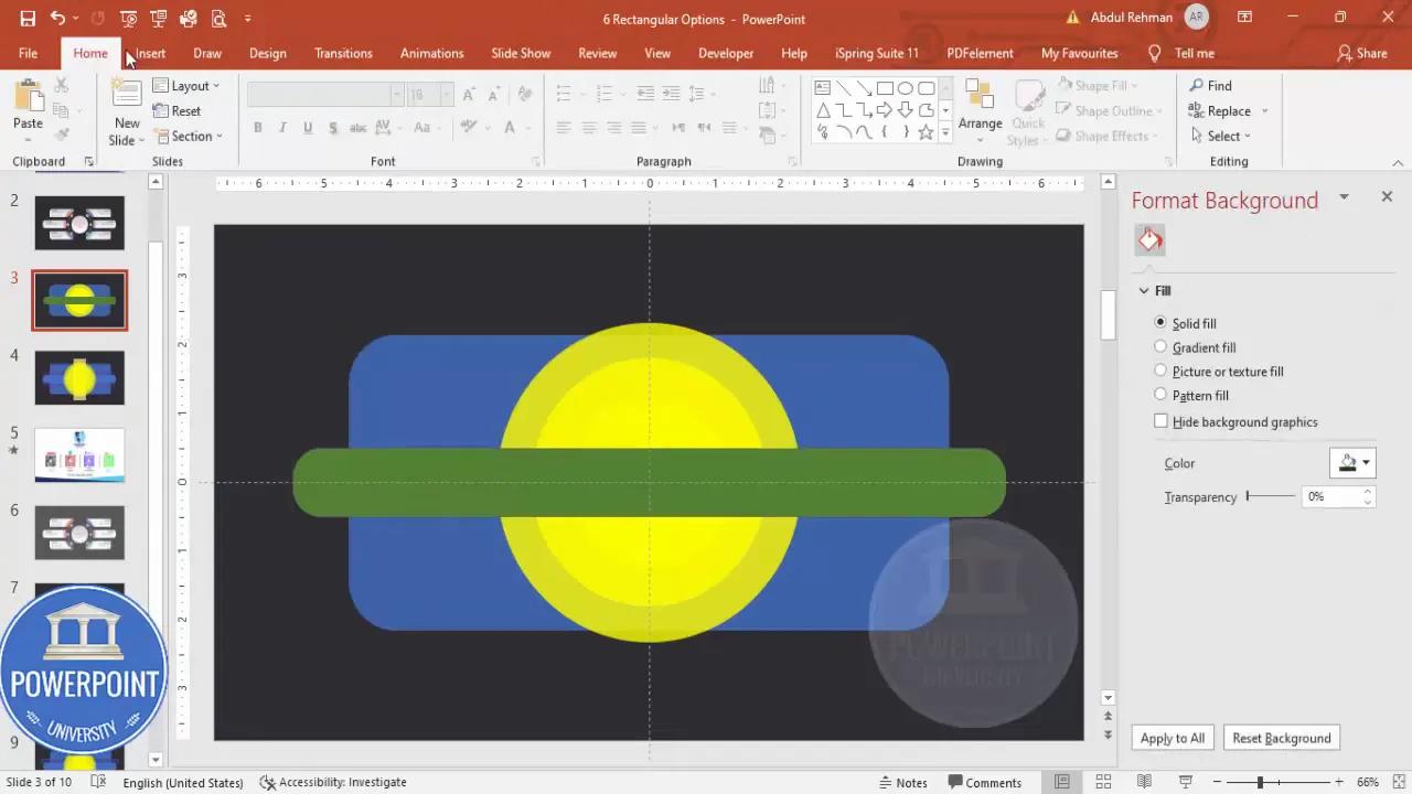
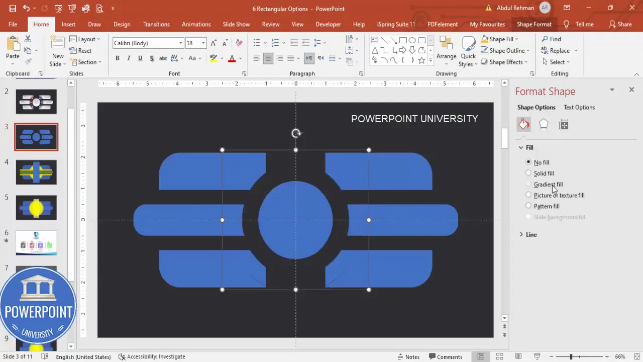
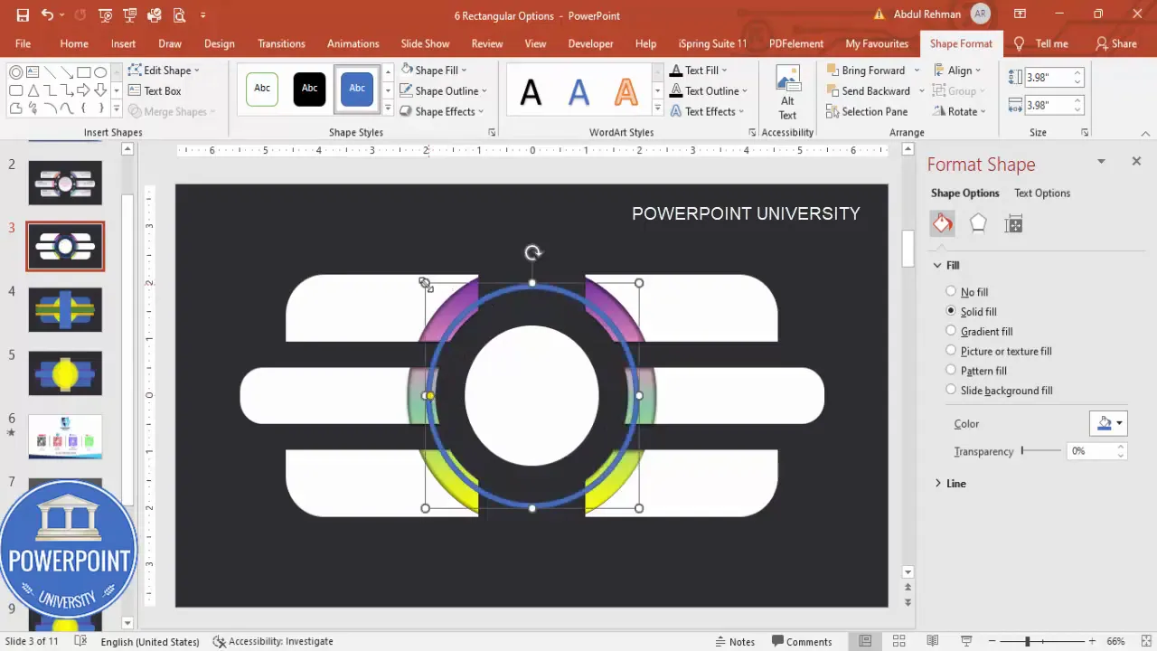
Hollow circle and accent elements
For a centered anchor, create a hollow circle and split it into two halves to create visual markers that coincide with the left and right options.
- Insert → Shapes → Oval. Hold Shift to create a circle.
- Remove fill and set a thin outline, or subtract an inner rectangle with Merge Shapes → Subtract to create a hollow ring fragment.
- Duplicate and subtract again to split the hollow circle into two halves if you want a cut-in look behind the central spine.
Small oval dots and indicators
Create small oval indicators on each option to hold an icon or number. Use small white ovals and duplicate them across options to keep the style consistent.
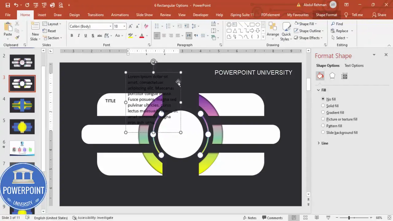
Adding text, numbering, and repeating with duplication
Text hierarchy matters. Use a concise title and a short supporting line for each option. The speaker’s preference was Open Sans SemiBold for titles and Open Sans regular for supporting text.
- Title: Open Sans SemiBold, size depending on layout (approx. 14–18 pt for slide-level cards).
- Supporting text: Open Sans Regular, smaller (10–12 pt) and kept to one or two lines to prevent overflow.
- Option numbers (1–6): place them within the small oval placeholder or as a separate text box aligned to the cards.
To quickly populate all six options:
- Design one card fully (background, shadow, icon placeholder, title, supporting text).
- Select the entire card group and press Ctrl+D to duplicate. Position duplicates on the left and right columns.
- Edit copy for each option — keep titles brief and supporting copy focused on the single idea per card.
Making the slide interactive: show options on click (basic animation techniques)
One reason the 6 Rectangular Options Slide is so useful is its interactivity. You can reveal cards individually on clicks or use a two-step reveal (show three left options on first click, three right options on the next). While the original build focuses on layout and styling, here’s how to quickly add simple interactivity that mirrors the interaction described:
Create Slides in Seconds with ExpertSlides AI |
|
Generate AI Presentations today: |
| TRY NOW! |
Basic animation setup
- Select the card group you want to animate (for example, the left-side three cards grouped together).
- Go to Animations → Add Animation → choose an entrance effect (Appear, Fade, or Wipe work well).
- Set Timing → Start to “On Click” if you want manual advance, or “With Previous/After Previous” for automatic flows.
- Repeat for the right-side group but set its trigger to the next click so the right options appear after the left ones.
If you want per-card reveals:
- Apply entrance animation to each card individually (stagger them with Start → On Click so each card appears per click), or use With Previous and set Delay values to create a cascading reveal.
Using triggers for shape-specific clicks
To reveal an option only when a specific shape or button is clicked, use triggers:
- Insert a small invisible button or keep an existing shape you want to act as the trigger.
- Select the object to animate → Animations → Trigger → On Click of [Shape Name].
- This ties the animation to the user clicking that shape during presentation mode.
Triggers are especially useful when you want to present one option at a time and discuss details without advancing the entire slide sequence.
Tips, best practices, and common mistakes
Below are practical lessons learned during this build for the 6 Rectangular Options Slide along with prevention for common errors:
Top tips
- Use guides and Align tools: Guides and Align (center, middle) remove guesswork and produce a professional layout.
- Group early and often: Group shapes whenever you reach a stable subcomponent (e.g., a single option card) to avoid accidental misalignment.
- Use Ctrl+D: Duplicate shapes and groups with Ctrl+D to maintain identical spacing and dimensions quickly.
- Set no outlines: Remove default outlines from shapes for a cleaner modern look unless the design calls for a stroke.
- Keep gradients subtle: Harsh gradients draw attention away from content and can make text harder to read.
Common mistakes and how to avoid them
- Too many fragments after merging: When you use Fragment, zoom in and delete small lines carefully. Keep a duplicate slide as a backup.
- Unreadable text: Don’t apply heavy transparency or dark gradients behind text. If you must, add a small semi-opaque shape between text and flashy backgrounds to protect legibility.
- Misaligned duplicates: When duplicating, always verify horizontal and vertical alignment with the original using Align tools.
- Overuse of shadow: Heavy shadows look unprofessional. Choose subtle blurred shadows only for depth.
Advanced variations and accessibility considerations
Once you have the baseline 6 Rectangular Options Slide, explore variations and ensure your slide is accessible to all audience members.
Design variations
- Photo-filled options: Instead of gradient fills, place images inside each rectangular card. Use Insert → Pictures and then right-click → Send to Back, or crop images to shapes.
- Icon-first layout: Use a circular icon at the left of each card and put title + short line of supporting text to the right for a left-aligned list feel.
- Vertical variation: Stack six rectangular options (single column) for mobile or narrow-aspect presentations.
- Two-stage reveal: Reveal left 3 cards on first click, expand the central area on second click and reveal right 3 cards on third click using sequential animations.
Accessibility best practices
- Choose color contrasts that meet WCAG AA standards: text must have enough contrast against background fills.
- Use large font sizes for readability — keep titles 14–18 pt and supporting text no smaller than 10–12 pt depending on viewing distance.
- Add alt text to images when exporting slides for web or PDFs so that screen readers describe the visual elements.
- Test the slide in Slide Show mode and with remote controls to ensure click-triggered reveals work as expected for presenters.
Troubleshooting
Encounter a hiccup? Here are troubleshooting steps for the most common issues encountered while building the 6 Rectangular Options Slide.
Problem: Fragments left behind after combining shapes
Solution:
- Undo (Ctrl+Z) if you notice immediately and try merging with different order.
- Zoom to 400% and select small stray fragments to delete one by one.
- If the shape is beyond repairable, revert to the duplicated slide and reapply Fragment carefully while monitoring which pieces you’ll keep.
Problem: Text becomes hard to read after gradients
Solution:
- Add a semi-opaque overlay rectangle between the gradient background and the text with 30–50% opacity.
- Switch to stronger color contrast or increase font weight (SemiBold) for the title.
Problem: Animations look choppy
Solution:
- Use simpler entrance effects (Appear or Fade) for smooth playback.
- Reduce simultaneous animated objects — group items and animate the group instead of many separate objects.
FAQ — Frequently Asked Questions
Q: What slide size should I use for the 6 Rectangular Options Slide?
A: Default 16:9 slide size works well. If you need a presentation for a portrait-oriented screen, scale the layout proportionally and increase the height of the rounded container. The 6 Rectangular Options Slide adapts to both widescreen and standard formats as long as you maintain relative spacing and alignment.
Q: Can I use pictures inside the rectangular option cards?
A: Yes. You can mask photos to shapes by cropping an image to a shape or inserting an image and then using Format Picture → Crop to Shape. Ensure the image contrast doesn’t overpower the text; if it does, add a semi-transparent overlay or increase text contrast.
Q: How do I make each option appear on a separate click?
A: Apply entrance animations to each card individually and set their Start property to “On Click.” If you prefer to click a central button to show an option, use Animations → Trigger to bind the animation to the click of a specific shape.
Q: Are there template files I can reuse for the 6 Rectangular Options Slide?
A: Save your finished slide as a slide template or copy it into your Slide Master as a custom layout so you can reuse the exact design in future presentations.
Q: What fonts work best for this slide?
A: Clean, sans-serif fonts like Open Sans, Lato, or Montserrat work well. Use a semi-bold weight for titles to make them legible above soft gradients and a regular weight for supporting copy.
Q: How much should I repeat the phrase “6 Rectangular Options Slide” in my document or description?
A: When describing or tagging your file, include the phrase clearly in the title and metadata — and once within the slide notes or presenter notes — so collaborators can easily find and reuse the slide. In documentation or written tutorials, repeat the phrase naturally where it helps search or clarity.
Conclusion
The 6 Rectangular Options Slide is a flexible, modern template that presents six distinct pieces of information in a balanced, visually appealing way. Starting from basic shapes — rounded rectangles, circles, and small ovals — and using Shape Format tools like Fragment and Union, you can build a polished layout that’s easy to style and animate.
Key takeaways for a successful 6 Rectangular Options Slide:
- Start with a dark background and enable guides for precision.
- Create a translucent rounded rectangle as the main container and layer soft circular accents behind the cards.
- Use Fragment and Union carefully to clean up overlaps and make each card a simple object to style.
- Apply subtle gradients and soft shadows for depth; keep color palettes limited for cohesion.
- Group and duplicate card designs to rapidly fill the left and right columns, and add click-based animations or triggers to control reveals in presentation mode.
If you follow these steps you’ll have a professional 6 Rectangular Options Slide that’s visually attractive, easy to update, and fully interactive. Use it for product features, options comparison, agenda sections, or any scenario where six parallel items need to be presented in a single clear view.
Ready to build your own? Start with the main rounded rectangle, add the circular accents, craft three horizontal cards on each side, merge and clean up fragments, then style and animate — your 6 Rectangular Options Slide will be ready for the next presentation in no time.

Check out the full video: Create 6 Rectangular Options Slide in PowerPoint. Tutorial No.: 991


