
Welcome, dear readers! Today, I am excited to share with you a comprehensive, step-by-step guide on how to create an amazing animated infographic using PowerPoint. This tutorial is perfect for anyone looking to compare two products, services, or any other items visually and dynamically. The techniques I’ll walk you through will not only enhance your presentation skills but also help you craft professional and engaging slides that captivate your audience.
Throughout this article, I will guide you through designing the infographic slide from scratch, adding subtle design elements, and applying smooth animations that bring your infographic to life. Whether you are a beginner or an intermediate PowerPoint user, this tutorial will equip you with valuable skills to elevate your slide design game.
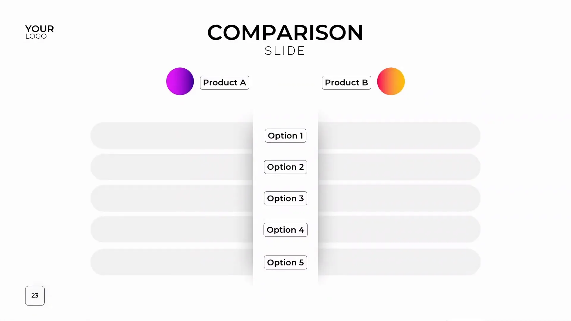
Table of Contents
- Why Use Animated Infographics in PowerPoint?
- Getting Started: Creating a New Slide with a Custom Layout
- Designing the Central White Shape with Subtle Shadow
- Creating Product Labels and Bubbles
- Designing Subtle Rounded Rectangles for Background Decoration
- Creating the Colorful Sliding Bars
- Adding Animations to the Sliding Bars
- Understanding the Animation Mechanism
- Creating the Opposite Sliding Bar
- Synchronizing the Animations
- Adding Labels and Final Touches
- Conclusion: Mastering Animated Infographics in PowerPoint
- Frequently Asked Questions (FAQ)
Why Use Animated Infographics in PowerPoint?
Animated infographics are a powerful way to present comparative information effectively. Unlike static charts or tables, animated graphics engage the viewer’s attention and make complex data easier to understand. By animating different sections of the infographic, you can control the flow of information, emphasize key points, and make your presentation memorable.
In this tutorial, you will learn how to create an infographic that is ideal for comparing two products or services side by side, with animated sliding bars and labels that provide clear visual cues.
Getting Started: Creating a New Slide with a Custom Layout
Let’s begin by adding a new slide to your presentation. Navigate to the bottom of your slide list and press Enter to insert a new slide. The slide you’ll work with includes a title and subtitle placeholder, a spot for your logo, and a custom slide number that adds a professional touch.
These features are possible because of a custom slide layout created in the Slide Master view. If you’re interested in mastering professional slide layouts and templates, I highly recommend taking a dedicated PowerPoint master class that covers these essentials in detail.
Why Custom Slide Layouts Matter
Custom slide layouts ensure consistency across your presentation, save you time, and give your slides a polished, modern appearance. Instead of manually formatting each slide, you can apply a layout that already has placeholders and design elements perfectly positioned.
Creating and using custom layouts also makes it easier to maintain branding, such as logos and slide numbers, throughout your deck.
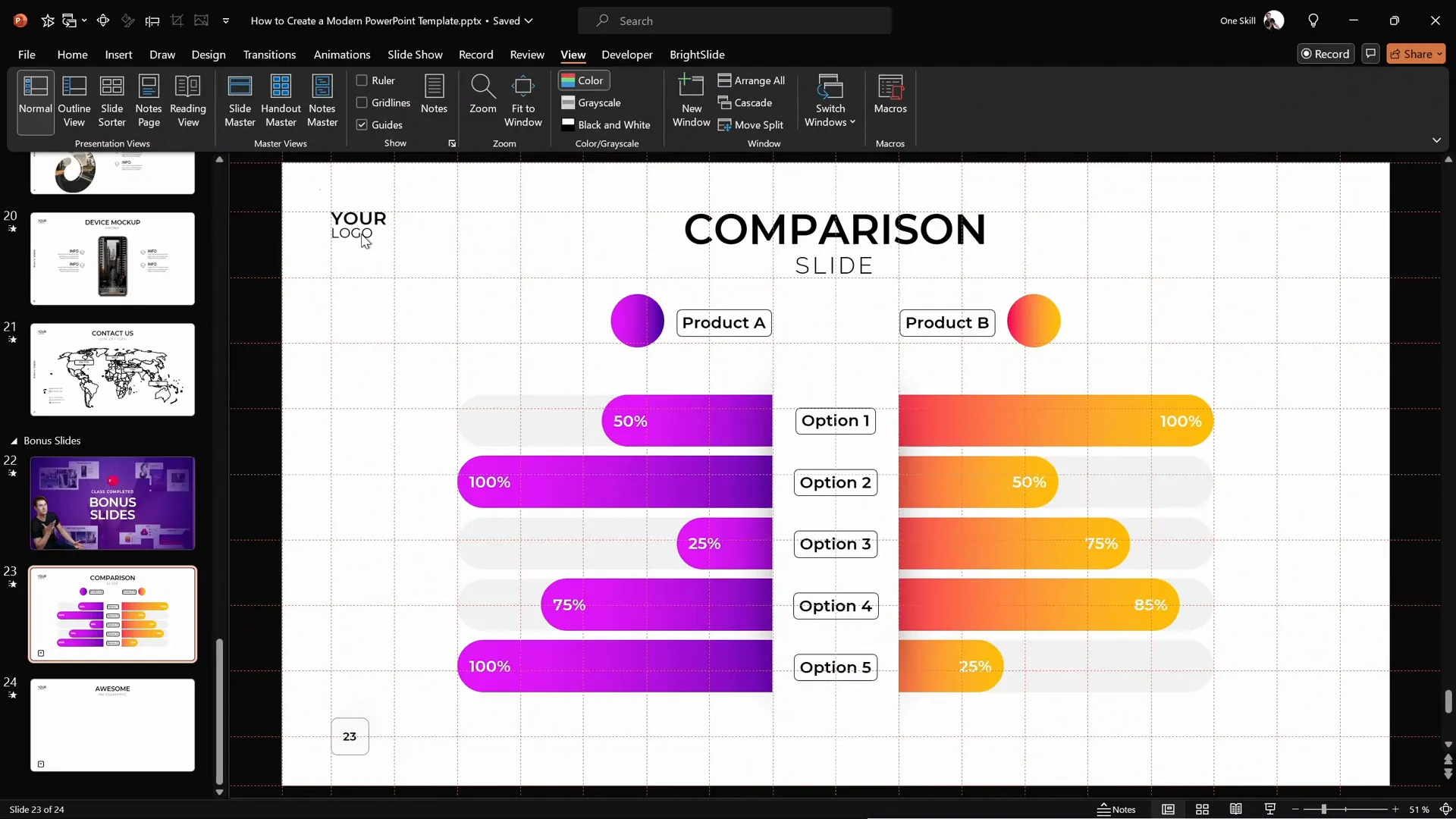
Designing the Central White Shape with Subtle Shadow
Now, let’s focus on the main visual element of our infographic: a white rectangle with a subtle shadow that sits in the center of the slide. This shape acts as the base for the animated sliding bars.
To create this, first turn on your gridlines and guides. In this tutorial, the grid consists of 18 columns and 8 rows. The white shape will span 2 columns in width and 6 rows in height, perfectly centered.
Insert a rectangle shape following these dimensions. Then, fill it with a solid white color and remove the outline by selecting no line in the formatting options.
Next, add a shadow effect to create depth. Use the shadow preset set to the center, and adjust the transparency to 20%, the blur to 100 points, and size to 70. This combination results in a soft shadow that appears only around the middle of the shape, giving it a subtle but elegant lift from the background.
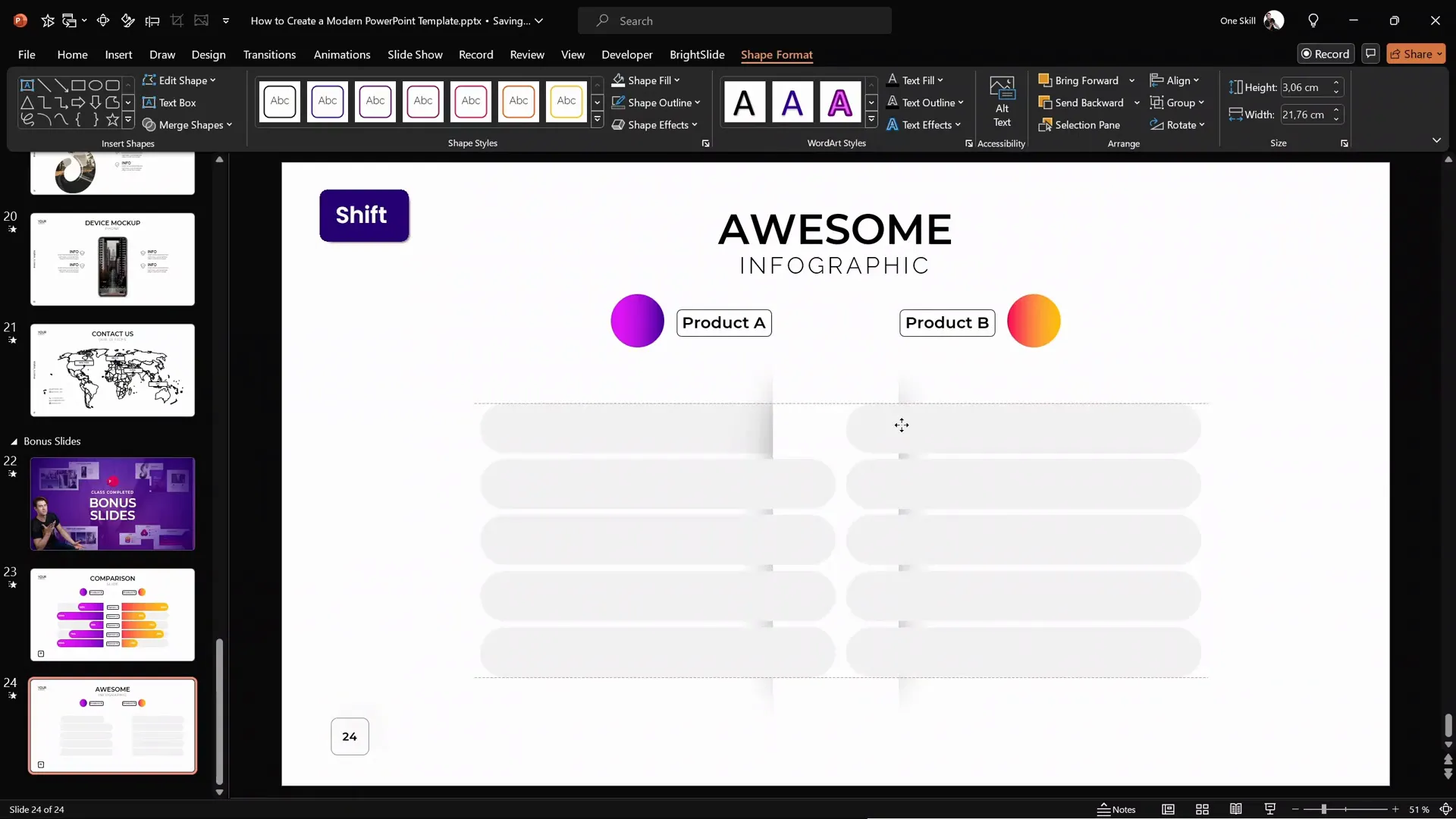
Creating Product Labels and Bubbles
To make the infographic visually appealing and informative, we add colorful product labels and bubbles. These elements highlight key data points or product features.
Start by inserting a perfect circle using the circle tool while holding the Shift key. Fill this circle with a beautiful gradient fill that adds depth and vibrancy.
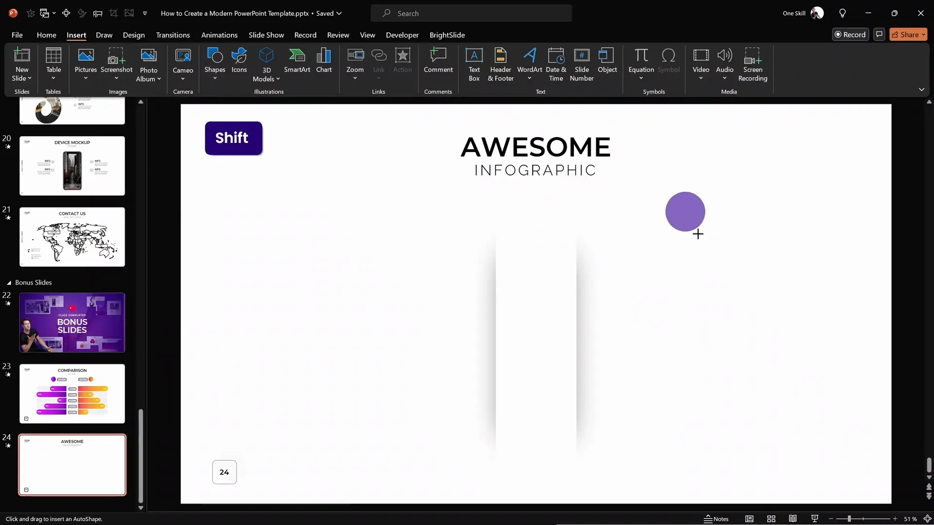
To save time and ensure consistency, you can use the Format Painter tool to copy the gradient fill from a previously designed shape and apply it to your new circle.
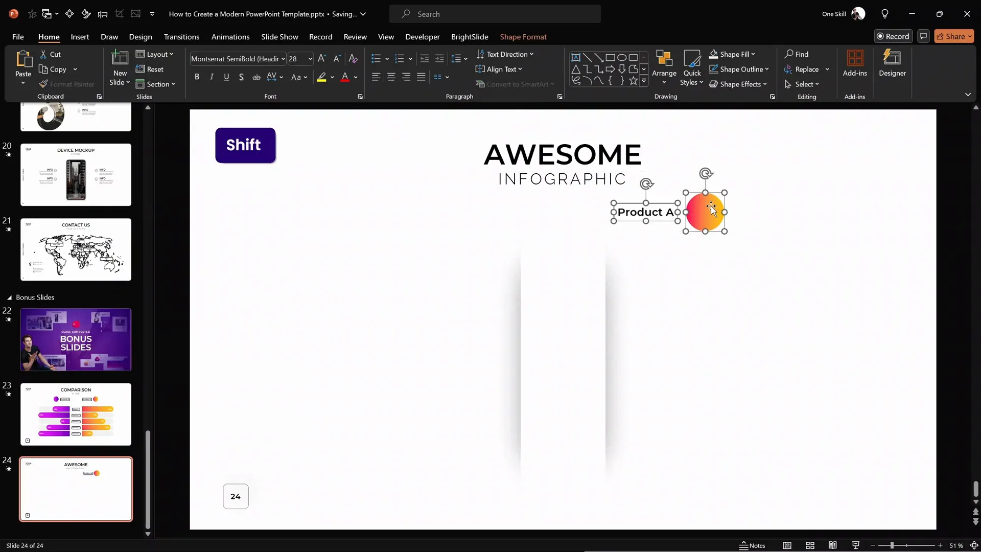
For product labels, insert a rounded rectangle. Double-click inside to type your desired text. Again, use the Format Painter or shortcut keys Ctrl + Shift + C to copy the style from an existing label and Ctrl + Shift + V to paste it onto your new label.
Group the circle and label by selecting both and pressing Ctrl + G. This makes it easier to move and animate them together.
Designing Subtle Rounded Rectangles for Background Decoration
In the background of the infographic, you’ll notice several subtle gray rounded rectangles. These serve as a visual foundation for the sliding bars and add a layer of sophistication to the design.
To create these, insert a rounded rectangle and adjust the yellow handle to make the corners fully rounded. Stretch the shape horizontally and set the fill color to a light gray shade. Remove the outline by setting no line.
Send this shape to the back so that the central white shape remains on top.
Use the Ctrl + Shift keys to drag copies of this shape in a straight line, making as many duplicates as needed. Once one side is complete, select all and copy them to the other side of the slide, maintaining perfect symmetry.
Tip: Using BrightSlide Add-In for PowerPoint
If you want to speed up your workflow, consider using the free BrightSlide PowerPoint add-in. For example, you can select one shape, then use the Select Object feature to select all shapes with the same fill color instantly. This makes managing and copying multiple shapes effortless.
Creating the Colorful Sliding Bars
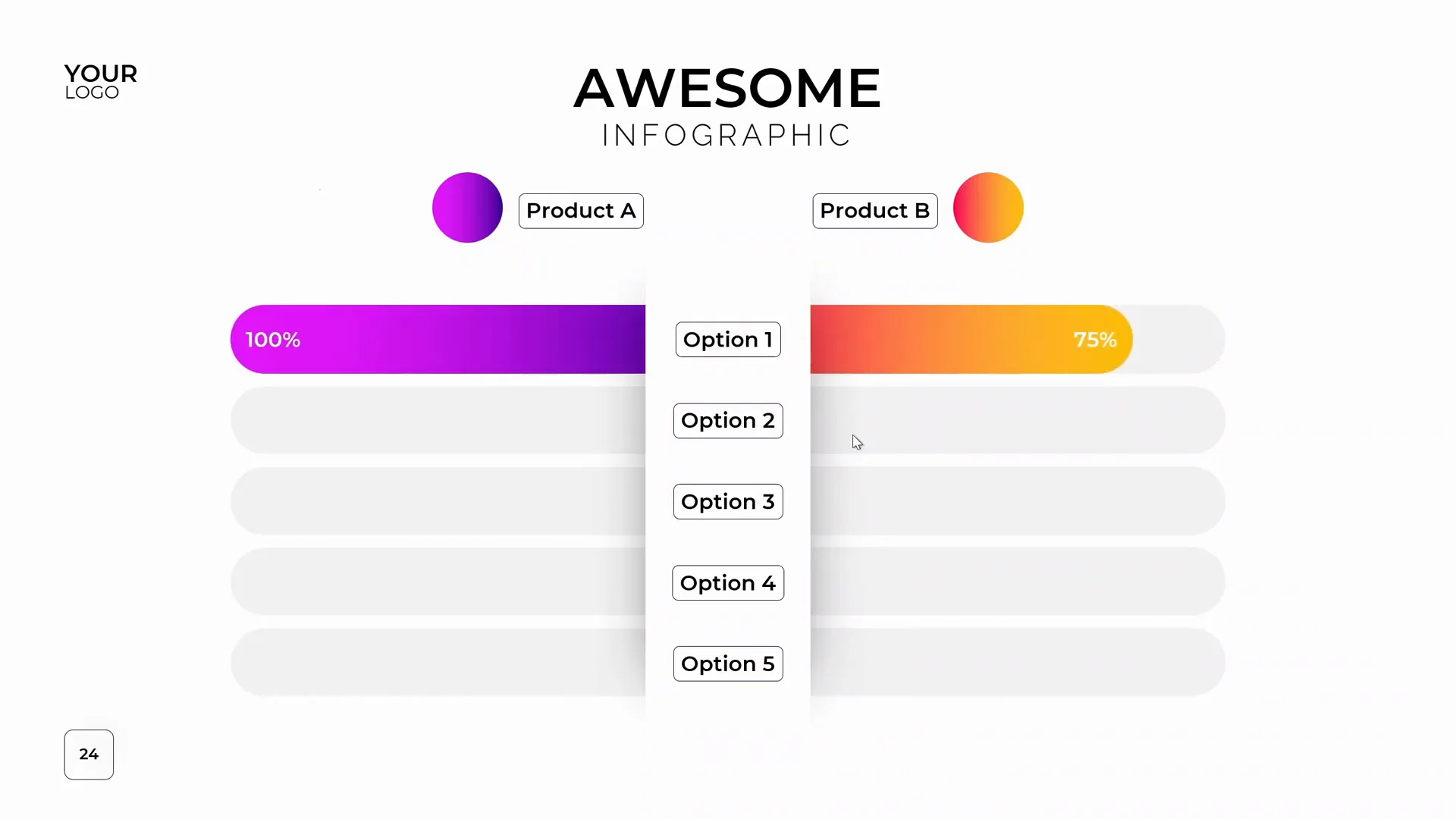
The heart of this animated infographic lies in the colorful sliding bars that extend from the center white shape. These bars visually represent data points such as percentages or other metrics.
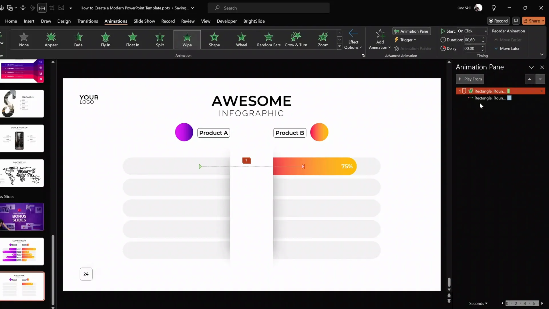
Select one of the duplicated rounded rectangles and fill it with a vibrant gradient fill (such as an orange gradient). Align this shape precisely with one of the gray rounded rectangles in the background. Use the PowerPoint alignment tools or keyboard shortcuts to nudge the shape into perfect position.

Adjust the length of this colored bar to represent a data value—for example, 75%. Double-click inside the shape to add the text “75%” or any other label you prefer. Make sure the central white shape remains on top to maintain the clean layered look.
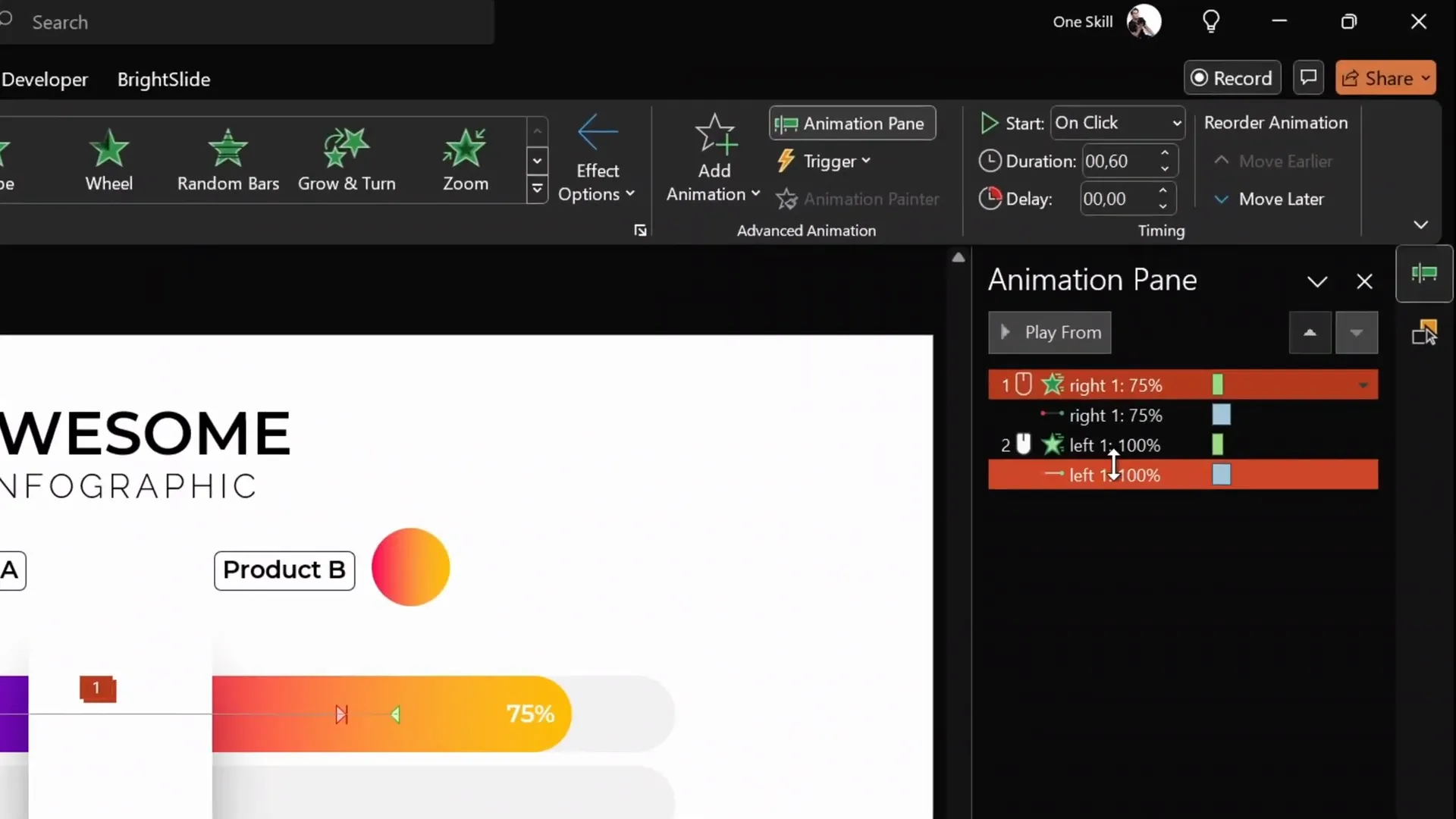
Adding Animations to the Sliding Bars
Now comes the exciting part—animating the sliding bars to create a dynamic infographic.
Step 1: Setting Up the Motion Path Animation
Select the orange rounded rectangle and open the animation pane. Remove any existing animations to start fresh.
Add a Motion Path: Line animation. By default, it might point downwards, but you want it to slide out horizontally. Change the direction to Left and then reverse the path direction to make it slide right.
Set the animation duration to 1 second for a smooth effect. Double-click the motion path animation to access its options and enable Smooth Start and Smooth End to soften the movement.
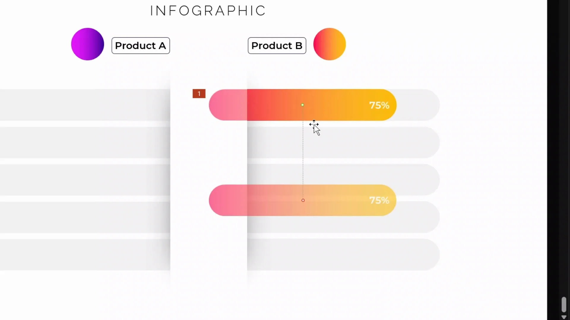
Step 2: Adding a Wipe Entrance Animation as a Mask
To hide the left edge of the sliding bar during the animation and create a clean reveal effect, add a Wipe entrance animation.
Set the wipe direction to From Right and the duration to 0.6 seconds. Move this wipe animation above the motion path animation in the animation pane.
Set the motion path animation to start With Previous, so both animations play simultaneously.

When you play this animation, the orange bar will smoothly slide out from behind the central white shape, with the wipe animation masking the left edge, creating a polished and professional effect.
Understanding the Animation Mechanism
To better understand how these two animations work together, you can copy the orange bar onto a new slide and observe the animations separately:
- The Motion Path moves the shape horizontally.
- The Wipe animation acts as a moving mask that reveals the shape from one side.
Combined, they create the illusion that the bar is growing out of the white shape, which is exactly the effect we want for our infographic.
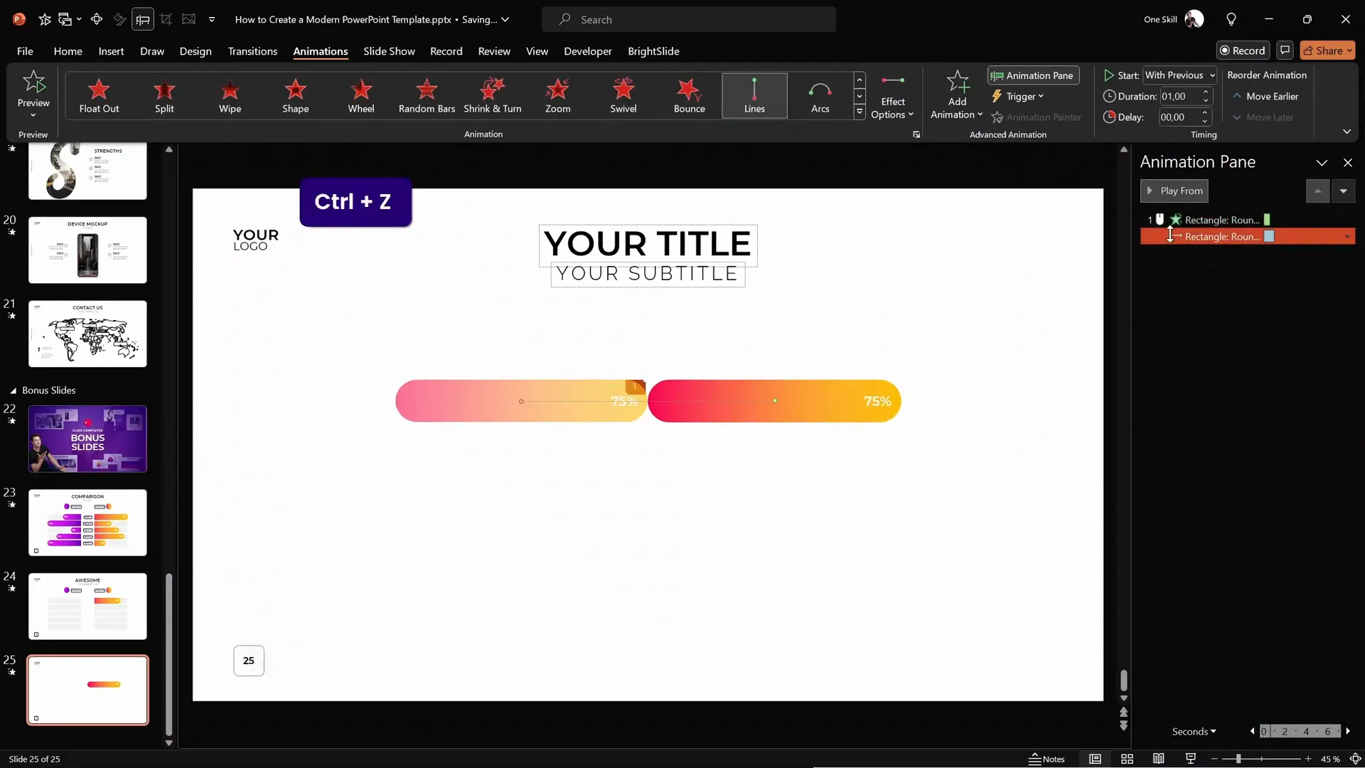
Creating the Opposite Sliding Bar
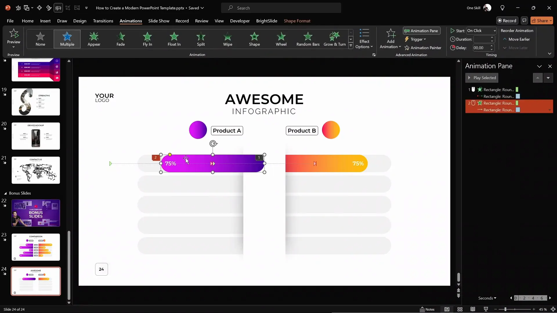
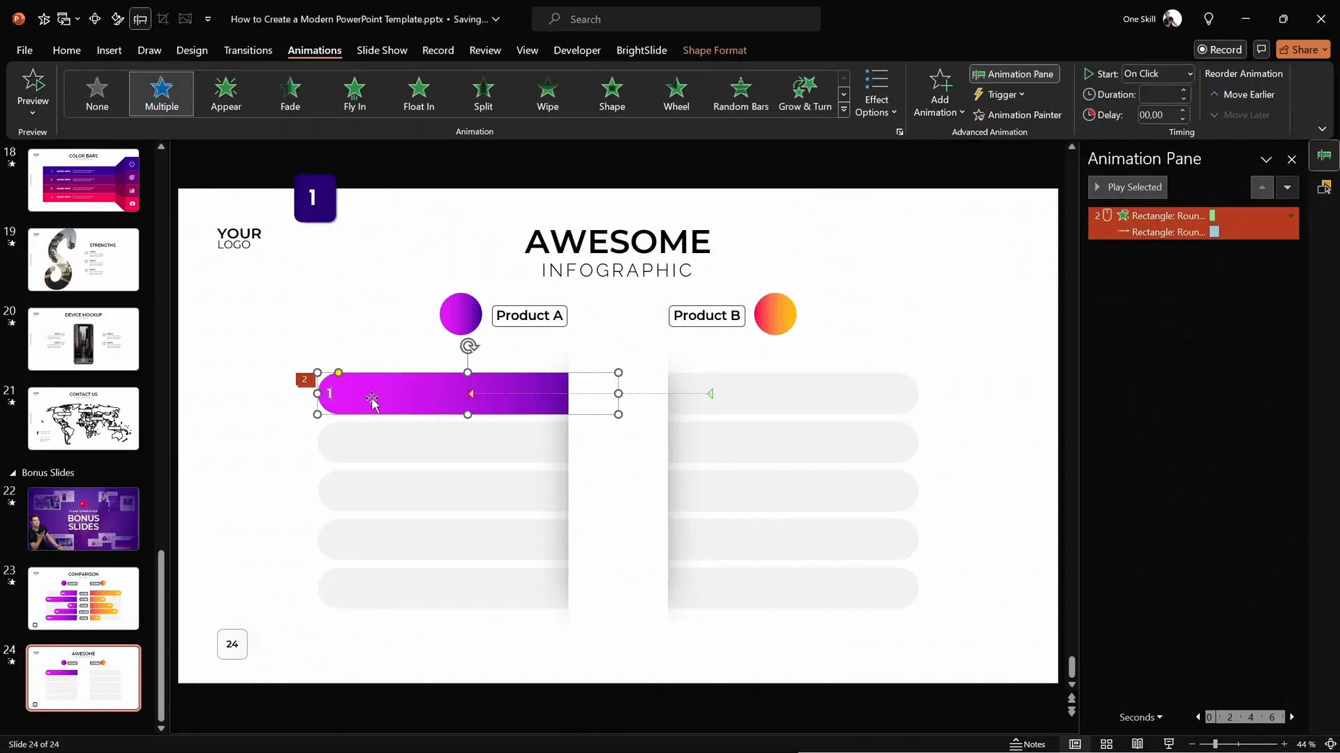
Duplicate the orange sliding bar and align it on the opposite side of the central white shape. Change its gradient fill to a different color, such as purple, to distinguish it visually.
Align the text inside this bar to the left, opposite to the orange bar’s right-aligned text. This contrast helps the viewer easily compare the two options.
Hide the orange bar temporarily to work more easily with the purple bar.
Animating the Purple Bar
Adjust the purple bar’s motion path to slide left instead of right. Modify the wipe animation direction to From Left so it reveals correctly.
You can also adjust the length of this bar to represent data, for example, 100%, by stretching the shape and updating the text.
Ensure the motion path animation distance matches the length of the bar, so the animation looks smooth and natural.
Synchronizing the Animations
Currently, the orange and purple bars animate on separate clicks. To make your infographic more dynamic, you might want both bars to animate simultaneously.
To do this, set the wipe animation of the purple bar to start With Previous alongside the orange bar’s animations.
Now, when you click once during your presentation, both sliding bars animate together, providing a seamless comparison.
Adding Labels and Final Touches
Copy the product labels and bubbles from your previous slides and paste them onto your infographic slide. Remove any animations from these labels to keep them static.
Position the labels appropriately near the sliding bars to clearly indicate what each bar represents.
By following these steps, you can add as many sliding bars and labels as needed for your infographic. In the example, we used five animated options, but you can customize this based on your content.
Conclusion: Mastering Animated Infographics in PowerPoint
Congratulations! You have now learned how to design a visually stunning, animated infographic in PowerPoint, perfect for comparing two products, services, or any other items.
This tutorial covered everything from setting up custom slide layouts, designing shapes and labels, to applying sophisticated animations that engage your audience and communicate your message effectively.
Remember, mastering these techniques will not only improve your presentation skills but also allow you to create professional-quality slides that stand out.
Stay creative, keep practicing, and happy presenting!
Frequently Asked Questions (FAQ)
1. Do I need advanced PowerPoint skills to follow this tutorial?
Not necessarily. This tutorial is designed to guide users step-by-step, explaining each action clearly. While some familiarity with PowerPoint basics helps, beginners can follow along with patience and practice.
2. Can I use this animated infographic for presentations other than product comparisons?
Absolutely! The design and animation techniques demonstrated here can be adapted for any comparative data or side-by-side information you want to present, such as service plans, survey results, or project timelines.
3. What version of PowerPoint is required?
Most modern versions of PowerPoint support the features used in this tutorial, including motion path and wipe animations. PowerPoint 2016 and later versions are recommended for the best experience.
4. How can I create custom slide layouts like the one used in this tutorial?
Creating custom slide layouts involves using the Slide Master view in PowerPoint. If you want to learn this in depth, consider taking specialized courses that cover template creation and slide masters.
5. What is the BrightSlide add-in and how does it help?
BrightSlide is a free PowerPoint add-in that enhances productivity by providing additional tools and shortcuts. For example, it allows you to select all shapes with the same fill color quickly, speeding up repetitive tasks.
6. Can I adjust the animations to fit my presentation timing?
Yes, all animation durations and timings can be customized in the animation pane. You can change the speed, delay, and start options to synchronize with your narration or other slide elements.
7. Is it possible to add more than two sliding bars?
Definitely! You can duplicate the sliding bars and labels as many times as needed to represent multiple data points. Just ensure to align and animate them consistently for a clean look.
8. Can I use 3D models in PowerPoint as mentioned?
Yes, PowerPoint supports importing 3D models, which can enhance your presentations. Learning 3D modeling through tools like Blender can help you create custom assets to import. There are many courses available online to get started with 3D modeling.
9. How do I ensure my animations run smoothly on different devices?
Test your presentation on the devices you’ll be using beforehand. Avoid overly complex animations or very long durations, and keep your PowerPoint software updated to minimize compatibility issues.
10. Where can I find more tutorials like this?
There are many resources online, including free tutorials and comprehensive courses on platforms like Skillshare, YouTube, and specialized websites dedicated to PowerPoint skills.
Check out the full video: AMAZING PowerPoint Infographic Tutorial ✅ Step-by-Step!


