
Creating engaging and visually appealing presentations is a skill that can transform how your audience perceives data and information. One of the most effective ways to showcase progress, proportions, or percentages is through animated doughnut charts. In this comprehensive tutorial, inspired by the expertise of One Skill PowerPoint, you will learn how to design and animate doughnut charts in Microsoft PowerPoint, bringing your slides to life with creative flair.
This guide will walk you through each step of the process—from crafting the doughnut shape to adding sophisticated animations that make your charts dynamic and captivating. Whether you’re a beginner or looking to sharpen your PowerPoint skills, this article will empower you to create professional-quality animated doughnut charts that can elevate your presentations and captivate your audience.

Table of Contents
- Why Animated Doughnut Charts?
- Getting Started: Setting Up Your PowerPoint Workspace
- Step 1: Creating the Doughnut Shape
- Adjusting the Doughnut Percentage
- Step 2: Adding the Fading Wheel Animation
- Step 3: Creating the Solid Wheel Animation
- Step 4: Adding a Cover to Refine the Animation
- Step 5: Animating the Cover
- Tweaking the Animation Timing
- Step 6: Adding the Starting Circle for a Clean Finish
- Step 7: Customizing Colors and Duplicating Charts
- Step 8: Adjusting Doughnut Lengths and Spin Degrees for Different Percentages
- Final Touches and Troubleshooting
- Summary: Bringing Your Doughnut Charts to Life
- Frequently Asked Questions (FAQ)
- Further Learning and Resources
Why Animated Doughnut Charts?
Doughnut charts are a versatile tool for representing proportions and percentages visually. Unlike static charts, animated doughnut charts add an extra layer of engagement by dynamically illustrating data progression. This visual storytelling technique helps audiences grasp information quickly and retain it longer.
Animating doughnut charts in PowerPoint also allows you to customize the style and pacing of your presentation. Whether you want a subtle fade or a bold spinning effect, animations can be tailored to fit the tone and purpose of your message.
Getting Started: Setting Up Your PowerPoint Workspace
Before diving into the design, it’s important to prepare your PowerPoint environment to streamline the process. Opening key panes will help you easily access formatting options, manage your slide elements, and control animations.
- Format Pane: This pane allows you to fine-tune the appearance of shapes, lines, and fills.
- Selection Pane: Essential for managing and renaming objects on your slide for clarity and ease of editing.
- Animation Pane: Provides detailed control over animation sequences, timings, and effects.
To open these panes, navigate to the “View” tab and select each pane so they appear on the right side of your PowerPoint window. Having these panels visible will make the subsequent steps more efficient and organized.
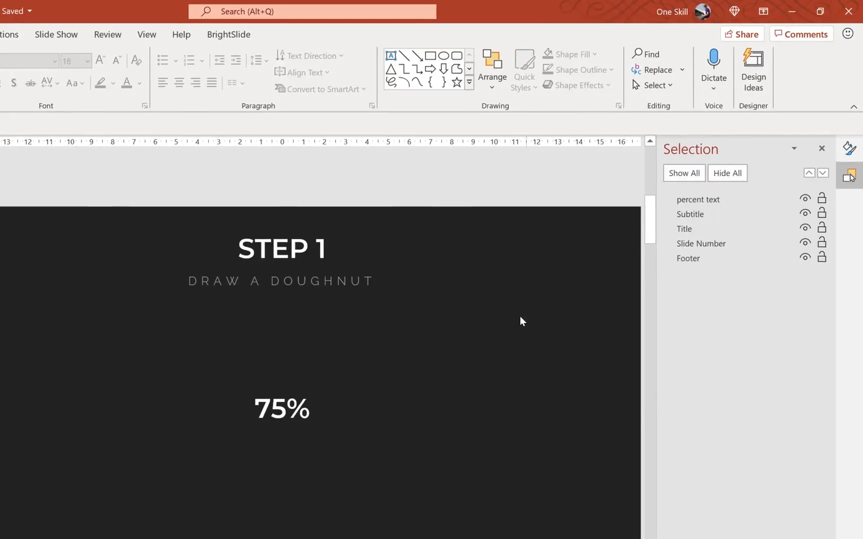
Step 1: Creating the Doughnut Shape
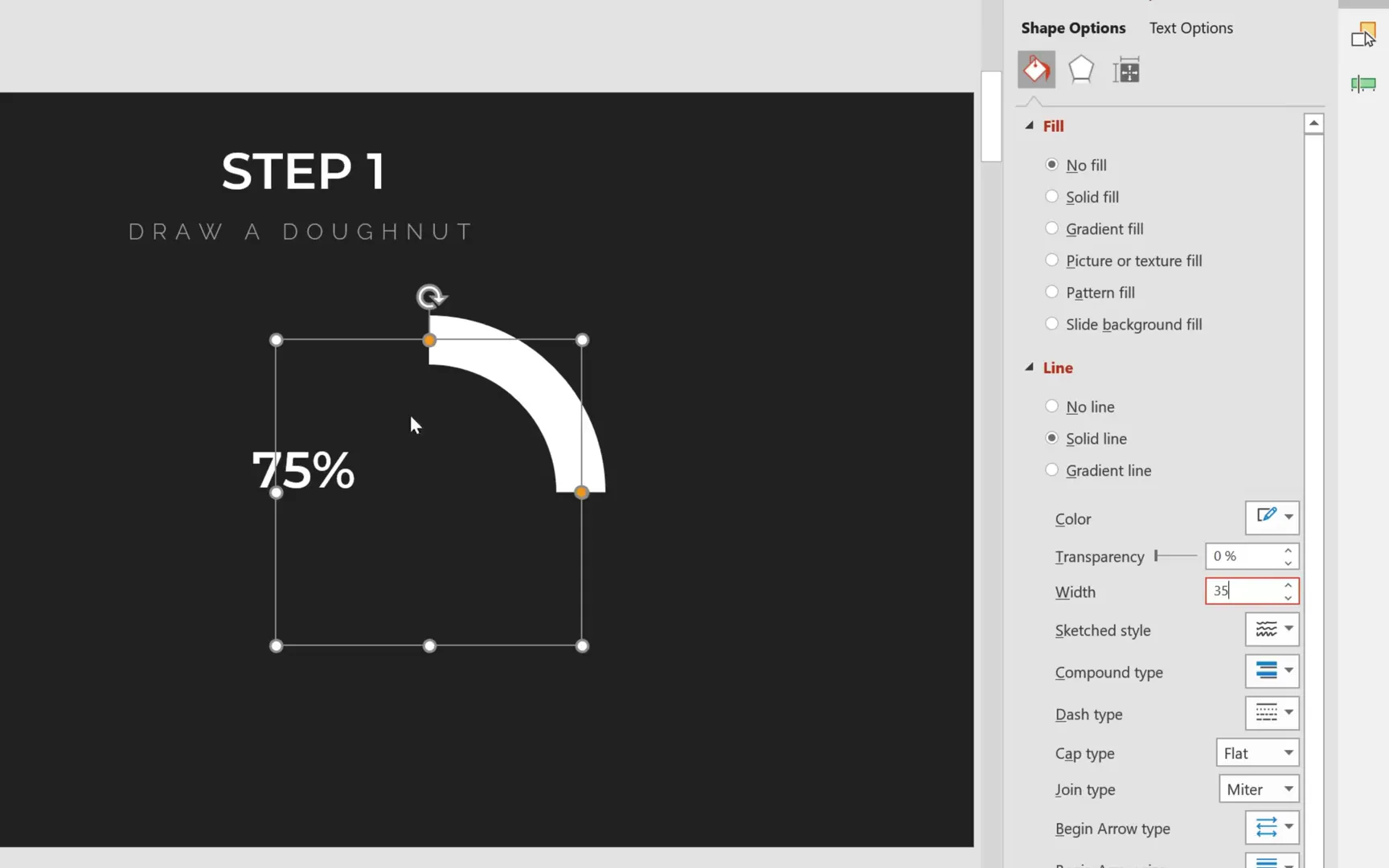
The core of your animated chart is the doughnut shape, which can be created using the Arc shape in PowerPoint. Follow these steps to design a clean and precise doughnut:
- Go to the Insert tab, click Shapes, and select the Arc shape.
- Hold down the Shift key while drawing to ensure the arc is perfectly proportioned.
- Change the line color to white for better visibility against your background.
- Adjust the line width to 35 points for a bold, visible stroke.
- Make the line edges round by selecting Cap type: Round in the format options.
- Set the shape’s height and width to 6 centimeters each for a balanced doughnut size.
- Use guides to locate the center of the slide and center-align the arc.
At this point, your arc will look like a thick curved line. The next step is to create the hole in the middle, typical of a doughnut chart.
To create the hole:
- Insert a perfect circle by holding Shift while drawing a circle.
- Set the circle’s dimensions to 8 centimeters height and width, slightly larger than the arc.
- Center-align the circle on the slide so it perfectly overlaps the arc.
- Select both the arc and the circle while holding Shift and align them centrally.
- Group the two shapes by pressing Ctrl + G to keep them together.
- Center-align the group on the slide for perfect positioning.
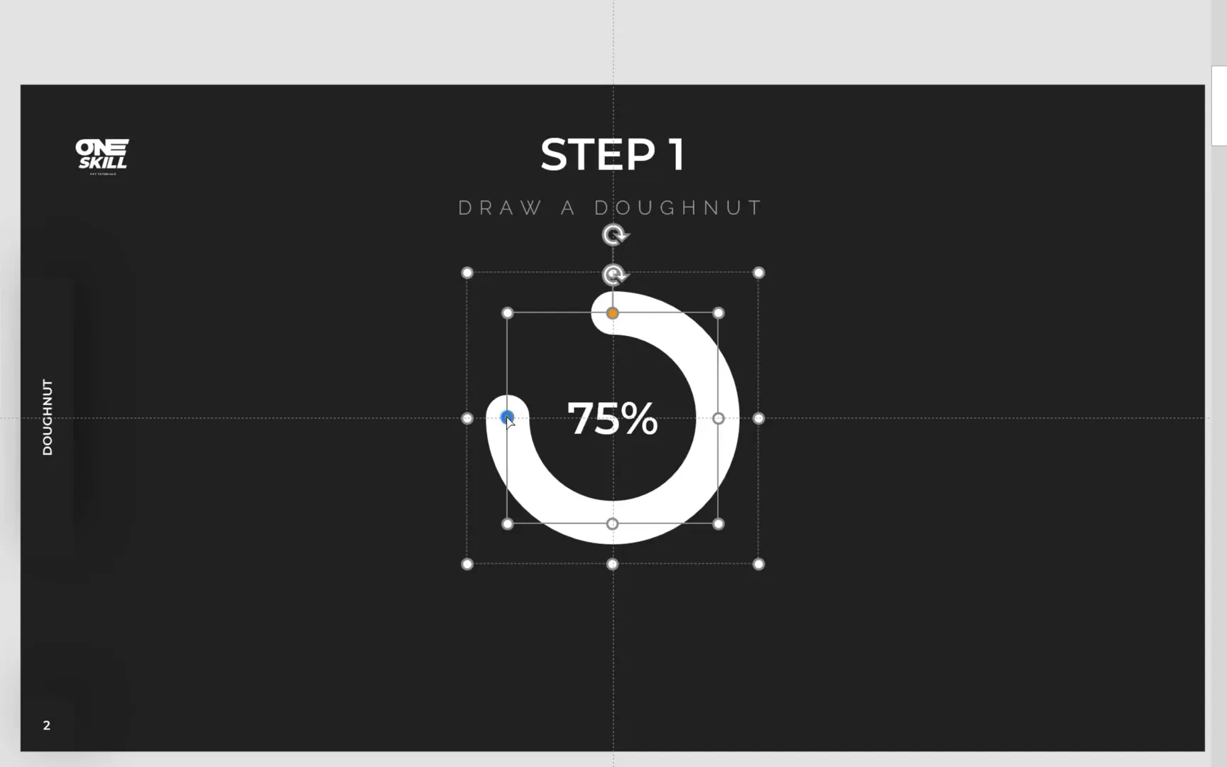
Rename the group in the selection pane to doughnut for better organization. Then, for the circle (the hole), set the line to No Line so only the arc remains visible, creating the doughnut effect.
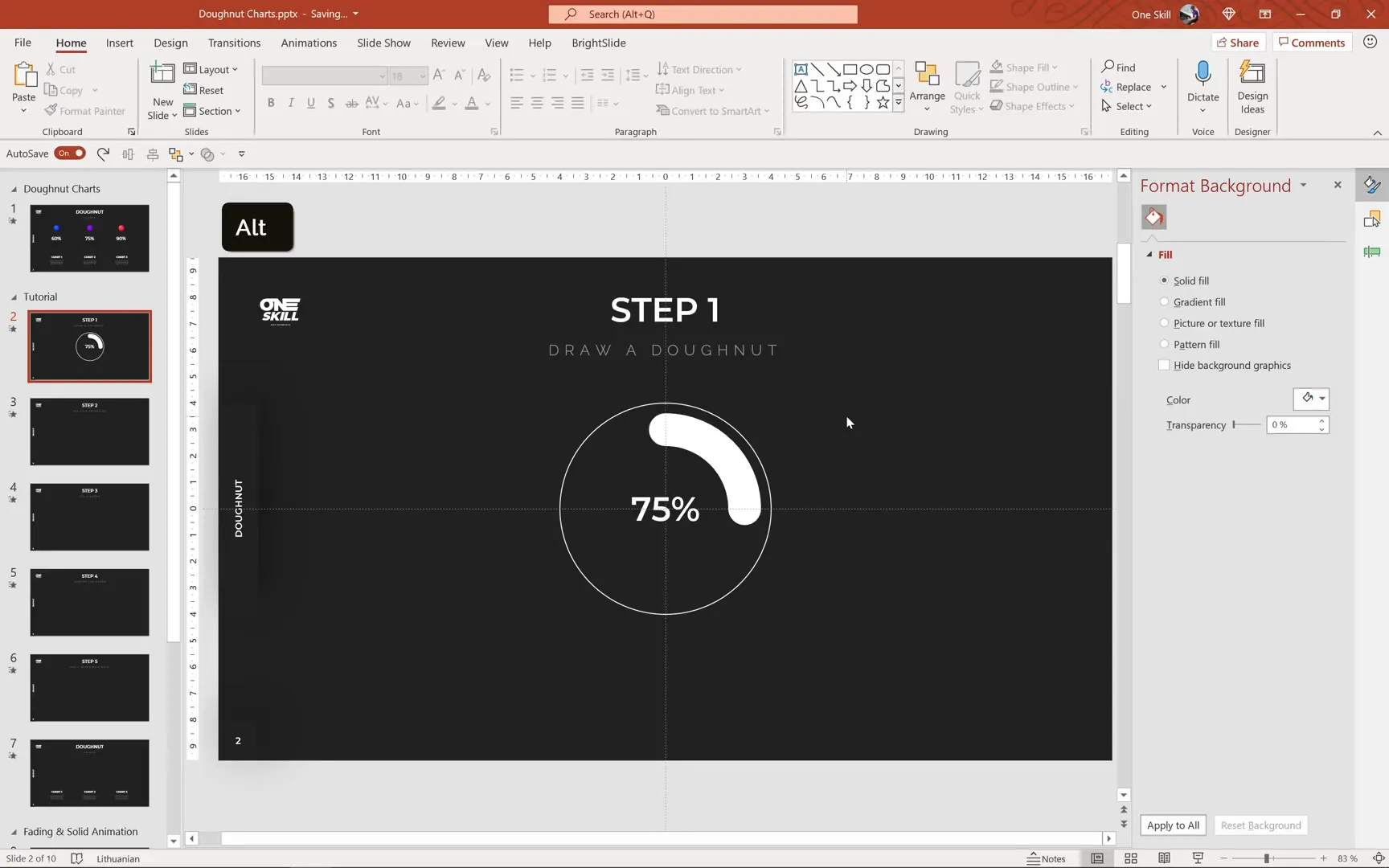
Adjusting the Doughnut Percentage
To represent different percentages on your doughnut chart, you adjust the length of the arc. The yellow handle on the arc allows you to extend or reduce the sweep angle:
- Fifty percent coverage is about halfway around the circle.
- Seventy-five percent coverage extends further, roughly three-quarters of the circle.
Drag the yellow handle to approximately seventy-five percent to create a doughnut chart representing 75% completion.
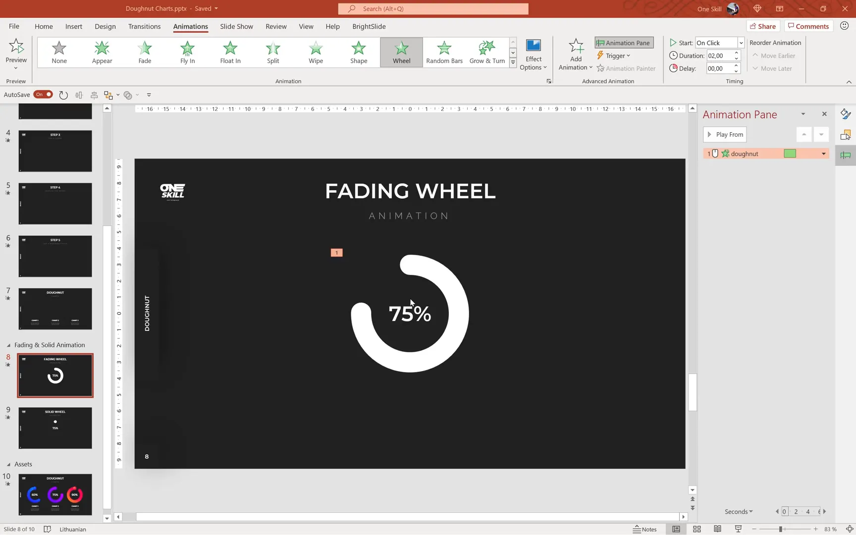
Step 2: Adding the Fading Wheel Animation
Animations bring your doughnut charts to life. The first animation style to explore is the Fading Wheel animation, which sequentially fades in segments of the doughnut:
- Copy the doughnut group and its associated percentage text box.
- Paste it onto the slide where you want the animation.
- Select the doughnut shape and go to the Animations tab.
- Choose the Wheel animation from the entrance effects.
- Preview the animation in full-screen mode to see the fading effect in action.
One issue you may notice is that the rounded cap of the arc appears only after the animation completes, causing a visual gap at the start. To fix this:
- Insert a small white circle shape at the starting point of the arc.
- Align it precisely with the arc’s start to mask the missing cap during the animation.
This simple addition completes the fading wheel animation, making it smooth and visually consistent.
Step 3: Creating the Solid Wheel Animation
For a more dynamic effect, try the Solid Wheel animation, which simulates the doughnut being drawn with a paintbrush. This effect requires a combination of spin and exit animations along with shape manipulation:
- Copy the doughnut and percentage text box to a new slide or area.
- Flip the doughnut horizontally using the Flip Horizontal option under the format tab.
- Apply the Spin animation to the doughnut shape.
- By default, the spin is a full 360 degrees. Calculate the degrees for your target percentage by multiplying 360 by the decimal equivalent of the percentage (e.g., 0.75 for 75%).
- For 75%, the spin should be 270 degrees. Set this value in the Effect Options under the spin animation settings.
- Set the animation duration to 1 second for smoothness.
This creates a spinning doughnut chart that visually represents the percentage by how far it spins.
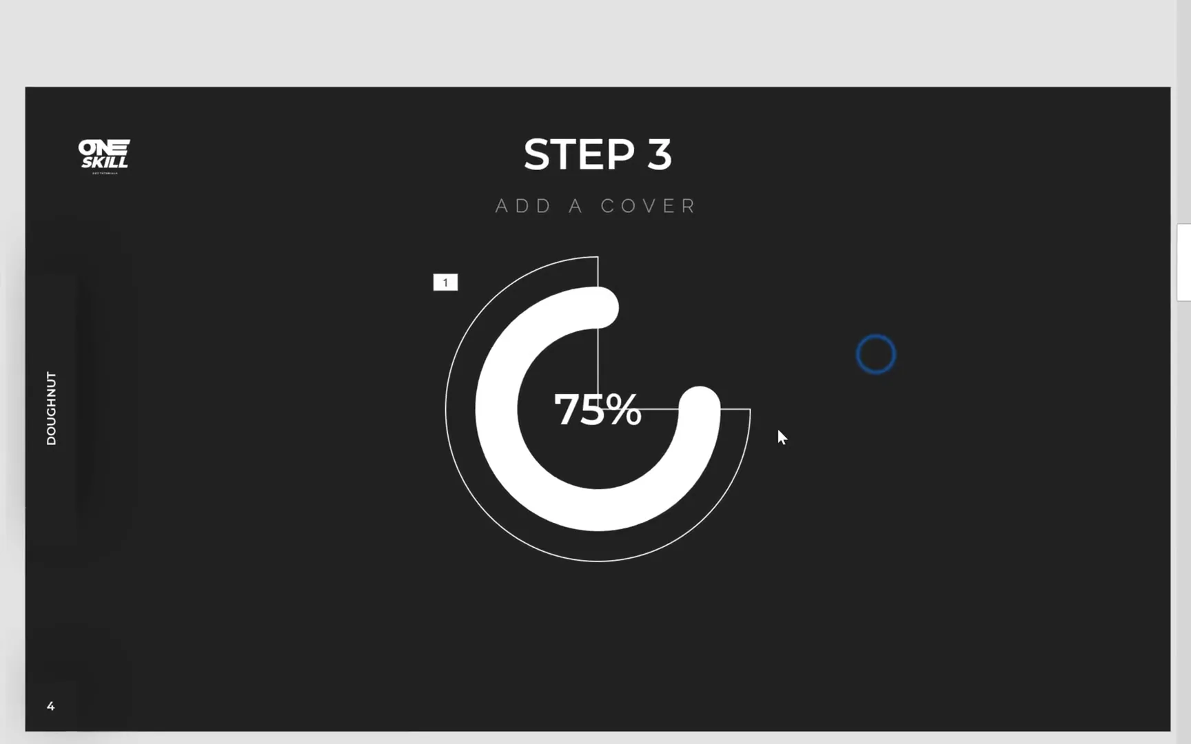
Step 4: Adding a Cover to Refine the Animation
To enhance the solid wheel animation and avoid unwanted visual artifacts, you need to add a cover shape that hides parts of the doughnut during the spin:
- Insert a Partial Circle shape from the shapes menu.
- Set the cover’s dimensions larger than the doughnut (e.g., 9 centimeters) and center-align it.
- Adjust the yellow handle to cover the doughnut entirely, leaving only the top half of the doughnut’s cap visible.
- Rename this shape to cover in the selection pane.
- Set the fill color of the cover to match the slide background and remove its outline by choosing No Line.
Initially, the cover will hide the doughnut, so you will animate the cover to exit gradually, revealing the doughnut in sync with the spin animation.
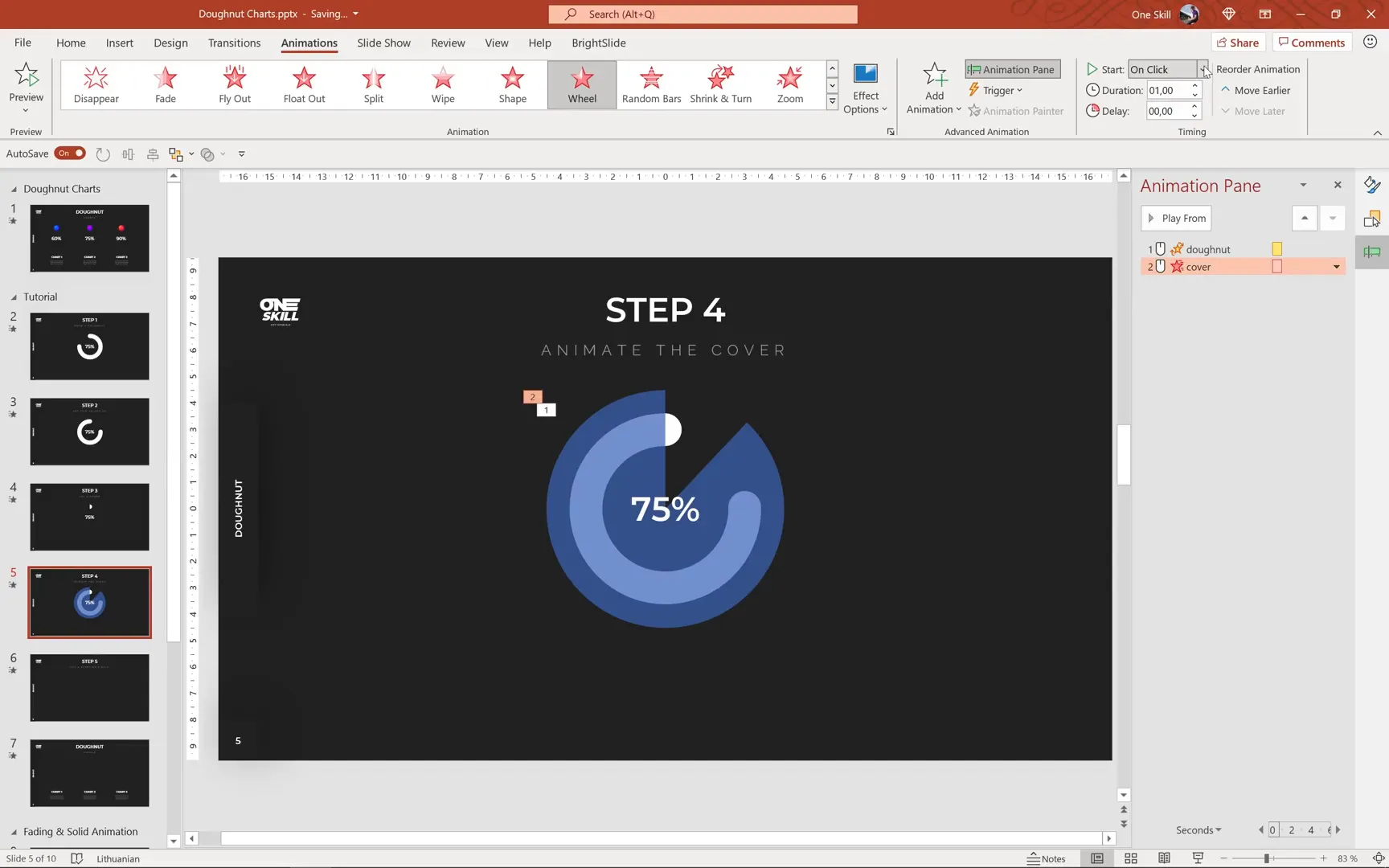
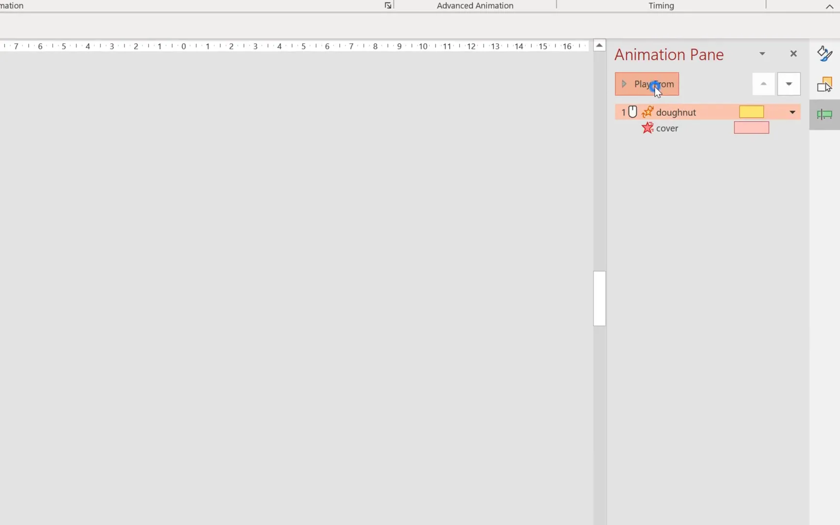
Step 5: Animating the Cover
Animate the cover to create the solid wheel effect:
- Select the cover shape and apply the Wheel exit animation.
- Set the animation duration to 1 second.
- Make the animation start With Previous to synchronize with the doughnut’s spin.
- Adjust the animation timeline for precise coordination.
This setup ensures the cover fades away as the doughnut spins, revealing the chart as if it’s being painted on.
Tweaking the Animation Timing
Sometimes, the solid wheel animation might show slight fading at the end, which can be distracting. To fix this:

- Add a small delay (e.g., 0.15 seconds) to the doughnut spin animation.
- Reduce the spin animation duration slightly (e.g., to 0.7 seconds) to tighten the effect.
- Preview the animation multiple times to ensure smoothness.
Fine-tuning these timing settings will polish your animation and make it look professional.
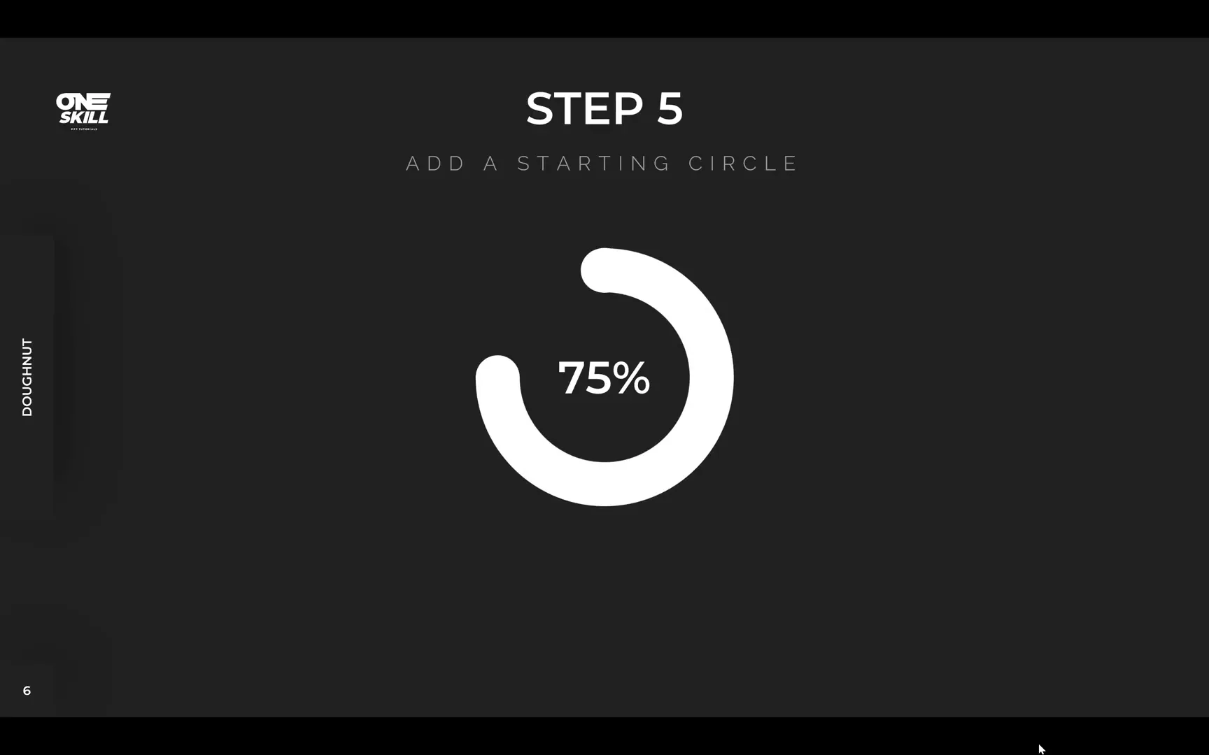
Step 6: Adding the Starting Circle for a Clean Finish
Similar to the fading wheel animation, the solid wheel animation benefits from a small circle at the start of the arc to keep the rounded cap visible throughout the animation:
- Insert a small circle shape at the beginning of the doughnut arc.
- Match its size to the width of the doughnut stroke.
- Rename it starting dot in the selection pane for clarity.
- Ensure it is perfectly aligned with the doughnut’s start point.
This finishing touch completes the solid wheel animation, making it appear as if the doughnut is being drawn fluidly.
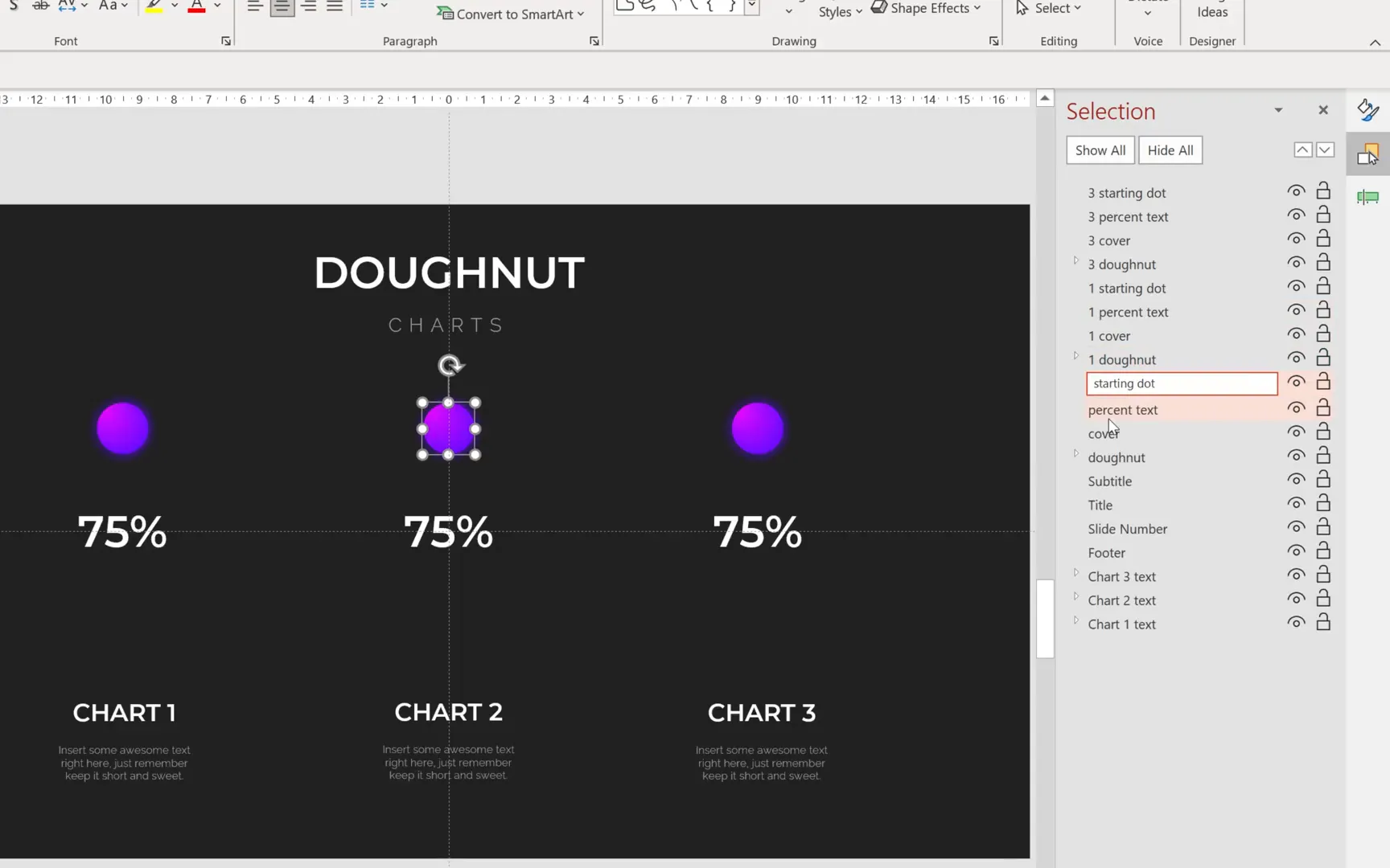
Step 7: Customizing Colors and Duplicating Charts
With the animation framework in place, it’s time to add color and create multiple doughnut charts representing different percentages. This not only makes your slides more vibrant but also demonstrates how versatile your design can be.
- Hide the cover shape to better see the doughnut and the starting circle.
- Use the Format Painter tool (
Ctrl + Shift + CandCtrl + Shift + V) to copy and paste colors and styles efficiently. - Adjust the starting circle’s size if desired; increasing it slightly (e.g., to 1.5 centimeters) can enhance the visual balance.
- Create two copies of the doughnut chart and arrange them horizontally on the slide using Ctrl + Shift while dragging to keep alignment.
- Rename and organize the shapes in the selection pane to keep track of which elements belong to which chart.
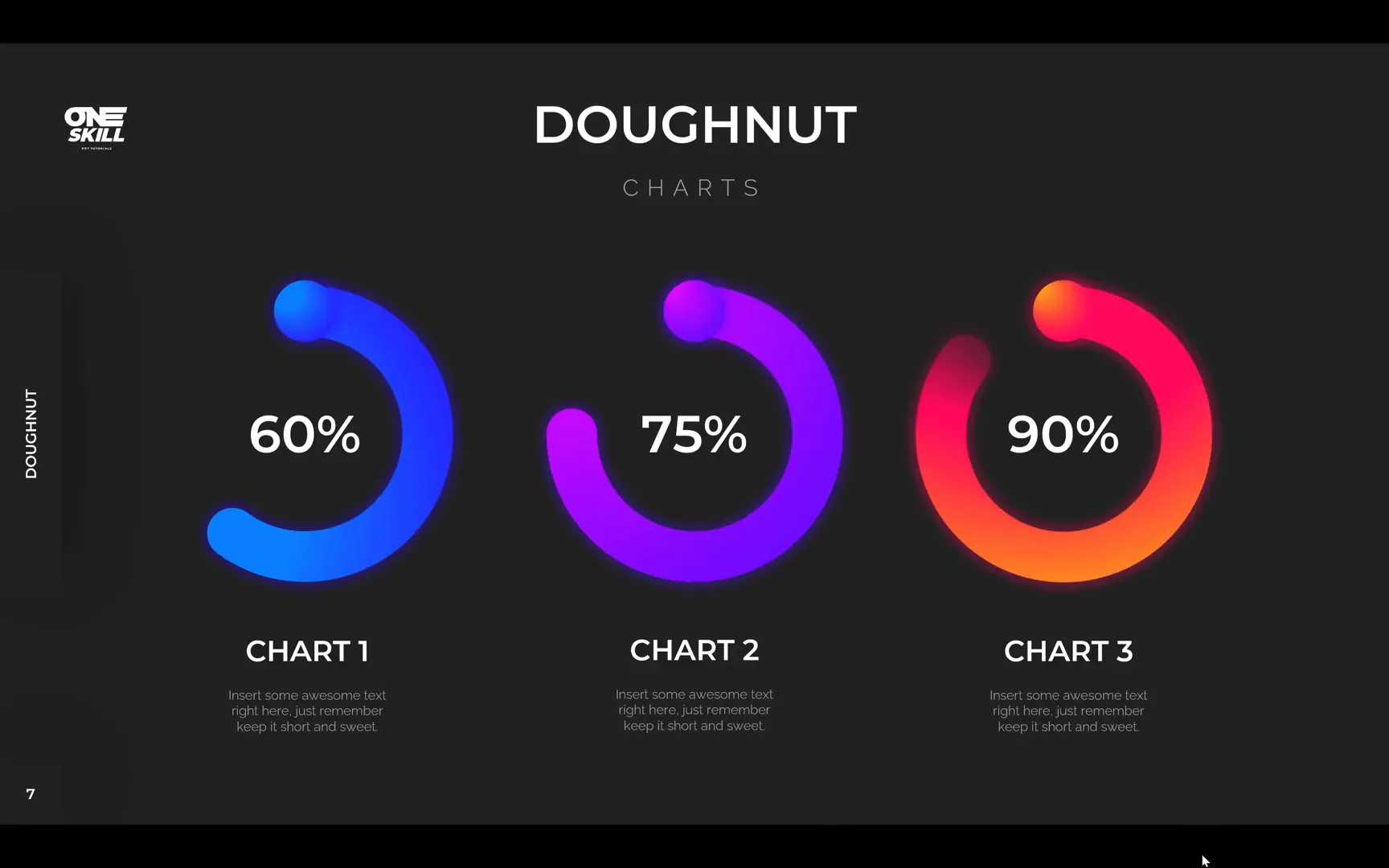
Having multiple doughnut charts allows you to showcase varying data points side-by-side, such as 60%, 75%, and 90% completion rates.
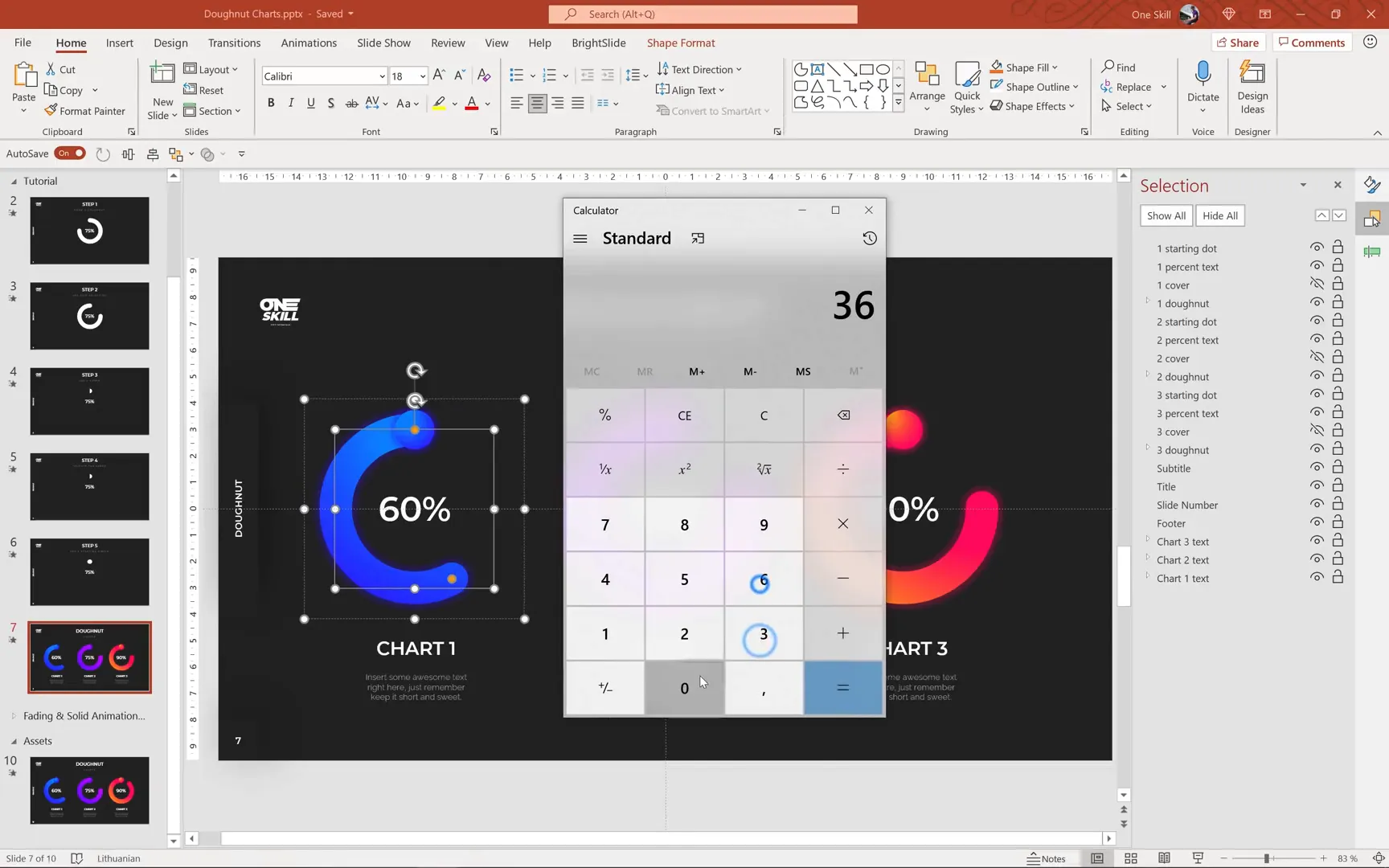
Step 8: Adjusting Doughnut Lengths and Spin Degrees for Different Percentages
Each doughnut chart must reflect the correct percentage by adjusting the arc length and spin degrees:
- Use the yellow handle to adjust the arc length for each chart:
- 60% corresponds to a shorter arc
- 75% is the middle arc length
- 90% is the longest arc
- Calculate the spin degrees by multiplying 360 by the percentage decimal:
- 60% → 216 degrees
- 75% → 270 degrees
- 90% → 324 degrees
- Update the spin animation settings for each chart accordingly.
- Adjust the cover shape to ensure it correctly hides the doughnut during the spin animation, especially for the 90% chart.
These adjustments guarantee that each chart accurately represents its data point with consistent animation quality.
Final Touches and Troubleshooting
After setting up the animations and colors, preview the entire slide show to observe the charts in action. You may notice minor issues such as:
- Unintended fading effects at the end of animations.
- Misalignment of covers or arcs.
- Incorrect animation timings.
To fix fading issues, reduce the delay in the spin animation (e.g., from 0.15 seconds to 0.1 seconds). Ensure that all elements are perfectly aligned and grouped where necessary. Consistent naming in the selection pane will help you navigate and troubleshoot your slide elements efficiently.
Summary: Bringing Your Doughnut Charts to Life
By following these detailed steps, you now have the tools and techniques to create stunning animated doughnut charts in PowerPoint. You’ve learned how to:
- Design a precise doughnut shape using arcs and circles.
- Apply two distinct animation styles: fading wheel and solid wheel.
- Use spin animations and cover shapes to simulate drawing effects.
- Customize colors and duplicate charts for multiple data points.
- Troubleshoot common animation issues for a polished result.
Animated doughnut charts add a professional and dynamic touch to your presentations, making complex data visually appealing and easier to understand. With practice, these skills will become an integral part of your PowerPoint toolkit.
Frequently Asked Questions (FAQ)
Can I create animated doughnut charts in older versions of PowerPoint?
While the techniques shown here are optimized for Microsoft 365, many features like shapes, grouping, and basic animations are available in older versions. However, some advanced animation options or the interface layout may differ.
How do I calculate the spin degree for other percentages?
Simply multiply 360 degrees by the decimal equivalent of your percentage. For example, for 40%, multiply 360 by 0.4 to get 144 degrees.
Can I use these animated doughnut charts for other types of data visualization?
Absolutely. Animated doughnut charts are versatile and can be adapted to represent progress, proportions, comparisons, or any data where part-to-whole relationships matter.
Is there a way to automate these animations for multiple charts?
PowerPoint does not have built-in automation for this specific animation, but using the Animation Painter tool can help quickly copy animation effects from one object to another, saving time.
What are some best practices for using animated charts in presentations?
- Use animations sparingly to avoid distraction.
- Keep animations smooth and consistent across slides.
- Ensure animations support your message and improve understanding.
- Test animations on the presentation device beforehand to prevent technical issues.
Further Learning and Resources
To deepen your PowerPoint skills, consider exploring online learning platforms like Skillshare, which offers curated classes on animation, design, and presentation techniques. For example, the class Video for Instagram: Tell an Engaging Story in Less Than a Minute offers great insights into storytelling and visual editing techniques that can enhance your video and presentation content.
Additionally, One Skill PowerPoint offers a dedicated course on creating modern PowerPoint templates, which includes step-by-step instructions on customizing templates to fit your unique style and needs.
By continuously learning and experimenting with these tools, you can create presentations that not only inform but also inspire and engage your audience.
Happy presenting, and may your slides always dazzle!
Check out the full video: Animated PowerPoint Slide Design Tutorial 🔥Doughnut Charts🔥


