

Creating visually engaging presentations is essential for capturing your audience’s attention and effectively communicating your message. One powerful visual tool you can add to your PowerPoint arsenal is a 3D bar graph slide with dynamic sliding animations. This tutorial guides you step-by-step through the process of designing a professional 3D bar graph slide in PowerPoint that not only looks impressive but also functions interactively with sliding effects to display different data points.
Whether you’re presenting business metrics, survey results, or any quantitative data, this PowerPoint 3D bar graph slide tutorial will help you build a clean, animated, and customizable bar graph slide from scratch. This article breaks down the entire workflow—from building the 3D bars to adding percentage labels, icons, shadows, and finally animating the slide for smooth transitions.
Table of Contents
- Getting Started: Setting up Your PowerPoint Slide
- Creating the 3D Bars: Shapes and Alignment
- Applying Color and 3D Effects for Depth
- Adding Percentage Labels with 3D Text Effects
- Inserting and Matching Icons to Bars
- Enhancing the 3D Perspective with Shadows and Shapes
- Adding Large 3D Numbers for Bar Identification
- Grouping Objects for Easy Animation
- Animating the Slide for Sliding Bar Effect
- Frequently Asked Questions
- Conclusion
Getting Started: Setting up Your PowerPoint Slide
Begin by adding a new slide in your PowerPoint presentation. For clarity and visual comfort, choose a light-colored background, which helps the 3D bars and text to stand out.
Next, enable guides to help with precise alignment of shapes and objects throughout the slide. To do this, go to the View tab and check the Guides option. These guides will serve as your visual aid when positioning shapes.
Creating the 3D Bars: Shapes and Alignment
The foundation of the 3D bar graph lies in clever use of PowerPoint shapes. Here’s how to build each bar:
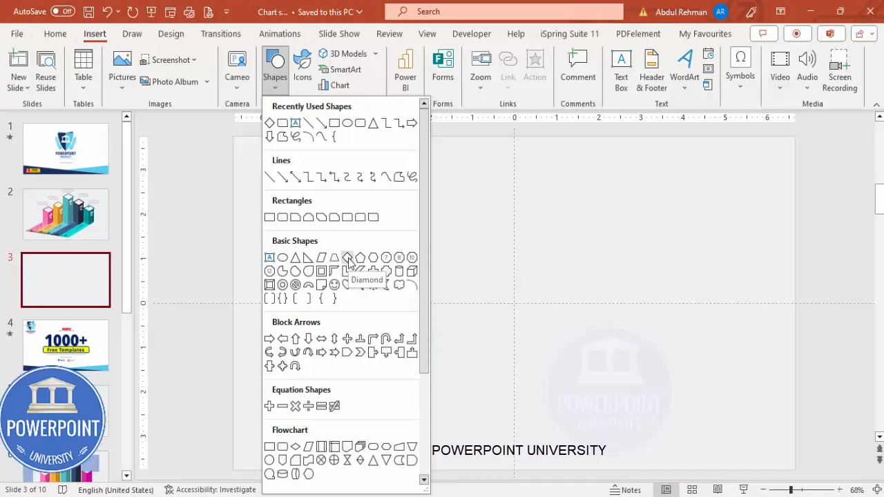
- Insert a diamond shape from the Insert > Shapes > Basic Shapes menu.
- Remove the shape outline by setting it to No Outline.
- Resize the diamond shape to a height of 0.91 inches and width of 1.62 inches.
- Center-align the diamond shape horizontally on the slide, then drag it downward slightly to position the base of your 3D bar.
- Hold the Ctrl + Shift keys and drag upwards to create the height of the bar, adjusting it to match the percentage value you want to represent.
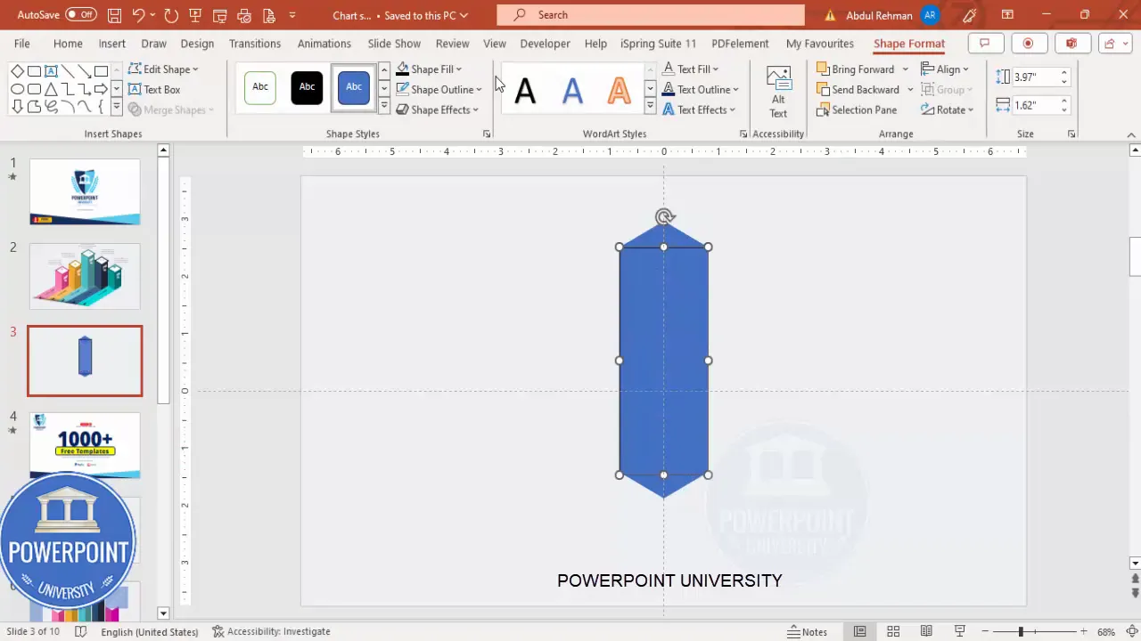
To create the illusion of a 3D bar, cover the diamond shape with a rectangle:
- Insert a rectangle shape, starting from the center of the diamond shape’s top to the center of the diamond shape’s bottom.
- Remove the outline and apply a fill color of your choice.
- Set the rectangle’s transparency to about 20% to allow layering effects.
- Zoom in and ensure the rectangle perfectly covers the diamond without any overflow or gaps, especially at the top and bottom.
Once you have created one bar, duplicate it by holding Ctrl + Shift and dragging to the left and right to create multiple bars (five bars in this example). Adjust the height of each bar to represent different percentages while keeping the width consistent.
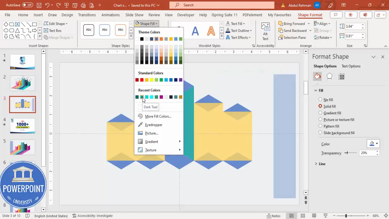
Applying Color and 3D Effects for Depth
To enhance the 3D effect, we need to segment the bar shapes and apply different color shades:
- Insert a rectangle over the top half of the bar and make it transparent.
- Use the Merge Shapes > Fragment tool to split the diamond and rectangle shapes into separate parts.
- Delete unnecessary fragments to isolate the four main parts of the bar (top diamond, rectangle body, bottom diamond, and shadow).
- Apply darker colors to the front faces and lighter colors to the top and side faces to simulate light and shadow.
- Group these parts together (Ctrl + G) for easier manipulation.
- Repeat this process for each bar, using different color combinations to distinguish them.
Ensure no transparency remains on the colored shapes to maintain crisp visuals.
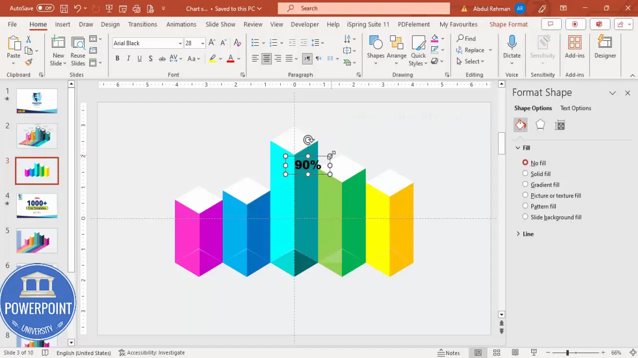
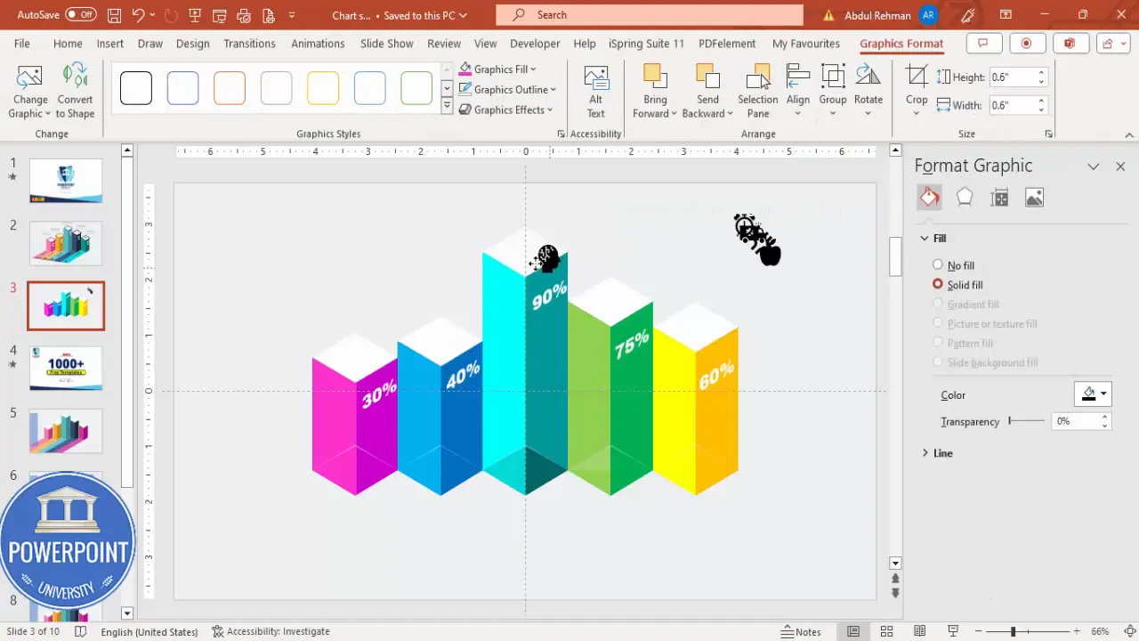
Adding Percentage Labels with 3D Text Effects
Adding clear percentage labels on each bar helps viewers quickly grasp the data values. Here’s how to add and style them:
- Insert a text box and type the percentage value (e.g., “90%”).
- Use a bold, legible font such as Arial Black, and increase the font size to around 28 for visibility.
- Center-align the text box over the respective bar.
- Adjust the 3D rotation of the text by selecting Text Effects > 3D Rotation Presets and choosing a parallel isometric right-up style for a consistent 3D look.
- Make the font color white or a contrasting color for readability.
- Duplicate the text box (Ctrl + D) and update the percentage values for other bars accordingly.
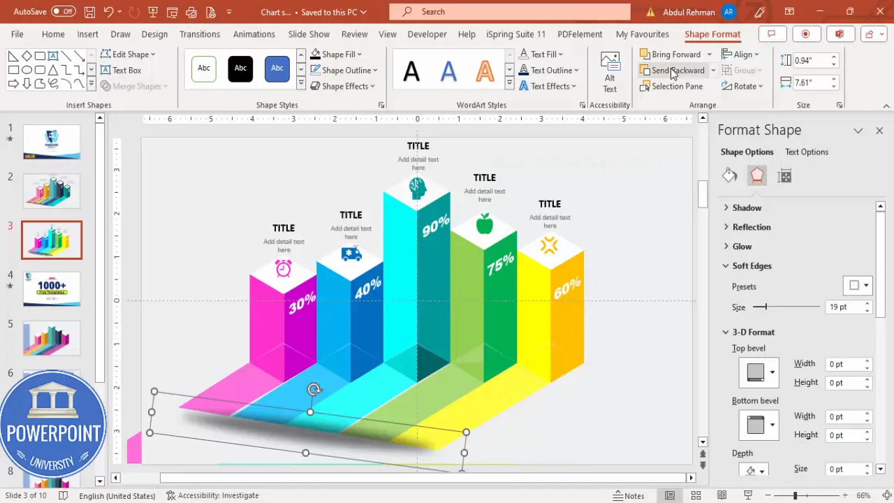
Inserting and Matching Icons to Bars
Icons add visual interest and help represent categories or topics associated with each bar. To add icons:
- Go to Insert > Icons and choose icons relevant to your data or presentation theme.
- If icons are slow to load or unavailable, you can also insert icons saved locally on your computer.
- Adjust the size of each icon to around 0.6 inches in height and width for uniformity.
- Place the icons near the base or top of each bar, depending on your design preference.
- Use the Eyedropper tool under Graphic Format to match the icon colors exactly to the bar colors for a cohesive look.
Enhancing the 3D Perspective with Shadows and Shapes
To make the 3D bars appear even more realistic, add shadows and perspective shapes:
- Insert a rectangle shape matching the size of the bar tops and fill it with a gray color, removing outlines.
- Add right triangles, flipped horizontally, near the base of the bars to simulate depth.
- Use Merge Shapes > Union and Subtract to create custom shadow shapes that fit perfectly with the bars.
- Ensure all shapes are aligned precisely to avoid gaps that break the illusion.
- Send these shadow shapes to the back and adjust their fill colors to lighter tones matching the bar colors.
- Add an oval shape with black fill and increased transparency, softened with shadow effects, placed beneath the bars as a subtle shadow.
These subtle details contribute significantly to the overall 3D effect and make the slide visually appealing.
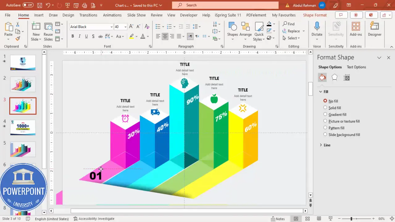
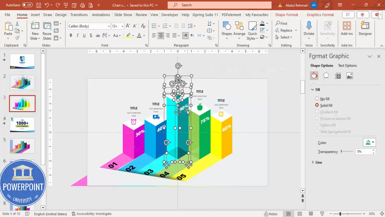
Adding Large 3D Numbers for Bar Identification
Adding large numbers to identify each bar adds clarity and professionalism to your graph:
Create Slides in Seconds with ExpertSlides AI |
|
Generate AI Presentations today: |
| TRY NOW! |
- Insert text boxes with numbers like “01,” “02,” “03,” etc., using Arial Black font and a large font size.
- Apply 3D rotation presets to these numbers, experimenting with different angles to see which fits best.
- Position the numbers above or beside each bar to act as labels.
- Duplicate and position the numbers for all bars accordingly.
Grouping Objects for Easy Animation
To streamline animation and slide management, group related objects:
- Select all parts of a single bar, including shapes, labels, and icons, and group them with Ctrl + G.
- Group shadows and perspective shapes separately but consistently for each bar.
- Make sure all groups are properly aligned and layered, sending background elements to the back as needed.
- This grouping makes it easier to apply animations and edit the slide later without accidentally moving pieces out of place.
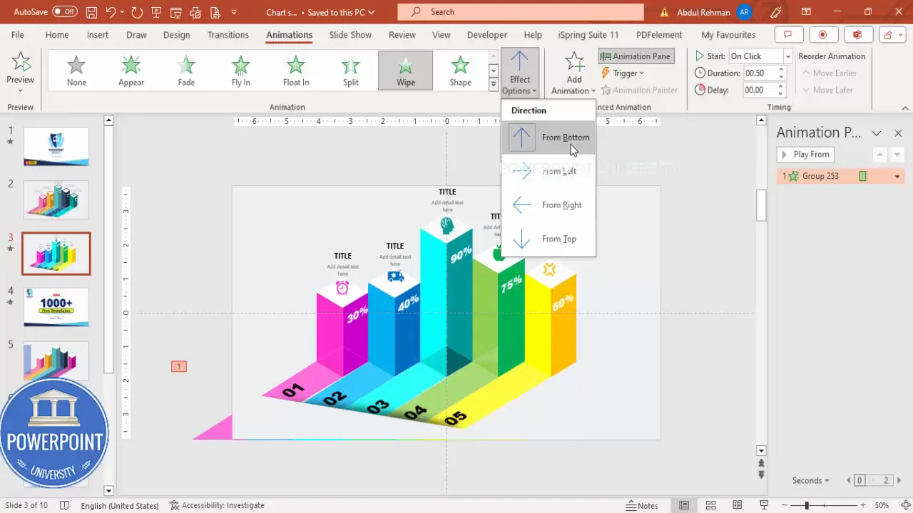
Animating the Slide for Sliding Bar Effect
Now that your 3D bar graph is constructed, it’s time to add dynamic animations to create a sliding effect that reveals each bar sequentially:
- Open the Animations tab and enable the Animation Pane for better control.
- Select the first bar group and add a Wipe animation that wipes upward from the bottom.
- Add a Stretch animation from the bottom for the rectangle parts to enhance the sliding effect.
- Set the second animation to start After Previous for smooth sequencing.
- Use the Animation Painter to copy these animations to the other bar groups.
- Adjust the timing of each animation in the animation pane to ensure they play one after the other, creating a smooth flow.
- Preview the animations by playing the slide to confirm the sliding bars appear as expected.
Frequently Asked Questions
What version of PowerPoint is best for creating 3D bar graph slides?
PowerPoint 2016 and later versions, including Microsoft 365, provide the best support for advanced shapes, merge tools, and animations needed for 3D bar graph slides.
Can I customize the colors and number of bars?
Absolutely! The tutorial allows you to add as many bars as needed and customize their colors to match your brand or presentation theme.
Is it possible to add icons other than the ones available in PowerPoint’s icon library?
Yes. If you have custom icons or images saved on your computer, you can insert them as images to use instead of or alongside the built-in icons.
How do I ensure my animations run smoothly during the presentation?
Test your animations several times in Slide Show mode before presenting. Use the Animation Pane to fine-tune the timing and order of animations.
Can I save this 3D bar graph slide as a template for future use?
Yes. Save your presentation as a PowerPoint template (.potx) to reuse the 3D bar graph slide in other presentations.
Are there any tips to make the 3D bar graph more visually appealing?
Pay attention to alignment, color contrast, and consistent font usage. Using shadows and light effects as shown enhances the 3D illusion significantly.
Conclusion
This PowerPoint 3D bar graph slide tutorial equips you with a detailed roadmap to design an impressive, animated 3D bar graph slide from scratch. By leveraging PowerPoint’s shape tools, merge features, color fills, and animation capabilities, you can create a professional bar graph that not only presents data clearly but also captivates your audience.
Remember, the key steps include setting up your slide with guides, building precise 3D bars using diamond and rectangle shapes, applying color gradients to simulate depth, adding percentage labels and icons for clarity, enhancing the design with shadows and perspective shapes, grouping objects for smooth animation, and finally animating the bars for a dynamic sliding effect.
With practice, you can customize this technique further to fit your unique presentation needs—whether that’s tweaking colors, adding more bars, or adjusting animations. This approach helps elevate your PowerPoint skills and creates slides that leave a lasting impression.
For those looking to save time, consider downloading pre-made templates or exploring other PowerPoint tutorials that expand on animation and design techniques. But mastering this 3D bar graph slide is a fantastic step toward more engaging and visually compelling presentations.
Check out the full video: How to Create 3D Bar Graph Slide in PowerPoint


