
Creating dynamic and visually engaging presentations is essential for captivating your audience, and what better way to do it than by animating charts directly within PowerPoint? In this comprehensive tutorial, we’ll walk through the process of designing animated gauge charts—complete with scrolling numbers, smooth spinning arrows, and clickable buttons—all created seamlessly inside PowerPoint with a little Excel automation magic.
This guide is inspired by the expertise of One Skill PowerPoint, who demonstrates how to bring these animations to life using Microsoft 365 PowerPoint on Windows. Whether you’re looking to spice up a dashboard, a report, or any presentation that requires clear data visualization, this tutorial will equip you with the skills to create beautiful, interactive speedometer-style charts that convey data intuitively and stylishly.
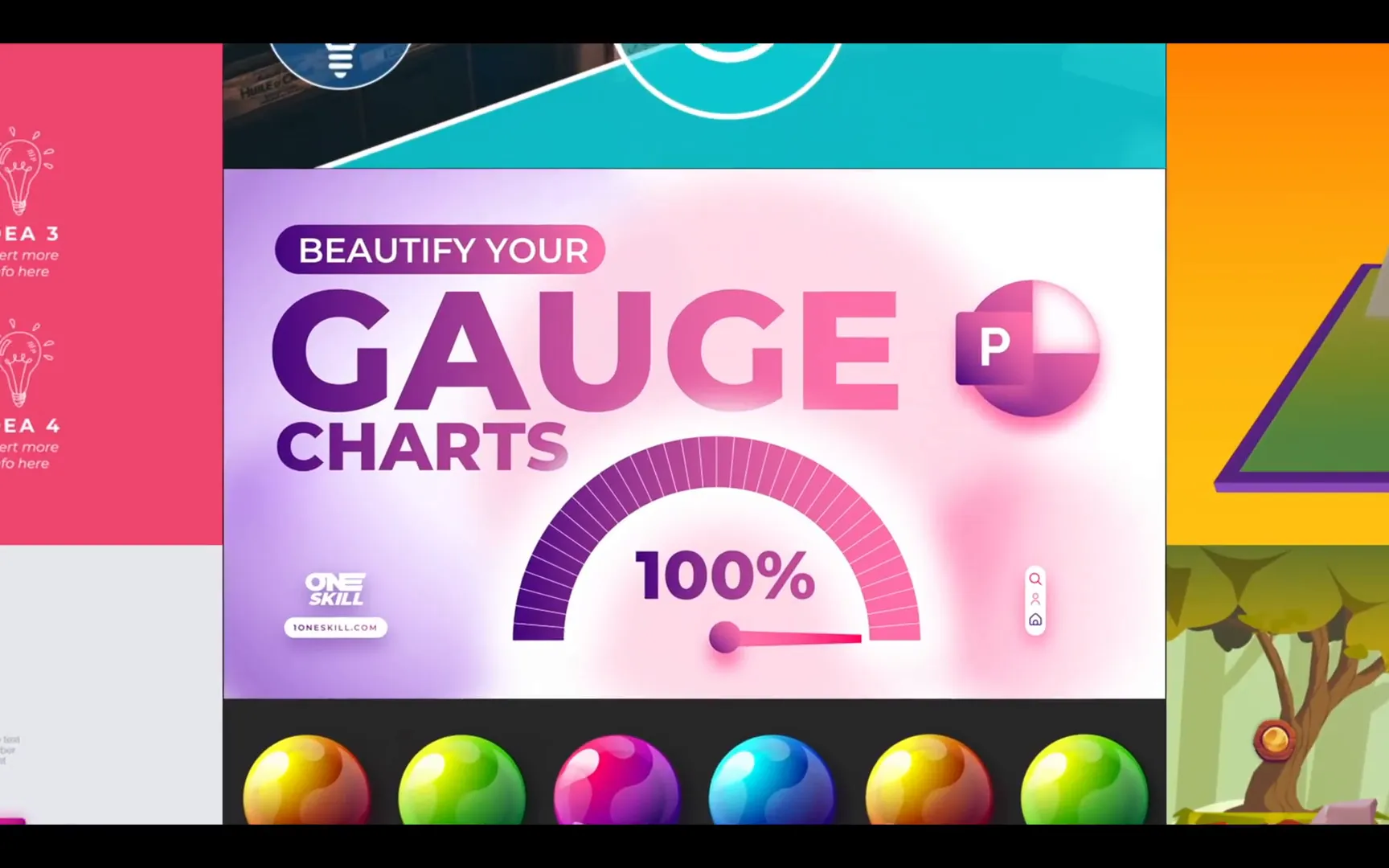
Table of Contents
- Getting Started: Fonts, Colors, and Slide Setup
- Creating the Gauge Chart: Step-by-Step
- Adding the Striped Effect to the Chart
- Designing the Chart Arrow
- Animating the Gauge Chart and Arrow
- Creating the Scrolling Numbers Effect
- Adding Percentage Symbol and Final Touches
- Integrating the Gauge into Your Presentation
- Creating a Clickable Button for Interactive Effects
- Animating a Comment Bubble
- Exploring Variations: The Green Version
- Conclusion: Bringing Your Data to Life with Animated Gauges
- Frequently Asked Questions (FAQ)
Getting Started: Fonts, Colors, and Slide Setup
Before diving into the chart creation, it’s crucial to set up your slide environment properly to ensure your designs look crisp and professional. Here are the key setup details you’ll want to follow:
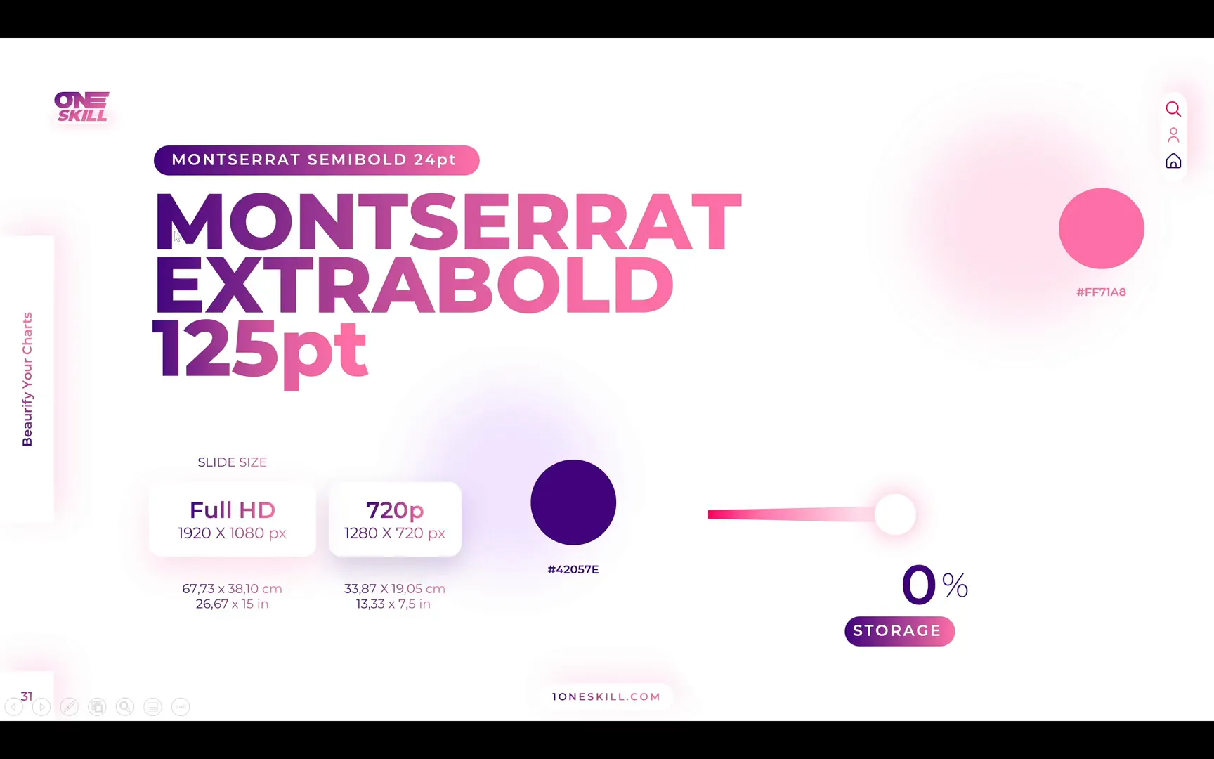
- Font Selection: Use the Montserrat font family for a clean and modern look. For subtitles, Montserrat Semi Bold works well, while slide titles should be Montserrat Extra Bold at a large size—One Skill PowerPoint uses 125 points.
- Slide Dimensions: Set your slide size to Full HD with a width of 67.73 cm and height of 38.10 cm. This custom size ensures your large text boxes don’t appear oversized, as they might in the default 720p resolution setting.
- Color Palette: Stick to two main colors: a dark purple (#4A148C) and a vibrant pink (#EC407A). These colors will be used to create attractive gradient fills for your charts and text.
Setting these basics upfront helps maintain consistency throughout your presentation and makes it easier to apply gradient fills and animations later on.
Creating the Gauge Chart: Step-by-Step
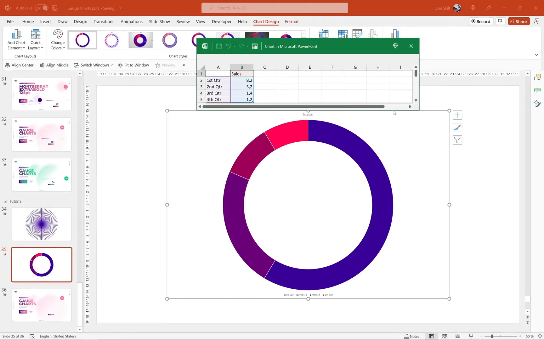
Inserting and Customizing the Donut Chart
The foundation of the animated speedometer is a donut chart, which allows for a hollow center perfect for adding an arrow pointer and other design elements.
- Open a new blank PowerPoint presentation.
- Go to the Insert tab, select Chart, and choose the Donut chart type.
- Once inserted, the default donut chart has four slices. Delete the third and fourth rows in the embedded Excel data to reduce it to two slices—one for the visible part of the gauge and one for the invisible part.
- Rename the first slice as Visible and the second as Invisible.
- Set the value for the visible slice to 100, and automate the invisible slice with a formula:
=200 - B2, so it dynamically updates based on the visible value.
This setup means whenever you change the visible value, the invisible slice automatically adjusts, keeping the total consistent at 200. This little Excel trick saves time and allows for easy updates.
Formatting the Donut Chart
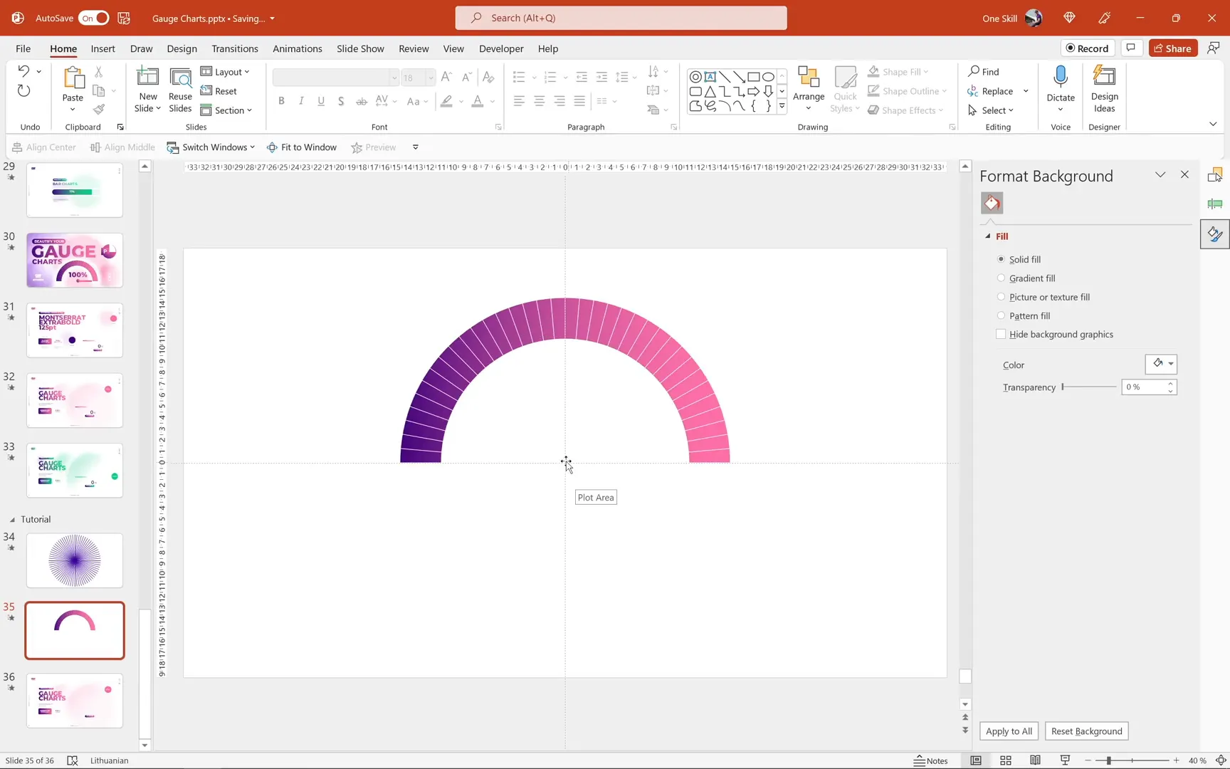
Next, customize the appearance of the donut chart to match the dark purple and pink gradient theme:
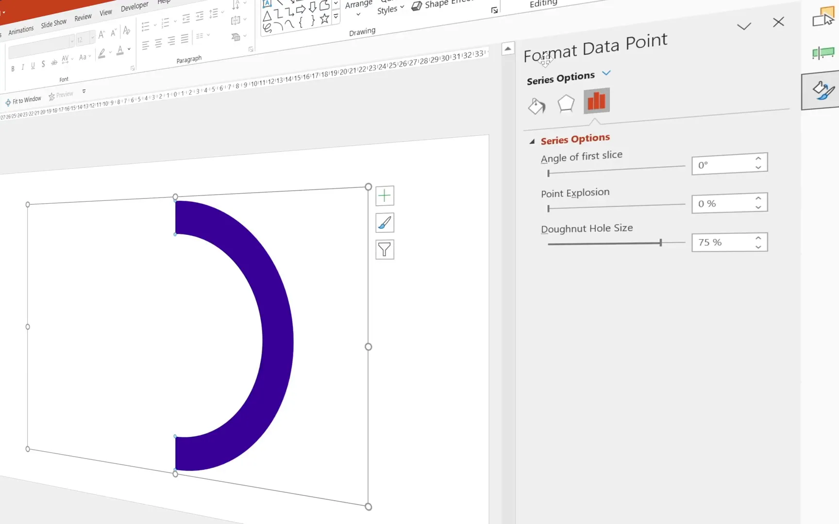
- Make the invisible slice fully transparent by selecting it, going to Format Shape > Fill and selecting No fill.
- Remove unnecessary chart elements such as the legend and chart title.
- Rotate the chart so the visible slice sits on the right. You can do this by adjusting the Angle of first slice in Series Options—setting it to 270 degrees works well.
- Apply a gradient fill to the visible slice using your dark purple and pink colors, creating a smooth transition that enhances the visual appeal.
Adding the Striped Effect to the Chart
To give the gauge a unique, dynamic look, you can create a subtle striped pattern over the donut chart. This involves drawing thin white rectangles arranged in a circular pattern and then masking them to the donut shape.
Creating and Arranging the Stripes
- Activate slide guides for precise alignment.
- Insert a thin rectangle shape (height approx. 0.25 cm), center it both horizontally and vertically on the slide.
- Duplicate the rectangle multiple times (Ctrl + D) and rotate each duplicate by an increment of 5 degrees, creating a full circular pattern of stripes.
- Adjust the height of the rectangles to make stripes thinner or thicker as desired; remember to realign them to the center after resizing.
- Fill all rectangles with white color for the stripe effect.
This approach uses rectangles instead of lines because you need to combine these shapes using PowerPoint’s Merge Shapes feature, which does not work with lines.

Masking the Stripes to the Donut Chart
Once the stripes are arranged, the next step is to restrict them only to the donut chart area:
- Insert a new donut shape matching the size of your chart.
- Select all your white stripes, then select the donut shape.
- Use Shape Format > Merge Shapes > Intersect to keep only the parts of the stripes that overlap with the donut.
The result is a clean, striped overlay perfectly fitted on your donut chart, adding depth and texture to your speedometer gauge.
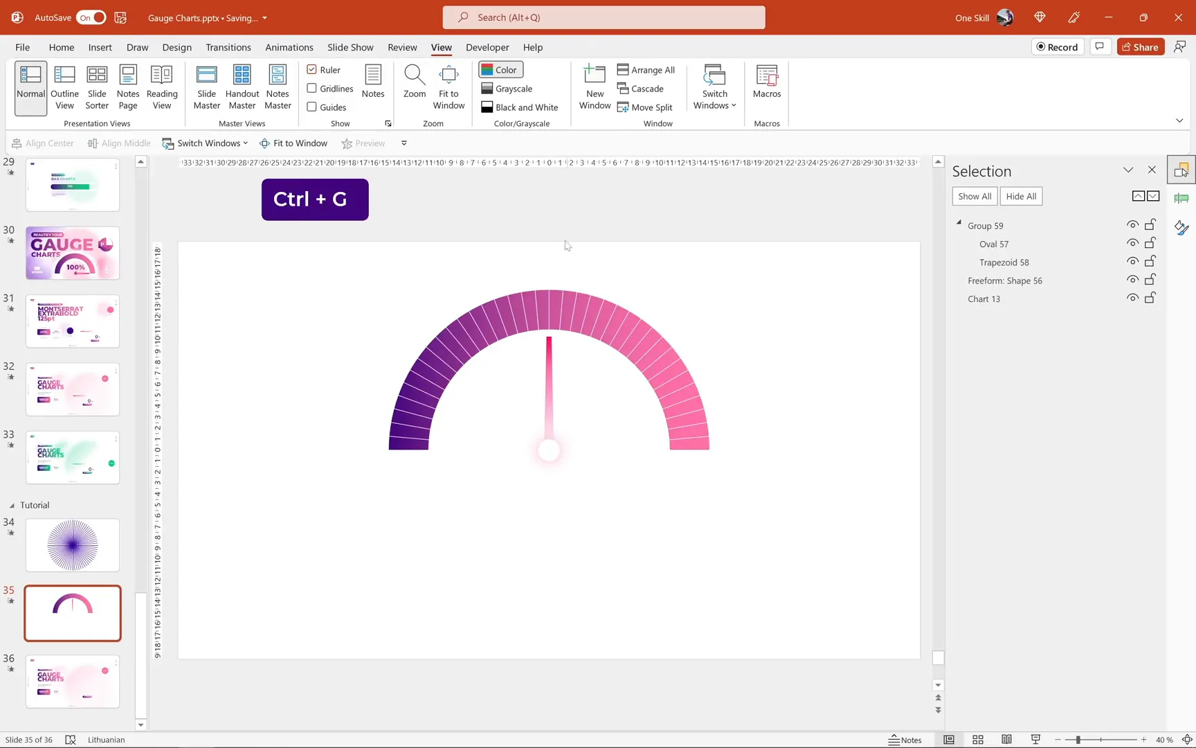
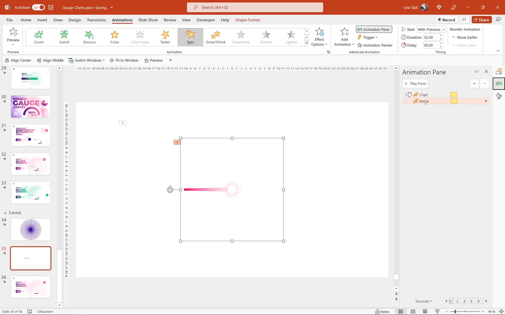
Designing the Chart Arrow
The arrow pointer is a crucial element that indicates the current value on the gauge. Here’s how to create and properly set up an arrow that rotates smoothly around the center:
Building the Arrow Components
- Insert a small circle at the center of the chart. This will serve as the base of the arrow.
- Draw a thin trapezoid shape to act as the arrow pointer.
- Style both shapes with the pink-purple gradient and hot pink shadow effects for consistency.
- Send the trapezoid behind the circle to create a layered look.
- Select both shapes and group them for easier manipulation.
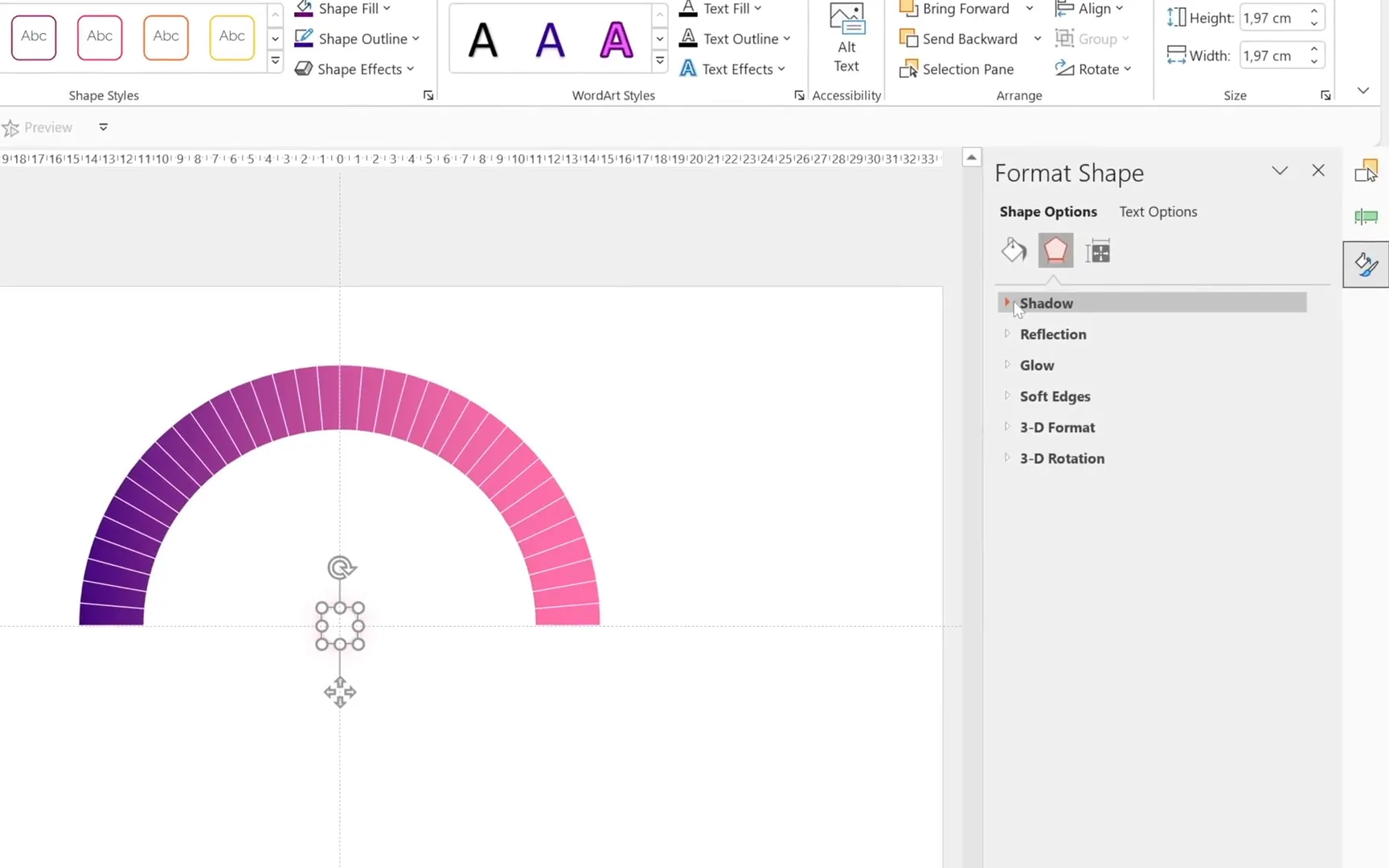
Adjusting the Arrow’s Rotation Center
By default, the rotation pivot of grouped shapes is at their center, which can cause the arrow to rotate improperly. To fix this:
- Insert a larger transparent circle around the arrow group, centered on the slide.
- Group the arrow group and this large circle together.
- Remove the outline of the large circle for invisibility.
- This new group now has its rotation center at the middle of the large circle, allowing the arrow to spin correctly around the gauge.
Reset the rotation angle to zero before proceeding to animations.
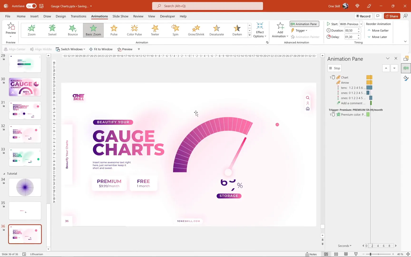
Animating the Gauge Chart and Arrow
Animating the Chart Spin
To create the effect of the gauge spinning from the bottom and then stopping at the correct value:
- Flip the chart vertically by adjusting the angle of the first slice from 270 degrees to 90 degrees.
- Apply a Spin animation to the chart, setting the rotation angle to 180 degrees.
- Adjust the animation timing with a smooth end of 1 second to create a natural deceleration effect.
- Modify the gradient direction so that the color transition animates correctly during the spin.
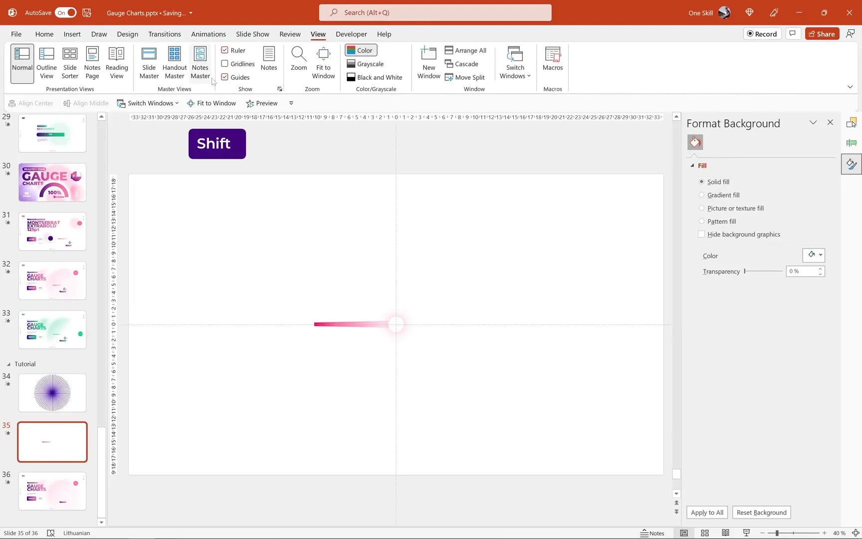
Creating a Mask to Hide the Bottom Part of the Chart
To ensure the chart appears to come from the bottom smoothly without showing the start position:
- Create a donut shape that covers the chart.
- Insert a rectangle covering the top half of this donut.
- Select both shapes and use Subtract from Merge Shapes to create a mask.
- Set this mask’s fill color to white and place it over the chart.
Animating the Arrow to Match the Chart
To synchronize the arrow rotation with the chart spin:
- Use the Animation Painter to copy the spin animation from the chart to the arrow group.
- Adjust the arrow’s spin angle to stop at the correct position based on the gauge value. For example, for 75%, multiply 180 degrees by 0.75 to get 135 degrees.
- Add a smooth start of 0.75 seconds to the arrow animation to align the speeds of the chart and arrow spins.
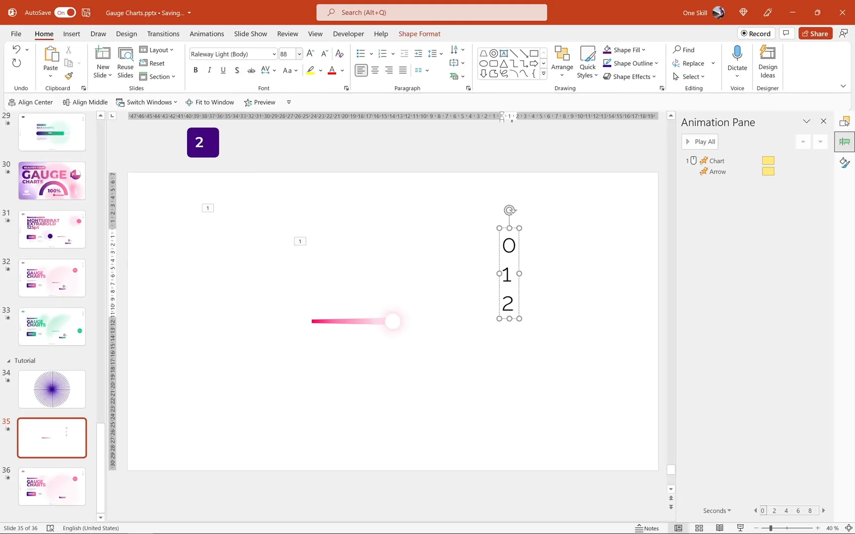
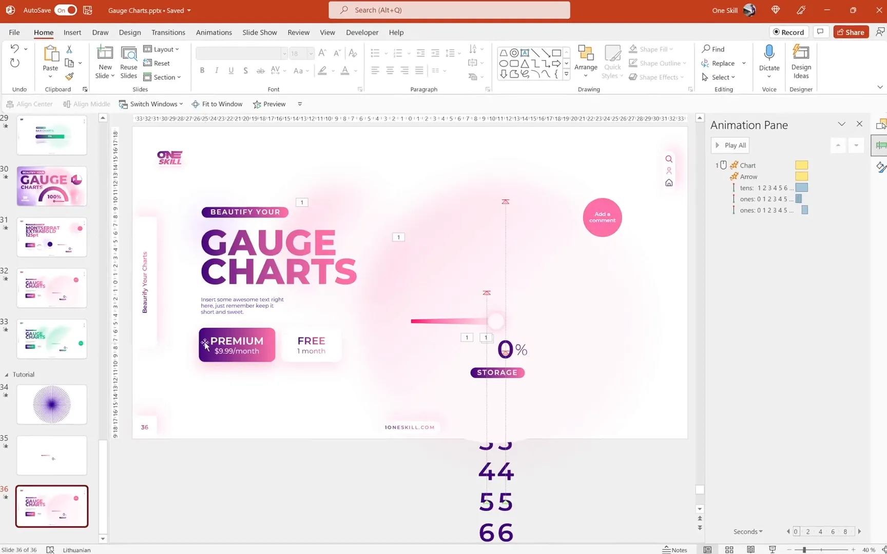
Creating the Scrolling Numbers Effect
One of the most eye-catching features of this gauge chart is the scrolling numbers at the bottom, which dynamically count up as the gauge spins. This effect is achieved using motion path animations on text boxes containing numbers.
Setting Up the Number Columns
- Insert two text boxes side by side below the arrow: one for the tens digit and one for the ones digit.
- In each text box, type numbers 0 through 9 vertically in a single column. For the tens text box, omit zero at the top since tens digit zero is not needed.
- Use Montserrat Semi Bold font, size 88, colored with the dark purple shade.
- Align both text boxes precisely using slide guides and arrow keys.
Animating the Tens and Ones Columns
Apply vertical motion path animations to create a scrolling effect:
- For the tens text box, add a motion path going up, adjusting the end position so the “7” aligns with the “0” in the ones box, matching the target value (e.g., 75).
- Set the motion path animation to start With Previous and tweak smooth start and smooth end for natural movement.
- Copy this animation to the ones text box using Animation Painter but adjust the end position so the “0” aligns with the starting “0”.
- For the ones box, add multiple short, fast repeated motion path animations to simulate fast scrolling, followed by a final slower motion path to land on the correct digit.
This layered animation technique creates the illusion of digits rapidly scrolling and then settling on the final number.

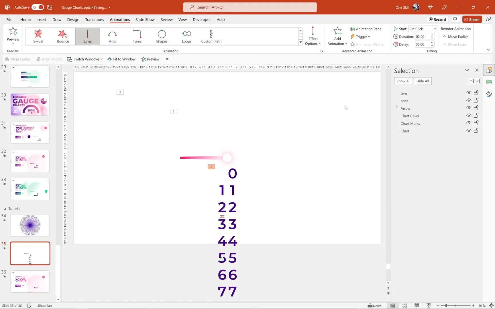
Adding Covers to Mask the Scrolling Numbers
To ensure only the relevant numbers are visible and the scrolling looks clean:
- Insert two white rectangles to cover the top and bottom parts of the scrolling number columns, leaving only the central number visible.
- Position and size these rectangles carefully so they mask all unwanted digits during animation.
- Group these covers with the number text boxes and place them below the chart layers in the selection pane.

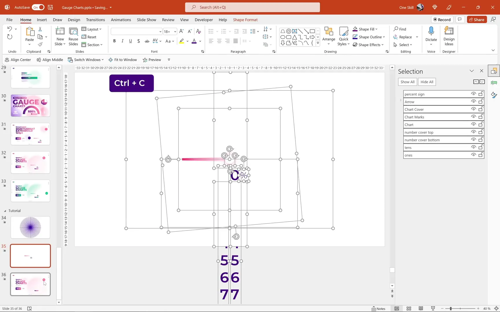
Adding Percentage Symbol and Final Touches
To complete the gauge, add a percentage sign near the scrolling numbers to indicate the unit:
- Insert a text box containing the percent symbol (%) and position it close to the right of the ones digit.
- Match the font style and color with the rest of the text for consistency.
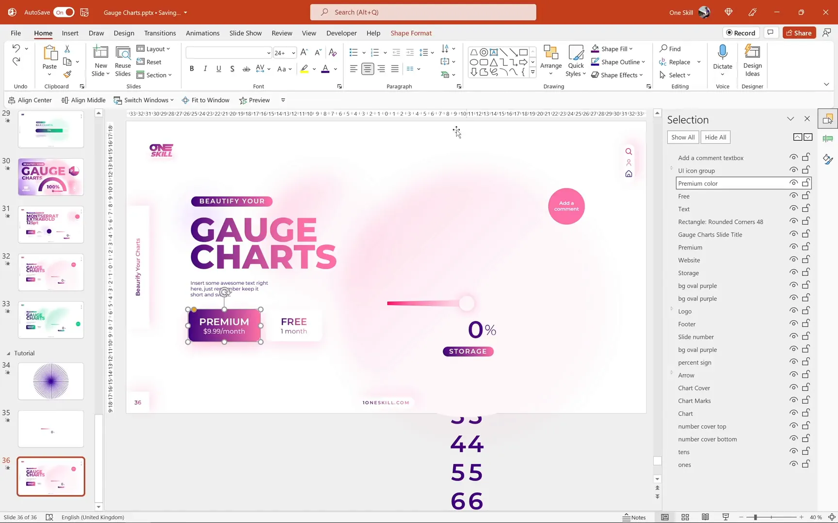
- Group all chart elements (donut chart, stripes, arrow, scrolling numbers, covers, and percent symbol) for easy movement and resizing.
Integrating the Gauge into Your Presentation
With your animated gauge complete, you can now place it into your existing slides:
- Copy and paste the grouped gauge chart into your desired slide, such as a dashboard or report slide.
- Adjust the position and size as needed.
- Ensure the number covers extend to the top edge of the slide to prevent unwanted numbers from showing.
- Test the animations in slideshow mode to confirm everything works smoothly.
Creating a Clickable Button for Interactive Effects
To add interactivity, you can create a clickable button that toggles between different chart styles or colors:
- Create two identical rounded rectangle shapes with distinct styling (e.g., one white and one colored).
- Align them perfectly on top of each other.
- Apply an Exit animation (e.g., Shape Out) to the colored button.
- Set the animation to trigger On Click of the white button, so clicking toggles the color visibility.
This method produces a smooth click effect, enhancing user engagement.
Animating a Comment Bubble
For added polish, animate a comment bubble or callout to appear gracefully after the chart animation:
- Select the bubble shape.
- Add a Basic Zoom entrance animation.
- Set the animation to start With Previous, delayed by about 1.3 seconds, with a duration of 0.5 seconds.
This subtle effect draws attention to the comment without distracting from the main gauge animation.
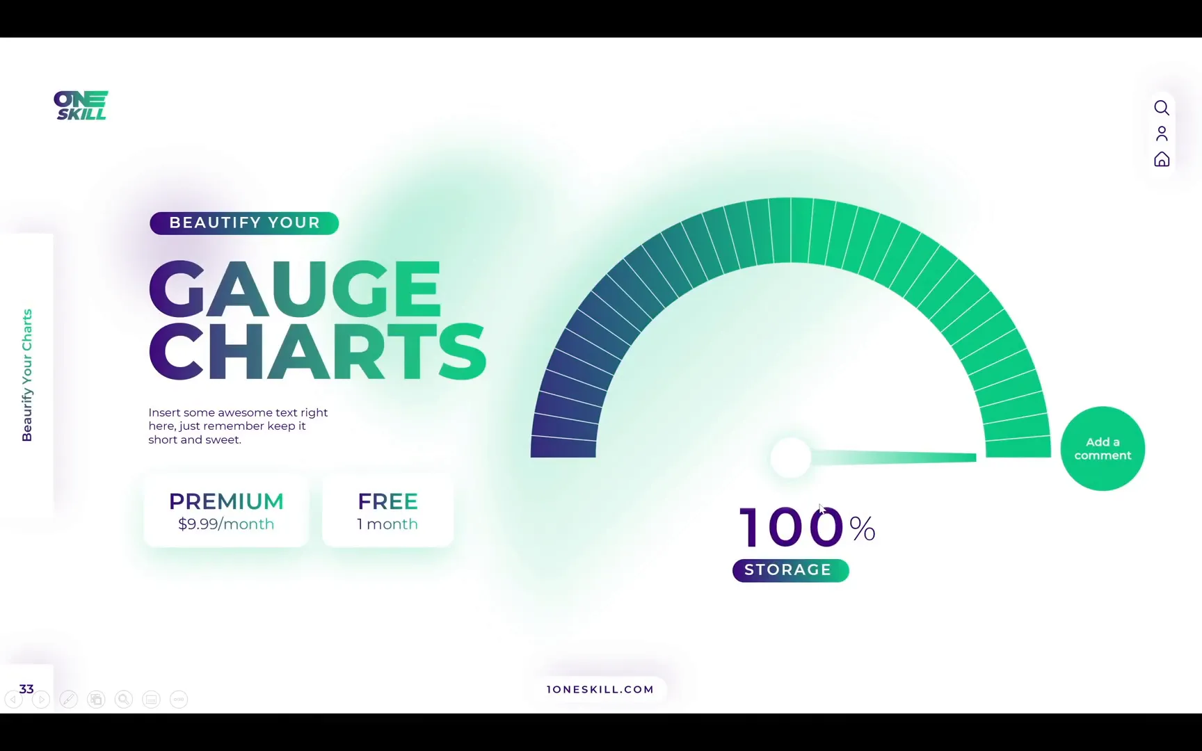
Exploring Variations: The Green Version
Besides the purple-pink gauge, you can easily create alternative color schemes, such as a green-themed gauge indicating 100%. The process is the same, with the main difference being:
- Use three number text boxes instead of two for displaying three-digit values.
- Adjust colors to green shades for the gauge and arrow.
This flexibility allows you to tailor the gauge to different branding or presentation needs.
Conclusion: Bringing Your Data to Life with Animated Gauges
By following this detailed guide, you can create stunning animated gauge charts in PowerPoint that not only look professional but also provide engaging, clear data visualization.
Key takeaways include:
- Using Excel data automation to manage chart slices dynamically.
- Applying gradient fills and stripes for visual richness.
- Designing custom arrows with precise rotation centers.
- Synchronizing spin animations between chart and pointer.
- Creating scrolling numbers using layered motion path animations.
- Adding interactive clickable buttons and animated comment bubbles.
These techniques will elevate your PowerPoint presentations, making them more interactive and visually appealing. Experiment with colors, sizes, and animation timings to best fit your content and audience.
Stay creative, and happy presenting!
Frequently Asked Questions (FAQ)
Q1: Can I create these animated gauge charts without Excel?
While PowerPoint alone can create donut charts, using Excel’s embedded data sheet allows for automation like calculating the invisible slice dynamically. This makes updating values easier and keeps the animation smooth. However, you can manually adjust values in PowerPoint if preferred, though it is less efficient.
Q2: Can these animations work in older versions of PowerPoint?
Animations like spin and motion paths are supported in PowerPoint 2010 and later, but some features like merge shapes might have limited functionality in very old versions. Using Microsoft 365 or PowerPoint 2019 ensures full compatibility.
Q3: How do I make the scrolling numbers show values other than 75%?
Simply update the visible slice value in the Excel data sheet linked to the donut chart. Then adjust the ending positions of the motion path animations on the tens and ones text boxes to align with the desired final digits.
Q4: Is it possible to change the gauge colors?
Absolutely. You can modify the gradient fill colors for the visible slice and adjust the colors of the arrow and numbers to match your branding or design preferences.
Q5: Can I add more digits for values over 99%?
Yes. For three-digit numbers, create an additional text box for the hundreds place and animate it similarly to the tens and ones boxes. This approach is demonstrated in the green version of the gauge chart.
Check out the full video: Excel Chart Animation in PowerPoint 🔥Speedometer🔥


