
If you want to make your PowerPoint slides more impressive and engaging, one of the most crucial elements to consider is the font style you choose. Fonts are not just about aesthetics; they play a key role in how your audience receives and understands your message. A well-chosen font can set the tone for your entire presentation and make your content easier to read and more visually appealing.
In this comprehensive guide, I’ll walk you through the best fonts to use in PowerPoint presentations, share tips on how to pair fonts effectively, and demonstrate how to customize fonts to elevate your slide decks. Whether you’re a seasoned presenter or just starting out, mastering PowerPoint fonts will help you create presentations that look professional and communicate clearly.
We’ll also explore how to access a wide variety of fonts and templates through Envato Elements, a powerful resource for creatives that offers thousands of stylish PowerPoint themes and custom fonts. Let’s dive in!

Table of Contents
- Why Fonts Matter in PowerPoint Presentations
- Understanding Font Types: Serif, Sans Serif, and Decorative Fonts
- Key Rules for Choosing PowerPoint Fonts
- Creating Effective Font Pairings in PowerPoint
- How to Customize Fonts in PowerPoint
- Top Five Fonts for PowerPoint Presentations
- Avoiding Common Font Mistakes in PowerPoint
- Expand Your Font Choices with Envato Elements
- Putting It All Together: A Practical Example
- Frequently Asked Questions (FAQ)
- Conclusion
Why Fonts Matter in PowerPoint Presentations
Your choice of font style does more than just add flair to your slides—it fundamentally affects readability and audience engagement. Fonts convey mood, professionalism, and clarity. A poor font choice can make your slides look amateurish or confusing, while the right fonts enhance your message and keep viewers focused.
PowerPoint font style sets the stage for your entire slide deck. It influences how your content is perceived and remembered. When you use fonts that are easy to read and visually appealing, your audience will find it easier to follow your story and retain the information you present.
To get started, it’s essential to understand the different types of fonts and when to use them.
Understanding Font Types: Serif, Sans Serif, and Decorative Fonts
Fonts generally fall into three categories: serif, sans serif, and decorative (or script) fonts. Each has unique characteristics and best-use scenarios in presentations.
Serif Fonts
Serif fonts are distinguished by the small “feet” or lines attached to the ends of their characters. These details help guide the eye along the text, improving readability, especially in printed materials or larger bodies of text.
Popular serif fonts include Georgia and Times New Roman. These fonts have a classic, elegant feel that works well for formal or professional presentations.
One of the biggest advantages of serif fonts in PowerPoint is their crisp readability. They help text stand out clearly on the slide without overwhelming the viewer.
Sans Serif Fonts
Sans serif fonts are similar to serif fonts but lack the “feet” on their characters. Their edges are smooth and rounded, giving them a clean, modern look.
Sans serif fonts are also easy to read, especially on digital screens, making them a popular choice for PowerPoint presentations. Fonts like Arial, Calibri, and Helvetica fall into this category.
Because of their straightforward design, sans serif fonts work well for both headings and body text. They provide a neat and uncluttered look that keeps your slides looking fresh and professional.
Decorative and Script Fonts
Decorative and script fonts are more stylized and artistic. They can add personality and flair to your slides, but they come with a big caveat: they are often difficult to read, especially from a distance.
While these fonts might look pretty, they can distract or confuse your audience, particularly if used for large blocks of text or important information. Use decorative fonts sparingly—perhaps only for slide titles or accent text—and always prioritize readability.
Remember, your audience might be sitting far from the screen, so it’s best to stick with serif or sans serif fonts for the majority of your presentation.
Key Rules for Choosing PowerPoint Fonts
When selecting fonts for your PowerPoint slides, keep these essential rules in mind to ensure your presentation is effective and visually appealing.
- Keep Text Readable: Choose fonts that are easy to read at a glance. Avoid overly intricate or thin fonts.
- Use Appropriate Sizes: Headings should be noticeably larger than body text to create a clear hierarchy.
- Limit the Number of Fonts: Stick to two or three complementary fonts to keep your slides cohesive.
- Ensure Contrast: Make sure your font color contrasts well with the slide background for maximum visibility.
- Be Consistent: Use the same fonts throughout your presentation to maintain a professional look.
Creating Effective Font Pairings in PowerPoint
Font pairing is a powerful design technique that involves combining two (or sometimes more) fonts to create visual interest and hierarchy. This generally means using one font for headings and another for body text.
For example, a serif font like Georgia can be paired with a sans serif font like Calibri to create a balanced and professional look. The serif font can be used for headings to grab attention, while the sans serif font is used for body paragraphs to ensure easy reading.
Another common approach is to use the same font family but different weights or sizes for headings and body text. For example, using Arial Bold for titles and Arial Regular for body text keeps things simple and clean.
Visual hierarchy is key here. Headings should be larger and bolder to stand out, while body text should be smaller but still readable. This guides your audience’s eyes naturally through the content.
How to Customize Fonts in PowerPoint
PowerPoint makes it easy to customize your fonts directly on the ribbon under the Home tab. Here’s a step-by-step guide to editing fonts in your slides:
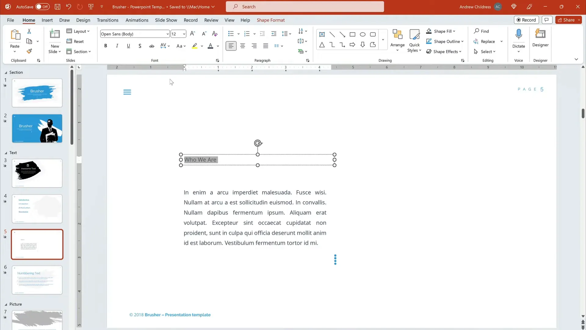
- Select the Text Box: Click on the text box containing the text you want to edit.
- Choose Your Font: On the Home tab, find the Font group. Use the dropdown menu to scroll through available fonts. Hovering over a font previews it on your slide.
- Adjust Font Size: Use the font size dropdown or the increase/decrease font buttons to resize your text. Remember, headings should be larger than body text.
- Apply Font Styles: You can also apply bold, italics, underline, or change the font color to enhance your text further.
By mixing and matching fonts and sizes, you can create a sleek, professional look for your presentation in just a few clicks.
Top Five Fonts for PowerPoint Presentations
While PowerPoint offers a vast array of fonts, some stand out as particularly well-suited for presentations due to their readability and professional appearance. Here are five top fonts I recommend for PowerPoint:
- Georgia: A classic serif font with excellent readability, perfect for headings and body text alike.
- Garamond: Another elegant serif font with a timeless look, great for body text or more formal presentations.
- Calibri: A modern sans serif font that is clean and easy to read, widely used in corporate presentations.
- Arial: A simple sans serif font that’s versatile and familiar to most audiences.
- Helvetica: Known for its clean lines and professional look, ideal for headings and bullet points.
These fonts strike a perfect balance between style and functionality, ensuring your slides look polished without sacrificing readability.
Avoiding Common Font Mistakes in PowerPoint
Even the best fonts can be undermined by poor usage. Here are some common mistakes to avoid when working with fonts in PowerPoint:
- Using Too Many Fonts: Avoid cluttering your slides with multiple fonts. Stick to two or three complementary fonts max.
- Choosing Overly Decorative Fonts for Body Text: These can be difficult to read and distract from your message.
- Using Small Font Sizes: Tiny text is unreadable to your audience, regardless of how beautiful the font is.
- Poor Contrast: Fonts that blend into the background color will make your text invisible from a distance.
- Ignoring Consistency: Changing fonts or styles mid-presentation can confuse your audience and reduce professionalism.
Always preview your slides on a large screen or projector to ensure your font choices work well in real presentation settings.
Expand Your Font Choices with Envato Elements
If you want to explore beyond the default PowerPoint fonts, Envato Elements is an incredible resource that offers thousands of stylish PowerPoint templates and custom fonts to choose from.
Envato Elements provides an all-you-can-download subscription model, giving you access to millions of digital assets including:
- Stock photos
- Music and sound effects
- Graphics and illustrations
- Thousands of custom fonts
- PowerPoint templates
Using Envato Elements, you can browse through a vast library of fonts and themes to find the perfect style that matches your presentation’s tone and purpose. You can download these assets and easily integrate them into your PowerPoint slides, ensuring your presentations are always fresh, unique, and professional.
Putting It All Together: A Practical Example
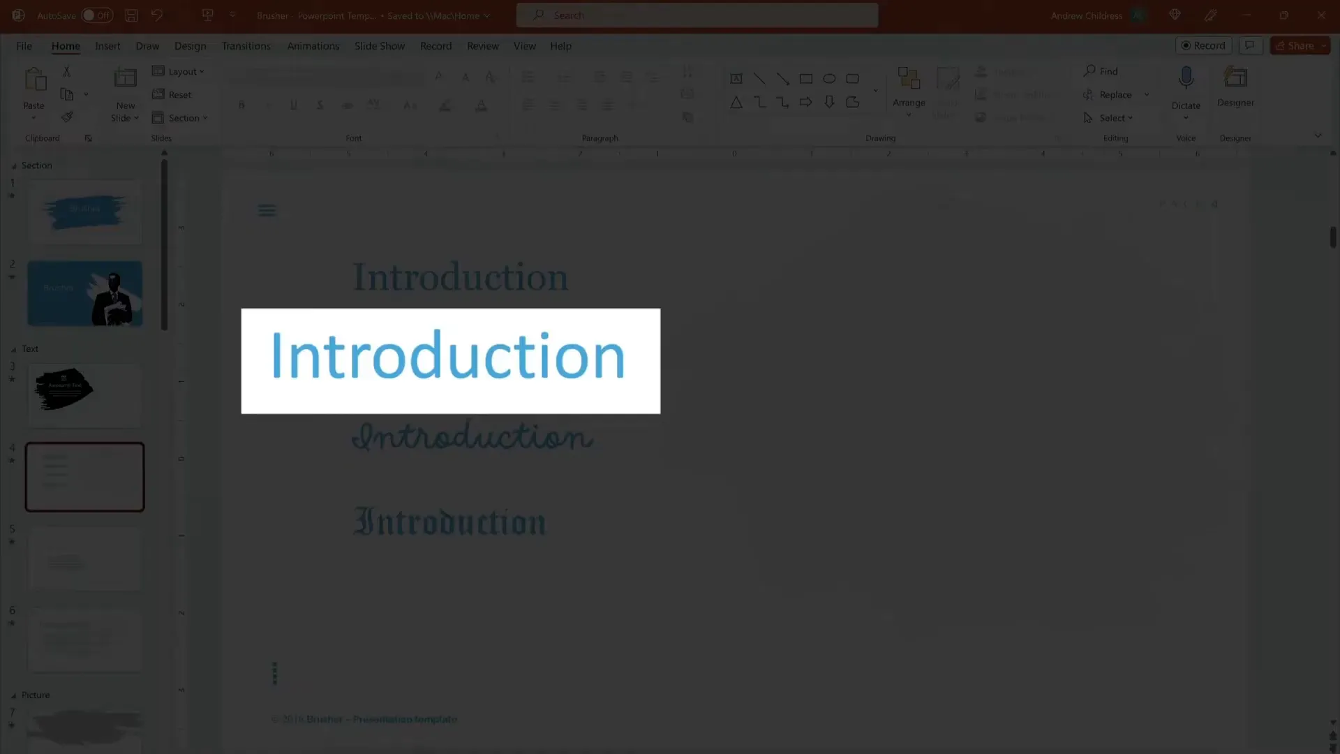
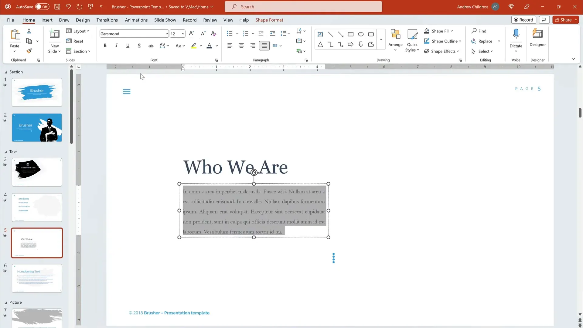
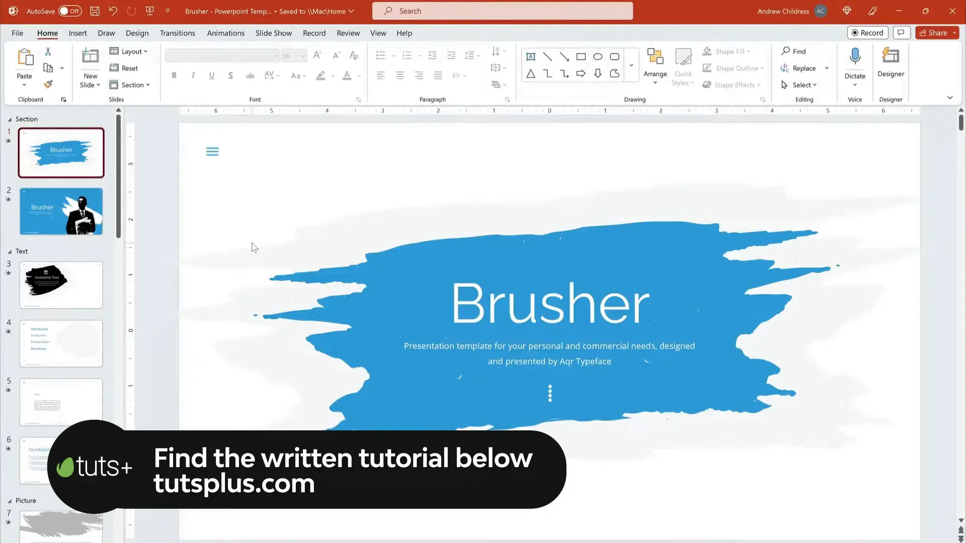
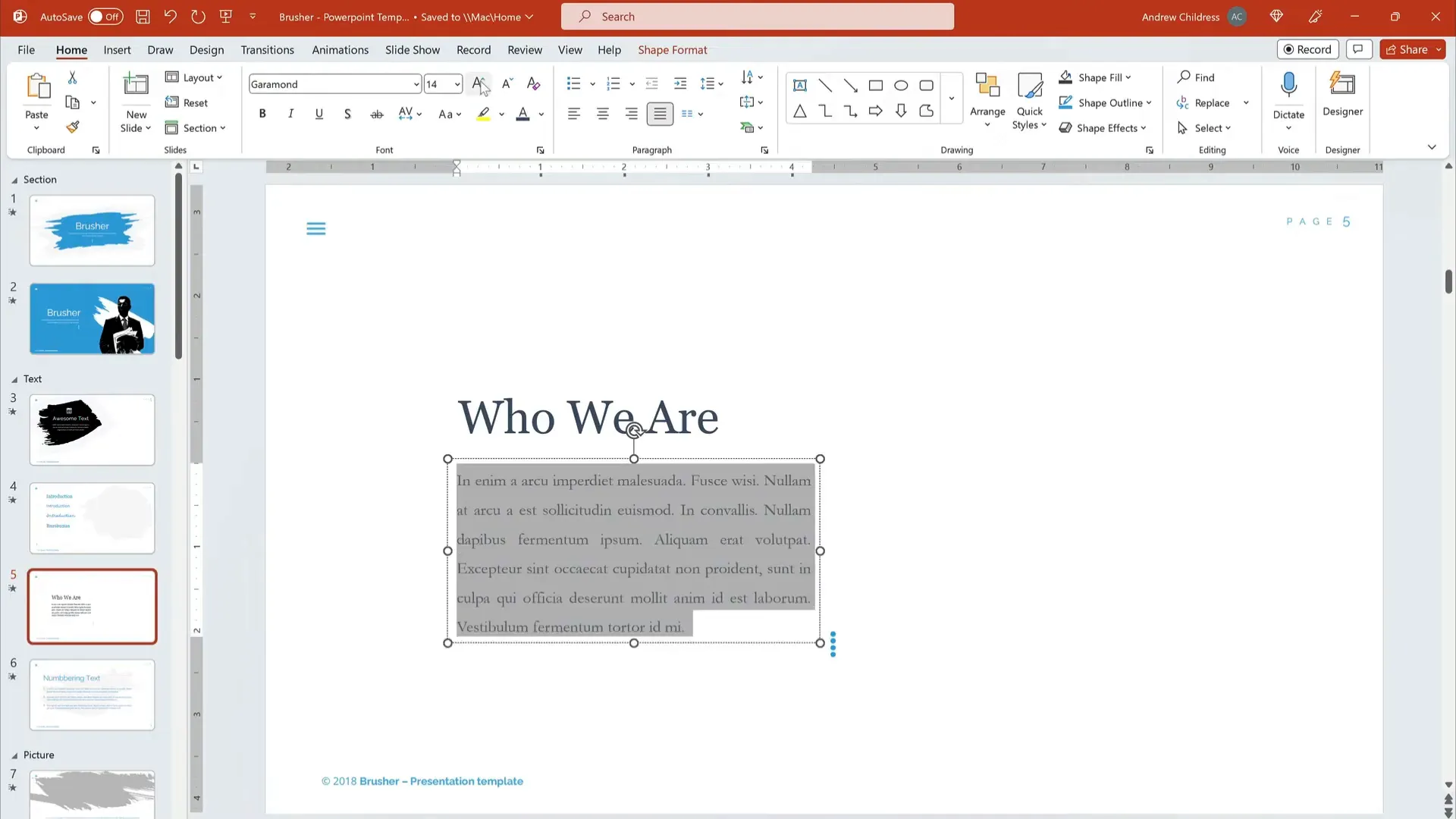
Let’s walk through a practical example of customizing fonts in PowerPoint using the beautiful Brusher PowerPoint Template from Envato Elements.
1. Select the Heading Text: Click on the heading text box to activate it.
2. Choose a Font: From the Home tab, open the font dropdown menu and select Georgia. This gives your heading a crisp, elegant look.
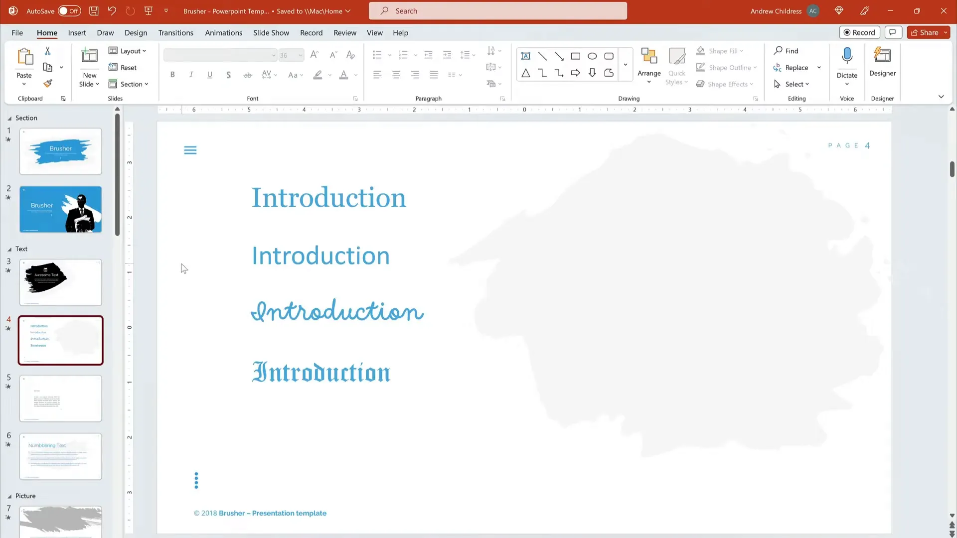
3. Increase Font Size: Make the heading noticeably larger than the body text to draw attention.
4. Customize Body Text: Select the body text box, then choose Garamond from the font list. Keep the size smaller than the heading but large enough for easy reading.
5. Adjust Styling: Apply bold or color changes if needed to highlight key points.
By following these steps, you create a sleek, readable slide that grabs attention and keeps your audience engaged.
Frequently Asked Questions (FAQ)
What font size should I use for PowerPoint presentations?
For headings, use a font size between 32 and 44 points to ensure they stand out. Body text should be between 18 and 28 points for readability. Avoid using font sizes smaller than 18 points.
Can I use script or decorative fonts in PowerPoint?
While script and decorative fonts can add personality, they are often hard to read and should be used sparingly, such as for slide titles or accent text. Always prioritize readability, especially for body text.
How many fonts should I use in a single presentation?
Stick to two or three fonts maximum. Usually, one font for headings and another for body text works best. Using too many fonts can make your slides look cluttered and unprofessional.
Are serif or sans serif fonts better for PowerPoint?
Both serif and sans serif fonts can be effective. Serif fonts like Georgia are elegant and easy to read, while sans serif fonts like Calibri offer a clean, modern look. The choice depends on your presentation style and audience, but both are safe bets.
Where can I find more fonts and templates for PowerPoint?
Envato Elements offers thousands of stylish PowerPoint templates and custom fonts available through an all-you-can-download subscription. It’s a fantastic resource for enhancing your presentations.
Conclusion
Choosing the right fonts for your PowerPoint presentations is essential for creating slides that are not only visually appealing but also easy to read and understand. By using serif or sans serif fonts like Georgia, Garamond, Calibri, Arial, or Helvetica, you can ensure your content looks professional and polished.
Remember to keep your font choices consistent, use appropriate sizes for headings and body text, and avoid overly decorative fonts for large blocks of text. Effective font pairing adds hierarchy and visual interest that guides your audience through your message.
Don’t hesitate to explore resources like Envato Elements to expand your font and template options, helping you create unique and captivating presentations every time.
Mastering PowerPoint fonts is a simple but powerful way to elevate your presentations and make a lasting impression on your audience.

Check out the full video: What Are the Best Fonts to Use in PowerPoint?


