

Want to create a visually striking, professional slide fast? In this walkthrough I’ll show you how to create a Stunning Slide in Powerpoint using a single image, layered shapes, icons, glow effects, and simple animations. I demonstrate every step from importing the photo to finishing the animations so you can reproduce the exact effect in your own presentations. This guide mirrors the method I use in the tutorial and expands on design choices, shortcuts, troubleshooting tips, and alternatives so you can confidently build your own Stunning Slide in Powerpoint for reports, pitches, or social posts.
What you’ll learn: how to crop and fit a full-bleed image, create a translucent circular overlay, mask unwanted areas with a freeform shape, add radial gradients and duplicated highlights, insert and style icons, add glow effects, position text blocks, group elements, and animate them with wipe and stretch entrance effects — all to make a single image become the focal point of a Stunning Slide in Powerpoint .
Tools required: Microsoft PowerPoint (Windows or Mac with the Shapes, Merge Shapes, Icons, and Animations features). Basic familiarity with the Ribbon and right-click menus helps but I’ll include keyboard shortcuts and small design rules so you can follow along easily.
Estimated time: 15–30 minutes depending on how much styling and animation you add.
Table of Contents
- Introduction & Goals
- Assets and Preparation
- Step 1 — Insert and Crop the Image
- Step 2 — Add the Translucent Circle (Sphere)
- Step 3 — Mask the Soil Using Freeform & Subtract
- Step 4 — Apply Radial Gradient & Add Highlights
- Step 5 — Insert and Style Icons
- Step 6 — Add Glow Effects to Icons
- Step 7 — Add Text Blocks & Duplicate
- Step 8 — Group Elements and Animate
- Design Rationale, Pro Tips & Variations
- Troubleshooting & FAQs
- Final Checklist
Introduction & Goals
Creating a Stunning Slide in Powerpoint is about more than pretty graphics — it’s about guiding attention. In this project we’ll use contrast, translucency, and motion to direct the viewer to the sapling image while reinforcing ideas with icons and short text blocks. The steps below are optimized for speed and clarity so you can replicate the effect for any subject, not just a plant photo.
Assets and Preparation
Before you begin, gather the elements you need:
- A high-resolution image (sapling/seedling or any focal subject).
- PowerPoint built-in shapes and icons (no external software required).
- Basic brand colors (optional) and font family choices.
Keep these points in mind to make your work easier:
- Use an image with negative space on the right side if you plan to place text there.
- Prefer PNG or JPEG images with good resolution — you will crop and potentially scale, so avoid tiny images.
- Decide on a short title and compact supporting lines (12 pt or higher for readability).
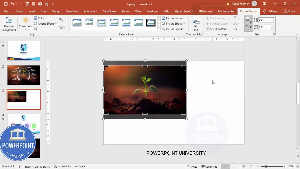
Step 1 — Insert and Crop the Image
1. Insert a new blank slide (Home → New Slide) and paste or insert your chosen image (Insert → Pictures).
2. If parts of the image extend outside the slide when you drag it, use the Picture Format tools to crop to the correct aspect ratio.
- Go to Picture Format → Crop → Aspect Ratio → 16:9 to match the slide.
- Drag to reposition the focal element (the sapling) into the visible framing.
This step ensures your base photo becomes a full-bleed background that fits the slide cleanly — the foundation for a Stunning Slide in Powerpoint .
Quick tips for image placement
- Keep the main subject slightly left of center if you plan to add text to the right.
- Avoid placing important details too close to the edge; cropping/resizing during export can cut them off.
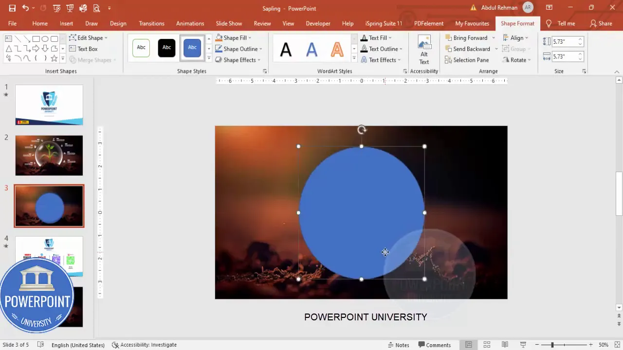
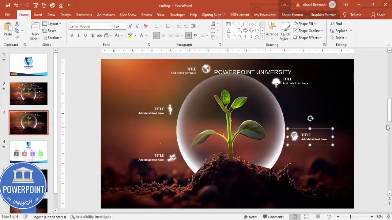
Step 2 — Add the Translucent Circle (Sphere)
The translucent circle (or “sphere”) placed over the sapling creates the impression of an orb or spotlight — a simple effect that dramatically increases polish.
- Insert → Shapes → Oval. Hold Shift while drawing to get a perfect circle.
- Right-click the circle → Format Shape → Fill: choose White, then increase Transparency (e.g., 60–80%).
- Shape Outline → No Outline.
Position the circle so it covers the sapling. The semi-transparent white softens the image and creates a backdrop for icons and highlights — a classic trick for designing a Stunning Slide in Powerpoint .
Why a translucent circle works
- It separates the subject from the rest of the image subtly without cutting away context.
- It provides a high-contrast area for white icons and text.
- It reads well on both light and dark photos because of adjustable transparency.
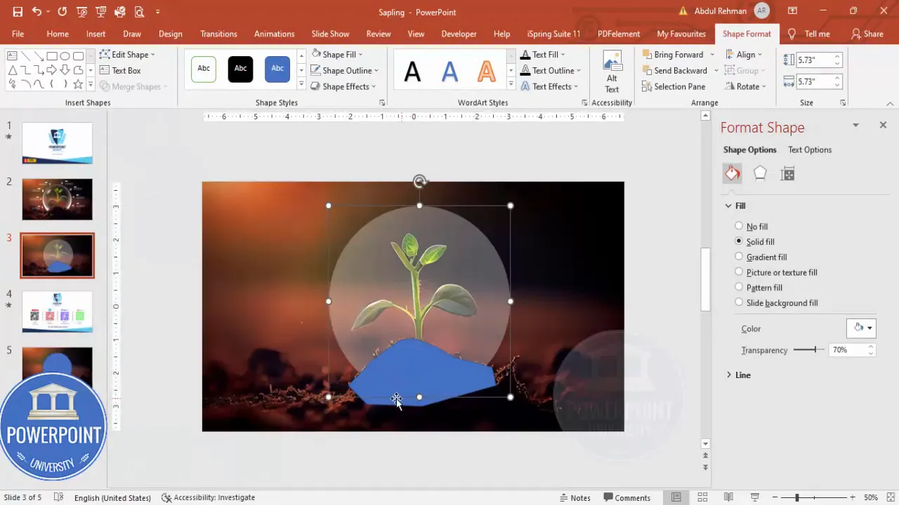
Step 3 — Mask the Soil Using Freeform & Subtract
In the video demo we removed the soil portion inside the circle to create a cleaner composition. Here’s how to do that with Merge Shapes.
- Insert → Shapes → Lines → Freeform Shape.
- Click to plot points around the soil area you want removed. When finished, close the shape by clicking the starting point or using Join.
- Select the freeform shape, then hold Shift and also select the circle.
- On the Shape Format tab choose Merge Shapes → Subtract. The freeform will cut away that portion of the circle.
This subtract technique lets you sculpt overlays to match irregular image details — a powerful way to refine your Stunning Slide in Powerpoint .
Troubleshooting the Merge Shapes step
- If Merge Shapes is greyed out, ensure both objects are shapes (not grouped shapes or images). Convert pictures to shapes by inserting shapes and using Picture Fill if needed, or ensure you have Shape Format selected.
- If the result isn’t what you expect, use Undo (Ctrl+Z) and redraw the freeform with finer points.
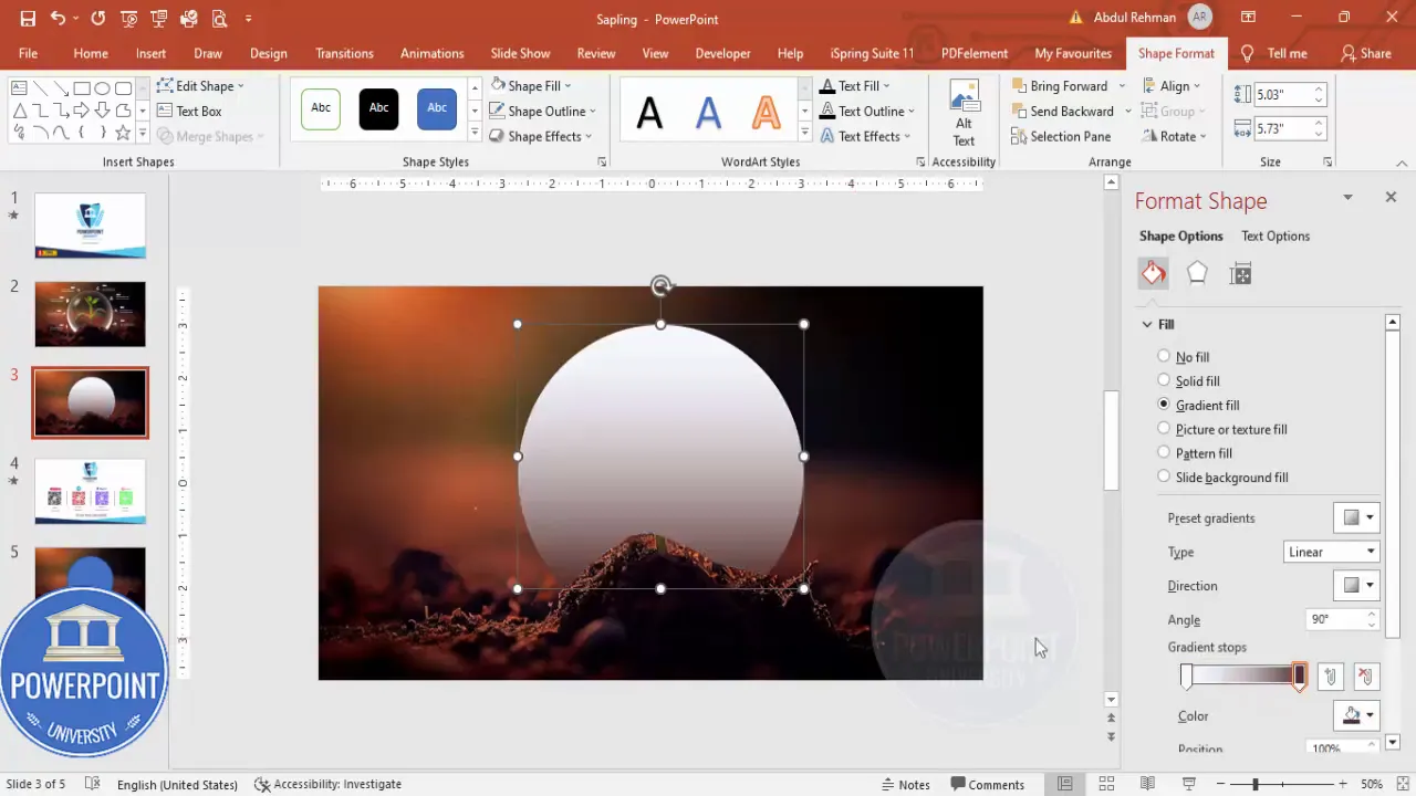
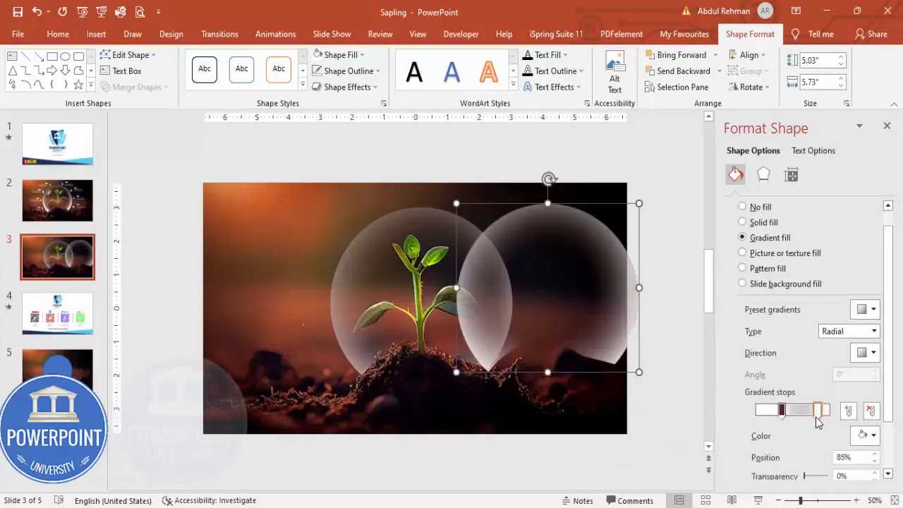
Step 4 — Apply Radial Gradient & Add Highlights
Now we’ll give the circle a subtle glassy look with a radial gradient and duplicate highlights to add depth.
- Right-click your shape → Format Shape → Fill → Gradient Fill.
- Keep two stops: one white (opaque) and the other matching a color sampled from the image using the Eyedropper (then set that stop to fully transparent).
- Change Type to Radial and Direction to From Center so the white appears offset within the circle.
- Adjust the stop positions to get the white highlight where you want it. Fine-tune transparency and gradient radius.
To add a layered highlight:
- Select the circle, press Ctrl+D to duplicate it, make the duplicate slightly smaller, and increase the white portion to make it brighter.
- Repeat duplicates as needed and reposition them to create multiple glints of light.
These layered gradients emulate a three-dimensional orb effect and are a key visual element that makes a Stunning Slide in Powerpoint feel crafted and premium.
Practical gradient settings
- White stop: 60–100% opacity depending on image contrast.
- Colored/transparent stop: 0–20% opacity, set to transparent so the underlying photo shows through.
- Radial type, direction from center, radius around 30–60%—adjust visually.
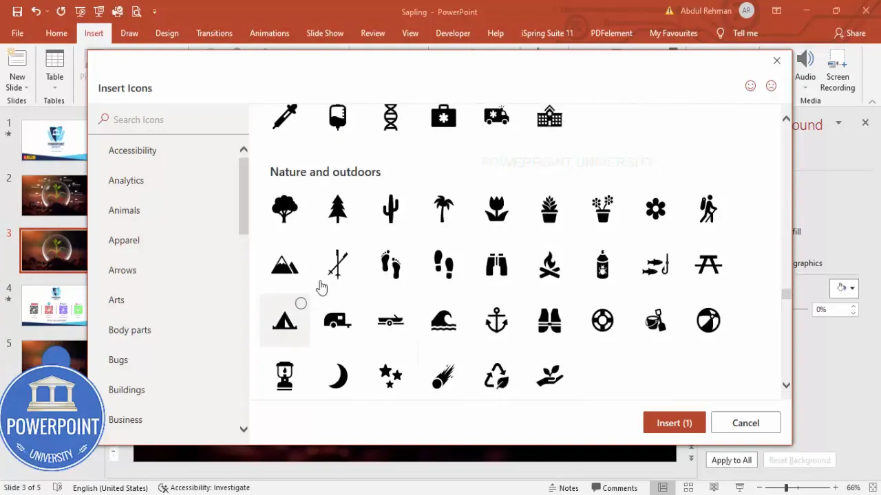
Step 5 — Insert and Style Icons
Icons provide symbolic meaning quickly — essential when space is limited. PowerPoint’s Insert → Icons lets you choose from hundreds of vector icons that scale without quality loss.
- Insert → Icons. Use the search box for keywords (e.g., tree, brain, people) and select 5–10 icons depending on your layout.
- After insertion, set Graphic Fill to White so icons appear clean against the translucent circle.
- Resize icons consistently — the demo used approx. 0.5 (height/width scaled uniformly). Align them around the orb for balance.
Icons are flexible placeholders for concepts (growth, sustainability, community, etc.) and are especially effective on a Stunning Slide in Powerpoint where you want to communicate multiple ideas without heavy text.
How to choose icon themes
- Stick to one visual style (outline, filled, or glyph) for cohesion.
- Pick icons that clearly map to your concepts — ambiguous icons confuse viewers.
- Use spacing and rotation sparingly — icons should feel anchored, not floating randomly.
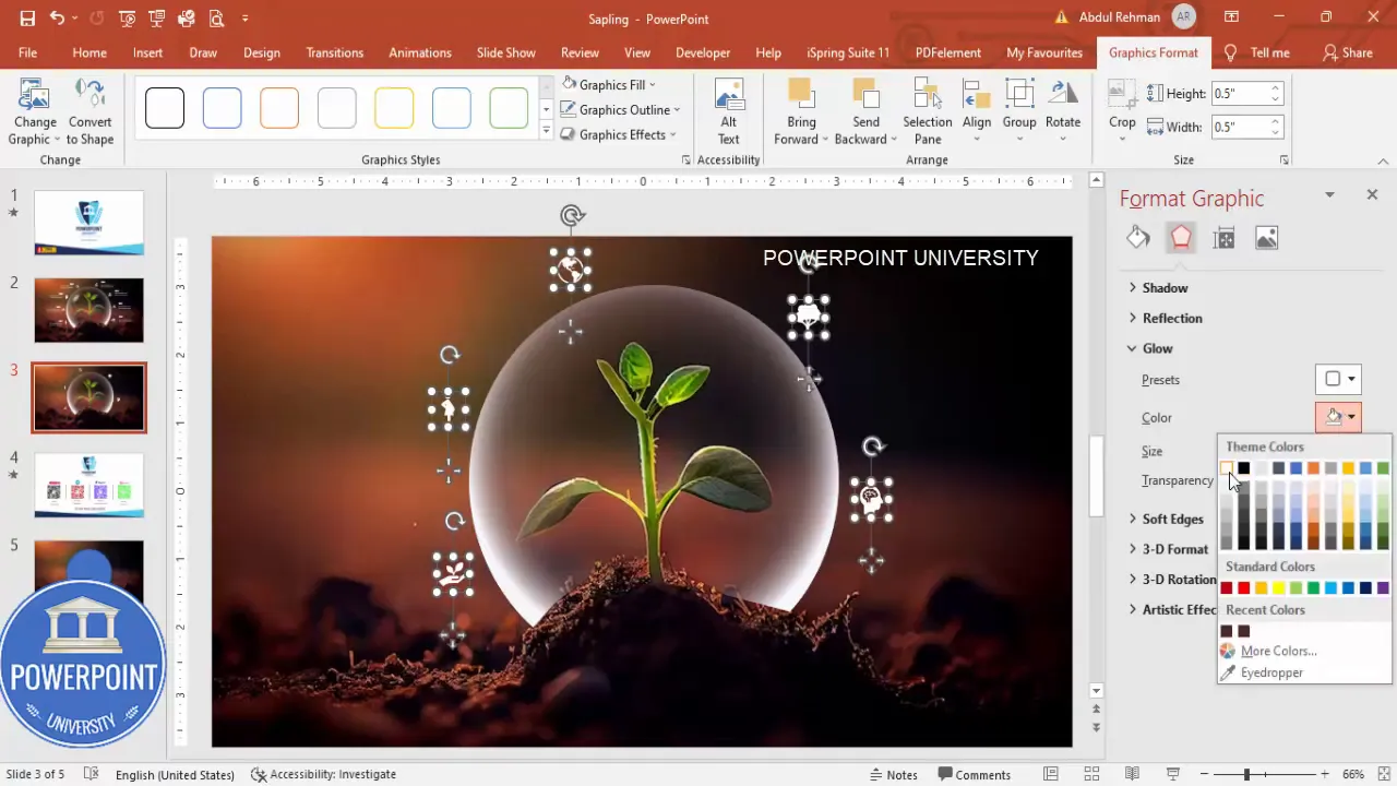
Step 6 — Add Glow Effects to Icons
To make icons feel luminous and connected with the orb, apply subtle glow effects. This helps the icons pop and integrates them with the translucent sphere.
- Select an icon → Format Graphic Effects → Glow.
- Choose White as the glow color for a soft halo.
- Reduce Glow Transparency to make it subtle and adjust size for the correct spread.
Use the same glow settings across icons for consistency. If the glow looks too aggressive, raise transparency or reduce size. The goal is a soft halo, not a neon ring.
Performance note
- Large numbers of shapes with heavy effects can slow older versions of PowerPoint; test on your target machine if you’ll present from it.
- To reduce file size, group icons and apply effects to the group when possible.
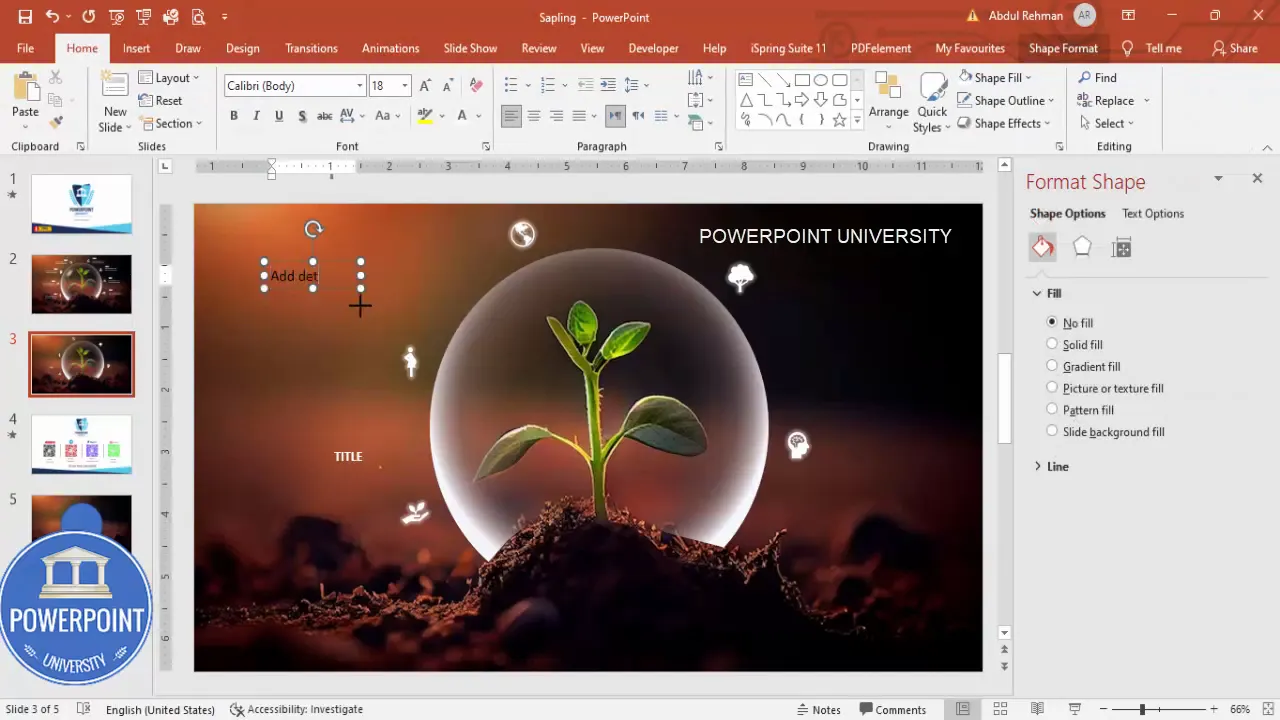
Step 7 — Add Text Blocks & Duplicate
Small text blocks help explain the icons without overwhelming the design. Use concise titles and 1–2 lines of detail per block.
Create Slides in Seconds with ExpertSlides AI |
|
Generate AI Presentations today: |
| TRY NOW! |
- Insert → Text Box. Type a short title; set font color to White and Bold for readability.
- Add a smaller text box for supporting detail; size around 12 pt and right-align if placed on the right side of the slide.
- Select both text boxes and Group them (Ctrl+G) so you can duplicate and position them quickly.
- Press Ctrl+D to duplicate the grouped text and move duplicates into place. The demo uses three stacked text clusters aligned to the right of the orb.
Consistency matters: align text groups, match spacing, and pick a legible font family. These elements make a Stunning Slide in Powerpoint feel intentional.
Typography reminders
- Use a sans-serif font for clean legibility on screens.
- Aim for a maximum of 30 words per cluster; keep lines short for scanning.
- Contrast is key — white text on a semi-opaque circle is highly readable.
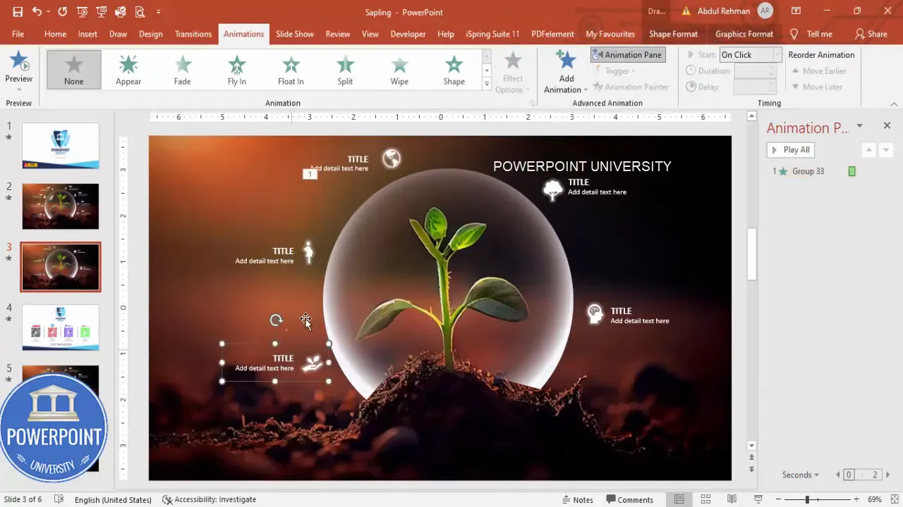
Step 8 — Group Elements and Animate
Animation reinforces hierarchy and draws attention. In this layout we’ll add wipe and stretch animations to text clusters and icons and sequence them for a clean entrance.
- Select the orb, icons, and text elements you want to animate — group related items first (Ctrl+G).
- Open Animations → Animation Pane to manage timing and order.
- For the first element, choose Wipe (Entrance). Set direction to Right or Left to match the element’s position.
- For other elements, use Add Animation → More Entrance Effects → Stretch. Set the stretch direction appropriately (From Right or From Left).
- Important: set each staggered item to Start: After Previous so the slide plays automatically with smooth sequencing.
This combination of wipe and stretch creates a polished entrance and gives viewers a sequence to follow — an effective way to present content in a Stunning Slide in Powerpoint .
Animation tips
- Aim for 200–600 ms duration for quick, snappy entrances.
- Keep motion subtle; fast and consistent timing avoids distraction.
- Preview frequently using the Animation Pane’s Play button.
Design Rationale, Pro Tips & Variations
Below I’ve collected the reasoning behind each design choice, plus powerful shortcuts and variations so you can adapt the effect to other subjects or brand identities.
Why this layout works
- Single focal image anchors the message and provides emotional resonance (the sapling conveys growth, regeneration).
- Translucent orb creates a reading area for white icons and text while letting the image remain visible.
- Icons offer instant concept mapping — great when you have limited verbal real estate.
- Subtle animations create flow and keep the audience attentive.
Pro tips for speed and consistency
- Use Slide Master to set a base style (font sizes, colors) so duplicates stay consistent.
- Group elements (Ctrl+G) to move/scale them together — saves time when resizing for different slide sizes.
- Duplicate entire slides (right-click → Duplicate Slide) to create variations quickly.
- Save your final slide as an image (File → Export) if you need to reuse the design elsewhere.
Variations you can try
- Replace the white translucent orb with a colored tint (brand color) at reduced opacity for themed slides.
- Swap icons for small photos or charts when you have richer visual data to show.
- Reverse layout: place text and icons on the left and the image on the right if your photo composition calls for it.
- Use a dark overlay (black at 20–40% opacity) for moody photography and place light text within it.
Troubleshooting & Common Questions
Here are common issues and quick fixes when building a Stunning Slide in Powerpoint .
- Shapes won’t merge: Ensure you’re selecting two shapes (not a picture and a shape). If a picture is involved, insert a shape and set its Fill to the picture or convert objects to shapes as needed.
- Animations jitter on older hardware: Lower animation complexity, remove shadows, or export as a video to play seamlessly.
- Artifacting after export: Export at a higher resolution or save the slide as PNG rather than JPEG to preserve crisp edges.
- Icons scale incorrectly: Unlock aspect ratio by right-click → Size and uncheck Lock Aspect Ratio only if you need non-uniform scaling; otherwise keep it locked.
FAQ — Frequently Asked Questions
Q1: Can I use this process if my image is vertical rather than horizontal?
Yes. For vertical images, either place the image on a slide with a layout that suits a portrait crop (set custom slide size) or crop the image to focus the subject within the horizontal slide. The key is to maintain visual balance — crop or reposition so text and icons fit cleanly.
Q2: What are the best fonts for a Stunning Slide in Powerpoint ?
Sans-serif fonts like Arial, Helvetica, Open Sans, or Montserrat are excellent for on-screen clarity. Use bold weights for titles and regular or medium for supporting lines. Keep a minimum size of 24 pt for readable on-screen text in presentations.
Q3: How many icons should I add around the orb?
Balance is important. The example uses 4–6 small icons. Too many icons dilute meaning and clutter the composition. Aim for 3–6 icons depending on available space.
Q4: What if I don’t like the translucent white — can I use color?
Absolutely. Use a brand color or a dark tint depending on your image. Lower opacity values (30–60%) keep the image readable while giving the overlay personality.
Q5: Can I animate icons individually?
Yes. Select each icon and apply entrance animations (wipe, fade, stretch). Stagger timing with “After Previous” and small delays (0.1–0.3s) for a rhythmic entrance.
Q6: How do I ensure the slide looks good on mobile/phone screens?
Keep text short and large, use high-contrast colors, and avoid extremely fine details. Export as a PNG at higher resolution and test on a phone to confirm legibility.
Q7: Will this slide print well?
Not necessarily. On-screen translucency and glow effects can be difficult to replicate in print. If printing is required, consider simplifying effects and increasing contrast between text and background.
Q8: Is there a way to make the entire slide interactive?
PowerPoint supports hyperlinks and action buttons. You can add links to icons or areas using Insert → Link or Action to make the slide interactive during a presentation.
Q9: How do I reduce file size after adding many effects?
Compress pictures (File → Compress Pictures), reduce the number of large images, and avoid embedding very large media files. Save a copy and experiment with compression settings.
Q10: What if Merge Shapes removes the wrong area?
Undo and redraw the freeform shape with additional nodes. Smaller, more precise clicks yield better subtract results. Use the Selection Pane (Home → Arrange → Selection Pane) to confirm the correct layers are selected before merging.
Final Checklist Before Presenting
- All elements aligned and grouped where appropriate (Ctrl+G).
- Text legible at the intended presentation size (test on a projector or exported image).
- Animation timing checked in Animation Pane and set to After Previous for automatic flow.
- File size optimized and saved — consider saving a backup with embedded fonts if using custom fonts.
- Test the slide on the presenting device to ensure effects and fonts render correctly.
Quick Recap — One-Page Workflow to Build Your Stunning Slide in Powerpoint
- Insert an image and crop to match slide aspect ratio (16:9).
- Create a perfect circle overlay (hold Shift) and set Fill to white with high transparency.
- Use a Freeform shape and Merge Shapes → Subtract to remove unwanted parts of the circle.
- Apply a radial gradient with an eyedropper color stop set to transparent; duplicate highlights for depth.
- Insert icons, set Graphic Fill to White, size consistently, and position around the orb.
- Add a white glow effect to icons, tune transparency and size.
- Add title and supporting text, group, duplicate, and align.
- Group final elements, add Wipe and Stretch animations, set to After Previous, and preview.
By following these steps you’ll be able to reproduce a clean, modern, and effective visual: a true Stunning Slide in Powerpoint that focuses attention, communicates clearly, and looks polished. With small adjustments — color shifts, icon choices, or animation timing — you can adapt this design for many presentation contexts.
If you want a ready-made template or the sample file to practice on, create a copy of your presentation and try the steps above. Practice will make you faster and more confident, and soon you’ll be able to produce multiple Stunning Slide in Powerpoint designs in minutes.
Design motto: Keep the visual hierarchy clear — image first, orb second, icons third, and text last. Animations should support — not replace — clarity.
Now it’s your turn: open PowerPoint, pick a strong image, and build a Stunning Slide in Powerpoint using these steps. Small adjustments will personalize the layout for your message and brand. Good luck — and design something that makes people stop scrolling.
Check out the full video: Create Stunning Slide in PowerPoint. Tutorial No.: 976


