

- Introduction: What you’ll build and why
- Table of tools and assets
- Step-by-step: Building the Busniess Network Slide
- Design tips to polish your Busniess Network Slide
- Animation and interactivity
- Variations and alternative layouts
- Troubleshooting common problems
- Best practices checklist
- FAQ
- Conclusion
Introduction: What you’ll build and why
Hi — I’m the creator behind PowerPoint University, and in this guide I’ll walk you through how to build an attractive, functional Busniess Network Slide in PowerPoint. This slide is ideal for showing a central device or node (an iPad in my example) connected to multiple smaller nodes, each with its own icon and short descriptive text. Use it for project overviews, product ecosystems, departmental connections, vendor networks, or client journeys.
The Busniess Network Slide is visually compact yet information-rich. It highlights relationships and enables you to explain each sub-element with a short piece of text. The end result is a slide that looks professional, uses built-in PowerPoint features, and remains fully editable so you can tailor colors, icons, and copy to your brand.
Throughout this tutorial I use plain, repeatable techniques: inserting pictures, drawing shapes, using freeform lines, applying 3D bevel effects, adding icons, and layering a semi-transparent overlay to hide or dim the device screen. The instructions are modular, so you can adopt individual techniques even if you only need one piece of the final layout.
Table of tools and assets
Before you start, gather these assets and become familiar with these PowerPoint features. This will save time and keep the build smooth:
- PowerPoint (2016 / 2019 / Microsoft 365 recommended). Most steps work in older versions, but some icon and 3D features may vary.
- A device image (I use an iPad screenshot or illustration from Online Pictures).
- Icons: Use the built-in PowerPoint Icons (Insert → Icons) or your own SVGs.
- Basic shapes: Oval, small circles, and freeform lines for connectors.
- Format Shape panel: Fill, Line, Effects → 3-D Format (bevel), and Gradient Fill.
- Animation panel: Wipe and entrance effects.
- A free downloadable .pptx template (optional) if you want to reverse-engineer my final slide.
Quick asset checklist
- iPad image from Insert → Pictures → Online Pictures
- Four icons representing categories or functions
- Color palette (4 colors for spheres + neutral color for overlay)
- Short descriptive texts for each small node
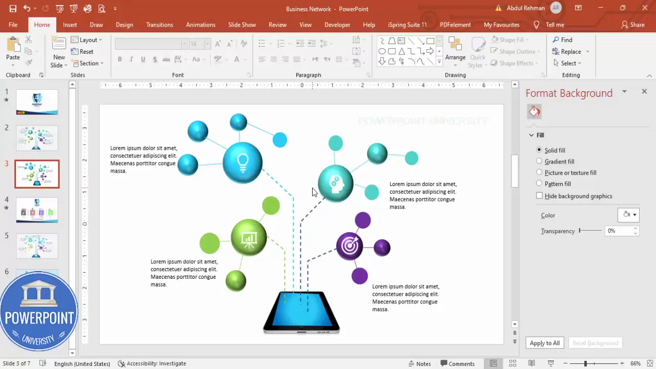
Step-by-step: Building the Busniess Network Slide
Follow these steps exactly as described to build the Busniess Network Slide. I break the process into small actions so you can replicate the layout precisely and adapt it to your needs.
1. Create the slide and add the device image
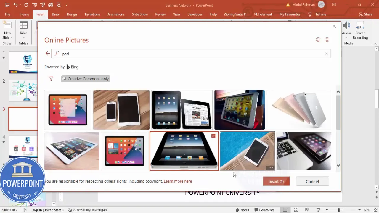
- Start with a blank slide. Delete any placeholders.
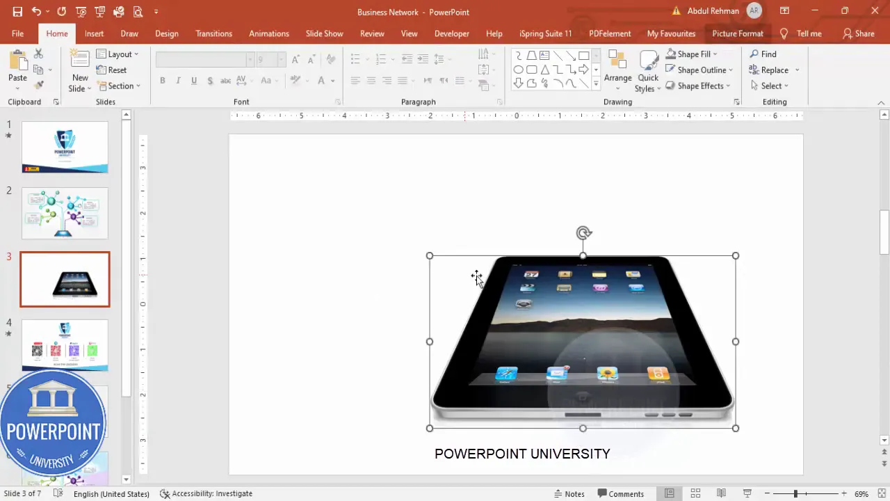
- Insert the iPad image: Go to Insert → Pictures → Online Pictures and search for “iPad”. Select an illustration or photo that matches your visual style and click Insert.
- Resize the image and center it on the slide. The iPad will act as the central hub where connectors meet.
Make sure the iPad is roughly central and occupies about 30–40% of the slide height so there’s room for connectors and surrounding nodes.
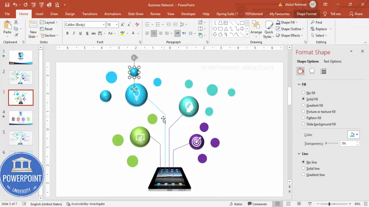
2. Create the main spheres (larger circular nodes)
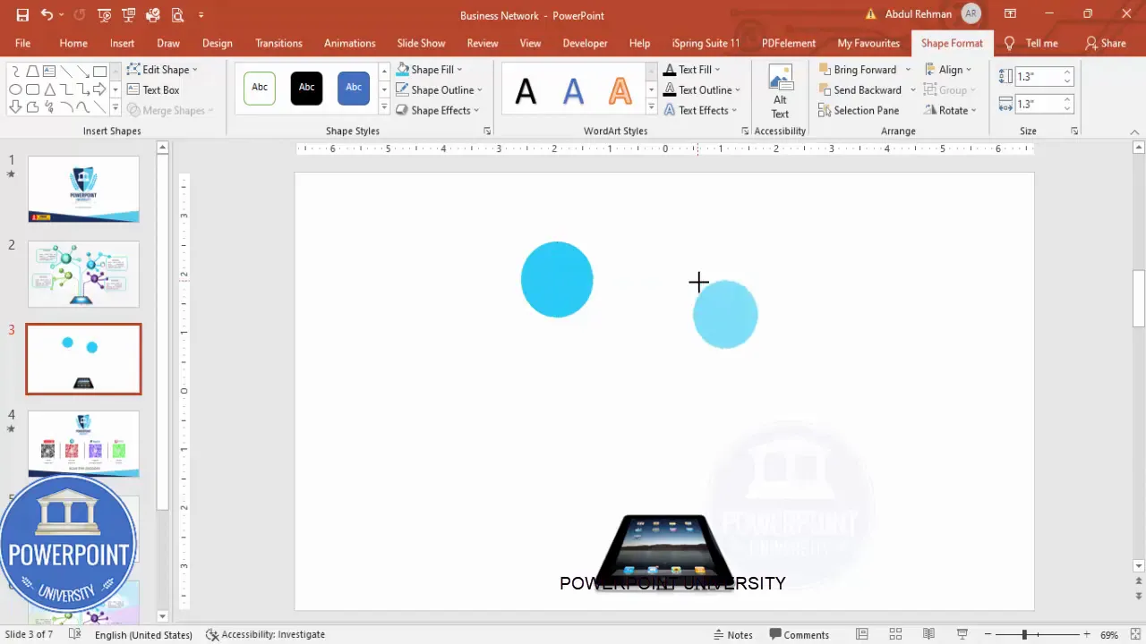
- Insert an oval: Insert → Shapes → Oval (hold Shift while drawing to create a perfect circle).
- Remove the outline: Shape Format → Shape Outline → No Outline.
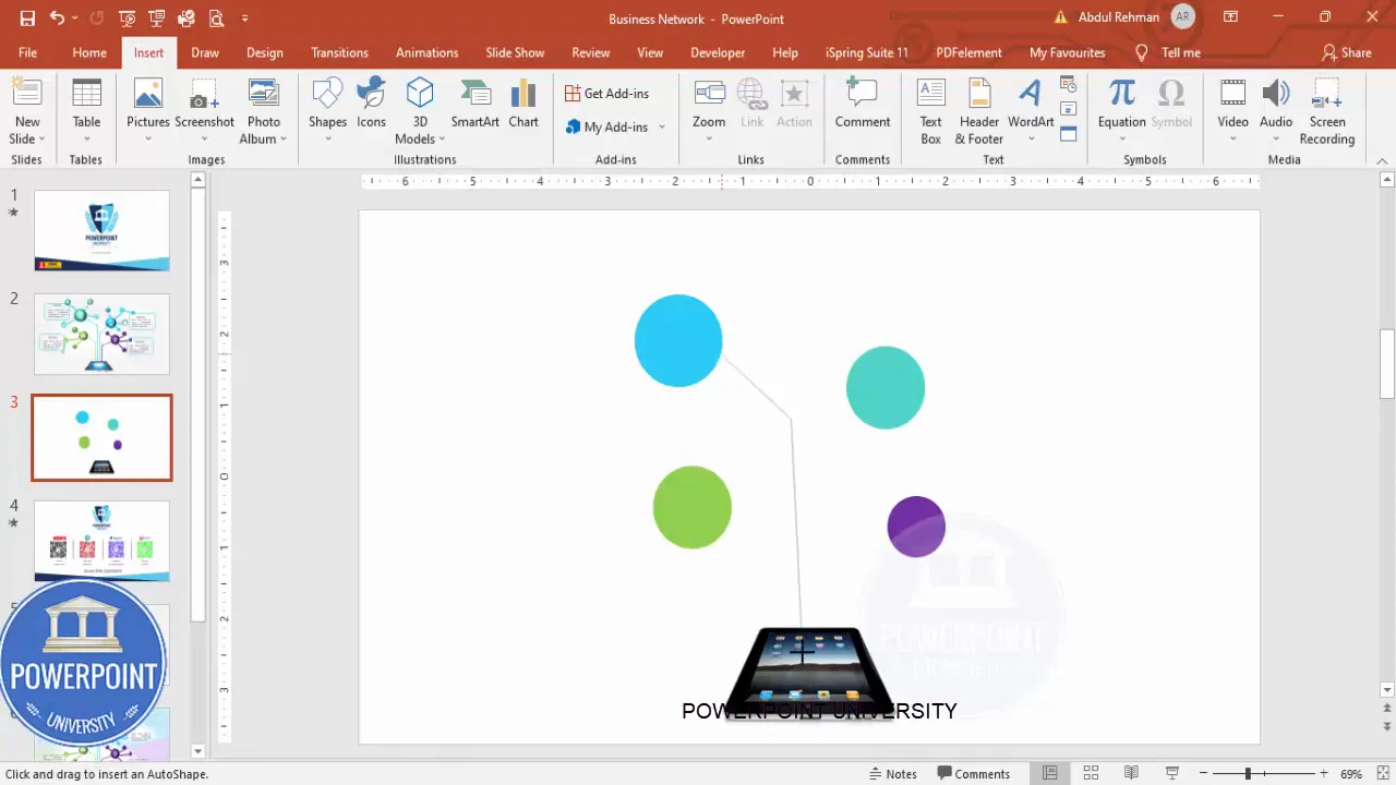
- Choose a color: Pick the color that matches your visual theme. Repeat for the other three main spheres using varied colors to differentiate nodes (e.g., blue, red, green, purple).
- Duplicate: Use Ctrl + D to copy circles and position them around the iPad where you want them to connect.
Spacing matters. Arrange the four spheres so they form a balanced layout around the iPad—one at the top-left, top-right, bottom-left, bottom-right, or however your content dictates.
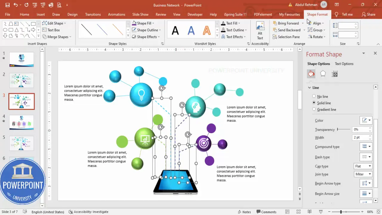
3. Draw connectors from each sphere to the iPad
- Insert → Shapes → Lines → Freeform Shape. Click the circle center (or desired edge), hold Shift as you draw to keep the line straight when needed, and click again on the top of the iPad where the connector should meet. Double-click to finish the line.
- Repeat for all four spheres.
- Match line color: Set each connector’s Shape Outline to match the color of the sphere it originates from. This creates an immediate visual association between node and connector.
- Adjust line weight: Select all connectors and increase the Width under Shape Format so they’re visible. Optionally add a dashed style for visual interest.
Using the freeform tool gives you control over exact connector placement. Holding Shift helps when you want straight lines between points.
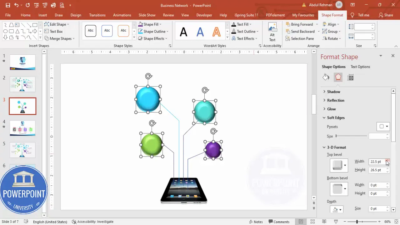
4. Turn the flat circles into 3D-looking spheres
- Right-click a circle and choose Format Shape.
- Open Effects → 3-D Format.
- Apply a Bevel (Round) and increase Height and Width slightly to give dimension.
- Apply the same 3D settings to each node. Use the Format Painter (Home → Format Painter) to copy the 3D appearance quickly between shapes.
This bevel technique turns flat ovals into button-like spheres that read as tactile UI elements. The subtle depth helps the icons sit naturally on top.
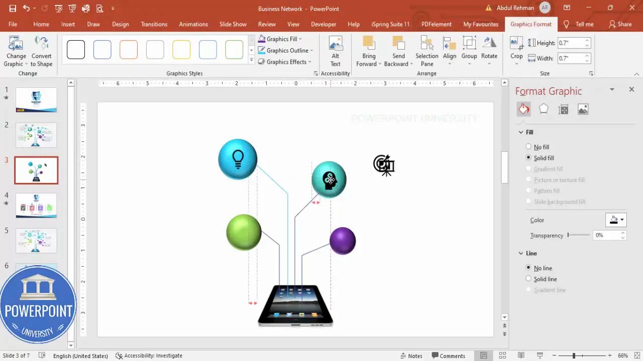
5. Add icons to the spheres
- Insert → Icons. Search for icons that represent each node (e.g., analytics, cloud, user, settings). Select four icons and click Insert.
- Resize icons to fit centrally inside each sphere. I typically scale icons to about 0.7 of their default size after testing fit.
- Set icon fill color to white or a contrasting color so the icon stands out on the colored sphere background.
Icons should be simple and recognizable at small scales. If you use SVG icons you can recolor and resize without losing quality.
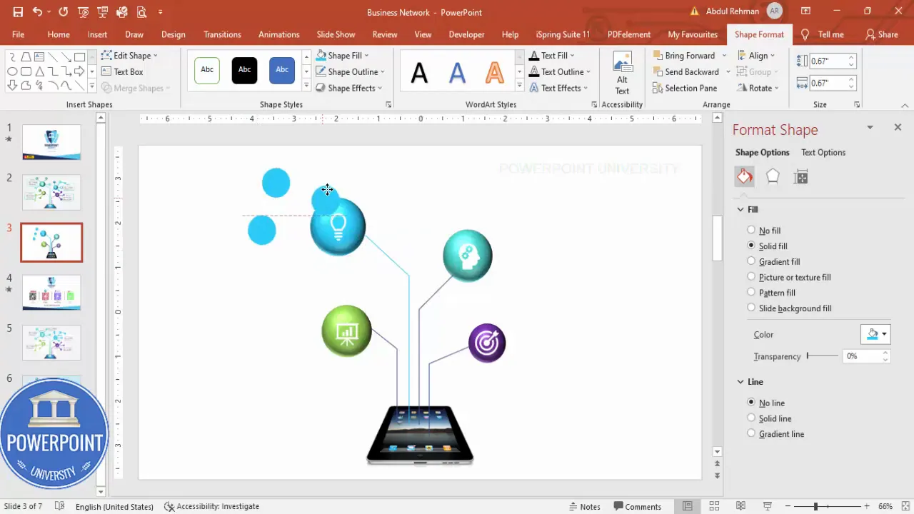
6. Create sub shapes (smaller secondary nodes)
- Insert small circles as secondary markers around each main sphere. These can indicate sub-features, steps, or linked items.
- Set no outline and match the fill color to either the parent sphere or a tonal variant.
- Duplicate (Ctrl + D) and position multiple small sub nodes near each main sphere as needed.
These smaller shapes reinforce the idea that each main sphere contains multiple related elements. Keep them small so they don’t compete with the primary icon.
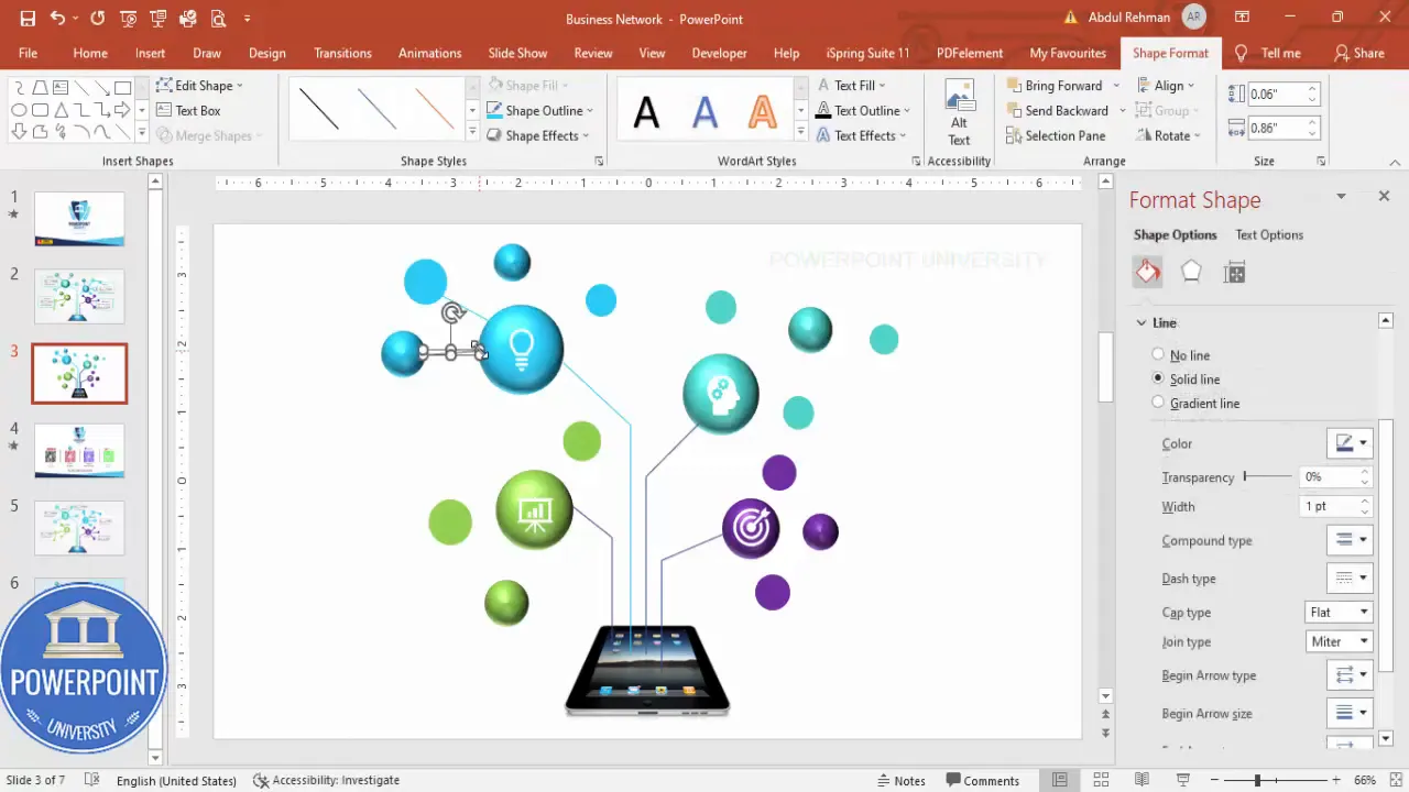
7. Connect sub shapes to their main sphere
- Use freeform lines again to draw small connectors between sub shapes and their parent sphere.
- Match line color to the parent sphere color for clarity.
- Group related sub elements (select elements → right-click → Group) so you can move them together later.
Grouping is a small time-saver when you later adjust layout or apply animations.
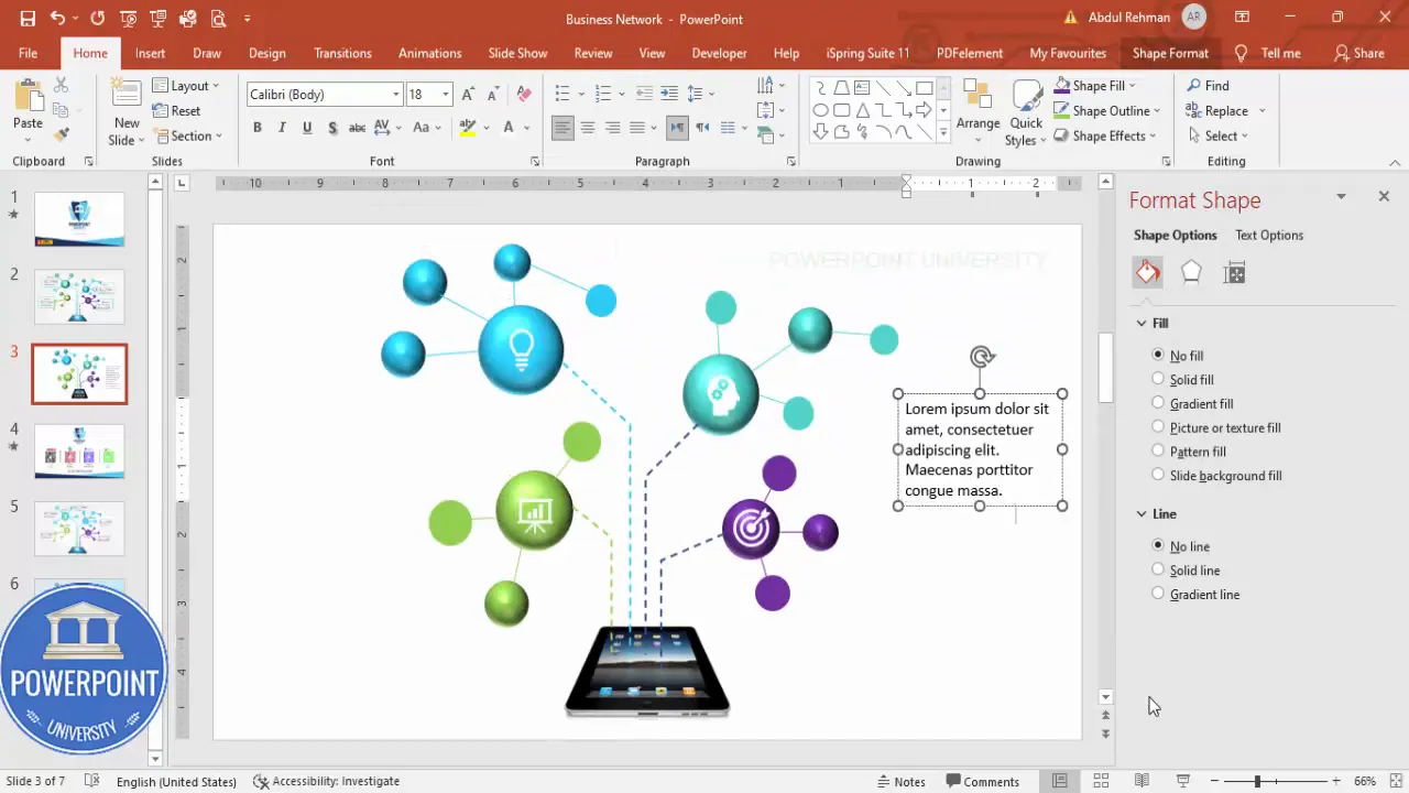
8. Add detailed text for each node
- Insert → Text Box and type a short descriptive headline and one-line detail for each main sphere. Keep copy concise.
- Position text near the associated sphere, but leave sufficient whitespace.
- Use consistent font sizes: headline ~18–20 pt, body ~12–14 pt. Choose a legible sans-serif for clarity.
Labels should clarify — not overwhelm. Aim for one short sentence or a key phrase under each node to explain its role.
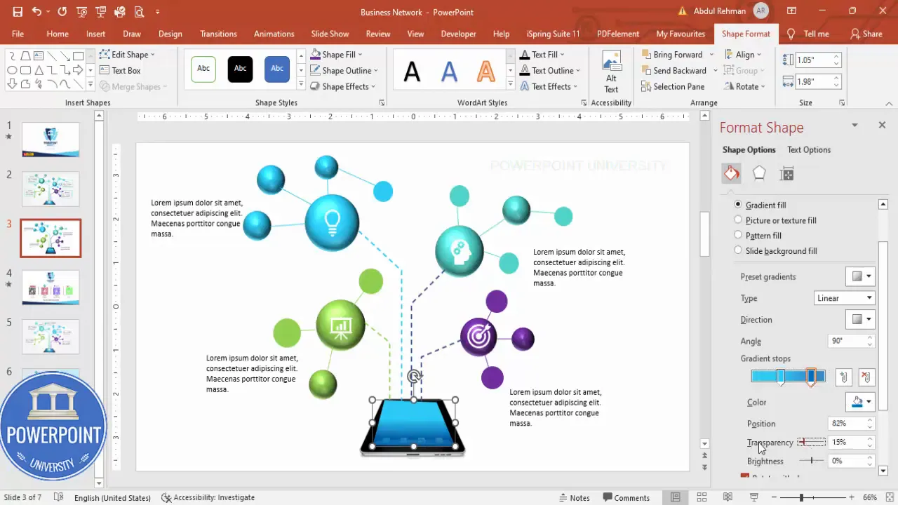
9. Add an overlay to the iPad screen (optional)
- If you want the iPad screen to be dimmed or to create a subtle backdrop for the connectors, use the freeform shape tool to draw a mask that fits the iPad screen area.
- Set Shape Outline to No Outline. Use a Gradient Fill and increase Transparency to 40–60% depending on the desired dimming.
- Choose a Radial gradient from center to edges for a subtle vignette and then Bring to Front so it sits above the iPad screen but below the connectors if that’s the desired look.
This overlay narrows attention to the connected nodes while still preserving the device silhouette as part of the composition.
10. Final alignment, grouping, and clean-up
- Align objects: Use the Align tools (Home → Arrange → Align) to ensure consistent spacing and tidy edges.
- Group major sections for easy repositioning: Group each node with its icon, sub-shapes, connectors, and text.
- Lock positions or create a master slide if you plan to reuse the layout repeatedly.
Grouping also makes applying animation and slide transitions easier, since you can animate an entire node with one selection.
Design tips to polish your Busniess Network Slide
Now that the structure is complete, apply these design principles to make the Busniess Network Slide look professional and on-brand.
Color and contrast
- Use a limited palette: four accent colors plus neutrals. This keeps the slide cohesive and prevents color confusion.
- Maintain contrast: white icons on color spheres work well because they remain readable at small sizes.
- Use transparency strategically: overlays and soft shadows help create depth without clutter.
Typography
- Stick with one or two fonts across the slide for consistency.
- Headlines should be bold and larger; details should be small but legible.
- Limit text to short phrases. The slide should be visual-first; text supports the icons, not replace them.
Spacing and alignment
- Keep equal padding around circles and between the iPad and surrounding nodes.
- Align text boxes so they visually correspond to their spheres (left/right centering rules help).
- Use guides and ruler for pixel-perfect layout.
Visual hierarchy checklist
- Primary focus: iPad (largest visual weight)
- Secondary focus: colored spheres with icons
- Tertiary focus: sub-shapes and detailed text
When stakeholders view the Busniess Network Slide, their eyes should follow this hierarchy naturally: device → main nodes → subnodes → supporting text.
Animation and interactivity
To bring the Busniess Network Slide to life, follow a few animation strategies that support the message instead of distracting from it.
Recommended animation approach
- Apply simple entrance animations: Use Wipe, Fade, or Appear for primary nodes. Wipe works well for connectors because it visually imitates a connection forming.
- Sequence thoughtfully: Animate the iPad first, then each connector with its corresponding sphere and icon, and finally the sub-shapes and text.
- Use Animation Pane to fine-tune timing: Set small delays (0.1–0.3s) between related elements for a cascade effect.
- Set trigger animations for interactive presentations: If you want the nodes to appear when you click a specific area, use Triggers in the Animation Pane to control them.
For example, animate the connector to wipe from the sphere to the iPad, then fade the icon and text in to complete the reveal. This approach mimics a data flow and makes concept explanations intuitive.
Performance tips
- Avoid overly complex animations or long bounce effects; they slow down slide transitions and appear unprofessional.
- Preview animations in Slide Show mode to ensure smooth playback on the presentation computer.
Variations and alternative layouts for the Busniess Network Slide
The technique above is flexible. Here are several variations to adapt the Busniess Network Slide to different contexts:
1. Vertical stack layout
Instead of arranging spheres around a device, stack them vertically to the right of a device image. Use vertical connectors that imply step-by-step processes or hierarchical relationships.
Create Slides in Seconds with ExpertSlides AI |
|
Generate AI Presentations today: |
| TRY NOW! |
2. Circular hub-and-spoke
Place the device (or central concept) at the center, with spheres equally distributed in a circle around it. This is perfect for ecosystems or product features where each node has equal importance.
3. Timeline-style network
Convert spheres into milestones on a horizontal timeline. Connect each milestone to the central device with a subtle curved connector when you want to show evolution or phases.
4. Multi-device comparison
Duplicate the Busniess Network Slide layout on one slide for two or three devices to compare features or network reach across platforms.
Troubleshooting common problems
Even with careful steps, you may encounter hiccups. Here are common issues and solutions to keep you moving.
Problem: Icons clip or appear pixelated
- Solution: Use PowerPoint icons or vector SVGs. Increase icon size before recoloring or resizing down for crispness.
Problem: Connector lines look misaligned after moving shapes
- Solution: Group the parent node and connector together before repositioning. Alternatively, use “Connectors” from the Shapes menu that stick to shapes when moved.
Problem: 3D bevel looks too heavy or unrealistic
- Solution: Reduce bevel height and width. Apply a subtle shadow instead of a strong bevel if you prefer a flatter design.
Problem: Animations stutter during presentation
- Solution: Reduce animation complexity and use fewer simultaneous animations. Export the slide as a video for playback in very resource-limited environments.
Problem: Color mismatch across duplicated slides
- Solution: Use Theme Colors or define a custom slide master with exact color codes. This ensures consistent color application across all slides.
Best practices checklist for your Busniess Network Slide
Use this checklist before finalizing your slide to ensure visual clarity and presentation readiness:
- Are sphere colors consistent with brand palette?
- Do icons use a consistent stroke or fill style?
- Is the text concise and legible at a distance?
- Have you grouped nodes and connectors logically?
- Do animations enhance rather than distract from the message?
- Did you test the slide in Slide Show mode on target hardware?
- Have you saved a backup without animations (PDF or static image) for contingency?
FAQ
Q: What file formats should I use for icons to ensure high quality?
A: Use vector formats, like the built-in PowerPoint Icons or SVG files. These scale cleanly and allow recoloring without loss of fidelity. Avoid rasterized PNG icons for main visual elements if you plan to resize extensively.
Q: Can I change the device from an iPad to a phone or laptop?
A: Yes. The Busniess Network Slide is a framework. Replace the iPad image with any device image of similar proportions, then adjust connector endpoints and overlay as necessary to fit the new screen area.
Q: How many nodes can I have before the slide becomes cluttered?
A: For clarity, four main nodes works well for a single slide. If you need more, consider splitting content across multiple slides or using smaller subnodes with clear visual grouping. Remember: each additional node increases cognitive load.
Q: Is it better to use solid or gradient fills for spheres?
A: Solid fills are cleaner and more modern; gradients add depth but can date the design if overused. If you choose gradients, keep them subtle and consistent across nodes.
Q: How can I make the slide accessible for color-blind viewers?
A: Pair colors with distinct icons or labels so meaning isn’t conveyed by color alone. Use high-contrast icon fills and provide a short caption or legend describing each node.
Q: Can I animate only a single node on click during a live presentation?
A: Yes. Use Triggers in the Animation Pane to make specific animations start when you click the associated shape or a separate control shape. This enables interactive explanations during Q&A or demos.
Q: How do I reuse this Busniess Network Slide across different presentations?
A: Create a slide template or include it in your Slide Master as a layout. Save the slide as a .pptx or export it to a templates folder so you can import it into any deck with consistent formatting.
Q: Will the bevel 3D effect export correctly to PDF?
A: Yes, basic 3D effects and bevels will render into PDF. However, complex gradient overlays or shadow softening can look slightly different depending on PDF renderer. Always preview the exported PDF to confirm appearance.
Q: What font sizes are recommended for on-screen readability?
A: Use 18–20 pt for short headlines next to nodes and at least 12–14 pt for supporting text. On large presentation screens, increasing these sizes slightly enhances readability for the audience.
Final tips and workflow improvements
To work faster and keep your Busniess Network Slide consistent across multiple uses, follow these workflow tips:
- Create a palette: Use PowerPoint’s Theme Colors to lock in the four node colors and a neutral set for text/background.
- Make a slide master layout: Build the iPad baseline, connectors, and node placeholders in Slide Master so every time you create a new instance, you only replace icons and text.
- Use Format Painter: Copy fills and 3D effects between shapes to maintain visual unity.
- Save a simplified copy: Export a static PDF version for handouts or printing.
- Build a reusable icon bank: Save grouped nodes with icons to use as compound objects in other slides.
Wrap-up and next steps
Designing a Busniess Network Slide is a practical way to visualize relationships between a central device or idea and connected elements. The techniques shared here—freeform connectors, 3D bevels, icons, overlays, and animation sequencing—are adaptable and reinforce your storytelling with clear visuals.
Next steps you can take:
- Duplicate the slide and experiment with alternate color schemes or icons.
- Practice delivering the slide while triggering each node reveal to build a smooth narrative.
- Create a master version that holds your brand colors and reuse it across decks for consistency.
If you’d like a starting point, I offer a downloadable Busniess Network Slide template you can use and customize. Keep your slides editable, clean, and audience-focused—less clutter means more impact.
Pro tip: When presenting, use the build sequence to tell a story: introduce the central node, then reveal each related sphere and explain its role. This staged reveal keeps the audience focused and prevents information overload.
Check out the full video: Create Business Network Slide in PowerPoint. Tutorial No.: 987


