
Designing professional and eye-catching PowerPoint slides can often feel like a time-consuming task. But what if you could create multiple unique slide designs in just a few minutes? In this article, I’ll share my experience and techniques for designing five different PowerPoint slides in under ten minutes—just two minutes per slide! Inspired by my own challenge, I’ll guide you step-by-step through each design, share useful tips, and introduce a powerful tool to speed up your entire presentation creation process.
Whether you’re a busy professional, student, or content creator, mastering quick slide design can boost your productivity and help you deliver stunning presentations faster than ever before. Let’s dive in and explore how to create compelling slide layouts with style and efficiency.
Table of Contents
- The Challenge: Five Slides in Ten Minutes
- Slide #1: Dynamic Circular Layout with Four Points
- Slide #2: Bold Horizontal Bars with Numbered Points
- Bonus Tip: Generate a Full Presentation in Under Two Minutes
- Slide #3: Minimalist Image and Text Layout
- Slide #4: Corporate Business Style Layout
- Slide #5: Abstract Background with Bold Cutout Text
- Tips for Speedy and Effective PowerPoint Slide Design
- Frequently Asked Questions (FAQ)
- Final Thoughts
The Challenge: Five Slides in Ten Minutes
The goal was simple yet daunting: design five unique slides in PowerPoint in less than ten minutes total. That breaks down to two minutes per slide—a tight deadline that pushes creativity and speed. I wasn’t sure if I could make it, but the challenge was on!
Before starting, I did one small prep: defining a color palette for each slide. This step is crucial because picking colors while designing eats up a lot of time. By setting the colors upfront, I saved precious seconds and kept the designs cohesive.
With the timer running, I jumped straight into the first slide.
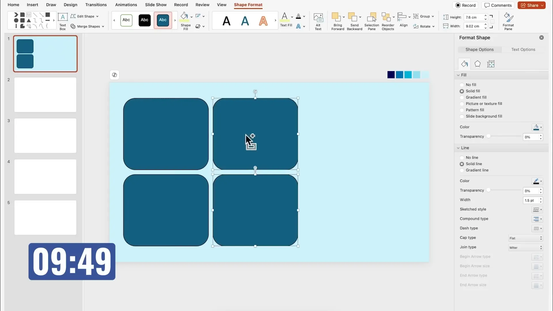
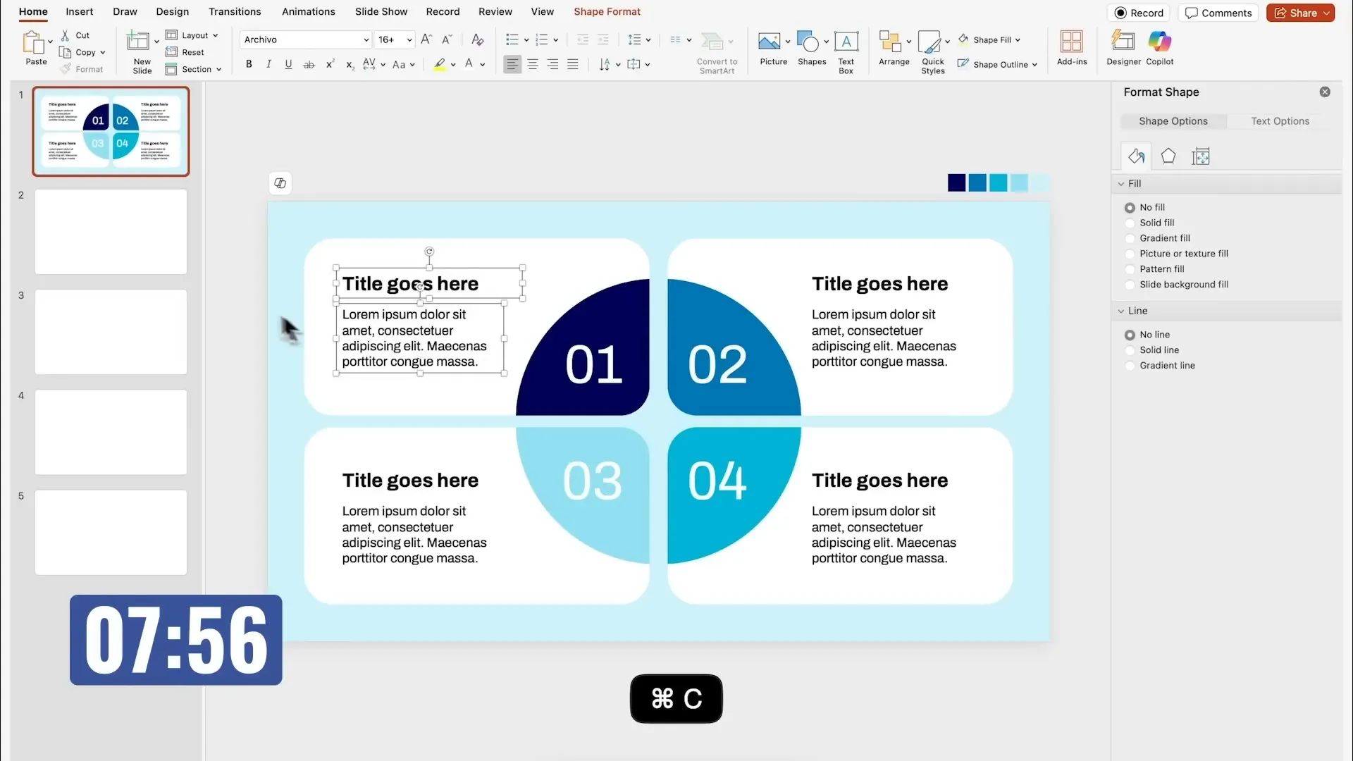
Slide #1: Dynamic Circular Layout with Four Points
The first slide features a visually interesting circular layout segmented into four slices, perfect for highlighting four key points. Here’s how I created it quickly:
- Added several rounded rectangles and grouped them for easy alignment to the center and middle of the slide.
- Inserted a circle in the middle of the slide, then used the Merge Shapes > Fragment feature to slice the circle where the rectangles intersected.
- Removed unnecessary shapes inside the circle, leaving four distinct slices.
- Changed the rounded rectangles’ color to white for contrast.
- Filled each slice of the circle with different shades of blue from the predefined palette. Using various tones of the same color creates harmony and visual interest.
- Added placeholder text boxes within each slice for points and numbered them 1 through 4 for clarity.
One thing I want to clarify is about the placeholder text “Lorem Ipsum” that I used. Many people ask me what it means, and the answer is: it doesn’t mean anything. It’s simply dummy text used to fill space and simulate content.
I duplicated the text boxes holding the Alt key to replicate the layout quickly, adjusting font sizes and alignment as I went. I switched the font to Archivo, which I find clean and professional, perfect for presentations.
This slide came together nicely, and even though I was moving fast, I made sure alignment and spacing were consistent. The key here is to set up one element perfectly and then duplicate it to save time.
Where I Find Design Inspiration
Many viewers ask me where I get inspiration for my slide designs. Honestly, I browse sites like Pinterest and follow graphic designers on Instagram. These platforms are treasure troves of ideas and trends that help me stay creative and fresh.
For this slide, the circular segmented layout was inspired by infographics I’ve seen online, adapted to fit a clean PowerPoint style.
Slide #2: Bold Horizontal Bars with Numbered Points
For the second slide, I wanted to create a layout that feels modern and bold, using horizontal bars with a diagonal cut on one corner for a dynamic look.
- Duplicated the text boxes from the previous slide to save time and grouped them on the left side.
- Added numbered labels from 1 to 0, enlarging the font for emphasis.
- Inserted shapes with a diagonal cut on the top right corner, then duplicated them horizontally across the slide.
- Moved these shapes behind the text to create layered depth.
- Changed the color scheme to warm tones: dark orange, light orange, and dark purple for the shapes, with a light purple background.
- Adjusted text box colors accordingly, using white for high contrast against the colored shapes.
- Added a title space at the top to finish the slide.
One of the most time-consuming parts was picking colors using the eyedropper tool, but having the palette ready helped speed this up.
By layering shapes and text strategically, this slide achieves a professional and engaging look that’s easy to replicate for different content.
Bonus Tip: Generate a Full Presentation in Under Two Minutes
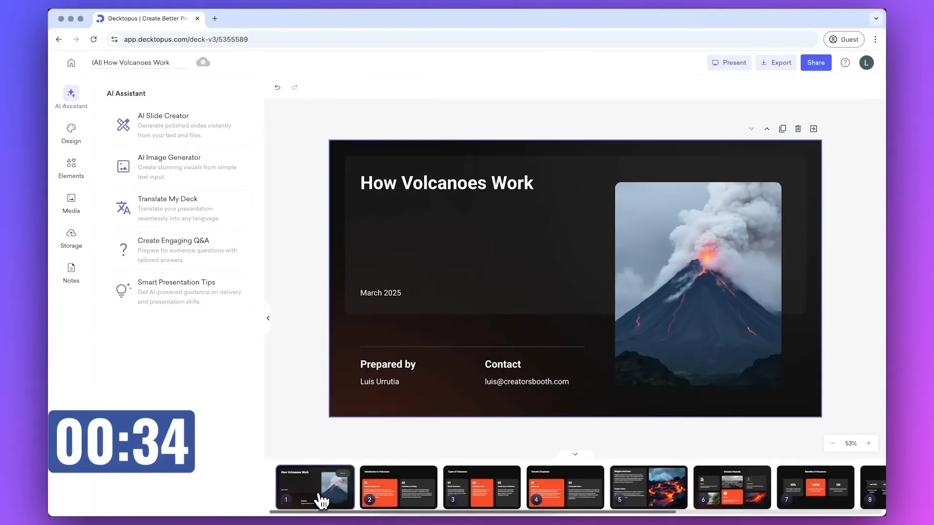
While designing slides manually is rewarding, there’s an even faster way to create presentations. I tested Decktopus, a website that uses AI to generate entire slide decks in seconds.
Here’s how it works:
- Go to decktopus.com in your browser.
- Enter a topic for your presentation—for example, “How volcanoes work.”
- Click “Generate Presentation” to create an outline with suggested slide topics.
- Edit the outline as needed—add or remove topics.
- Choose a theme from the available options and apply it.
- Click “Generate Presentation” again to get fully designed slides with images, icons, and text.
- Export the presentation to PowerPoint if desired.
In my test, Decktopus created a polished, multi-slide presentation in just 34 seconds. It even included relevant images and icons automatically, making it a powerful tool for rapid presentation creation.
Other features include AI image generation and language translation, which add extra flexibility.

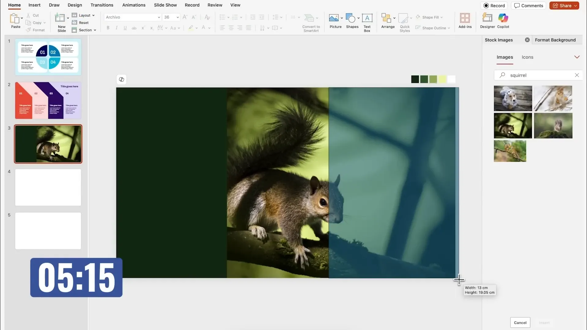
Slide #3: Minimalist Image and Text Layout
The third slide is all about simplicity and professionalism, using a large image with a clean text section on the right.
- Changed the background color to a dark green shade for a fresh look.
- Inserted a stock image of a squirrel that matched the color scheme.
- Added a rectangle shape on the right side for text content, aiming for a balanced layout.
- Copied the numbered text boxes from earlier slides and positioned them vertically within the rectangle.
- Updated the colors for contrast: a bright acid yellow for the title and darker text for the numbered points.
- Added a small arrow detail for visual interest.
This slide demonstrates how minimalism can be impactful when combined with strong color contrast and clear typography. It’s also easy to replicate or customize for different topics.
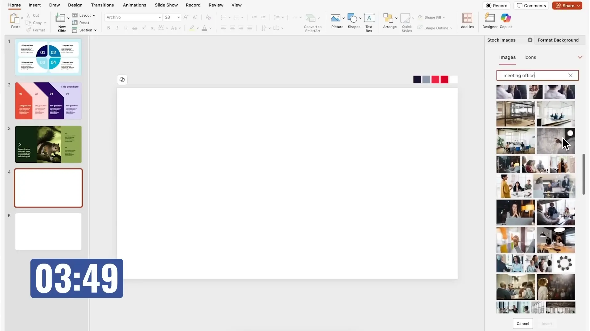
Slide #4: Corporate Business Style Layout
For the fourth slide, I aimed for a corporate, business-style design featuring a professional stock photo and clean text boxes.
- Inserted a stock image of a meeting in an office and flipped it horizontally to fit the layout.
- Changed the background color to a dark purple for a sleek feel.
- Added three evenly spaced rounded rectangles on the right side to contain key points.
- Removed outlines from the rectangles and filled them with white for contrast.
- Copied text from the previous slide, pasted into the rectangles, and adjusted colors and numbering.
- Added a title and description area on the right with an accent color to make it pop.
- Used smaller white font for the description to maintain readability against the dark background.
This slide strikes a balance between professionalism and visual appeal, making it suitable for business presentations or reports.
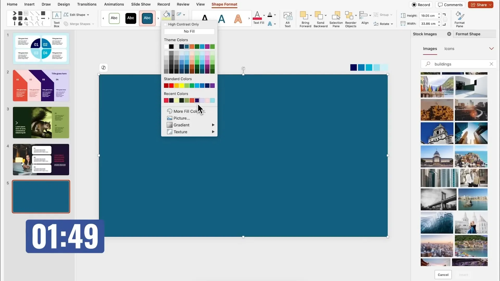
Slide #5: Abstract Background with Bold Cutout Text
The final slide is a bold, modern design using an abstract building image and a creative text cutout effect.
- Inserted an abstract image of a building and cropped it to fill the entire slide.
- Added a rectangle covering the whole slide and set its color to dark blue.
- Inserted a large text box with the year “2025,” centered and using a bold font.
- Adjusted line spacing and font size for maximum impact.
- Selected both the rectangle and text, then used Merge Shapes > Subtract to create a cutout effect where the text appears transparent.
- Copied title and description text boxes from previous slides and positioned them on the right side.
- Added semi-transparent boxes behind the text for readability and adjusted colors.
This slide showcases how combining imagery, typography, and shape effects can produce a striking visual statement quickly.
Tips for Speedy and Effective PowerPoint Slide Design
- Predefine Your Color Palette: Spend time choosing a palette before designing. This reduces decision fatigue and speeds up the process.
- Use Grouping and Duplication: Group elements to move and align them easily; duplicate and modify existing elements to save time.
- Leverage PowerPoint’s Shape Merge Tools: Merge shapes to create custom graphics and layouts without external tools.
- Keep Text Simple and Consistent: Use placeholder text where necessary, and stick to a limited set of fonts like Archivo for clean readability.
- Use Stock Images and Icons: PowerPoint’s built-in libraries are great resources for professional images and icons that fit your design.
- Don’t Get Stuck on Perfection: Aim for good enough under tight deadlines; you can always refine later.
- Try AI-Powered Tools: Tools like Decktopus can generate entire presentations in seconds, saving massive time.
Frequently Asked Questions (FAQ)
How can I design PowerPoint slides quickly without sacrificing quality?
Start by defining your color scheme and fonts beforehand. Use grouping and duplication features to replicate elements. Utilize PowerPoint’s shape merge tools to create custom designs efficiently. Also, consider AI tools like Decktopus to automate slide creation.
What is the best font to use for professional presentations?
I recommend using clean, modern fonts like Archivo for its readability and professional look. It pairs well with bold colors and simple layouts.
Can I use AI tools to create entire presentations?
Yes! Tools like Decktopus allow you to generate full slide decks in under two minutes, complete with images and icons. You can customize and export the slides to PowerPoint afterward.
What are some tips for choosing colors for slides?
Choose a harmonious color palette with complementary or analogous colors. Using different shades of the same color can create a cohesive look. Always ensure sufficient contrast between text and background for readability.
How do I avoid spending too much time on slide design?
Plan your design elements and colors before starting. Use templates or duplicate existing elements. Set a timer to keep yourself accountable and avoid perfectionism slowing you down.
Final Thoughts
Designing five unique PowerPoint slides in just ten minutes is challenging but absolutely doable with the right approach. By preparing a color palette, leveraging PowerPoint’s built-in tools, and focusing on clean, replicable layouts, you can boost your slide creation speed without compromising quality.
Remember, sometimes “good enough” is better than perfect—especially when time is limited. And when you need to create an entire presentation fast, AI-powered platforms like Decktopus can be lifesavers.
I hope these techniques inspire you to experiment with quick slide design and elevate your presentations. With practice, you’ll find your own rhythm and style that balances speed and creativity.
Happy designing!
Check out the full video: Easy 2-MINUTE SLIDE DESIGNS in PowerPoint 🫢


