
Presenting in front of an audience can feel intimidating, especially when you’re unsure where to start. Whether you want to inform, persuade, or simply captivate your listeners, the challenge remains the same: how do you keep their attention from wandering to phones, drifting into sleep, or whispering among themselves? The good news is, creating memorable, engaging presentations doesn’t have to be daunting. By incorporating creative ideas and thoughtful design, you can transform any presentation into an experience that your audience will remember and appreciate.
In this comprehensive guide, we’ll explore 31 creative presentation ideas designed to wow your audience and elevate your delivery. These tips come from seasoned experts and creative professionals who understand the art and science behind effective presentations. From minimalist design to dynamic visuals, from color psychology to humor, you’ll discover actionable strategies to make your next presentation shine.
Ready to take your presentations from dull to dazzling? Let’s dive in!

Table of Contents
- 1. Embrace Minimalism: Less is More
- 2. Use All Caps to Be Bold and Clear
- 3. Keep Slide Transitions Consistent and Horizontal
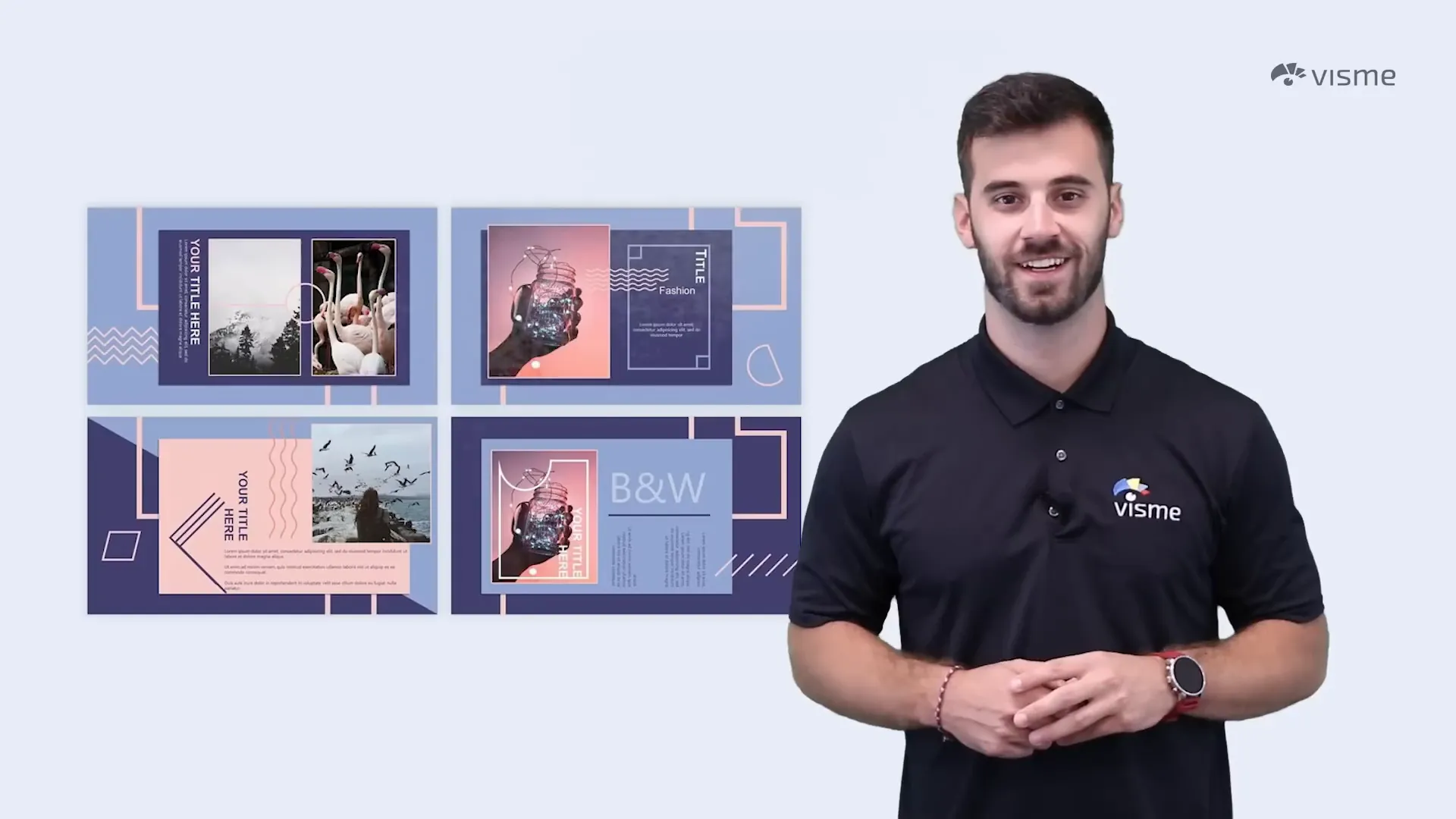
- 4. Add a Pop of Color in Black and White Designs
- 5. Go Vintage for Presentations About History or Tradition
- 6. Use a Monochrome Palette for Elegant Cohesion
- 7. Get Creative with Photo Crops and Shapes
- 8. Feature Circles for Emotional Accessibility
- 9. Use Isometric Illustrations to Visualize Complex Concepts
- 10. Add GIFs to Showcase Creativity and Humor
- 11. Incorporate Quotes to Break Up Dense Content
- 12. Start with a Provocative Statement
- 13. Understand What Your Audience Cares About
- 14. Use Black and White Photography for Elegance
- 15. Add Audio Narratives to Enhance Delivery
- 16. Use Space Themes to Inspire Imagination
- 17. Include Music to Set the Mood
- 18. Organize Content with Color Blocks
- 19. Incorporate Polaroid-Style Images for Nostalgia
- 20. Use Memes to Inject Humor
- 21. Utilize Timelines to Visualize Progress and History
- 22. Spice Up Data with Visualizations
- 23. Use Contrasting Colors to Make Text Pop
- 24. Inject Humor Through Your Personality
- 25. Create a Journal-Like Look for Authenticity
- 26. Use Ink Splatters to Add Color and Elegance
- 27. Theme Your Presentation Around Video Games
- 28. Use a Blackboard Theme for Educational Presentations
- 29. Bring Props to Elevate Interaction
- 30. Choose Bright, Fun Colors to Match Your Personality
- 31. Use Arrow Graphics to Guide Your Audience
- Bonus Tip: Stay Branded
- Conclusion
- Frequently Asked Questions (FAQ)
1. Embrace Minimalism: Less is More
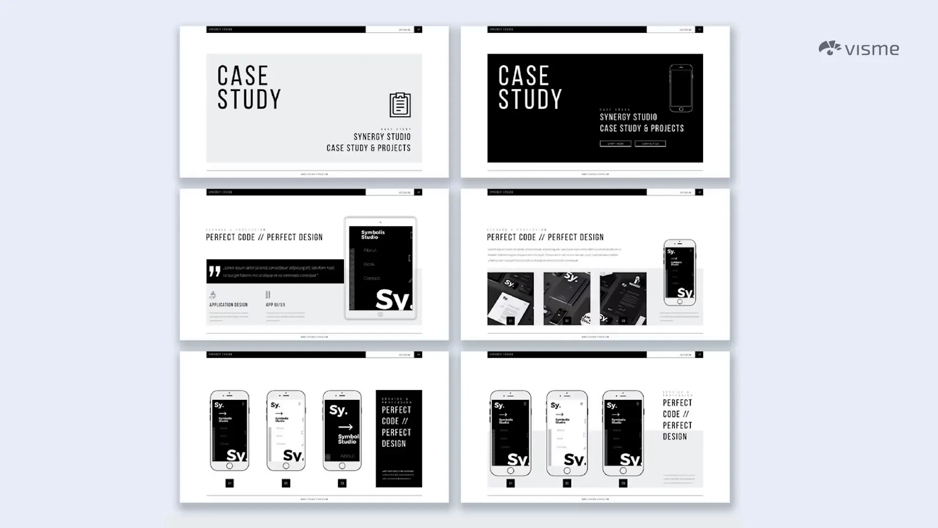
One of the simplest yet most powerful principles in presentation design is “less is more.” Minimalism means using just the right amount of visuals and information to communicate your message without overwhelming your audience. Clean, uncluttered slides invite your viewers to focus and absorb the information rather than feeling bombarded.
Look at minimalist slides — they feel calm and approachable. Too much text, too many images, or chaotic layouts can do the opposite, causing confusion and disengagement. The key is balancing simplicity with intrigue. Use just enough elements to keep your slides interesting without crowding them.
2. Use All Caps to Be Bold and Clear
When you opt for simplicity, don’t be afraid to make your text stand out. Using all capital letters for headlines and key points can draw attention effectively. It signals importance and urgency, making it easier for your audience to quickly grasp essential ideas.
All caps work especially well for titles, bullet points, and paired with audio narratives (more on that soon). Just be mindful not to overuse it—reserve all caps for the most important text to maintain clarity and impact.
3. Keep Slide Transitions Consistent and Horizontal
Slide transitions are often overlooked, but they play a crucial role in maintaining flow. One common mistake is using multiple types of transitions in one presentation — one slide might fade in, the next slide might move up, and the next might jump backward. This inconsistency distracts viewers.
Instead, choose a single transition style and stick with it. Horizontal transitions create a natural, easy-to-follow progression that feels seamless. Once you’re comfortable, you can extend this horizontal motion to individual elements like text and visuals for added polish and engagement.

4. Add a Pop of Color in Black and White Designs
Colors aren’t just pretty—they carry meaning and emotion. A striking way to use color is to create a black and white presentation with just one pop of color. This accent color draws the eye to specific details and highlights key points.
Choosing the right color is essential. Each hue conveys different feelings—blue might evoke trust, red can signal urgency, and green often represents growth. If you’re unsure, exploring color psychology can help you select colors that align with your message and brand identity.
5. Go Vintage for Presentations About History or Tradition
If your presentation explores history, tradition, or values rooted in the past, a vintage design can communicate trust and wisdom. Use bold fonts reminiscent of old posters, intricate frames around images, and sepia-toned colors like pastel turquoise, ochre yellow, washed-out blues, and oranges.
Faded vintage photographs also make excellent backgrounds, enhancing authenticity and emotional connection with the audience.

6. Use a Monochrome Palette for Elegant Cohesion
Monochrome palettes consist of various tones and shades of a single color. This approach creates a cohesive and sophisticated look. For example, a deep navy background paired with bright royal blue icons creates depth and focus.
When using this technique, keep your background pale and your text and icons in stronger, contrasting shades to maintain readability and visual hierarchy.
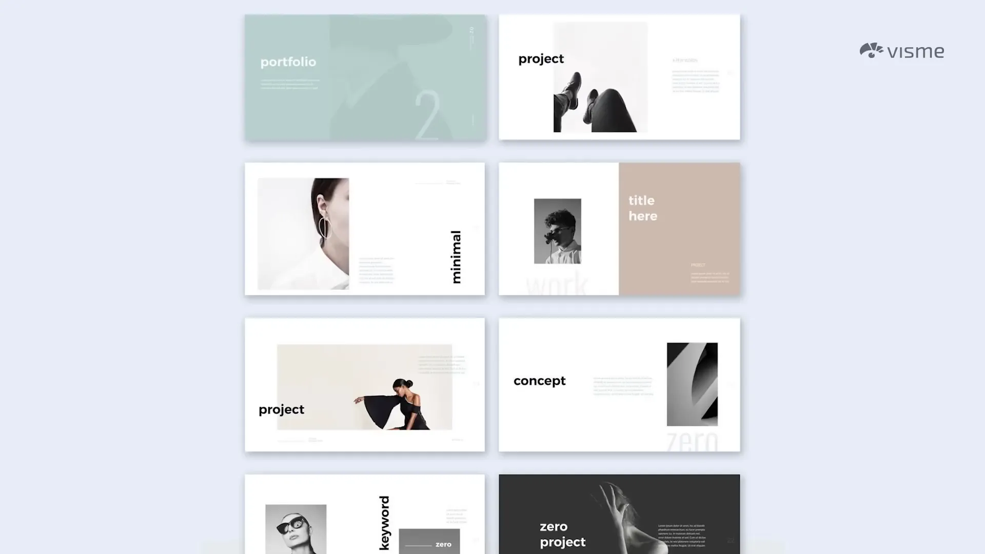
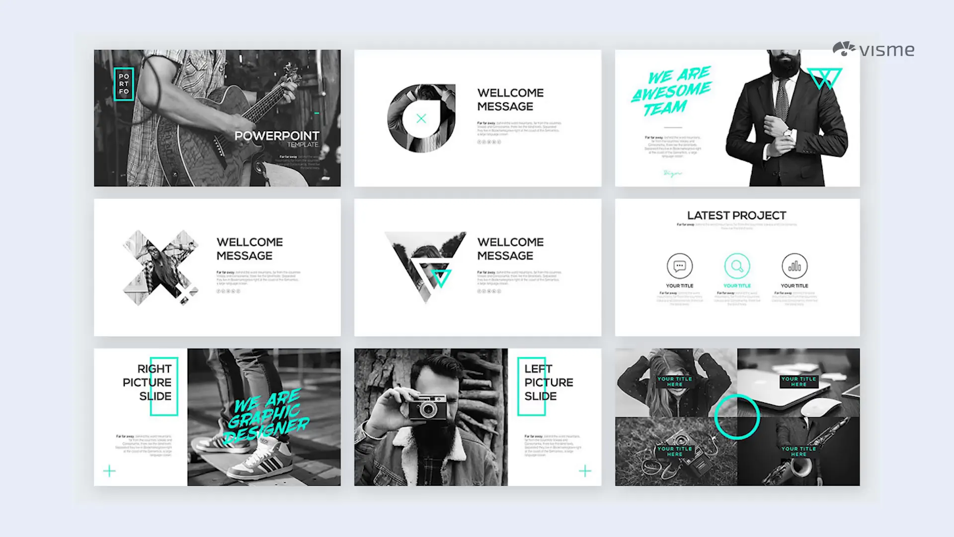
7. Get Creative with Photo Crops and Shapes
Don’t limit your images to boring squares or rectangles. Cropping photos into circles, brush strokes, or other shapes adds visual interest and personality to your slides. This technique can help match the mood or theme of your presentation.
You don’t need to be a Photoshop expert to do this—platforms like Visme offer easy editing tools to crop and style images beautifully.

8. Feature Circles for Emotional Accessibility
Circles in design symbolize wholeness and completion, and they tend to make presentations feel more emotionally accessible. Use them as framing elements or photo crops to soften the overall look and invite connection.

9. Use Isometric Illustrations to Visualize Complex Concepts
Isometric illustrations are 3D-like graphics that break down complex items into individual parts. They help your audience understand intricate ideas by visualizing each component clearly.
You can also create mini worlds with characters and actions to tell a story or demonstrate processes.

10. Add GIFs to Showcase Creativity and Humor
GIFs have become a staple in digital communication, and they’re perfect for presentations too. They add humor, illustrate points quickly, and keep your audience engaged.
Sites like Giphy.com offer vast libraries of GIFs or tools to create your own. Just ensure your GIFs align with your presentation’s theme and tone.

11. Incorporate Quotes to Break Up Dense Content
When your presentation is packed with information, inserting a slide with a relevant quote gives your audience a moment to breathe. Think of it as a commercial break on TV—an opportunity to pause and reflect.
Choose quotes that complement your message to avoid confusion and keep your presentation cohesive.

12. Start with a Provocative Statement
Grab your audience’s attention right from the first slide with a bold, thought-provoking statement. This immediate engagement encourages viewers to want to hear your explanation and follow along closely.
Follow the statement with slides that explain your reasoning and back up your claim, keeping your narrative clear and compelling.

13. Understand What Your Audience Cares About
Remember, people don’t care about your brand—they care about how your brand can help them. This mindset shift is crucial when crafting your presentation content and design. Focus on benefits, solutions, and value rather than just brand promotion.

14. Use Black and White Photography for Elegance
For a sophisticated and timeless feel, black and white photos are a great choice. You can find black and white images or desaturate your own photos to achieve this effect.
This technique also complements vintage themes and can calm down overly colorful presentations.

15. Add Audio Narratives to Enhance Delivery
If public speaking isn’t your strongest suit, consider adding audio narratives to your slides. This transforms your presentation into a multimedia experience and allows you to either create a full video presentation or add audio segments to individual slides.
Audio can help explain complex points, add personality, and keep your audience engaged. Tools like Visme make integrating audio easy and seamless.

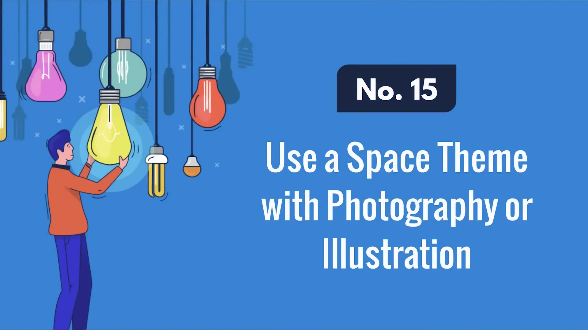
16. Use Space Themes to Inspire Imagination
Even if your topic isn’t about space, using cosmic backgrounds or galaxy imagery can symbolize endless possibilities, new beginnings, or innovation. It also adds a visually stunning backdrop that can elevate your presentation’s aesthetic.
If you’re unsure where to start, look for examples that inspire you and adapt them to fit your content.
17. Include Music to Set the Mood
Music is a powerful tool for engagement. It stimulates the audience, sets the tone, and can make presentations feel more entertaining. However, it must suit your content—instrumental or acoustic tracks work best as they don’t overpower your message.
Avoid loud or lyric-heavy music that can distract or overwhelm.

18. Organize Content with Color Blocks
Using blocks of color to section off information creates a neat, organized look. Important content fits inside these blocks, while decorative elements stay outside, maintaining clarity.
Experiment with different shapes and colors, but ensure your palette is harmonious and visually appealing.
19. Incorporate Polaroid-Style Images for Nostalgia
Polaroid photos are instantly recognizable and evoke nostalgia and warmth. Use them within your slides to showcase images in a fun, familiar way.

You can feature single Polaroids or multiple photos arranged on a corkboard-style background to create a storytelling effect.

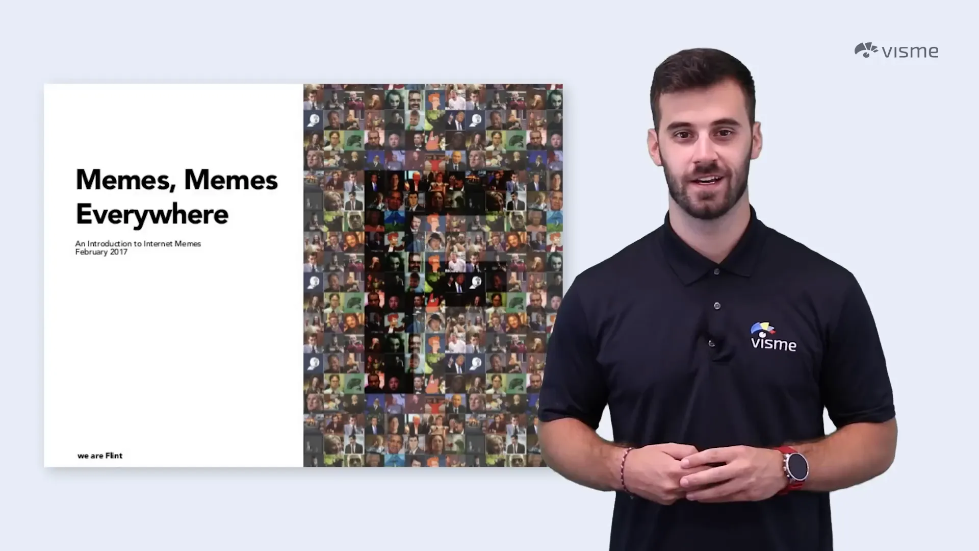
20. Use Memes to Inject Humor
Memes are a fantastic way to make your audience smile, especially when placed unexpectedly. They lighten the atmosphere and can make your presentation more relatable.
Use memes sparingly and only when they fit naturally into your content to avoid seeming forced or distracting.
21. Utilize Timelines to Visualize Progress and History
Timelines are excellent for presentations that cover projects, plans, or historical events. They help your audience follow sequences clearly and understand the flow of time.
If you use horizontal slide transitions, assign one timeline event per slide to maintain a natural progression toward your conclusion.

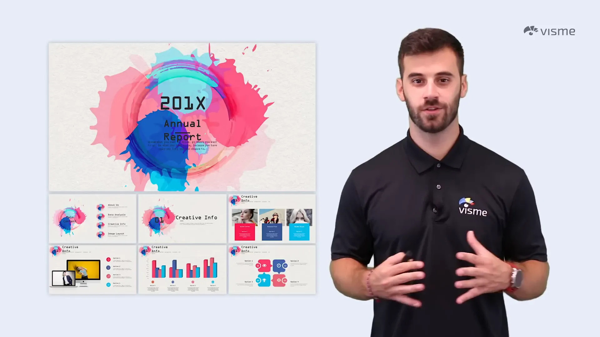
22. Spice Up Data with Visualizations
Raw data in spreadsheets can put your audience to sleep. Instead, focus on the key insights and transform them into beautiful, easy-to-understand charts and graphics.
Well-designed data visualizations not only make your points clearer but also keep your audience engaged and informed.

23. Use Contrasting Colors to Make Text Pop
If you have slides filled with text, use contrasting colors between the background and the text to enhance readability and draw attention. Contrasting colors help information leap off the page and guide the viewer’s eye.
Tools like Adobe Color can assist you in generating perfect color palettes that contrast well.

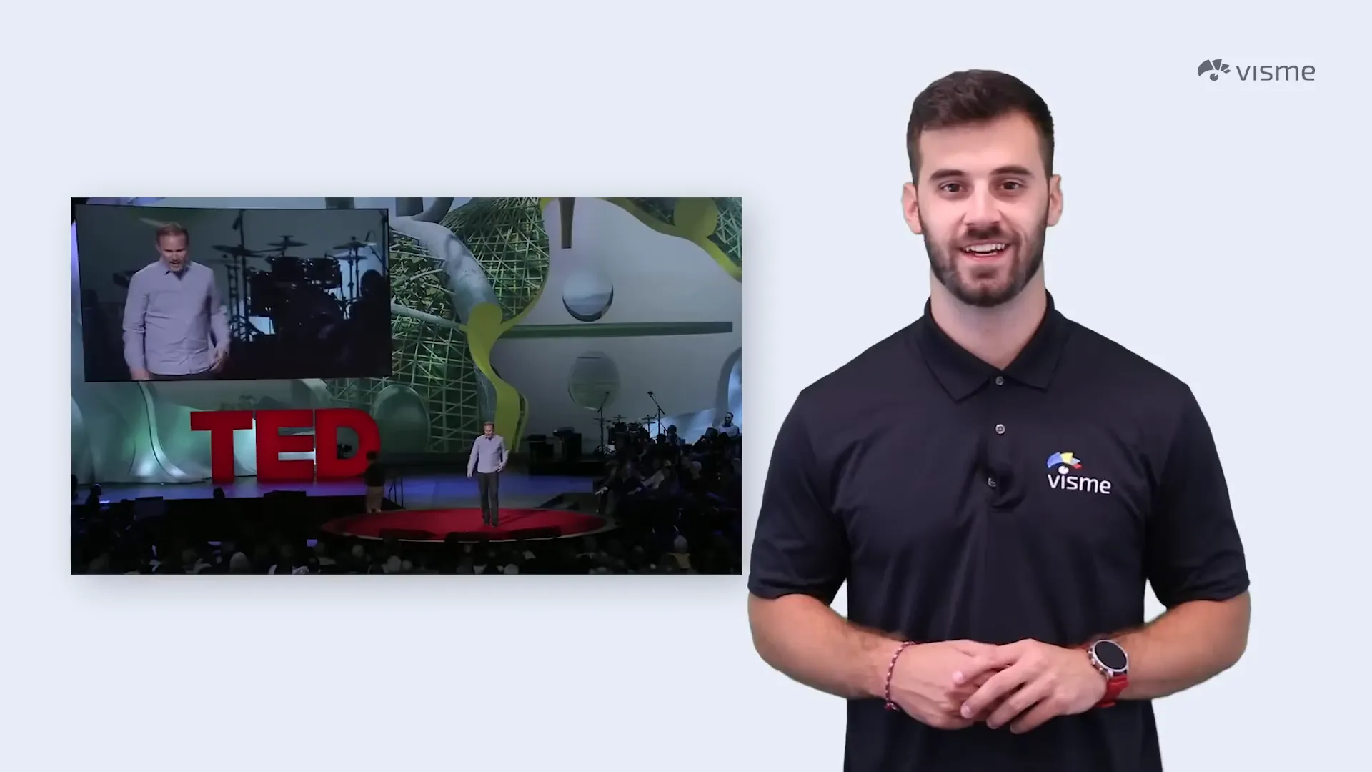
24. Inject Humor Through Your Personality
Your personality is a powerful asset. Don’t hesitate to include jokes or light-hearted moments in your presentation to engage your audience. Humor makes your message more memorable and creates a positive connection.
Take inspiration from speakers like Morgan Spurlock, who successfully used comedy in typically serious settings like TED Talks.
25. Create a Journal-Like Look for Authenticity
Designing your slides to resemble a journal with handwritten notes and personal items can make your presentation feel more real and natural. This style invites viewers into a personal space, making your content relatable.
Surround notes with objects someone might keep at their desk to enhance the effect.

26. Use Ink Splatters to Add Color and Elegance
Ink splatters are a versatile design element that can add color, energy, and even elegance to your slides. When used correctly, they can make your presentation look artistic yet clean.
Choose the size of splatters carefully—large splatters make bold statements, while tiny drops add subtle accents.
27. Theme Your Presentation Around Video Games
Video games are universally recognized and loved. Designing your slides to mimic a popular game like Super Mario creates a fun, immersive experience.
This approach is especially effective for presentations about progress, rankings, or gamified concepts. Do some research, capture screenshots, and build your own gaming world to engage your audience.

28. Use a Blackboard Theme for Educational Presentations
A chalkboard background paired with handwriting fonts evokes memories of school and learning. This theme works well for informative presentations where you want to emphasize education and clarity.
Fonts with chalky textures can enhance authenticity and visual appeal.

29. Bring Props to Elevate Interaction
Props can transform your presentation into a dynamic, interactive experience. For example, Kenny Nguyen used a sword and shield in his TED Talk to symbolize concepts, making his message more memorable.
Consider incorporating physical items that relate to your topic to captivate your audience and make your presentation stand out.

30. Choose Bright, Fun Colors to Match Your Personality
Color choice should reflect your personality and presentation topic. If you’re creative, energetic, and fun, bright colors can amplify that vibe. Use up to six bright colors carefully balanced to avoid overwhelming your slides.
Experiment with different palettes before finalizing your design.

31. Use Arrow Graphics to Guide Your Audience
Arrows are simple yet powerful design elements that signify direction, trends, and focus. They can guide your viewers’ eyes and help emphasize key points.
Whether straight, curved, colored, or bent, arrows add clarity and flow to your presentation.

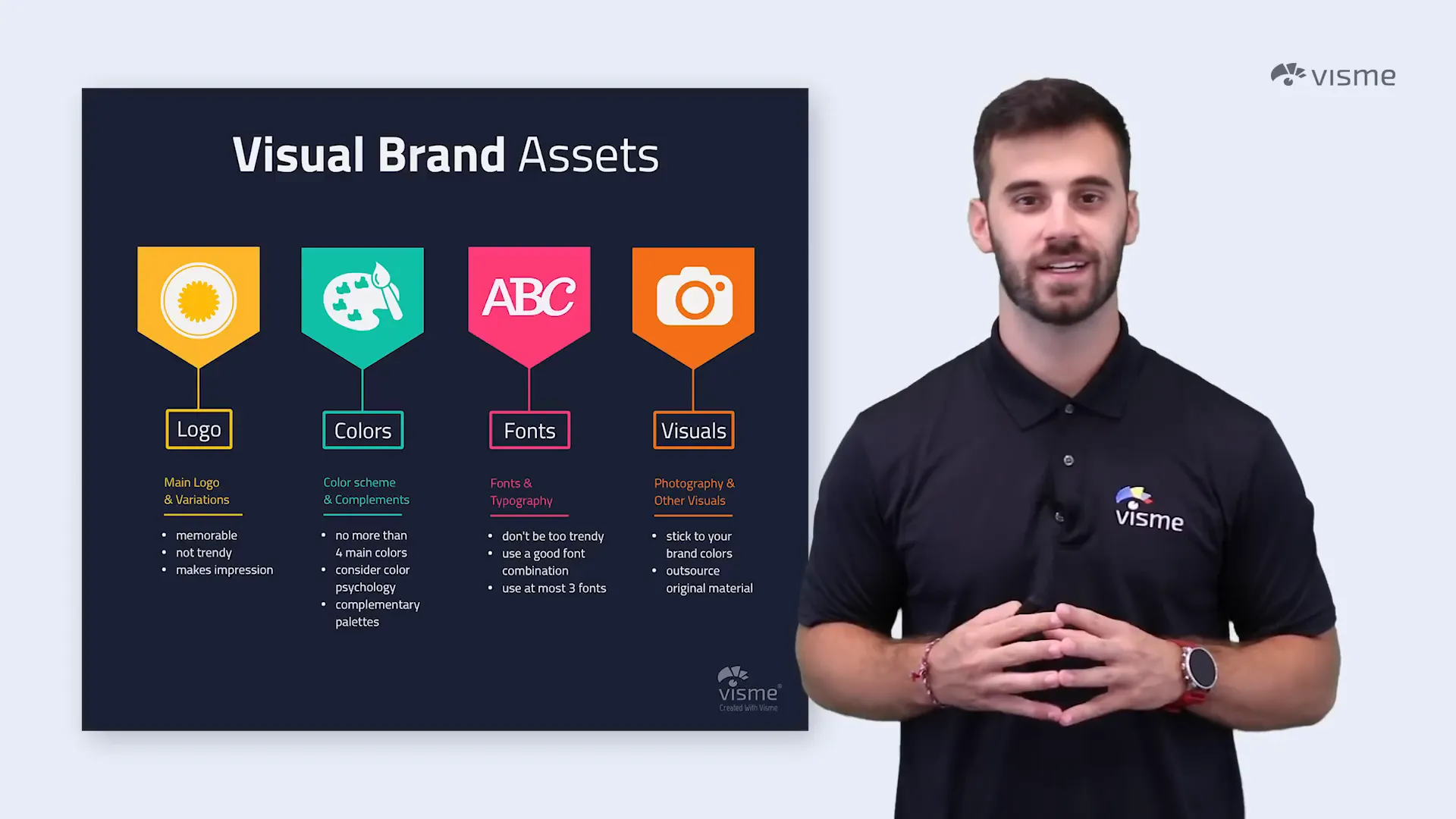
Bonus Tip: Stay Branded
Throughout your presentation, consistency is key. Use colors, fonts, and themes that align with your brand identity. Resist the temptation to use too many different styles or colors, which can confuse your audience and dilute your message.
Staying on brand builds trust and professionalism, reinforcing your message every step of the way.
Conclusion
Creativity and thoughtful design can turn any presentation from tedious to terrific. By applying these 31 ideas—from minimalist layouts and bold typography to interactive props and humor—you can captivate your audience and make your message unforgettable.
Remember, the best presentations are not only visually appealing but also aligned with your content and audience’s needs. Experiment with these ideas, find what resonates with your style, and watch your presentations come alive.
For more inspiration, explore tools like Visme that simplify creating stunning presentations with professional templates, charts, and multimedia options.
Frequently Asked Questions (FAQ)
Q1: How can I make my presentation more engaging?
Use a combination of clean design, consistent transitions, relevant visuals, and interactive elements like GIFs or props. Incorporate storytelling, humor, and audio narration to connect emotionally with your audience.
Q2: What is the best way to use color in presentations?
Choose colors that align with your brand and message. Use contrasting colors for text and backgrounds to improve readability. Consider using monochrome palettes or black and white with a pop of color for elegance and focus.
Q3: How do I keep my audience’s attention during a presentation?
Start with a bold, attention-grabbing statement. Vary your slide design with quotes, timelines, and visuals. Use audio and music appropriately, and include moments for your audience to pause and reflect.
Q4: Can I use humor in professional presentations?
Yes, humor can be very effective if it fits naturally with your content and audience. Avoid forced jokes and stay respectful. Humor can help humanize your presentation and make it memorable.
Q5: What tools can help me create creative presentations?
Platforms like Visme offer easy-to-use templates, multimedia integration, audio narration, and design tools that help you create professional, creative presentations without needing advanced design skills.
Check out the full video: 31 Creative Presentation Ideas to Delight Your Audience


