

Table of Contents
- Introduction: Why choose PowerPoint for posters
- What you need before you start
- Step-by-step build: Create the poster from scratch
- Working with shapes: subtract, union, edit points
- Adding and styling images
- Shadows, highlights and depth
- Typography and headline design
- Exporting and printing: digital vs print considerations
- Design variations and creative ideas
- Troubleshooting: common problems and fixes
- Tips, best practices, and accessibility
- FAQ
- Resources and download
- Conclusion
Introduction: Why choose PowerPoint for posters
Hello — I’m the creator behind POWERPOINT UNIVERSITY, and in this guide I’ll walk you through how to Design training poster in powerpoint from start to finish. PowerPoint is not only for slide decks; it’s a surprisingly powerful tool for creating posters, flyers, and single-slide marketing assets because of its intuitive shape tools, alignment features, and export options. Using PowerPoint means you don’t need expensive design software to produce a clean, print-ready training institute poster.
This tutorial covers every step: building the layout with shapes, cutting shapes using Merge Shape tools, adding photos, creating depth with shadows, and finalizing typography so your poster looks polished. If you want a ready-made template, there’s also a downloadable template available so you can skip to the finish line and customize quickly.
Throughout this article I’ll show concrete steps, explain why each choice matters, and offer alternatives so you can adapt the poster to your brand. The goal is to empower you to Design training poster in powerpoint that’s suitable for digital distribution and print.
What you need before you start
Before you begin to Design training poster in powerpoint, gather the following:
- PowerPoint (Office 2016 or later recommended for Merge Shape tools and online picture search).
- High-resolution photos (library interiors, students, instructors). Prefer PNG with transparent background when available.
- A clear headline or tagline (e.g., “New horizons, new hopes” or “Opening new opportunities”).
- Brand colors and a primary font (in the tutorial we use Open Sans and Open Sans Extra Bold).
- Contact information to display: phone number, website or address.
- Optional: the downloadable template if you want to customize an existing design quickly. (Download link referenced in resources.)
Having these elements ready before you start speeds up the process and ensures consistent brand application while you Design training poster in powerpoint.
Step-by-step build: Create the poster from scratch
Below is a structured, detailed walkthrough that mirrors the exact sequence used to create the training institute poster. If you follow each step you’ll reproduce the layout and be able to customize it for your own institute.
Step 1 — Create a new slide and set the background
Open PowerPoint and add a new blank slide. We’ll start by creating the poster background using a full-slide rectangle.
- Go to Insert > Shapes and select the Rectangle.
- Draw a rectangle covering the entire slide. This is the base background.
- Right-click > Format Shape > Fill > Solid fill, and choose a dark blue (or your brand color).
- Set Shape Outline to No Outline.
Tip: You can experiment with gradients in Format Shape > Gradient fill for more visual depth.
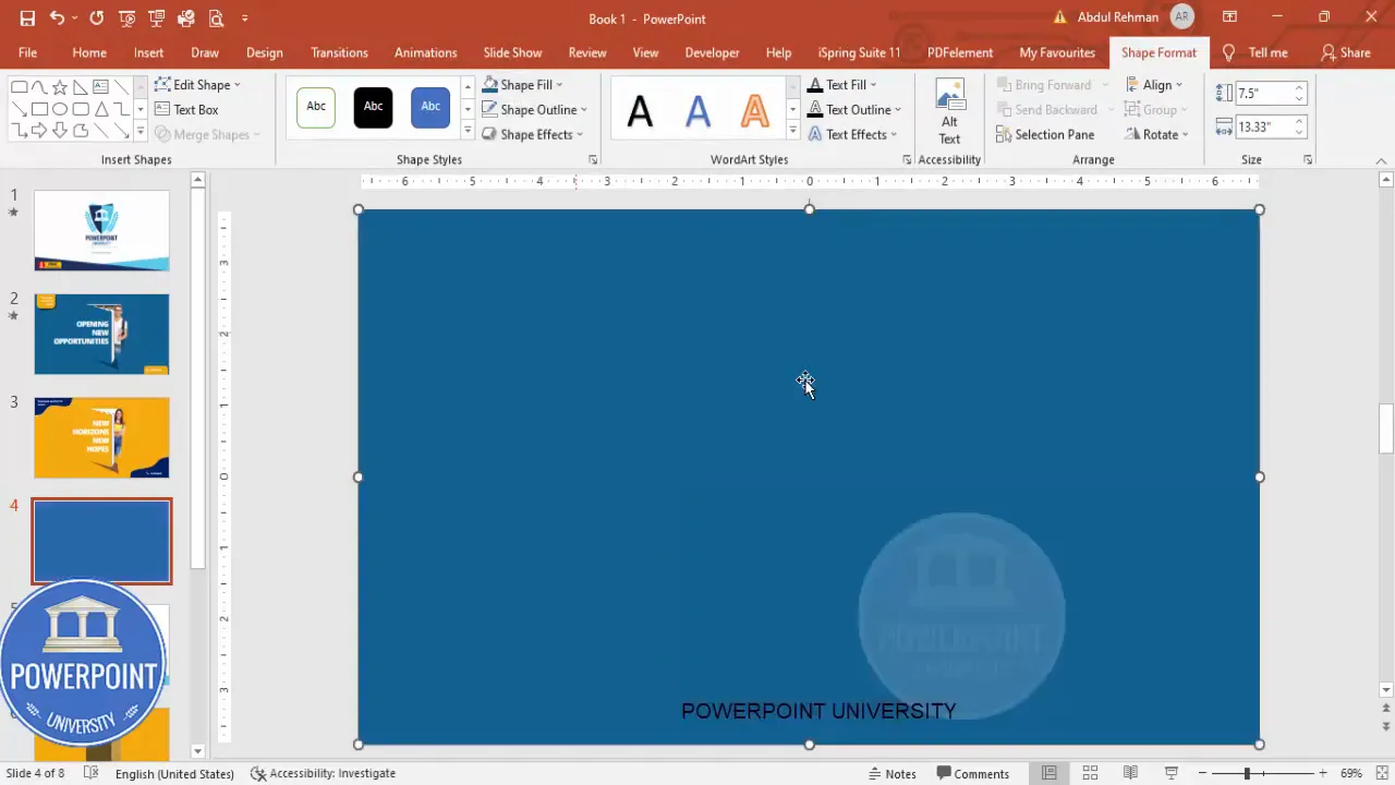
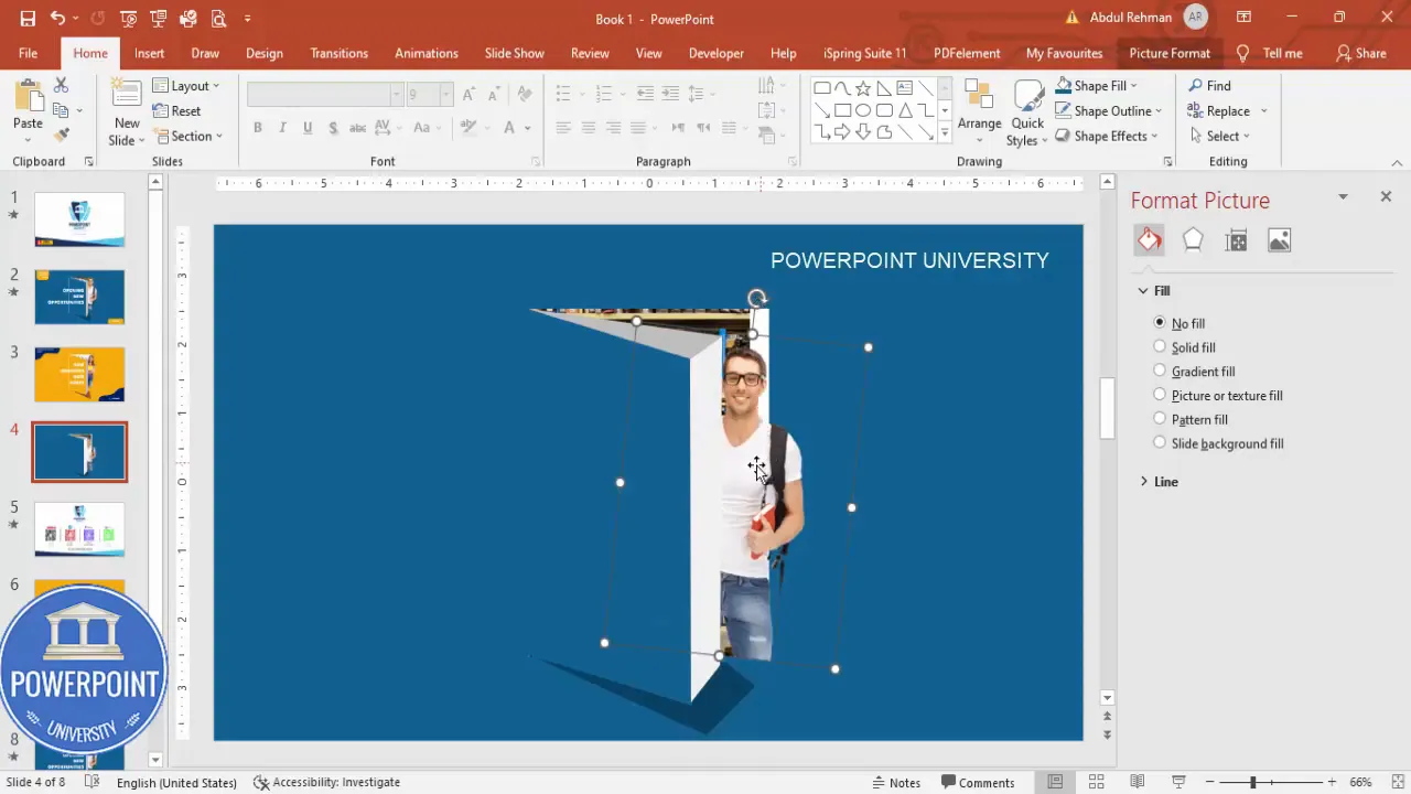
Step 2 — Create the centered cutout
We’ll create a cutout or a doorway-like shape by subtracting a white rectangle from the blue background. This creates a smart negative space effect that makes the poster look modern and focused.
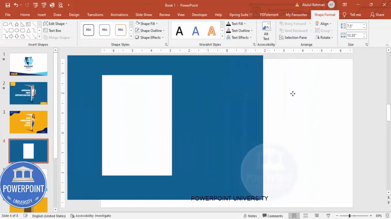
- Insert a second rectangle and place it centrally on the slide. This will be the area to subtract from the background.
- Format it with Shape Fill set to white and Shape Outline set to No Outline.
- Select the blue background rectangle first, then hold Shift and select the white rectangle. Use Drawing Tools > Merge Shapes > Subtract. The white rectangle will be removed from the blue background, leaving a cutout.
Why subtract? Subtraction creates dynamic shapes and effective framing for your imagery and headline. The negative space draws the viewer’s eye to the main content.
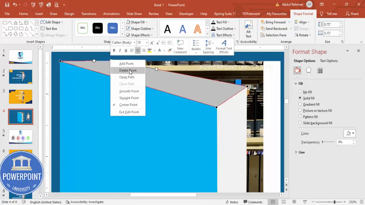
Step 3 — Make a “door” shape with a triangle and union
To enhance the cutout so it looks like a door opening, we’ll create a smaller white rectangle and a triangle, subtract the triangle from the top portion, and union the pieces at the bottom.
- Insert a new rectangle for the door shape and position it inside the cutout area.
- Insert a Right Triangle shape. Rotate and flip it as needed so the triangle will cut a portion from the top of the door rectangle.
- Select the blue rectangle (or the piece you want to cut), hold Shift and select the triangle, then Merge Shapes > Subtract.
- Select the remaining door-bottom shape and the rectangle you want to add to the bottom, then Merge Shapes > Union to make them a single piece.
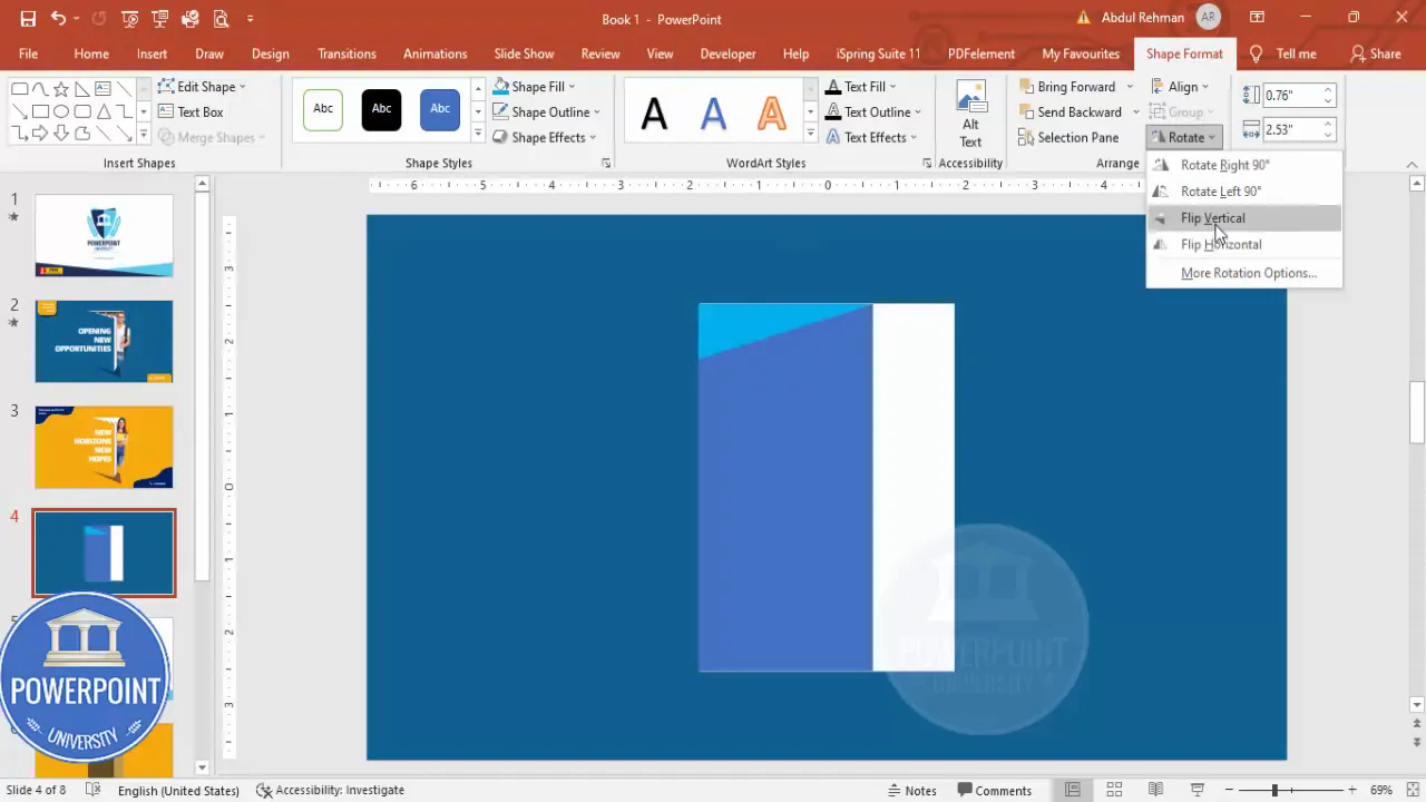
This combination of subtraction and union allows you to create custom shapes that would be harder to draw accurately with a single freehand shape.
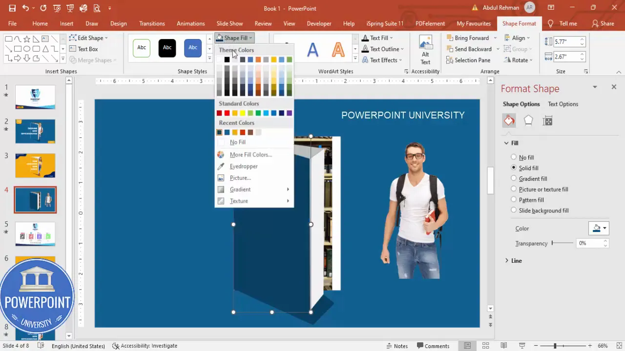
Step 4 — Add background imagery (library photo)
Next, insert a background image of a library or classroom to make the poster relevant and visually interesting.
- Insert a rectangle where you want the image to appear (this acts as an image frame).
- Right-click the rectangle > Format Shape > Fill > Picture or texture fill.
- Choose Insert > Online Pictures (or From a file). Search for “library” and pick a suitable image.
- Adjust the picture position and scale inside the rectangle using the Offset and Scale options or by cropping the source image if needed.
- Right-click the image shape and choose Send to Back so it sits behind the main blue frame and shapes.

Note: When you fill a rectangle with a picture, PowerPoint treats it as a shape fill — this gives you the flexibility to maintain the frame’s clean edges while using an image as content.
Step 5 — Insert a college student image
Add a photographic subject — a student, instructor, or graduate — that communicates who the poster is for.
- Insert > Pictures > Online Pictures and search for “college boy” or “college student.”
- Choose an image with a transparent background if possible, or use the Remove Background tool to cut away the background.
- Resize and place the student image so it partially overlaps the cutout/door area — this makes the composition dynamic and layered.
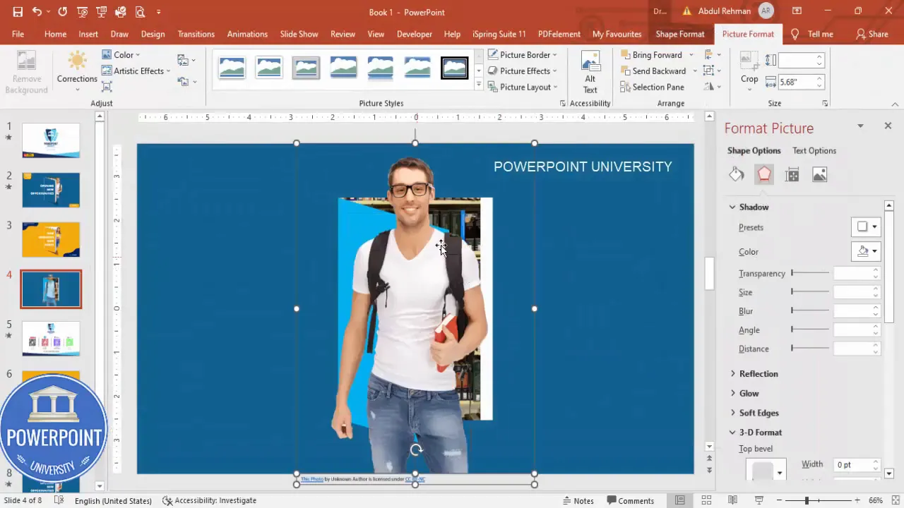
Pro tip: Images with transparent backgrounds (PNG) save time — you won’t need to remove backgrounds manually, and they blend naturally with your shapes.
Step 6 — Create book / layered shapes with Freeform
To add visual narrative — for example, a stack of books or layered surfaces — use the Freeform shape tool to draw organic shapes that overlap the background.
- Go to Insert > Shapes > Freeform and click to create points around the area you want to cover. Click at each corner and then join the final point back to the start.
- Set Shape Outline to No Outline and apply a light gray fill for the top shape and a darker gray for the lower shape to give a layered book effect.
- Right-click the shape > Edit Points to adjust curvature and make the shapes look like book covers or pages.
- Group related shapes (select them and press Ctrl+G) so they behave as a single object when repositioning.
Freeform shapes are powerful for custom designs — use Edit Points to refine the curves so the shapes look natural.
Step 7 — Add the shadow for the door
Depth sells; a subtle shadow makes the door cutout and the student image pop. We’ll create a shadow shape and place it behind the door.
- Use Freeform to draw the shadow shape that sits along the edge of the door cutout.
- Apply a dark color (deep blue or near-black) and remove the outline.
- Send the shadow to Back so it sits behind the door shape but above the background.
- Adjust transparency under Format Shape > Fill > Transparency to make the shadow soft (try 20–40%).
Small, subtle shadows produce a more professional look than heavy, obvious dropshadow effects.
Step 8 — Position and align everything
Now that the main shapes, image, and shadow are in place, align the pieces carefully.
- Use Home > Arrange > Align > Align Center and Align Middle for precise placement.
- Use PowerPoint gridlines and guides (View > Guides and Gridlines) to ensure consistent spacing.
- If grouped pieces aren’t moving the way you expect, ungroup temporarily, reposition, then regroup.
Be mindful: when you scaled some grouped objects earlier, distortion can occur. If an object distorts when resizing, try resizing the grouped parts independently, or use Scale options in Format Shape for better control.
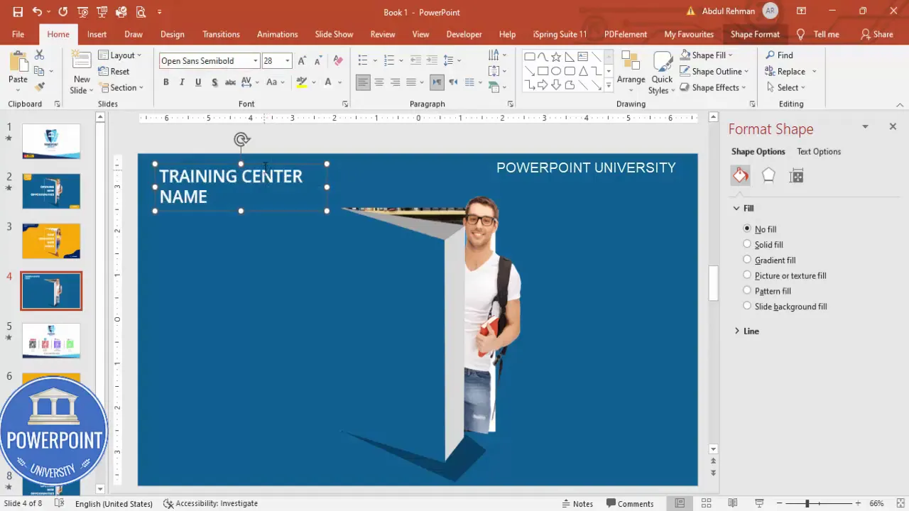
Step 9 — Add the training institute name and subtext
Text anchors the design. Decide hierarchy (institute name, course name, tagline, mobile number) and apply a clear typographic system.
- Insert > Text Box and type your training center name. Choose a clean, legible font such as Open Sans.
- Make the text white against the dark blue frame for contrast. Use Open Sans Regular or Semibold for the center name and Open Sans Extra Bold for the headline.
- Place the contact details at the bottom: mobile number, short URL, or QR code if you want to make it scannable.
Tip: Keep the contact line concise and readable from a distance. If you’ll print the poster, make sure the phone number is at least 14–18 pt depending on the poster size.
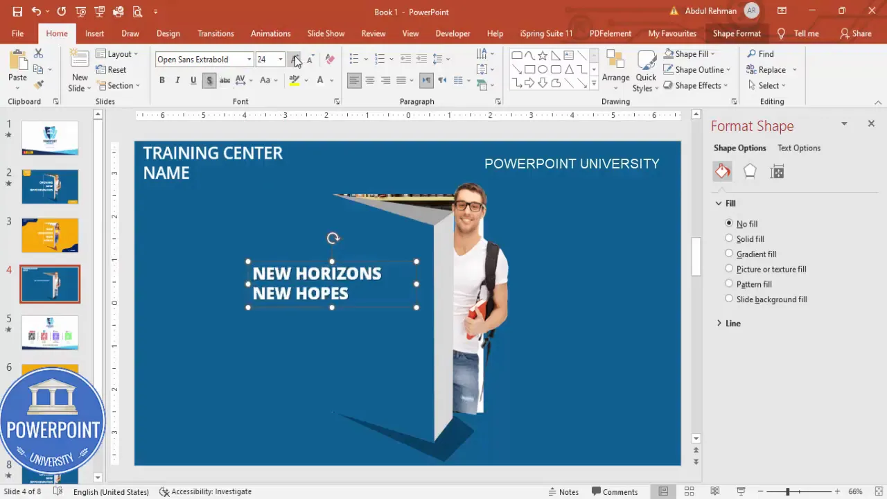
Step 10 — Add the headline: New horizons, new hopes
The headline should be bold and succinct. Here are the steps to style it:
- Insert > Text Box and type the headline: “New horizons, new hopes.”
- Set the font to Open Sans Extra Bold. Increase font size until the headline balances with the visual elements (don’t overwhelm the layout).
- Apply a subtle shadow via Format > Text Effects > Shadow to add contrast against bright backgrounds.
- Align the headline centrally or left-aligned depending on composition preference.
Headlines are your hook — test a few variations: “Opening new opportunities,” “Begin your journey,” or a program-specific headline like “Advanced Data Science Cohort.”
Create Slides in Seconds with ExpertSlides AI |
|
Generate AI Presentations today: |
| TRY NOW! |
Working with shapes: subtract, union, edit points
Mastering Merge Shapes and Edit Points unlocks advanced design possibilities in PowerPoint. Here’s a concise cheat sheet:
- Union: Combines selected shapes into one shape (useful to build complex single objects).
- Intersect: Keeps only the overlapping area of selected shapes.
- Subtract: Removes the top shape from the bottom shape (used to create windows or cutouts).
- Fragment: Breaks shapes into smaller overlapping parts (useful but can produce many pieces).
- Edit Points: Allows you to refine curves and corners — essential for creating natural-looking custom shapes.
When you plan to Design training poster in powerpoint, think of shapes as building blocks. Combine subtraction and union to create frames, doors, podiums, and abstract forms that direct attention.
Adding and styling images
Images are central to a training poster because they convey context. Use images strategically:
- Choose subject-focused images that align with the training content (students, teachers, labs, classrooms).
- Prefer high-resolution images (300 DPI for print). For digital use, 72–150 DPI is acceptable.
- Use picture fills inside shapes to keep edge control.
- When using people, try to position their gaze toward the headline or call-to-action — this subtly guides the viewer’s attention.
Use the Remove Background tool carefully if the subject requires isolation; manually refine the selection for cleaner edges. If you placed a portrait with transparent background, ensure it overlaps the cutout with natural-looking proportions.
Shadows, highlights and depth
Depth is created by layering and soft shadows. Avoid default heavy shadows. Instead:
- Create shadow shapes manually using Freeform and set transparency (20–40%).
- Use Format > Shape Effects > Soft Edges for subtle blending when appropriate.
- Apply slight gradients on large shapes to simulate light fall-off.
Manual shadow shapes, as used in this tutorial, offer more control than automatic effects — you can sculpt the shadow to match your implied light source accurately.
Typography and headline design
Your letter choices will determine readability and tone. When you Design training poster in powerpoint, follow these typography guidelines:
- Choose one primary headline font (Open Sans Extra Bold in this tutorial) and one secondary body font (Open Sans Regular/Light).
- Maintain contrast: white on dark backgrounds or dark on light backgrounds.
- Keep font sizes accessible: headlines large and legible; body text sized to be easily read at the intended viewing distance.
- Limit to two or three type weights to avoid clutter.
Use consistent spacing and alignment. If the poster will be printed, avoid using fonts not embedded in the final file unless you convert the text to shapes or provide the font file to the printer.
Exporting and printing: digital vs print considerations
Decide whether the poster will be used primarily online or printed — export settings differ:
- For digital sharing: Export as PNG or JPEG from File > Export > Change File Type > PNG/JPEG. 150–300 PPI is usually sufficient for high-quality screens and social assets.
- For print: Export as PDF for print. Use File > Save As > PDF and ensure Print Quality is set to High. For a single-page poster, you can also use File > Export > Create PDF/XPS Document.
- When printing large posters, set slide size to the final poster dimensions before you start (Design > Slide Size > Custom Slide Size). That prevents scaling and distortion.
Color profile: PowerPoint uses RGB. If your print provider requires CMYK, request a proof or use a conversion workflow outside PowerPoint. Always produce a test print when color precision matters.
Design variations and creative ideas
One of the strengths of using PowerPoint is speed. Here are ways to iterate quickly while you Design training poster in powerpoint:
- Swap background colors and test different contrast levels for legibility.
- Replace photos to convey different training themes (IT, language, management, arts).
- Try left-aligned vs centered compositions; each gives a different visual energy.
- Create program-specific posters by changing the headline and replacing the student image with program-specific imagery.
- Use icons instead of images for minimalist posters — PowerPoint’s icon library can be helpful.
Duplicate your primary slide and make variations for different programs. Use Duplicate Slide to save time and keep consistent structure across the series.
Troubleshooting: common problems and fixes
Shapes not merging as expected
If Merge Shapes options are unavailable or they don’t work correctly:
- Ensure both objects are shapes, not pictures or grouped objects that include pictures. Convert pictures into shapes by using a shape filled with picture rather than paste the picture directly, or recreate the object as a shape.
- Ungroup complex groups (Right-click > Group > Ungroup) and then try Merge Shapes again on the base shapes.
Image edges look jagged when exported
- Export at higher resolution (PNG at 300 PPI). In PowerPoint, you can increase export resolution by changing registry settings on Windows or by exporting with large dimensions and scaling down externally.
- Use vector shapes for crisp edges and avoid stretching raster images beyond their native resolution.
Text becomes too small when printing
- Design at the final poster size (e.g., A3, A2) to ensure text sizes are adequate. Typography that looks good on an A4 slide might be too small for larger posters.
- Ask your printer for recommendations on minimum font size for legibility at the intended viewing distance.
Tips, best practices, and accessibility
Designing effectively requires both aesthetics and usability. Keep these best practices in mind when you Design training poster in powerpoint:
- Contrast is critical: Use high contrast between text and background for readability. Check contrast ratios where possible (aim for at least 4.5:1 for body text).
- Hierarchy: Clear visual hierarchy (headline > subheading > body > contact) guides the viewer.
- Simplify copy: Posters are glance media — keep text short and action-focused.
- Use whitespace: Avoid clutter around the headline and call-to-action to improve legibility and visual impact.
- Consistency: Keep color and typography consistent across a campaign of posters.
- Export backups: Save a working .pptx and export a PDF for printing and PNG for web.
- Include contact clearly: Mobile number or QR code should be visible and scannable/readable.
FAQ
Q: Can I use PowerPoint to design posters for print?
A: Yes. PowerPoint can be used to design posters for print. Set your slide size to the final poster dimensions in Design > Slide Size before you start, and export as PDF at high quality. For accurate color reproduction, check with your print shop about RGB-to-CMYK conversion and request a proof.
Q: What file formats should I export for online sharing and printing?
A: For online sharing, export as PNG or JPEG. For printing, export as PDF at high quality. If your printer requires a specific format, follow their recommendations. Always keep a master .pptx file for edits.
Q: How do I remove the background from a person’s photo in PowerPoint?
A: Select the picture, then Picture Format > Remove Background. The tool will highlight the foreground. Use Mark Areas to Keep/Remove to refine. For more complex backgrounds, remove it in a dedicated photo editor and then import a PNG with a transparent background.
Q: Which fonts work best for posters created in PowerPoint?
A: Choose clean, legible sans-serif fonts for headlines (Open Sans, Montserrat, Lato). Avoid overly decorative fonts for body text. Use bold weights for headlines and keep body text readable at intended viewing sizes.
Q: What if my Merge Shapes option is grayed out?
A: Ensure the objects are shapes. Pictures or grouped elements that include pictures won’t merge. Ungroup and convert or recreate shapes as needed, then try Merge Shapes again.
Q: How many times should I use the key phrase “Design training poster in powerpoint”?
A: Use the phrase naturally in titles, headlines, and key areas of the copy. The phrase is intentionally included here to communicate the tutorial focus and for search relevance. Use the phrase where it reads naturally and maintain readability above all.
Resources and download
Want to skip the build process and customize an already-made layout? There’s a free template you can use as a starting point:
- Download the template from the provided link: https://www.dropbox.com/scl/fi/mov1aow22agis4vcfiaj9/Training-Poster.pptx?rlkey=05bnncgxw746sw7q4mzideu0y&dl=0
Other useful resources:
- Open Sans font (if not installed on your machine).
- High-resolution stock photo sources for library and student imagery.
- PowerPoint tutorials on Merge Shapes and Edit Points for deeper learning.
Conclusion
PowerPoint is a robust, accessible tool for graphic design when used intentionally. You can confidently Design training poster in powerpoint by using shape operations (subtract, union), freeform shapes, image fills, and careful typography. The step-by-step process in this guide mirrors a practical workflow: build the background, create dynamic cutouts, add images and shadows for depth, finalize with typography, and export for your intended medium.
Remember: prototypes and iterations are part of the process. Duplicate your slide to make different versions quickly, test headlines, swap imagery, and request test prints when color accuracy matters. If you want the template I used to create the poster, the download link is listed above — customize and reuse it for your institute’s marketing needs.
Happy designing — and if you want more step-by-step PowerPoint design tutorials, consider exploring additional resources and templates to keep leveling up your design skills. Use these techniques next time you Design training poster in powerpoint and you’ll save time while producing polished, professional materials.
Check out the full video: Design Training Poster in PowerPoint. Tutorial No.: 997


