

Table of Contents
- Introduction: What you’ll build and why
- Why use Excel-based doughnut charts (not manual shapes)
- Materials and setup — what you need before starting
- Step-by-step: Build the gradient doughnut card (visual card + shadow)
- Step-by-step: Insert and style the doughnut chart from Excel
- Design choices: gradient fills, color combinations, and fonts
- Adding labels, icons, and explanatory text
- Duplicate, edit data, and align multiple cards
- Add animations and use the Animation Painter for consistency
- Troubleshooting and alignment tips
- Exporting, saving as a template, and free download
- Final checklist
- FAQ
Introduction: What you’ll build and why
In this walkthrough I’ll show you how to create a polished slide that contains three gradient doughnut charts laid out as cards — each representing a year or a category — with clean labels, explanatory text, icon support, and subtle animations. The finished slide displays one card at a time when clicked, giving you a clean way to show progression across years or scenarios (for example: 2021 → 2022 → 2023).
This approach mixes PowerPoint’s charting (backed by Excel data), simple shape layers for depth and shadow, and tasteful gradient fills on the doughnuts. Using Excel-based charts gives you editable data and consistent rendering across devices — a big advantage over entirely manual shapes.
Why use Excel-based doughnut charts (not manual shapes)
There are two main ways to create doughnut charts in PowerPoint: build them manually (stacked shapes) or insert a chart that links to Excel data. I recommend using Excel-based charts for almost every report and presentation because:
- Data accuracy and editability: Charts are bound to Excel data and are easy to update without re-building shapes.
- Consistency: Chart rendering is consistent across machines and when you export to PDF or share the file.
- Label and legend features: Built-in data labels, legends, and chart formatting tools simplify design and make your slide more reliable.
- Animation compatibility: Chart objects animate smoothly using PowerPoint’s entrance effects, and you can copy animations with Animation Painter.
Manual shapes can be useful for custom aesthetics, but they’re more work to edit and maintain. For dashboards, client decks, and reusable templates, Excel charts win every time.
Materials and setup — what you need before starting
Before you begin, make sure you have:
- Microsoft PowerPoint (desktop app recommended) with a normal slide size (or your branded slide size).
- Basic familiarity with inserting shapes, charts, and using the Format pane.
- Optional assets (icons, logos) you want inside the cards.
- The free downloadable template (if you want to start from my file): use the provided template link to save time.
Recommended font: Open Sans (used for headings and data labels in this design). If Open Sans isn’t available, choose a neutral sans-serif such as Arial, Calibri, or Roboto.
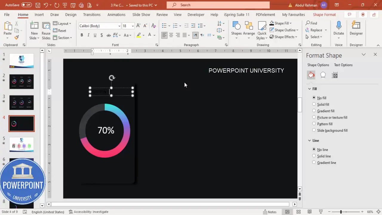
Step-by-step: Build the gradient doughnut card (visual card + shadow)
We’ll start by creating the card container and a soft shadow behind it to build depth. This card will hold a doughnut chart, a title, and a short description.
- Add a new slide
- Insert a blank slide and set the background to a dark color (deep gray or near-black) for good contrast with colorful doughnuts and white text.
- Draw the main card shape
- Insert → Shapes → Rounded Corner Rectangle. Click and drag to create the card.
- Adjust the corner radius using the yellow adjustment handle so the edges look friendly, not too rounded.
- Make the card’s Fill color exactly the same as the slide background temporarily if you want it to “float” (we’ll modify it later).
- Set Shape Outline → No Outline.
- Create a soft shadow
- Duplicate the rectangle (Ctrl + D). Change the duplicate’s fill to black (or very dark gray), place it behind the original (Right-click → Send to Back), and nudge slightly downward/right to suggest a shadow.
- With the shadow rectangle selected, go to Shape Effects → Soft Edges. Increase soft edges to create a subtle blur that reads like a shadow rather than a hard-edged block.
- Fine-tune the card size
- Adjust width and height based on how many cards you want across the slide. Remember you’ll duplicate later so design once, reuse many.
Tip: Use consistent spacing between the card and the shadow shape. This small detail makes the card feel polished and intentional.
Step-by-step: Insert and style the doughnut chart from Excel
Now we’ll insert the doughnut chart that will sit inside the card. The chart will be built from PowerPoint’s Chart → Doughnut option and linked to an Excel sheet that opens immediately.
- Insert the doughnut chart
- Insert → Chart → Pie → choose Doughnut. Click OK. An Excel data grid opens showing default slices.
- Simplify the data
- The chart initially contains multiple slices. We only need two: the primary value (e.g., 70%) and remaining (e.g., 30%). Edit the Excel range so you have two rows: the value and the complement to 100. Add percentage signs if you like; PowerPoint will show values but formatting in Excel helps.
- Remove clutter
- Remove chart title, legend, and any unnecessary elements: Chart Design → Add Chart Element → Legend/Title → set to None (or select and delete).
- Change slice colors
- Click the smaller slice (the “complement” slice) and change its fill to a light neutral so the main ring stands out. Make sure Shape Outline → No Outline for a seamless look.
- Select the main slice and set it to a Gradient Fill. This is the most important visual step: a subtle radial or linear gradient gives the doughnut dimensionality and makes it feel modern.
- Gradient suggestions
- Build gradients with 3–4 stops: start with a bright highlight, move to the main hue, add a slightly darker tone, and a deep accent color. This produces depth when the doughnut rotates or animates.
- Remove outlines and set proportions
- Select all chart elements and set Shape Outline → No Line. Resize the chart while holding Shift to keep proportions and make it fit inside the card.

Design choices: gradient fills, color combinations, and fonts
Design is where small choices have big impact. Below I expand on gradient combinations, color choices, and typography so your doughnut charts look modern and legible.
Gradient color combinations (recommended palettes)
Choose palettes that reflect your brand or the intent of the data. Here are several palettes I use often. You can pick one and apply consistent stops across your doughnuts.
- Teal → Blue Palette
- Stops: #3DD4C8 (highlight), #2298C1 (mid), #0D6B8A (deep)
- Purple → Magenta Palette
- Stops: #9B8CFF, #7A53D6, #52288A
- Orange → Red Palette
- Stops: #FFB75E, #FF7A59, #D9382F
- Green → Lime Palette
- Stops: #A8E063, #56C57B, #2E8F4D
Tip: Use a subtle light highlight stop to simulate a light source. Keep contrast in the darker stop so the doughnut ring reads volumetric on dark backgrounds.
Typography
- Primary font (labels and percentages): Open Sans Bold or Semi-Bold at 20–28 pt depending on the doughnut size.
- Secondary font (section title and detail copy): Open Sans Regular at 10–14 pt.
- Alignment: Center text horizontally below the chart inside the card for a compact, readable layout.
Adding labels, icons, and explanatory text
Alongside the doughnut, you want a title and a short description that contextualizes the number. You can also add tiny icons if appropriate (for example a calendar icon for years).
- Insert the title
- Insert → Text Box. Type the title (e.g., “2021”). Format: Open Sans, center aligned, white, bold, and placed just below the chart.
- Add the detail text
- Insert another text box below the title for the supporting sentence or data note. Keep it short (one or two lines) and use a smaller font size.
- Insert an icon (optional)
- Insert → Icons or Insert → Pictures if you have custom icons. Place the icon to the left or above the title as a subtle visual cue. Keep icon color white or neutral so it doesn’t clash with the doughnut’s gradient.
Copywriting tip: Keep card text short and action-oriented. Instead of “Yearly Growth for January to December” use “Yearly Growth — 70%” with the supporting note below.
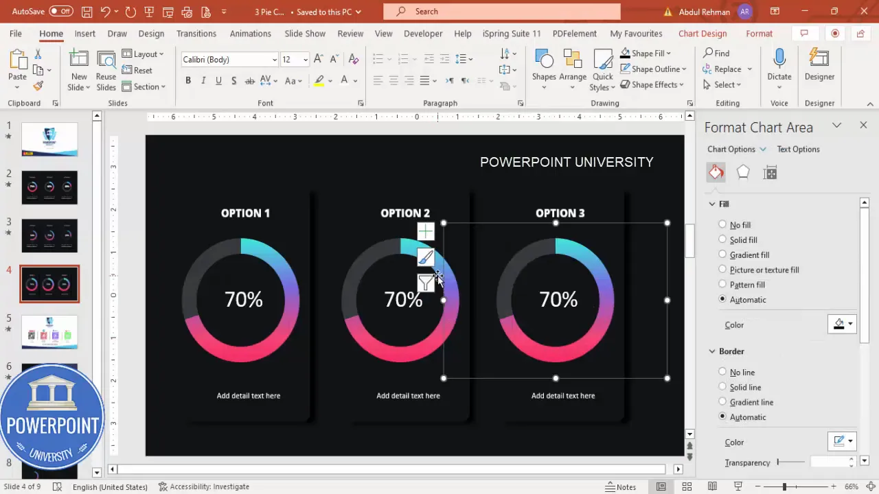
Duplicate, edit data, and align multiple cards
Once you’ve built one card (card shape, doughnut, title, detail text), reuse it to create the series of three cards representing different years. Duplicating preserves formatting and speeds workflow.
- Group the card
- Select all elements of the card (card shape, shadow, chart, title, text box, icon) and group them: Right-click → Group → Group or Ctrl + G.
- Duplicate with alignment
- With the group selected, hold Ctrl + Shift and drag horizontally. Holding Shift locks to the horizontal axis and helps maintain straight duplicates. Repeat for the third card.
- Edit chart data for each duplicate
- Right-click each chart → Edit Data. Change the numbers (e.g., 70% for 2021; 50% for 2022; 30% for 2023). Close the Excel window when done. If a label shifts slightly, re-center the chart inside its card.
- Align everything precisely
- Use PowerPoint’s alignment options: select the three groups → Arrange → Align → Align Middle and Distribute Horizontally to ensure equal spacing.
Note: Sometimes when you edit chart data the chart may nudge slightly. Re-center the chart visually by selecting and using arrow keys for small adjustments. Grouped objects make this easier to manage.
Create Slides in Seconds with ExpertSlides AI |
|
Generate AI Presentations today: |
| TRY NOW! |
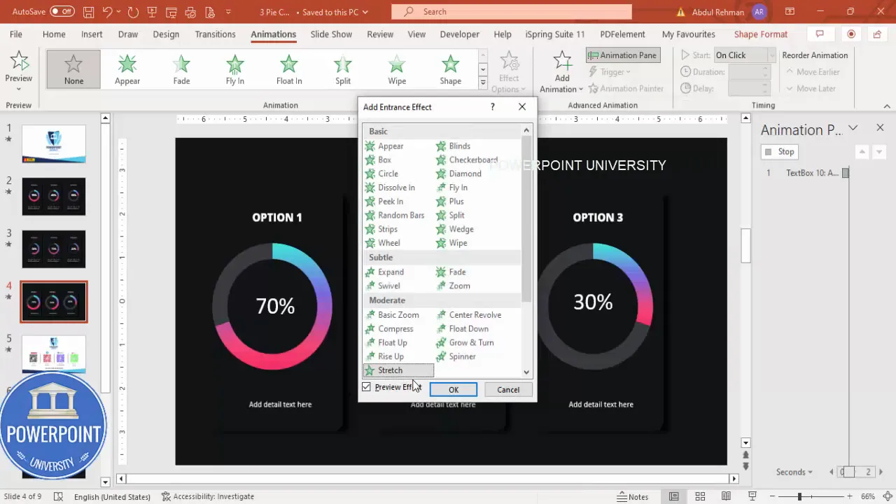
Add animations and use the Animation Painter for consistency
Animations add subtle polish and help guide attention when you present. For these doughnut cards, I use entrance animations that emphasize the growth of the chart and the appearance of text. Keep animations quick and consistent.
- Open the Animation Pane
- Animations → Animation Pane to manage timings.
- Apply an entrance animation to the first chart
- Select the doughnut chart (not the group). Add Animation → More Entrance Effects → choose Grow & Turn (or another effect like Spiral if you prefer). Click OK.
- Double-click the animation in the pane and set Timing → Duration to Very Fast (or a custom 0.3–0.5s). This makes the chart feel snappy.
- Add an animation for the text
- Select the title and add Animation → Entrance Effects → Stretch (or Fade). Set it to occur After Previous so it follows the chart entrance.
- Copy animations with Animation Painter
- Animations → Animation Painter. Click the animated chart to copy, then click the chart on the second and third card to paste the animation. Repeat for the title text and detail text using the painter.
- Sequence and triggers
- Optionally set each group to appear on click: set the first group to On Click, the second to On Click, etc., so a single click advances to the next card in presentation mode.
Pro tip: Keep animations consistent across all cards. Small timing variations can make your deck feel unpolished. Use the same Duration and Effect Options for each chart and text block.
Troubleshooting and alignment tips
Common issues and fixes you’ll likely encounter:
- Chart nudges when editing data: If the chart shifts, re-center it inside the card. Use arrow keys for precise nudges (hold Ctrl while pressing arrow keys for smaller increments).
- Data label leader lines appear: Click the leader line and delete it. Reposition the label inside the doughnut for a clean look.
- Gradient fill looks harsh: Reduce contrast between stops or add an intermediate stop. Use opacity adjustments for subtlety.
- Card shadow too strong: Lower the shadow rectangle’s transparency (Format Shape → Fill → Transparency) or reduce the Soft Edges amount.
- Animations not copying: Make sure you click the source animated object first, then the destination. For complex grouped animations, ungroup, apply, then regroup if necessary.
- Font mismatch on other machines: Embed fonts in the file (File → Options → Save → Embed fonts in the file) if you plan to share the deck and you used non-standard fonts.
Exporting, saving as a template, and free download
Once you’ve completed the slide you might want to reuse it or share it with colleagues. Here’s how:
- Save as template: File → Save As → PowerPoint Template (.potx). This preserves the layout and styles.
- Export static slides: File → Export → Create PDF/XPS if you need a non-editable version for reports.
- Share editable file: If you want others to reuse the charts with data, share the .pptx. Embed fonts if required.
If you prefer to skip some steps, you can use the downloadable template I provide as a starting point and then edit the charts and colors to match your brand.
Final checklist
Before you call the slide finished, run through this checklist:
- Card background and shadow spacing consistent across all three cards.
- Each doughnut is linked to correct Excel data and shows the correct percentage.
- Data labels are inside the doughnut and use a readable white font.
- Outlines are removed from slices and shapes (No Outline / No Line).
- Gradient fills are consistent in style (same type of gradient and stops structure).
- Animations are applied consistently and durations are matching.
- All text is center-aligned and uses the chosen font family (Open Sans recommended).
- Objects are grouped and distributed evenly across the slide.
- File saved as .pptx and/or exported to template/PDF as needed.
FAQ
Q: Why choose a doughnut chart over a pie chart?
A doughnut chart provides a center area where a label or percentage can be placed without overlapping slice edges. The hole also allows for a bolder ring visual when combined with gradient fills. For single metrics that represent a part of 100%, a doughnut chart with a centered percentage is often more visually compelling than a pie chart.
Q: Can I use more than two slices in a doughnut chart?
Yes, but for this visual style we intentionally use two slices: the main metric and the remainder to 100%. This simplifies the visual and makes the percentage the focus. If you need to present multiple categories, consider stacked doughnuts or separate cards for each category.
Q: What if I don’t have Open Sans on my computer?
Use any modern sans-serif: Roboto, Arial, Calibri, or Segoe UI. If you must share the file and require exact typography, embed the font (File → Options → Save → Embed fonts in the file) before distributing the .pptx.
Q: The gradient looks different on another computer — why?
Differences in display calibration and software version can slightly change how gradients render. To minimize variation, avoid using transparency-heavy gradients, and test on a colleague’s machine. Export to PDF for consistent distribution.
Q: How do I make the doughnut percentages update automatically if I change data elsewhere?
Charts are linked to the embedded Excel workbook. Right-click → Edit Data to modify values. If you want the chart to reflect a data source outside the file, use Power BI or Excel linked objects, but this is more advanced and depends on your workflow.
Q: Can the animation show one card at a time when I click?
Yes. Set the first group’s entrance animations to On Click, and sequence the following groups also to On Click. Alternatively, use triggers and custom animations if you want clickable buttons to show specific cards.
Q: How do I ensure the card looks good on mobile or when exported as an image?
When exporting to image or viewing on smaller screens, ensure font sizes aren’t too small and that the doughnut ring thickness remains visible. Consider increasing font size and doughnut thickness, or export a separate mobile-friendly version with stacked cards instead of a horizontal layout.
Q: I want the doughnut to rotate on entrance — can I do that?
Use entrance effects such as Grow & Turn or Spiral. If you want a continuous rotation, use motion path animations with repeat, but be cautious: continuous motion can become distracting in a slide deck. Subtle entrance rotation tends to feel professional.
Quick reference: keyboard shortcuts and menu paths
- Duplicate shape quickly: Ctrl + D
- Group objects: Ctrl + G
- Insert chart: Insert → Chart → Pie → Doughnut
- Edit chart data: Right-click chart → Edit Data
- Remove outline: Shape Format → Shape Outline → No Outline
- Animation Painter: Animations tab → Animation Painter
- Align tools: Arrange → Align → Align Middle / Distribute Horizontally
Design mini-guide (emulating a table)
- Purpose — Use doughnut cards to show percentages or KPIs across discrete categories (e.g., years).
- Best practice — Two slices only (value + complement). Add label inside the hole for clarity.
- Gradient — 3 stops: highlight, base, deep. Keep subtle highlights and avoid full transparency shifts.
- Shadow — Soft edge duplicate behind the card for depth. Lower opacity for subtlety.
- Animation — Very Fast entrance, copy with Animation Painter for consistency.
Closing notes
This style of slide is an effective way to present comparative percentage data while keeping your visuals clean and modern. Using Excel-based doughnut charts ensures accuracy and maintainability, while gradient fills and careful typography make the numbers visually appealing and easy to read.
Follow the steps above to build one card, then duplicate and edit the numbers for the remaining cards. Apply consistent gradients, copy animations, and align objects precisely. Before presenting, run through the final checklist and test the animations in Slide Show mode.
Happy designing — and remember: small visual choices (spacing, gradient stops, label placement) are what separate a good slide from a great one.
Check out the full video: Create Gradient Doughnut Chart Design Slide in PowerPoint | Tutorial 1013 | Free Template


