Welcome, my friends! If you’ve ever wanted to create stunning PowerPoint slides that look professionally designed, you’re in the right place. Today, I’m going to take you through an easy-to-follow, step-by-step guide to designing a beautiful, modern PowerPoint slide that will captivate your audience and elevate your presentations. Whether you’re preparing a pitch deck, a business presentation, or a creative showcase, mastering slide design can make all the difference.
This article is inspired by the creative process shared by One Skill PowerPoint, who expertly demonstrates how to craft balanced layouts, apply modern typography, use harmonious color schemes, and add dynamic visual effects—all within PowerPoint itself. By the end of this guide, you’ll have the tools and confidence to create slides that not only look great but also communicate your message effectively.
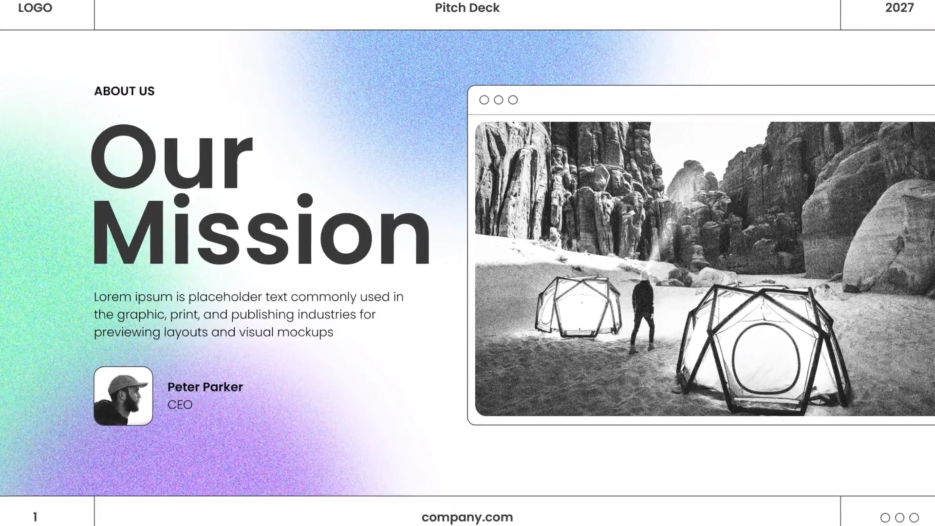
Table of Contents
- Why Slide Design Matters
- Step 1: Crafting a Beautiful Slide Layout
- Step 2: Adding Beautiful Typography for a Modern Look
- Step 3: Choosing and Applying Beautiful Colors
- Step 4: Creating a Green Effect in PowerPoint to Spice Up Your Slides
- Step 5: Creating Beautiful Shapes to Enhance Visual Appeal
- Step 6: Using High-Quality Photos to Elevate Your Slides
- Step 7: Designing Together – The Creative Process
- Summary: Designing an Awesome PowerPoint Slide
- Frequently Asked Questions (FAQ)
- Final Thoughts
Why Slide Design Matters
Before diving into the technical steps, let’s talk about why slide design is so important. A well-designed slide:
- Enhances communication: Clear, visually appealing slides help your audience absorb and retain information.
- Builds credibility: Professionally designed slides show that you are serious and prepared.
- Engages your audience: Good design keeps viewers interested and focused on your message.
- Supports your story: Visuals complement spoken words to create a memorable presentation.
With these goals in mind, let’s break down the process of designing a slide like a pro.
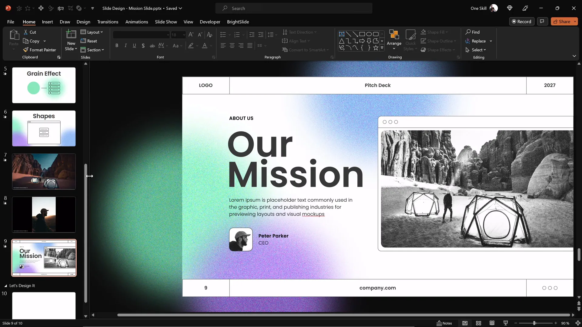
Step 1: Crafting a Beautiful Slide Layout
The foundation of any great slide is a well-balanced layout. This means arranging your content—text, images, and shapes—in a way that feels harmonious and easy to scan.
To begin, think about the slide’s structure:
- Margins and spacing: Leave enough white space around your elements so they don’t feel crowded.
- Visual hierarchy: Decide what the most important information is, and make it stand out by size or position.
- Alignment: Use PowerPoint’s alignment tools to keep elements neatly lined up.
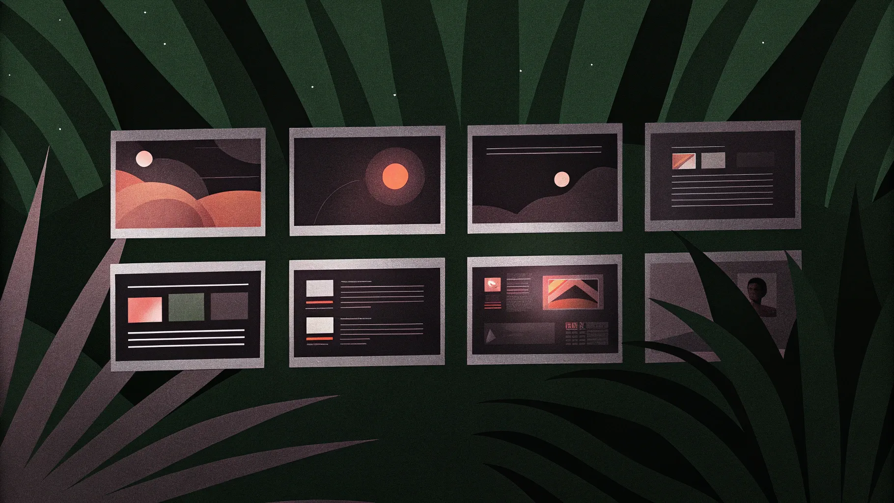
For example, in the featured slide, the layout balances a large, compelling image on one side with text on the other. This asymmetry creates visual interest while maintaining clarity.
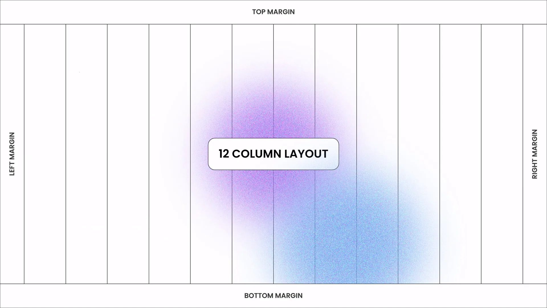
When positioning your elements, consider the rule of thirds or the golden ratio to guide placement. These principles help create natural focal points and pleasing proportions.
Tips for Balanced Layouts
- Use gridlines or guides to ensure consistent spacing.
- Group related elements together to avoid visual clutter.
- Limit the number of elements on a slide to maintain focus.
Remember, a clean layout is not just about aesthetics—it also improves readability and audience retention.
Step 2: Adding Beautiful Typography for a Modern Look
Typography is a powerful tool in slide design. The right fonts and text treatments can transform a basic slide into a stylish, professional presentation.
Here’s how to approach typography like a pro:
- Choose modern, clean fonts: Sans-serif fonts like Poppins are excellent choices for readability and style.
- Establish a hierarchy: Use different font sizes, weights, and colors to guide the viewer’s eye.
- Keep it minimal: Avoid using too many font types—stick to one or two complementary fonts.

In the example slide, the headline is large, bold, and eye-catching, while the supporting text is smaller and lighter in weight. This contrast helps the audience quickly grasp the key message.
Typography Best Practices
- Limit your text to essential information—slides are not documents.
- Use sentence case or title case consistently.
- Make sure text contrasts well with the background for accessibility.
With these principles, your typography will enhance—not detract from—your presentation’s impact.
Step 3: Choosing and Applying Beautiful Colors
Color sets the mood for your slide and can influence how your message is perceived. Choosing a harmonious color palette is key to creating visually appealing slides.
In this process, we use a curated set of colors that complement each other beautifully. These colors are carefully picked to:
- Create a cohesive look.
- Highlight important elements.
- Maintain readability.
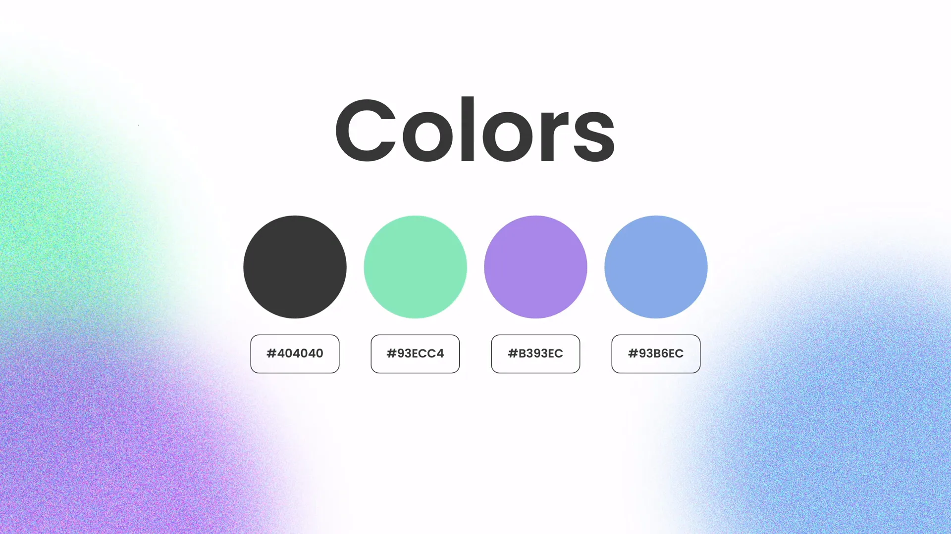
For example, the slide uses a combination of soft greens and neutral tones that feel fresh and modern. This palette supports the overall theme and gives the slide a polished appearance.
How to Select Colors Like a Pro
- Start with a base color: Choose a dominant color that fits your brand or theme.
- Add accent colors: Select one or two colors to highlight key information or decorative elements.
- Use neutral backgrounds: Whites, grays, or blacks help your colors pop.
Tools like Coolors or Adobe Color can help you create harmonious palettes effortlessly.
Step 4: Creating a Green Effect in PowerPoint to Spice Up Your Slides
Now for a little magic—adding a green effect to your slide to make it visually dynamic. This effect adds depth and interest without overwhelming your content.
Here’s how to create this effect:
- Use semi-transparent shapes filled with green hues to add layers and texture.
- Apply gradient fills or soft shadows to create a sense of dimension.
- Position these shapes strategically to frame your content or lead the eye across the slide.
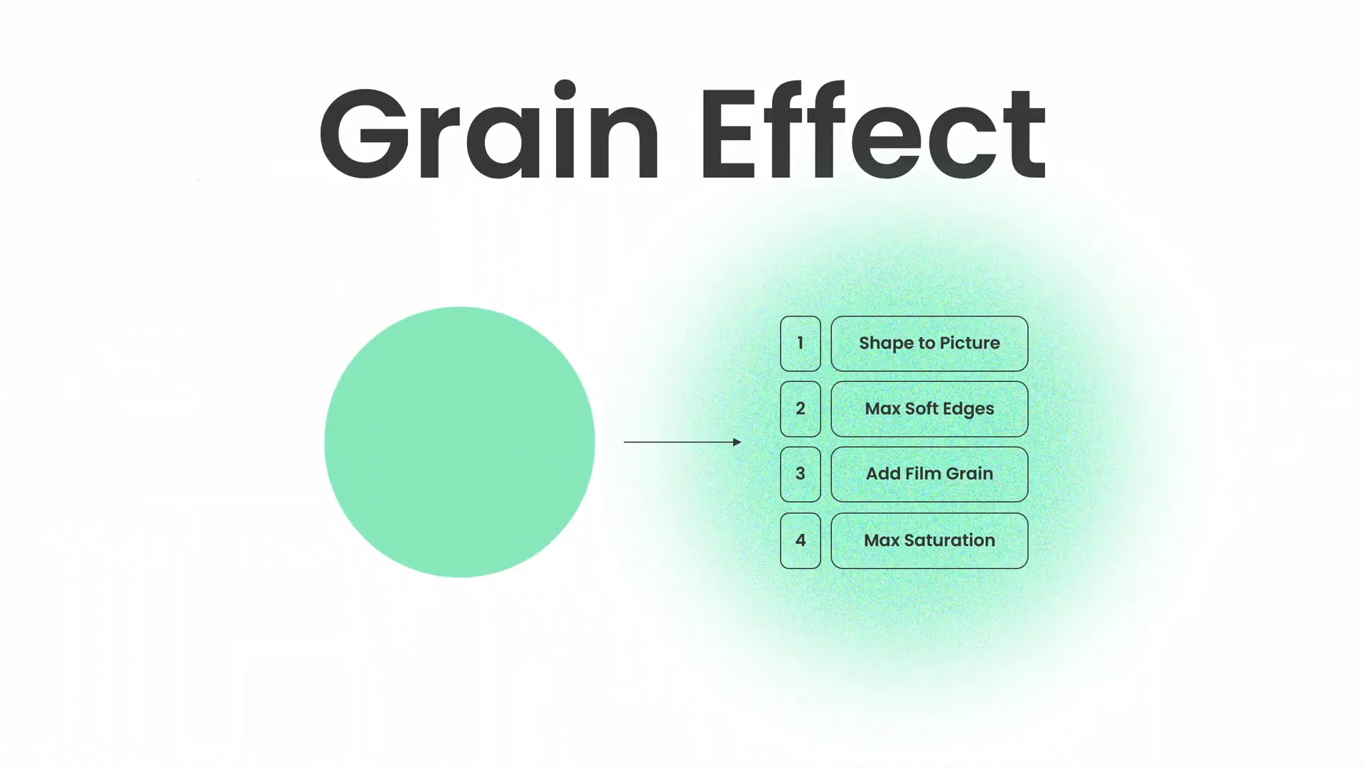
This technique can transform a flat slide into something vibrant and engaging, helping your presentation stand out.
Tips for Using Color Effects
- Keep the effects subtle to avoid distraction.
- Use transparency to blend effects smoothly with other slide elements.
- Test your slide on different screens to ensure colors look consistent.
Step 5: Creating Beautiful Shapes to Enhance Visual Appeal
Shapes are not just decorative—they can help organize information, create visual interest, and guide the viewer’s attention.
In PowerPoint, you can create custom shapes and style them with colors, gradients, and effects to complement your slide’s design.
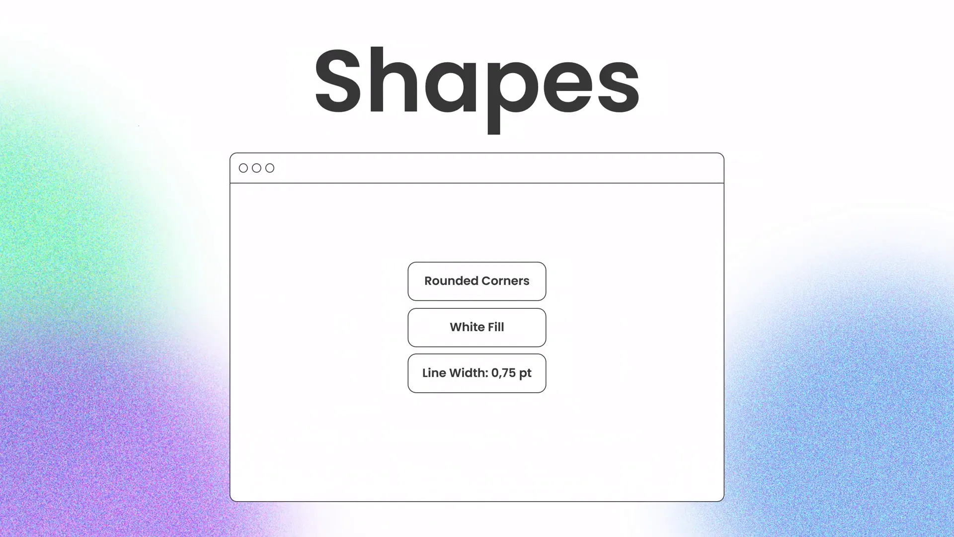
For example, the slide features softly rounded rectangles and overlapping circles that add a modern, friendly feel. These shapes also serve as containers or accents for text and images.

How to Design Effective Shapes
- Use simple geometric shapes for a clean look.
- Apply consistent corner radii and line weights.
- Combine shapes to create unique visual elements.
- Use layering to add depth and hierarchy.
Shapes are powerful design tools that can transform your slides from ordinary to extraordinary.
Step 6: Using High-Quality Photos to Elevate Your Slides
Great images can tell a story better than words alone. Using high-quality photos in your slides enhances professionalism and emotional impact.
For this slide design, we sourced beautiful photos from Unsplash.com, a fantastic resource for free, high-resolution images.

When choosing photos, consider:
- Relevance to your topic and message.
- Composition that complements your layout.
- Consistent style and tone across images.
Photos should enhance your message, not overpower it.
Step 7: Designing Together – The Creative Process
One of the best ways to learn slide design is by watching and practicing alongside a skilled creator. Instead of lengthy explanations, sometimes the best approach is to dive in and create.
In this spirit, the slide design session is like a creative jam—putting on background music and letting the design flow naturally. This method helps you stay relaxed and open to experimentation.
By following along, you can build your skills incrementally and develop your own unique style.
Summary: Designing an Awesome PowerPoint Slide
Congratulations! You’ve learned how to design a professional-quality PowerPoint slide by focusing on:
- Creating balanced and harmonious layouts.
- Applying modern typography to enhance readability and style.
- Choosing and applying beautiful, cohesive color palettes.
- Adding subtle yet effective green effects for visual interest.
- Designing custom shapes to organize and decorate your content.
- Incorporating high-quality photos to elevate your slide’s impact.
- Embracing the creative process with a relaxed, music-driven design session.
These elements combined will help you craft slides that look polished, professional, and engaging. Remember, slide design is a skill that improves with practice, so keep experimenting and refining your approach.

Frequently Asked Questions (FAQ)
What font is best for modern PowerPoint presentations?
Sans-serif fonts like Poppins, Helvetica, or Arial are excellent choices because they are clean, readable, and look contemporary. Avoid overly decorative fonts that can distract from your message.
How many colors should I use in a slide?
Stick to a palette of 3-4 colors: one main color, one or two accent colors, and a neutral background color. This keeps your design cohesive and visually appealing.
Can I create professional-looking slides using only PowerPoint?
Absolutely! PowerPoint has powerful built-in tools for layout, typography, color styling, shapes, and effects. With creativity and practice, you can design impressive slides without additional software.
Where can I find free high-quality images for my slides?
Unsplash is a great resource for free, high-resolution photos suitable for presentations. Other options include Pexels and Pixabay.
How do I balance text and images on a slide?
Use a layout that gives each element enough space. Avoid overcrowding by limiting text to key points and using images that complement rather than compete with your message. Align elements consistently and use white space effectively.
What is the green effect mentioned, and how do I create it?
The green effect involves adding semi-transparent green shapes or gradients to your slide to introduce depth and visual interest. You can create this by inserting shapes, adjusting their fill color and transparency, and layering them strategically.
How can I improve my slide design skills?
Practice regularly by designing slides for different topics. Watch tutorials, study well-designed presentations, and experiment with layouts, fonts, colors, and effects. Joining communities or channels like One Skill PowerPoint can provide inspiration and guidance.
Final Thoughts
Designing powerful PowerPoint slides is a skill that combines creativity with technical know-how. By mastering layout, typography, color, effects, and imagery, you can create presentations that not only inform but also inspire your audience.
Remember, the best slides tell a story visually and support your spoken message without overwhelming it. Keep your designs simple, balanced, and purposeful. Most importantly, enjoy the process of creating and sharing your ideas.
Stay happy, stay healthy, and keep designing like a pro!
Check out the full video: PowerPoint Presentation Skills: Design Slides Like a Pro! ✨


