
Colors play a vital role in making your PowerPoint presentations visually appealing and effective. Yet, many users overlook some subtle but powerful features related to color usage in PowerPoint. Understanding these can save you time, enhance your designs, and ensure your presentations communicate the right emotions and branding consistently.
In this comprehensive guide, we’ll dive deep into five important things you probably didn’t know about using colors in PowerPoint. These insights come from years of experience designing presentations and mastering PowerPoint’s quirks. Whether you’re a beginner or an advanced user, these tips will elevate your color game and help you create professional, vibrant, and cohesive slides effortlessly.
Let’s get started!
Table of Contents
- 1. Not All Colors Are Created Equal in PowerPoint
- 2. Use Preset Gradient Options to Make Your Diagrams Pop
- 3. How to Color and Apply Gradients to PowerPoint Icons
- 4. Apply Gradient Fills to Text and Lines
- 5. Search for Photos by Color to Match Your Presentation Theme
- Bonus Tips: Custom Theme Colors and Professional Color Palettes
- Summary: Make Your PowerPoint Colors Work for You
- Frequently Asked Questions (FAQ)
1. Not All Colors Are Created Equal in PowerPoint
At first glance, filling a shape with color in PowerPoint seems straightforward. You simply select the shape, go to Shape Fill, and pick the color you want. But PowerPoint actually offers two distinct sets of colors, each with very different behaviors. Understanding these differences is crucial when working with templates and themes.
When you open the Shape Fill menu, you’ll notice two groups of colors:
- Theme Colors: These appear at the top and are tied to the current design theme.
- Standard Colors: These are below the theme colors and are fixed, independent of the theme.
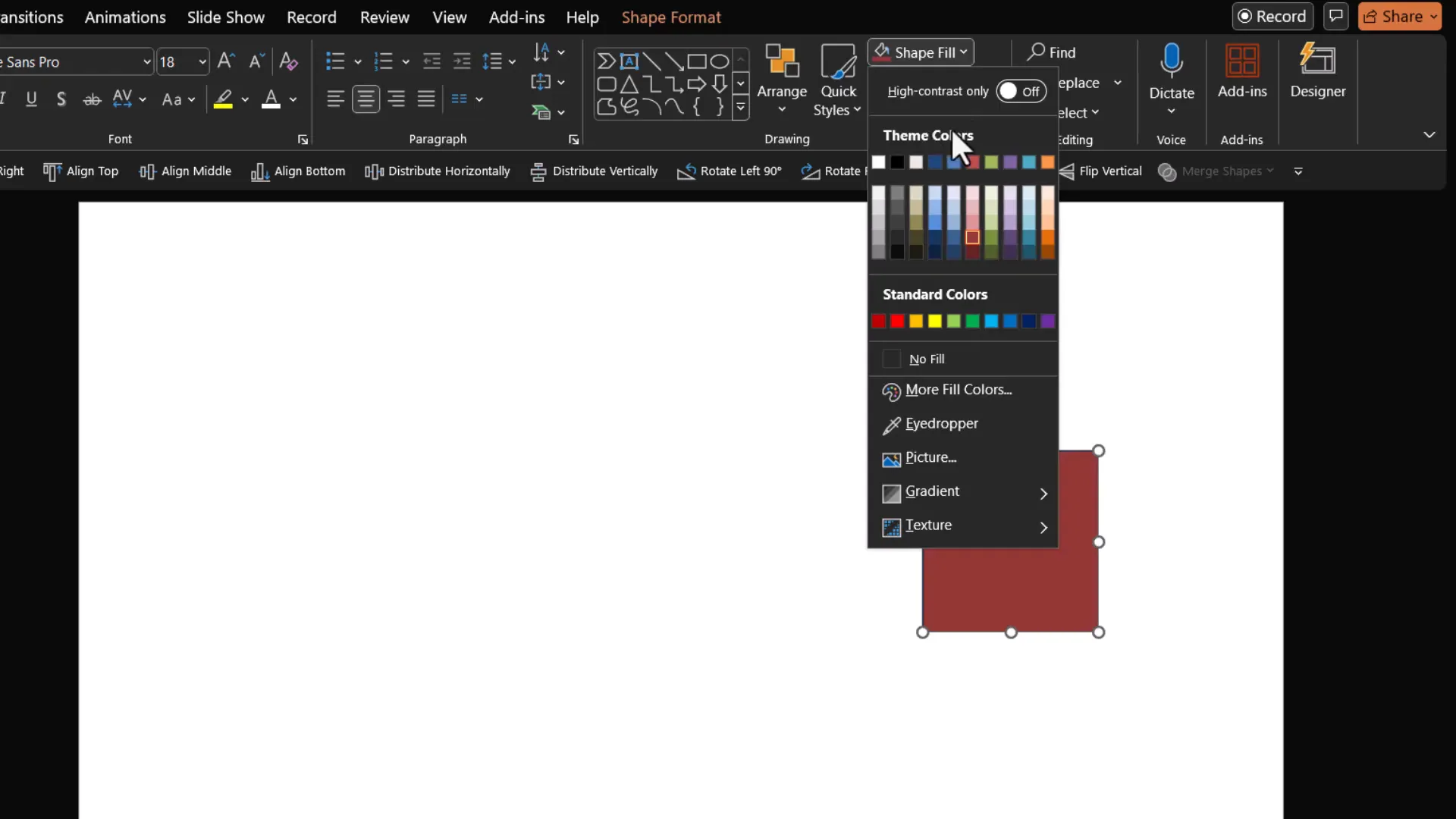
Here’s the key difference: Theme Colors dynamically change based on the design theme applied to your presentation, while Standard Colors remain constant no matter what theme you use.
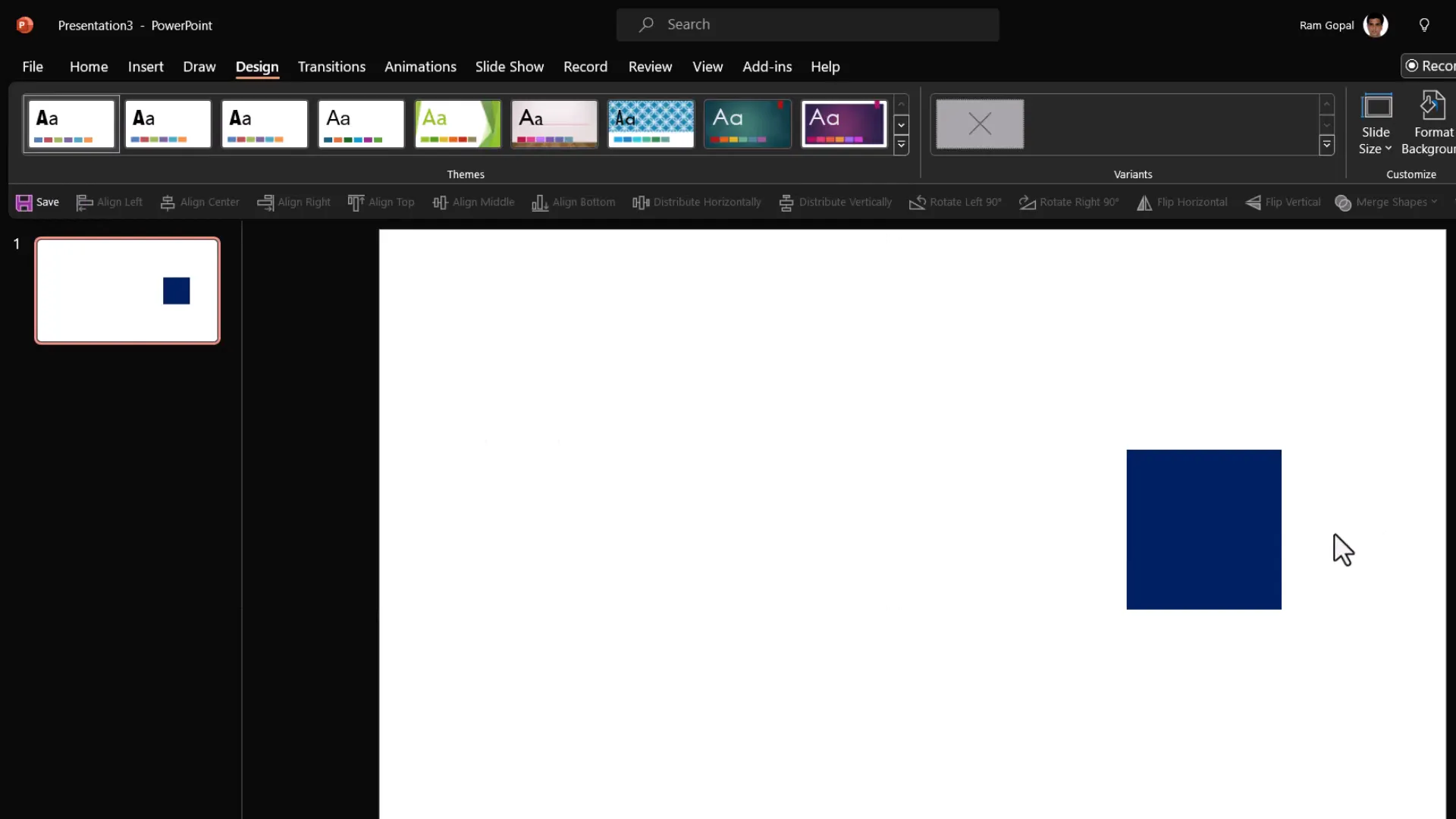
To see this in action, select a shape filled with a theme color (for example, red from the theme colors). Then go to the Design tab and cycle through different design themes. Notice how the color of your shape changes to match the theme’s palette, adapting automatically to maintain visual harmony.
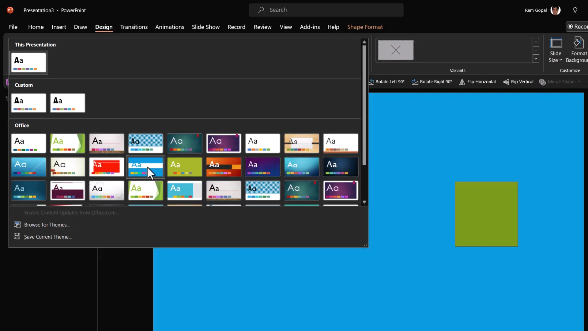
Now, try the same with a shape filled with a standard color such as blue. Change the design themes again and observe that the blue color does not change. It stays exactly the same regardless of the theme applied.
This behavior has important implications:
- If you want your shapes and diagrams to automatically adapt to different themes or your brand colors, use Theme Colors.
- If you want fixed, unchanging colors regardless of theme, use Standard Colors.
When working with templates, especially ones you purchase or download, this distinction becomes critical. Templates that use standard colors for fills won’t adapt to your theme, causing a mismatch in your presentation’s overall look and feel.
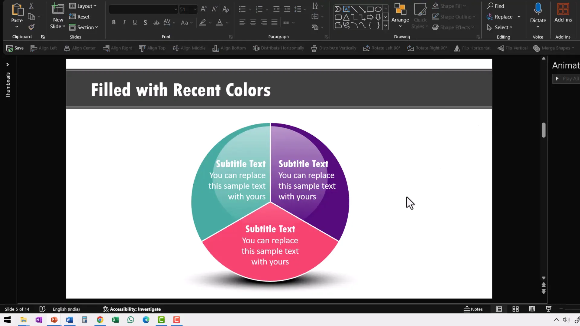
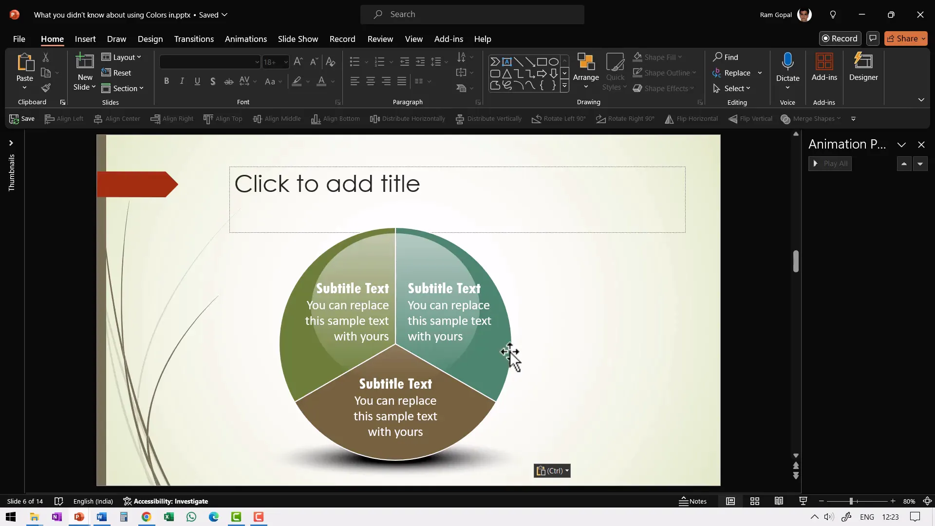
For example, here’s a diagram from one of our comprehensive PowerPoint bundles where all shapes are filled using theme colors. When you change the slide’s theme colors, the entire diagram’s colors update seamlessly, creating a vibrant and cohesive look.
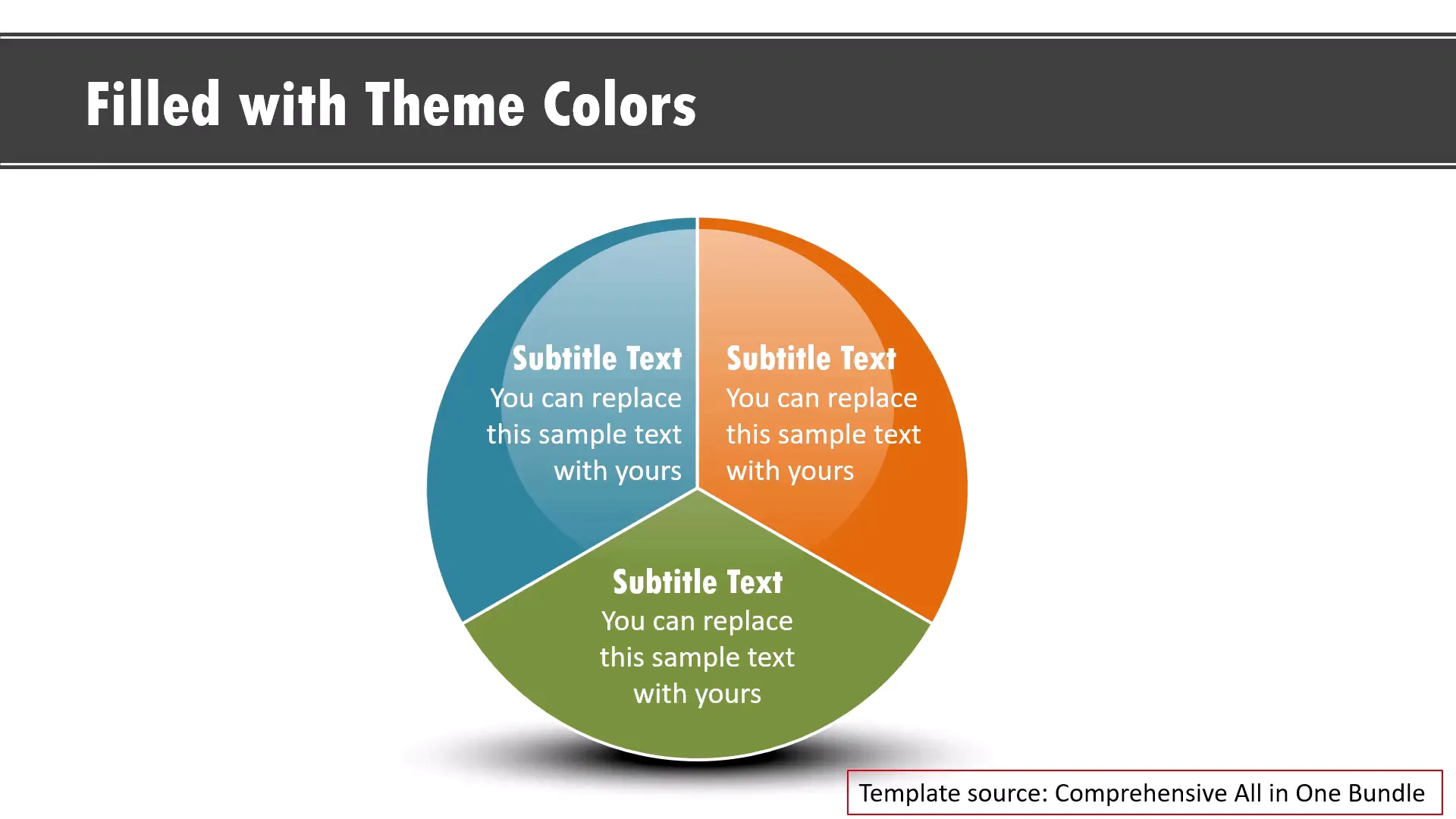
But if the shapes are filled with standard or custom-picked colors outside the theme, changing the theme won’t affect them. This means your diagrams won’t match the rest of your presentation, forcing you to manually update colors—a tedious and error-prone process.
How to Avoid the Template Color Trap
Some templates sold online fill shapes with standard or custom colors directly, which breaks theme flexibility. If you import such diagrams into your presentation, they won’t blend with your theme colors and will look out of place.
For example, let’s say you find an energetic color palette online and use an eyedropper tool to fill your diagram with those colors. These colors are not part of your theme, so when you paste this diagram into your presentation, the colors remain fixed and don’t integrate with your theme.
You then have to spend time manually changing each shape’s color to match your theme palette. If the diagram uses gradients or complex fills, reworking it becomes almost impossible.
In contrast, when you use diagrams from well-designed templates that only use theme colors, pasting them into any presentation theme makes them adapt instantly without extra work.
Bottom line: Always check that templates use theme colors for fills rather than standard or custom colors. This will save you hours of color correction and keep your presentation looking polished and consistent.
2. Use Preset Gradient Options to Make Your Diagrams Pop
Gradients can add depth and interest to your slides, but many PowerPoint users find them confusing or cumbersome to apply. The default way people apply gradients is by right-clicking a shape, choosing Format Shape, and then going to Gradient Fill. The preset options here are limited and awkward to customize.
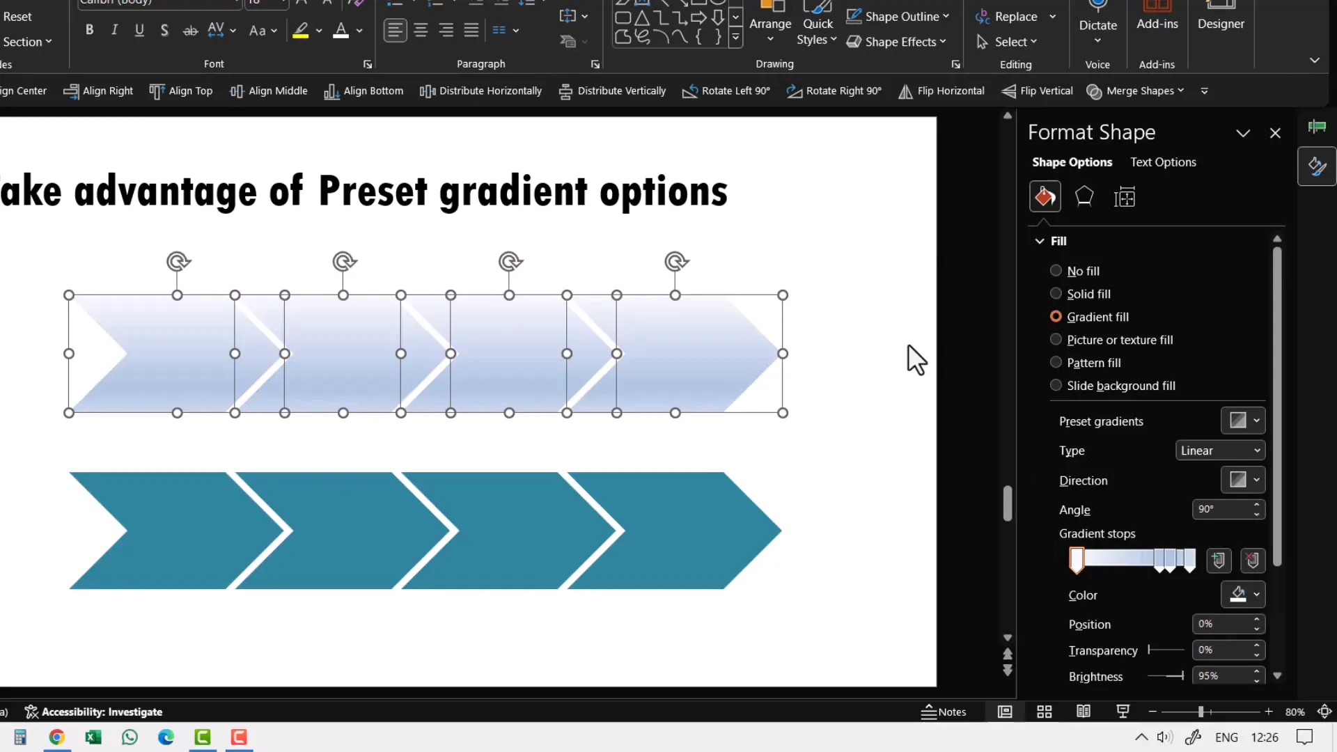
But there’s an easier and quicker way to instantly enhance your shapes with gradients:
- Select the shapes you want to apply gradients to.
- Go to the Home tab on the ribbon.
- Click Shape Fill > Gradient.
- Choose from the gradient presets available directly here.
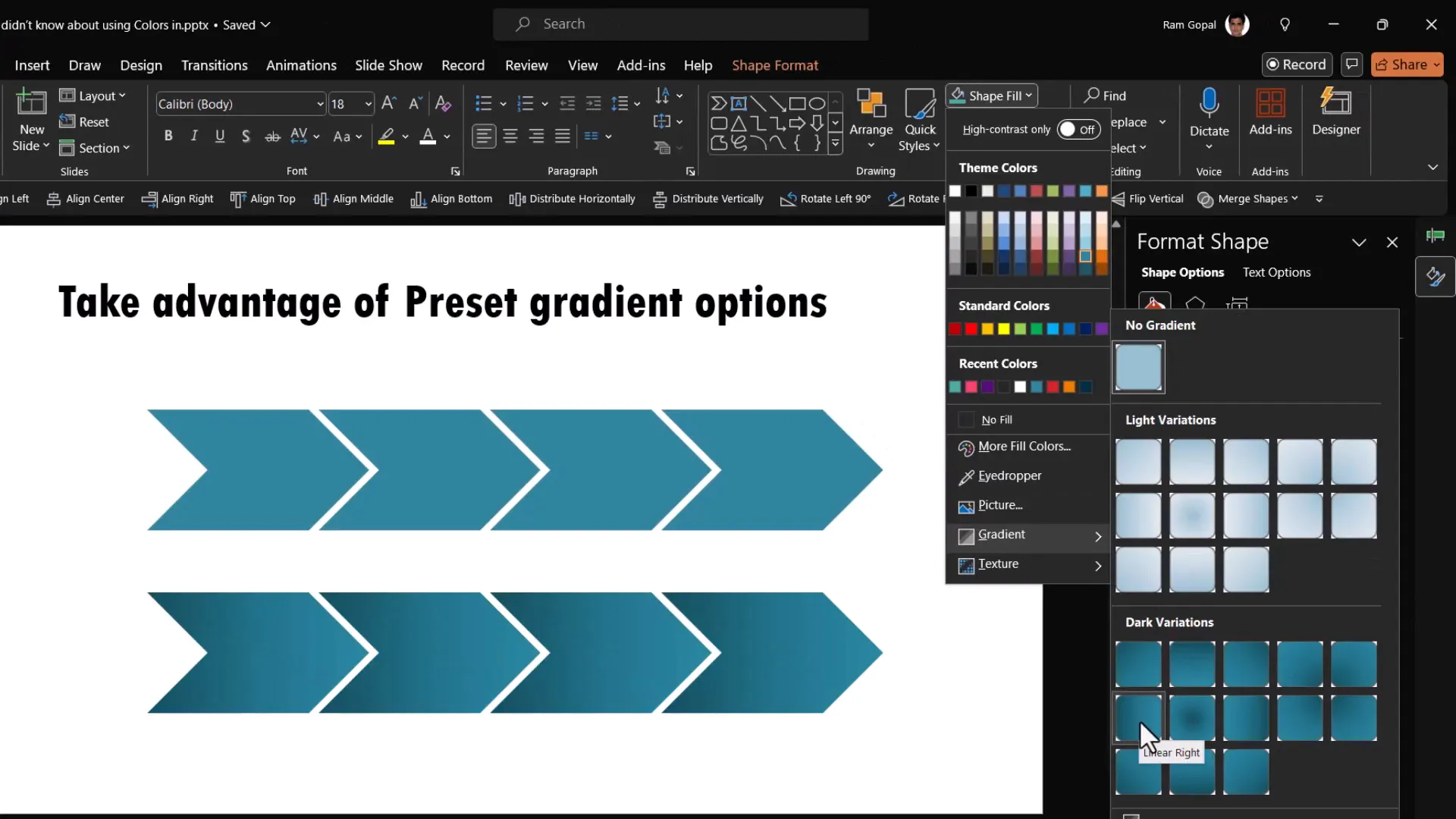
This approach applies ready-made gradient fills in one click, instantly making your diagrams look more professional and eye-catching. Compare a flat linear color with a preset gradient fill, and you’ll see the difference immediately.
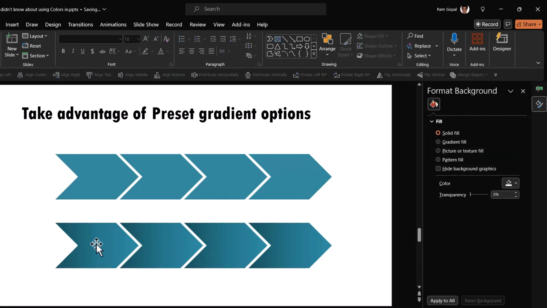
This simple tip can transform generic-looking shapes into visually appealing elements with minimal effort. Experiment with different gradient presets to find the style that fits your presentation’s mood and branding.
3. How to Color and Apply Gradients to PowerPoint Icons
PowerPoint includes a library of icons you can insert into your slides, which is great for adding visual interest and communicating ideas quickly. However, many users mistakenly believe you cannot change the color of these icons or apply gradients to them.
Here’s what actually happens:
- If you insert an icon and try to change its color through Format Graphic > Solid Fill, you’ll notice the color options are grayed out or ineffective.
- However, if you select the icon and use the Shape Fill menu on the Home tab, you can change the icon’s color using either theme or standard colors.
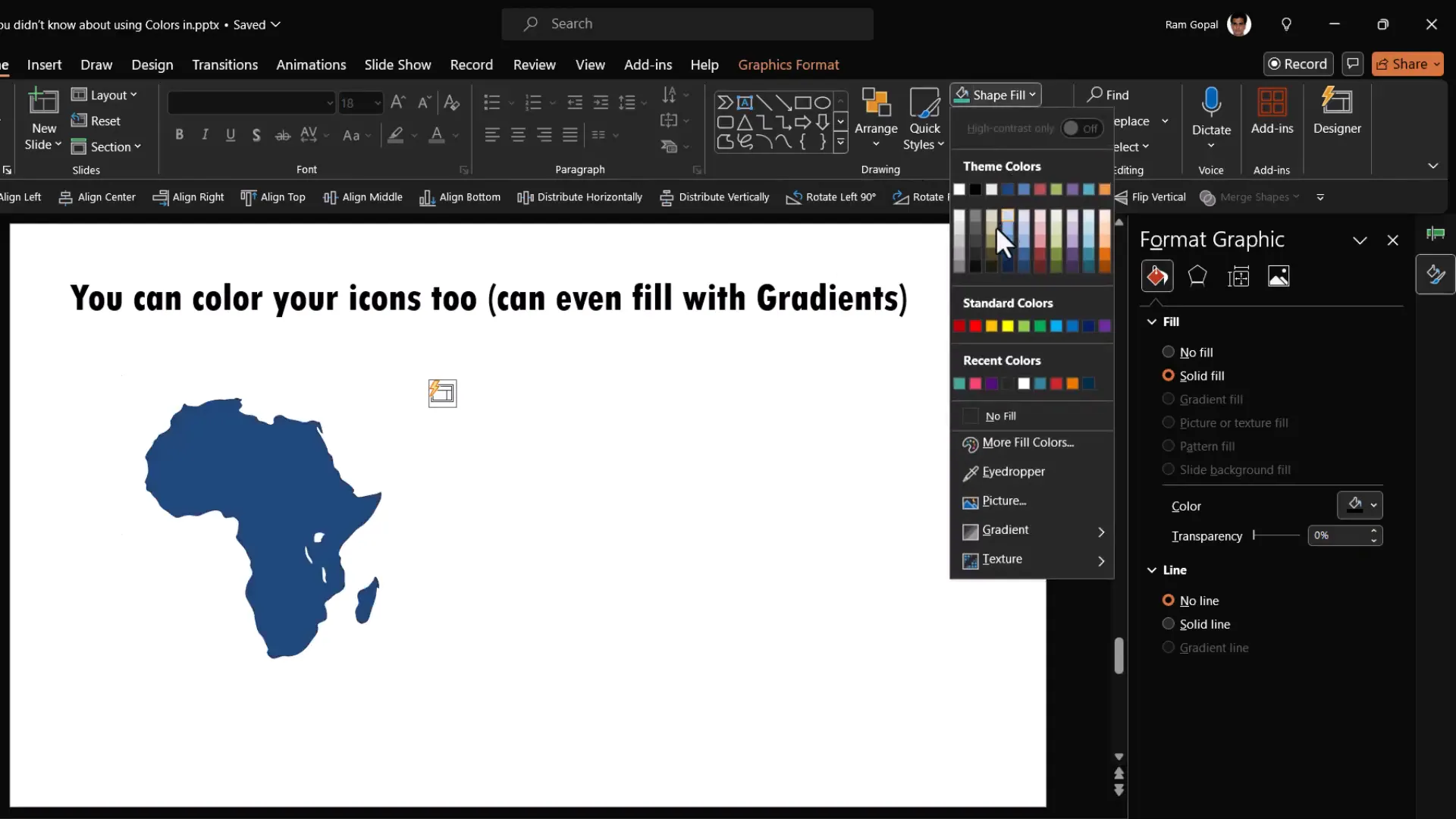
This quirk means that the usual fill color option doesn’t work for icons, but the shape fill option does. It’s one of those oddities in PowerPoint’s design.
Applying Gradient Fills to Icons
When it comes to applying gradients to these icons, you’ll find that the gradient options in the Shape Fill menu are disabled. To add gradients, you need to first convert the icon into a shape that PowerPoint can edit more deeply.
Here’s the step-by-step process:
- Right-click the icon and choose Group > Ungroup.
- PowerPoint will ask if you want to convert the icon to a Microsoft Office drawing object. Click Yes.
- After ungrouping, select all parts of the icon and group them again.
- Now, you can apply gradient fills to the icon shapes using the gradient options in the Shape Fill menu or the Format Shape pane.
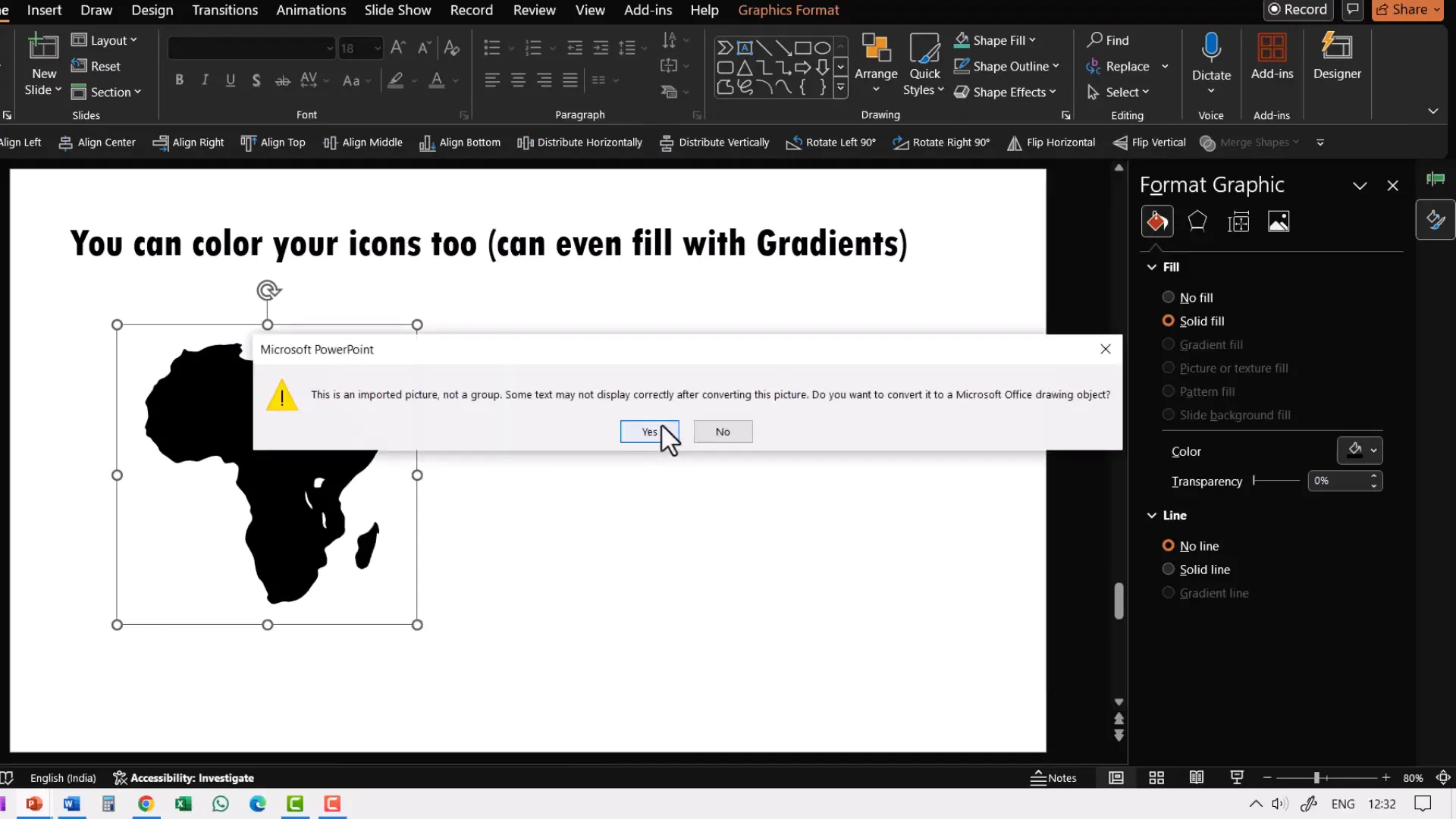
This workaround unlocks the ability to customize icons with gradients, shadows, and other effects just like any other shape.
4. Apply Gradient Fills to Text and Lines
Gradients aren’t just for shapes—they can also be applied to text and lines to add a unique, professional touch. However, many beginners struggle to find these options and assume gradients aren’t possible on text or lines.
How to Apply Gradient Fill to Text
Here’s the common mistake: Selecting the text and trying to change the font color to a gradient from the font color menu. This option isn’t available in PowerPoint.

The correct method is:
- Right-click the text box and select Format Shape.
- In the Format Shape pane, go to the Text Options tab (the icon with an A).
- Expand the Text Fill & Outline section.
- Choose Gradient Fill under Text Fill.
- Customize your gradient stops, colors, and direction as desired.
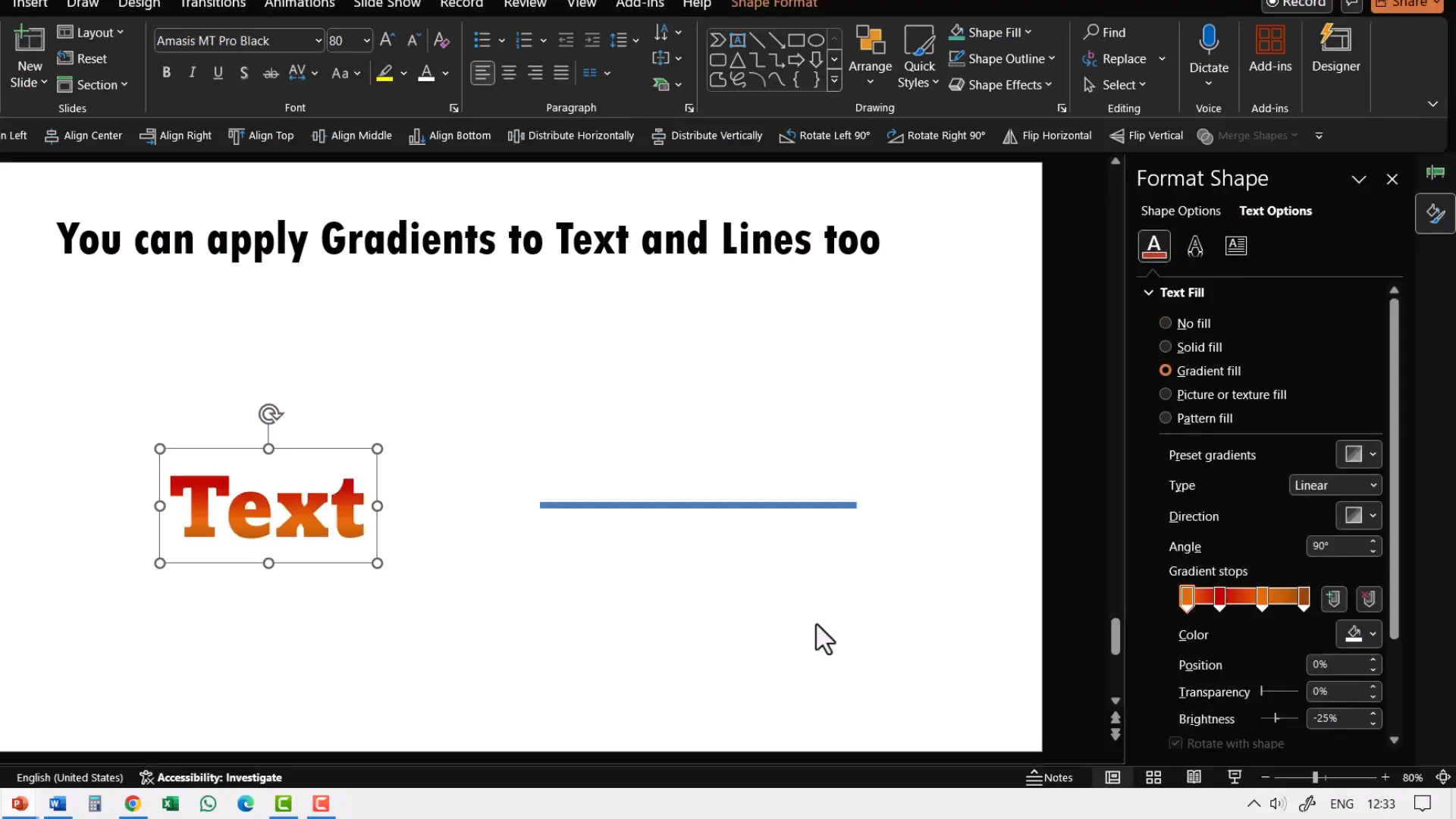
This method applies the gradient directly to the text characters, creating striking visual effects that are impossible with solid font colors.
How to Apply Gradient to Lines
Similarly, lines don’t offer gradient colors from the usual Shape Outline menu. To add gradients to lines, do the following:
- Select the line you want to format.
- Right-click and choose Format Shape.
- In the Format Shape pane, choose Line.
- Enable Gradient line.
- Adjust the gradient stops, colors, and direction.
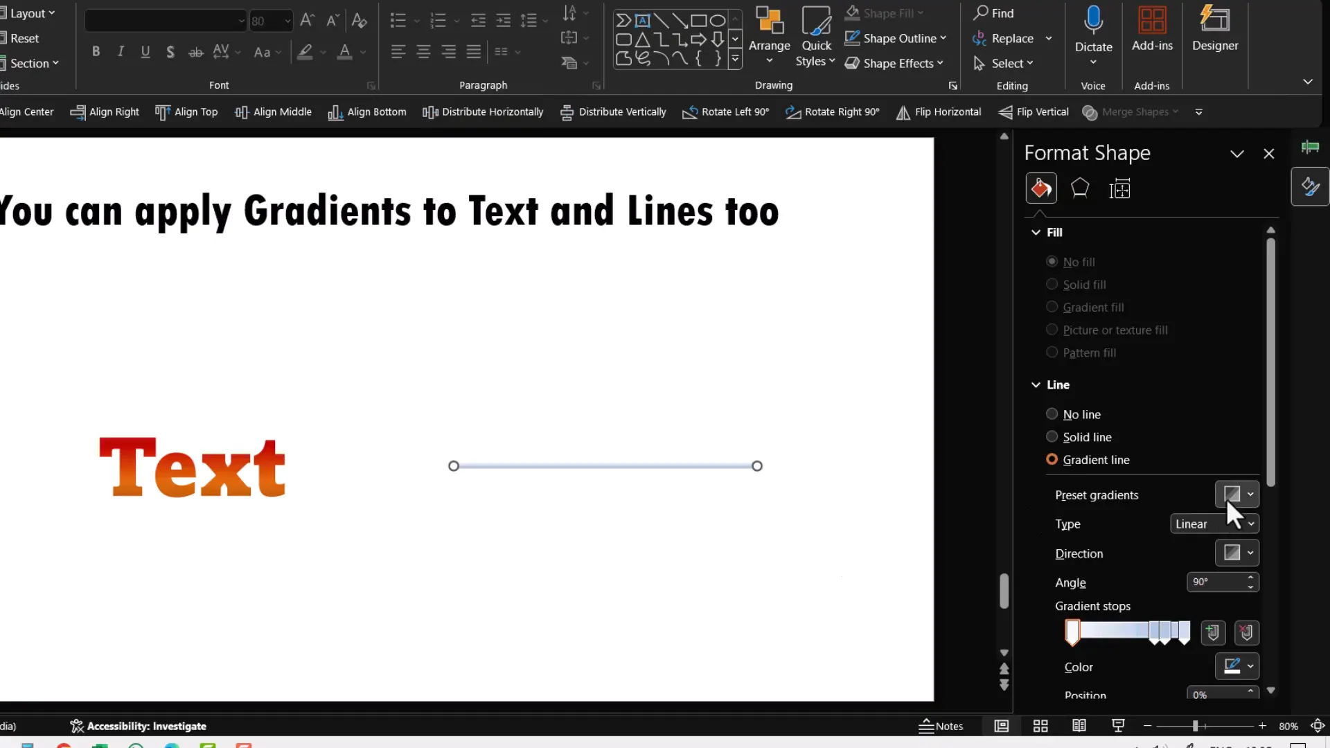
This feature lets you create visually dynamic outlines and connectors that enhance your presentation’s design sophistication.
5. Search for Photos by Color to Match Your Presentation Theme
When you select colors carefully for your presentation, you want all elements—including photos and graphics—to harmonize with that color scheme. Many presenters don’t realize that popular image search engines and stock photo websites allow you to filter images by color, making it easy to find visuals that perfectly complement your theme.
Using Google Images to Search by Color
For example, if you search for photos related to “happiness” on Google Images, you might get mostly yellow-themed images because yellow is associated with happiness.
If your presentation’s theme color is purple, you can filter Google Images by color:
- After searching, click Tools below the search bar.
- Click Color and select Purple.
Google will then show only photos with purple tones, ensuring your visuals align with your color scheme.
Using Stock Photo Sites to Search by Color
Popular free stock photo sites like Pixabay, Pexels, and Texels also offer color filters.
For example, on Pixabay:
- Search for your desired image topic.
- Use the Color filter to select your theme color (e.g., purple).
On Pexels and Texels, you can either select colors from a color palette or enter a specific hex color code for your brand color to find images that contain those hues.
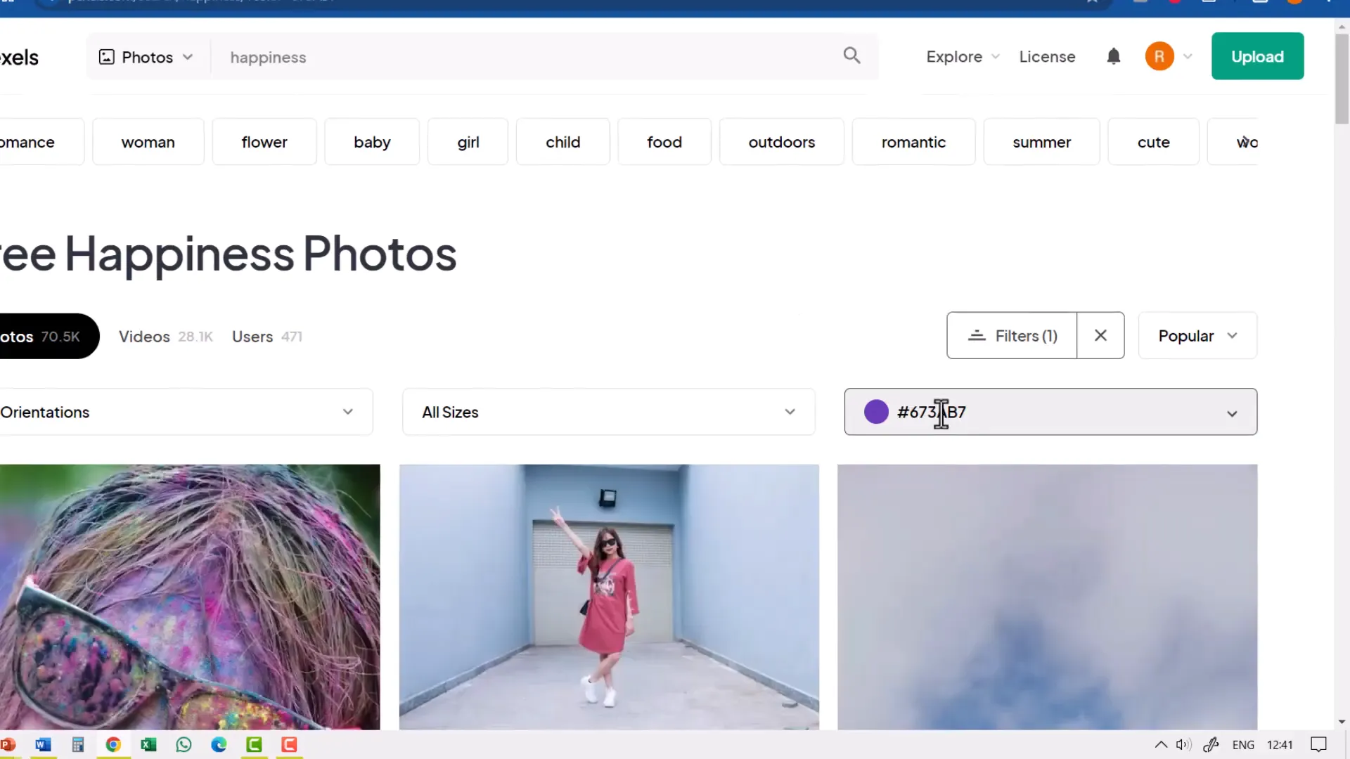
By matching photos with your theme colors, you create a consistent, polished look that reinforces your brand and message.
Bonus Tips: Custom Theme Colors and Professional Color Palettes
PowerPoint allows you to customize theme colors to perfectly match your brand or presentation style. You can create your own palette by picking colors from your brand assets or website and saving them as your theme colors. This way, your theme colors are available across all Microsoft Office programs with just a click.
Creating and using a custom color palette ensures consistency across presentations, documents, and other materials.
If you want to learn how to build your own color palette step-by-step, there are excellent tutorials available that guide you through the process, such as “Spice up your brand: create your own color palette in PowerPoint.”
For those looking to take color selection to the next level, there are advanced tutorials and AI-powered tools that generate stunning color palettes tailored to your existing brand colors. These tools help you pick complementary shades and create visually appealing color schemes effortlessly.
Summary: Make Your PowerPoint Colors Work for You
Mastering color in PowerPoint is about more than just picking pretty shades. It’s about understanding the underlying mechanics of theme colors versus standard colors, using gradients smartly, customizing icons and text, and integrating your visuals harmoniously through color-based image searches.
By applying these five little-known tips, you’ll:
- Ensure your diagrams and templates adapt seamlessly to your presentation themes.
- Quickly enhance your shapes with professional preset gradients.
- Unlock the ability to color and apply gradients to icons.
- Create eye-catching gradient text and line effects.
- Find photos that perfectly match your color scheme, boosting visual consistency.
These insights will save you hours of frustration and elevate the quality of your presentations, helping you impress your audience and communicate with clarity and style.
Frequently Asked Questions (FAQ)
Q1: What are theme colors and why should I use them?
Theme colors are colors that change dynamically based on the design theme applied to your PowerPoint presentation. Using theme colors ensures that your shapes, text, and diagrams automatically adapt when you switch themes or customize your palette, maintaining a consistent and professional look throughout your slides.
Q2: Can I use standard colors if I want specific brand colors?
You can use standard colors if you need a fixed color that won’t change, but this means your shapes won’t adapt if you change themes. For brand consistency, it’s better to customize your theme colors to include your brand colors, so you can still use theme colors that adapt but reflect your brand palette.
Q3: How do I apply gradients to text in PowerPoint?
To apply gradients to text, right-click the text box, select Format Shape, go to the Text Options tab, then expand Text Fill & Outline and choose Gradient Fill. Customize the gradient stops and colors as you like. This applies the gradient directly to the text characters.
Q4: Why can’t I change the color of PowerPoint icons using the usual fill options?
PowerPoint icons inserted from its icon library are SVG graphics that don’t respond to the normal Solid Fill option under Format Graphic. Instead, you need to use the Shape Fill menu to change their color. To add gradients, you must first ungroup and convert the icon to shapes, then regroup before applying gradient fills.
Q5: How can I find photos that match my presentation’s color scheme?
Most image search engines and stock photo websites have color filters. For example, on Google Images, after searching, use the Tools > Color filter to select your desired color. Sites like Pixabay, Pexels, and Texels also let you filter images by color or enter a specific hex code to find photos matching your brand colors.
Q6: Can I customize the theme colors in PowerPoint?
Yes, PowerPoint allows you to create custom theme color palettes. You can select your brand colors or any colors you want and save them as a theme. These custom themes then become available in all Microsoft Office programs, making it easy to maintain consistency across your documents and presentations.
With these tips and knowledge, you’re now equipped to use colors in PowerPoint like a pro, making your presentations more vibrant, cohesive, and impactful.
Check out the full video: 5 Things you didn’t know about choosing colors in PowerPoint


