
Waterfall charts are a staple in consulting presentations, often used to convey complex data changes in a visually appealing and clear manner. If you’ve ever admired the sleek, professional look of consulting slide decks, chances are you’ve seen a waterfall chart at work. But did you know there are actually three distinct types of waterfall charts that consultants use, each serving a unique purpose? Understanding these can elevate your data storytelling and presentation skills significantly.
In this comprehensive guide, I’ll walk you through the three main types of waterfall charts, explain when and how to use each, and provide real-world examples from top consulting firms like McKinsey, BCG, and Bain. Along the way, I’ll also share some golden rules I learned during my consulting days to help you build effective waterfall charts that truly communicate your message.
Table of Contents
- Introduction to Waterfall Charts
- The Three Types of Waterfall Charts
- Three Golden Rules for Building Effective Waterfall Charts
- Why Waterfall Charts Are So Effective in Consulting
- Additional Tips for Using Waterfall Charts
- Frequently Asked Questions (FAQ)
- Conclusion
Introduction to Waterfall Charts
Waterfall charts, also known as bridge charts, are designed to show how an initial value is influenced by a series of intermediate positive or negative values, leading to a final result. They are especially popular in consulting because they combine clarity and visual appeal, making complex data easier to understand at a glance.
These charts are versatile and can be used in various contexts, from financial analysis to project management, marketing metrics, or operational data. But to harness their full power, you need to know which type of waterfall chart fits your story best.
The Three Types of Waterfall Charts
Consultants typically use three types of waterfall charts, each tailored to a specific analytical purpose:
- Build Up Waterfall Chart
- Movement Waterfall Chart
- Gap Waterfall Chart
Let’s dive into each type to understand their structure, use cases, and how they help tell different kinds of data stories.
1. Build Up Waterfall Chart
The Build Up Waterfall Chart is the simplest and most common type you’ll encounter. Its primary function is to show how different parts contribute to a total. Imagine starting with Part A, then adding Part B, then Part C, and so on, until you reach the overall total.
In its most basic form, this could resemble a stacked column or stacked bar chart. However, the waterfall format looks cleaner and offers more flexibility, especially when you want to add explanatory callouts—those informative boxes above the chart that highlight key insights or anomalies.
What makes the build up waterfall chart so powerful is its ability to group components sensibly and show subtotals for each group. For example, instead of displaying individual parts, you can aggregate them into groups and show totals for each group, which is something a stacked column chart struggles to do effectively.

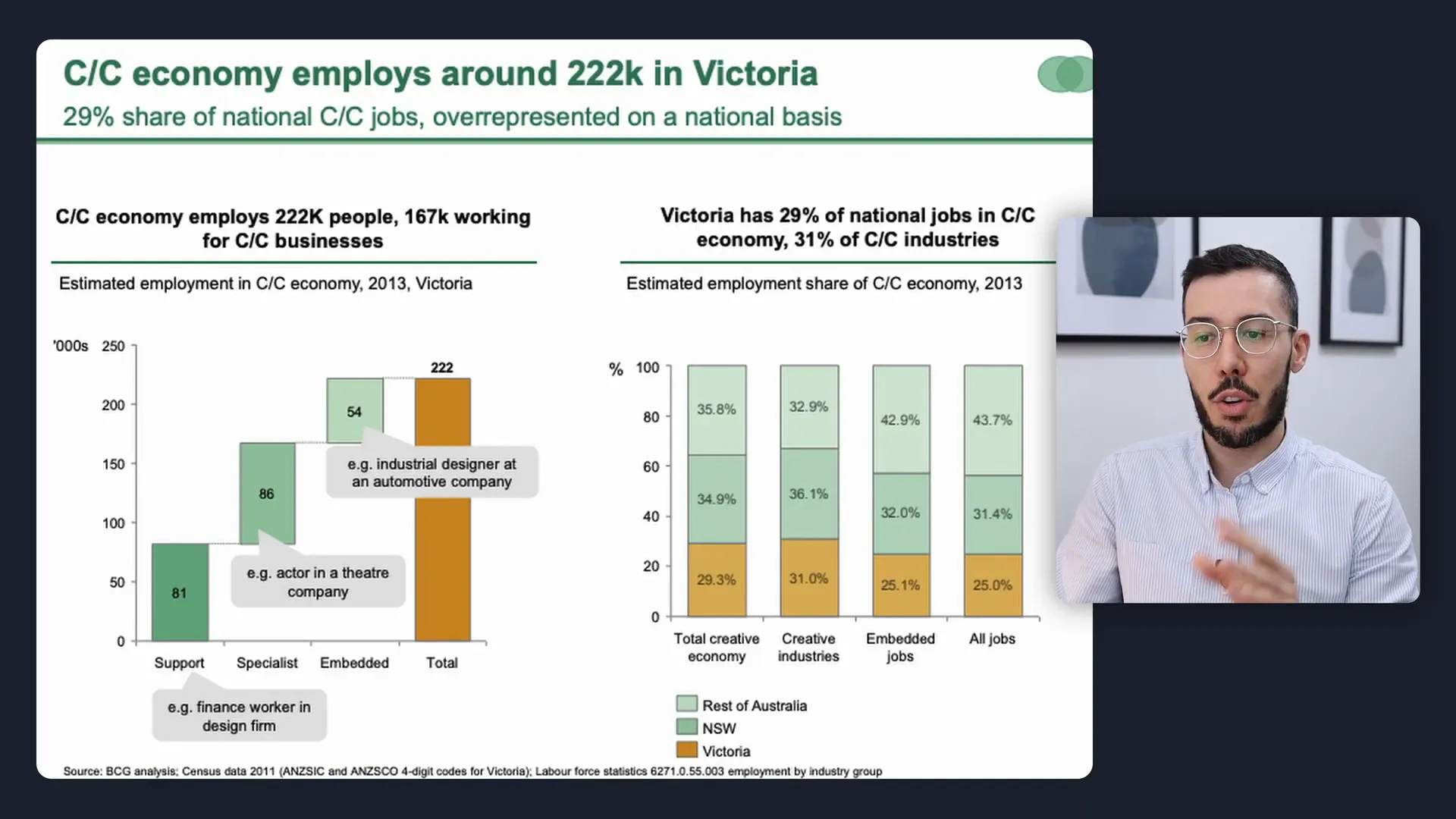
Example: Creative Economy Jobs in Victoria, Australia
Let’s look at a real-world example from BCG. This slide illustrates the number of jobs produced by the creative economy in Victoria, Australia. On the left, there’s a build up waterfall chart showing how different job categories contribute to the total.
The chart breaks down the total into 81,000 support jobs, 86,000 specialist jobs, and 54,000 embedded jobs. While a stacked column chart could technically display this data, choosing a waterfall chart provides additional advantages:
- Callouts: The gray boxes above the chart explain why certain segments are larger or smaller than expected, adding valuable context.
- Visual balance: The waterfall chart avoids excessive white space on one side of the slide, creating a more balanced and aesthetically pleasing layout.
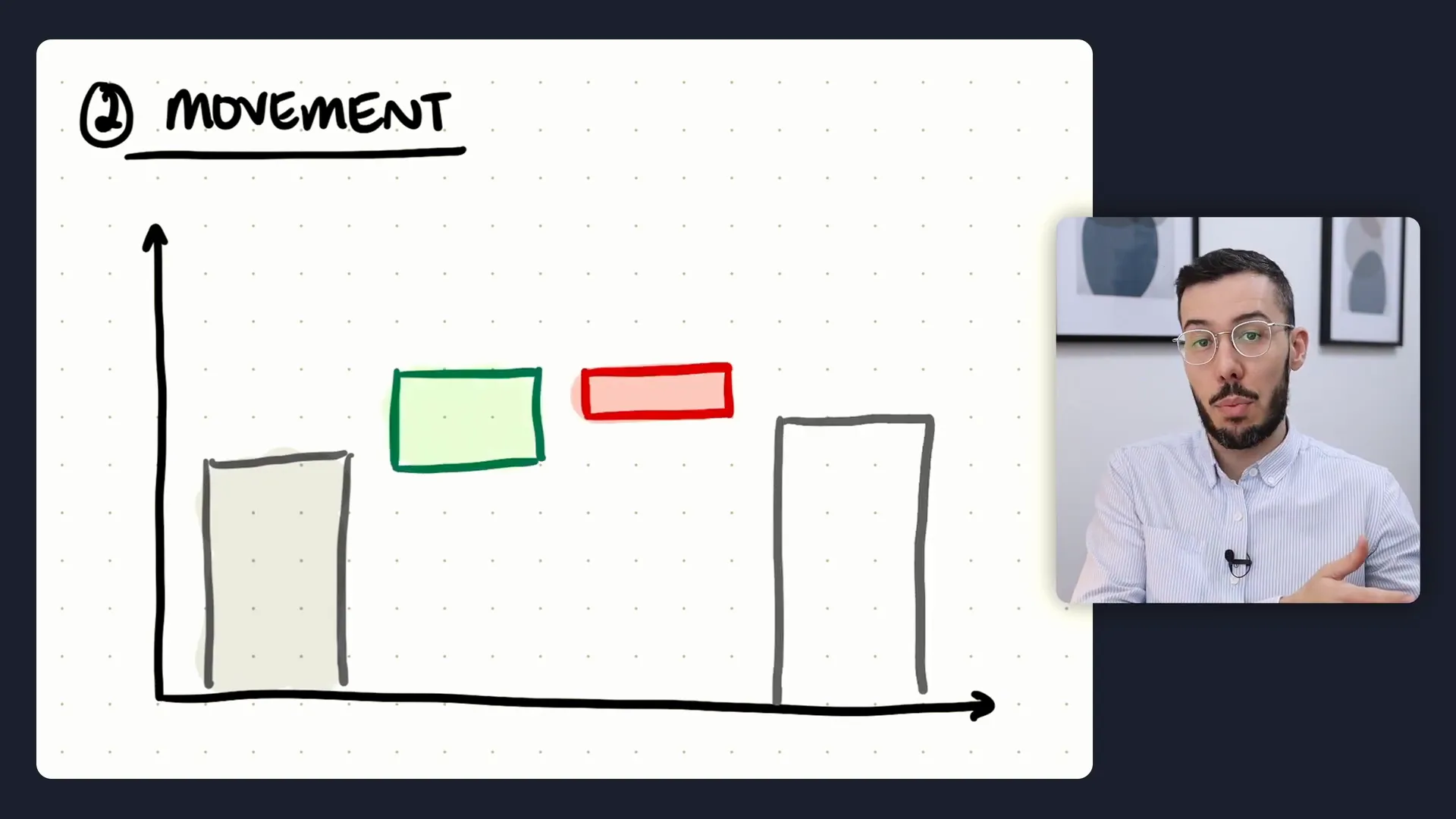
2. Movement Waterfall Chart
The Movement Waterfall Chart is what waterfall charts were originally designed for. This type focuses on showing changes from an initial value to a final value by adding intermediate increases and decreases.
Think of it as starting from a baseline number, then adding or subtracting various factors until you reach a new total. This type is especially popular for illustrating financial metrics such as net income, profit margins, or bank interest margins over time.
One hallmark of the movement waterfall chart is the difference arrow. This visual element emphasizes the overall change from the initial value to the final value, helping viewers grasp the net effect of all the intermediate movements.
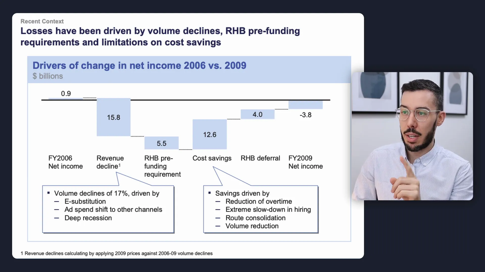
Example: Drivers of Net Income Change Over Time (McKinsey)
McKinsey uses a classic movement waterfall chart to explain changes in net income from fiscal year 2006 to 2009. The chart starts with the 2006 net income, then shows downward drivers (factors that decreased net income), followed by upward drivers (factors that increased net income), and finally the 2009 net income.
This chart is a perfect example of elucidating why net income shifted over time. McKinsey also includes callouts to highlight that revenue decline and cost savings were the largest drivers of change.
Here are some tips I would apply if I were building this chart:
- Use distinct colors for positive and negative movements—green for increases, red for decreases. This color coding instantly communicates whether each factor added or subtracted value.
- Add plus (+) or minus (-) signs next to the values to further reinforce the direction of the changes.
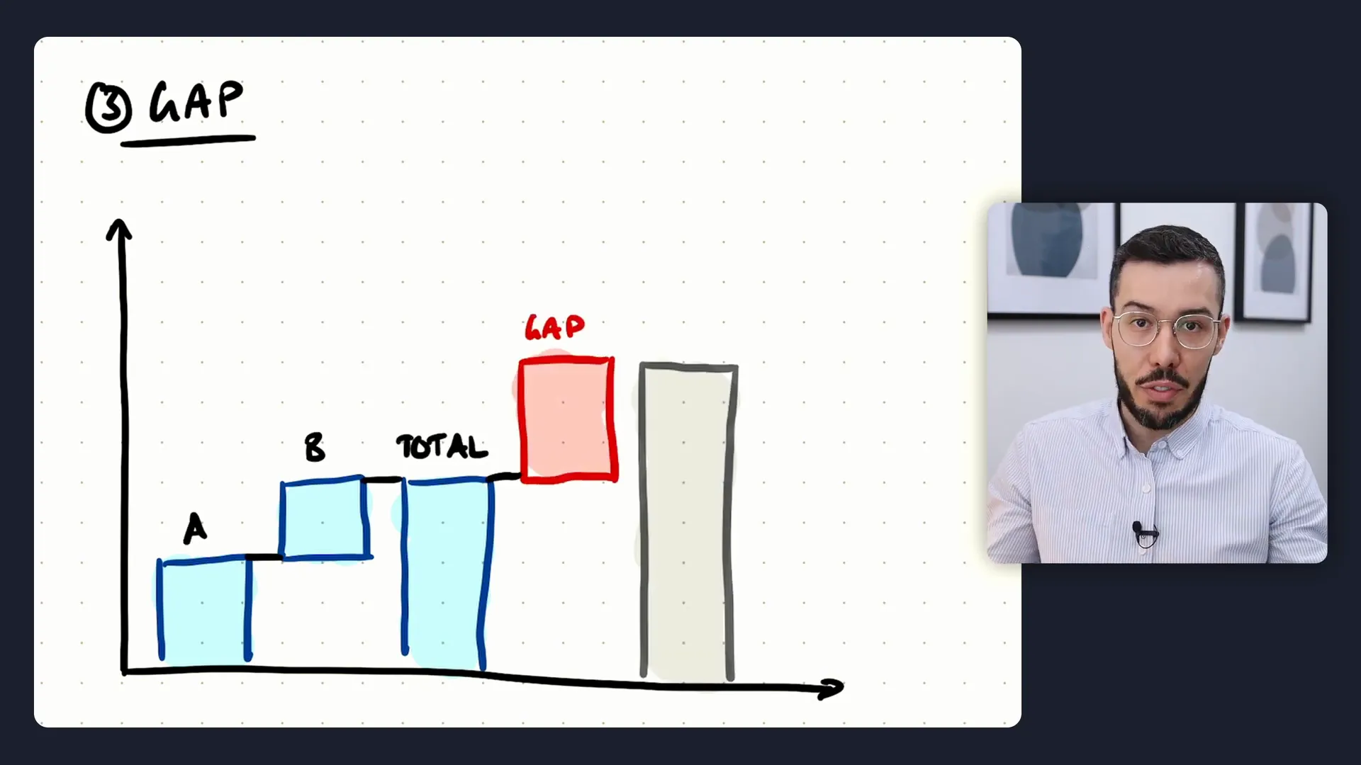
3. Gap Waterfall Chart
The Gap Waterfall Chart is less common but incredibly useful, especially in consulting contexts. This chart type builds up to a total, then highlights the gap between actual results and a target, followed by the target itself.
The key purpose here is to emphasize the difference between where you are and where you want to be, making it ideal for setting up complications or challenges in your story.
One handy tip is to use a distinct color or border style for the gap column to draw attention to it. Pairing this with callouts that explain why the gap exists or its magnitude can reinforce the message.
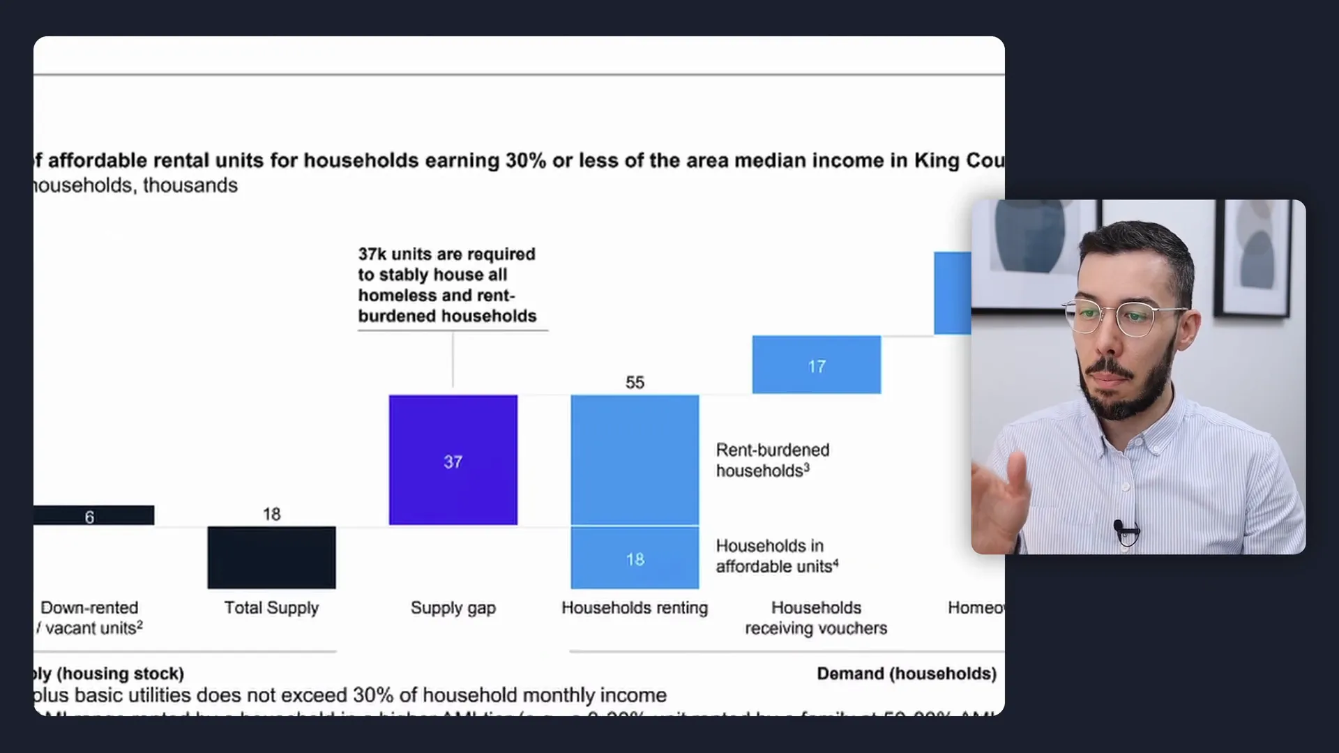
Example: Affordable Housing Supply Gap in Kings County (McKinsey)
In this more complex McKinsey example, the waterfall chart illustrates the supply and demand of affordable housing units in Kings County. The middle section, highlighted in a rich blue color, shows the supply gap—essentially the difference between total supply and households renting.
A callout explains this gap in detail, helping viewers understand the problem clearly. This slide typically appears at the end of the complication section in a storyline, with subsequent slides focused on resolving the supply gap.
Three Golden Rules for Building Effective Waterfall Charts
Knowing the types of waterfall charts is just the start. Building effective charts that communicate your points clearly requires a blend of art and science. Here are the three golden rules I was taught during my consulting career:
1. Choose Colors with a Purpose
Avoid using the same color throughout your waterfall chart. Instead, use color strategically to highlight important parts and to differentiate between positive and negative values, groups, or gaps.
The goal is to guide the viewer’s eye to the most critical parts of the chart and to make it easier to understand what each segment represents at a glance. For example, green for positive contributions, red for negative impacts, and a neutral color for totals or groups.
2. Use Chart Decorations to Emphasize Points
Chart decorations are visual aids that help highlight or explain parts of your chart. These include:
- Difference arrows: To show the overall change from start to finish.
- Callouts: Boxes or text annotations that explain why a particular value is significant or unexpected.
- Borders or shading: To differentiate specific columns like gaps or targets.
These elements reinforce your message, making the chart more than just numbers—it becomes a storytelling tool.
3. Don’t Force a Waterfall Chart
Waterfall charts look cool and professional, but they aren’t suitable for every dataset. The golden rule is to choose the right chart based on your data, not the other way around.
If your data doesn’t lend itself to a waterfall chart, don’t try to force it. Instead, pick the most appropriate visual that clearly conveys your message. Save the waterfall chart for situations where it naturally fits the story.
Why Waterfall Charts Are So Effective in Consulting
Consulting presentations thrive on clarity, precision, and storytelling. Waterfall charts excel in all three areas by:
- Breaking down complex data: They decompose totals into understandable components or show how values change over time.
- Visualizing contributions and changes: Whether building up to a total, tracking movements, or highlighting gaps, waterfall charts provide a clear visual narrative.
- Supporting storylines: They fit perfectly into structured presentations that follow the Situation-Complication-Resolution framework, especially the gap waterfall chart for complications.
By mastering these charts, you can elevate your presentations to consulting-level professionalism.
Additional Tips for Using Waterfall Charts
- Label clearly: Make sure each part of the waterfall is well-labeled so viewers can easily understand what each column represents.
- Keep it simple: Avoid cluttering charts with too many components. Group data sensibly to maintain clarity.
- Use consistent scales: Ensure that all columns align on the same scale to avoid misleading impressions.
- Integrate with your narrative: Use callouts and other chart decorations to tie the visual to your spoken or written story.
Frequently Asked Questions (FAQ)
What is a waterfall chart and why is it useful?
A waterfall chart is a visual tool used to show how an initial value is affected by a series of intermediate positive or negative values, resulting in a final value. It’s useful because it breaks down complex data changes into understandable parts, making it easier to communicate insights.
What are the three types of waterfall charts?
The three types are:
- Build Up Waterfall Chart: Shows how parts contribute to a total.
- Movement Waterfall Chart: Illustrates changes from an initial to a final value.
- Gap Waterfall Chart: Highlights the gap between actual results and targets.
When should I use a gap waterfall chart?
Use a gap waterfall chart when you want to highlight a difference between actual performance and a target, especially useful in the complication phase of a presentation to set up a problem that needs solving.
How do I choose colors for my waterfall chart?
Choose colors purposefully to differentiate positive and negative values, groups, and gaps. Typically, green indicates positive contributions, red indicates negative impacts, and neutral colors are used for totals or groupings.
Can I use waterfall charts for non-financial data?
Absolutely. While commonly used in financial contexts, waterfall charts can effectively visualize changes or contributions in any data type, such as job categories, project metrics, or inventory levels.
What are callouts and why are they important?
Callouts are text boxes or annotations on the chart that explain key points, anomalies, or important insights. They help provide context and guide the viewer’s understanding of the data.
Is it ever wrong to use a waterfall chart?
Yes. If your data doesn’t naturally fit the waterfall structure, forcing a waterfall chart can confuse your audience. Always choose the chart type that best suits your data and message.
Conclusion
Mastering the use of waterfall charts can transform your data presentations from mundane to impactful. By understanding the three main types—build up, movement, and gap waterfall charts—you can select the right format to tell your data story effectively.
Remember the three golden rules: choose colors with intention, use chart decorations like callouts and difference arrows to emphasize key points, and never force a waterfall chart if it doesn’t fit your data. These principles will help you create charts that not only look professional but also communicate clearly and persuasively.
Whether you’re analyzing financial results, breaking down contributions to a total, or highlighting gaps that need addressing, waterfall charts are powerful tools in your presentation arsenal.
If you want to take your presentation skills further, consider exploring storylining techniques that help you craft compelling narratives around your data. Combining strong visuals like waterfall charts with a clear storyline is the hallmark of top-tier consulting presentations.
Feel free to leave any questions about waterfall charts in the comments section below. I’m here to help you refine your data storytelling skills and build presentations that stand out.

Check out the full video: How To Use Waterfall Charts: 3 Types With Real Examples


