

Thank you for joining me — I’m the creator at POWERPOINT UNIVERSITY, and in this comprehensive guide I’ll walk you through how I built one of my most requested designs. In the original tutorial I showed a five-option interactive slide that highlights different body parts (lungs, kidneys, heart, stomach, bone) and swaps related imagery when you click each option. This article expands that tutorial into a detailed, written walkthrough so you can recreate, adapt, and reuse the same concept for your presentations. If you want practical, reusable templates and polished ideas for Useful powerpoint slides, this post will give you every step, tips, and variations you need.
This guide covers everything from the assets and setup to advanced refinements, accessibility, and troubleshooting. Use it as a reference while you build, or read through to learn design choices and repurposing ideas. I’ll also include strategically placed screenshots from the source tutorial to help you follow visually.
Table of contents
- Why this slide concept works for Useful powerpoint slides
- What you’ll build — final behavior and use cases
- Assets and preparation: what you need before you start
- Step-by-step build: creating the base slide
- Step-by-step: adding icons, images, and morph transitions
- Design tips to make your Useful powerpoint slides look professional
- Variations and repurposing ideas for corporate, education, and health
- Performance, export, and compatibility notes
- Troubleshooting common issues
- Accessibility and best practices
- Resources and downloadable template
- FAQ
- Conclusion
Why this slide concept works for Useful powerpoint slides
Interactive slides that combine icons, shapes, and image swaps grab attention and allow a single slide to communicate multiple ideas without overwhelming the viewer. The “five-option” concept is especially effective because:
- It reduces slide count while increasing interactivity — one slide can present five related ideas.
- Visual anchors (icons and colored ovals) make it simple for the audience to follow which option is active.
- Morph transitions and image fills create smooth visual movement, which feels modern and polished.
- The approach adapts easily to different topics: health, corporate features, educational modules, or product highlights.
Because the result is a reusable slide that’s both attractive and functional, it belongs in any folder of Useful powerpoint slides. Below, I’ll show exactly how to build this step-by-step, and I’ll also explain why I made each choice so you can adapt it confidently.
What you’ll build — final behavior and use cases
By the end of this tutorial you will have a master slide (replicated across five slides) where:
- Five colored circular options are aligned around a central focal area.
- Icons in each circle identify the option (for example: lungs, kidneys, heart, stomach, bone).
- Clicking advances to the next slide where the selected option visually grows and a related image appears inside a large oval image area.
- Morph transition is used to animate the size and position changes for a smooth effect.
- Optional text area, shadows, and lines help emphasize the active selection.
Use cases for Useful powerpoint slides built this way include:
- Health presentations: explain multiple wellness tips using a single slide with different health tips per option.
- Corporate features: highlight product features or service pillars (Feature A, Feature B, etc.) with imagery per feature.
- Education: show student activities, modules, or topic explorations inside one slide shell.
- Marketing: break down campaign pillars with supportive visuals and smooth transitions.
Assets and preparation: what you need before you start
Before you begin building, gather these assets and set up your workspace. Proper preparation makes the build faster and prevents layout changes later.
- PowerPoint (desktop version recommended with Morph transition feature)
- Five icons (SVG or vector-style icons work best) for your options. If you plan to change color, use icons that can inherit shape color or are white on transparent background.
- Five images relevant to each option (landscape or portrait works depending on your oval crop).
- Brand or color palette for consistent styling.
- Optional: a copy of the downloadable template to inspect the finished file (link in Resources).
Tip: Use high-resolution images to avoid pixelation when they’re cropped or scaled. If you plan to share the PPTX file, embed fonts or use web-safe fonts to avoid substitution on other machines.
Step-by-step build: creating the base slide
The build begins by creating a background, a large oval image container, and a masked area to control the image placement. I’ll walk through every click and setting so you can replicate the exact outcome for your own Useful powerpoint slides.
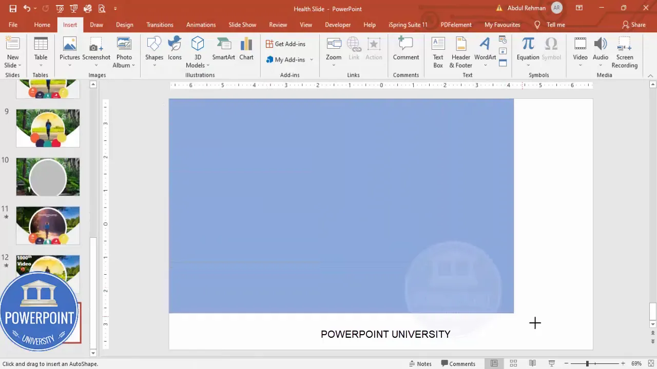
1. Add a new blank slide and insert the background image
Start with a blank slide and cover the entire slide with a rectangle shape. This rectangle becomes the background image holder.
- Insert → Shapes → Rectangle. Draw it to cover the full slide.
- Shape Outline → No Outline.
- Right-click → Format Shape → Fill → Picture or Texture Fill.
- Choose Insert From: either “This Device” or “Online Pictures” and locate an appropriate landscape image (keyword: landscape) to set as the background.
This gives you a clean, crisp background without relying on the slide’s default theme. A neutral background keeps attention on your interactive elements and is a staple of Useful powerpoint slides.
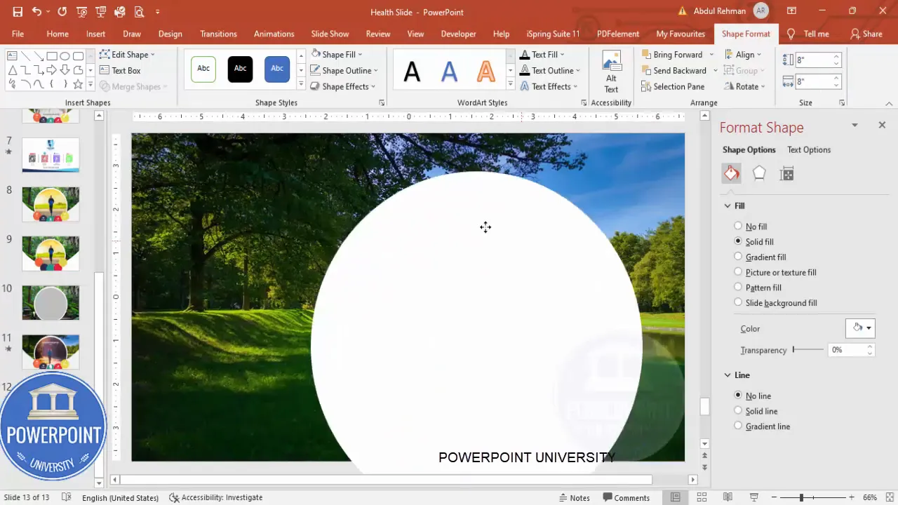
2. Create the large central oval for imagery
Next create the primary image container — a large oval that will display context images and visually anchor the slide.
- Insert → Shapes → Oval.
- Set Shape Outline → No Outline.
- Set Fill to white temporarily so you can see it while positioning.
- In the Size settings, set both Height and Width to 8 inches (or the size that suits your slide). Center it on the slide. Portions may extend beyond the slide edge — that’s fine.
- Duplicate the oval (Ctrl+D) and change the size of the duplicate to 7.5 inches. This creates a layered visual that helps when the morph transition occurs.
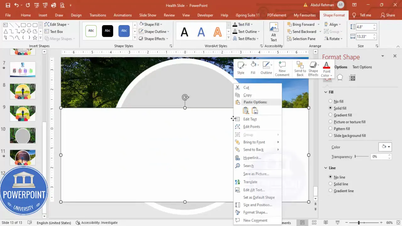
3. Mask the oval area using an edited rectangle
To shape the image and create a clean border or overlay, we add a white rectangle and edit its points to tuck under the oval. This creates a neat visual cutout when the image is set as the oval’s fill.
- Insert → Shapes → Rectangle. Draw it so it covers the top area overlapping the oval.
- Shape Outline → No Outline. Shape Fill → White.
- Right-click → Edit Points. Drag the top-right point down to the bottom red alignment guide to create a custom shape that blends under the oval.
- Send this edited rectangle to Back so it sits beneath the oval shapes.
4. Create five colored option circles
These five circles act as selectable options. Make them equal size and spread them around or in a row depending on design preference. For the health slide I positioned them to the right of the central oval.
- Insert → Shapes → Oval. Set Height & Width = 2 inches (or a size that complements the central image).
- Shape Outline → No Outline. Set Fill color using your palette — I used five distinct, slightly transparent colors for cohesion.
- Set transparency to about 5% so they’re visible but not overpowering.
- Duplicate (Ctrl+D) the circle four times and position them thoughtfully (overlapping slightly can create a layered look).
- Align them evenly using Align → Distribute Horizontally / Vertically as needed.
Step-by-step: adding icons, images, and morph transitions
With the layout ready, it’s time to add icons, insert images into the central oval, duplicate slides, and activate Morph transitions to animate the interactions. Follow carefully and use the screenshots as checkpoints.
5. Add icons into the circles
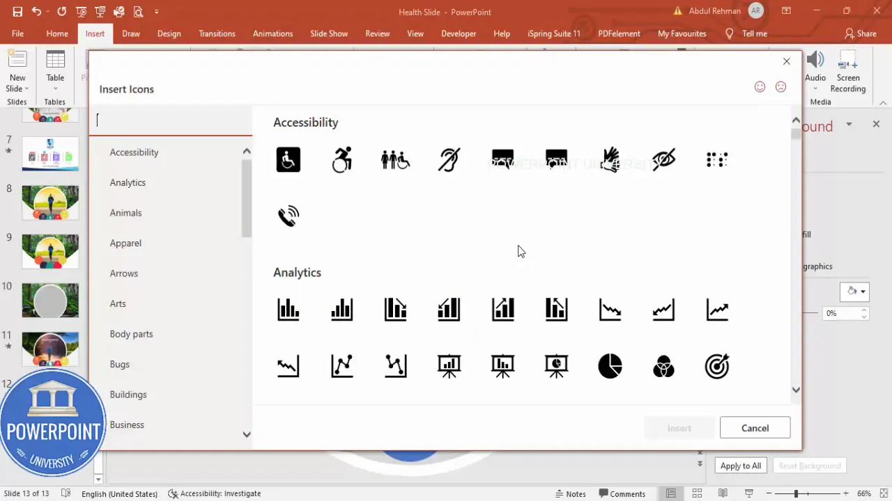
Icons make each option instantly recognizable. Use PowerPoint’s built-in icon library for quick, vector-based icons that scale cleanly.
- Insert → Icons. Search for icons relevant to your topic (health icons in my example: heart, lungs, kidneys, stomach, bone).
- Insert the icons, set their fill color to white, and scale them to about 0.5 inches for clear visibility inside each circle.
- Place each icon centered inside its circle: right-click → Align Center and Align Middle for perfect centering.
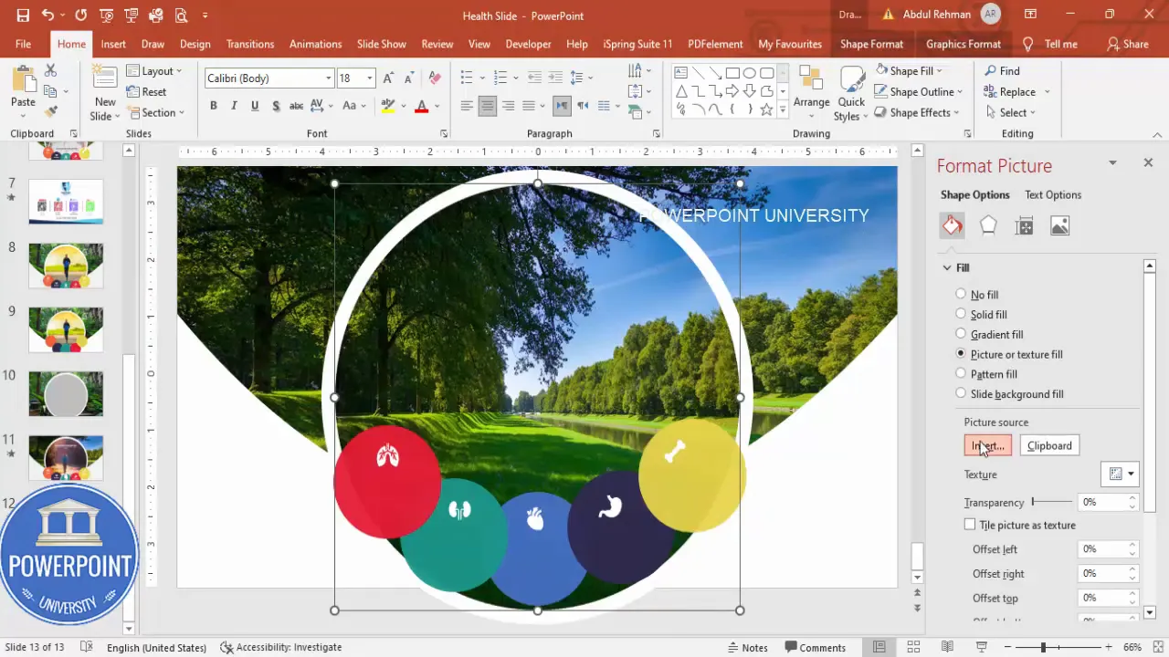
6. Insert the first image into the central oval
Now add the first contextual image to the central oval. For my first option (lungs), I used a jogging image that suggests respiratory fitness.
- Select the central oval → Right-click → Format Shape → Fill → Picture or Texture Fill → Insert Picture.
- Choose the image that corresponds to the first option (e.g., jogging for lungs).
- Adjust Offset settings (under Fill) if you want to reposition the visible portion of the image in the oval. Untick “Tile picture as texture” if present, then use the offset sliders to reposition or zoom.
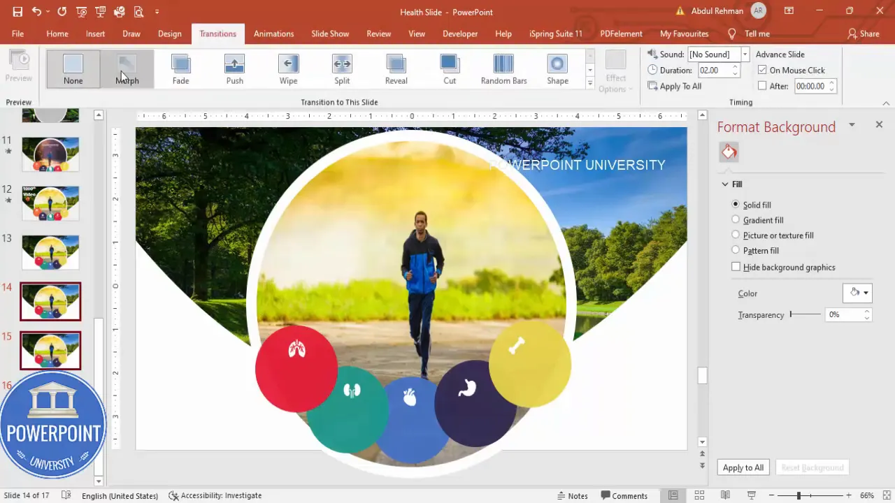
7. Duplicate the slide and prepare option-specific slides
To animate between options we’ll create five slides — one master state for each option — and apply Morph transitions between them. Duplicate the original slide four times so you have five in total.
- Right-click the slide thumbnail → Duplicate Slide (repeat until you have 5 slides total).
- On Slide 1 keep the initial image and sizing as the baseline state.
- Slide 2 will represent the next option: make the lungs circle larger and highlight the icon. Also prepare the image that corresponds to the next option (kidneys → drinking water image).
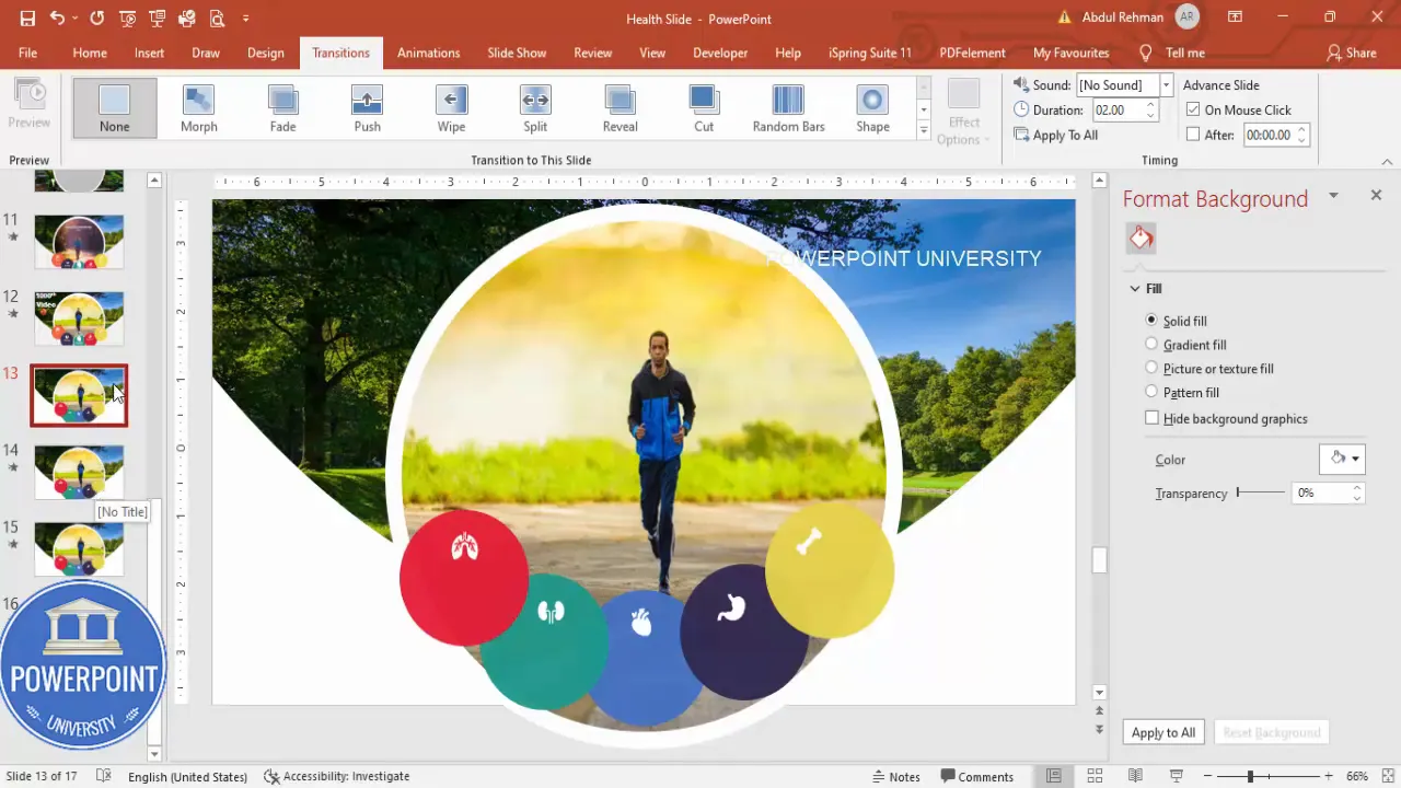
8. Apply Morph transition and set timing
Morph creates the illusion of objects changing position and size instead of appearing abruptly. Apply it to slides 2–5 so clicking advances the active selection smoothly.
- Go to Slide 2 thumbnail → Transitions → Morph.
- Repeat: select slides 3, 4, and 5 and apply Morph to each.
- Select the last four slides and set Transition Duration to 1 second (or another value that looks natural). This speeds up the animation for a more responsive feel.
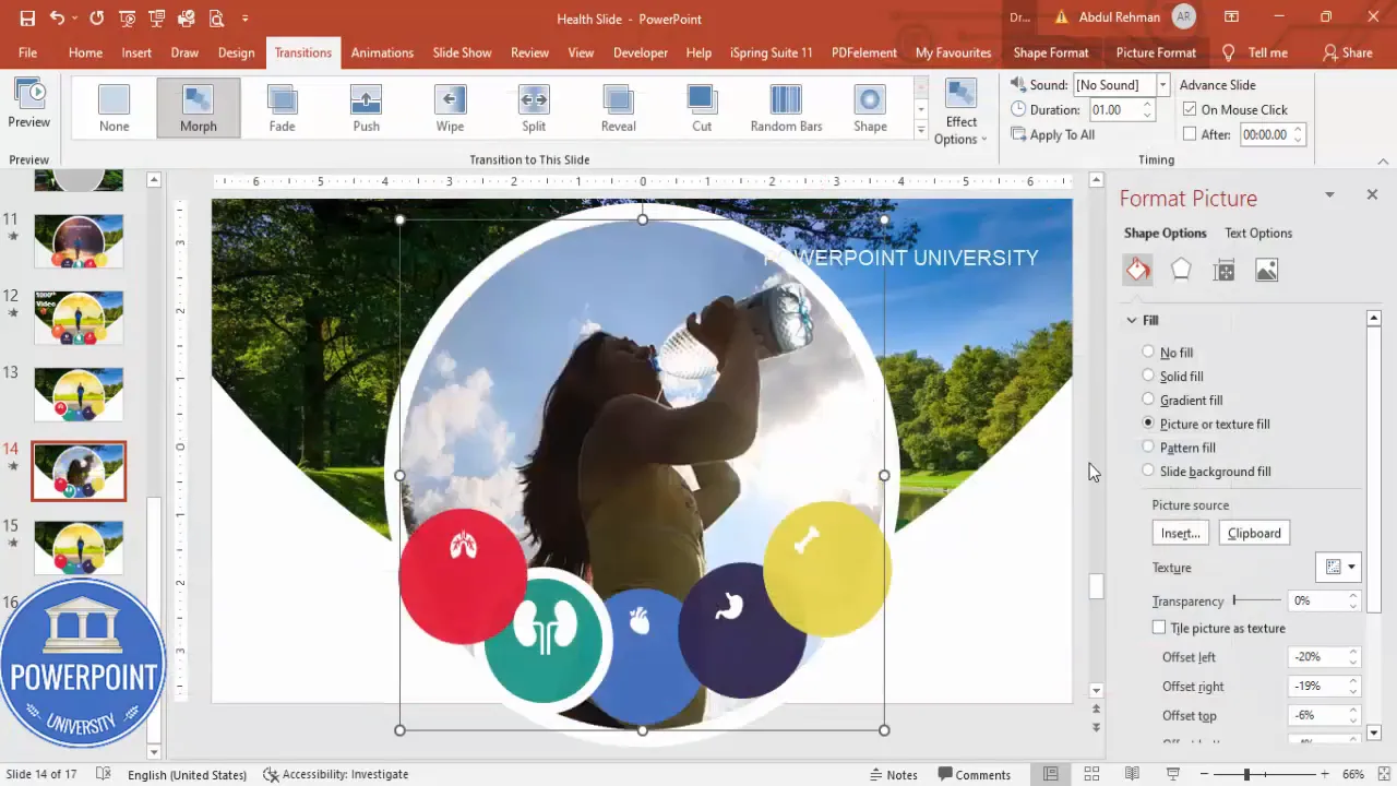
9. Change the oval image and enlarge the active circle per slide
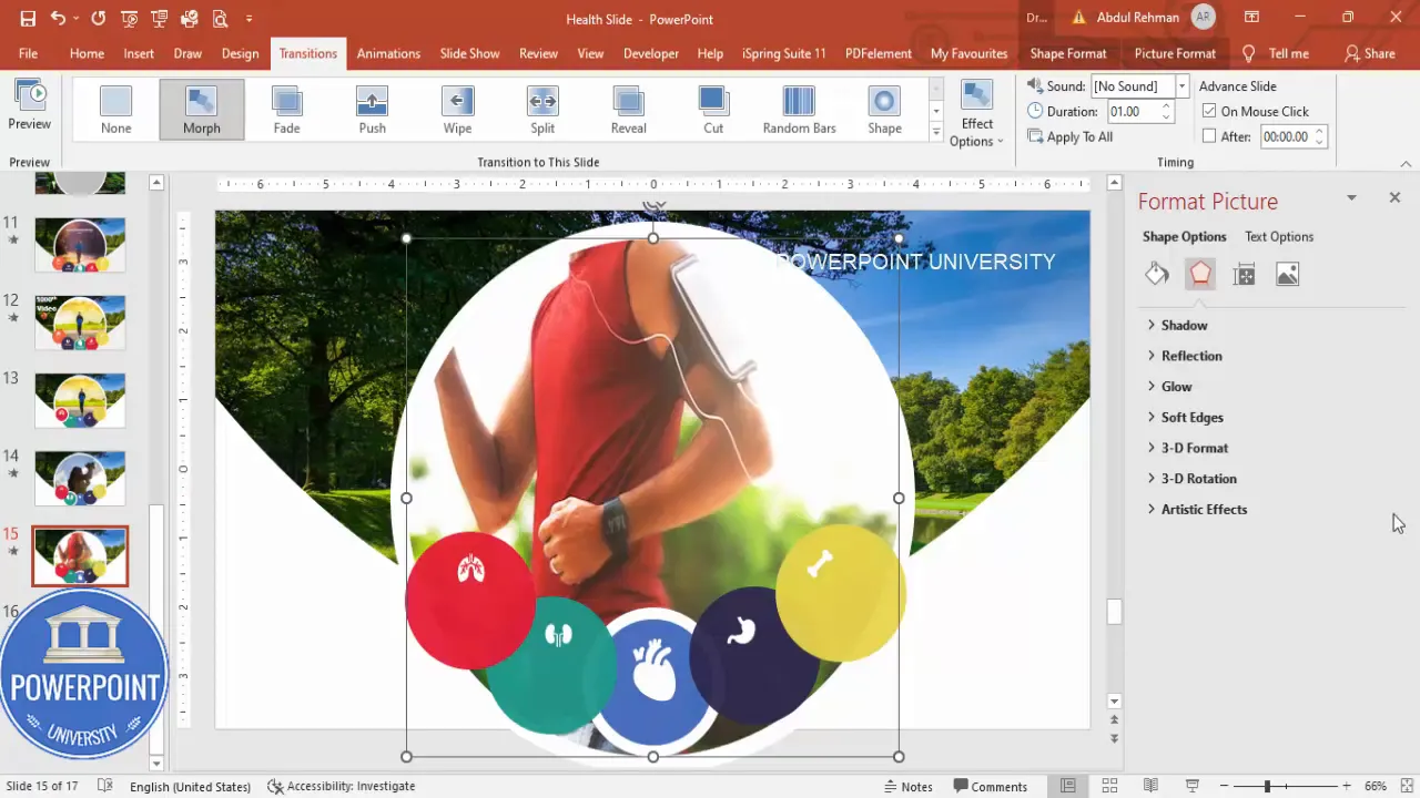
On each subsequent slide, change the central oval’s image fill to match the active option, and increase the size and border (stroke) of the corresponding circle to indicate it’s active.
- Select the oval on Slide 2 → Format Shape → Picture Fill → Insert the image for the kidney option (drinking water).
- On Slide 2 enlarge the kidney circle (select circle → increase size) and add a solid white outline (Format Shape → Line → Solid line; set width to 12.25 or similar to create a thick ring).
- Repeat for slides 3, 4, and 5: change oval image, enlarge the corresponding circle and apply the same thick outline.
10. Align and fine-tune offsets
On each slide, fine tune the image offset for the oval so important visual content remains centered or highlighted. You can also control the oval fill zoom by adjusting the offsets to crop different areas of the image.
- Select the oval → Format Shape → Fill → Picture or Texture Fill → untick any texture options and adjust Offset X / Y until the focal point is correct.
- For natural movement with Morph, ensure objects maintain consistent names/IDs by not re-creating them on each slide — editing the same object across slides helps Morph identify the transformation.
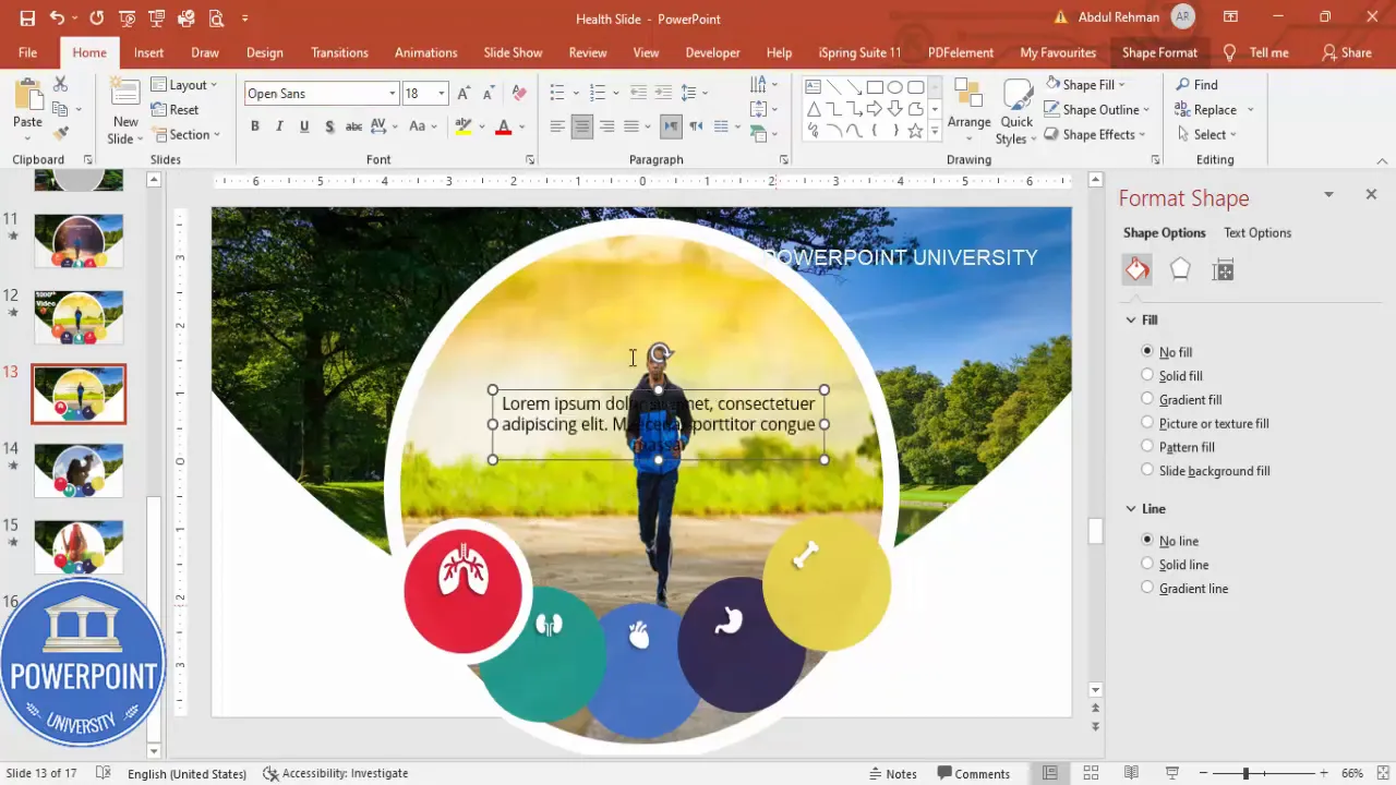
11. Add text, shadows, and polish
Finally, add brief text descriptors and optional shadow effects to reinforce the active selection. Use short, readable lines — avoid paragraphs that are too long which distract from the visual.
Create Slides in Seconds with ExpertSlides AI |
|
Generate AI Presentations today: |
| TRY NOW! |
- Insert → Text Box and add short supporting text (e.g., “Jogging helps your lungs”). Keep copy concise; aim for 6–8 lines or less per slide.
- Use a clean font like Open Sans (or your brand font). Center align the text and adjust size for legibility.
- For extra depth, add shadow effects to the oval via Format Shape → Effects → Shadow and choose a subtle shadow for prominence.
Design tips to make your Useful powerpoint slides look professional
Design choices make the difference between a demo and an audience-pleasing slide. Here are design rules I followed to ensure the slide looks clean and professional.
Color and contrast
- Choose five colors with consistent saturation and contrast. Too many vivid, unmatched hues feel chaotic — choose a family (e.g., desaturated jewel tones or soft pastels).
- Keep icons white or neutral inside colored circles for consistency.
- Ensure text contrasts strongly with the background for accessibility.
Typography
- Use a modern sans-serif like Open Sans, Lato, or Montserrat for clarity.
- Titles: 28–36 pt; Body text: 18–24 pt depending on slide size — adjust for readability when presenting on different screens.
- Limit text to short phrases. Use bullet points only when they add clarity.
Spacing and alignment
- Use PowerPoint’s Align tools to keep objects evenly spaced and visually balanced.
- Use multiples of a base spacing (8–10 px grid equivalent) for margins and object spacing for a cohesive look.
Animation and motion
- Morph is powerful but avoid overusing it. Keep transitions consistent so the movement supports understanding rather than distracts.
- Use 1 second duration for snappy interactions; increase to 1.5–2 seconds for more cinematic reveals.
Variations and repurposing ideas for corporate, education, and health
This core technique—icons + central image + Morph—can be adapted in many ways. Below are examples and practical tips to repurpose the slide for common scenarios when creating Useful powerpoint slides.
Corporate features slide
- Replace body icons with product or service icons (e.g., Security, Speed, Support, Pricing, Integrations).
- The central oval shows a photo or infographic representing each feature when selected.
- Add a short metric or KPI overlay for each feature (e.g., “99.9% uptime”).
Educational module navigator
- Use icons for each module or lesson; the central oval reveals a sample exercise, a learning outcome, or an illustrative diagram.
- Use consistent color codes for module levels (Beginner, Intermediate, Advanced).
Marketing campaign pillars
- Icons represent campaign channels (Social, Email, Events, SEO, PR). The central oval shows sample creative or metrics for each channel.
- For presentations to stakeholders, animate in a timeline with Morph to show sequence or expected impact.
All of these are examples of Useful powerpoint slides that let you present multiple related ideas on a single slide while keeping the audience engaged with interaction and motion.
Performance, export, and compatibility notes
Before you share your presentation widely, review these compatibility points to avoid surprises.
- Morph transition requires PowerPoint (desktop) — exported PPTX preserves it for other desktop users but doesn’t function in older viewers like PowerPoint Online or some mobile apps. If your audience will view online, export to video (File → Export → Create a Video), or provide GIFs for web use.
- Large images increase file size. Compress pictures (File → Info → Compress Pictures) if you need a smaller file but maintain sufficient quality for presentation screens.
- Embed fonts if you use custom fonts (File → Options → Save → Embed fonts in the file) to avoid substitution.
- Test the file on the target presentation machine ahead of time to verify animations and fonts.
Troubleshooting common issues
Here are common hiccups you might run into when building these Useful powerpoint slides, and quick fixes:
Issue: Morph doesn’t animate as expected
- Fix: Ensure objects exist on both slides and are the same type (e.g., the same oval object edited, not a newly created oval). If you recreate the object, Morph treats it as a new object and may not morph correctly.
- Fix: Give objects consistent names in Selection Pane (Home → Arrange → Selection Pane) to help Morph match items across slides.
Issue: Image positioning changes unexpectedly
- Fix: Use the same oval object across slides, and alter its fill offset instead of inserting a new oval. This maintains a consistent object ID for Morph.
Issue: Slow or choppy transitions
- Fix: Reduce image sizes or compress images. Close other apps to free memory. Reduce Morph duration if it feels sluggish.
Issue: Shapes lose color or icons change on another machine
- Fix: Avoid using system-specific icons or fonts. If necessary, convert icons to shapes or images and ensure fonts are embedded.
Accessibility and best practices
Design that looks great should also be accessible. A few adjustments make your Useful powerpoint slides more inclusive:
- High contrast: Ensure text color contrasts sufficiently with background (use contrast checkers if needed).
- Readable fonts: Use a minimum size of 18–24 pt for body text during presentations.
- Alt text: Add descriptive alt text to images to support screen readers (Right-click image → Edit Alt Text). Example: “Jogging image to illustrate lung health”.
- Keyboard navigation: Test advancing slides by keyboard (not all interactive effects respond to a mouse click when accessed by keyboard-only users; provide clear instructions in slide notes if necessary).
Resources and downloadable template
If you’d like to inspect the final file or use it directly, I’ve provided a ready-to-download template you can adapt: a downloadable file was included with the original tutorial. When you download, replace the images and icons with your own branded assets to create your own Useful powerpoint slides quickly.
- Template: Health-Slide.pptx (refer to the source channel for the free download link).
- Icons: PowerPoint built-in Icons (Insert → Icons) or simple SVG icon packs.
- Stock images: Use royalty-free sources or your licensed images sized appropriately.
FAQ — Frequently asked questions about Useful powerpoint slides
Q: Do I need PowerPoint desktop to use Morph?
A: Yes. The Morph transition is available on PowerPoint for Microsoft 365 (desktop) and recent versions of PowerPoint on Windows. It is not reliably supported on older versions or some web/mobile viewers. If your audience will view slides online, export the slides as a video to preserve the animation effect.
Q: Can I use this slide concept in Google Slides?
A: Google Slides does not have a direct equivalent of Morph. You can approximate the effect using fade and motion animations, but recreating the smooth vector morph will be challenging. For the closest result, export the PowerPoint as a video or GIF and insert that into Google Slides.
Q: What images work best inside the oval?
A: Portrait or close-cropped photos where the subject is centered or on one side work best. Use images with negative space around the focal subject so you can crop with offsets without losing important parts. High-res images are preferred so they remain crisp after cropping.
Q: How do I ensure Morph recognizes the object to animate?
A: Use the same object across slides (don’t delete and recreate). If you must recreate, use the Selection Pane to confirm object names match across slides. Consistent object types help Morph infer how to animate between states.
Q: How many times should I repeat the phrase “Useful powerpoint slides” in a presentation?
A: For SEO in articles it’s a consideration; in slide text, avoid repetitive language. Use descriptive headings and short phrases that communicate your point. In a blog article like this one, the term helps readers find the tutorial. In slide decks, prioritize clarity for the audience over keyword usage.
Q: Can I create clickable hotspots to jump to specific slides instead of linear clicks?
A: Yes. Instead of relying on sequential clicks, you can add hyperlinks to the circles (Insert → Link) and point each to the corresponding slide. This creates non-linear navigation so presenters (or viewers) can jump directly to any option out of sequence.
Q: How do I create a “back to menu” button after each option?
A: Create a small icon or label (“Back”) on each option slide and hyperlink it back to the first slide (or index slide). Use consistent placement so the user can easily locate and click it.
Q: Will the thick white outline I used look good on dark backgrounds?
A: Yes, a strong white outline can be very effective on dark backgrounds, but test contrast and ensure the stroke width scales well when projecting. Adjust the stroke width relative to slide dimensions and viewing distance.
Step-by-step checklist (quick reference)
- Create background rectangle and apply picture fill.
- Insert large central oval; set initial image fill and offsets.
- Create and style five option circles; set color and slight transparency.
- Insert and center icons in circles; set icon color to white.
- Duplicate the slide until you have five slides (one per option).
- On each duplicate, change the central oval image to match option and increase the size and stroke of the active circle.
- Apply Morph transition to slides 2–5 and set duration (1s recommended).
- Add short text descriptions and subtle shadow for polish.
- Test the slide show, compress images if file is large, and embed fonts if necessary.

Final tips and presentation notes
Here are quick practical tips I’ve learned building this slide and similar Useful powerpoint slides:
- Practice the click order so you can narrate each option smoothly. Transitions are impressive but content is still king.
- Use short, punchy descriptors. Visual slides are memory aids — don’t overload them with text.
- If sharing the file for editing, include a slide with notes explaining how to swap images and set strokes so others can adapt the template easily.
- Consider adding a subtle entrance animation to the icons on the first slide load (appear or fade) to draw initial attention without distracting from the Morph actions that follow.
Conclusion
This five-option interactive slide is one of my favorite patterns for Useful powerpoint slides because it balances interactivity, visual clarity, and reusability. Whether you’re building a health-focused presentation like the example here or repurposing this structure for product features, the steps in this guide will give you a replicable method to produce professional, modern slides quickly.
Remember: the key to success with this layout is consistency in object usage (so Morph can do its work), careful image cropping using offsets, and minimal, readable text to support the visuals. With these guidelines you’ll be able to create a compact, engaging slide that helps you communicate multiple ideas with clarity and polish.
If you want the starting file to explore, refer to the template download referenced earlier in this post. Happy building — and feel free to adapt the techniques here to design other Useful powerpoint slides that suit your audience and message.
Check out the full video: Most Useful PowerPoint Slide. Tutorial No.: 1000


