
Welcome to a comprehensive guide where I’ll walk you through the process of designing and animating an editable bar chart in Microsoft PowerPoint 365. This tutorial focuses on creating a visually appealing and functional bar chart that automatically updates when new data is inserted and retains all animations seamlessly. Whether you are a beginner or an intermediate PowerPoint user, this step-by-step article will equip you with the skills to elevate your presentations with dynamic, professional charts.
Before we dive in, I want to take a moment to acknowledge the ongoing tragic events in Ukraine. Since February 24th, Russia has launched devastating attacks leading to loss of lives and homes. My heart is with the Ukrainian people, including my own family who are there. I urge all of us to advocate for peace and support humanitarian efforts.

Table of Contents
- Introduction to the Bar Chart Design
- Preparing the Slide and Initial Setup
- Inserting and Customizing the Bar Chart
- Cleaning Up the Chart for a Minimal Look
- Stylizing the Bar Chart Series
- Creating a Rounded Look for the Bar Chart
- Enhancing the Background with Soft Circles
- Adding Subtle Inside Shadow for Depth
- Animating the Bar Chart
- Adding Text Boxes and Final Touches
- Testing the Editable and Animated Bar Chart
- Conclusion
- Frequently Asked Questions (FAQ)
Introduction to the Bar Chart Design
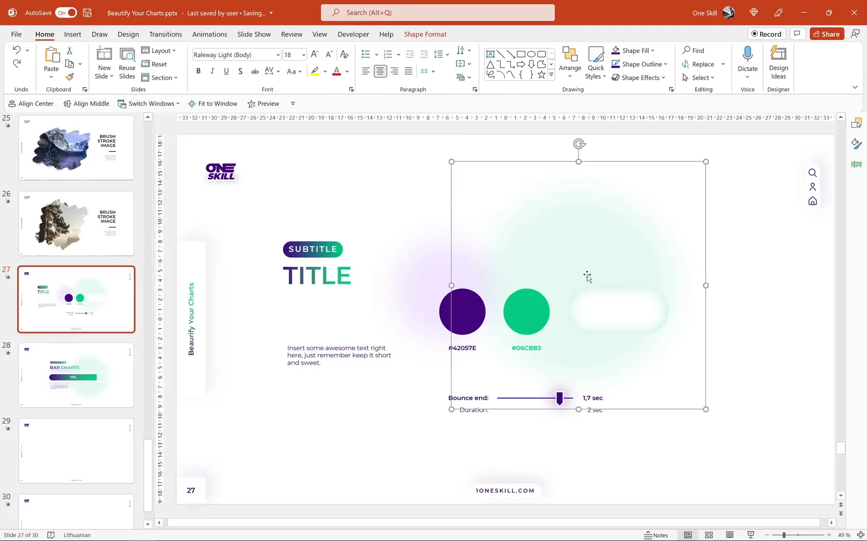
In this tutorial, we will use a color palette consisting of a dark purple and a green hue, both carefully chosen to complement each other and create a modern aesthetic. The chart design will feature rounded rectangles with subtle inside shadows and soft circular shapes in the background to add depth and softness to the slide. Animations will include flying effects with bounce endings to make the chart visually engaging.
On the left side of the slide, we’ll add simple text boxes to display titles or labels, keeping the focus on the bar chart itself without overwhelming the viewer with too much information.
Preparing the Slide and Initial Setup
Start with a fresh blank slide. I usually include slide numbers and footers for consistency, which you can learn to create by checking out my Skillshare class on modern PowerPoint templates (link in the video description). Today’s tutorial slides will also be added as bonus content in that class.
Inserting and Customizing the Bar Chart
To insert the bar chart:
- Go to the Insert tab on the ribbon.
- Click on the Chart button.
- Choose a Stacked Bar chart from the options.
- Click OK to insert it onto your slide.
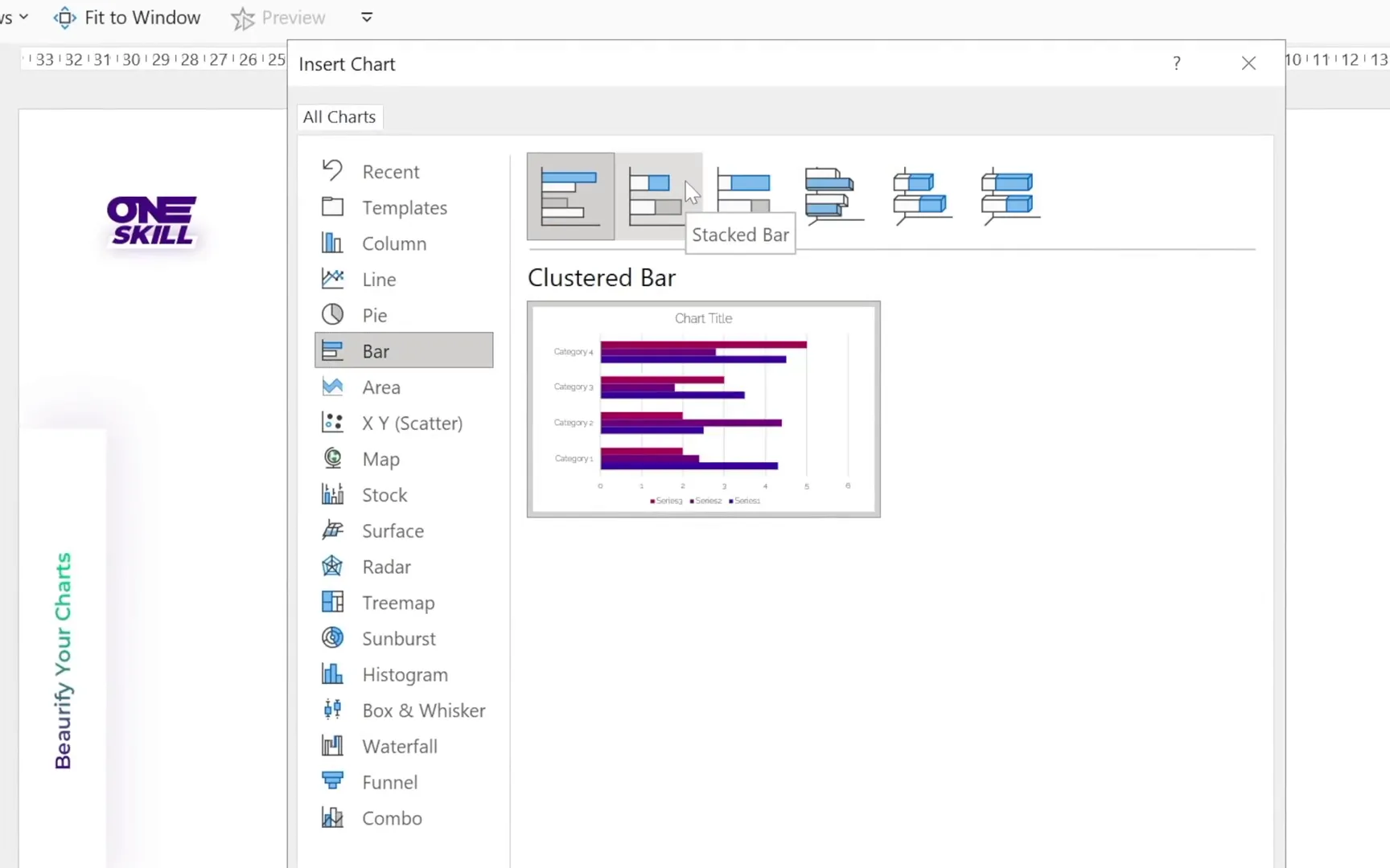
By default, the chart will have four bars and three data series. Since we need only one bar and two series, we will:
- Delete the unnecessary rows in the embedded Excel worksheet to have just one bar.
- Remove the third series so that only two series remain.
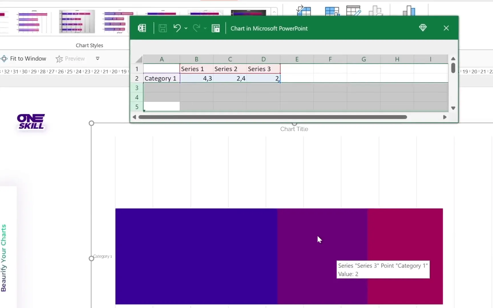
Next, we want the bar chart to represent 100% in total. For example:
- Series 1: 70%
- Series 2: 30%
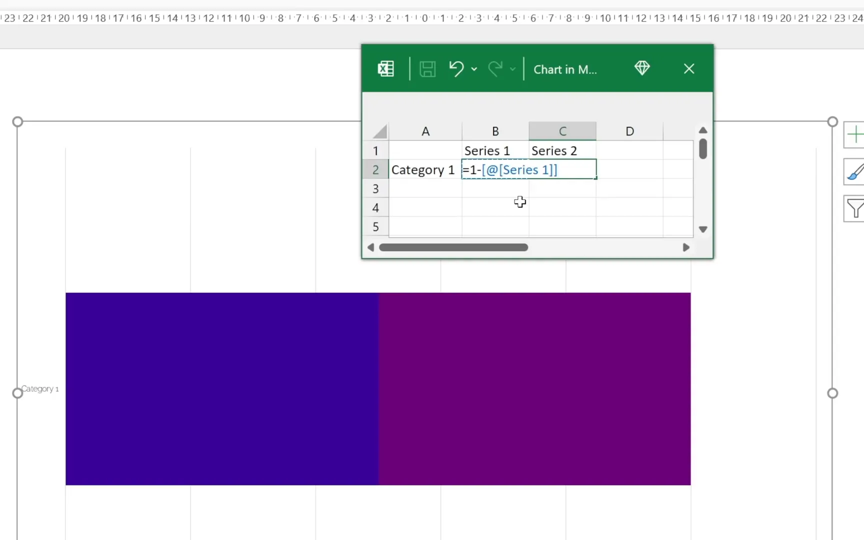
However, manually updating Series 2 every time you change Series 1 can be tedious. So, we will automate Series 2 using an Excel formula:
In the Series 2 cell, type:
=1 - [cell reference of Series 1]
This way, whenever you update Series 1, Series 2 automatically adjusts to keep the total at 100%, making your chart dynamic and easy to manage.
Adjusting the Horizontal Axis for Accurate Representation
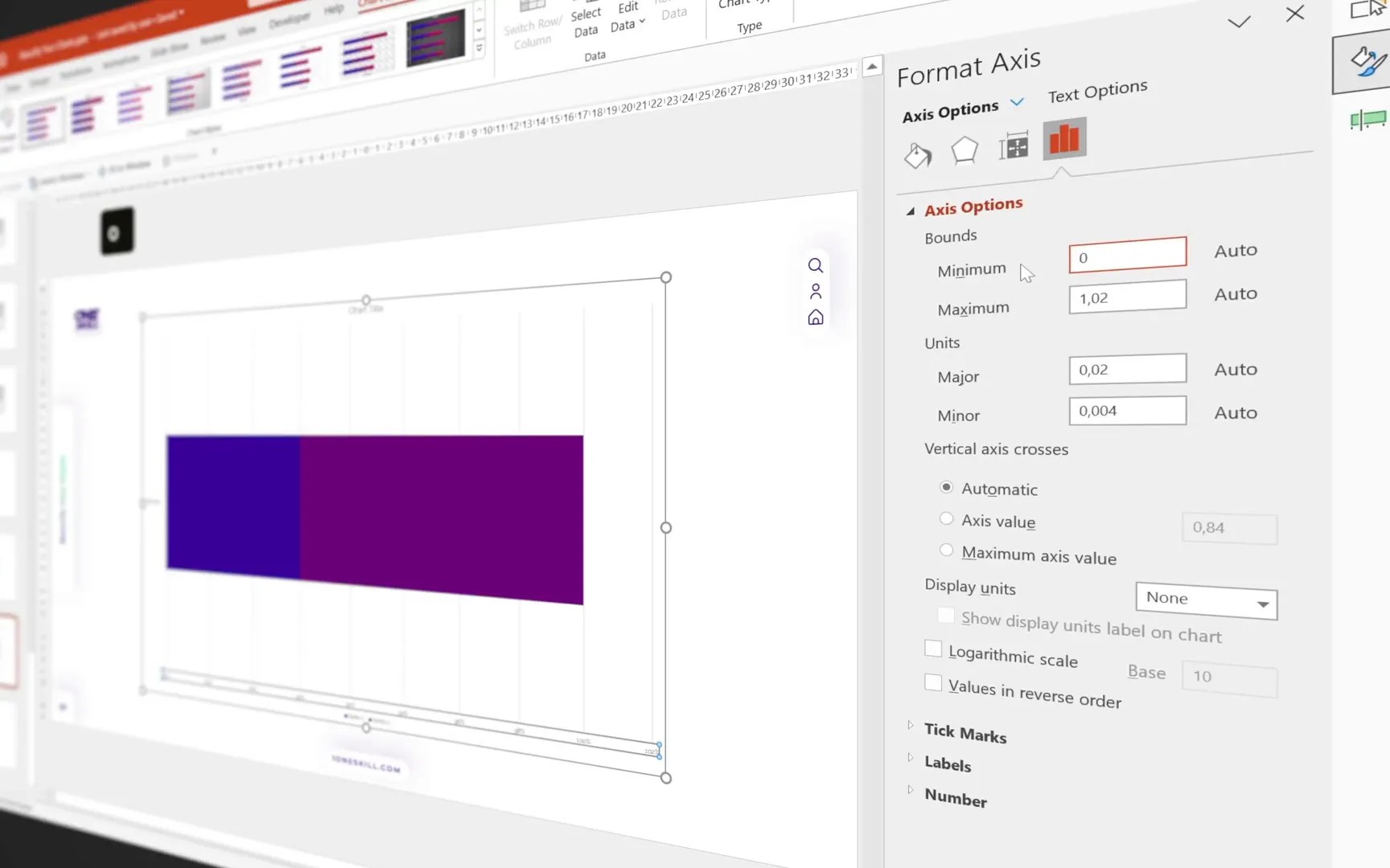
When Series 1 is high, such as 90%, you may notice the bar chart looks unbalanced with the dark purple section smaller than it should be. To fix this, adjust the horizontal axis:
- Right-click the horizontal axis.
- Select Axis Options.
- Set the minimum bound to 0 and the maximum bound to 1.
This ensures the chart accurately reflects percentages, maintaining visual integrity regardless of data changes.
Cleaning Up the Chart for a Minimal Look
To create a clean and focused design, remove unnecessary chart elements:
- Chart title
- Gridlines
- Vertical and horizontal axes
- Legend
After cleaning, only the bar chart itself should remain.
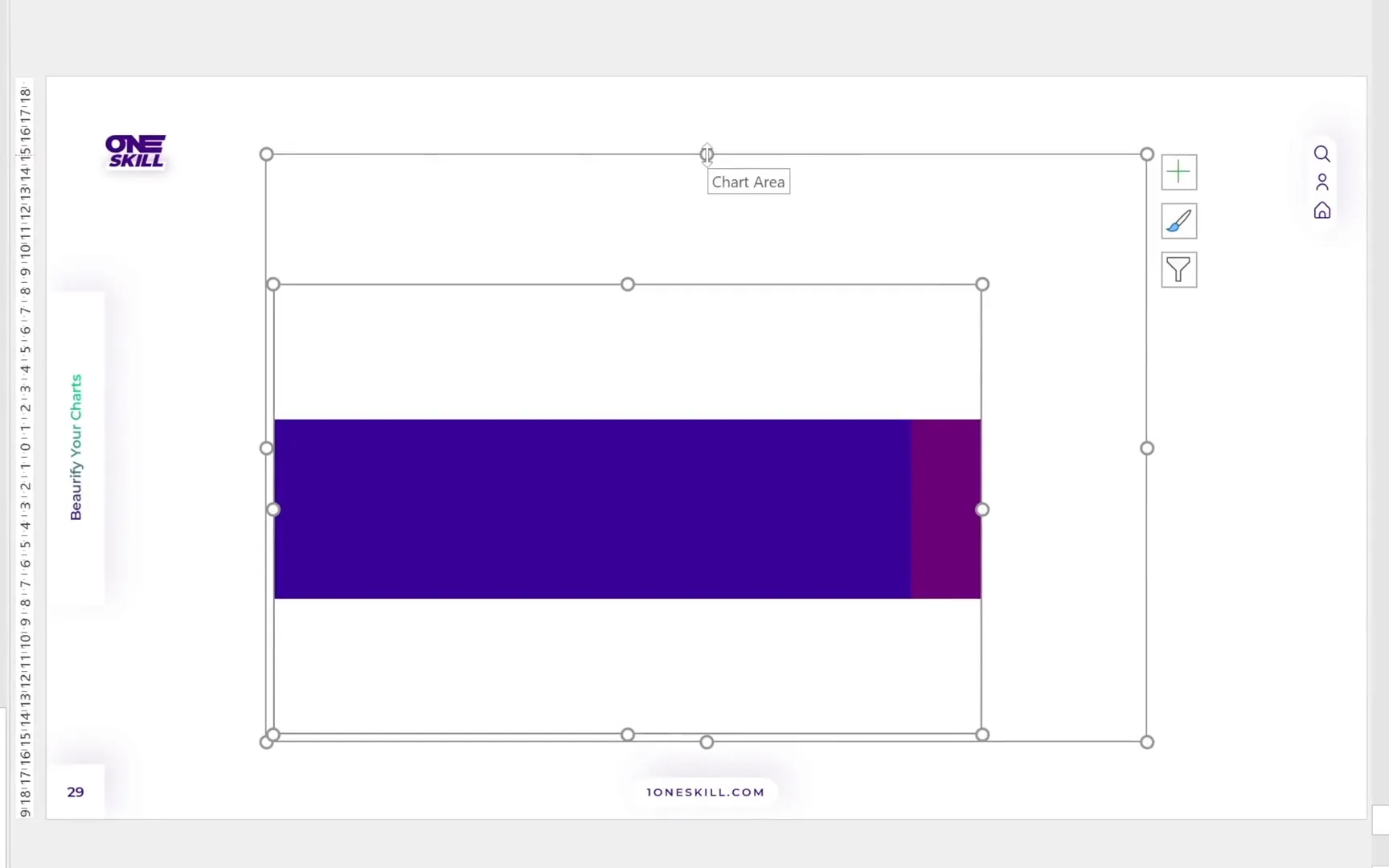
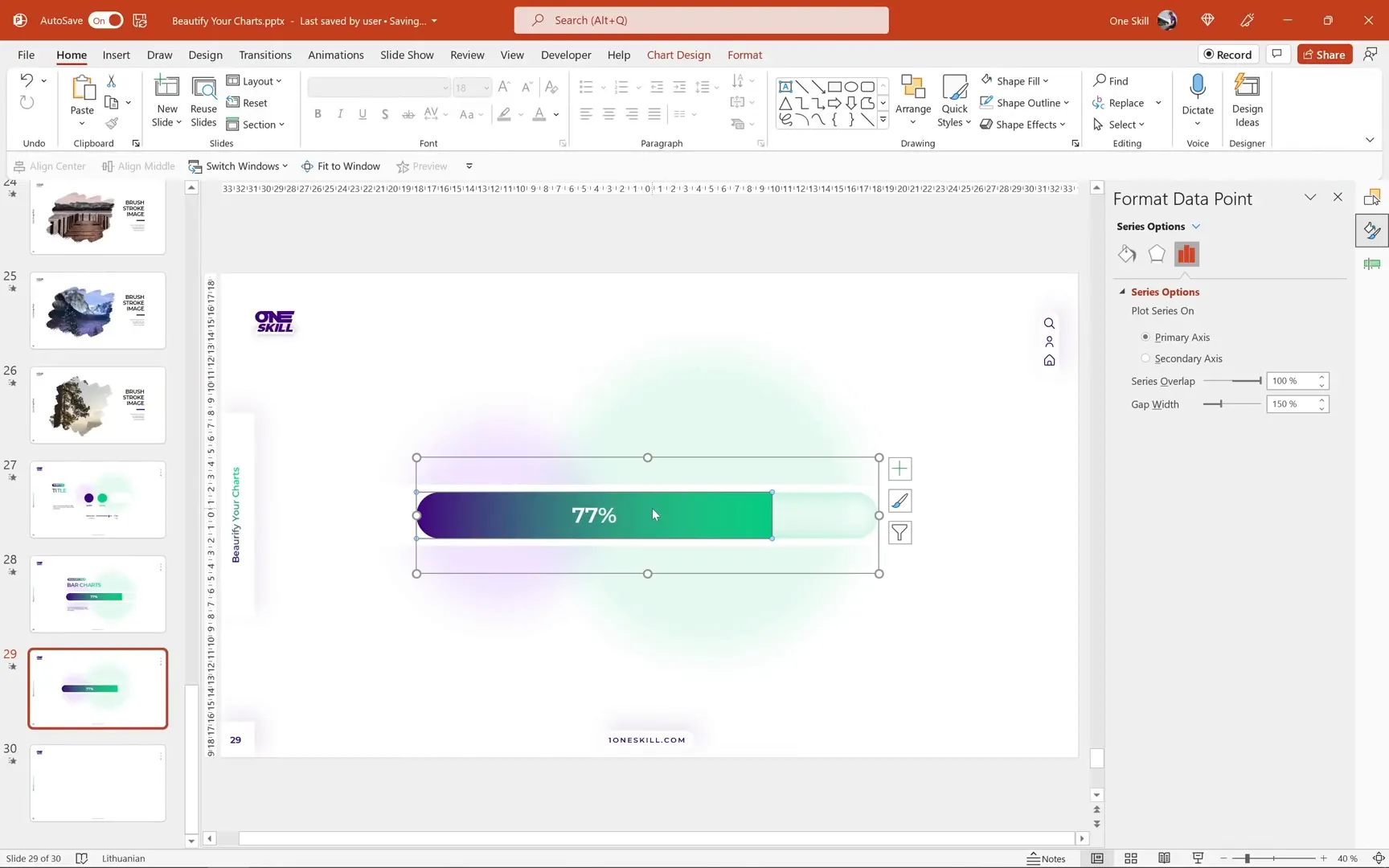
Understanding Chart Area vs. Plot Area
Each PowerPoint chart contains two key areas:
- Chart Area: The outer rectangle encompassing the entire chart.
- Plot Area: The inner area where the actual chart bars live.
For better control and resizing, move the plot area to the top-left corner and resize it to match the chart area. This alignment makes resizing the bar chart easier and more consistent.
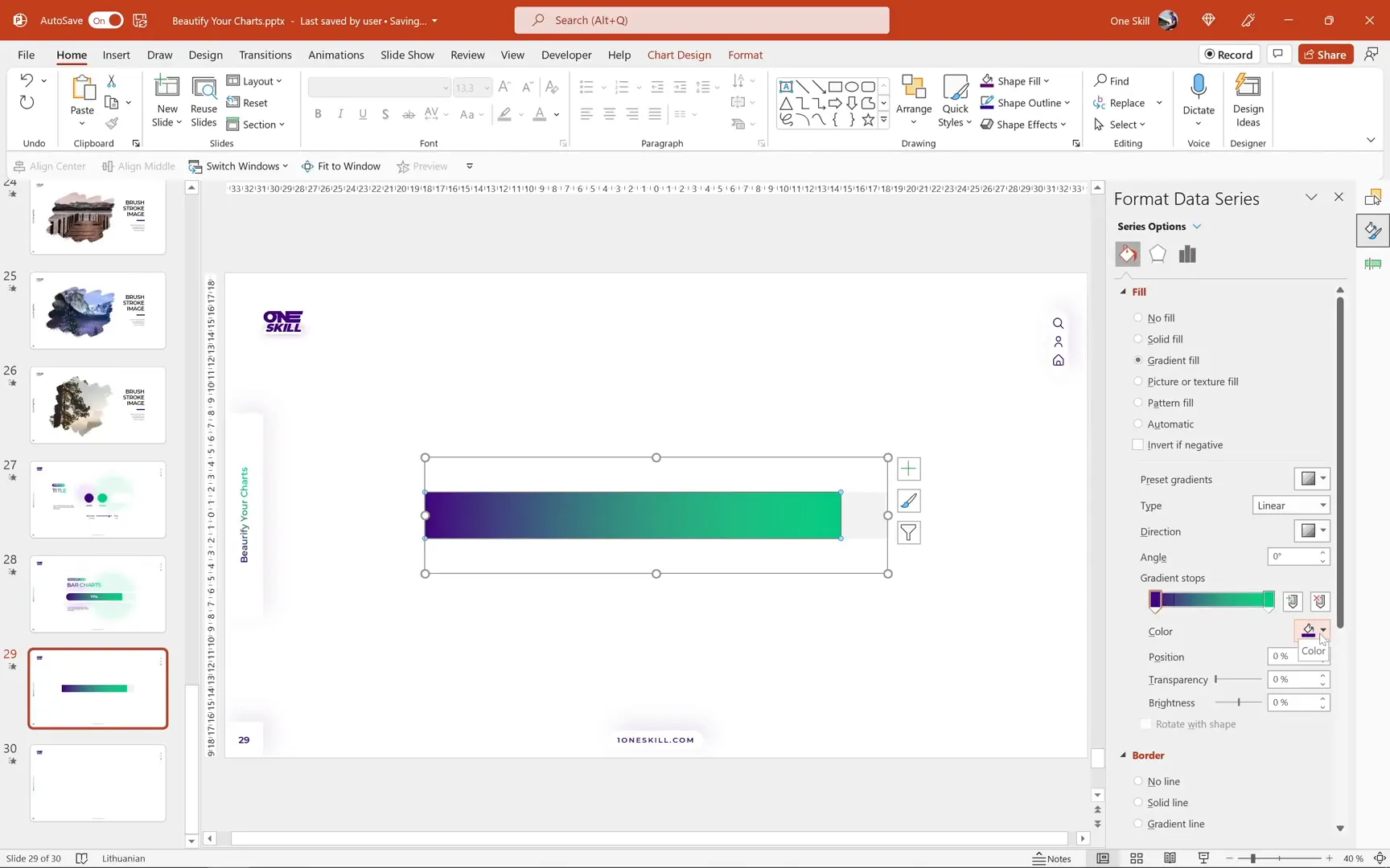
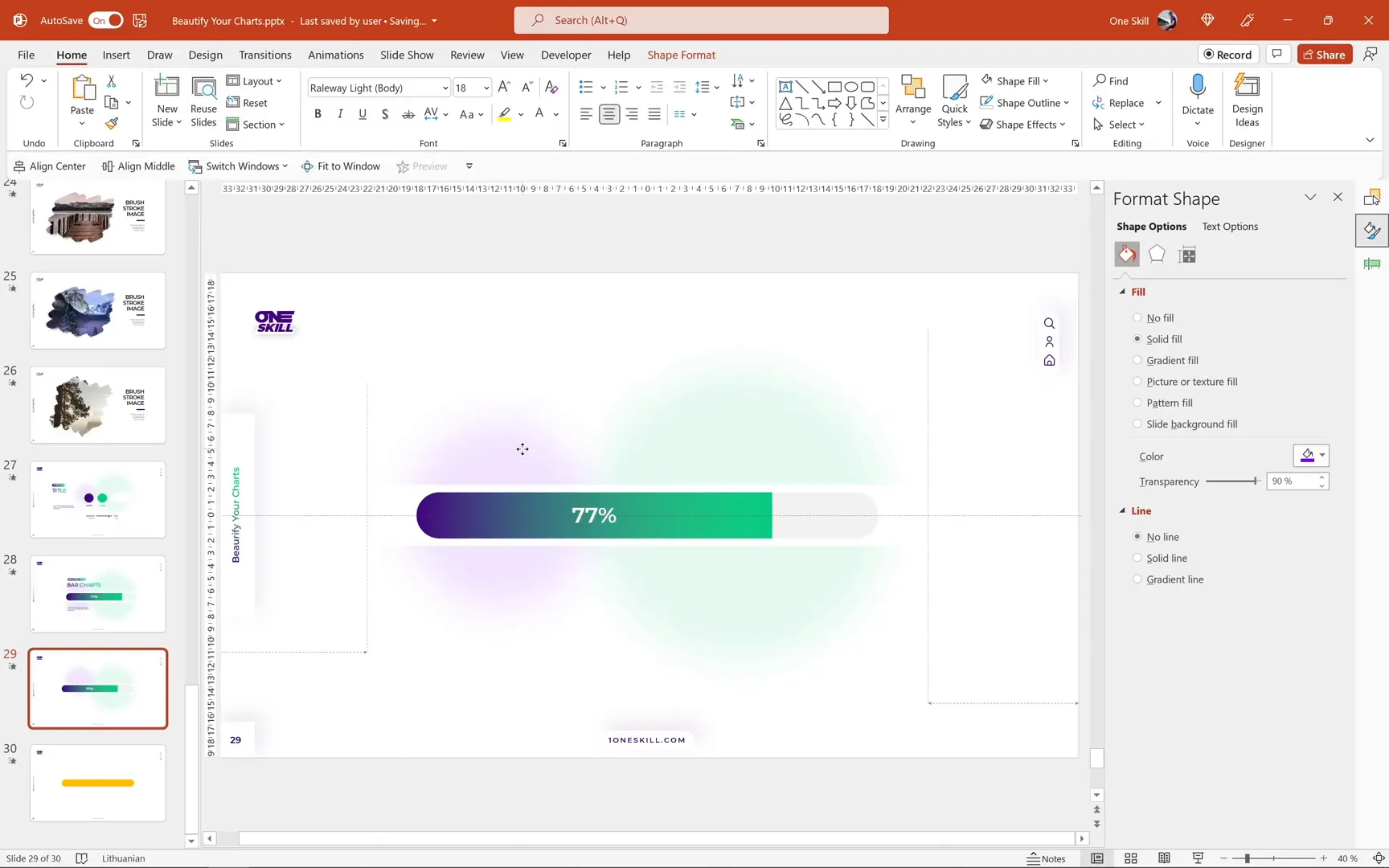
Stylizing the Bar Chart Series
Now for the fun part: styling the bars to bring the chart to life.
- For the right-side series, apply a solid fill with a light gray color.
- For the left-side series, apply a gradient fill using the dark purple and green colors introduced earlier.
PowerPoint remembers your last gradient settings, which makes it easy to apply consistent styles across your presentation.
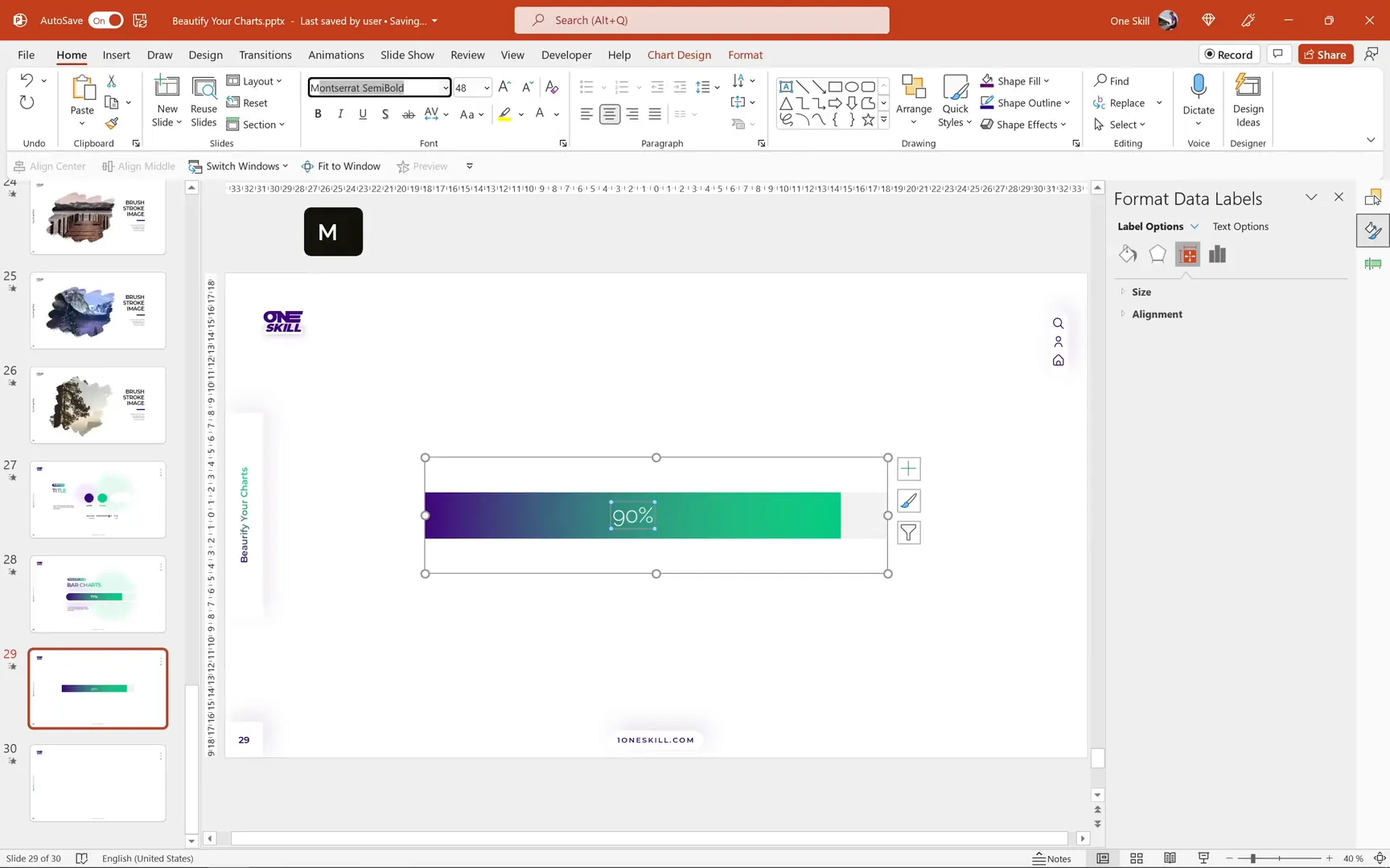
Adding Data Labels to Show Percentages
To make the chart informative, add data labels displaying the percentage values:
- Right-click the gradient bar (left-side series).
- Select Add Data Label.
- Increase the font size for better visibility.
- Change the font color to white for contrast.
- Choose a clean, professional font such as Montserrat Semi Bold.
Test the dynamic functionality by changing the Series 1 value and observing the data label update automatically.
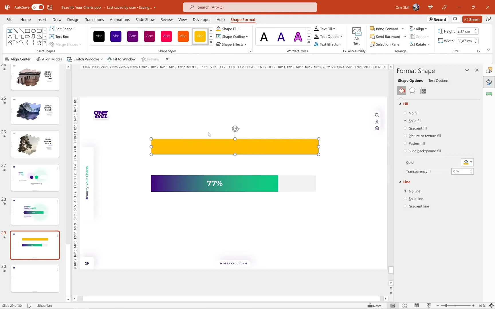
Creating a Rounded Look for the Bar Chart
The default rectangular bars can look a bit harsh. To soften the appearance, we’ll create a rounded bar effect using shapes and masks.
- Insert a simple rectangle and color it bright yellow for visibility.
- Remove the outline and match the rectangle’s width and height to the bar chart.
- Adjust the rectangle’s transparency temporarily to align it precisely over the bars.
- Convert the rectangle to a rounded rectangle by using the Edit Shape > Change Shape option.
- Use the yellow handle to adjust the roundness to your liking.
- Create a backup copy of this rounded rectangle for future use.
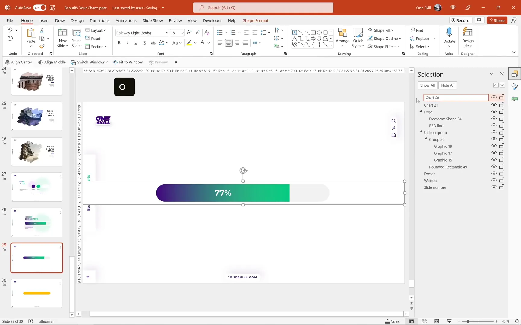
Masking the Chart to Achieve Rounded Edges
Next, we’ll create a mask to punch a hole in a white rectangle, which will serve as a cover for the chart and create the rounded edge effect:
- Insert a white rectangle with a visible outline to help with alignment.
- Send the white rectangle to the back and align it to the slide edges.
- Select the white rectangle and the rounded rectangle while holding the Shift key.
- Go to Shape Format > Merge Shapes > Subtract to punch a hole in the white rectangle.
- Remove the outline from the resulting shape and rename it to chart cover in the selection pane.
- Arrange the layers so the chart cover sits just above the chart itself.
Enhancing the Background with Soft Circles
To add visual interest and depth, insert soft circles with a high soft edge effect and high transparency (90%). These “soft balls” sit behind the chart, providing a subtle background texture without distracting from the main content.

Copy these soft balls from a branding slide or create your own by:
- Drawing circles
- Applying a soft edge effect set to 100 points
- Setting fill transparency to 90%
Resize and position the soft balls according to your taste for a balanced composition.
For the right-side series, you can turn off the fill completely to make the soft balls visible through, creating an even cleaner and more minimal design.
Adding Subtle Inside Shadow for Depth
To give the bar chart a subtle 3D effect, we’ll add an inside shadow using the rounded rectangle shape:
- Apply a white fill to the rounded rectangle.
- Add an inside shadow preset centered with a green color.
- Set blur to 50 points and transparency to 70%.
- Copy this style and apply it to a backup rounded shape.
- Paste the shadow shape behind the chart in the selection pane.
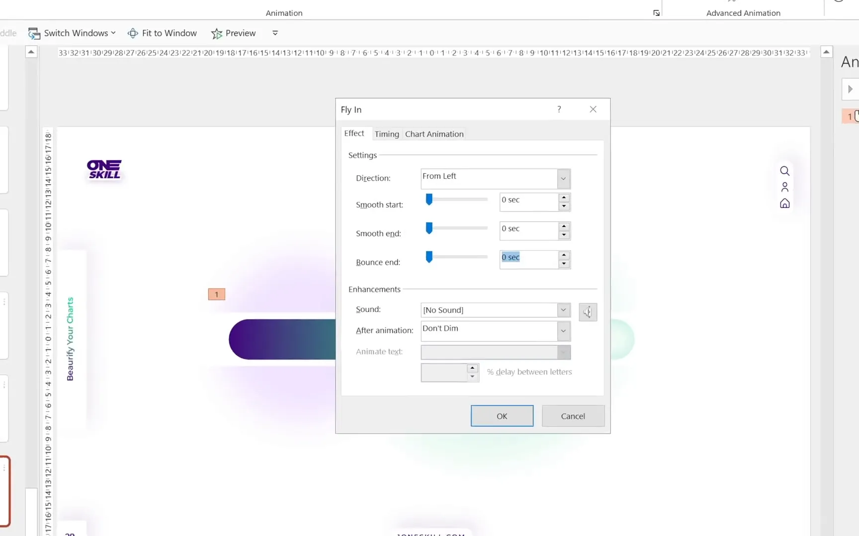
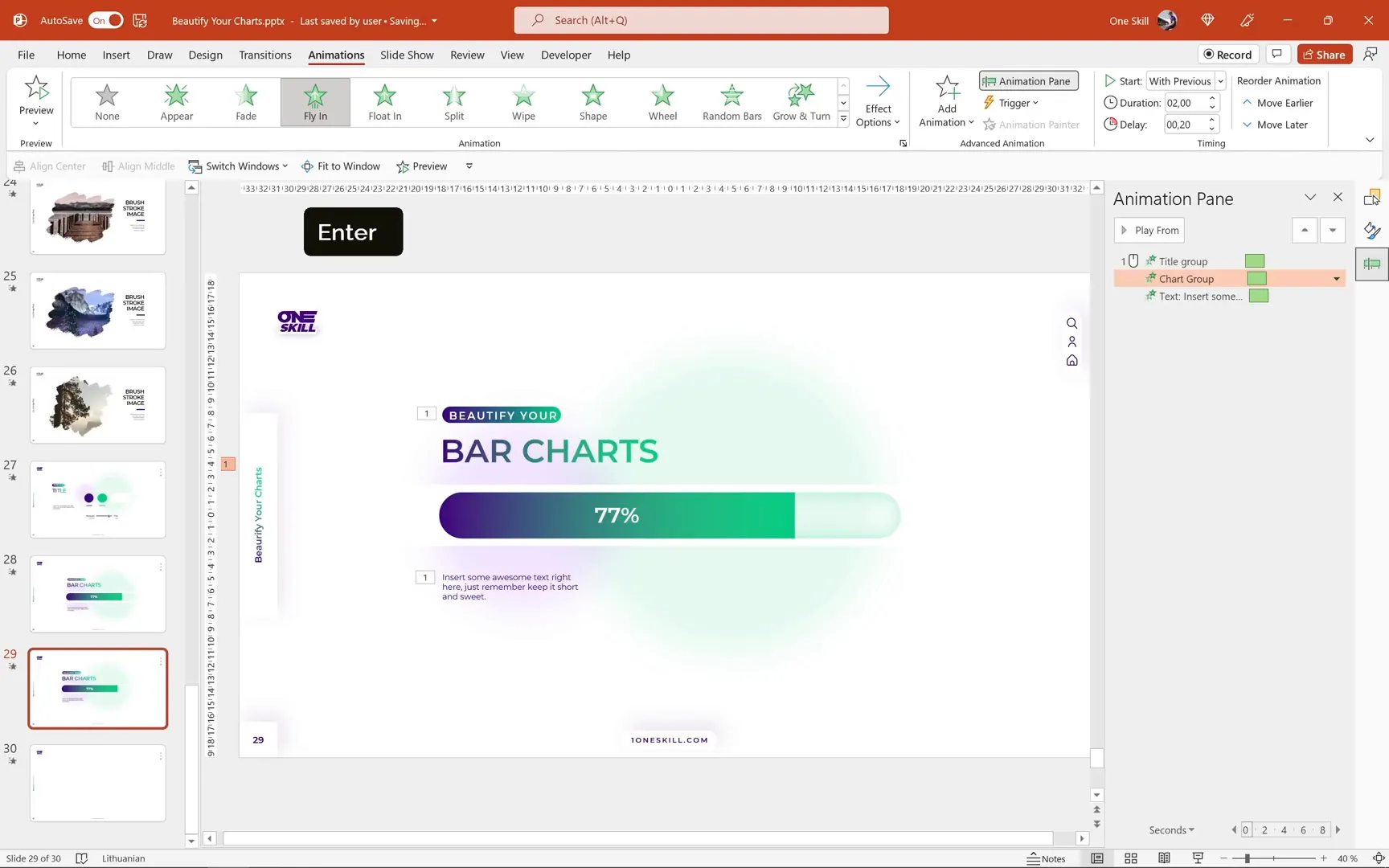
Animating the Bar Chart
Now that the design is complete, let’s bring the chart to life with animations:
- Select the left-side series (the colored bar).
- Go to the Animations tab.
- Choose the Fly In animation from the left.
- Set the animation to start On Click.
- Open the animation pane to adjust timing.
- Set the duration to 2 seconds.
- Under animation options, set the Bounce End to 1.7 seconds.
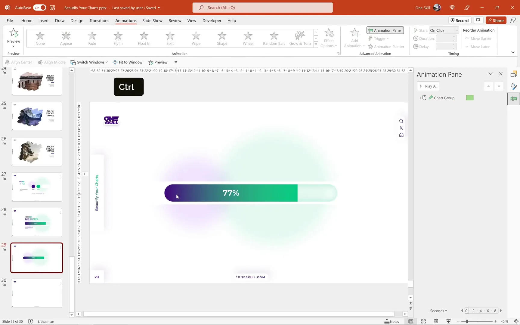
Fixing the Animation Gap
You might notice a small gap on the left side during the fly-in animation. To fix this:
- Open the selection pane and temporarily hide the chart cover for visibility.
- Rename the inside shadow shape to chart inside shadow.
- Make a copy of the inside shadow and move it to the left side.
- Remove the shadow effect from the copy.
- Change its fill to dark purple and convert it to a simple rectangle.
- Align this purple rectangle to touch the chart and the slide edge.
- Select the purple rectangle and the chart, then group them (Ctrl + G).
- Rename the group to chart group and place it just below the chart cover.
- Unhide the chart cover.
- Reapply the flying animation to the group with the same settings.
This additional purple shape fills the gap and smooths the animation.
Adding Text Boxes and Final Touches
For the finishing touches, copy the text boxes from your previous slide and align them to the left edge of the chart. In the animation pane, arrange the sequence so the title appears first, then the chart flies in with a 0.2-second delay.
Adjust the placement of the soft fuzzy balls in the background as needed to maintain a balanced, polished look.
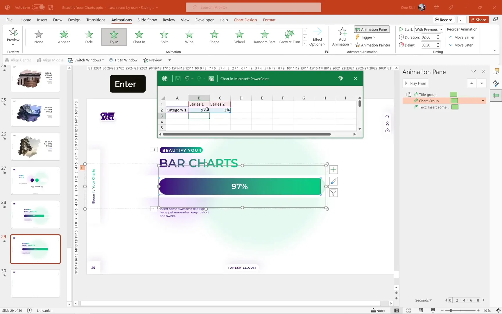
Testing the Editable and Animated Bar Chart
Before wrapping up, it’s important to verify that the chart remains editable and the animations intact after all customizations. To test:
- Right-click the chart and select Edit Data.
- Try inserting various values for Series 1, such as 17%, 37%, 67%, and 97%.
- Observe the chart updating automatically with the correct percentages.
- Play the slide to confirm animations work smoothly.
The chart should update dynamically and animate perfectly, making it a powerful tool for your presentations.
Conclusion
Congratulations! You now have the skills to design and animate beautiful, editable, and rounded bar charts in PowerPoint. This tutorial has covered everything from initial chart insertion, data automation, styling, masking for rounded edges, background enhancement, to adding smooth animations that captivate your audience.
With these techniques, you can create modern and professional charts that update dynamically and add visual interest to your presentations, saving you time and impressing your viewers.
Stay happy, stay healthy, and keep creating amazing PowerPoint content!
Frequently Asked Questions (FAQ)
How do I automate Series 2 values in a stacked bar chart?
You can automate Series 2 by entering a formula in the embedded Excel worksheet: =1 - [cell reference of Series 1]. This keeps the total at 100% automatically when Series 1 changes.
How can I create rounded edges on my PowerPoint bar chart?
Create a rounded rectangle shape aligned and sized to your chart, then use a white rectangle with a hole punched out via the Merge Shapes > Subtract function to mask the chart and give it rounded edges.
What animation works best for bar charts in PowerPoint?
A Fly In animation from the left with a bounce end creates a smooth and engaging effect that draws attention to the data.
Can I update the data after adding animations?
Yes! If you keep your chart and grouped shapes organized, the chart remains editable, and animations will still work after data updates.
How do I fix the gap issue during the fly-in animation?
Add a dark purple rectangle to the left of the chart and group it with the chart before applying the animation. This fills the gap and creates a seamless entrance effect.
Where can I find the colors and design elements used in this tutorial?
The dark purple and green colors with their hex codes are provided in the tutorial. Soft, transparent circles with a high soft edge effect are used for background texture. You can create these yourself or copy from branded slides.
Is this tutorial applicable to all versions of PowerPoint?
This tutorial is demonstrated using Microsoft PowerPoint 365 on Windows. Some features like Merge Shapes and animation options are available in recent versions, so ensure your PowerPoint is up to date for best results.
Check out the full video: Excel Chart Animation in PowerPoint 🔥Bar Chart🔥


