
When it comes to presenting complex processes, such as online ordering systems, clarity and simplicity are key. If you’ve ever tried to explain a multi-step process using only text, you know how quickly your audience can become overwhelmed. That’s precisely why mastering PowerPoint functions to create effective visuals like Data Flow Diagrams (DFDs) can transform your presentations and make them more engaging and easier to understand.
In this comprehensive guide, we will walk you through how to convert a lengthy, text-heavy process into a clear, concise Data Flow Diagram using PowerPoint. From selecting icons and shapes to connecting steps with arrows, you’ll learn practical tips to leverage PowerPoint’s built-in tools and create professional diagrams that communicate your message with impact.
Whether you’re a business analyst, project manager, or a presenter looking to elevate your slides, this tutorial will empower you to harness PowerPoint functions for better visual storytelling. Let’s dive in.
Table of Contents
- Why Use Data Flow Diagrams Instead of Text Slides?
- Understanding the Online Ordering Process
- Step-by-Step: Creating a Data Flow Diagram in PowerPoint
- Key PowerPoint Functions to Master for Diagramming
- Best Practices for Creating PowerPoint Data Flow Diagrams
- Conclusion
- Frequently Asked Questions (FAQ)
Why Use Data Flow Diagrams Instead of Text Slides?
Imagine you are tasked with presenting an online ordering process to your company’s higher management. If you simply present a slide filled with 12 detailed steps written out in text, you’ll quickly lose your audience’s attention. In fact, such slides often result in confusion or disengagement because:
- Executives and stakeholders typically don’t have the time to read through lengthy text.
- Text-heavy slides can appear cluttered and overwhelming.
- It’s difficult to visualize the flow of information and responsibilities between entities.
Instead, Data Flow Diagrams (DFDs) offer a visually intuitive way to represent processes. They map out the flow of data between entities, processes, and data stores in a clear, structured manner. This makes it easier for your audience to:
- Quickly grasp the key steps involved.
- Understand interactions between various components.
- Identify bottlenecks or areas for improvement.
Here’s a quick comparison:
| Text Slide | Data Flow Diagram |
|---|---|
| Lists steps sequentially without showing relationships. | Visualizes data movement and interactions between entities. |
| Can be overwhelming and hard to follow. | Clear, simple shapes and arrows guide the viewer. |
| Requires reading and interpretation. | Conveys information at a glance. |
By converting text into a DFD, you make your presentation more engaging and professional, improving comprehension and decision-making.
Understanding the Online Ordering Process
To create an effective Data Flow Diagram, you first need to understand the process you want to visualize. Let’s break down a typical online ordering process into its core steps:
- Customer selects an item from the product catalog.
- The selected products are added to the shopping basket (cart).
- Customer reviews the basket and proceeds to checkout.
- Item details from the basket are sent to the checkout process.
- Customer makes a payment (e.g., via credit card).
- Payment information is sent to the credit card company or bank for authorization.
- Two-way communication occurs: payment request sent, confirmation received.
- Once payment is confirmed, the order is issued.
- Order information is sent to the inventory department.
- Inventory prepares and ships the product to the customer.
- Payment details are logged in the accounting department.
- A receipt or confirmation is sent to the customer.
This multi-step process involves several entities (customer, credit card company, inventory, accounting), data flows (item details, payment info, order info), and processes (checkout, payment collection, order issue). Visualizing these interactions is essential for clarity.
Step-by-Step: Creating a Data Flow Diagram in PowerPoint
Now, let’s walk through the creation of a Data Flow Diagram for the online ordering process using PowerPoint’s core functions. This section assumes some familiarity with PowerPoint but will guide you through the essential steps.
1. Prepare Your Slide
Start by adding a new slide and enabling guides to help with alignment:
- Go to View and check the Guides option.
- This will display vertical and horizontal lines to help you place elements precisely.
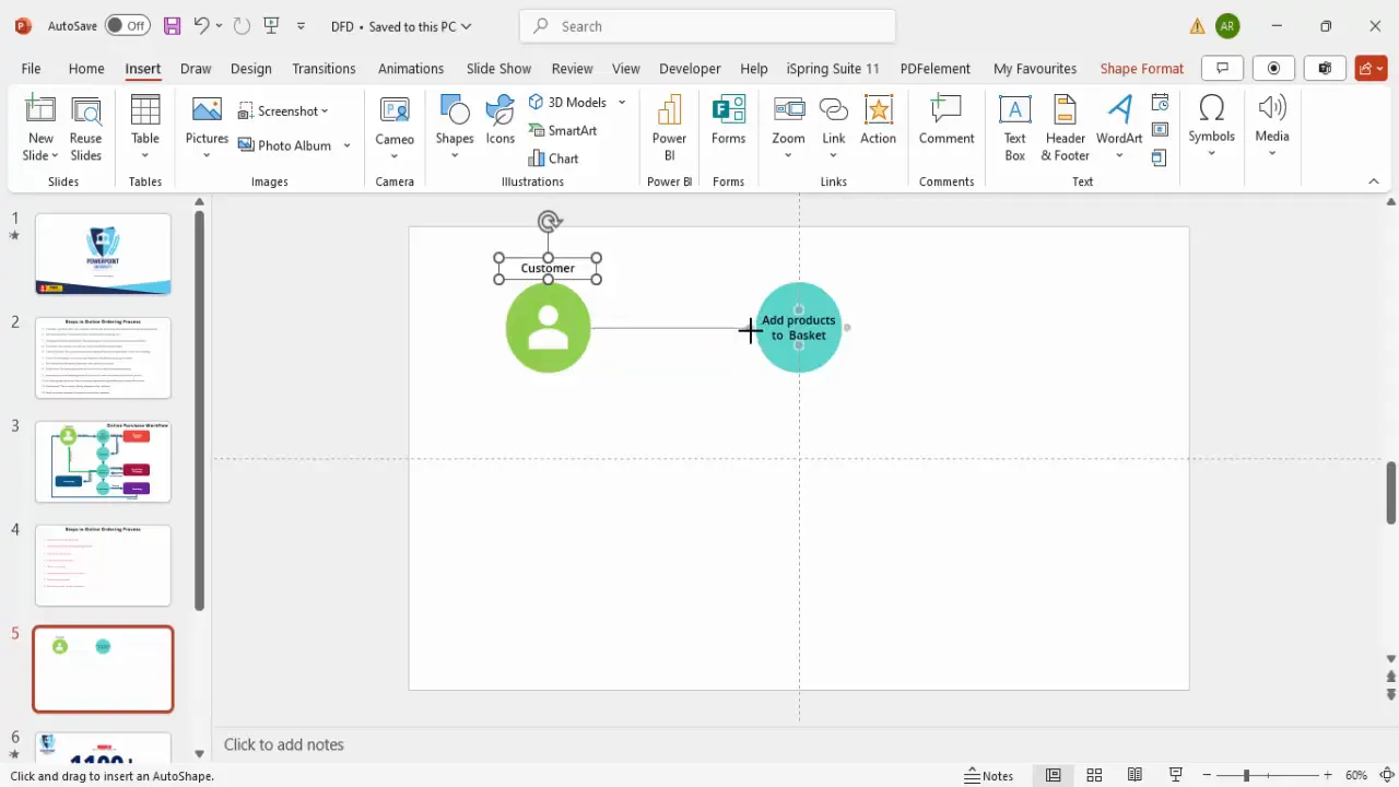
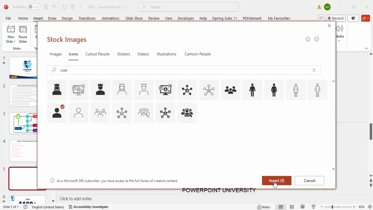
2. Add the Customer Icon
Represent the primary entity, the customer, with an icon:
- Go to Insert > Icons.
- Search for “user” or “customer” and select an appropriate icon.
- Insert the icon onto the slide.
- Change the icon color to white for better contrast.
3. Create Process Bubbles with Oval Shapes
DFDs typically use oval shapes for processes. Create an oval for the first process: “Customer selects item.”
- Go to Insert > Shapes > Oval.
- Hold the Shift key while drawing to create a perfect circle or oval.
- Remove the shape outline for a cleaner look (Format Shape > Shape Outline > No Outline).
- Fill the shape with a light green color.
- Place the customer icon centered inside the oval.
Label the icon “Customer” below or inside the shape for clarity.
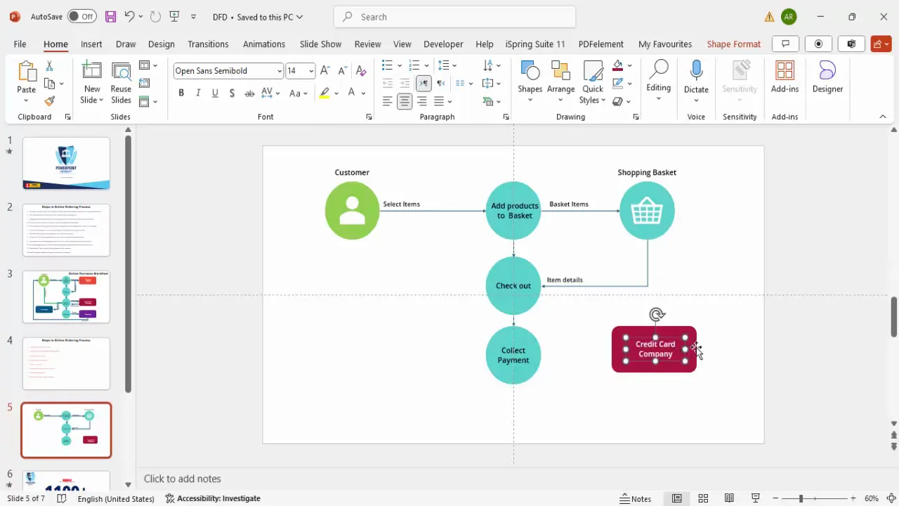
4. Duplicate and Modify Shapes for Subsequent Steps
Instead of creating each shape from scratch, use duplication to save time:
- Select the first oval shape and press Ctrl+D (Cmd+D on Mac) to duplicate.
- Move the duplicate to the right or below the original.
- Change the fill color to differentiate steps (e.g., light blue for “Add products to basket”).
- Add descriptive text inside each shape, such as “Add products to basket” or “Checkout.”
Use Insert > Text Box to add or edit text, and choose a clean font like Open Sans or Arial for readability.
5. Insert Icons for Data Stores (e.g., Shopping Basket)
To represent data stores such as the shopping basket, add an icon:
- Go to Insert > Icons and search for “basket.”
- Insert the basket icon and place it adjacent to the “Add products to basket” process.
- Change icon colors to match your theme.
- Label it “Shopping Basket.”
6. Connect Shapes with Arrows
Connecting processes and entities with arrows illustrates the flow of data:
- Go to Insert > Shapes > Line Arrow.
- Draw arrows from the customer to “Add products to basket,” then to “Shopping Basket,” and so forth.
- Label arrows to indicate the data or action being transferred, e.g., “Select items,” “Basket items.”
Use elbow arrows or curved connectors for better visual flow where necessary.
7. Add Payment Process and Two-Way Communication
Payment processing involves interaction with the credit card company, which is a two-way communication:
- Create a rectangle shape to represent the “Credit Card Company.”
- Fill it with a contrasting color (e.g., dark purple) and remove the outline.
- Connect the payment collection process to the credit card company with arrows going both ways.
- Label the arrows appropriately, such as “Payment info sent” and “Payment confirmation received.”
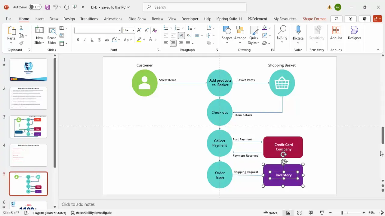
8. Add Order Issue, Inventory, and Shipment
Once payment is confirmed, the order is issued and sent to inventory for shipping:
- Duplicate an existing process shape for “Order Issue.”
- Add a new rectangle or oval for “Inventory.”
- Connect “Order Issue” to “Inventory” with an arrow labeled “Shipping Request.”
- Add an arrow from “Inventory” to “Customer” labeled “Ship Product.”
9. Incorporate Accounting and Receipt Notification
After payment, financial details are logged and a receipt is sent to the customer:
- Add an “Accounting Department” shape with a unique fill color.
- Connect the payment collection process to accounting with an arrow labeled “Order Info.”
- Add an arrow from accounting back to the customer labeled “Send Receipt.”
- Adjust arrow directions and angles for clarity.
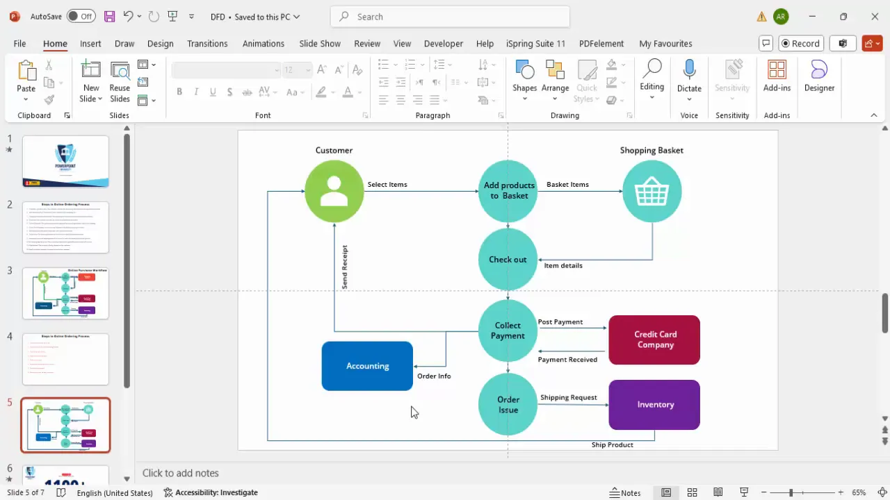
10. Finalize and Align the Diagram
Ensure all shapes and arrows are properly aligned:
- Use PowerPoint’s alignment guides and grid to keep elements consistent.
- Group related shapes and connectors for easier movement.
- Review the flow to verify all steps and interactions are represented.
By following these steps, you will have converted a complex, text-heavy process into a clear, professional Data Flow Diagram that anyone can understand at a glance.
Key PowerPoint Functions to Master for Diagramming
Mastering the following PowerPoint functions will make creating diagrams like Data Flow Diagrams much easier and more efficient:

| PowerPoint Function | Description | Tip |
|---|---|---|
| Insert Icons | Access a wide library of icons to visually represent entities and objects. | Search with keywords to quickly find relevant icons. |
| Insert Shapes | Add ovals, rectangles, lines, and arrows to build diagram components. | Hold Shift key to constrain proportions (e.g., perfect circles). |
| Shape Fill and Outline | Customize colors and borders for shapes to enhance aesthetics and clarity. | Use no outline for a cleaner look, and consistent color themes for better visual flow. |
| Text Boxes | Add and format text inside or near shapes for labels and descriptions. | Center-align text for neatness and use readable fonts like Open Sans or Arial. |
| Duplicate (Ctrl+D) | Quickly copy shapes and connectors to save time and maintain consistency. | Use duplication instead of recreation for efficiency. |
| Align and Distribute | Use built-in alignment guides and distribution functions to arrange elements evenly. | Enable guides via View > Guides for precise placement. |
| Rotate and Flip | Adjust orientation of shapes and arrows for proper directional flow. | Use Format Shape > Rotate for horizontal flips or specific angle rotations. |
| Grouping | Group multiple elements to move or format them as a single unit. | Select multiple objects, right-click, and choose Group. |
Best Practices for Creating PowerPoint Data Flow Diagrams
To ensure your Data Flow Diagrams are effective and professional, keep these best practices in mind:
1. Keep It Simple and Clear
Use minimal text and clear labels. Avoid clutter by breaking complex processes into multiple diagrams if needed.
2. Use Consistent Color Coding
Assign distinct colors for different entities or process types (e.g., green for customer actions, blue for system processes, purple for external agencies).
3. Leverage Icons for Visual Appeal
Icons help quickly identify entities and improve engagement. Make sure icons are simple and universally understandable.
4. Label Arrows Clearly
Describe what data or action each arrow represents to avoid ambiguity.
5. Use Alignment and Spacing Tools
Maintain even spacing and alignment for a polished look. Avoid overlapping arrows or shapes.
6. Test Your Diagram for Understandability
Share your DFD with someone unfamiliar with the process to ensure it conveys the intended message clearly.
7. Utilize PowerPoint Functions Efficiently
Use duplication, grouping, and guides to speed up your workflow and maintain consistency.
8. Update and Maintain Your Diagrams
Processes evolve, so keep your diagrams current to reflect any changes.
Conclusion
Mastering PowerPoint functions to create Data Flow Diagrams is a valuable skill that can drastically improve the clarity and professionalism of your presentations. By transforming complex, text-heavy process descriptions into intuitive visual diagrams, you make it easier for your audience to understand and engage with your content.
This step-by-step guide has walked you through the process of creating a Data Flow Diagram that captures an online ordering system—from customer selection to payment processing and shipment. Along the way, you’ve learned how to use shapes, icons, connectors, and text effectively within PowerPoint to build your diagram.
Remember, the key to successful presentations lies in clear communication. Using Data Flow Diagrams is an excellent way to visually map processes, making them accessible and memorable for any audience, especially higher management who value concise, impactful information.
Start practicing these techniques today, and watch your presentations become more engaging and insightful!
Frequently Asked Questions (FAQ)
What is a Data Flow Diagram (DFD)?
A Data Flow Diagram is a visual representation of how data moves through a system, showing the flow between processes, data stores, and external entities.
Why should I use PowerPoint to create Data Flow Diagrams?
PowerPoint is widely accessible, user-friendly, and offers a variety of shapes, icons, and formatting tools that make it easy to create professional-looking diagrams without specialized software.
How do I ensure my Data Flow Diagram is easy to understand?
Keep the diagram simple, use clear labels and icons, maintain consistent colors, and organize elements logically. Also, test it with others to get feedback.
Can I use templates to create Data Flow Diagrams in PowerPoint?
Yes, templates can save time and provide a structured starting point. Many free and paid templates are available online to help you create DFDs efficiently.
What are the essential PowerPoint functions for diagramming?
Key functions include inserting shapes and icons, using text boxes, duplicating elements, connecting with arrows, aligning objects, rotating shapes, and grouping elements.
Is it possible to animate Data Flow Diagrams in PowerPoint?
Absolutely. You can animate individual components to demonstrate step-by-step flows or highlight specific parts of the diagram during your presentation.
How can I keep my diagrams consistent across multiple slides?
Use the Slide Master to define styles and layouts, duplicate slides to maintain consistency, and use grouping and alignment tools to standardize element placement.
Where can I find free PowerPoint icons and templates?
PowerPoint offers a built-in icon library under Insert > Icons. Additionally, many websites and channels provide free templates and icons, including creative commons resources.
Can I collaborate with others on creating PowerPoint Data Flow Diagrams?
Yes, using cloud-based platforms like OneDrive or SharePoint allows multiple users to edit and comment on PowerPoint files in real-time.
How do I handle complex processes that are too large for one diagram?
Break the process into smaller sub-processes and create multiple diagrams that focus on each part. Use a high-level overview diagram to provide context.
Check out the full video: Create Data Flow Diagrams in PowerPoint – Step-by-Step Tutorial


