
When it comes to delivering impactful presentations, the ability to visually compare data side-by-side is a crucial skill. Whether you’re analyzing business metrics, comparing products, or presenting regional statistics, a well-designed comparison table in PowerPoint can make your message clearer and more engaging. This comprehensive guide dives deep into the step-by-step process of creating an effective comparison table using PowerPoint functions, inspired by expert techniques that anyone can apply, regardless of your design background.
In this article, you will learn how to construct a visually appealing and customizable comparison table from scratch. We will cover everything from setting up the slide layout, using shapes creatively, formatting tables, and adding images to enhance comprehension and aesthetics. By the end, you will have a powerful tool to present comparative data that grabs attention and communicates your points effectively.
Table of Contents
- Why Use Comparison Tables in PowerPoint?
- Planning Your Comparison Table: Key Factors to Consider
- Step-by-Step Guide to Creating a Comparison Table
- Customizing the Design: Colors, Shapes, and Images
- Tips for Making Your Comparison Table More Effective
- Frequently Asked Questions (FAQ)
- Conclusion
Why Use Comparison Tables in PowerPoint?
Comparison tables are essential when you want to juxtapose two or more subjects across multiple criteria. They allow your audience to quickly grasp differences and similarities without sifting through paragraphs of text or complex charts.
Some benefits of using comparison tables include:
- Clarity: Present data in a structured, easy-to-read format.
- Engagement: Visual elements and tables can keep your audience focused.
- Efficiency: Saves time by summarizing key points side-by-side.
- Flexibility: Can be adapted for comparing products, demographics, performance metrics, and more.
By using PowerPoint functions to create these tables, you gain full control over design and can tailor the layout to your unique content and branding.
Planning Your Comparison Table: Key Factors to Consider
Before jumping into PowerPoint, it’s important to outline what you want to compare and how to present it. A well-planned table will save time and ensure your message is delivered clearly.
Identify Your Comparison Subjects
Decide the two (or more) entities you want to compare. This could be countries, products, services, departments, or any other units relevant to your presentation.
Choose Relevant Factors or Categories
Determine the key attributes or criteria you want to compare. For example, if comparing countries, you might look at:
- Population
- Geographical area
- GDP (Gross Domestic Product)
- Employment percentage
- Military strength
Select factors that are directly relevant to your audience and presentation goals.
Decide on Visual Elements
Think about how to enhance your table with colors, shapes, and images. These elements help differentiate sections and add visual interest, making data easier to digest.
Step-by-Step Guide to Creating a Comparison Table
Now, let’s walk through the process of creating a comparison table in PowerPoint using fundamental PowerPoint functions and tools.
1. Set Up Your Slide
- Add a new slide: Start with a blank slide to have full control.
- Enable guides: Go to the View tab and enable Guides to help align your shapes and text perfectly.
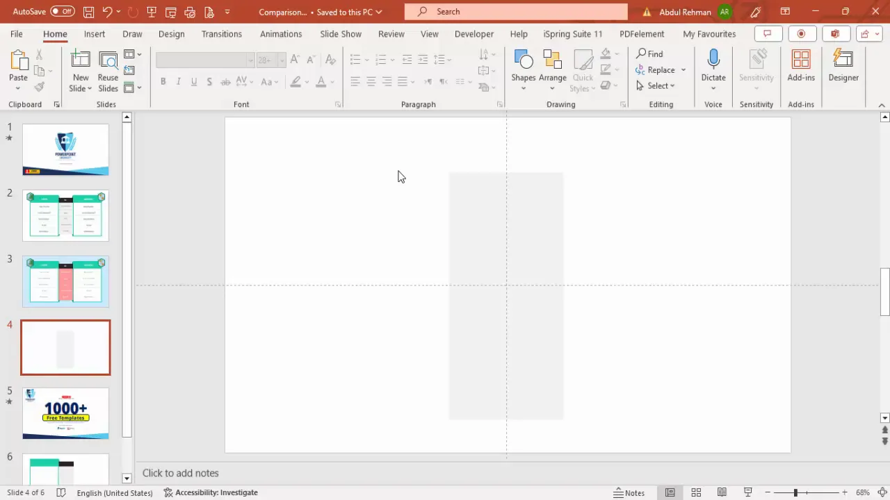
2. Create the Background and Base Shapes
- Insert a central rectangle: Go to Insert > Shapes, select the rectangle, and draw one in the center of the slide. This will serve as the base of your table.
- Format the rectangle: Remove the outline by setting Shape Outline > No Outline and fill it with a light gray color to create a subtle background.
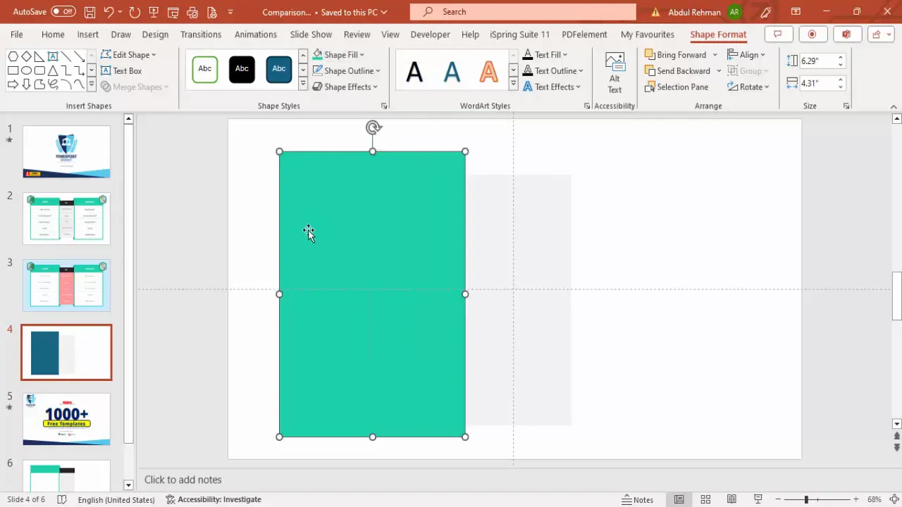
3. Add Side Rectangles for Each Comparison Subject
- Insert left rectangle: Add a larger rectangle to the left side of the central gray rectangle.
- Fill color: Choose a light green shade and remove the outline.
- Insert inner white rectangle: Inside the green rectangle, add a smaller white rectangle to create contrast for your text.
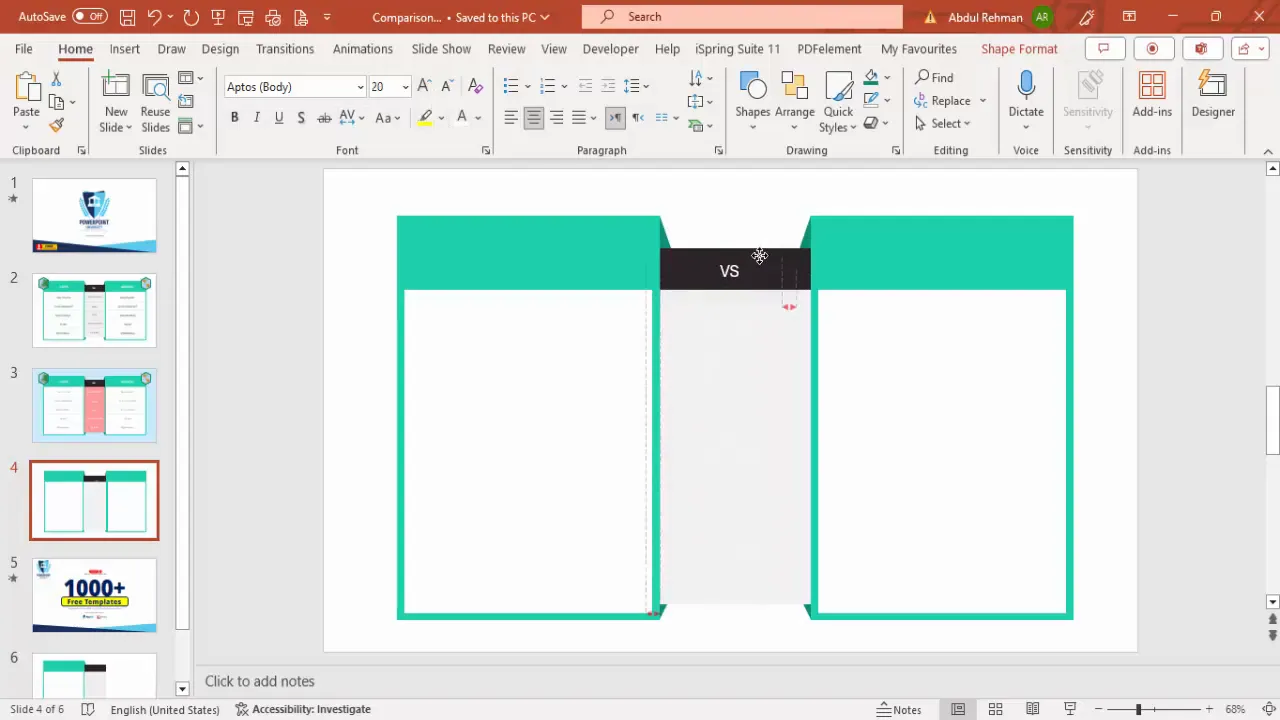
- Add black text box: On the left side, add a black rectangle to be used for headings or labels. Resize it to match the height of the green rectangle and use the Alt key while resizing to adjust only one border.
4. Create Decorative Triangles to Frame the Table
- Insert right triangles: From Insert > Shapes, select the right triangle and draw a small triangle near the left rectangle.
- Format triangles: Remove outlines and fill them with a dark green color.
- Duplicate and adjust: Hold Ctrl + Shift to drag a copy downward. Flip one triangle vertically and resize to fit along the rectangle edges.
- Group shapes: Select all green shapes and triangles on the left, right-click and group them (Ctrl + G) for easy movement.
- Duplicate and flip horizontally: Duplicate the grouped shapes and flip them horizontally to create the right-side frame.
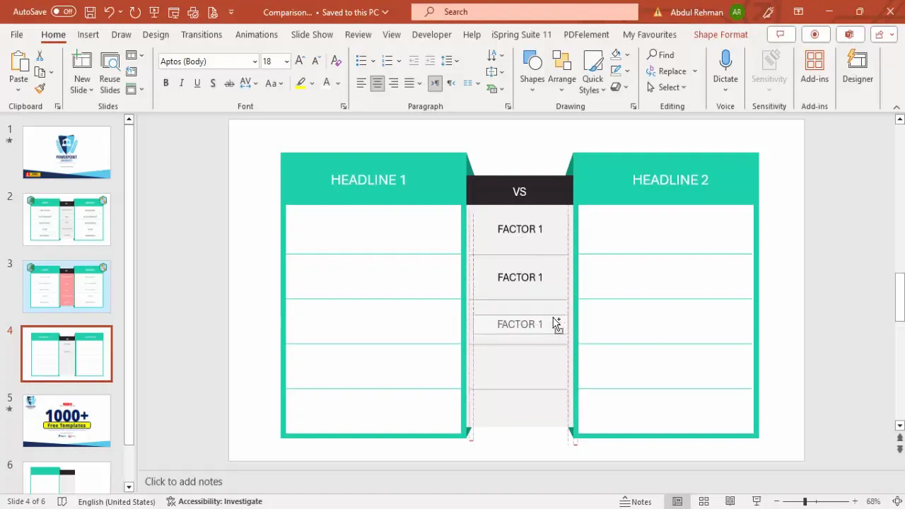
5. Insert Text Boxes for Titles and Labels
- Add center text box: Insert a text box in the center between the two side rectangles and type “Versus” or any comparison indicator.
- Format text: Use white font, increase size for visibility, and center align it.
- Add headlines: Insert text boxes on each side for your comparison subjects (e.g., “Europe” and “America”). Adjust font size and alignment as needed.
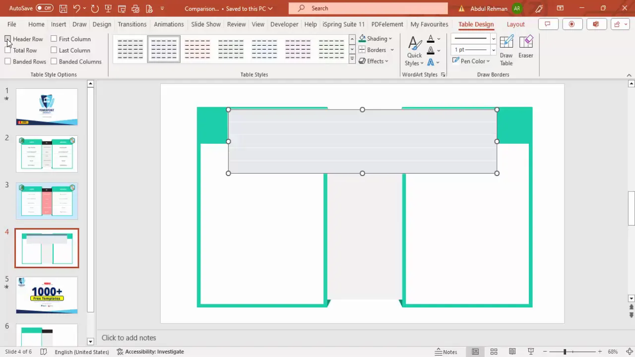
6. Build the Comparison Table
The core of your slide is the table that presents the factors and data you want to compare.
- Insert a table: Go to Insert > Table and create a table with 5 rows and 1 column initially.
- Remove default styling: Go to Table Design and uncheck Header Row and Banded Rows to start with a clean slate.
- Set border colors: Choose a bright green color for the pen to match your side rectangles.
- Customize borders: Remove all borders first, then add only inside horizontal borders to create row separators.
- Adjust cell size: Increase the row height for readability.
- Duplicate table: Copy the table twice more and place them on the left and right side rectangles and the center area.
- Change center table border color: Set the inside horizontal borders of the center table to a gray color to differentiate it.
7. Add Comparison Factors and Data
Now populate your table with the factors you want to compare and their corresponding data for each subject.
- Insert factor names: In the left table, add your factors such as “Population,” “Area,” “GDP,” “Employment %,” and “Military.” Center-align the text for neatness.
- Insert data: In the center and right tables, add the respective data points for each factor, aligning them properly.
- Duplicate and align: Use Ctrl + Shift to duplicate text boxes and maintain consistent spacing.

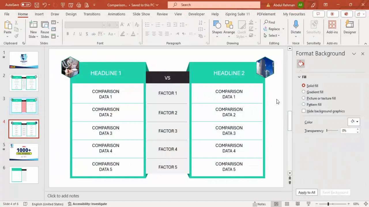
8. Enhance with Images and Shapes
Adding images can help the audience visually associate the comparison subjects with the data.
- Insert hexagon shapes: Go to Insert > Shapes and select the hexagon.
- Rotate hexagons: Use Alt + Right Arrow to rotate the hexagon to a diamond-like orientation.
- Position hexagons: Place them above or near the side rectangles.
- Format hexagons: Remove outlines or set them to green, and fill with pictures or textures.
- Insert pictures: Use Format Shape > Fill > Picture or Texture Fill to add relevant images inside the hexagons (e.g., landmarks for countries).
- Duplicate and replace images: Copy the hexagon shape for the other side and replace the picture to correspond to the other comparison subject.
Customizing the Design: Colors, Shapes, and Images
One of the most powerful PowerPoint functions is the ability to customize your design to fit your brand or presentation theme. Here are some ways to tailor your comparison table:
Color Schemes
- Use contrasting colors for the side rectangles to clearly differentiate the subjects.
- Choose neutral or light backgrounds for the main table to keep focus on the data.
- Use accent colors (like bright green in this example) for borders and highlights to add vibrancy.
Shapes and Icons
- Incorporate basic shapes like rectangles and triangles to frame your table and add structure.
- Group shapes to move or resize them easily without losing alignment.
- Use rotated shapes like hexagons to add a modern and dynamic look.
Images and Textures
- Insert images inside shapes to visually represent the comparison subjects.
- Use texture fills for backgrounds or shapes to add depth.
- Ensure images are relevant and high quality for professional appearance.
Tips for Making Your Comparison Table More Effective
Beyond the technical steps, here are some best practices to keep in mind when creating comparison tables in PowerPoint:
1. Keep It Simple and Clear
Focus on the most important factors. Avoid cluttering the table with too many data points or overly complex visuals.
2. Align All Elements Precisely
Use guides and snapping features in PowerPoint to ensure all shapes, text, and tables are perfectly aligned for a polished look.
3. Use Consistent Fonts and Sizes
Maintain uniform typography to ensure readability and professionalism.
4. Highlight Key Differences
Use color contrasts or bold fonts to draw attention to the most significant comparisons.
5. Test Your Table with Your Audience in Mind
Make sure the text is legible from a distance and the color scheme is accessible to all viewers, including those with color vision deficiencies.
6. Duplicate and Modify for Different Comparisons
Once you build a master comparison table, duplicate the slide and simply update the headlines and data for different comparisons to save time.
Frequently Asked Questions (FAQ)
Q1: Can I create comparison tables with more than two subjects?
Absolutely! While this tutorial focuses on comparing two subjects, you can easily expand your table by adding more columns and adjusting the shapes accordingly. Just ensure the slide doesn’t get overcrowded.
Q2: How do I keep all elements aligned when resizing?
Use PowerPoint’s guides and hold Shift or Alt keys when resizing to maintain proportions. Group related shapes and text boxes to move and resize them as a single unit.
Q3: Can I use this table for presentations on mobile devices?
Yes. However, keep in mind smaller screens might make detailed tables hard to read. Consider simplifying your table or breaking it into multiple slides for mobile-friendly viewing.
Q4: Are there free templates available for comparison tables?
Yes, many free PowerPoint templates include comparison table layouts. You can customize these or create your own from scratch using the steps outlined here. Using templates can save time and provide design inspiration.
Q5: How can I add animations to my comparison table?
PowerPoint allows you to animate individual elements. You can animate rows, columns, or entire tables using entrance, emphasis, or exit effects to guide your audience’s attention during your presentation.
Conclusion
Mastering PowerPoint functions to create dynamic and visually appealing comparison tables is an invaluable skill for any presenter. By following the step-by-step process outlined here, you can craft tables that not only display your data clearly but also engage and persuade your audience effectively.
Remember to plan your content carefully, use shapes and colors strategically, and incorporate images to add context and interest. With practice, creating customized comparison tables will become a seamless part of your PowerPoint design toolkit, helping you deliver presentations that stand out and communicate with impact.
Empower your presentations with the right tools and techniques, and watch how your audience responds to your clear, compelling comparisons.
Check out the full video: Comparison table in PowerPoint


