
Creating a clear, visually appealing Gantt chart is essential for managing complex projects, especially within supply chain operations. Leveraging PowerPoint functions effectively can help you build a professional Gantt chart quickly, even if you’re a beginner. This comprehensive guide walks you through the process of making a supply chain Gantt chart in PowerPoint, detailing each step with practical tips and examples to ensure your presentation stands out.
Whether you’re a project manager, supply chain analyst, or business professional, mastering these PowerPoint functions will empower you to communicate your project timelines and milestones clearly and efficiently. Follow along as we explore how to design a six-month Gantt chart that covers key supply chain stages from inventory supply to consumer feedback.
Table of Contents
- Understanding Gantt Charts in Supply Chain Management
- Preparing Your PowerPoint Slide and Table
- Formatting the Table for Clarity and Style
- Adding Headers and Timeline Labels
- Inputting Supply Chain Steps and Tasks
- Designing Timeline Arrows to Represent Task Duration
- Inserting Milestones for Key Project Events
- Finalizing the Chart and Adding Legends
- Frequently Asked Questions
- Conclusion
Understanding Gantt Charts in Supply Chain Management
A Gantt chart is a powerful visual tool to map out project timelines, showing the start and finish dates of various elements. In supply chain management, it helps coordinate activities such as inventory supply, raw material procurement, product development, transportation, and customer feedback collection.
By organizing these steps across a timeline, the chart provides a clear overview of dependencies and progress, which is critical to ensuring deadlines are met and resources are allocated efficiently.
- Supply Inventory: The initial stage where producers supply inventory, typically starting at month one.
- Raw Materials: Procurement and preparation of raw materials, often following inventory supply.
- Product Development: The phase where the actual product is developed, often around month three.
- Transportation: Logistics and delivery managed by transport companies.
- Consumer Feedback: The final stage where feedback is gathered to evaluate the product’s success.
Preparing Your PowerPoint Slide and Table
Start by adding a new slide in your PowerPoint presentation. The foundation of your Gantt chart will be a table that organizes tasks and timelines.
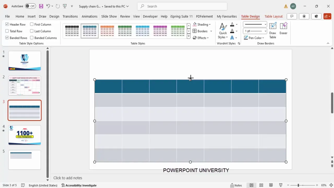
- Insert Table: Go to the Insert tab and select Table. Insert a table with 7 columns and 6 rows. This will accommodate the timeline across six months plus a header column for task steps.
- Position and Resize: Reposition the table on the slide and adjust its height and width to fill the space appropriately for readability.
- Remove Default Styles: Under the Table Design tab, untick options like Banded Rows and Header Row to clear default formatting for a clean slate.
Formatting the Table for Clarity and Style
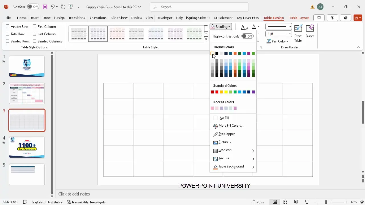
Formatting is essential to make your Gantt chart visually appealing and easy to interpret. Use PowerPoint functions to customize the table’s borders, shading, and font styles.
- Set Borders and Pen Color: Select the entire table, choose a gray pen color for borders, and apply All Borders for clear cell delineation.
- Fill Color: Shade the table background white to keep the chart clean and professional.
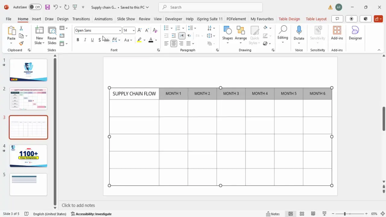
- Adjust Column Width: Increase the width of the first column to around 3 inches to accommodate task descriptions clearly.
- Adjust Row Height: Reduce the height of the first row (header) to around 0.6 inches for a compact timeline header.
- Font and Alignment: Apply the Open Sans font across the table for consistency, set the font color to black, and center-align text both horizontally and vertically to enhance readability.
Adding Headers and Timeline Labels
Next, you’ll add the main title and timeline labels to the table header, which represent the months across which your supply chain activities occur.
- Title Cell: In the first cell of the first row, type SUPPLY CHAIN FLOW in uppercase letters for emphasis.
- Timeline Headers: Label the remaining six columns with Month 1, Month 2, up to Month 6.
- Font Size and Weight: Use font size 16 and apply Extra Bold to the title, while the months can be slightly smaller, around size 14.
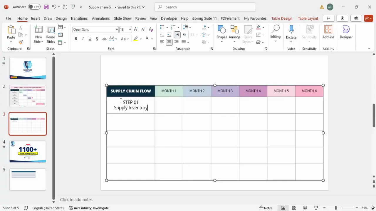
- Color Coding: Use shading to differentiate the title and month headers. For example, fill the title cell with a dark blue and set the font color to white, while months can have varying lighter shades of blue for visual segmentation.
Inputting Supply Chain Steps and Tasks
With the timeline in place, it’s time to list the key supply chain steps down the first column. This sets the structure for mapping each task’s timeline.
- Step Labels: Enter Step 1, Step 2, through Step 5 in the first column, using the Open Sans Extra Bold font at size 14 for emphasis.
- Task Descriptions: Next to each step, input the corresponding task name such as Supply Inventory, Raw Materials, Product Development, Transport Company, and Consumer Feedback.
- Font Styling: Use regular font weight for task descriptions to contrast with the bold step numbers.
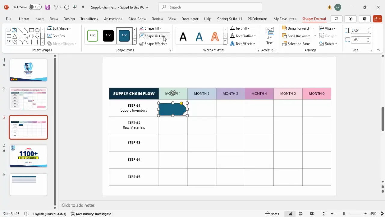
Designing Timeline Arrows to Represent Task Duration
Visualizing the duration and timing of each task is crucial in a Gantt chart. PowerPoint’s shape functions allow you to create arrows that span the appropriate months to represent task timelines.
- Insert Shapes: Go to Insert > Shapes, and select the Pentagon arrow shape from block arrows.
- Draw Arrows: Place arrows within the timeline cells corresponding to when each task occurs. For example, the supply inventory arrow will be positioned in Month 1’s cell.
- Customize Colors: Match the arrow fill color with the cell’s shading for consistency. Remove the outline by setting shape outline to No Outline.
- Add Details: Inside or near the arrow, add text to specify details like the responsible party (e.g., Producer, Supplier, Manufacturer).
- Duplicate and Adjust: Use Ctrl+D to duplicate arrows for subsequent tasks, adjusting their length and color shade to reflect duration and importance.
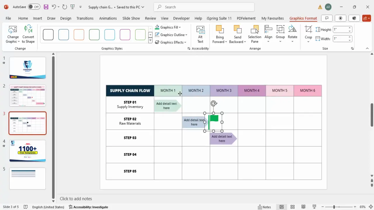
Inserting Milestones for Key Project Events
Milestones mark critical points in the project timeline and should be clearly identifiable on your Gantt chart.
- Insert Icons: Use Insert > Icons and search for a flag icon to represent milestones.
- Customize Size and Color: Resize the icon to about 0.5 inches and change its color to green for visibility.
- Positioning: Place the milestone icon below the timeline cells at the appropriate month, such as after Product Development at month 3.
- Duplicate Milestones: Use Ctrl+D to copy the icon and reposition for other milestones as needed, adjusting colors to differentiate between milestone types.
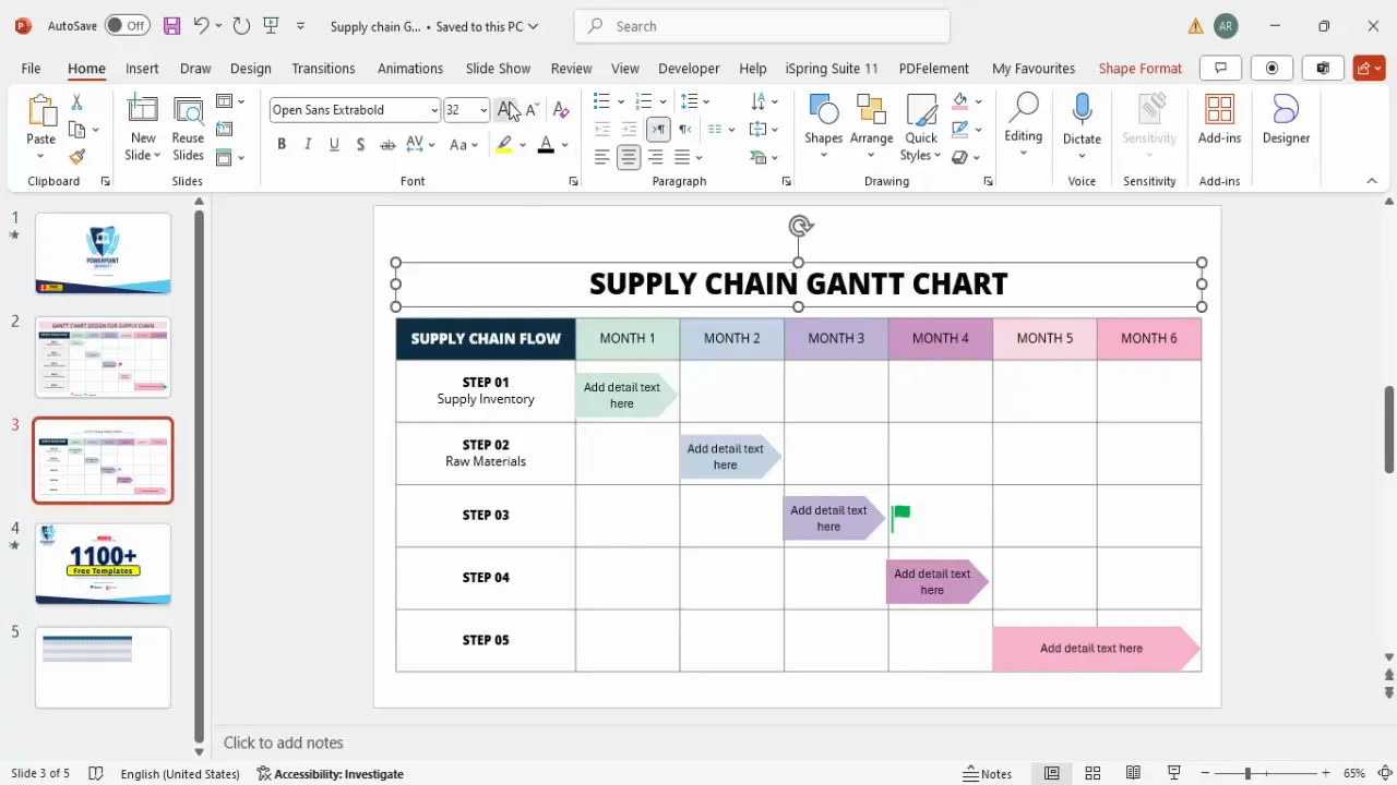
Finalizing the Chart and Adding Legends
To complete your Gantt chart, add a title and legend to ensure clarity for all viewers.

- Add Chart Title: Insert a text box above or on top of the table and type Supply Chain Gantt Chart. Use Open Sans Extra Bold, increase font size, and apply a subtle gray color.
- Add Legend for Milestones: Insert a smaller flag icon and place it near the bottom or side of the chart.
- Label the Legend: Add a text box next to the icon with the word Milestone in gray font, size 12, to explain the icon meaning.
- Additional Information: Optionally, you can insert other icons or text boxes to denote other important events or notes on the timeline.
Summary Table: PowerPoint Functions Used to Create the Gantt Chart
| PowerPoint Function | Purpose | Tips |
|---|---|---|
| Insert Table | Creates the grid structure for the Gantt chart | Use 7 columns x 6 rows for timeline and tasks |
| Table Design | Customize table borders, shading, and styles | Untick banded rows and header row for clean look |
| Table Layout | Adjust column width and row height for readability | Expand first column for task names; reduce header row height |
| Font Formatting | Set consistent fonts, sizes, and alignment | Use Open Sans, extra bold for headers; center text |
| Insert Shapes (Arrows) | Visualize task durations on timeline | Match shape color with cell shading; remove outline |
| Insert Icons (Milestones) | Mark key events or milestones | Use flags colored green; add legend for clarity |
| Text Boxes | Add titles, labels, and detailed notes | Keep font consistent with table; use gray for legends |
Frequently Asked Questions
What is the best way to start creating a Gantt chart in PowerPoint?
Begin by inserting a table that outlines your timeline and tasks. This structured grid forms the basis for mapping your project phases and durations visually.
How can I make my Gantt chart visually appealing?
Use consistent fonts like Open Sans, apply shading to differentiate headers, and use color-coded arrows and icons to represent tasks and milestones. Align text centrally and ensure adequate spacing for readability.
Can I customize the timeline duration beyond six months?
Yes, simply adjust the number of columns in your table to match your desired timeline length, and update the month headers accordingly.
How do I indicate task dependencies or milestones?
Use milestone icons such as flags at key points and position arrows to show task durations. Adding legends helps viewers understand the symbols used.
Are there free templates available to help with Gantt chart creation?
Many websites offer free PowerPoint templates tailored for project timelines and Gantt charts. These can save you time and provide design inspiration.
Conclusion
Mastering PowerPoint functions to create a supply chain Gantt chart equips you with a versatile tool to manage and present complex projects clearly. By following this guide, you can build a six-month timeline chart that tracks supply inventory, raw materials, product development, transportation, and consumer feedback effectively.
Remember to focus on clear structure, consistent formatting, and visual cues like arrows and milestones to enhance understanding. Whether presenting to stakeholders or coordinating internal teams, a well-crafted Gantt chart can make all the difference in project success.
Keep practicing these PowerPoint functions, and soon creating detailed, professional Gantt charts will become second nature.
Check out the full video: How to Make a Gantt Chart Fast: Easy, Quick, & Beginner-Friendly


