Creating a Gantt chart is an essential skill for anyone involved in project planning, especially within supply chain management. It visually maps out project activities over time, helping teams coordinate workflows, track progress, and meet deadlines efficiently. This comprehensive guide will walk you through creating a professional Gantt chart quickly and easily using PowerPoint, tailored specifically for supply chain processes.
Whether you are a beginner or looking for a fast method to visualize your supply chain timeline, this tutorial-style article covers everything from setting up your table to adding milestones and color coding for clarity. By the end, you’ll have a clear, functional Gantt chart that you can customize for your specific needs.
This article is inspired by expert techniques from POWERPOINT UNIVERSITY, a leading resource for PowerPoint tutorials and free templates.
Table of Contents
- What Is a Gantt Chart and Why Use It for Supply Chain?
- Step-by-Step Setup of Your Supply Chain Gantt Chart
- Design and Formatting Tips for Clarity
- Adding Timeline Details and Milestones
- Finalizing Your Chart and Adding Legends
- Frequently Asked Questions (FAQ)
- Conclusion
What Is a Gantt Chart and Why Use It for Supply Chain?
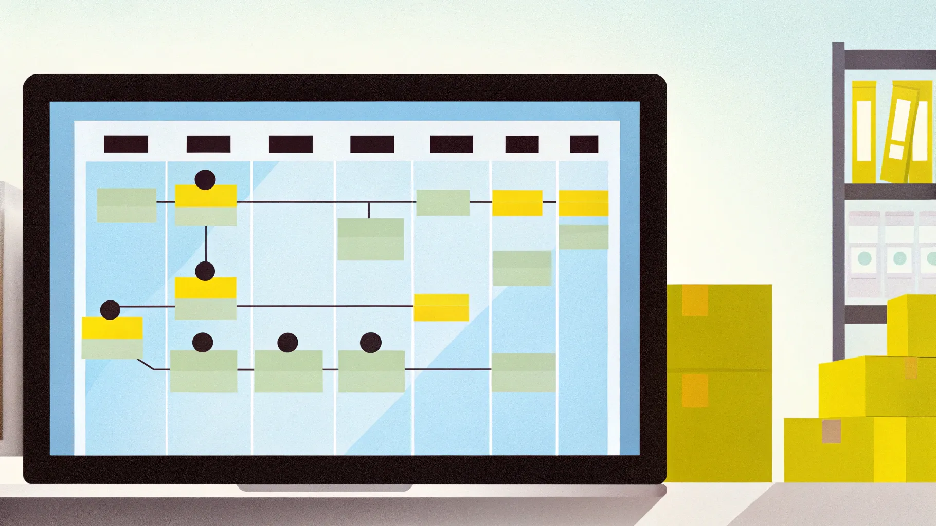
A Gantt chart is a bar chart that represents a project schedule, illustrating the start and finish dates of various elements of a project. In supply chain management, it helps visualize the phases from inventory supply through product development to consumer feedback, aligning tasks over a timeline.
Using a Gantt chart for supply chain provides several benefits:
- Visual Planning: See all supply chain steps laid out over months, making coordination easier.
- Timeline Management: Understand when each activity starts and ends to avoid bottlenecks.
- Milestone Tracking: Identify key achievements or deadlines to keep the project on track.
- Communication Tool: Share clear progress updates with team members and stakeholders.
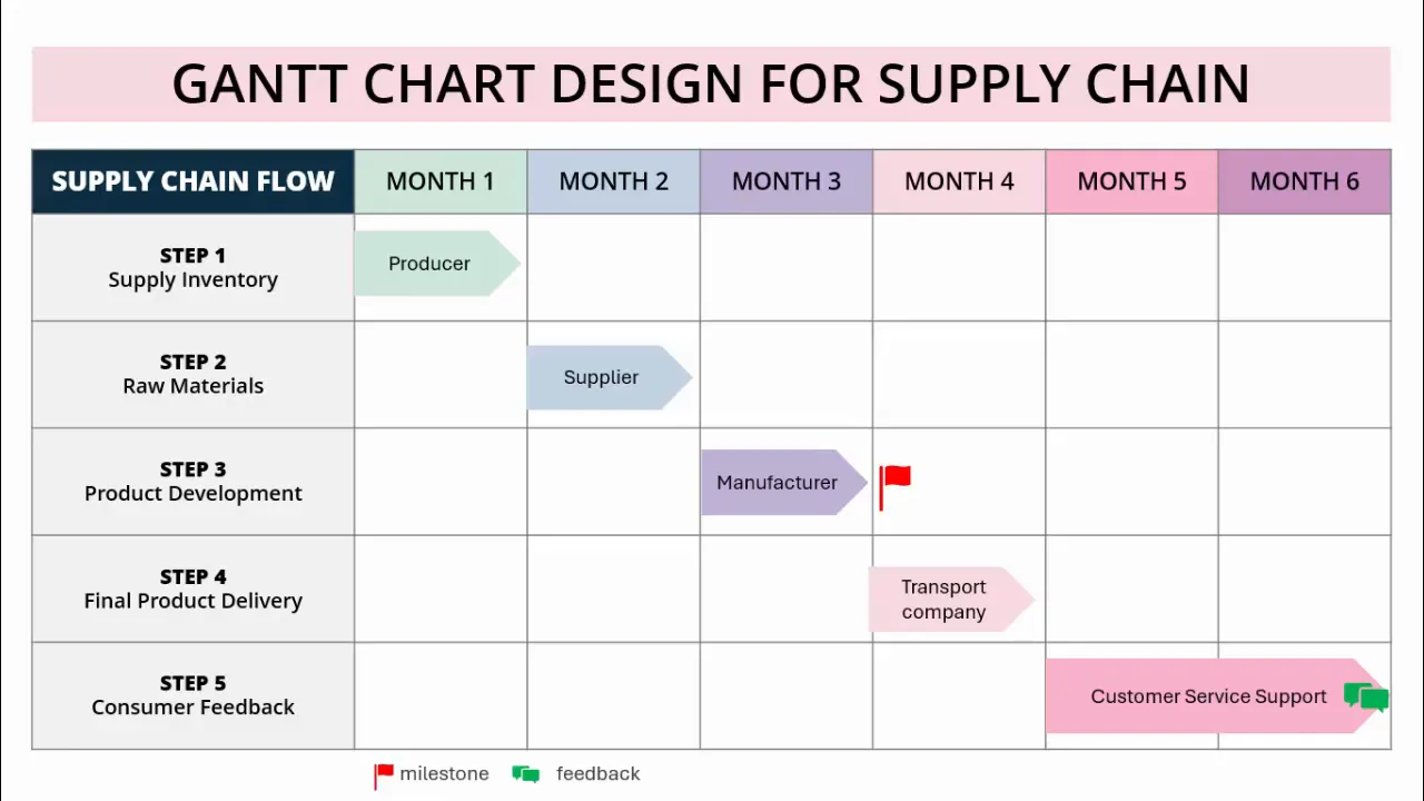
For example, a six-month supply chain Gantt chart might include steps such as supply inventory, raw materials procurement, product development, transport, final delivery, and consumer feedback, each mapped to specific months.
Step-by-Step Setup of Your Supply Chain Gantt Chart
Let’s dive into creating your Gantt chart from scratch using PowerPoint. This method is beginner-friendly and fast, allowing you to build a clear timeline for your supply chain activities.
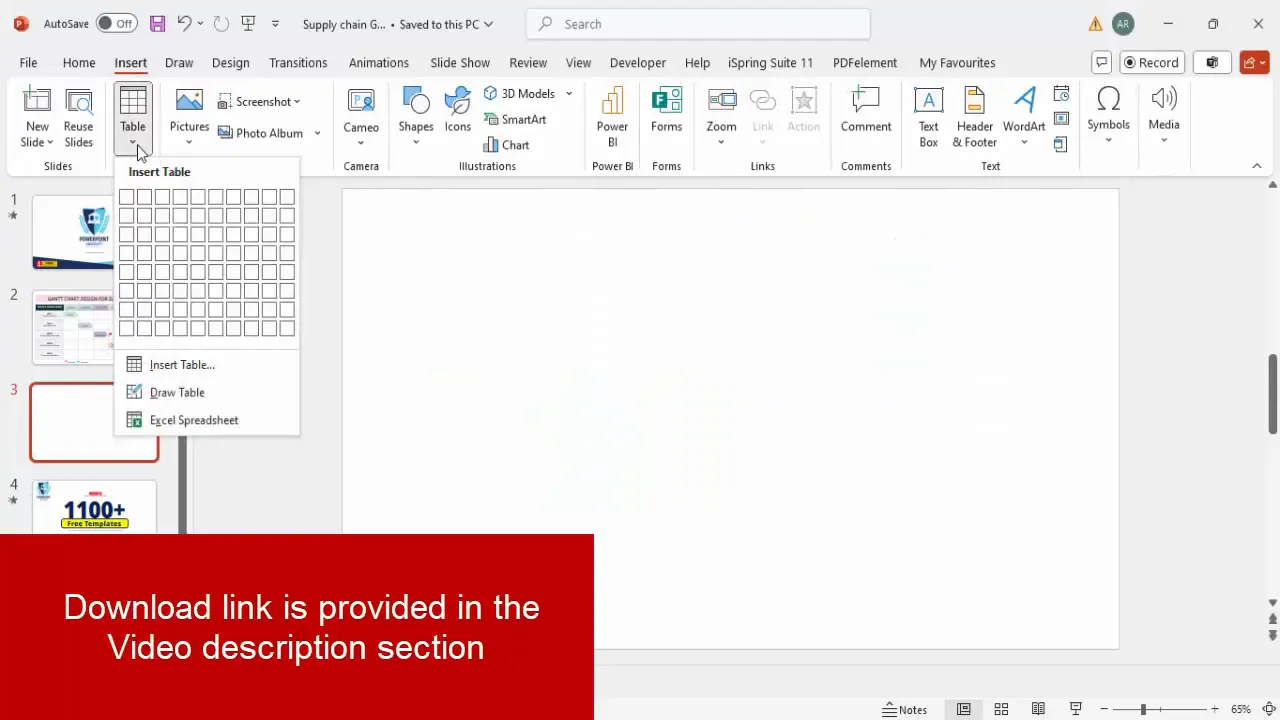
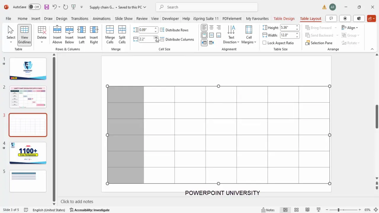
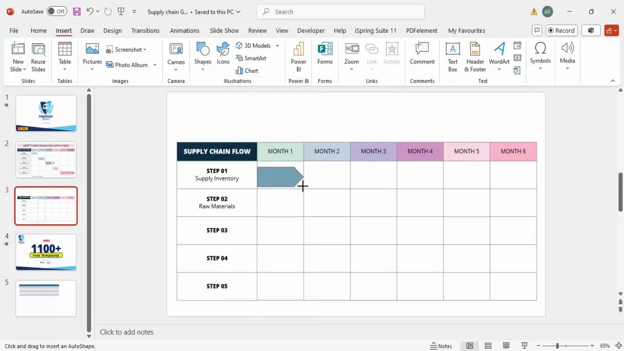
1. Insert a Table to Form the Chart Grid
- Open PowerPoint and add a new blank slide.
- Go to the Insert tab and select Table.
- Insert a table with 7 columns and 6 rows. This will give you one column for task names and six columns for monthly timelines.
- Once inserted, reposition the table on your slide and increase its height and width for better visibility.
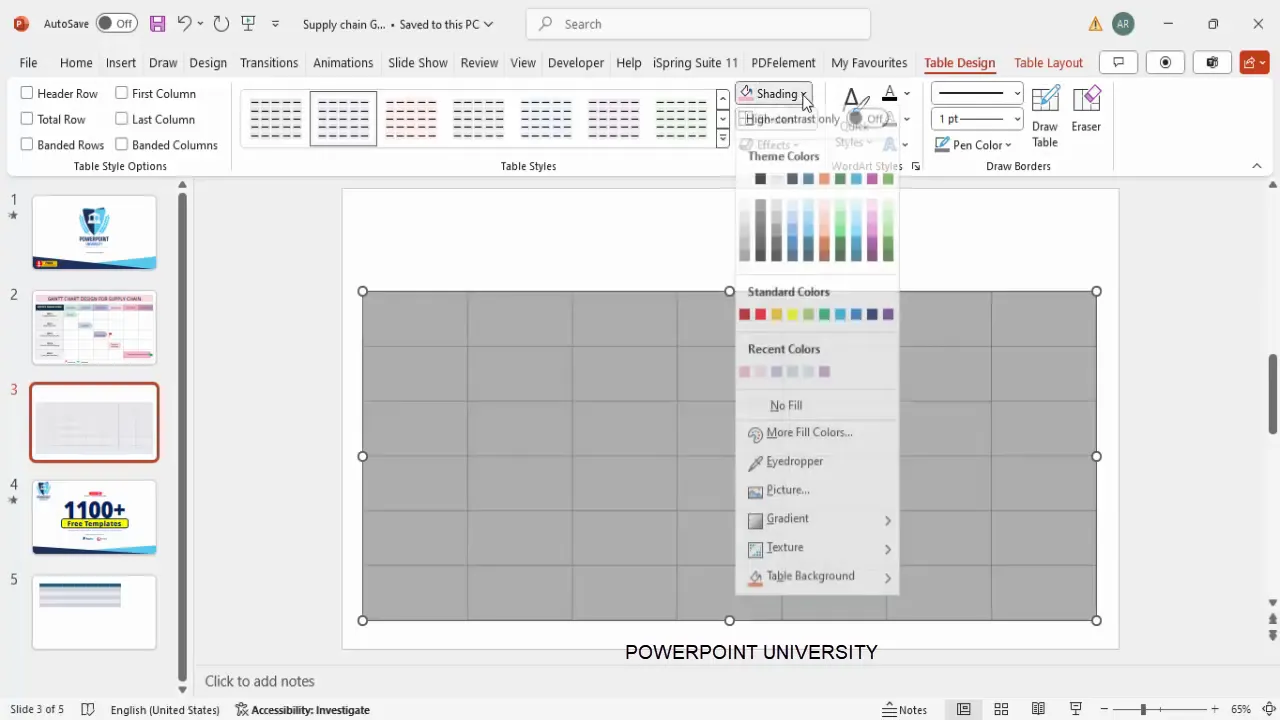
2. Adjust Table Design Settings
- Under the Table Design tab, untick options for banded rows and header row to get a clean grid.
- Select the entire table, then choose a gray color for the pen (border) color.
- Set all borders to be visible and fill the cells with white shading for a neat look.
3. Resize Columns and Rows for Readability
- Select the first column (task names) and increase its width to about 3 inches for enough text space.
- Reduce the height of the first row (header row) to approximately 0.6 inches, keeping other rows unchanged.
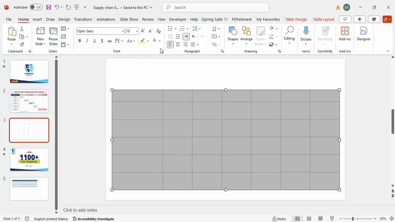
4. Set Font and Alignment
- Select the entire table and apply the font Open Sans for a modern, clean look.
- Set the font color to black and center-align all text horizontally.
- Go to Table Layout and enable vertical centering to make text align perfectly in each cell.
Design and Formatting Tips for Clarity
Now that the table structure is ready, it’s time to add meaningful content and make your Gantt chart visually appealing and easy to interpret.
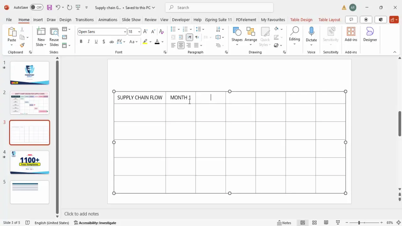
1. Add Headers and Timeline Labels
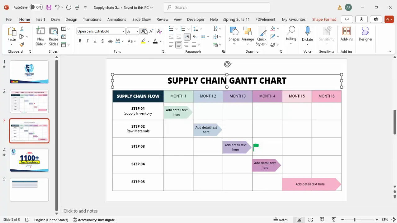
- In the top-left cell, type SUPPLY CHAIN FLOW in all caps for emphasis.
- Fill the top row from the second to seventh column with month labels: Month 1, Month 2, up to Month 6.
- Use a font size of 16 for the main header and 14 for the month labels.
- Make the header text extra bold and apply a contrasting dark blue background shading with white font for clarity.
- For the month columns, alternate light blue shading to visually separate the timeline blocks.
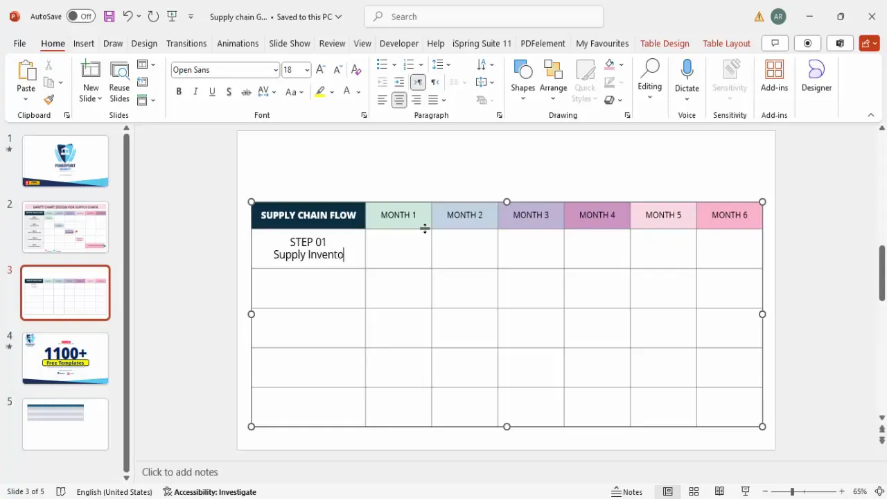
2. List Supply Chain Steps
In the first column, list out the key steps in your supply chain process. For example:
| Step | Description |
|---|---|
| Step 1 | Supply Inventory |
| Step 2 | Raw Materials Procurement |
| Step 3 | Product Development |
| Step 4 | Transport Company Handling |
| Step 5 | Final Product Delivery |
| Step 6 | Consumer Feedback |
- Use Open Sans Extra Bold font style for step labels for emphasis, with a font size around 14-16.
- Ensure the description text is clear but not bolded, to maintain hierarchy.
Adding Timeline Details and Milestones
With your table and steps in place, the next step is to represent the timing of each supply chain activity visually on the timeline.
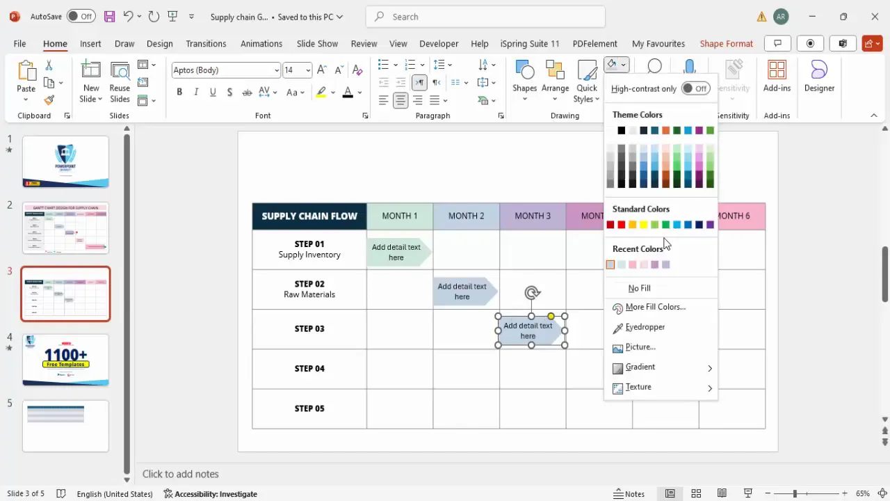
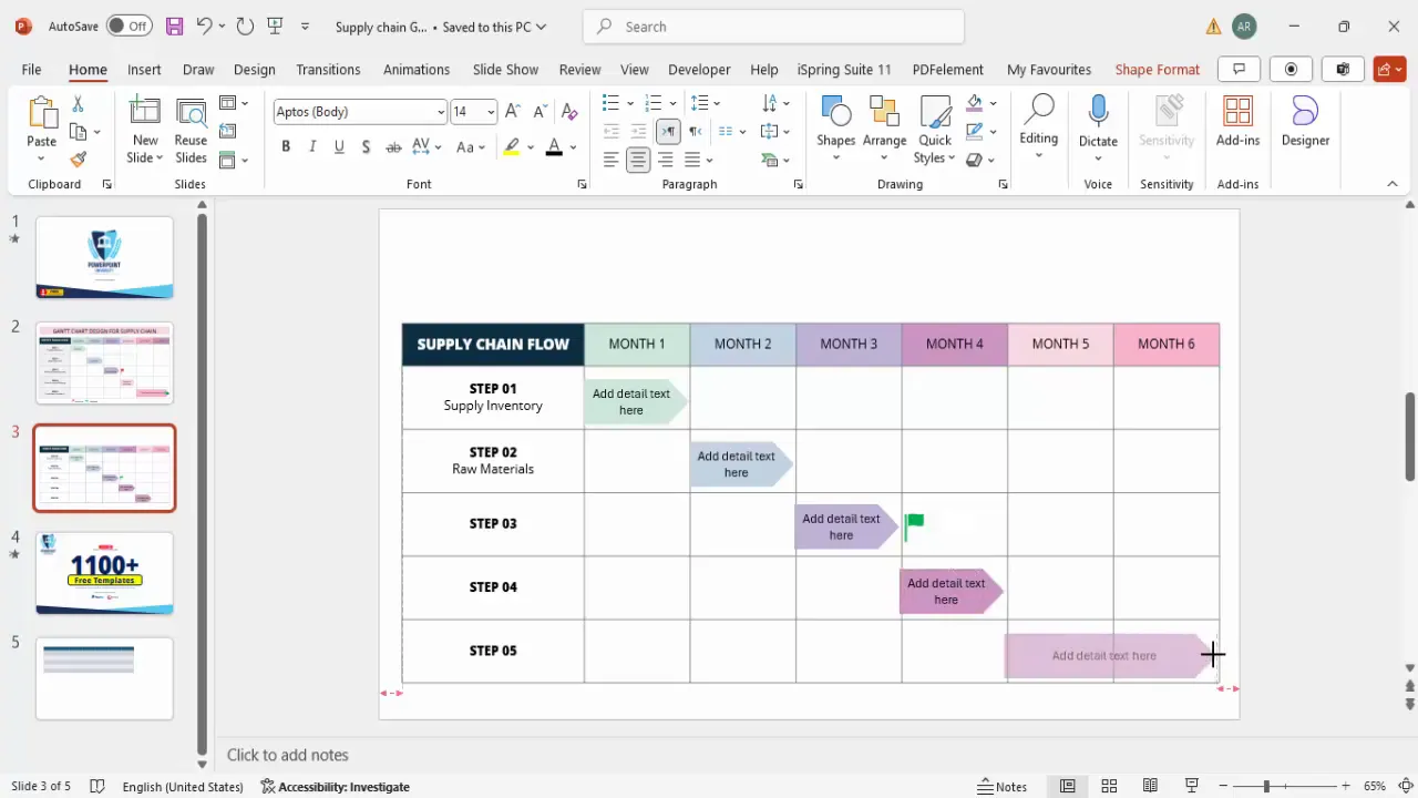
1. Insert Timeline Arrows
- Go to Insert > Shapes and choose a pentagon arrow shape from the block arrows category.
- Draw the arrow inside the table cells corresponding to the months during which the step occurs.
- Remove the shape outline and fill the arrow with a color matching or complementing your table shading for consistency.
- Add detailed text inside the arrow describing the responsible party or specific information, e.g., Producer, Supplier, Manufacturer.
- Use a font size of 14 and black color for readability.
For example, the Supply Inventory step might have an arrow spanning Month 1, whereas Product Development could span Month 3.

2. Duplicate and Customize Arrows for Other Steps
- Use Ctrl + D (duplicate) to copy the arrow and place it in appropriate timeline cells for subsequent steps.
- Adjust the fill color for each arrow to a slightly darker or lighter shade to differentiate steps visually.
- Change the descriptive text inside each arrow to fit the specific step’s details.
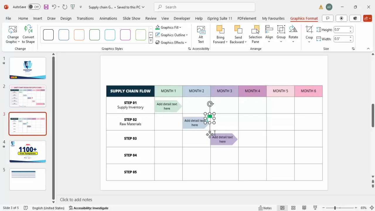
3. Add Milestones Using Icons
- Go to Insert > Icons and search for a flag icon to represent milestones.
- Insert the flag icon and resize it to about 0.5 inches for unobtrusiveness.
- Change the flag’s color to green for distinction.
- Place the milestone icon at the end of a critical step, e.g., after product development completion.
- Duplicate the milestone icon as needed and adjust colors and positions accordingly.
4. Extend Timeline Arrows for Multi-Month Activities
- For steps lasting multiple months, drag the arrow shape across corresponding cells, such as a two-month span for transport handling.
- Use lighter shades of the arrow color to indicate ongoing activities over multiple months.
Finalizing Your Chart and Adding Legends
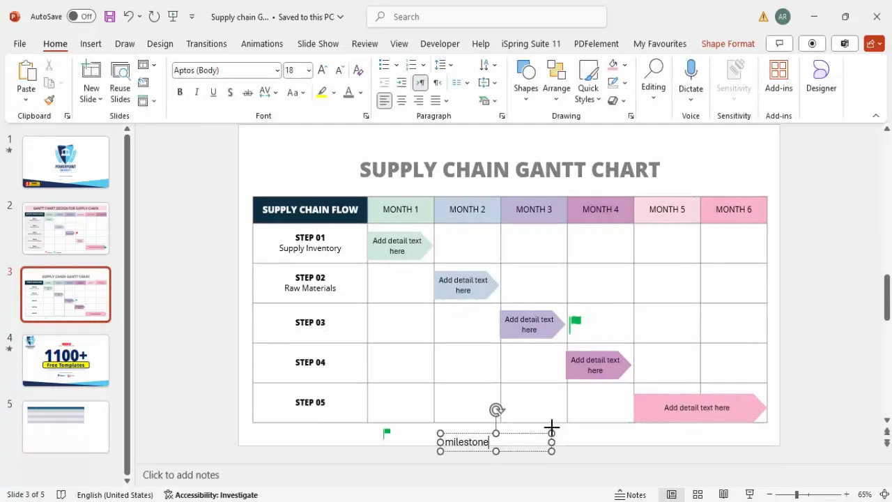
1. Add a Chart Title
- Insert a text box above the table and type Supply Chain Gantt Chart.
- Center-align the title and apply Open Sans Extra Bold font with a larger size for prominence.
- Use a gray color for a professional, subtle look.
2. Create a Legend for Milestones
- Place a green flag icon below or beside the table and reduce its size to about 0.3 inches.
- Insert a text box next to the icon and label it Milestone in gray font, size 12.
- This helps viewers understand what the icons represent, improving chart clarity.
3. Add Additional Information or Icons if Needed
- Depending on your supply chain’s complexity, you can add more icons or notes for specific events or phases.
- Use consistent colors and fonts to maintain a professional and cohesive appearance.
Frequently Asked Questions (FAQ)
Q1: Why use PowerPoint to create a Gantt chart instead of specialized software?
PowerPoint is widely accessible, easy to use, and offers flexible design options that allow you to create visually appealing Gantt charts quickly without needing specialized project management software. It’s ideal for beginners or those needing custom, presentation-ready charts.
Q2: How can I customize the timeline for projects longer than six months?
You can add more columns to your table to represent additional months or weeks depending on your project’s timeline. Adjust the column widths accordingly to maintain readability.
Q3: Can I use this Gantt chart template for other industries?
Absolutely. The method is versatile and can be adapted for any project management purpose, including marketing campaigns, software development, event planning, and more.
Q4: How do I update the chart as the project progresses?
Simply edit the text inside the arrows, move milestone icons, or adjust the lengths of the timeline arrows to reflect current statuses. PowerPoint’s flexible shapes and text boxes make this easy.
Q5: Are there free templates available to speed up this process?
Yes, many free PowerPoint templates are available online, including those offered by POWERPOINT UNIVERSITY. These templates come with pre-built Gantt charts that you can customize to your needs.
Conclusion
Creating a Gantt chart for supply chain management doesn’t have to be complex or time-consuming. By following this step-by-step guide, you can build a clear, visually engaging timeline that maps out your entire supply chain flow, from inventory supply to consumer feedback.
Using PowerPoint’s table and shape tools, combined with thoughtful design choices like color coding and milestone icons, your Gantt chart will not only organize your project timeline but also communicate it effectively to your team and stakeholders.
Remember to keep your chart simple, consistent, and easy to read. Experiment with colors, fonts, and icons to fit your brand or presentation style. With practice, you’ll be able to create professional Gantt charts fast and with confidence.
For more creative PowerPoint tutorials and free templates, consider exploring resources from POWERPOINT UNIVERSITY, which offers over a thousand free templates to elevate your presentations.
Check out the full video: How to Make a Gantt Chart Fast: Easy, Quick, & Beginner-Friendly


