If you’re looking to elevate your PowerPoint presentation skills and create slides that look professional, balanced, and visually appealing, you’re in the right place. Whether you’re preparing a pitch deck, business presentation, or educational content, mastering slide design can make all the difference in how your message is received.
In this comprehensive guide, we’ll walk through a step-by-step process inspired by the popular One Skill PPT tutorial that shows how to design an eye-catching PowerPoint slide from scratch. You’ll learn how to craft a balanced layout, choose modern typography, apply harmonious colors, and add creative effects and shapes to spice up your slides.
By the end of this article, you’ll have the confidence and skills to design your PowerPoint slides like a pro — even if you’re a beginner or have never designed a slide before.
Table of Contents
- Creating a Balanced Slide Layout
- Choosing Modern Typography
- Using Harmonious Colors
- Adding Green Effects and Shapes
- Design Session Insights
- Frequently Asked Questions
- Conclusion
Creating a Balanced Slide Layout
The foundation of any great PowerPoint slide is a well-balanced layout. A balanced layout ensures that all the elements on your slide — text, images, shapes — are arranged harmoniously so the slide looks clean, professional, and easy to follow.
Here are the essential principles to keep in mind when designing your slide layout:
- Use a Grid or Guides: PowerPoint allows you to enable gridlines or guides, which help you position elements evenly. Aligning objects to these grids creates a sense of order.
- Whitespace is Your Friend: Avoid overcrowding your slide. Give your content room to breathe by leaving sufficient whitespace (also called negative space) around text and images.
- Visual Hierarchy: Arrange content so that the most important elements are prominent. Typically, titles and key messages are larger and positioned at the top or center.
- Consistent Margins: Maintain equal margins on all sides to keep the slide balanced.
- Symmetry vs. Asymmetry: Symmetrical layouts give a formal and stable feel, while asymmetrical layouts can feel more dynamic and modern when done carefully.
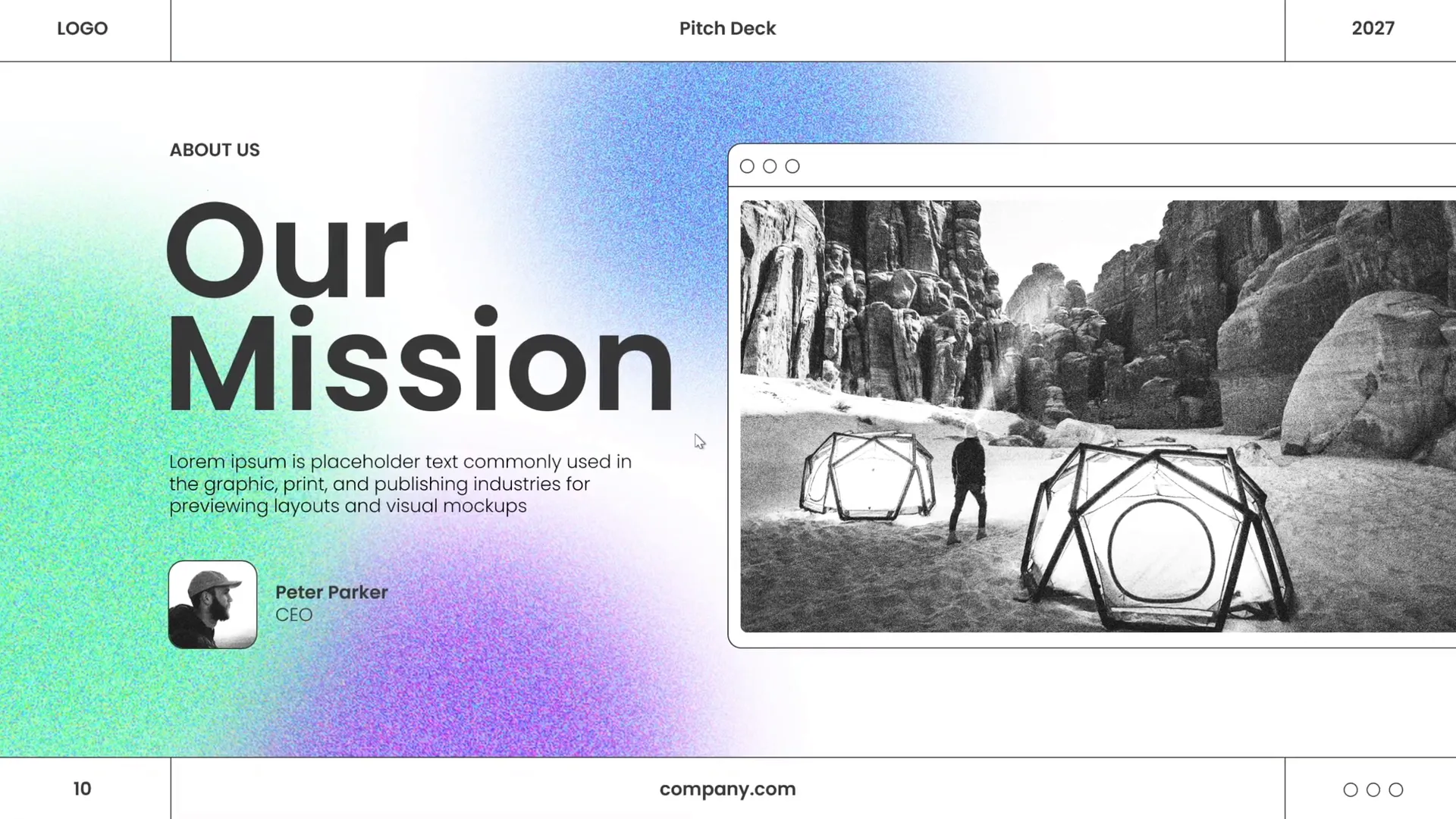
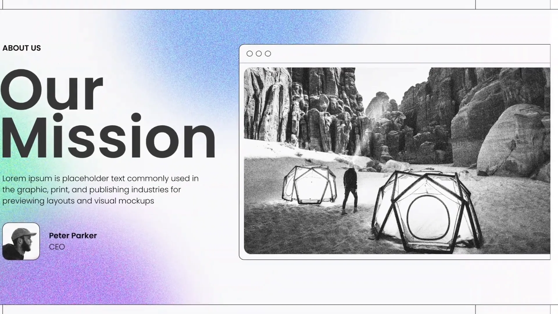
In the One Skill PPT tutorial, the presenter starts by creating a beautiful slide layout that looks well balanced. This involves placing the photo, headline, and shapes in a way that guides the viewer’s eye naturally across the slide.
By following these principles, you can ensure your slide will not only look aesthetically pleasing but also communicate your message effectively.
Choosing Modern Typography
Typography is a powerful design element that can make or break your PowerPoint presentation skills. The right font choice improves readability, sets the tone, and enhances the overall aesthetic of your slides.
Here’s how to add beautiful typography to create a modern look, just like in the tutorial:
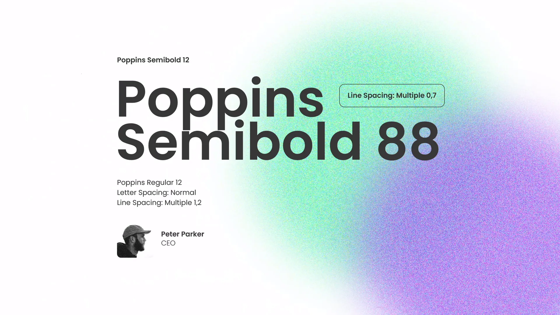
- Use Clean, Sans-Serif Fonts: Fonts like Poppins (used in the tutorial), Helvetica, or Arial are modern and easy to read. Avoid overly decorative or script fonts that can distract.
- Limit Font Families: Stick to one or two font families to maintain consistency. For example, use a bold version for headings and a regular version for body text.
- Font Size Matters: Titles should be large enough to grab attention (around 30-44 pt), while body text should be readable from a distance (minimum 24 pt).
- Use Weight and Color for Emphasis: Bold or colored text can highlight key points without cluttering the slide.
- Keep Text Minimal: Use concise bullet points or short sentences. Avoid large paragraphs of text.
In the video, the presenter applies typography to the slide to complement the layout and colors, crafting a sleek and modern vibe.
When designing your slides, experiment with font sizes and weights until your text stands out but still fits well within the layout.
Using Harmonious Colors
Color is one of the most important aspects of PowerPoint presentation skills. The right color palette can evoke emotions, draw attention, and create a cohesive visual story.
Here’s how to choose and apply beautiful colors effectively:
- Pick a Color Palette: Select 3-5 colors that work well together. Use color palette tools like Coolors or Adobe Color for inspiration.
- Use Accent Colors: Use a bold accent color to highlight important elements (like headings or buttons) while keeping the background and body text neutral or muted.
- Maintain Contrast: Ensure text contrasts well with the background for readability. Light text on dark backgrounds or vice versa works well.
- Consistency is Key: Use the same color scheme throughout your presentation for a polished look.
- Consider Color Psychology: Colors have meanings and associations (green = growth, blue = trust). Choose colors that support your message.
In the tutorial, the presenter uses a set of beautiful colors to apply to the slide elements, creating a fresh and professional look.
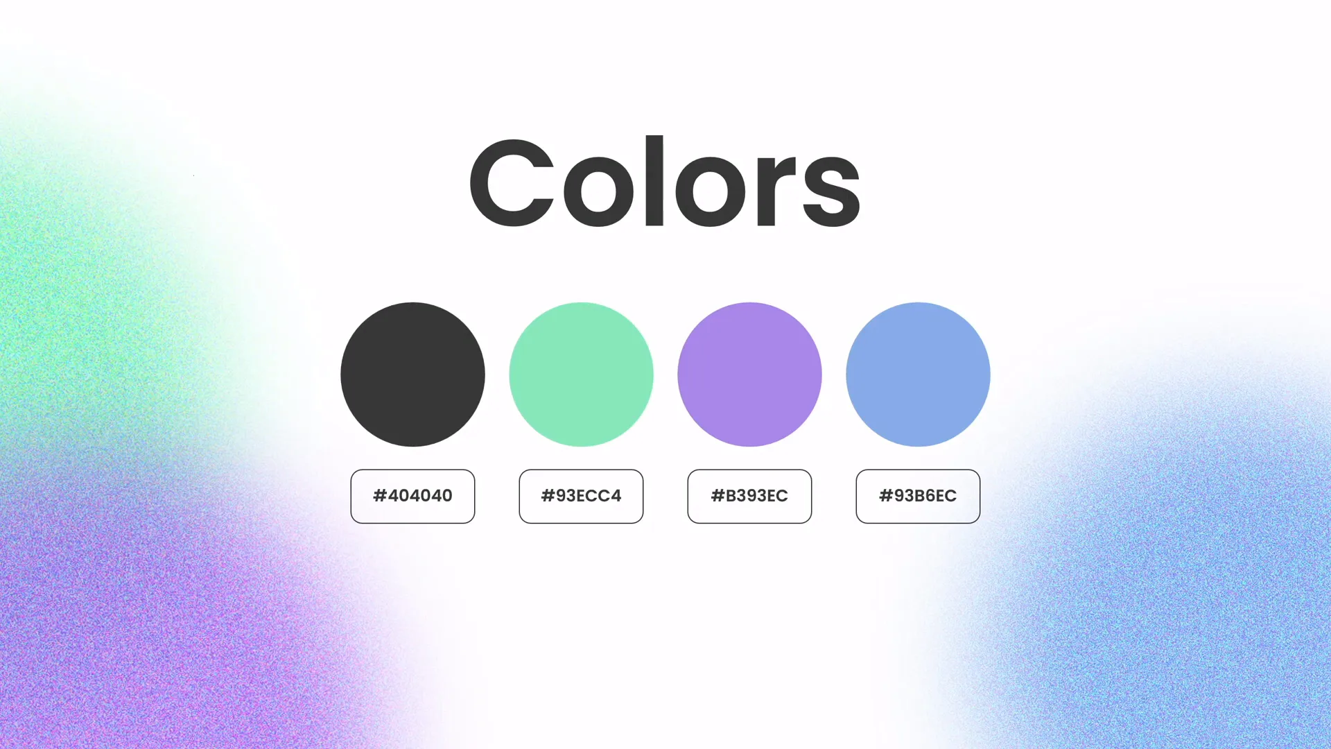
Don’t be afraid to experiment with different shades to find the perfect balance for your slide design.
Adding Green Effects and Shapes
To spice up your slides and make them visually appealing, adding creative effects and shapes is a fantastic strategy. In the One Skill PPT tutorial, the presenter demonstrates how to create a green effect and add beautiful shapes in PowerPoint.
Here are some tips for adding these effects:
- Use Shape Tools in PowerPoint: PowerPoint offers a variety of shapes that you can customize by changing colors, transparency, and borders.
- Create Overlays: Apply semi-transparent shapes over images to create a color effect or mood.
- Use Gradients and Shadows: These effects add depth and dimension to your shapes without overwhelming the design.
- Combine Shapes: Use the “Merge Shapes” tool to create custom shapes that fit your design concept.
- Balance Effects: Avoid clutter by keeping effects subtle and purposeful.
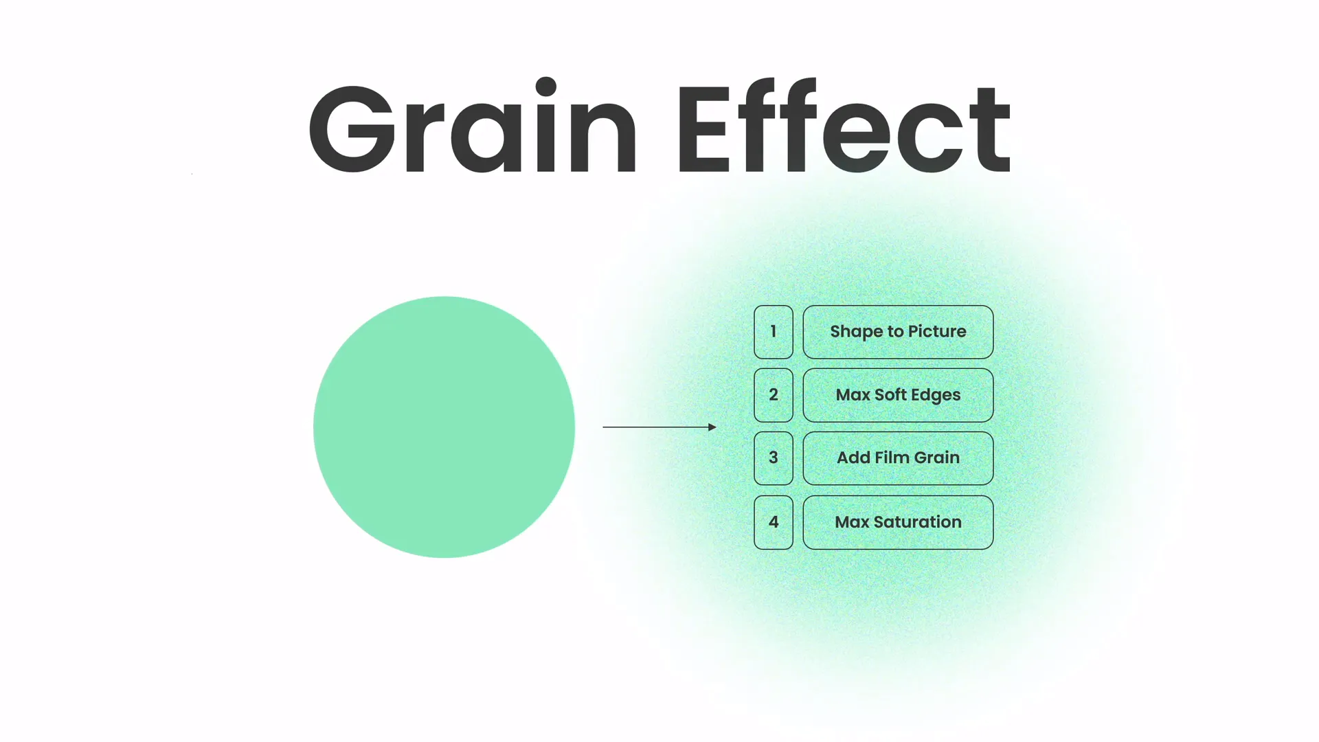
These techniques allow you to add a unique flair to your slides and help guide your audience’s focus.
Design Session Insights
One of the unique aspects of the original video is the live design session with background music, where the presenter designs the slide with minimal talking, giving viewers a chance to watch the process organically.
This approach offers valuable insights:
- Step-by-Step Design: Watching the live process helps you understand how to build a slide from an empty canvas to a finished product.
- Workflow Tips: You can see how the presenter arranges elements, tweaks colors, and adjusts typography in real-time.
- Creative Inspiration: The session inspires you to experiment with your own designs.
During this session, the presenter credits Unsplash.com for providing beautiful photos used in the slide, highlighting the importance of sourcing high-quality images to complement your design.
Watching such sessions can boost your confidence and creativity when designing your own slides.
Summary Table: Key PowerPoint Presentation Skills Covered
| Skill | Description | Benefits |
|---|---|---|
| Balanced Slide Layout | Arranging elements harmoniously using grids and whitespace | Creates professional look and improves readability |
| Modern Typography | Choosing clean fonts, proper sizes, and consistent styles | Enhances clarity and conveys tone |
| Harmonious Colors | Selecting palettes with contrast and meaning | Evokes emotions and creates visual cohesion |
| Creative Effects & Shapes | Using overlays, gradients, and custom shapes | Adds interest and guides audience focus |
| Live Design Practice | Watching and learning from real-time slide creation | Improves workflow and inspires creativity |
Frequently Asked Questions
What are the essential PowerPoint presentation skills to learn?
Essential skills include creating balanced slide layouts, choosing readable and modern typography, applying harmonious color schemes, adding visual effects and shapes thoughtfully, and practicing your design workflow. These skills help you create slides that look professional and support your message effectively.
How do I create a balanced slide layout in PowerPoint?
Use PowerPoint’s gridlines and guides to align elements evenly. Leave sufficient whitespace around text and images, maintain consistent margins, and arrange content to highlight the most important points. Aim for visual harmony between all slide elements.
Which fonts are best for PowerPoint slides?
Sans-serif fonts like Poppins, Helvetica, Arial, or Calibri (with caution) are great choices because they are clean and easy to read on screens. Limit yourself to one or two font families, and avoid decorative or script fonts for body text to maintain professionalism.
How can I use colors effectively in my slides?
Choose a limited color palette of 3-5 complementary colors. Use accent colors sparingly to highlight key points, ensure there is enough contrast between text and background for readability, and maintain consistent use of colors throughout your presentation to create cohesion.
Where can I get high-quality photos for my presentations?
Free stock photo websites like Unsplash offer beautiful, high-resolution images that you can use royalty-free to enhance your slides.
How can I improve my PowerPoint design workflow?
Watch live design sessions or tutorials to learn step-by-step processes. Practice duplicating slides to save time, use PowerPoint’s shape and formatting tools for customization, and experiment with typography and color until you find a style that works for you.
Conclusion
Mastering PowerPoint presentation skills is a journey that combines creativity, technique, and practice. By focusing on creating balanced layouts, selecting modern typography, applying harmonious colors, and adding creative effects, you can design slides that not only look professional but also communicate your message with clarity and impact.
The One Skill PPT tutorial provides a great example of how to approach slide design in a structured yet creative way. Watching the live design session can inspire you to develop your own workflow and style.
Remember, great presentations don’t just happen — they are crafted through thoughtful design and preparation. Use the tips and techniques covered in this article as a foundation, and keep experimenting to refine your PowerPoint presentation skills.
Thank you for reading! Stay inspired, and happy designing!