If you want to elevate your presentations and captivate your audience, mastering PowerPoint presentation skills is essential. Whether you’re preparing a pitch deck, educational slides, or business presentations, a well-designed slide can make all the difference. In this comprehensive guide, inspired by the creative process shared by One Skill PPT, you will learn how to design professional, modern, and visually appealing PowerPoint slides step-by-step.
From balancing layouts and choosing typography to working with colors and creating unique effects, this article covers everything you need to know to create slides that stand out. We also include practical tips, design principles, and resources to help you build your confidence and skill as a PowerPoint designer.
Table of Contents
- Getting Started: Slide Layouts and Balance
- Typography Techniques for Modern Slide Design
- Choosing and Applying Colors Effectively
- Creating the Green Effect and Adding Shapes
- Useful Resources and Image Credits
- Frequently Asked Questions (FAQ)
- Conclusion: Master Your PowerPoint Presentation Skills
Getting Started: Slide Layouts and Balance
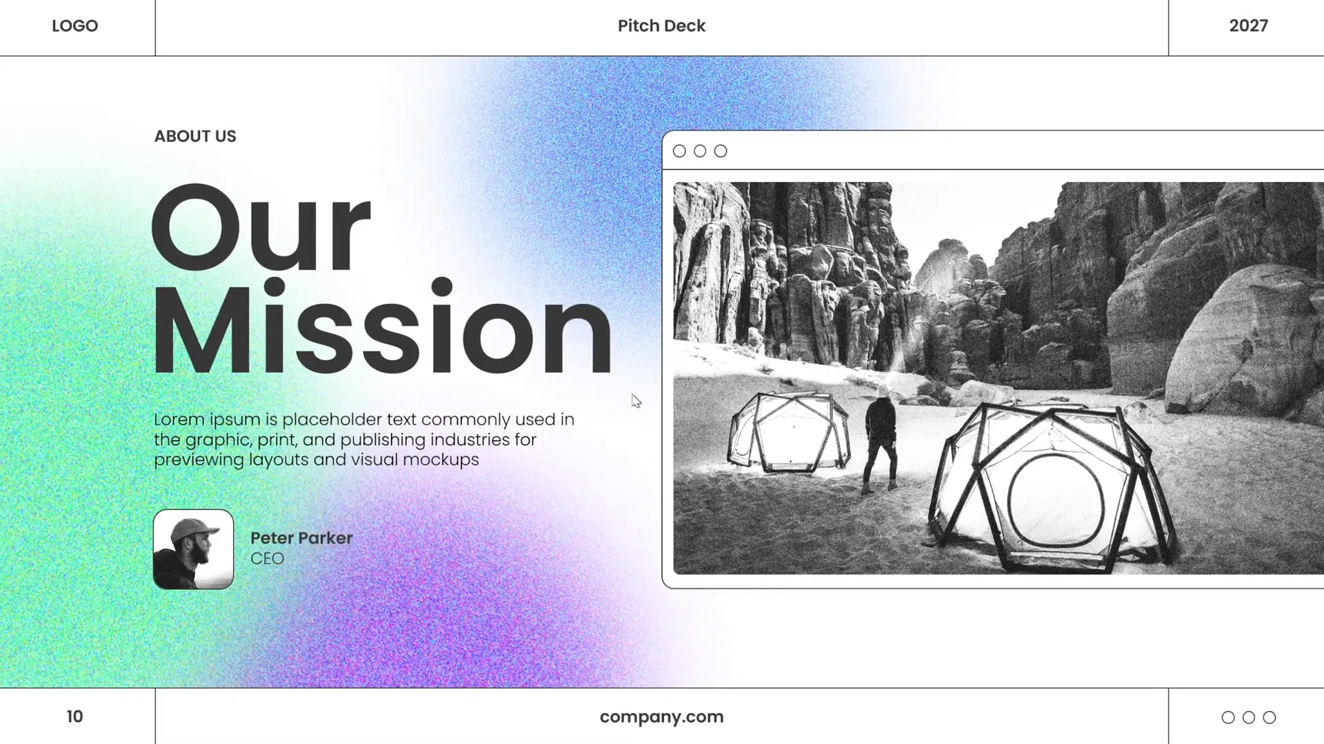
Designing a slide like a pro starts with understanding the importance of a well-balanced layout. A balanced slide ensures that the viewer’s eye flows naturally across the content without feeling overwhelmed or distracted. Here’s how to build that foundation:
1. Plan Your Slide Structure
Before adding content, visualize your slide as a composition of visual and textual elements. A balanced layout usually consists of:
- Title/Header: Clear and concise to introduce the slide topic.
- Main Content Area: Where your message, data, or visuals will go.
- Visual Elements: Photos, icons, shapes that complement the text.
- Whitespace: Essential negative space to avoid clutter and improve readability.
2. Use Grids and Guides
PowerPoint provides gridlines and guides to help align objects perfectly. To activate them:
- Go to the View tab.
- Check Guides and Gridlines.
These tools help you place text boxes, images, and shapes symmetrically, ensuring the slide looks professional and polished.
3. Create a Balanced Layout
Place your elements thoughtfully. For example, if you have an image on the right, balance it with text on the left. Avoid crowding all elements on one side. You want the slide to feel harmonious and easy on the eyes.
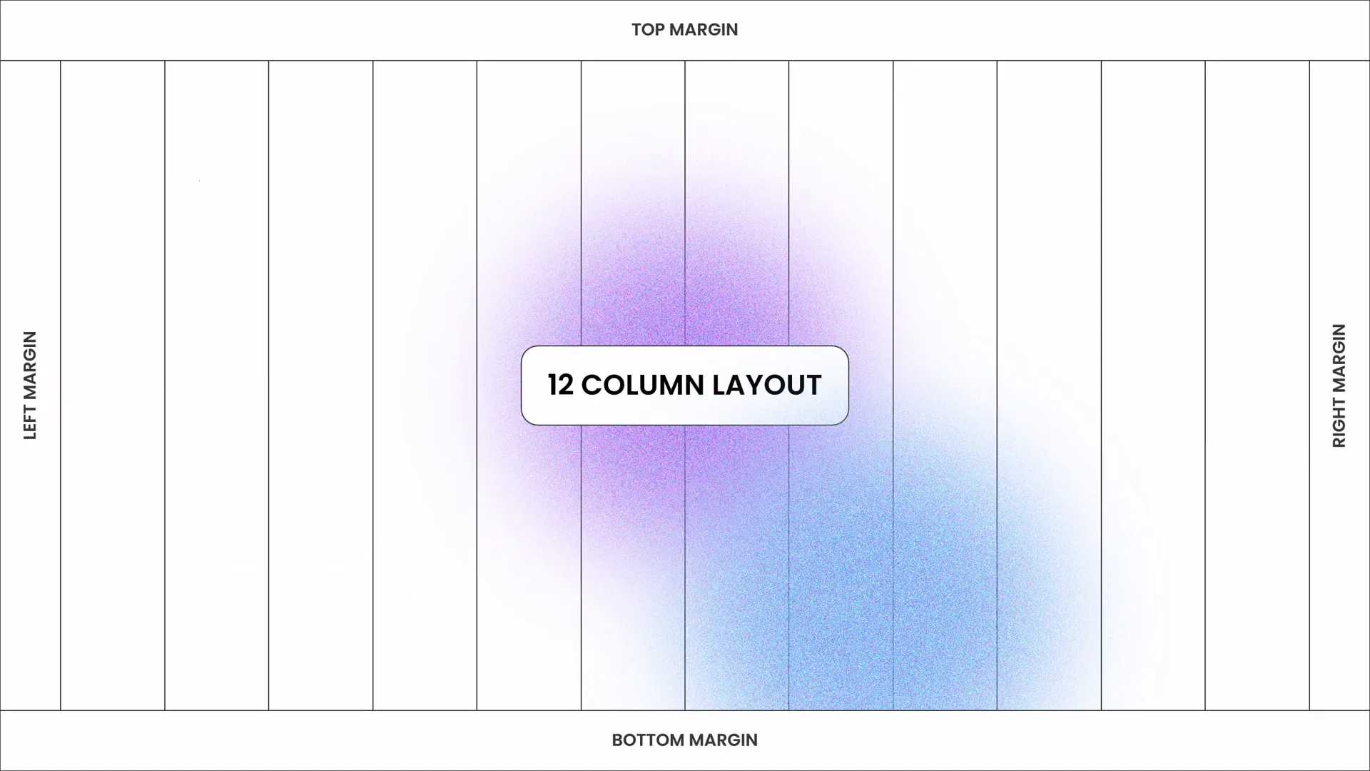
4. Use Consistent Margins and Padding
Keep consistent spacing between elements. This uniformity helps the slide look organized and deliberate. PowerPoint’s Align and Distribute commands are great for this:
- Select multiple objects.
- Click Arrange → Align or Distribute.
Typography Techniques for Modern Slide Design
Typography plays a critical role in how your message is perceived. It’s not just about choosing a font but about creating a visual hierarchy and readability that enhances your content.
1. Choose a Modern Typeface
One Skill PPT recommends using the Poppins font for its clean, modern look. It’s a sans-serif font that works well for presentations because it’s legible and stylish.
2. Establish a Clear Hierarchy
Use font size, weight, and color to distinguish between titles, subtitles, and body text. For example:
- Title: Larger font size, bold weight.
- Subtitle or Key Points: Moderate font size, semi-bold or regular.
- Body Text: Smaller font size, regular weight.
3. Limit Text Lines
Keep text concise. Avoid paragraphs longer than 6-8 lines or about 30 words per text box. This improves readability and keeps the audience focused.
4. Contrast Text and Background
Make sure your text color stands out against the background. For example, use white or light-colored text on dark backgrounds and dark text on light backgrounds.
5. Use Typography to Guide the Viewer’s Eye
Align text boxes consistently and use bullet points or numbered lists to break down information into digestible pieces.

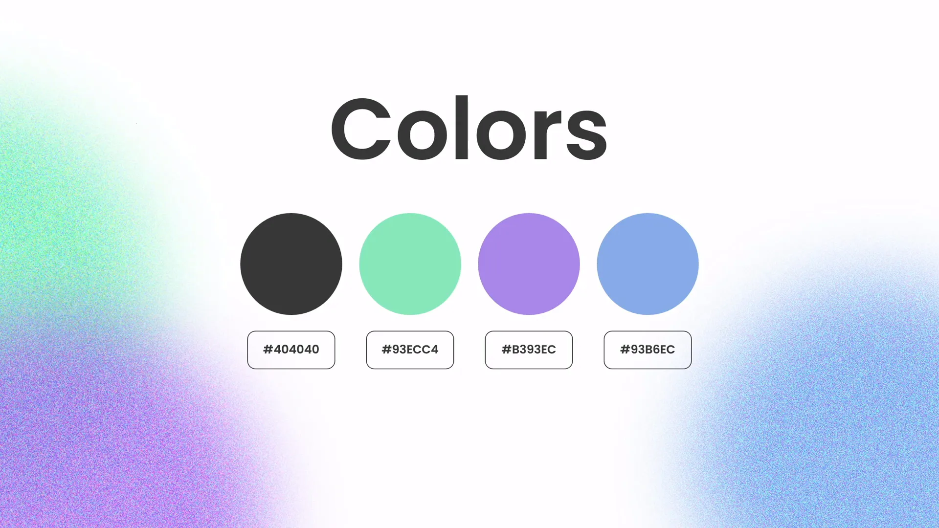
Choosing and Applying Colors Effectively
Colors set the tone of your presentation and can evoke emotional responses. Using a well-thought-out color palette is key to professional design.
1. Select a Cohesive Color Palette
One Skill PPT uses a set of beautiful colors thoughtfully chosen to complement each other. When selecting colors for your slides, consider:
- Brand Colors: If applicable, use your brand’s color scheme for consistency.
- Color Psychology: Different colors evoke different feelings (e.g., blue for trust, green for growth).
- Contrast: Use contrasting colors to make important elements pop.
2. Apply Colors Consistently
Use your palette consistently for backgrounds, text, shapes, and accents. This creates a unified and professional look.
3. Use Color to Highlight Key Points
Use a brighter or different color to emphasize important numbers, keywords, or data points.
4. Avoid Overuse of Colors
Too many colors on one slide can be distracting. Stick to 3-5 colors maximum per slide.
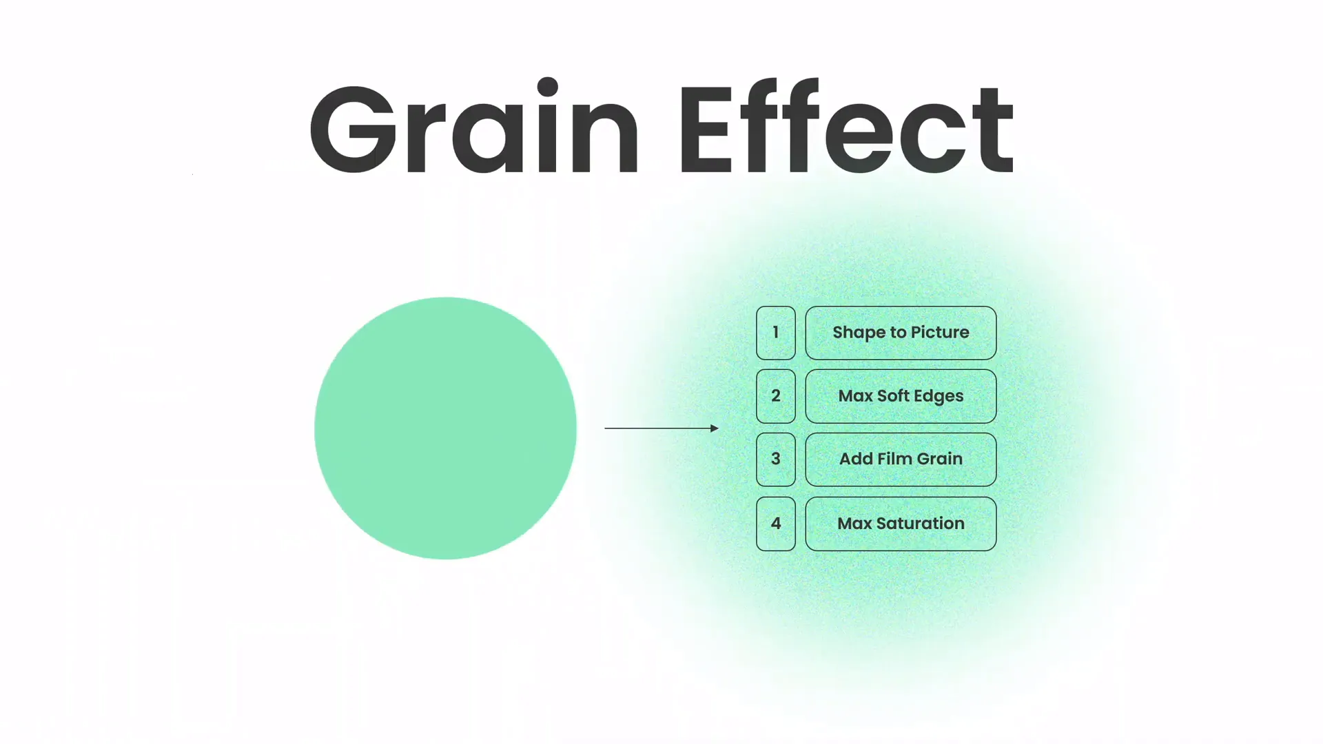
Creating the Green Effect and Adding Shapes
Adding effects and shapes can spice up your slides and make them more visually engaging. One Skill PPT demonstrates a unique “green effect” and the use of shapes to enhance the presentation.
1. The Green Effect in PowerPoint
The green effect adds a fresh, vibrant tone to your slide, making it stand out. Here’s how you can create a green effect:
- Add a semi-transparent green overlay on images or background shapes.
- Use gradient fills with various shades of green to add depth.
- Apply color correction or recolor effects on images to introduce a green hue.
2. Creating Custom Shapes
Shapes can be used to frame content, create visual interest, or separate sections on a slide. PowerPoint allows you to:
- Insert basic shapes such as rectangles, circles, or triangles.
- Use the Edit Points feature to create custom shapes.
- Merge shapes using the Merge Shapes tool for unique designs.
3. Positioning and Styling Shapes
Shapes should complement, not overpower, your content. Use subtle shadows, transparency, and fills to integrate them smoothly into the slide.
4. Combining Effects and Shapes
Apply the green effect to your shapes or images to create a cohesive look that ties the slide elements together.
Useful Resources and Image Credits
To create stunning slides, high-quality images and fonts are essential. One Skill PPT credits Unsplash for beautiful free photos used in their tutorial. Here are some resources to get you started:
| Resource | Description | Link |
|---|---|---|
| Unsplash | Free high-quality photos for presentations and design | unsplash.com |
| Poppins Font | Modern, clean sans-serif font ideal for presentations | Google Fonts |
| One Skill PPT Channel | PowerPoint tutorials and templates | YouTube Channel |
Consider exploring these resources to enhance your PowerPoint presentation skills further.

Frequently Asked Questions (FAQ)
Q1: How can I create a balanced slide layout in PowerPoint?
A: Use PowerPoint’s guides and gridlines to align elements symmetrically. Distribute text and images evenly, maintain consistent margins, and leave whitespace to avoid clutter.
Q2: What font should I use for a modern PowerPoint presentation?
A: Sans-serif fonts like Poppins, Helvetica, or Arial work well. They are clean, readable, and professional. Avoid overly decorative or script fonts for body text.
Q3: How do I choose colors for my presentation?
A: Pick a cohesive color palette with 3-5 colors. Use brand colors if available. Apply colors consistently and use contrast to highlight key points.
Q4: What is the “green effect” in PowerPoint?
A: It is a design technique that uses green color overlays, gradients, or image recoloring to add a fresh, vibrant look to your slides.
Q5: Where can I find free images for my slides?
A: Websites like Unsplash provide high-quality, royalty-free images that you can use in your presentations.
Q6: Can I create custom shapes in PowerPoint?
A: Yes, use the Edit Points feature and Merge Shapes tools to create unique shapes tailored to your slide design.
Conclusion: Master Your PowerPoint Presentation Skills
Developing strong PowerPoint presentation skills involves more than just knowing how to place text and images on a slide. It requires an understanding of design principles such as balance, typography, color theory, and the creative use of effects and shapes. Following the step-by-step techniques shared by One Skill PPT, you can transform ordinary slides into professional, engaging presentations that captivate your audience.
Remember these key takeaways:
- Balance your layout to create harmony and guide your viewer’s eye.
- Choose modern typography that enhances readability and reinforces your message.
- Use a consistent color palette to set the tone and emphasize key points.
- Incorporate effects and shapes thoughtfully to add visual interest.
- Leverage high-quality images from trusted sources like Unsplash.
With practice and attention to these details, your PowerPoint presentations will look polished, professional, and persuasive.
Happy designing!