If you’ve ever wondered how to elevate your PowerPoint presentation skills and create slides that look professional and visually stunning, you’re in the right place. Creating a powerful slide isn’t just about adding text and images; it’s about balancing layout, typography, color, and effects to deliver a compelling message with style. This article will guide you through an easy, step-by-step process to design a polished PowerPoint slide like a pro — all based on a practical tutorial from the One Skill PPT YouTube channel.
Whether you’re preparing a pitch deck, business presentation, or educational slide, mastering these design techniques will help you make a memorable impact on your audience. We’ll cover everything from slide layout and typography to color choices and visual effects, plus tips for creating beautiful shapes and adding flair to your slides.
Table of Contents
- Creating a Balanced Slide Layout
- Adding Beautiful Typography for a Modern Look
- Choosing and Applying Effective Colors
- How to Create a Green Effect to Spice Up Slides
- Designing Beautiful Shapes for Visual Appeal
- Resources and Tools Used
- Frequently Asked Questions
- Conclusion
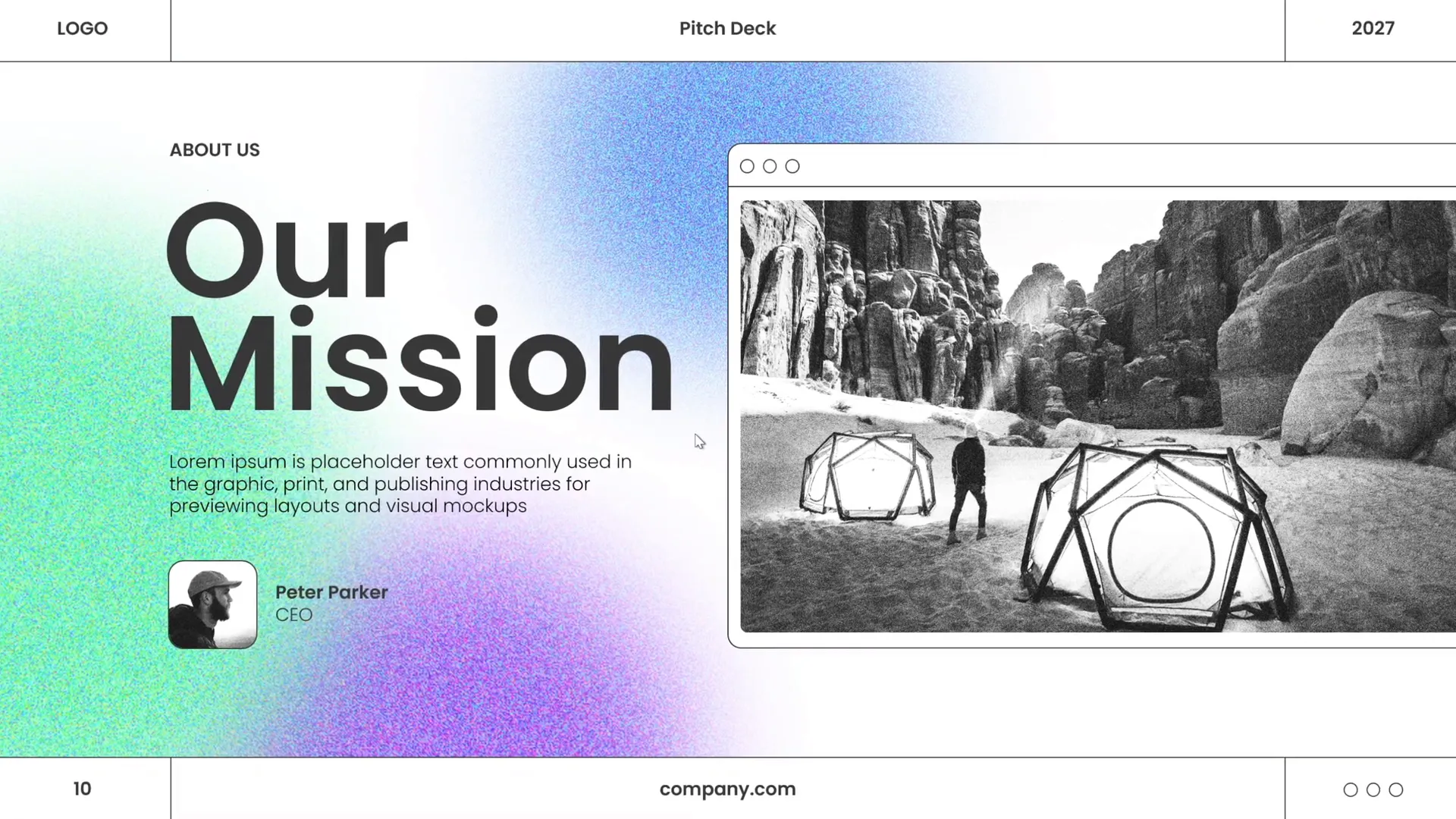
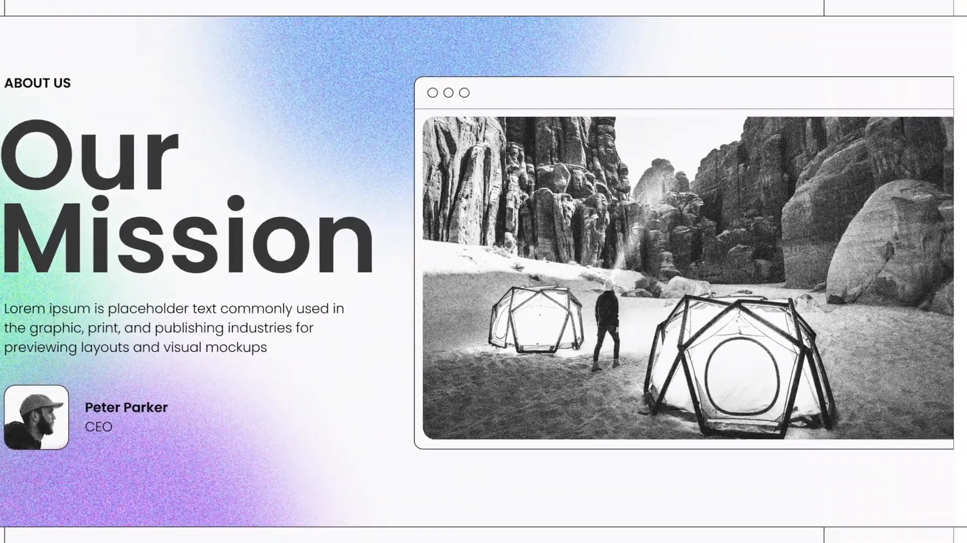
Creating a Balanced Slide Layout
One of the foundational skills in PowerPoint presentation design is mastering slide layout. A well-balanced layout ensures that all elements on the slide — text, images, and shapes — are harmoniously arranged to guide the viewer’s eye and communicate your message effectively.
Here’s how to approach creating a balanced slide layout:
- Start with a Blank Slide: Begin by clearing any default placeholders to have full control over your design.
- Divide Your Slide into Sections: Use guides or invisible grids to split the slide into logical zones. For example, you might dedicate the left side to text and the right side to an image.
- Align Elements Consistently: Use PowerPoint‘s alignment tools (Arrange > Align) to line up your objects precisely. Proper alignment improves professionalism and readability.
- Use White Space Effectively: Don’t overcrowd your slide. Leave breathing room around your text and images to avoid a cluttered look.
- Establish Visual Hierarchy: Position the most important elements prominently and use size and color contrasts to guide attention.
By following these principles, your slide layout will feel intentional and well-structured.
Pro Tip: Use PowerPoint Guides
Activate guides by right-clicking the slide background and selecting Grid and Guides. Drag guides to create columns or rows that help you position elements evenly.
Adding Beautiful Typography for a Modern Look
Typography plays a crucial role in setting the tone and readability of your presentation. Choosing the right fonts and arranging text thoughtfully can transform a plain slide into a sleek, modern design.
Here are some tips to enhance your slide typography:
- Choose Clean, Sans-Serif Fonts: Fonts like Poppins (used in the tutorial) are modern and easy to read, making them perfect for presentations.
- Limit Font Variations: Stick to one or two fonts max — one for headings and one for body text — to maintain cohesion.
- Use Font Sizes to Establish Hierarchy: Make headings larger and bolder; keep supporting text smaller but legible (minimum 24 pt recommended).
- Keep Text Minimal: Avoid long paragraphs. Use concise bullet points or short phrases to keep your audience engaged.
- Use Contrast for Readability: Ensure your text color contrasts well with the background for easy reading.
Applying these typography principles will give your slides a polished and professional feel.

Typography Best Practices
| Tip | Why It Matters | Example |
|---|---|---|
| Use Sans-Serif Fonts | Improves readability on screens | Poppins, Arial, Helvetica |
| Limit Fonts | Maintains visual consistency | One font for headers, one for body |
| Font Size Hierarchy | Guides viewer attention | Headings: 36-44 pt, Body: 24-28 pt |
| Short Text | Prevents overwhelming the audience | Bullet points, keywords |
| High Contrast | Ensures text is legible | Dark text on light background |
Choosing and Applying Effective Colors
Color is a powerful tool in PowerPoint presentation skills. It can evoke emotions, highlight key points, and unify your slide design. In the tutorial, a carefully selected color palette was used to create an appealing and modern look.
When selecting colors for your slides, consider these guidelines:
- Use a Limited Color Palette: Stick to 3-5 colors to avoid visual chaos. This includes a primary color, secondary colors, and neutrals.
- Choose Colors with Purpose: Use colors to differentiate sections, emphasize important content, or convey brand identity.
- Consider Color Psychology: Colors like green can signal growth and calmness, while red can denote urgency or passion.
- Ensure Accessibility: Check color contrast to make sure text and graphics are readable for all viewers, including those with color blindness.
In the video, the presenter used a harmonious set of colors to add vibrancy without overwhelming the slide.
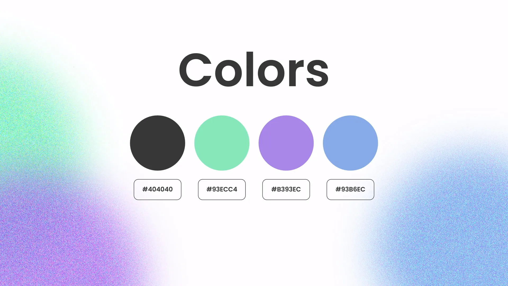
How to Apply Colors in PowerPoint
- Open the Design tab and select Variants to customize colors.
- Click Colors > Customize Colors to create a custom palette.
- Apply your palette consistently across all slides for a professional look.
- Use the Eyedropper Tool to pick colors from images or logos to maintain brand consistency.
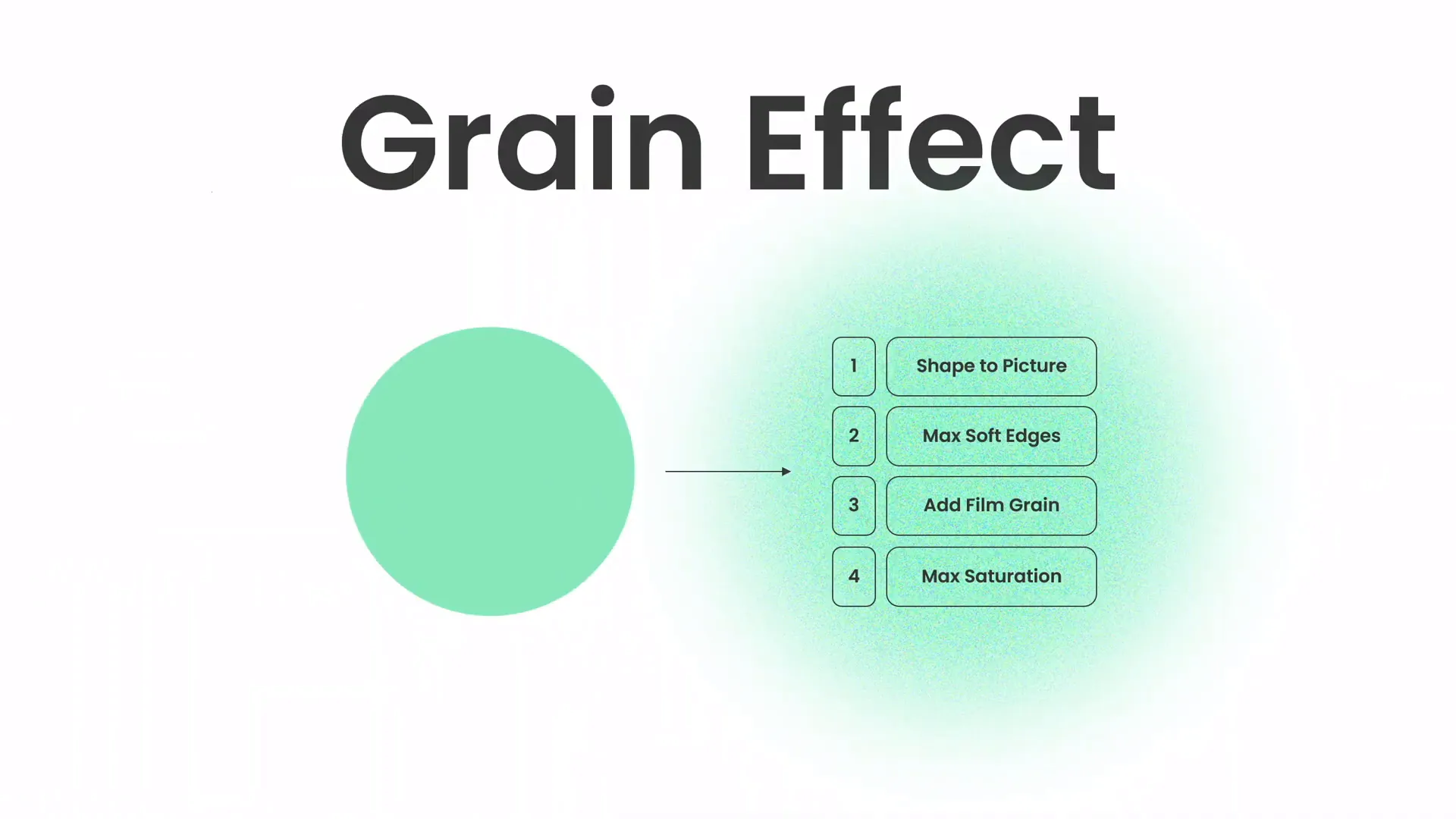
How to Create a Green Effect to Spice Up Slides
One exciting tip from the tutorial is how to create a green effect in PowerPoint to add visual interest and freshness to your slides. This effect can make your presentation pop and hold your audience’s attention.
Here’s a breakdown of how to create this effect:
- Insert an Image: Start by adding a high-quality photo to your slide.
- Add a Shape Overlay: Draw a rectangle or other shape over the image.
- Apply Green Fill: Fill the shape with a green color from your palette.
- Adjust Transparency: Set the shape’s transparency so the image is visible beneath the green overlay.
- Use Blend Modes: If available, try different blend modes like Multiply or Overlay (PowerPoint has limited options, but transparency works well).
This green overlay effect adds a modern, stylish touch that makes images and text stand out.
Why Use the Green Effect?
- Enhances visual appeal without distracting from content
- Creates a consistent color theme
- Helps text placed over images remain readable
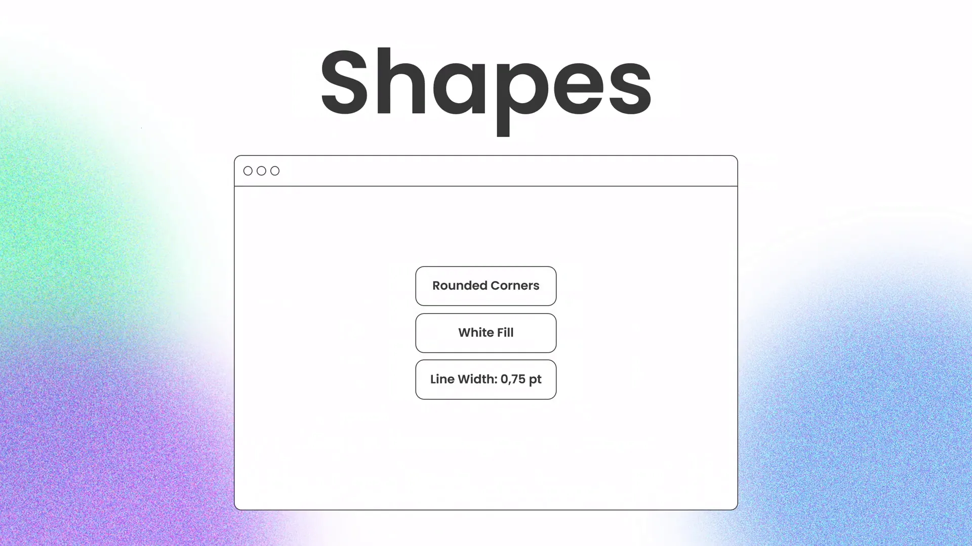
Designing Beautiful Shapes for Visual Appeal
Shapes are often overlooked in PowerPoint presentation skills, but they’re incredibly useful for adding structure, emphasis, and creativity to your slides.
In the tutorial, the presenter showed how to create custom shapes to complement the slide design and make it more visually engaging. Here’s how you can do the same:
- Insert Basic Shapes: Use the Insert > Shapes menu to add rectangles, circles, or triangles.
- Edit Points: Right-click a shape and select Edit Points to customize its contours and create unique forms.
- Combine Shapes: Use the Merge Shapes feature under the Shape Format tab to unite, subtract, or intersect shapes for custom designs.
- Apply Effects: Add shadows, gradients, or outlines via Format Shape to give depth and polish.
- Use Shapes as Frames or Highlights: Place shapes behind or around text and images to guide focus and create contrast.
These techniques help create slides that look thoughtfully designed rather than thrown together.
Shape Customization Tips
| Feature | Description | Use Case |
|---|---|---|
| Edit Points | Modify individual vertices of a shape | Create unique shapes that fit your layout |
| Merge Shapes | Combine two or more shapes | Design custom icons or frames |
| Format Shape | Adjust fill, outline, and effects | Add depth and style |
Resources and Tools Used
To create professional-looking slides, using the right resources and tools can save time and elevate your design. Here are some valuable assets mentioned in the tutorial:
- Photos: Unsplash.com — A great source of free, high-quality images for presentations.
- Fonts: Poppins — A clean, modern sans-serif font perfect for PowerPoint.
- Music: Background music used in the tutorial is from Artlist, ideal for slide design sessions.
- PowerPoint Templates: Various recommended templates for pitch decks and business presentations can be found on marketplaces like Envato.
Leveraging these resources can streamline your workflow and help you create slides that look professional and polished.
Frequently Asked Questions
How can I create a balanced layout in PowerPoint?
Use guides to divide your slide into sections, align elements consistently, and leave enough white space. Avoid clutter by focusing on one main idea per slide.
What fonts should I use for professional presentations?
Choose clean, sans-serif fonts like Poppins, Arial, or Helvetica. Limit yourself to 1-2 fonts to maintain consistency and avoid distraction.
How do I apply a color palette effectively?
Pick 3-5 complementary colors, including a primary color and neutrals. Use these colors consistently for text, shapes, and backgrounds to create a cohesive look.
What is the green effect in PowerPoint, and how do I create it?
The green effect is a semi-transparent green overlay placed over images to add style and make text readable. Create it by adding a shape over your image, filling it with green, and adjusting transparency.
How do I create custom shapes in PowerPoint?
Insert basic shapes, then right-click and select “Edit Points” to modify their form. Use “Merge Shapes” to combine or subtract shapes for unique designs.
Where can I find free images and fonts for my presentations?
Unsplash.com offers free high-quality images, and Google Fonts provides a wide range of free fonts suitable for presentations.
Conclusion
Mastering PowerPoint presentation skills is essential for creating slides that not only look professional but also communicate your message clearly and memorably. By focusing on a balanced layout, beautiful typography, effective color choices, creative visual effects like the green overlay, and custom shapes, you can design slides that captivate your audience and boost your confidence as a presenter.
The tutorial from One Skill PPT offers an excellent practical example of how to put these principles into action, and I highly recommend following along with it to sharpen your design skills.
Remember, great slide design combines both creativity and discipline. Keep experimenting with layouts, fonts, colors, and shapes, but always aim for clarity and simplicity. With practice, your PowerPoint presentation skills will elevate your presentations to the next level.
Thank you for reading, and happy designing!