

If you want to elevate your presentations and master Powerpoint presentation skills, you’re in the right place. Designing professional, visually appealing slides is a crucial part of delivering an impactful presentation. In this article, we’ll walk you through a step-by-step guide on how to design a stunning PowerPoint slide like a pro, focusing on layout, typography, colors, and creative effects — all inspired by the expert tips from the One Skill PPT YouTube tutorial.
Whether you’re preparing a pitch deck, business presentation, or an educational slideshow, these design techniques will help you create well-balanced, modern, and visually captivating slides. Let’s dive into the details!
Table of Contents
- Creating a Balanced Slide Layout
- Choosing Modern Typography
- Applying Beautiful Color Schemes
- Adding Creative Green Effects and Shapes
- Leveraging Free Resources for Images
- Design Session Tips for PowerPoint
- Frequently Asked Questions (FAQ)
- Conclusion
Creating a Balanced Slide Layout
The foundation of any professional PowerPoint presentation lies in a well-structured and balanced slide layout. When your slide elements are thoughtfully arranged, your audience can easily focus on the key messages without distraction.
Key Principles for Balanced Layouts:
- Visual Hierarchy: Arrange elements so that the most important information stands out, guiding the viewer’s eye naturally.
- Whitespace: Use sufficient spacing between elements to avoid clutter and give your content room to breathe.
- Alignment: Ensure text, images, and shapes are aligned consistently for a clean, polished look.
- Proportions: Balance the size of images and text blocks so no single part overpowers the slide.
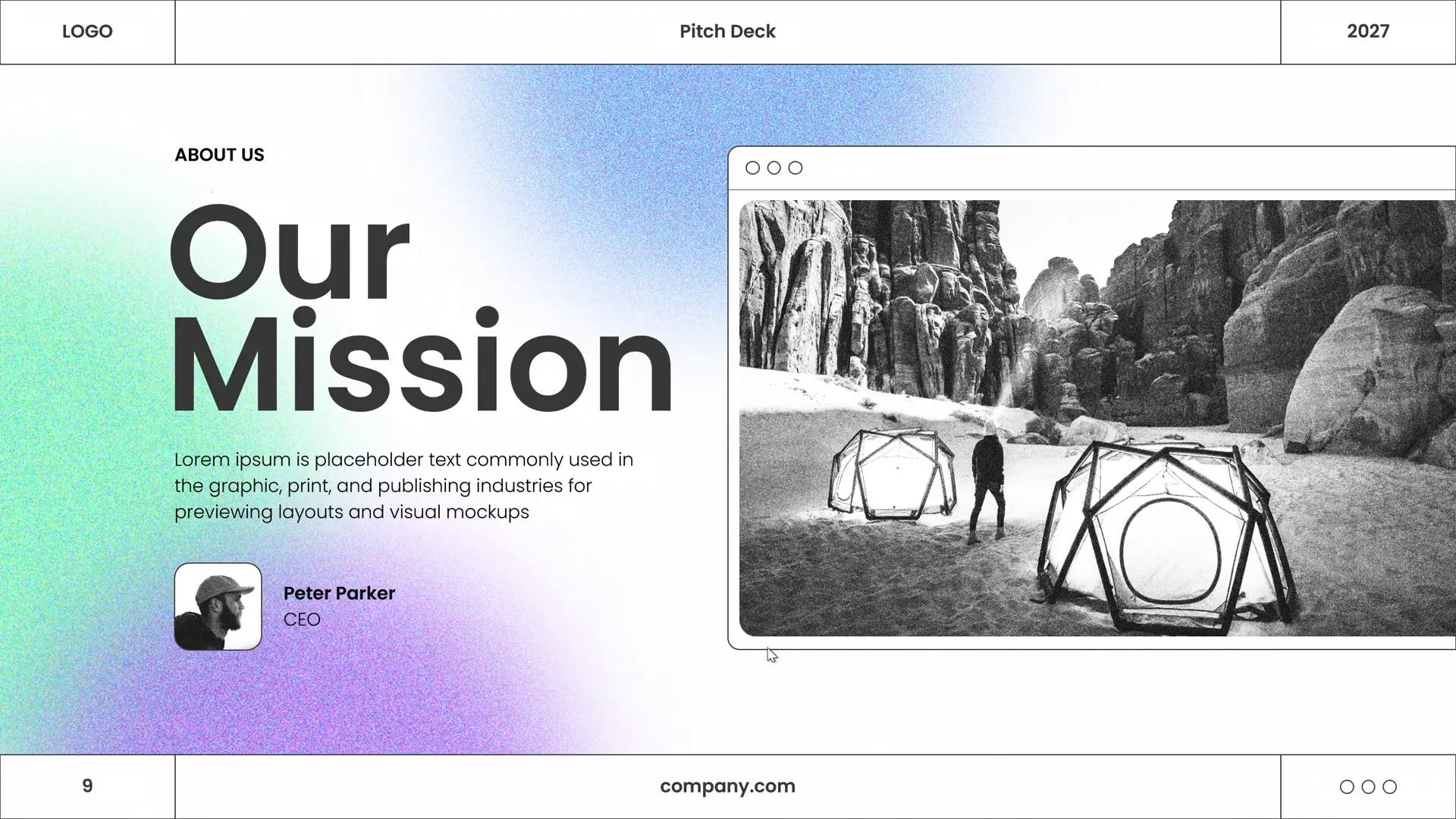
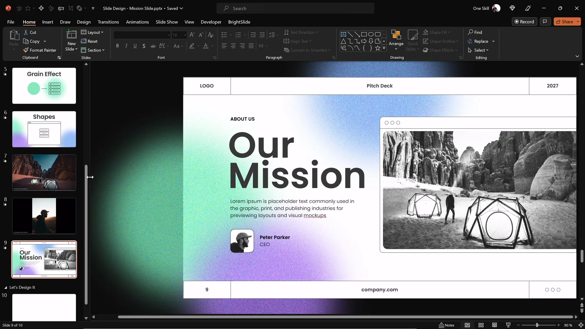
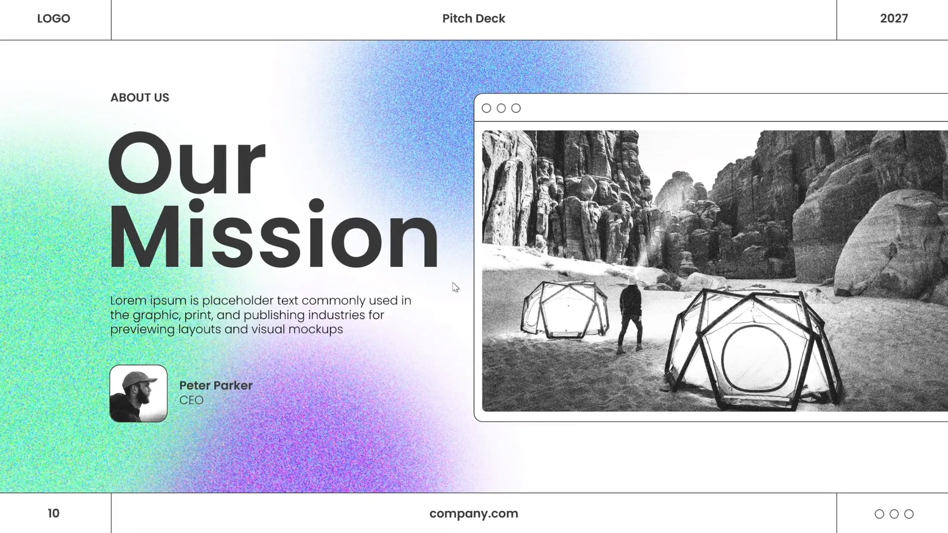
In the tutorial, the presenter demonstrates how to create a layout that balances visual elements harmoniously. Starting with a blank slide, the process involves:
- Dividing the slide space logically, often using grids or guides.
- Positioning the main image or focal point on one side.
- Adding text blocks or headlines on the opposite side, ensuring they don’t crowd the image.
- Using simple shapes to frame or highlight areas without overwhelming the slide.
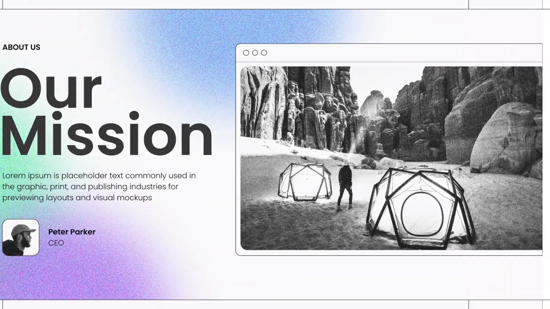
Pro Tip: Use PowerPoint’s built-in gridlines and guides (View > Grid and Guides) to help align your objects perfectly. This ensures your slide looks professional and clean.
Choosing Modern Typography
Typography plays a vital role in how your audience perceives your presentation. The right font choice can convey professionalism, clarity, and style.
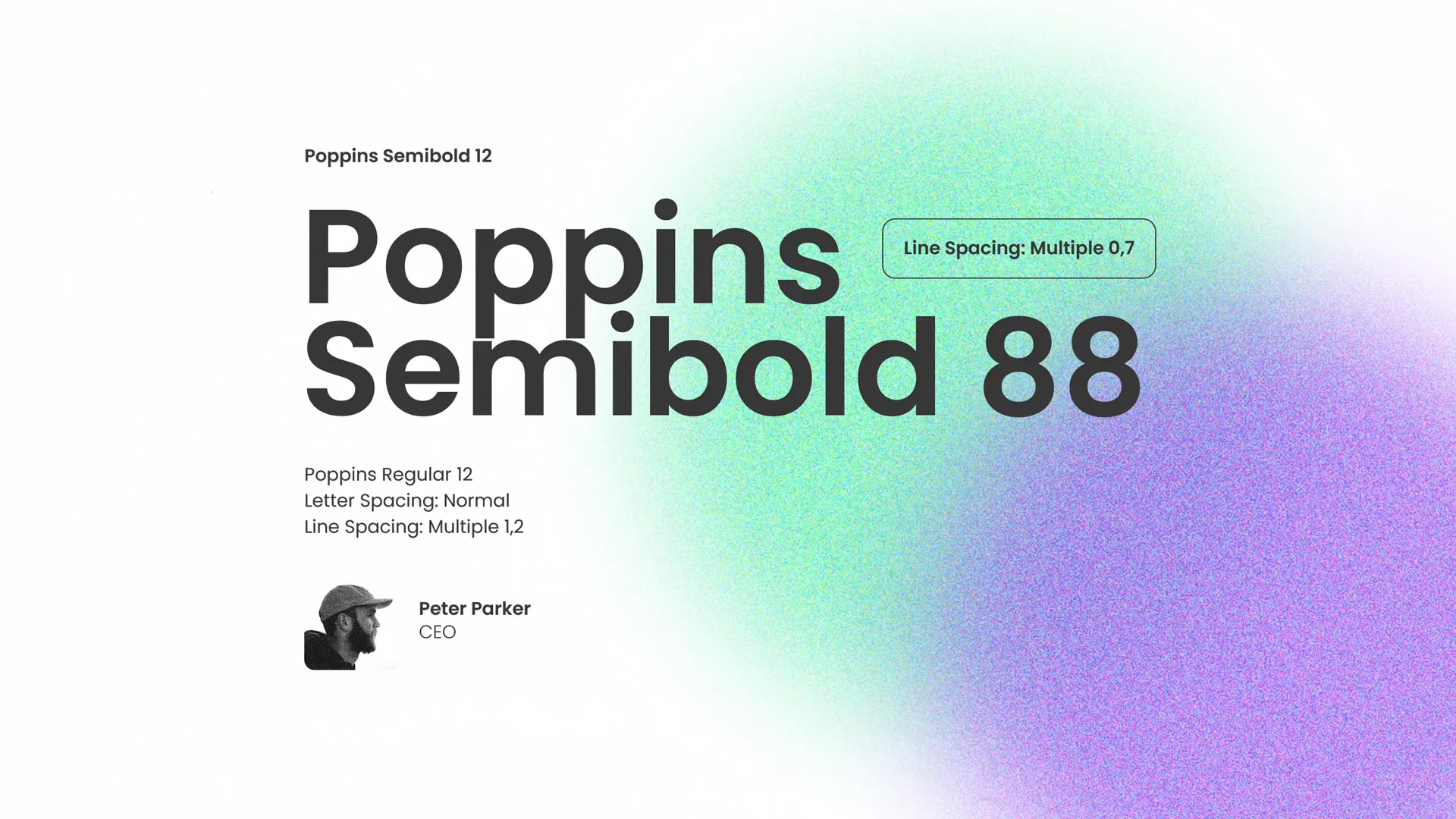
In the video, the presenter emphasizes adding beautiful typography to create a modern look. Here are some guidelines to help you choose and apply typography effectively:
- Font Choice: Opt for clean, sans-serif fonts like Poppins (used in the video), which are readable and contemporary.
- Font Size: Make sure your headings are large enough to command attention (typically 36-44 pt), and body text is legible (24-28 pt minimum).
- Font Weight: Use bold weights for titles and lighter weights for supporting text to create contrast.
- Consistency: Use no more than two complementary fonts throughout your presentation to maintain cohesion.
- Line Spacing: Ensure sufficient line height to improve readability, especially for paragraphs.
Applying these principles results in slides that feel modern and easy to read, enhancing your message delivery.
Applying Beautiful Color Schemes
Colors greatly influence the mood and professionalism of your presentation. A well-chosen color palette can unify your slides and reinforce your brand or message.
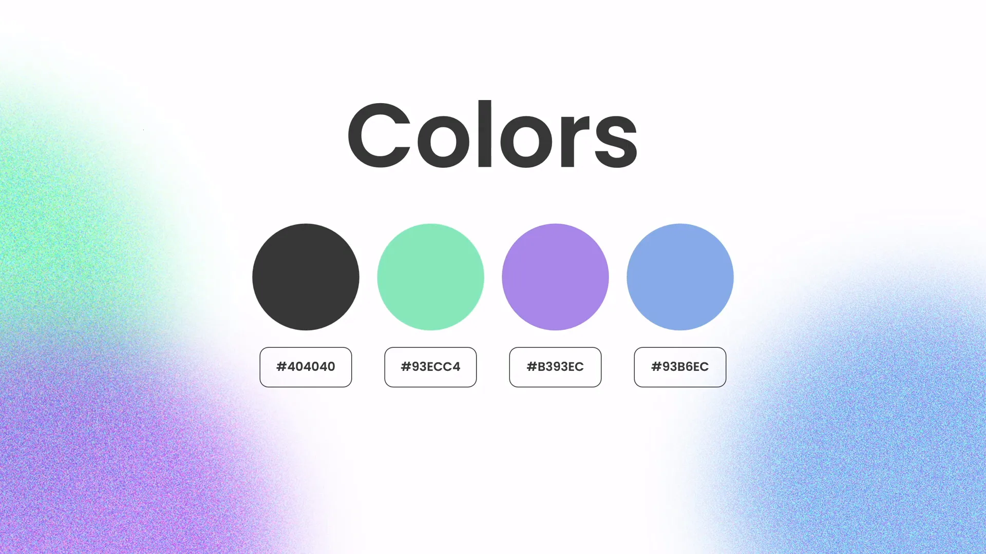
The tutorial highlights the use of beautiful colors — carefully selected hues that complement each other and the content. Here’s how to apply effective color schemes in PowerPoint:
- Choose a Palette: Select 3-5 colors that work well together. This often includes a dominant color, one or two accent colors, and neutral shades.
- Use Brand Colors: If you’re presenting on behalf of a company, incorporate brand colors for consistency and recognition.
- Contrast: Ensure sufficient contrast between text and background for readability. Dark text on a light background or vice versa usually works best.
- Accent Elements: Use accent colors sparingly to highlight key points or call-to-action areas.
- Color Psychology: Consider the emotional impact of colors — green evokes growth and calm, blue suggests trust, red signals urgency or passion.
In the video, the presenter uses a beautiful color palette that includes green tones, which not only looks fresh but also ties into the creative green effect added later.
Adding Creative Green Effects and Shapes
To make your slides stand out, creative effects and shapes are excellent tools to add visual interest and reinforce your message without overcrowding the slide.
The presenter demonstrates how to create a green effect in PowerPoint that spices up the slides. This effect involves layering shapes with gradients or transparencies to add depth and a modern feel.
Here’s how you can add similar creative effects:
- Create Shapes: Use PowerPoint’s shape tools (Insert > Shapes) to add rectangles, circles, or custom shapes to your slide.
- Apply Fill Effects: Fill shapes with colors from your palette, and experiment with gradients or transparency to achieve a subtle overlay.
- Layer Shapes: Stack shapes strategically behind or in front of images and text to frame content or add emphasis.
- Use Shape Effects: Add shadows, reflections, or soft edges to enhance the 3D look.
These techniques make your slides more dynamic and visually appealing, helping to keep your audience engaged.

Leveraging Free Resources for Images
High-quality images can transform a slide, making it more engaging and professional. However, sourcing great images can be challenging.
Thankfully, the tutorial credits Unsplash.com for providing free, beautiful photos used in the video. This is a fantastic resource for finding royalty-free images that elevate your presentation.
Tips for Using Images in PowerPoint:
- Choose Relevant Images: Ensure images relate to your content and support your message rather than distract.
- High Resolution: Use high-resolution images to avoid pixelation on large screens.
- Consistent Style: Stick to images with a similar style or color tone for a cohesive look.
- Proper Placement: Position images to balance text and other elements, often on one side of the slide.
- Optimize Size: Compress images in PowerPoint to reduce file size without sacrificing quality (File > Info > Compress Pictures).
Design Session Tips for PowerPoint
One unique aspect of the tutorial is the interactive design session, where the presenter switches to background music and demonstrates the slide design process in real-time with minimal talking.
This approach can inspire you to try a similar workflow — focusing on creating and experimenting with design elements in a relaxed, uninterrupted manner. Here are some tips to maximize your design sessions:
- Start with a Plan: Outline your slide’s purpose and key content before designing.
- Use Background Music: Playing music can boost creativity and keep you in flow.
- Iterate Quickly: Don’t be afraid to try different layouts, colors, or fonts and adjust as you go.
- Pause and Review: Step back regularly to assess balance and clarity.
- Save Versions: Keep multiple versions of your slide to experiment with variations.
By dedicating focused design sessions, you’ll improve your Powerpoint presentation skills and create professional slides efficiently.
Frequently Asked Questions (FAQ)
1. What are the essential Powerpoint presentation skills for beginners?
Essential skills include understanding slide layout, choosing readable fonts, applying a consistent color scheme, inserting and formatting images, and using basic shapes and effects to enhance visual appeal. Practicing these fundamentals builds a strong foundation.
2. How can I balance images and text on a PowerPoint slide?
Divide your slide space logically, placing images and text in separate zones. Use guides and grids to align elements, and ensure whitespace exists between objects. Avoid overcrowding by limiting text and making images large enough to be impactful.
3. Where can I find free images for my presentations?
Websites like Unsplash, Pexels, and Pixabay offer free, high-quality images that you can use legally in your presentations.
4. How do I create custom shapes and effects in PowerPoint?
Use the “Insert > Shapes” menu to add shapes, then right-click and choose “Edit Points” for custom adjustments. Apply gradients, transparency, and layering to create effects. PowerPoint’s “Format Shape” pane provides advanced options for shadows, reflections, and fills.
5. What font styles work best for professional presentations?
Clean sans-serif fonts like Poppins, Arial, Helvetica, and Calibri are ideal for readability and modern aesthetics. Avoid overly decorative or script fonts that can reduce legibility.
6. How can I make my PowerPoint slides more engaging?
Use a combination of balanced layouts, appealing typography, vibrant color schemes, high-quality images, and subtle effects to draw attention. Incorporate multimedia like videos or GIFs when appropriate, and keep slides uncluttered.
7. Can I embed fonts and images to avoid display issues on other computers?
Yes, you can embed fonts in PowerPoint (File > Options > Save > Embed fonts) to ensure consistency across devices. Compress and embed images properly to maintain quality and reduce file size.
8. How long should I spend designing each slide?
It depends on the slide’s complexity and purpose. Simple slides might take 10-15 minutes, while more intricate designs require longer. Efficiency improves with practice, so consider using templates and duplicating slides to save time.
Conclusion
Mastering Powerpoint presentation skills is a combination of understanding design principles, leveraging PowerPoint’s tools, and practicing your creative process. By focusing on creating balanced layouts, choosing modern typography, applying beautiful color schemes, and adding creative effects like the green overlay demonstrated in the tutorial, you can craft slides that look professional and engage your audience.
Remember to source high-quality images from free platforms like Unsplash to enhance your visual storytelling. Don’t hesitate to experiment with shapes, layering, and font styles to make your slides uniquely yours.
As you build your skills, consider setting aside dedicated design sessions with minimal distractions, as shown in the video, to foster creativity and productivity.
Congratulations! You’re now equipped with actionable tips to design stunning PowerPoint slides like a pro. Keep practicing, stay inspired, and your presentations will continue to impress and captivate.
Thank you for exploring these Powerpoint presentation skills with us. Stay happy, stay healthy, and happy designing!
Credits: This article is based on the expert tutorial by One Skill PPT on YouTube, who generously shares their knowledge and resources, including free images via Unsplash. Check out their channel for more PowerPoint design inspiration and tutorials: One Skill PPT YouTube Channel.


