
If you’re looking to elevate your PowerPoint presentation skills and create slides that look polished, modern, and balanced, you’re in the right place. Designing an effective PowerPoint slide is both an art and a science — it requires a good sense of layout, typography, color, and visual hierarchy. In this comprehensive guide, I’ll walk you through how to design a beautiful, professional slide from scratch, step by step.
Whether you’re preparing a pitch deck, business presentation, or educational deck, mastering these design techniques will help you communicate your message more clearly and impress your audience with your visual storytelling.
Let’s dive in and explore the essential elements of professional slide design, including layout balance, typography choices, color schemes, and creative effects you can easily implement in PowerPoint.
Table of Contents
- Creating a Balanced Slide Layout
- Adding Beautiful Typography for a Modern Look
- Choosing and Applying a Cohesive Color Palette
- Creating a Green Effect to Spice Up Your Slides
- Designing Beautiful Shapes for Visual Appeal
- Using High-Quality Images from Unsplash
- Frequently Asked Questions About PowerPoint Presentation Skills
- Conclusion: Master Your PowerPoint Presentation Skills
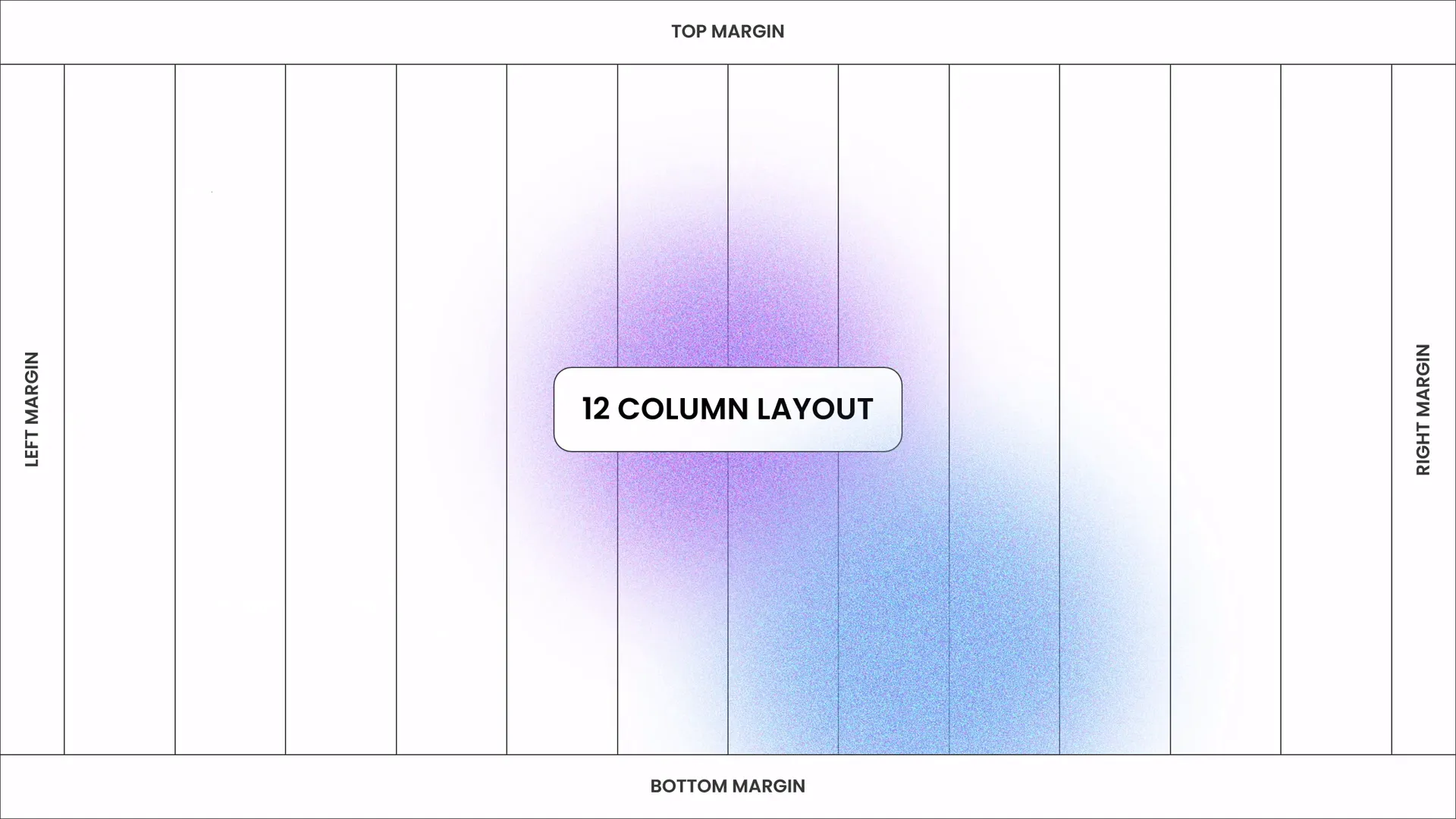
Creating a Balanced Slide Layout
The foundation of any great slide is its layout. A well-balanced design ensures that every element on the slide feels intentional, organized, and easy to follow. Poorly arranged content can confuse your audience and dilute your message.
Here’s a step-by-step approach to designing a balanced slide layout like a pro:
1. Define Your Slide Structure
Start by deciding how many elements you want on your slide and their relative importance. Common slide elements include:
- Title or headline
- Supporting text or bullet points
- Images or icons
- Shapes and graphical accents
Organize these elements logically—your title should be prominent, followed by supporting details and visuals.
2. Use Grids and Guides
PowerPoint offers gridlines and alignment guides that allow you to place objects precisely. Utilize these to align your text boxes, images, and shapes consistently. This creates a clean and professional look.
3. Maintain Adequate White Space
Don’t overcrowd your slide. White space (or negative space) is crucial as it helps separate different elements, making your content easier to read and visually appealing.
4. Balance Visual Weight
Try to balance heavier elements (like large images or bold text) with lighter ones (like smaller icons or subtle shapes). This prevents one side of your slide from feeling heavier or cluttered.
5. Consider the Visual Flow
Arrange elements so the viewer’s eye naturally flows from the most important part of the slide to the least. Usually, this is top-to-bottom and left-to-right, but you can create unique flows depending on your content.
Adding Beautiful Typography for a Modern Look
Typography plays a vital role in communicating your message clearly and establishing a modern aesthetic. Here’s how to choose and apply typography effectively in your slides:
1. Select the Right Font
Choose clean, sans-serif fonts for a contemporary feel. In this example, the Poppins font is used, which is geometric, friendly, and highly readable.
2. Use Hierarchy to Guide Attention
Differentiate titles, subtitles, and body text by using size, weight, or color variations:
- Title: Large, bold, and attention-grabbing
- Subtitle or headings: Medium size, semi-bold
- Body text: Smaller size, regular weight
3. Limit Font Variations
Stick to one or two complementary fonts to keep the design cohesive and professional. Avoid using too many font styles or sizes.
4. Pay Attention to Spacing
Adjust line spacing (leading) and letter spacing (tracking) to improve readability and aesthetics. Proper spacing prevents your text from looking cramped or too loose.
5. Keep Text Concise
Limit the amount of text on each slide. Aim for no more than 6-8 lines or 30 words per slide. This keeps your audience focused and prevents overwhelming them.

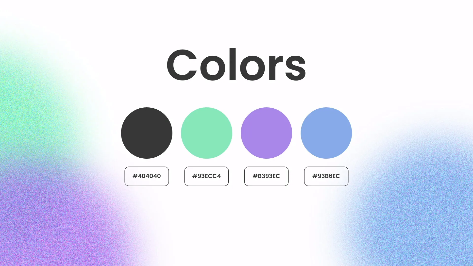
Choosing and Applying a Cohesive Color Palette
Color is a powerful tool that can unify your slide design and evoke emotions. Using a well-chosen color palette helps make your presentation visually appealing and memorable.
1. Pick Your Primary Colors
Start with 2-3 main colors that reflect your brand or the tone of your presentation. In this example, a palette of fresh, vibrant colors is used to create energy and modernity.
2. Use Color to Create Hierarchy
Apply your primary color to important elements like titles or call-to-action text, and use complementary or neutral colors for secondary content.
3. Balance Bright and Neutral Tones
Bright colors can draw attention but should be balanced with neutral tones (like white, gray, or black) to avoid visual overload.
4. Test for Accessibility
Make sure your color combinations have enough contrast to be easily readable by all audience members, including those with color vision deficiencies.
5. Apply Colors Consistently
Maintain color consistency throughout your presentation to help your audience follow along and recognize recurring themes.
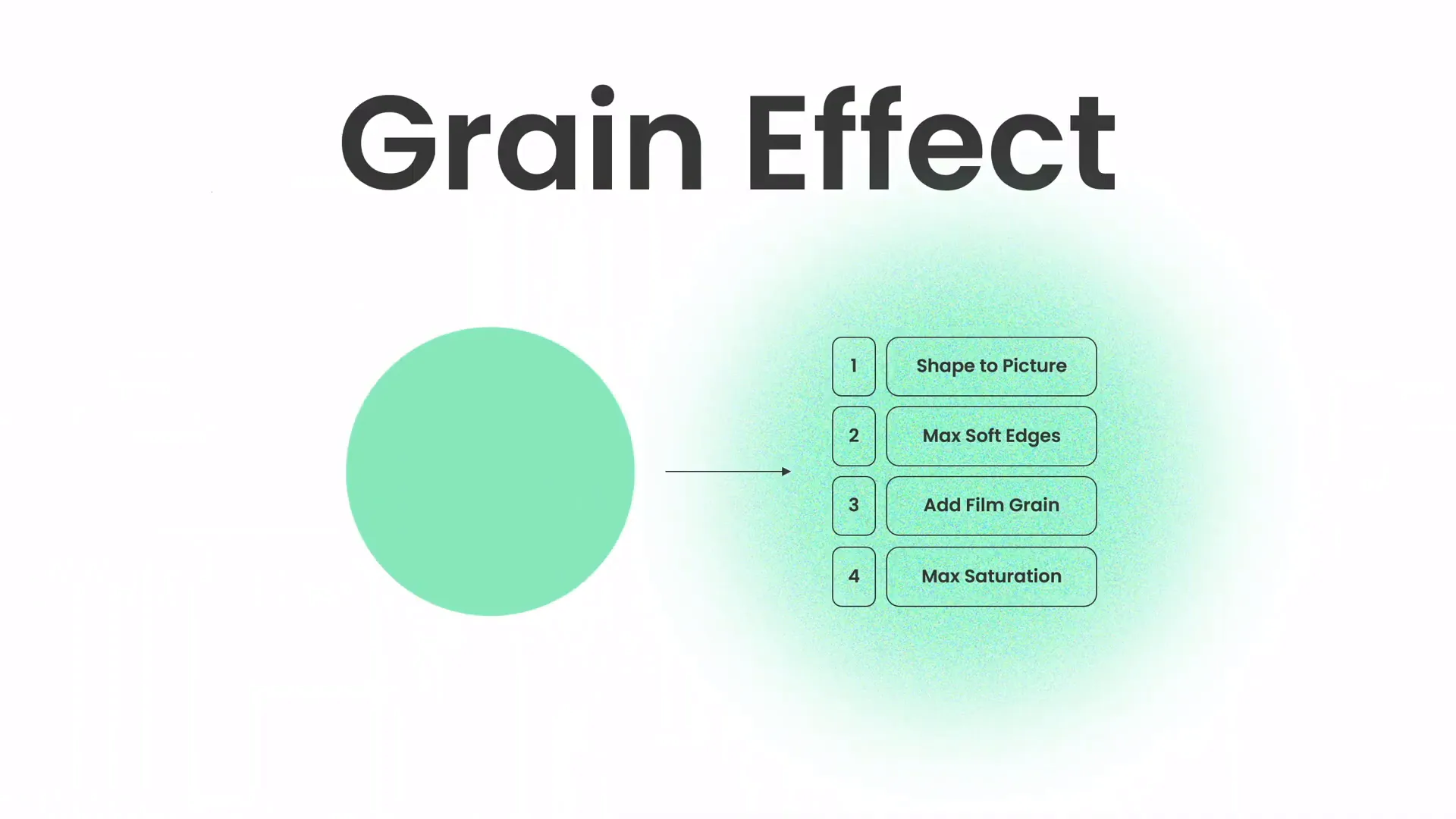
Creating a Green Effect to Spice Up Your Slides
Adding subtle effects can elevate your slide design beyond the basics. One creative approach is to use a “green effect” to add freshness and vibrancy to your slides.

1. What Is the Green Effect?
The green effect involves using shades of green in your slide’s shapes, overlays, or accents to create a natural and calming vibe. Green is often associated with growth, harmony, and renewal, making it a great choice for presentations about innovation, environment, or progress.
2. How to Create the Green Effect in PowerPoint
- Insert shapes such as rectangles, circles, or custom shapes where you want to add the effect.
- Fill the shapes with various shades of green from your color palette.
- Adjust the transparency of these shapes to create layered, soft overlays.
- Use gradient fills or blur effects to add depth and dynamism.
3. Combining the Green Effect with Images
Overlay green shapes on top of images to create a cohesive color theme and highlight specific parts of your slide.
4. Tips for Using the Green Effect
- Don’t overuse the effect — subtlety is key.
- Ensure text remains readable by balancing the opacity of overlays.
- Complement green with neutral colors for balance.
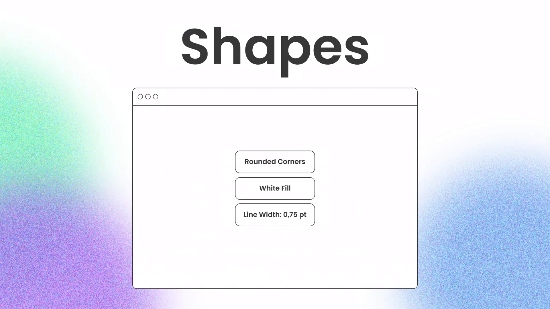
Designing Beautiful Shapes for Visual Appeal
Shapes are powerful design elements that can add structure, highlight content, and guide your audience’s attention. Here’s how to incorporate shapes effectively into your slides:
1. Use Shapes to Frame Content
Place shapes behind text or images to create contrast and separation. For example, a rounded rectangle behind a headline can make it stand out.
2. Create Custom Shapes
PowerPoint allows you to combine, subtract, and merge shapes to create unique visuals that fit your brand or message.
3. Add Shadows and Effects Sparingly
Subtle shadows or glows can add depth, but avoid heavy effects that distract or clutter your slide.
4. Use Shapes for Branding and Color Consistency
Shapes can carry your brand colors and reinforce your visual identity throughout the presentation.
5. Guide the Viewer’s Eye
Strategically place shapes to lead the audience’s focus from one point to another, improving the slide’s flow.
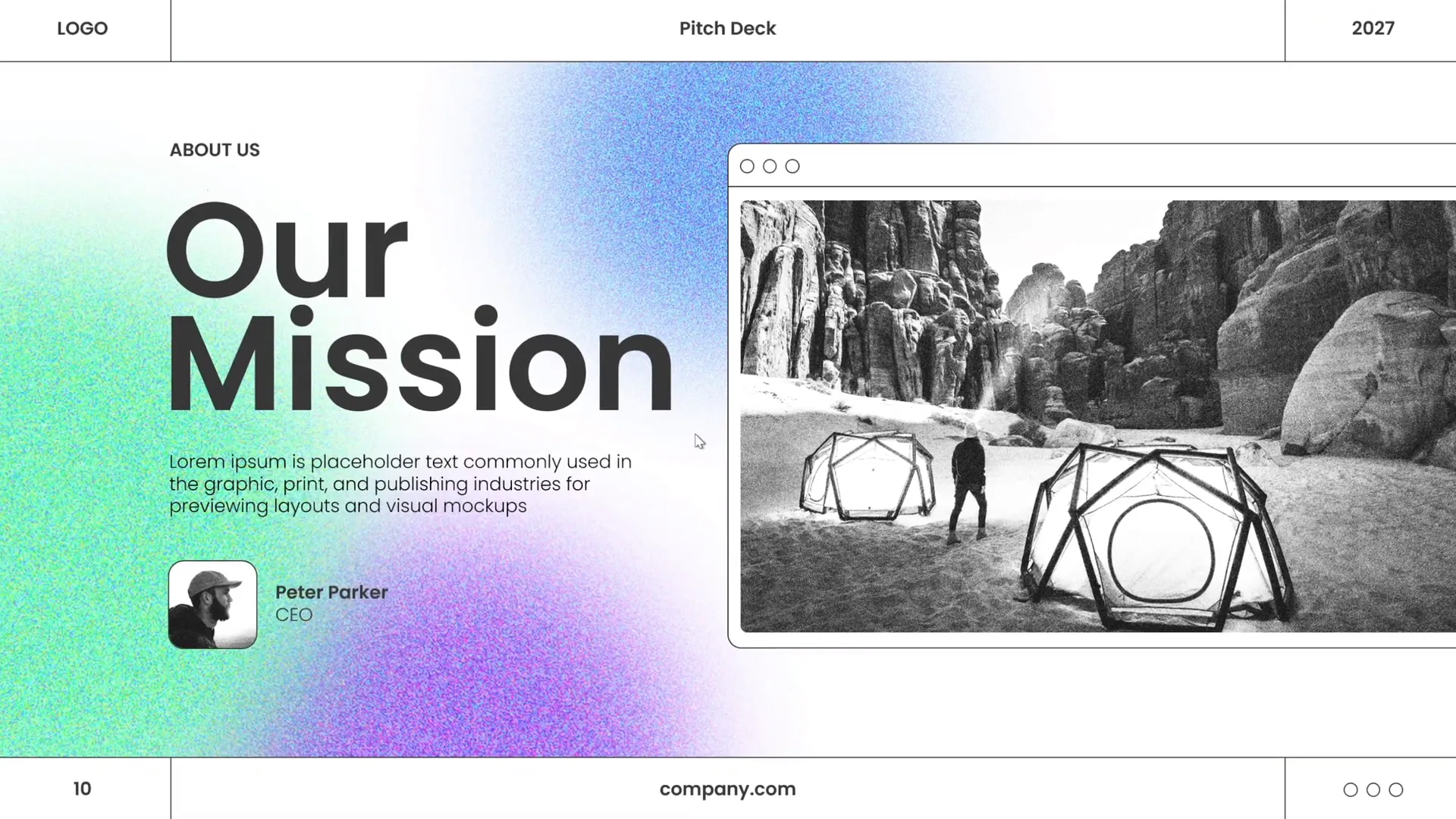
Using High-Quality Images from Unsplash
Great images can transform your slides by adding emotion, context, and visual interest. I highly recommend using high-quality, royalty-free images from Unsplash.
Why Unsplash?
- Offers a vast collection of free, professional photos
- Easy to download and insert into your presentations
- Images cover a wide range of topics and styles
- Perfect for business, technology, nature, and lifestyle themes
How to Incorporate Images into Your Slides
- Choose images that support your message and match your color scheme.
- Insert images using the “Insert > Pictures” menu in PowerPoint.
- Crop or mask images into shapes to create interesting compositions.
- Use overlays or color filters to unify the image with your slide’s color palette.
- Maintain balance by not letting images overpower your text.
Special thanks to Unsplash for providing the beautiful photos that inspired this design approach.
Frequently Asked Questions About PowerPoint Presentation Skills
Q1: How do I create a professional slide layout in PowerPoint?
A: Start by organizing your content logically, use alignment guides and grids for precision, maintain adequate white space, balance visual weight, and create a natural flow for your audience’s eyes to follow.
Q2: What fonts work best for modern PowerPoint presentations?
A: Clean, sans-serif fonts like Poppins, Helvetica, or Arial work well. Use font hierarchy by varying size and weight, and limit the number of fonts to one or two for consistency.
Q3: How can I choose the right colors for my slides?
A: Select 2-3 primary colors that reflect your brand or message, balance bright colors with neutrals, use color to create hierarchy, and ensure good contrast for readability.
Q4: What is the “green effect” and how do I create it?
A: The green effect involves adding green-colored shapes or overlays with varying transparency to add freshness and vibrancy. Use gradient fills and subtle layering to enhance your slide design.
Q5: Where can I find free, high-quality images for my presentations?
A: Unsplash (https://unsplash.com) is an excellent resource for free, professional photos that can be used to enhance your slides without worrying about copyright issues.
Q6: How much text should I include on each slide?
A: Keep text concise—ideally no more than 6-8 lines or 30 words per slide—to maintain audience engagement and ensure clarity.
Q7: How do I add custom shapes in PowerPoint?
A: Use the “Insert > Shapes” menu to add basic shapes, then combine, subtract, or merge them using the “Merge Shapes” tool under the Drawing Tools Format tab to create custom designs.
Conclusion: Master Your PowerPoint Presentation Skills
Developing strong PowerPoint presentation skills takes practice and attention to detail, but the payoff is huge. By focusing on creating balanced layouts, choosing beautiful typography, applying cohesive color palettes, and adding creative effects like the green overlay, you’ll transform your slides from ordinary to professional-grade.
Remember to keep your slides simple, visually appealing, and consistent with your messaging. Use high-quality images thoughtfully and leverage shapes to guide your audience’s attention. These design principles will not only make your presentations look fantastic but also help you communicate your ideas more effectively.
Keep practicing these techniques, experiment with your own styles, and soon you’ll be designing slides like a true pro!
Stay happy, stay healthy, and keep honing your PowerPoint presentation skills. See you on your next design journey!
Check out the full video: PowerPoint Presentation Skills: Design Slides Like a Pro! ✨


