
Delivering powerful presentations is an essential skill in today’s professional world. Whether you’re pitching a project, educating a team, or sharing insights, your ability to create and present your PowerPoint slides effectively can make all the difference between a forgettable talk and an unforgettable experience. This comprehensive guide will walk you through key techniques and tips to transform your PowerPoint presentations from dull and disengaging to dynamic and memorable.
Learn from Mo Jones, an IT professional and educator, as we explore storytelling, retention techniques, common pitfalls, and advanced PowerPoint features that will elevate your next presentation. This tutorial blends practical advice with psychological insights, ensuring your audience not only listens but remembers and acts on your message.
Table of Contents
- 1. The Power of Storytelling in Presentations
- 2. Visualizing Your Story for Maximum Impact
- 3. Increasing Retention with SmartArt and Infographics
- 4. Engagement Tools to Keep Your Audience Active
- 5. Common Presentation Mistakes and How to Avoid Them
- 6. Customizing Your Presentation with Slide Master and Themes
- 7. Applying the Rule of Thirds to Slide Design
- 8. Creating Reusable, Custom Title Slides
- 9. Leveraging New PowerPoint Features for Accessibility and Practice
- 10. Additional Tips for Effective PowerPoint Presentations
- Conclusion
- Frequently Asked Questions (FAQs)
1. The Power of Storytelling in Presentations
Storytelling isn’t just for novels or movies; it’s a vital tool in business communication. Stories captivate audiences, create emotional connections, and help structure information logically.
What Story Do You Want to Tell?
Every presentation should have a clear story arc: a beginning, a middle, and an end. This simple framework guides your audience through your content in an engaging way.
For example, a compelling narrative might be: How can we transform boring presentations into engaging, memorable experiences?
Consider what boring presentations look like:
- Low engagement
- Low retention
In contrast, amazing presentations offer:
- Opportunities for audience engagement
- Increased retention of information
Structuring your presentation as a story helps you guide your audience from the problem (boring presentations) to the solution (engaging presentations) with clear, compelling points along the way.
Creating Your Story Outline
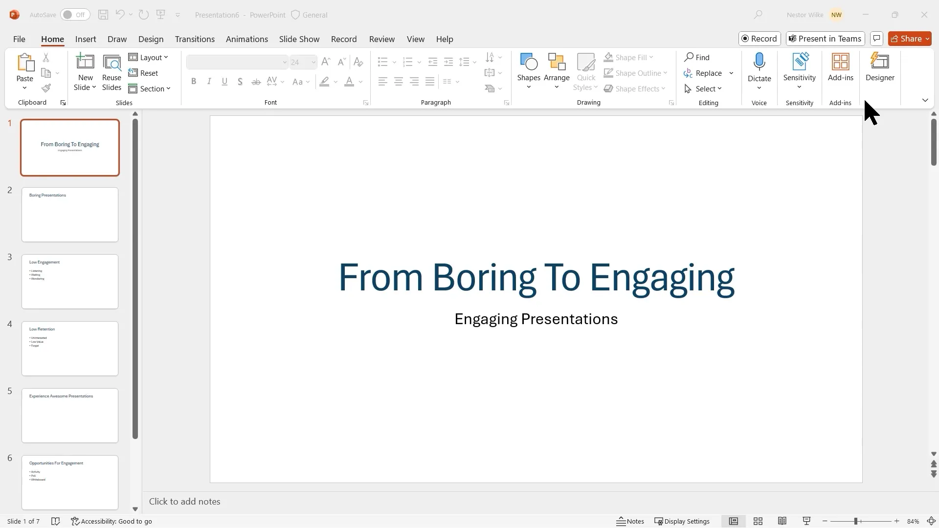
Start by drafting your presentation story in an outline format. You can do this in Microsoft Word using heading styles or directly in PowerPoint’s Outline View. The advantage of building an outline is that it helps you organize your message and easily convert it into slides.
For example, create headings for:
- Boring Presentations
- Effects of Boring Presentations
- Awesome Presentations
- Effects of Awesome Presentations
Once you have your outline, import it into PowerPoint using the “Insert Slides from Outline” feature to quickly generate your slide deck structure.
2. Visualizing Your Story for Maximum Impact
Text-heavy slides are a common culprit behind disengaged audiences. To capture attention and boost retention, pairing concise text with compelling visuals is essential.
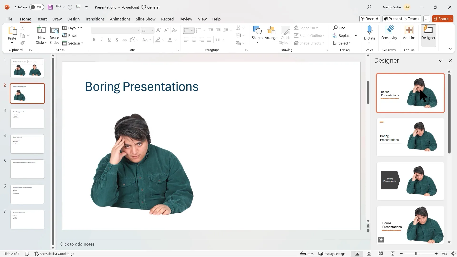
Using PowerPoint Designer for Slide Enhancement
PowerPoint Designer offers automated design suggestions based on your slide content. It helps you quickly improve slide layouts, ensuring your slides look professional and visually appealing without manual alignment hassles.
To enhance your title slide, for example, add stock images of people or relevant icons, then let Designer propose polished layouts that integrate your visuals and text seamlessly.
Incorporating Visuals to Combat Boredom
When discussing boring presentations, use visuals that reflect the low engagement experience—images or icons that depict listening passively, waiting, or distraction. This visual storytelling reinforces your message and helps your audience relate.
Why Visuals Matter: Insights from Psychology
According to research from Stanford Graduate School of Business, people retain structured information up to 40% more reliably than unstructured content. Storytelling inherently provides structure, making it easier for audiences to follow and remember your message.
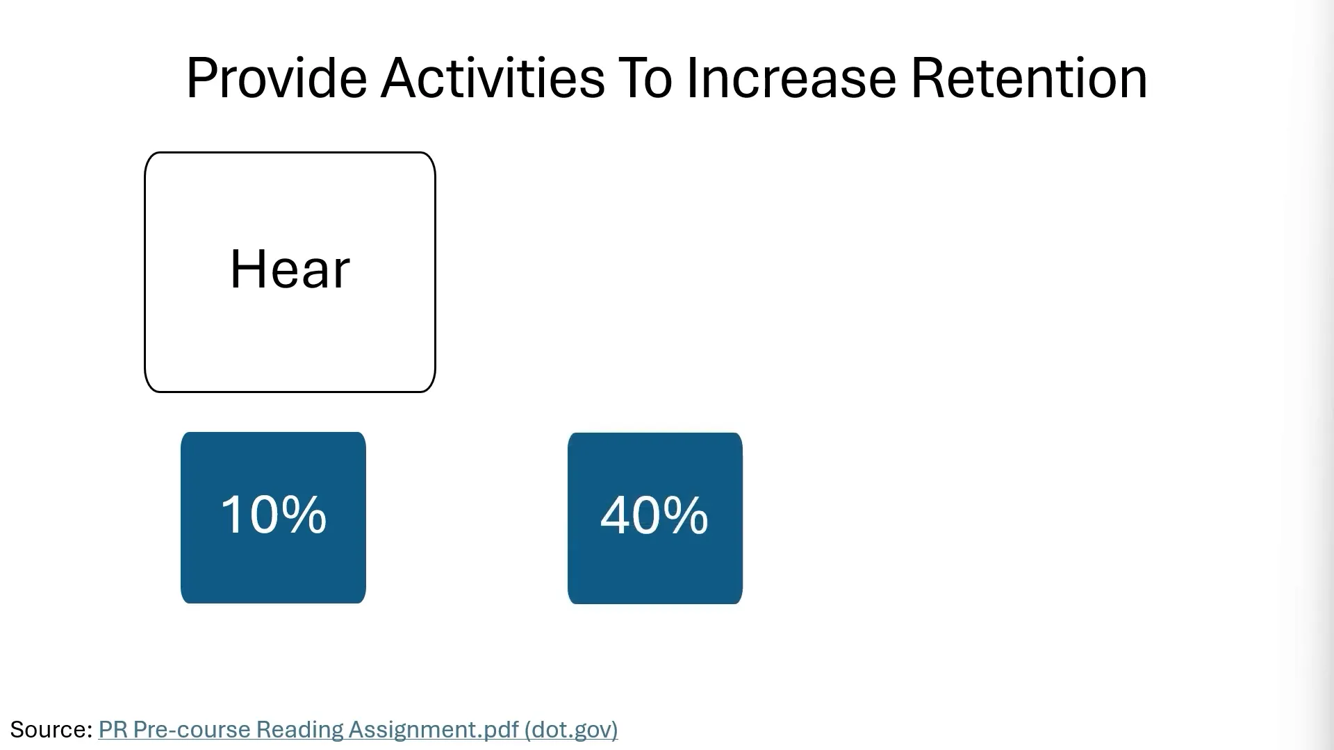
Moreover, retention statistics reveal:
- After 10 minutes, only 50% of information is remembered
- After 24 hours, retention drops to 25%
- After a week, only 10% remains
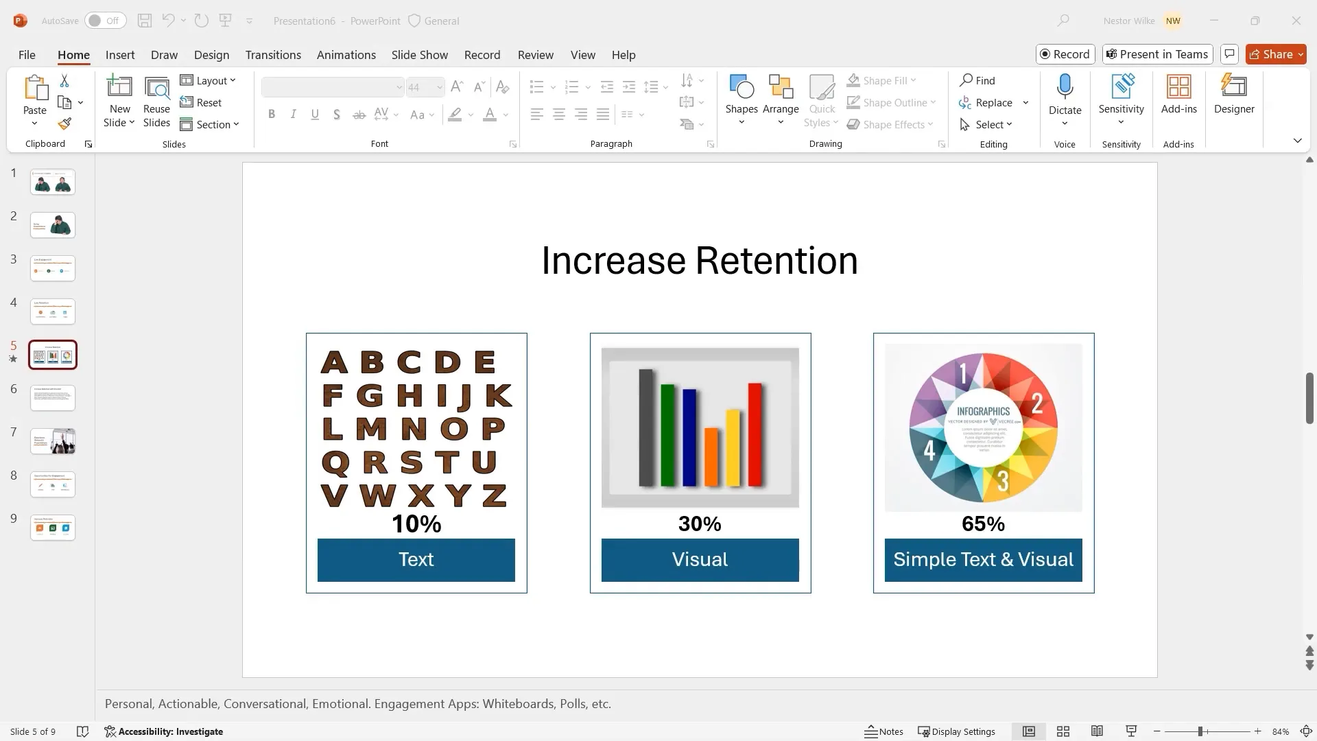
Retention improves significantly when information is presented with both text and visuals. For example:
- Text alone: ~10% retention
- Visuals alone: ~30% retention
- Text + Visuals: up to 65% retention
Lessons from Reading Habits
Elementary school books use vibrant pictures, making reading enjoyable and engaging for children. In contrast, middle school textbooks often replace images with dense text, charts, and tables, making the material harder to digest and less appealing.
This analogy highlights the importance of integrating visuals to maintain audience interest and facilitate understanding.
3. Increasing Retention with SmartArt and Infographics
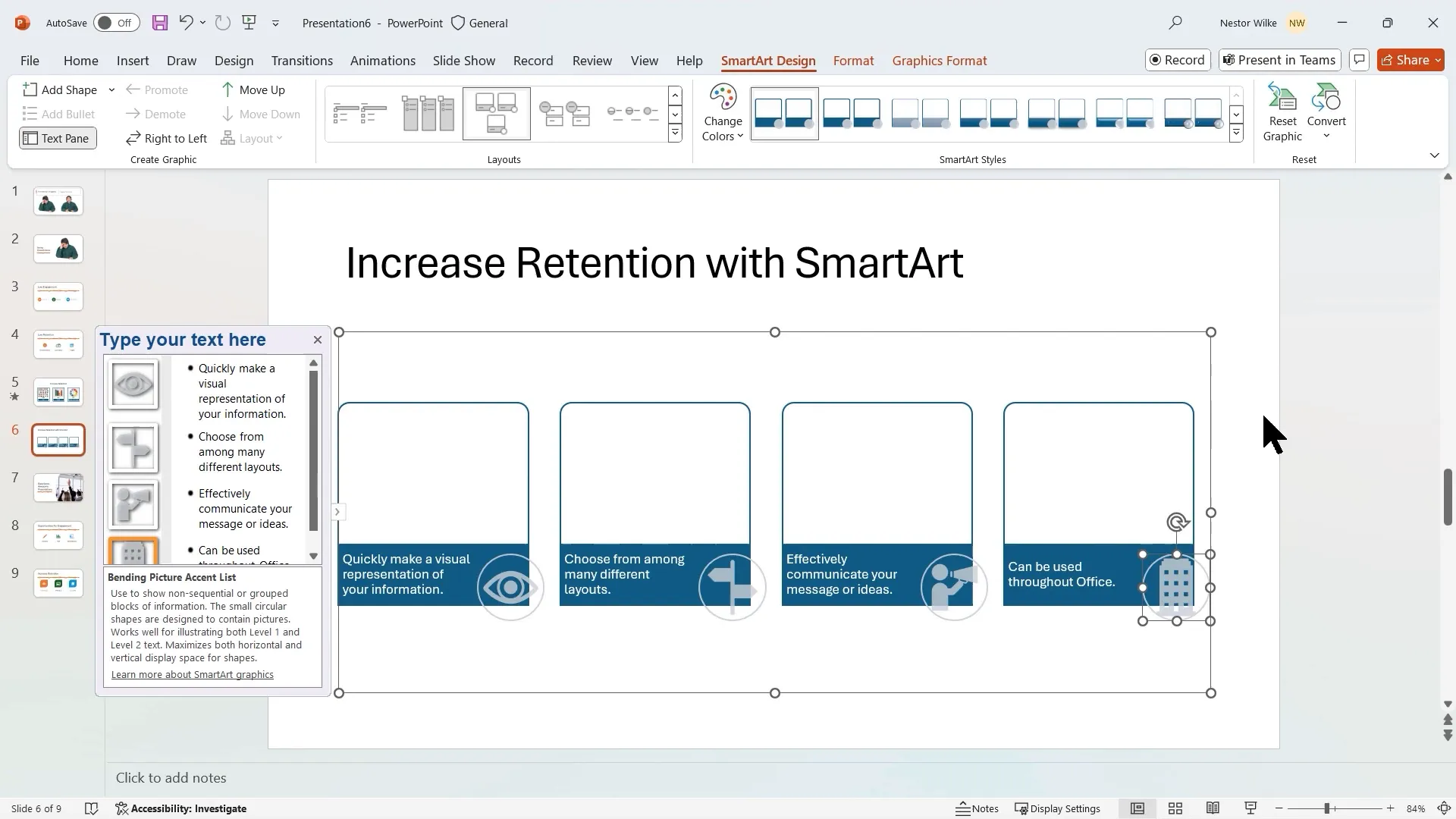
SmartArt graphics are powerful tools for converting dense text into visually digestible content. They help your audience grasp concepts quickly and remember them longer.
Condensing Text into Bullet Points
Start by breaking down heavy paragraphs into concise bullet points. Keep each bullet to a single line to avoid wrapping, which can overwhelm your audience and reduce readability.
Example:
- Quickly make a visual representation of your information
- Choose from many different layouts
- Effectively communicate your message or ideas
- Can be used throughout Office applications
Converting Bullets into SmartArt
Once the text is condensed, convert your bullets into SmartArt. Choose a layout that includes pictures or icons to enhance visual appeal. Customize icons to match the theme, such as a choice icon, communication symbol, or Office logo.
Benefits of Using SmartArt
- Improves information retention by combining text and visuals
- Creates a clean, professional look
- Facilitates presentation flow and audience understanding
4. Engagement Tools to Keep Your Audience Active
Engagement is key to preventing your audience from passively listening or losing interest. PowerPoint and associated tools offer several interactive features to boost participation.
Using Whiteboard Mode in PowerPoint
Pressing the W key during a presentation activates Whiteboard Mode, allowing you to annotate slides live. You can draw, write, or create columns for audience input, such as voting or brainstorming.
This simple interaction keeps your audience involved and makes your presentation more dynamic.
Microsoft Teams Whiteboard and PowerPoint Live
If you’re presenting via Microsoft Teams, leverage its built-in whiteboard for collaborative exercises. Additionally, PowerPoint Live enables your audience to navigate slides independently at their own pace while staying synchronized with the presenter.
These tools foster interactivity, making remote or hybrid presentations more engaging.
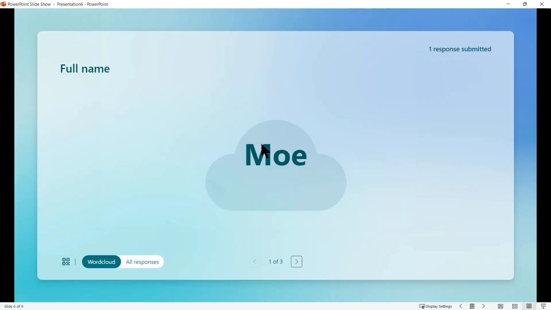
Integrating Microsoft Forms for Real-Time Feedback
Microsoft Forms can be embedded directly into PowerPoint slides to collect live responses. You can display results in various formats, including:
- Word clouds that highlight popular answers
- Bar charts showing distribution of multiple-choice responses
This immediate feedback loop encourages participation and provides valuable insights during your talk.
5. Common Presentation Mistakes and How to Avoid Them
Understanding common pitfalls helps you design better presentations and avoid disengaging your audience.
Slides That Look the Same
Monotonous slides with repetitive layouts and content styles bore audiences quickly. Use varied slide designs, layouts, and visuals to maintain interest.
Ignoring Your Audience
Always tailor your presentation to your audience’s needs and interests. Focus on key conclusions and insights rather than overwhelming them with random data.
Presenting Data Ineffectively
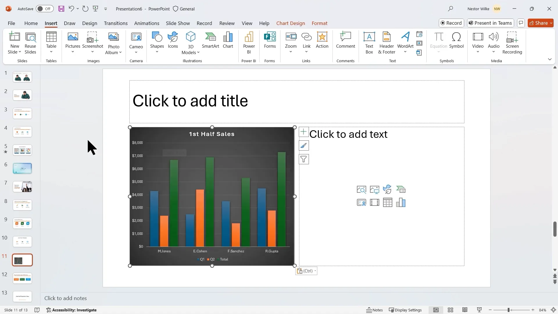
Text-heavy data slides are difficult to follow. Instead, use tables, charts, or embed Power BI reports for interactive data visualization.

For example, copy Excel charts directly into PowerPoint and animate them to reveal data step-by-step, building suspense and clarity.
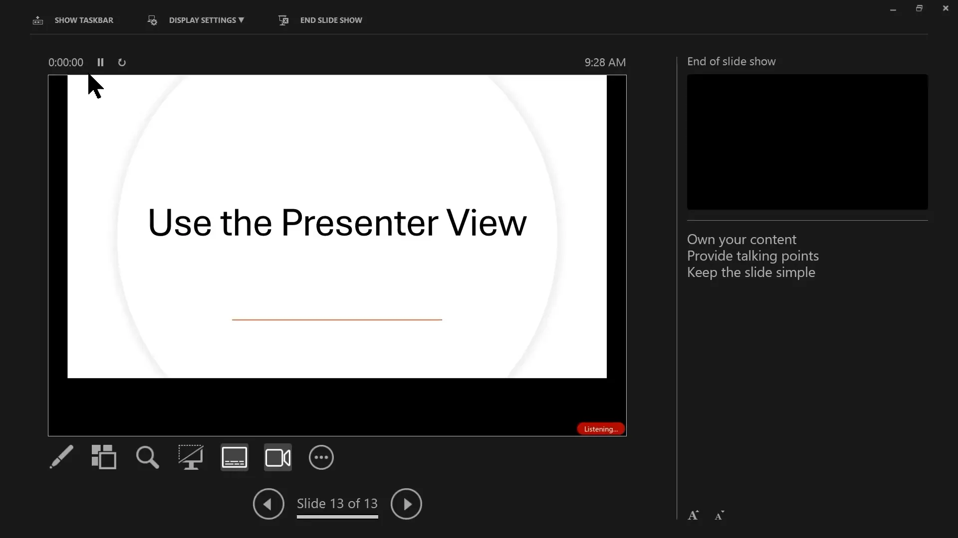
Not Using Presenter View
The Presenter View is a powerful feature that shows you notes, upcoming slides, and timing while your audience only sees the slide content.
Benefits include:
- Keeping track of your talking points without reading slides verbatim
- Controlling slide animations and transitions smoothly
- Using subtitles for accessibility and clarity
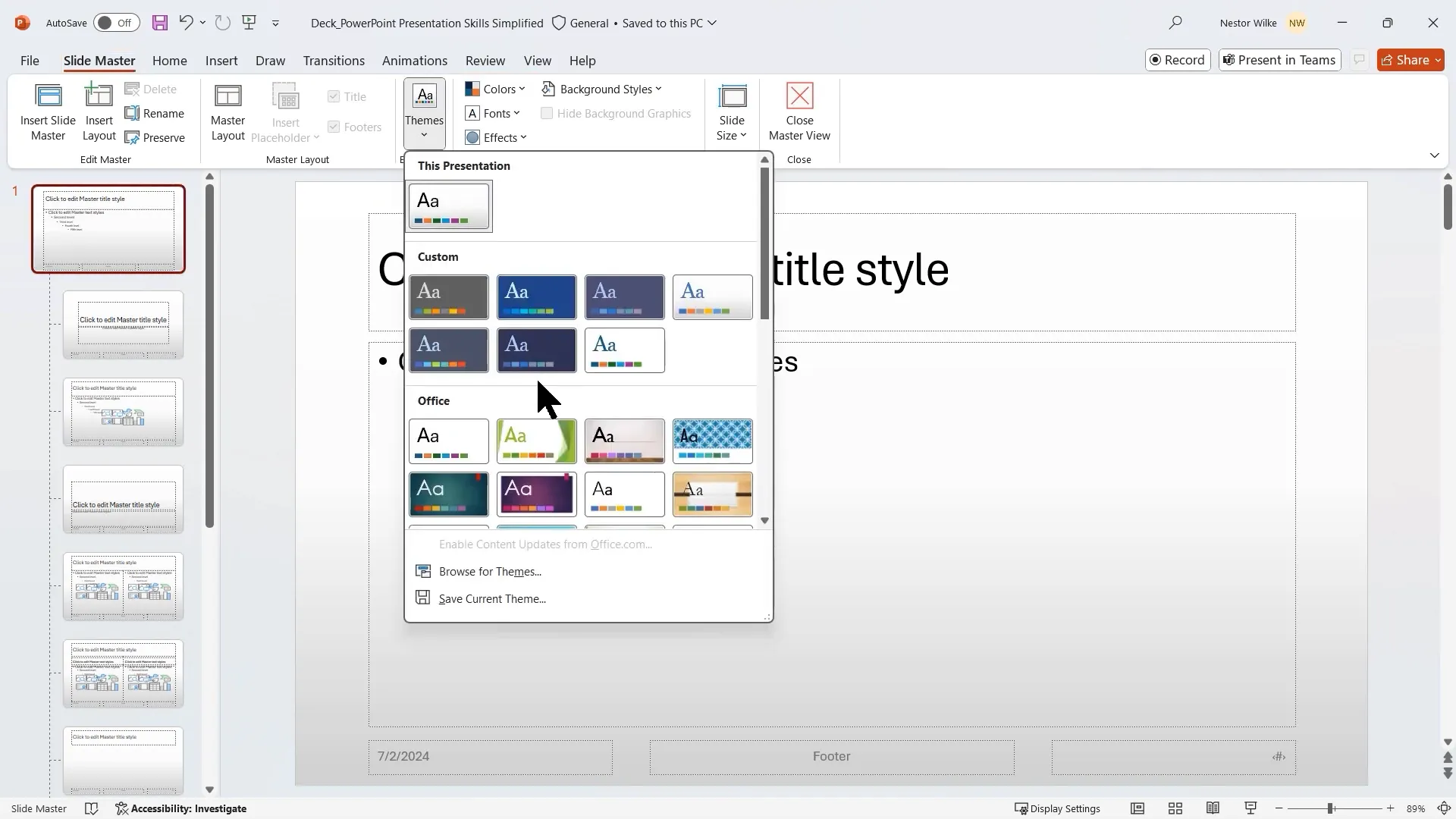
6. Customizing Your Presentation with Slide Master and Themes
Consistency and branding are vital for professional presentations. PowerPoint’s Slide Master allows you to make universal changes across all slides, saving time and ensuring uniformity.
Creating Your Own Theme
A theme is a set of colors, fonts, and effects applied across your presentation. You can select existing themes or create custom ones to match your brand or style.
Steps to create a custom theme:
- Open Slide Master view
- Select the master slide at the top
- Choose a color palette, fonts for headings and body, and effects
- Save your theme for reuse in other presentations
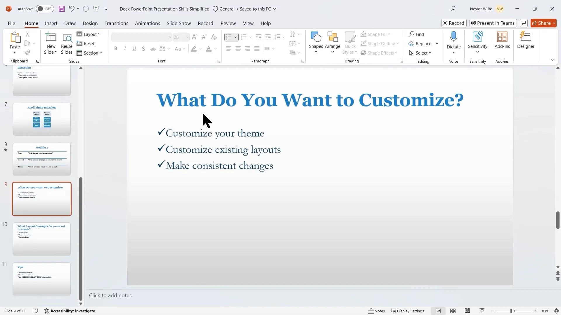
Customizing Existing Layouts
Modify layouts such as Title and Content to change font colors, sizes, bullet styles, and add design accents.
For example, replacing standard bullets with check marks or adding a colored accent shape at the bottom of slides can enhance visual appeal and consistency.
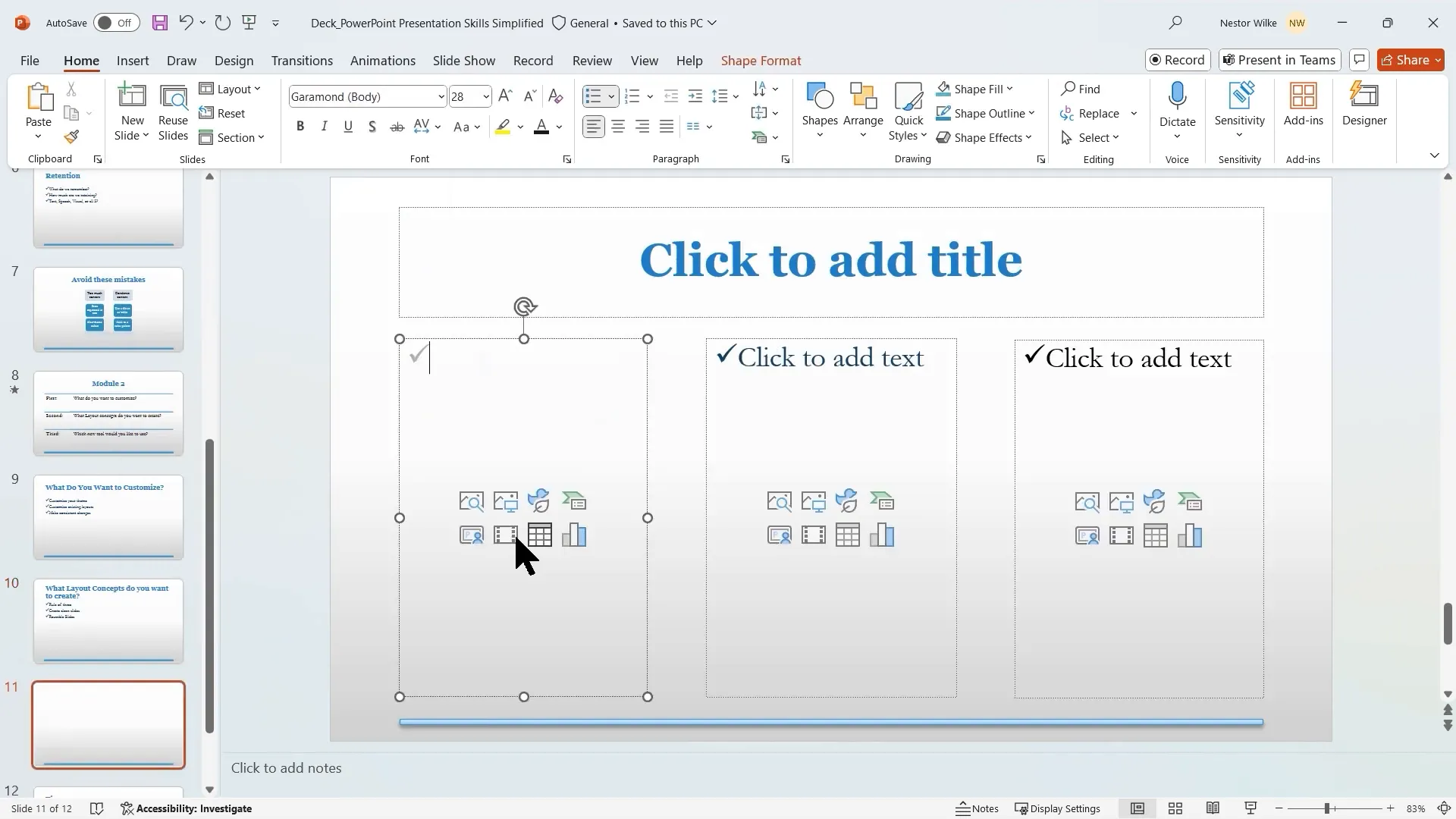
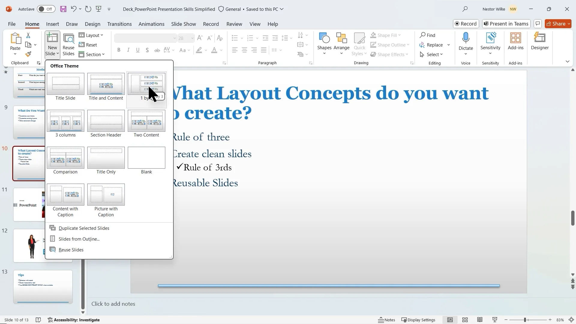
Creating New Layouts for Specific Needs
PowerPoint offers default layouts like Title and Content or Comparison, but you can create custom layouts tailored to your content.
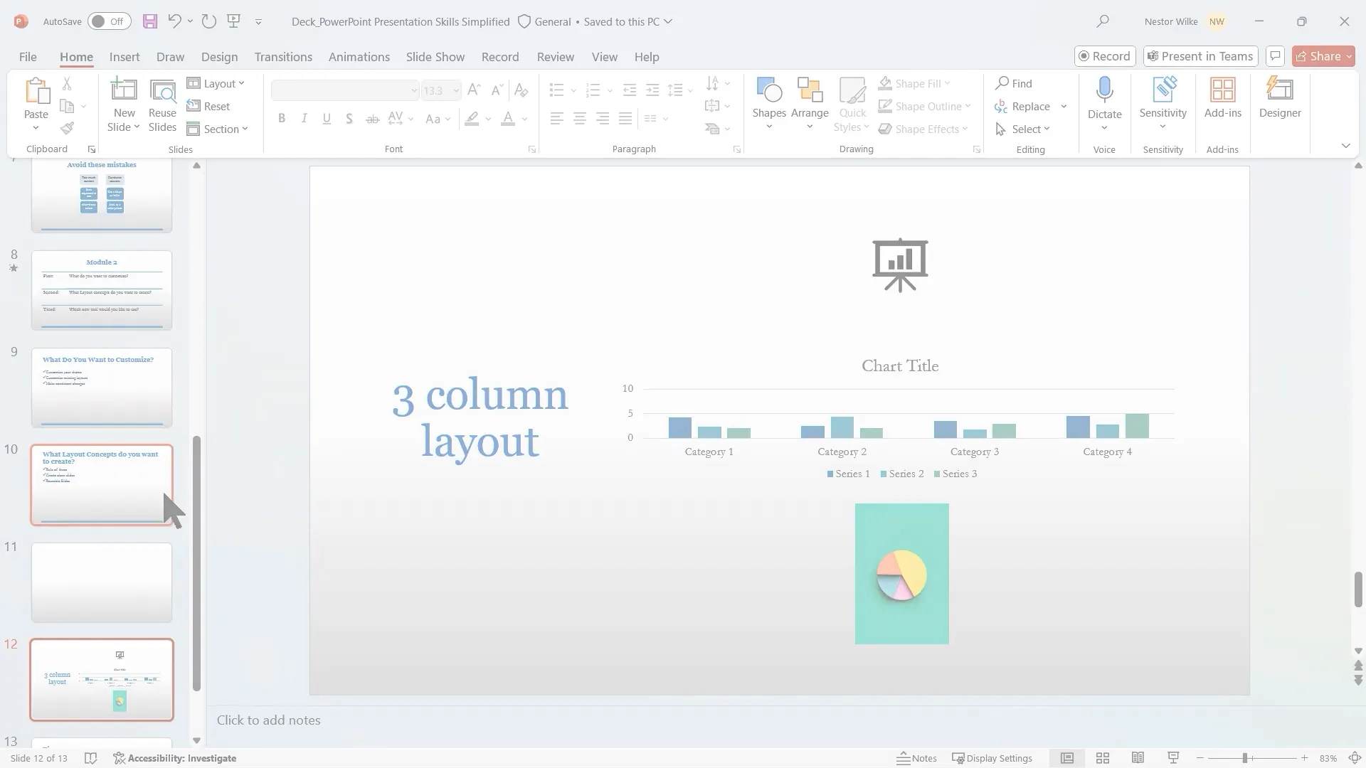
Some useful custom layouts include:
- Three-Column Layout: Divide content into three equal sections for balanced presentation of multiple concepts.
- One Column, Three Rows: Stack content vertically for step-by-step explanations or lists.
These layouts follow the Rule of Three, which suggests limiting content to three main points per slide for better comprehension.
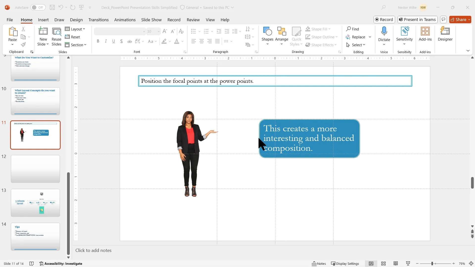
7. Applying the Rule of Thirds to Slide Design
The Rule of Thirds is a design principle from photography and filmmaking that divides a frame into three equal parts both horizontally and vertically, creating intersection points called “PowerPoints.”
Aligning key slide elements (images, text boxes, charts) on these PowerPoints creates balanced, visually appealing slides that naturally draw viewers’ attention.
Use guides and gridlines to mark the Rule of Thirds on your slide canvas, then position your content accordingly. This technique improves slide aesthetics and audience engagement.
8. Creating Reusable, Custom Title Slides
First impressions matter. A unique, well-designed title slide sets the tone for your presentation and surprises your audience in a good way.
Design your own title slide layout in Slide Master by:
- Inserting a large, high-quality image covering part of the slide
- Adding text placeholders for title and subtitle with contrasting colors
- Incorporating shapes or accents for modern design flair
- Optionally inserting a logo for branding
9. Leveraging New PowerPoint Features for Accessibility and Practice
High Contrast Mode for Color Selection
Ensuring your slides are readable by everyone, including those with visual impairments, is critical. The High Contrast mode filters color choices to only those that provide sufficient contrast with your background.
Use it when selecting fill colors or text colors to make slides more accessible.
Accessibility Checker
PowerPoint’s Accessibility Checker scans your presentation for issues that might hinder screen readers or users with disabilities.
It highlights problems like missing alternative text for images, poor color contrast, or incorrect reading order, and offers actionable fixes.
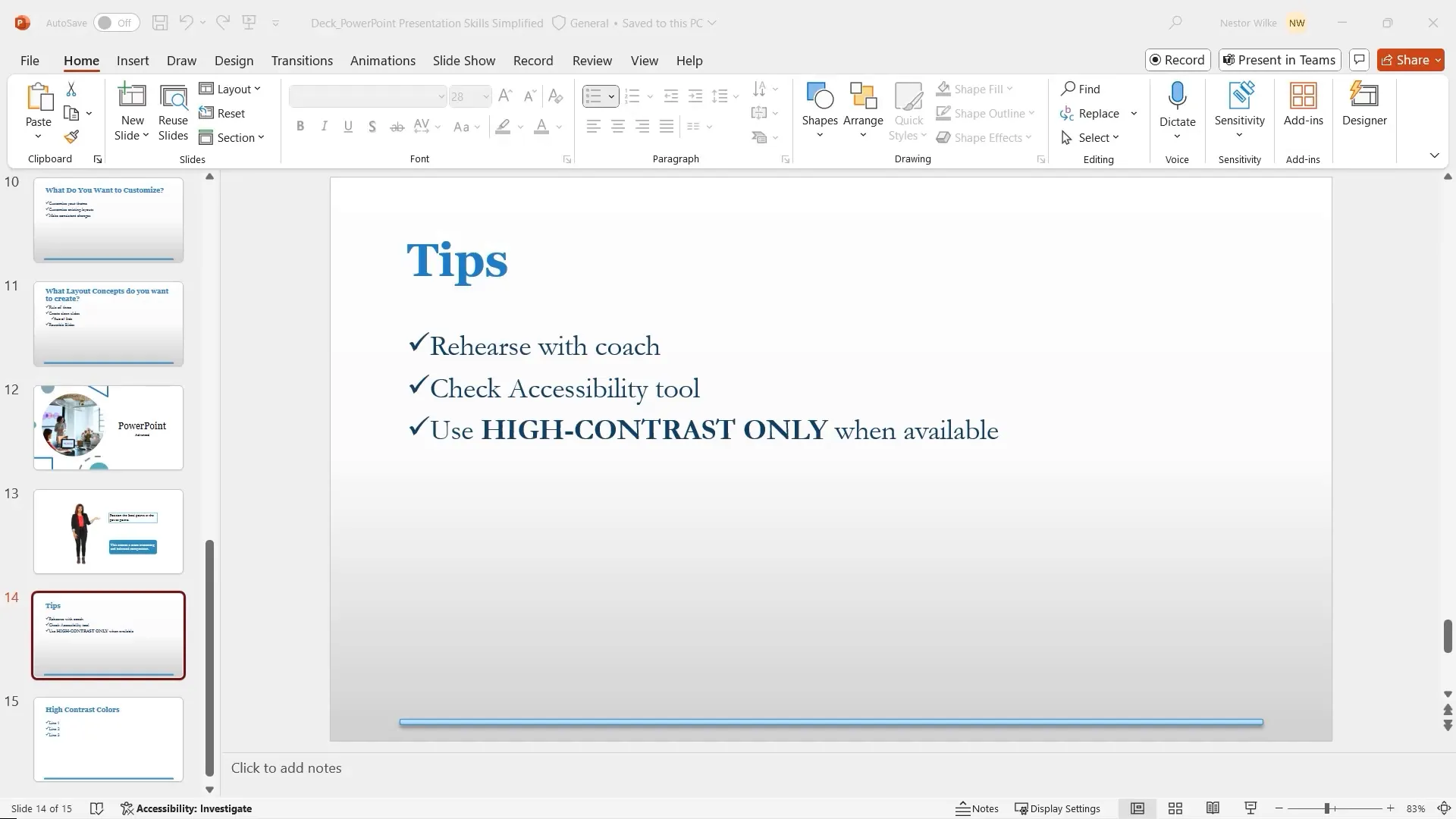
Rehearse with Coach Tool
Practice makes perfect. The Rehearse with Coach feature lets you rehearse your presentation while receiving real-time feedback on:
- Use of filler words
- Speaking pace
- Repetitive language
- Inclusiveness of language
- Originality and avoidance of reading slides verbatim
- Pitch variation
This digital coach acts like a colleague giving constructive criticism, helping you refine your delivery before the actual presentation.
10. Additional Tips for Effective PowerPoint Presentations
- Bullets Have Their Own Rules: Three bullets per slide is ideal; four is acceptable, but five or more can overwhelm your audience.
- Keep Bullets on One Line: Avoid wrapping text to the next line by condensing your message.
- Minimum Font Size: Use at least 20-point font to ensure readability, adjusting upward for thinner or more stylized fonts.
- Use the Eye Dropper Tool: Maintain color harmony by sampling colors from your slide images or design elements for text and shapes.
Conclusion
Mastering PowerPoint presentation skills involves more than just creating slides; it’s about crafting a story, engaging your audience, and making your message memorable. By applying storytelling techniques, pairing concise text with visuals, utilizing interactive tools, and avoiding common mistakes, you can transform your presentations into impactful experiences.
Customize your slides with Slide Master for consistency and branding, use design principles like the Rule of Thirds for visual appeal, and leverage PowerPoint’s accessibility and rehearsal features to polish your delivery.
Remember, a great presentation is a blend of compelling content, clear visuals, and confident delivery. With these skills and tools, you’re well on your way to presenting like a pro.
Frequently Asked Questions (FAQs)
Q1: Why is storytelling important in presentations?
Storytelling provides structure, making information easier to follow and remember. It creates an emotional connection and guides the audience through your message in a compelling way.
Q2: How can I increase audience retention during my presentation?
Use a combination of simple text and relevant visuals such as images, icons, or SmartArt. Incorporate interactive elements like polls or whiteboards to keep the audience engaged.
Q3: What common mistakes should I avoid in PowerPoint presentations?
Avoid slides that look identical, overload of text, ignoring audience needs, and presenting data poorly. Use charts and tables instead of text-heavy slides and leverage Presenter View to stay on track.
Q4: How do I create a consistent look for my presentation?
Use the Slide Master to create or customize themes, including colors, fonts, and effects. Customize layouts to apply changes universally and maintain a professional, branded appearance.
Q5: What is the Rule of Three, and how does it apply to slide design?
The Rule of Three suggests limiting content to three main concepts per slide. It aligns with how our brains process information and helps keep slides clear and focused.
Q6: How can I practice my presentation effectively?
Use PowerPoint’s Rehearse with Coach tool to get real-time feedback on your pacing, filler words, and delivery style. Repeated practice improves confidence and presentation quality.
Q7: What accessibility features does PowerPoint offer?
PowerPoint includes an Accessibility Checker to identify and fix issues, High Contrast mode for better color choices, real-time subtitles, and options to add alternative text for images, making presentations accessible to all.
Check out the full video: PowerPoint Presentation Skills Tutorial


