
Delivering a compelling presentation is an essential skill in today’s professional world. Whether you’re pitching an idea, training colleagues, or sharing insights, the ability to engage your audience and make your message memorable can set you apart. This comprehensive guide covers essential PowerPoint presentation skills to elevate your presentations from boring to captivating. Drawing from expert advice, research-backed retention techniques, and practical PowerPoint tips, this tutorial will empower you to present like a pro.
Table of Contents
- Introduction to Effective Presentation Skills
- Storytelling: The Heart of Your Presentation
- Visualizing Your Story with PowerPoint Designer
- The Psychology Behind Storytelling and Retention
- Boosting Retention with SmartArt and Infographics
- Engagement Tools to Keep Your Audience Active
- Common PowerPoint Mistakes to Avoid
- Maximizing Presentation Delivery with Presenter View
- Module 2: Customizing Your Presentation for Impact
- Creating Reusable Custom Slides
- Leveraging New PowerPoint Features for Accessibility and Practice
- Additional Presentation Tips
- Conclusion: Present Like a Pro
- Frequently Asked Questions (FAQ)
Introduction to Effective Presentation Skills
Presentations often suffer from low engagement and poor retention, leaving audiences disinterested and forgetting key information shortly after the session. The challenge lies not just in creating slides but in telling a story that resonates with your audience and using techniques that keep them actively involved and retain information longer.
In this tutorial, we explore:
- What story you want to tell through your presentation
- Retention techniques to maximize audience memory
- Common mistakes to avoid for a seamless delivery
- How to customize PowerPoint themes and layouts for consistency and professionalism
- New tools and features in PowerPoint that enhance interaction and accessibility
Let’s dive into the art and science behind powerful presentations.
Storytelling: The Heart of Your Presentation
Storytelling is a cornerstone of communication, especially in business. People naturally connect with stories because they provide structure and meaning. A well-crafted story in your presentation can transform dry data into an engaging narrative.
A simple story has three parts:
- Beginning: Introduce the topic and hook your audience
- Middle: Present the core content and build the narrative
- End: Conclude with key takeaways and a call to action
Consider this story arc for your presentation: How can we go from boring to engaging?
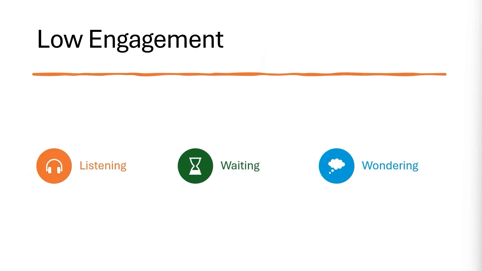
Think about recent presentations you’ve attended. What made some boring? Usually, they suffered from:
- Low engagement — the audience is passive, listening but not involved
- Low retention — information is forgotten immediately
Contrast this with amazing presentations where:
- Opportunities for engagement abound — activities, polls, discussions
- Retention increases — visuals and concise content help embed the message
By framing your presentation as a journey from boring to engaging, you give your audience a story to follow and a reason to stay attentive.
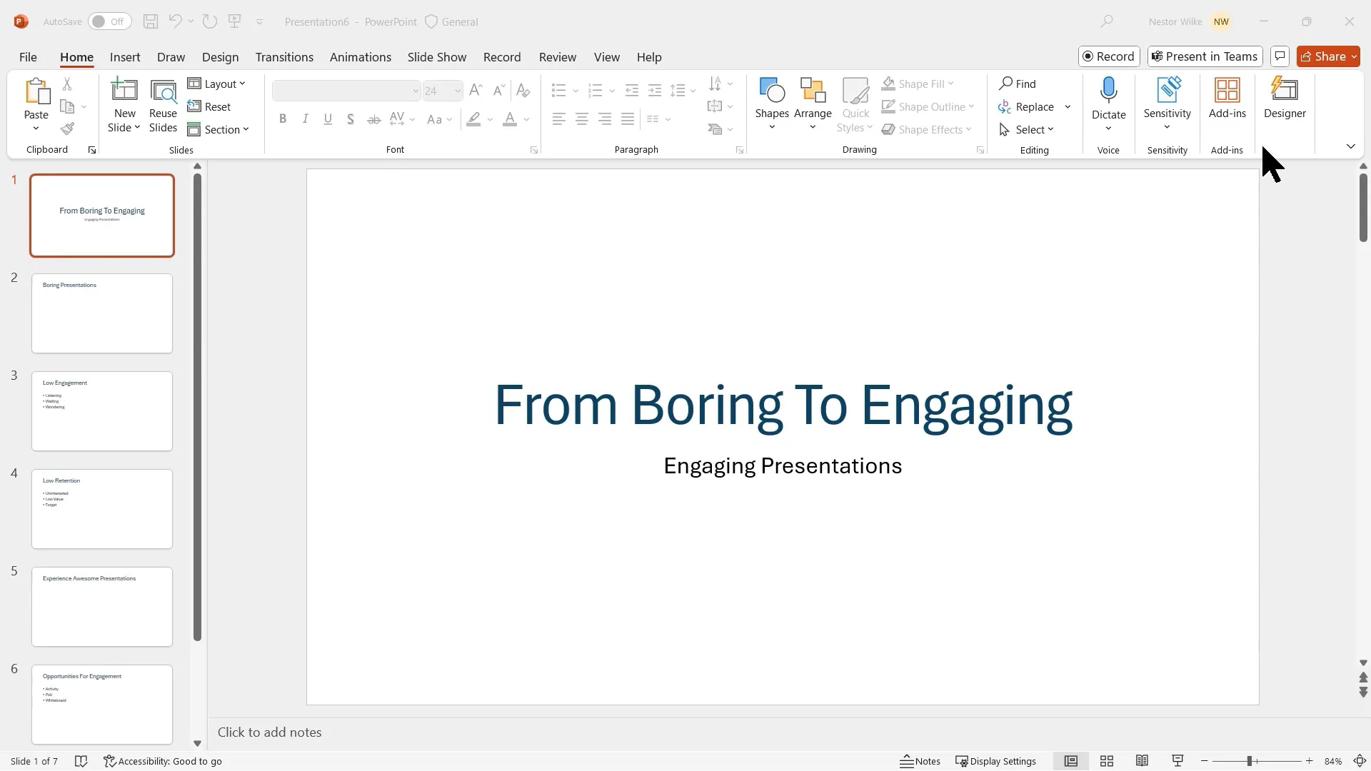
Creating Your Presentation Outline
Before jumping into slide creation, start by outlining your story. You can use a simple Word document with headings to map out your presentation’s structure. Applying heading styles (Heading 1, Heading 2) in Word allows for easy import into PowerPoint’s Outline view.
PowerPoint lets you insert slides directly from an outline, saving time and ensuring your presentation follows a logical flow. This method also helps you focus on content first, postponing design decisions until later.
Visualizing Your Story with PowerPoint Designer
One reason many presentations feel dull is that all slides look the same — plain text, generic layouts, and no visual interest. PowerPoint Designer is a powerful tool that offers design suggestions to make your slides visually appealing without extra effort.
For example, adding stock images of people or relevant visuals can make your slides more relatable. The Designer automatically aligns and formats images, so you don’t have to worry about messy layouts.
Remember, the goal is to combine concise text with meaningful visuals to boost engagement and retention.
Why Do Presentations Become Boring?
Common reasons include:
- Slides that look too similar
- Excessive text or content overload
- Lack of visuals to break up information
To fix this, reduce text to keywords or short phrases and pair them with icons or images that reinforce your message. This approach keeps slides clean and helps your audience focus.
The Psychology Behind Storytelling and Retention
According to research from the Stanford Graduate School of Business, people retain structured information up to 40% more reliably than information presented in a free-form manner. Structure, like storytelling, provides a mental framework that makes it easier for the brain to process and recall information.
Moreover, understanding retention rates helps shape how you deliver content:
- After 10 minutes, only 50% of the audience remembers what was said
- After 24 hours, retention drops to 25%
- By the end of the week, only 10% recall the information
Other statistics show:
- We remember 10% of what we hear
- We remember 40% of what we hear and see
- We remember up to 90% of what we hear, see, and do
These insights highlight the importance of combining text, visuals, and audience participation to maximize retention.
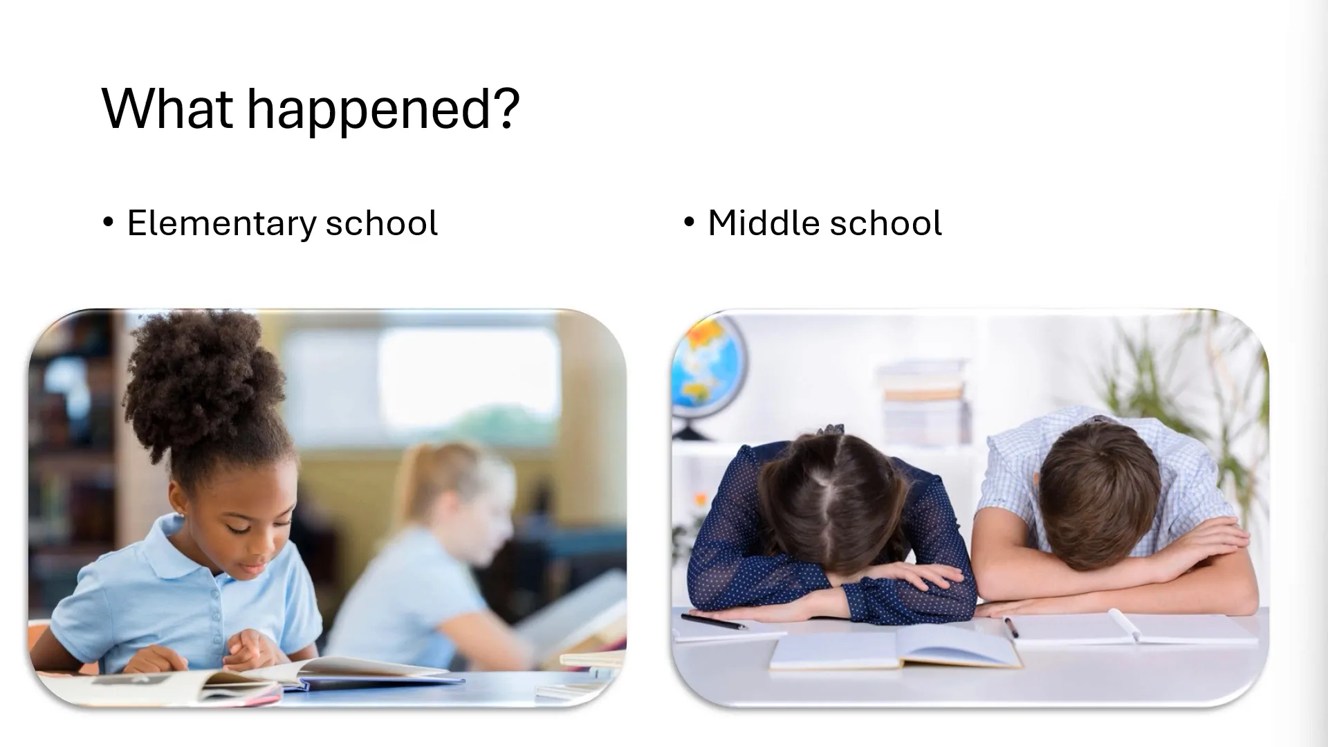
Elementary vs. Middle School Reading: A Retention Example
Elementary school books often contain colorful pictures that help children make connections and stay interested. In contrast, middle school books tend to have dense text, charts, and tables, which can reduce engagement.
This example teaches us to:
- Incorporate visuals to support text
- Keep content accessible and engaging
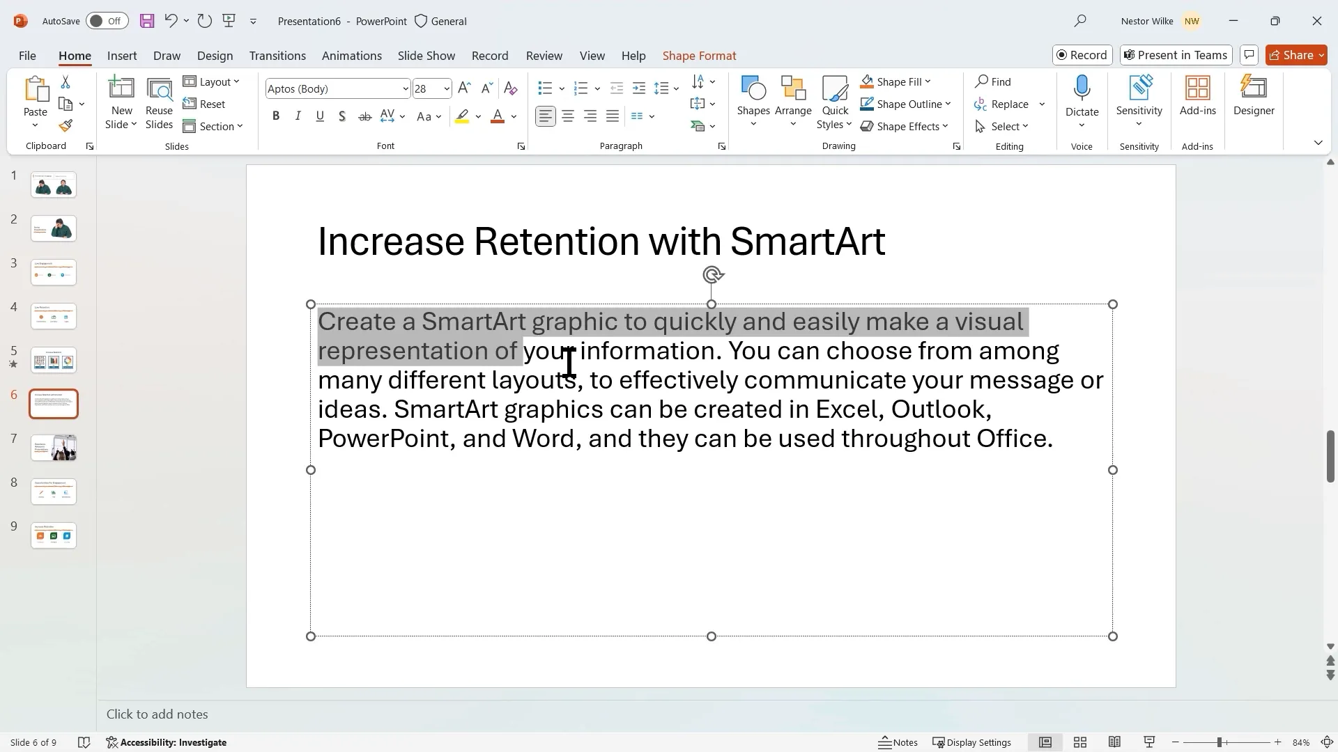
Boosting Retention with SmartArt and Infographics
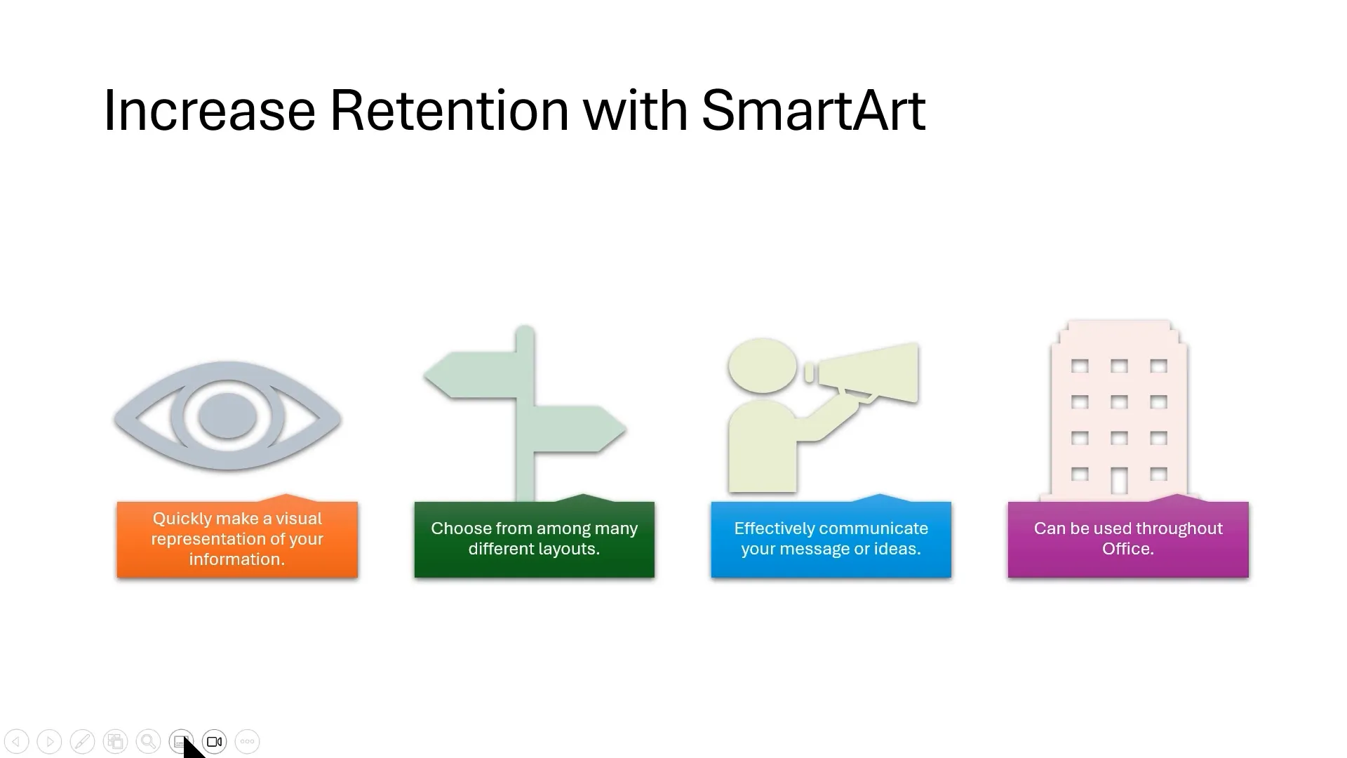
Infographics are powerful because they help the brain make connections quickly. Instead of heavy paragraphs, use SmartArt graphics to represent information visually.
Steps to convert text to SmartArt:
- Condense text into short bullet points. Keep bullets on one line to improve readability.
- Choose a SmartArt layout that includes pictures or icons for visual interest.
- Customize icons to match your message, such as using a loudspeaker icon for communication.
- Adjust colors and effects to create a polished look.
This method can increase retention to about 65% compared to text alone.
Engagement Tools to Keep Your Audience Active
Engagement is key to preventing your audience from passively listening, waiting, and wondering what’s next. PowerPoint offers several built-in tools to make your presentations interactive:
Whiteboard Mode
Pressing the W key during a presentation activates Whiteboard mode, which allows you to draw, annotate, and collect audience responses in real time.
You can create columns for audience options and tally votes by asking participants to raise their hands or respond verbally. This simple interaction keeps attendees involved and attentive.
Microsoft Teams Integration
If you present using Microsoft Teams, you can leverage:
- Teams Whiteboard: A collaborative space for brainstorming and mind mapping.
- PowerPoint Live: Allows your audience to navigate slides at their own pace and revisit previous slides without interrupting the presenter.
These tools enhance interactivity and accommodate diverse learning styles.
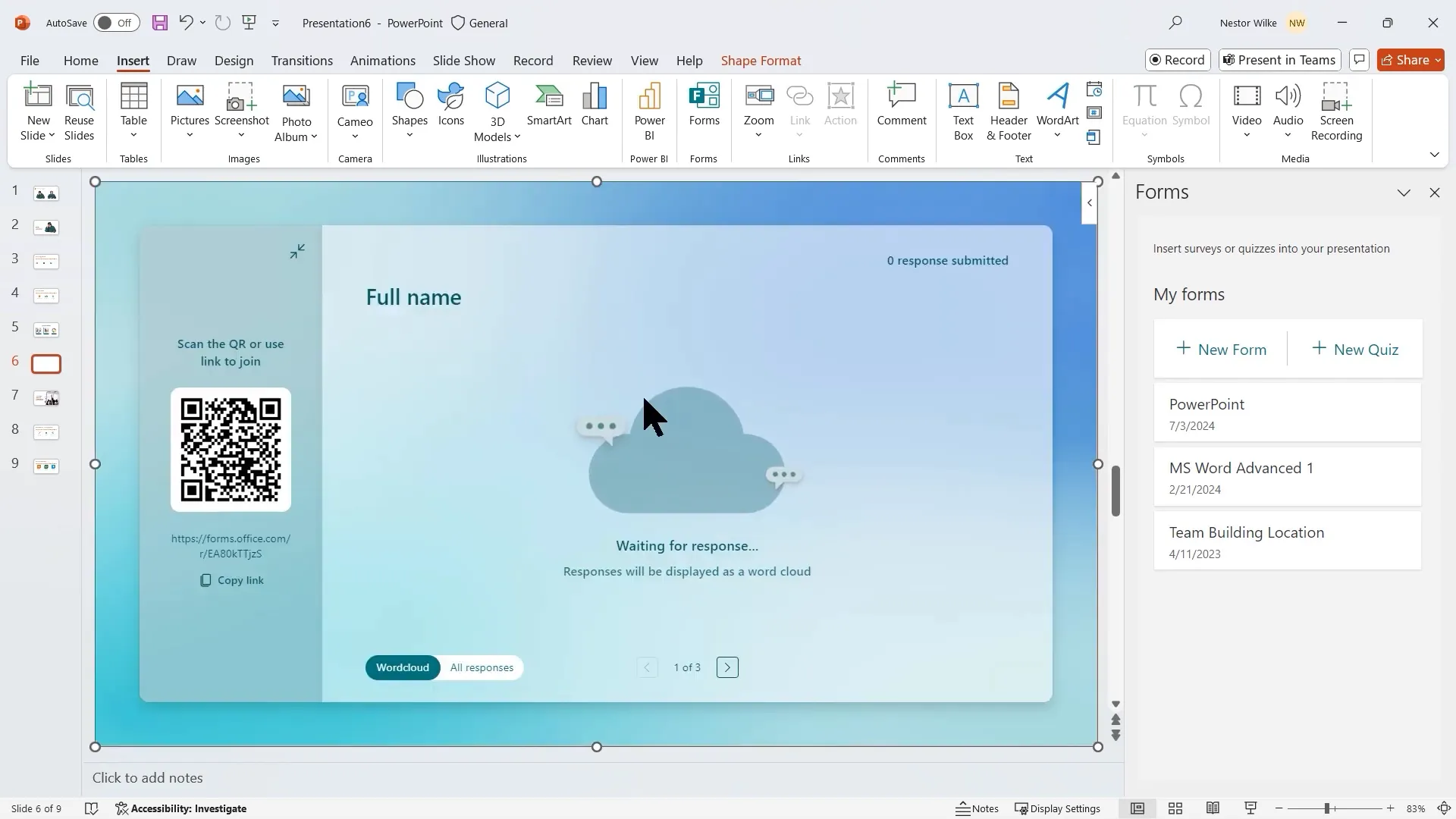
Microsoft Forms
Inserting Microsoft Forms directly into your PowerPoint lets you collect live feedback, quizzes, or polls. Responses can be visualized instantly as word clouds or bar charts, making data collection seamless and engaging.
Common PowerPoint Mistakes to Avoid
Many presentations fail due to predictable slides and lack of audience consideration. Avoid these pitfalls:
- Slides that all look the same with no variation
- Overloading slides with too much text or data
- Ignoring the audience’s needs and interests
- Presenting random information without clear conclusions or insights
Instead, tailor your presentation to your audience by providing:
- Key conclusions and summaries
- Insightful data that answers “What’s in it for me?”
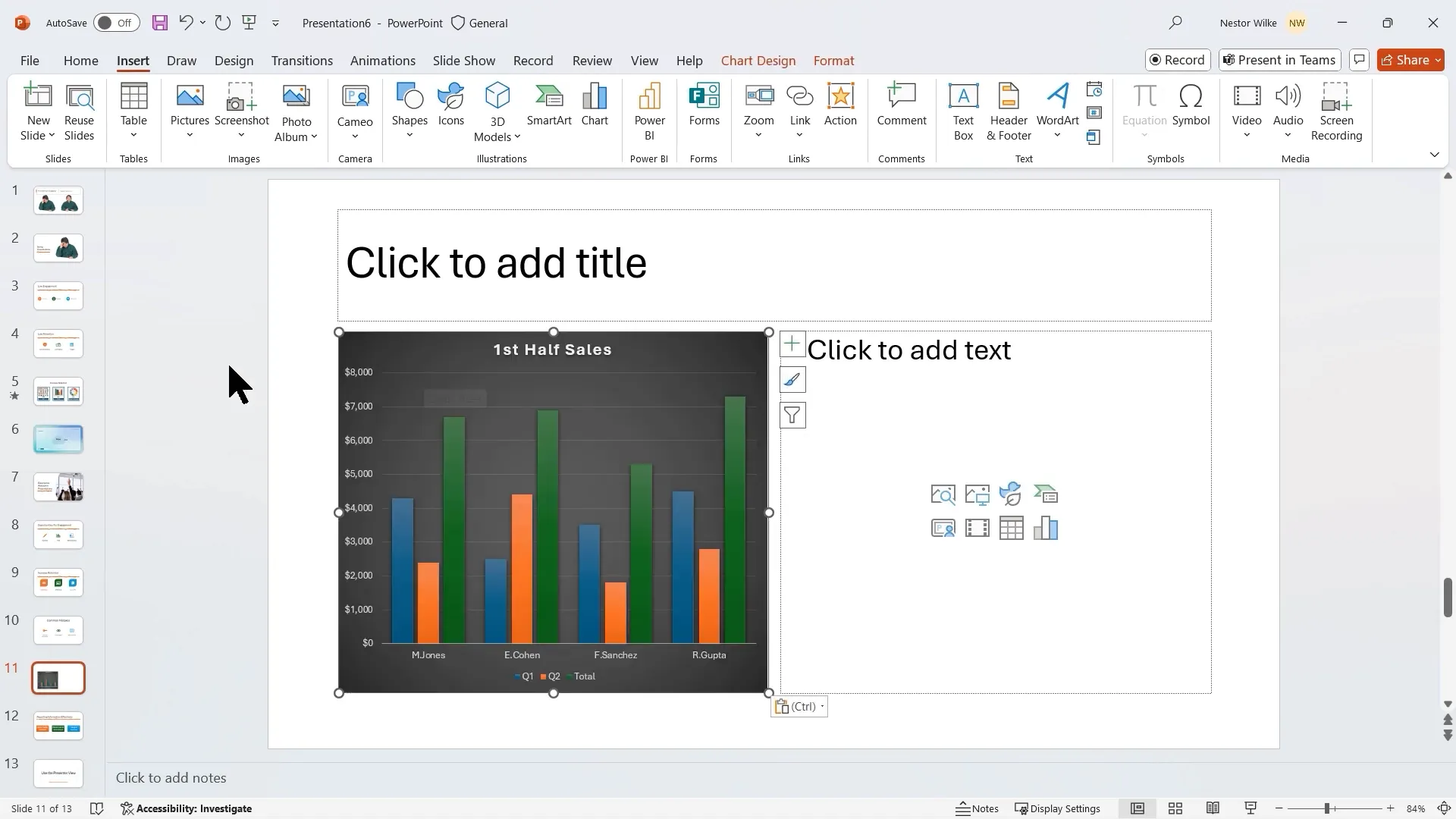
Presenting Data Effectively
When displaying data:
- Avoid long text explanations; use tables or charts instead.
- Copy and paste charts directly from Excel to retain formatting and interactivity.
- Use animations to reveal chart elements gradually, building suspense and clarity.
For example, animate your sales data chart by series or category to highlight each part sequentially.
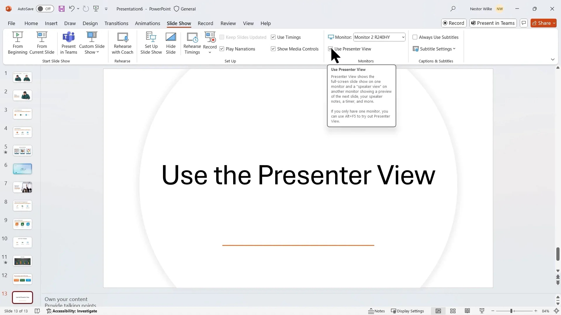
Maximizing Presentation Delivery with Presenter View
Presenter View is a powerful feature that helps you control your presentation confidently. It allows you to:

- View your current slide, upcoming slides, and speaker notes on your screen
- Use tools like laser pointer, pen, and subtitles
- Keep your audience focused on the slide content only
Using Presenter View lets you own your content, maintain eye contact, and avoid reading slides verbatim — all of which enhance audience trust and retention.
Tips for Using Presenter View
- Keep your slides simple, using notes for detailed talking points
- Stick to three key concepts per slide to avoid overloading your audience
- Use the black screen feature to focus attention during discussions or breaks
- Navigate smoothly between slides without revealing your slide sorter
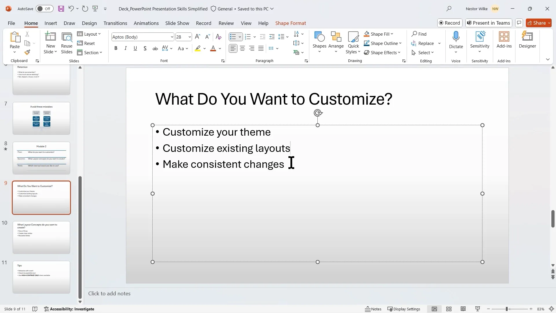
Module 2: Customizing Your Presentation for Impact
Customization ensures your presentation aligns with your brand and message, creating a professional and cohesive experience.
Creating Your Own Theme
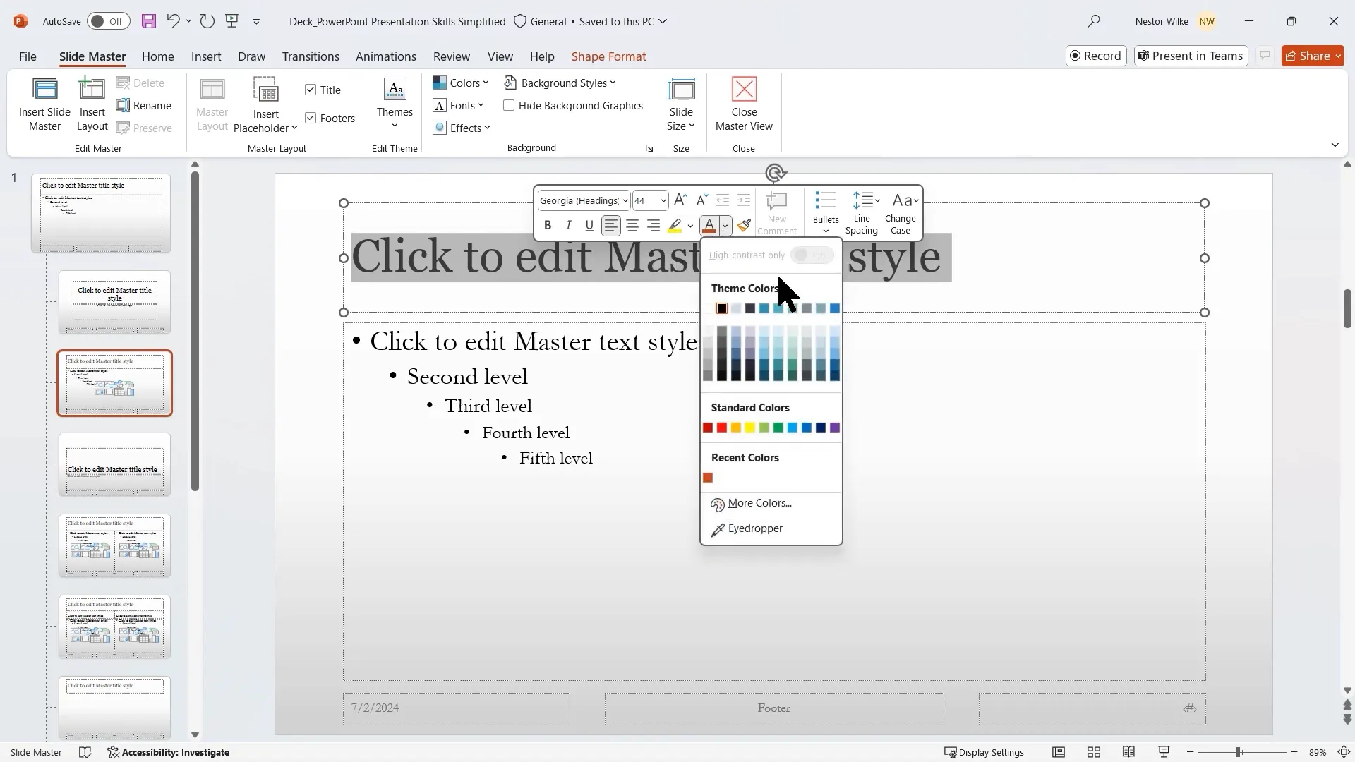
A theme in PowerPoint comprises colors, fonts, and effects. To create a custom theme:
- Open Slide Master view
- Select the master slide at the top
- Choose a color palette, font styles for headings and body text, and effects (e.g., glossy)
- Save your custom theme for reuse in future presentations
For instance, selecting Georgia for headings and Garamond for body text can give your slides a classic, elegant look.
Customizing Existing Layouts
Rather than editing slides individually, customize layouts in Slide Master to apply uniform changes across your presentation. For example:
- Change font colors and sizes
- Replace bullet points with check marks for visual interest
- Add accent shapes or remove footers for a cleaner look
All slides using a particular layout will update automatically, saving time and maintaining consistency.
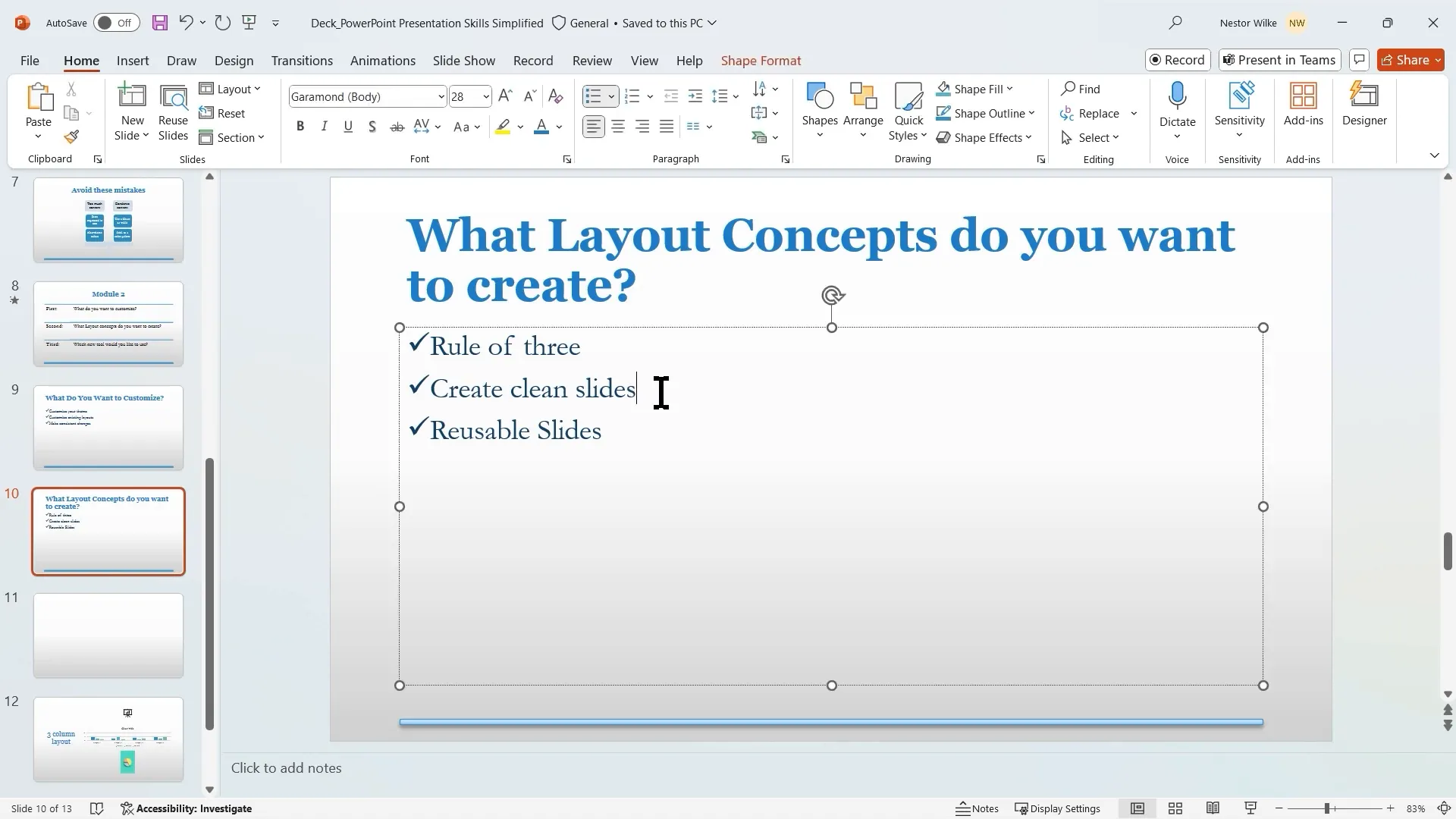
Creating Rule of Three Layouts
The “Rule of Three” suggests limiting content to three main points per slide, as our brains naturally grasp information in groups of three (e.g., breakfast, lunch, dinner). To support this, you can create custom layouts with three content placeholders arranged horizontally or vertically.
Steps:
- Duplicate an existing layout or insert a new layout in Slide Master
- Add three content placeholders and align them evenly
- Rename the layout for easy selection (e.g., “Three Columns” or “One by Three”)
This approach keeps slides simple, balanced, and easy to follow.
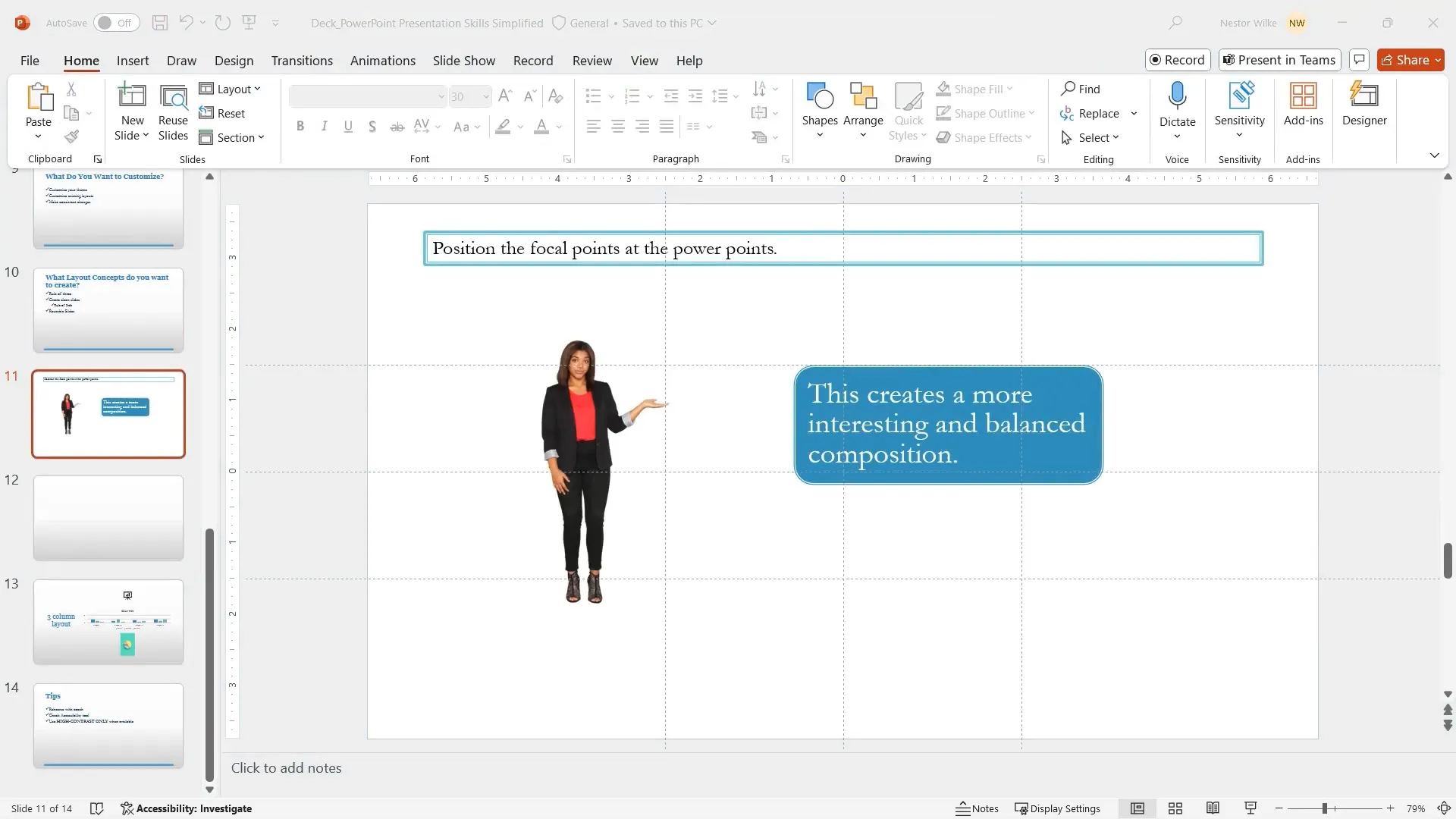
Applying the Rule of Thirds for Visual Balance
The Rule of Thirds is a design principle from photography and filmmaking that divides a frame into a 3×3 grid. Placing key elements at the intersections (called “PowerPoints”) creates a visually appealing and balanced composition.
In PowerPoint:
- Turn on guides and gridlines to mark the thirds on your slide
- Align images, text boxes, and other objects to these PowerPoints
- Distribute content across the slide for a natural flow
This method breaks the monotony of traditional slide layouts and captivates your audience’s attention.
Example of Rule of Thirds Layout
Instead of stacking content in one corner, spread three objects across the PowerPoints diagonally or in a triangular formation. This gives your slide a dynamic, balanced look that feels intentional and professional.
Creating Reusable Custom Slides
Custom title slides or section headers can surprise your audience and set the tone for your presentation. Using Slide Master, you can create reusable slides that incorporate:
- Unique layouts with custom image placements
- Branded colors and fonts
- Decorative shapes and accents
- Logos for brand consistency
For example, placing a large image on two-thirds of the slide with your title and subtitle on the remaining third creates a modern, stylish opening slide.
Leveraging New PowerPoint Features for Accessibility and Practice
High Contrast Color Selection
Choosing accessible colors ensures your presentation is readable by everyone, including those with visual impairments. PowerPoint’s high contrast mode filters color options to those that provide sufficient contrast against your background.
Use this feature when selecting fill colors or text colors to improve legibility and meet accessibility standards.
Accessibility Checker
PowerPoint includes an accessibility checker that scans your presentation for potential issues such as missing alternative text for images or poor color contrast. It provides recommended fixes to make your content more accessible to screen readers and diverse audiences.
Regularly running this tool before distributing your presentation ensures everyone can engage with your content effectively.
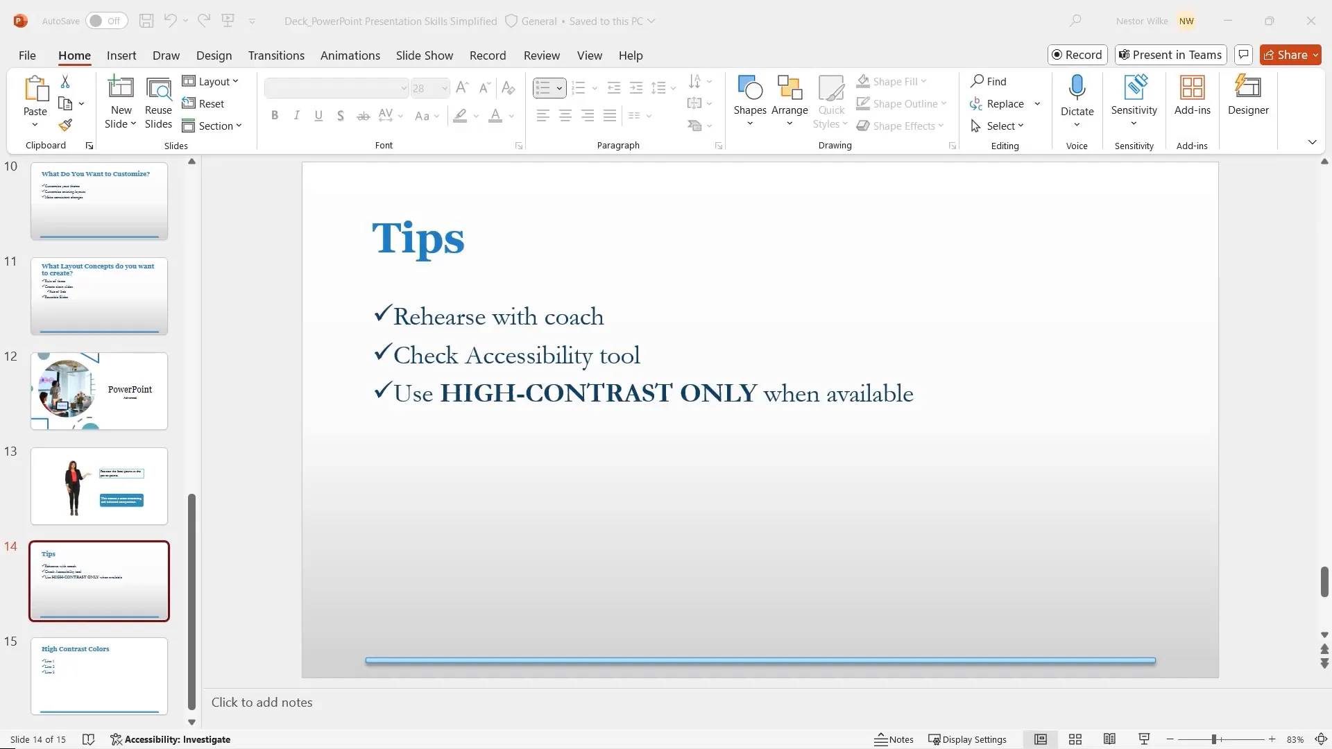
Rehearse with Coach Tool
Practicing your presentation is essential. PowerPoint’s Rehearse with Coach feature listens to your delivery and provides real-time feedback on:
- Use of filler words (e.g., “um,” “like”)
- Repetitive language
- Speech pace and pitch
- Inclusiveness of language
- Reading slides verbatim
This AI-powered coach helps you refine your style and build confidence before the real presentation.
Additional Presentation Tips
- Bullet Points: Aim for three bullets per slide. Four is acceptable, but five or more can overwhelm your audience.
- Bullet Length: Keep each bullet point to one line without wrapping to the next line. Condense information for clarity.
- Font Size: Use a minimum of 20-point font for readability, adjusting upward if your font is thinner or narrower.
- Eye Dropper Tool: Use the eye dropper to maintain a consistent color scheme by sampling colors from images or other slide elements.
Applying these tips will help you create presentations that are visually appealing, clear, and easy to follow.
Conclusion: Present Like a Pro
Mastering PowerPoint presentation skills involves more than just creating slides. It requires thoughtful storytelling, engaging your audience, maximizing retention, and avoiding common pitfalls. Customizing your themes and layouts ensures a professional and consistent look, while leveraging new tools enhances accessibility and interactivity.
Remember to:
- Tell a compelling story with a clear beginning, middle, and end
- Use visuals and concise text to boost retention
- Engage your audience actively with tools like whiteboards and forms
- Avoid overwhelming slides by summarizing key points and tailoring content to your audience
- Practice with PowerPoint’s Rehearse with Coach feature
- Customize your presentation with Slide Master to save time and maintain consistency
With these strategies, your presentations will be memorable, effective, and enjoyable for both you and your audience.
Frequently Asked Questions (FAQ)
1. How can storytelling improve my PowerPoint presentation?
Storytelling provides structure and context, making your presentation easier to follow and more engaging. It helps your audience connect emotionally and remember key points by framing your content as a journey with a clear beginning, middle, and end.
2. What are some effective retention techniques for presentations?
Combine concise text with relevant visuals, use infographics or SmartArt, and encourage audience participation through polls, quizzes, or whiteboards. These methods increase retention by engaging multiple senses and making information actionable.
3. How many bullet points should I include per slide?
Ideally, keep bullet points to three per slide. This aligns with how our brains process information and prevents cognitive overload. Avoid wrapping bullets to multiple lines by condensing the text.
4. What is the Rule of Thirds, and how does it apply to slide design?
The Rule of Thirds divides your slide into a 3×3 grid, with four intersection points called PowerPoints. Positioning key elements at these points creates balanced, visually appealing slides that naturally draw the audience’s attention.
5. How do I use the Presenter View effectively?
Presenter View allows you to see your notes, upcoming slides, and tools while your audience sees only the current slide. Use it to stay organized, control pacing, and avoid reading slides verbatim, which improves your delivery and audience engagement.
6. Can I customize PowerPoint themes to match my brand?
Yes, by using Slide Master, you can create custom themes with your preferred colors, fonts, and effects. This ensures consistency across all slides and reinforces your brand identity.
7. What tools does PowerPoint offer to enhance accessibility?
PowerPoint includes a high contrast color selection tool and an accessibility checker that identifies issues like poor color contrast or missing alternative text. These features help make your presentation accessible to all audience members.
8. How does the Rehearse with Coach feature help me improve?
It provides real-time feedback on your speech, including filler words, pace, pitch, and inclusiveness. Using this tool helps you polish your delivery and build confidence before presenting live.
9. How can I make my data presentations more engaging?
Use charts and tables instead of text to represent data visually. Animate charts to reveal data progressively, helping your audience absorb information without feeling overwhelmed.
10. What is the best way to start creating a PowerPoint presentation?
Begin with an outline, either in Word or PowerPoint’s Outline view, to structure your story and key points. This helps maintain focus and ensures your presentation flows logically before adding design elements.
Check out the full video: PowerPoint Presentation Skills Tutorial


