
Creating an engaging PowerPoint presentation is an art form in itself. Too often, we fall into the trap of designing slides cluttered with bullet points and excessive text that fail to captivate our audience. If you’ve ever been asked to create a one-slide presentation and ended up with a dull, text-heavy slide, you’re not alone. Fortunately, there’s a better way to approach PowerPoint slide design that makes your content visually appealing, memorable, and professional.
In this comprehensive guide, inspired by the expert insights from POWERPOINT UNIVERSITY, I’ll walk you step-by-step through transforming basic, uninspiring slides into vibrant, creative designs. You’ll learn the techniques to add color, icons, shadows, animations, and grouping effects that elevate your slides from bland to brilliant. Whether you are a beginner or looking to refresh your skills, this tutorial will help you master the art of PowerPoint slide design.
Table of Contents
- Why Bullet Points Fail in PowerPoint Slide Design
- Step 1: Create a Rounded Rectangle as Your Base
- Step 2: Add Shadow Effects for Depth
- Step 3: Insert and Style an Oval Shape
- Step 4: Design a Gradient Background
- Step 5: Add Text Boxes for Option Numbers and Titles
- Step 6: Insert and Customize Icons
- Step 7: Apply Animations for Visual Appeal
- Step 8: Duplicate and Color-Code Multiple Options
- Step 9: Change Icons for Each Option
- Tips for Effective PowerPoint Slide Design
- Frequently Asked Questions
- Conclusion
Why Bullet Points Fail in PowerPoint Slide Design
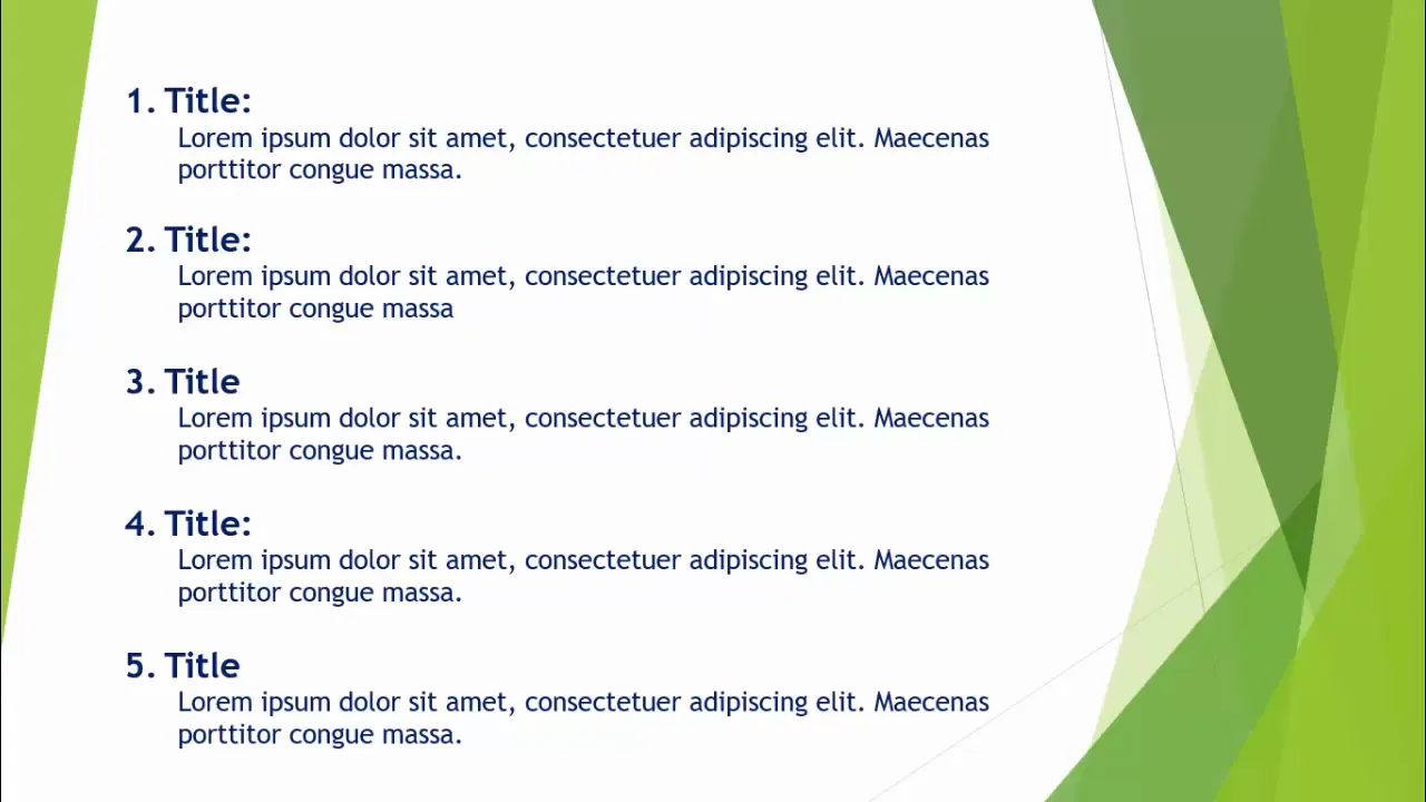
Almost everyone, at some point, relies on bullet points to organize information in a PowerPoint slide. While bullet points are useful for summarizing key ideas, overusing them can result in slides that are visually dull and text-heavy. This often leads to disengaged audiences who might tune out or miss the core message.
Bullet points tend to:
- Encourage reading rather than listening.
- Make slides look cluttered and uninviting.
- Limit creativity and visual storytelling.
To capture your audience’s attention, you need to break away from the traditional bullet-point format and embrace more visual, interactive elements such as shapes, colors, icons, and animations.
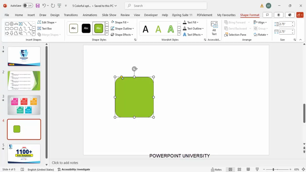
Step 1: Create a Rounded Rectangle as Your Base
The foundation of your new slide design begins with a simple yet visually appealing rounded rectangle. Here’s how to create it:
- In PowerPoint, add a new blank slide.
- Go to Insert > Shapes, then select a rectangle with rounded corners.
- Click and draw the shape on the slide. Set the height and width both to 2.75 inches for a balanced size.
- If you want softer curves, click and drag the yellow adjustment handles outward to reduce the corner radius.
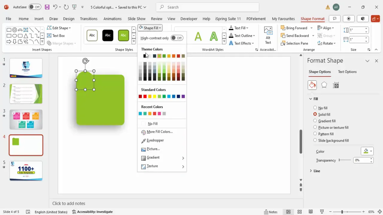
- Remove the outline by selecting Shape Outline > No Outline.
- Fill the shape with a color of your choice. For example, a medium green shade works well as a base.
This rounded rectangle will serve as a container for your content, breaking the monotony of plain text and adding a modern touch.
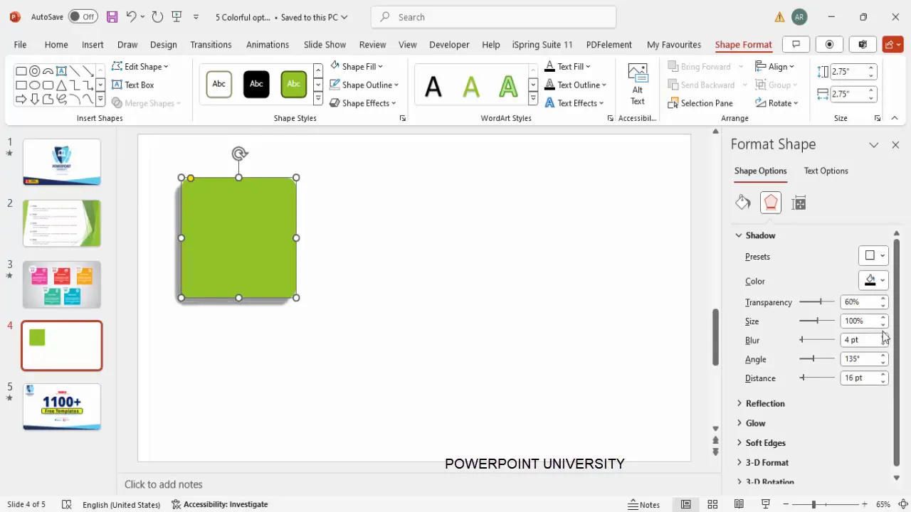
Step 2: Add Shadow Effects for Depth
Flat shapes can look dull, so adding subtle shadows gives your design depth and a polished look. Here’s how to do it:
- Select your rounded rectangle.
- Go to Format Shape > Effects > Shadow.
- Choose the preset Offset Bottom Left.
- Adjust the Distance and Blur settings to create a subtle shadow that lifts the shape off the slide.
The shadow effect creates a visual hierarchy and makes your slide look more professional and dynamic.
Step 3: Insert and Style an Oval Shape
To complement the rectangle and add an additional design element, insert an oval shape:
- Go to Insert > Shapes, then select the oval shape.
- Draw the oval and remove its outline by selecting Shape Outline > No Outline.
- Fill it with white color to contrast with the colored rectangle.
- Add a shadow effect to the oval by selecting Offset Bottom Right under shadow presets.
- Adjust the shadow distance for a subtle 3D effect.
- Position the oval overlapping the rectangle to create a layered look.
This layering technique adds sophistication and helps your slide stand out.
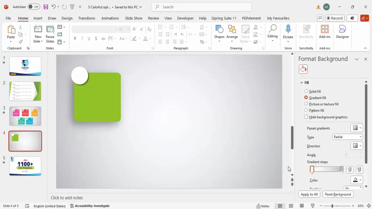
Step 4: Design a Gradient Background
A plain background can make your slide feel flat. By adding a gradient background, you introduce depth and focus:
- Right-click on the slide background and select Format Background.
- Select Gradient Fill.
- Choose the gradient type as Radial.
- Set the gradient direction to From Center.
- Pick colors that complement your main shapes — for example, lighter shades of your rectangle’s color.
- Adjust the gradient stops to control the smoothness and spread.
- Hold the Shift key and resize the gradient fill to cover the entire slide evenly.
This subtle background enhancement draws the viewer’s eye toward the content area.
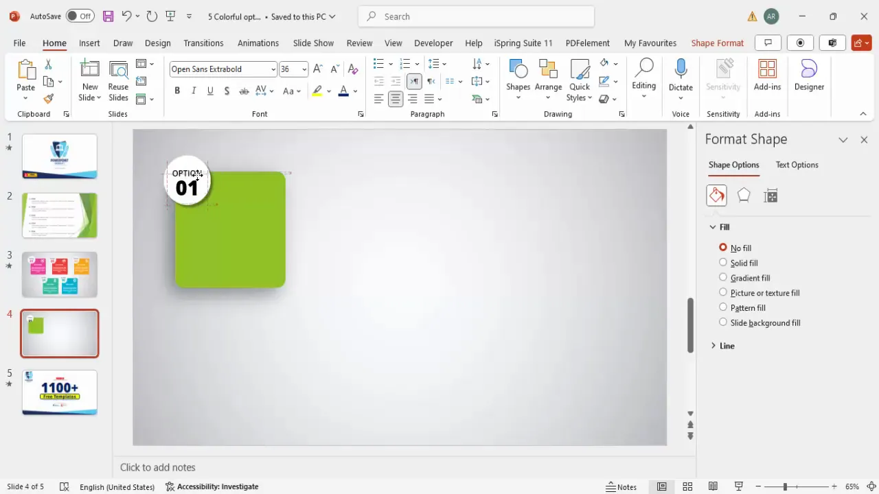
Step 5: Add Text Boxes for Option Numbers and Titles
Now that you have the base design elements, it’s time to add meaningful text that guides your audience through the content:
- Insert a text box and type a label such as Option, Step, or another term relevant to your presentation.
- Set the font to Open Sans, center-align the text, and reduce the font size for a subtle header.
- Make the text bold or semi-bold for better readability.
- Duplicate this text box (Ctrl + D) and replace the text with your option number, e.g., 01.
- Set this number text to Open Sans Extra Bold and increase the font size to around 36 pt.
- Color the number text with the same color as your rectangle’s fill for consistency.
- Insert another text box for the title of the option, using Open Sans Extra Bold, center-aligned and colored white or a contrasting color.
- Below the title, add a smaller text box for the detailed description.
- Use placeholder text like =lorem(1) to generate sample text, then trim it to a concise size.
- Center-align and reduce the font size for readability, coloring the text white or another light color.
This structured text layout improves clarity and guides the audience’s attention logically through each option.
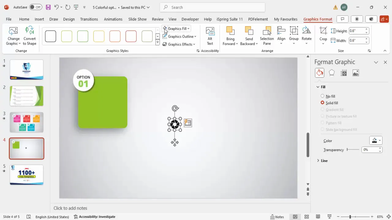
Step 6: Insert and Customize Icons
Icons are powerful visual cues that complement your text and add personality to your slides. To insert and style icons:
- Go to Insert > Icons and search for icons that match your content theme.
- Select an icon and click Insert.
- Resize the icon to approximately 0.6 inches square for balance.
- Change the icon fill color to white or a color that contrasts well with the background.
- Position the icon near the option number or title for visual association.
- Optionally, apply subtle shadow effects to the icon for depth.
Icons make your slide more engaging and help communicate ideas quickly.
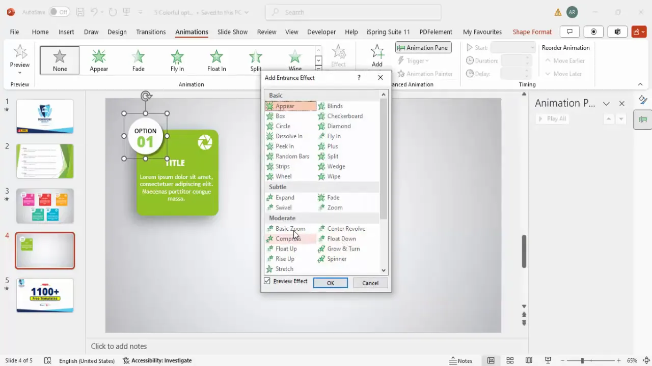
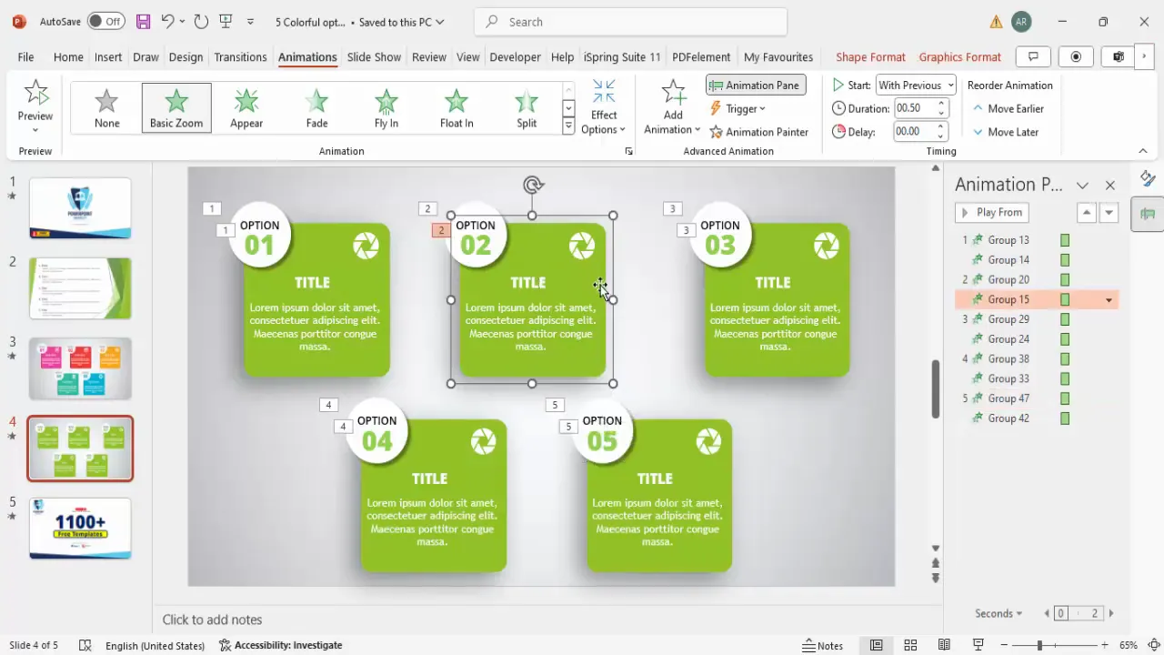
Step 7: Apply Animations for Visual Appeal
Adding animations can make your slide dynamic and interactive, keeping your audience engaged. Here’s how to apply animations effectively:
- Select the grouped shape or text element you want to animate.
- Open the Animations tab and enable the Animation Pane.
- Click Add Animation and select More Entrance Effects.
- Choose the Basic Zoom effect and click OK.
- Set the animation to start With Previous to synchronize entrance animations.
- Adjust timing and delay settings to create a smooth flow.
Animations should enhance your message, not distract. Use them sparingly and purposefully.
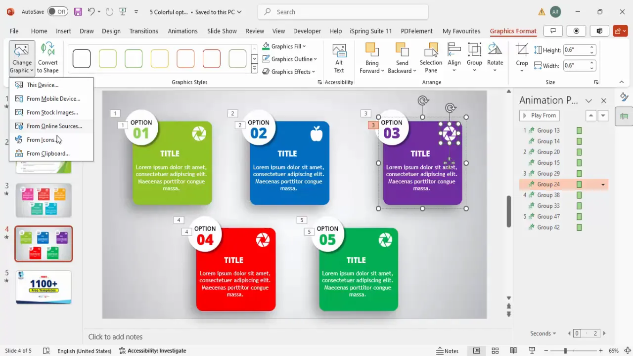
Step 8: Duplicate and Color-Code Multiple Options
Once you have designed one option box, you can save time by duplicating it and customizing the colors for variety and clarity:
- Select all elements of your option box (shapes, text, icons).
- Hold Ctrl + Shift and drag the selection to create a duplicate.
- Repeat this process to create as many options as needed (e.g., five options).
- Change the color fill of each rectangle and associated text to a new color to differentiate options.
- Use colors such as blue, purple, red, and darker green for distinctiveness.
- Ensure the text colors contrast well with the new background colors for readability.
Color coding helps your audience quickly identify and differentiate the options presented.

Step 9: Change Icons for Each Option
To further customize each option and maintain relevance, change the icons to match the content:
- Select the icon you want to replace.
- Go to Graphic Format > Change Graphic > From Icons.
- Choose a new icon that fits the option’s theme.
- Click Insert and resize or recolor as needed.
- Repeat for each option to keep the design fresh and meaningful.
Relevant icons improve comprehension and add a professional touch to your slide.
Tips for Effective PowerPoint Slide Design
Besides the technical steps, keep these design principles in mind to create impactful slides:
1. Keep It Simple
Avoid clutter by limiting text and visuals. Aim for clear, concise messaging with supportive graphics.
2. Use Consistent Fonts and Colors
Stick to one or two fonts and a harmonious color palette to maintain a professional look.
3. Align Objects Precisely
Use PowerPoint’s alignment tools to ensure elements are evenly spaced and balanced.
4. Leverage White Space
Give your content room to breathe by not overcrowding the slide.
5. Use High-Quality Icons and Images
Choose icons and images that are clear, relevant, and visually compatible with your design.
6. Test Your Slide in Presentation Mode
Preview animations and readability on the big screen to ensure your slide delivers impact.
Frequently Asked Questions
Q1: How do I choose the right colors for my PowerPoint slide design?
Choose colors that complement your brand or presentation theme. Use color theory principles—such as complementary or analogous colors—to create visually appealing combinations. Also, ensure sufficient contrast between text and background for readability.
Q2: Can I use any font for PowerPoint slides?
While you can use various fonts, it’s best to stick with clean, professional fonts like Open Sans, Arial, or Calibri. Avoid overly decorative fonts that may distract or reduce readability.
Q3: How many animations should I use in a single slide?
Use animations sparingly—just enough to highlight key points or add flow. Too many animations can be distracting and reduce the professionalism of your presentation.
Q4: Is it better to create slides from scratch or use templates?
Templates save time and provide consistent design, but creating slides from scratch allows full customization. Consider your time constraints and presentation needs when deciding.
Q5: What size should I make my PowerPoint slides?
The default slide size (16:9 aspect ratio) works for most presentations. You can customize slide size in File > Page Setup if you have specific display requirements.
Conclusion
PowerPoint slide design doesn’t have to be a mundane task filled with dull bullet points and plain text. By incorporating simple design techniques such as rounded rectangles, shadow effects, gradient backgrounds, thoughtfully placed text, relevant icons, and subtle animations, you can transform your slides into engaging visual stories.
Remember, the goal is to communicate your message clearly and memorably. Using color coding, grouping elements, and duplicating well-designed layouts saves time and maintains consistency across your presentation. And always keep your audience in mind—design slides that are easy to follow, visually balanced, and professional.
With these steps and tips, you’re now equipped to turn any old, boring PowerPoint slide into a creative masterpiece that commands attention and delivers impact.
For more creative PowerPoint templates and tutorials, consider exploring resources that offer free templates and ongoing support for your presentation design journey.
Check out the full video: Old Vs New Slide Design


