
PowerPoint slide design is an art form that merges creativity with technical skill, allowing presenters to captivate audiences and communicate complex ideas with clarity. In this comprehensive guide, I’ll walk you through a unique slide design challenge where I teamed up with two talented PowerPoint creators, Lewis and Marius, to transform the same basic slide into distinct, engaging presentations. This article offers a deep dive into the design process, techniques, and tools I used to create an interactive, animated PowerPoint presentation on the fascinating topic of time travel theories.
Whether you’re a beginner or an experienced PowerPoint user, this article will inspire you with practical tips, detailed explanations, and visual examples to enhance your own presentations. Let’s explore how to craft captivating slides that not only look great but also provide an interactive and immersive experience for your audience.
Table of Contents
- Challenge Overview: Designing Within Constraints
- Slide Structure and Layout: Dividing Content Effectively
- Incorporating Interactive Elements and Animations
- Using Audio for Accessibility and Engagement
- Technical Tips: Hyperlinks, Morph Transitions, and Kiosk Mode
- Resources for Design: Illustrations, Videos, and Voice Generation
- Final Presentation Walkthrough
- Frequently Asked Questions
- Conclusion: Elevating Your PowerPoint Slide Design
Challenge Overview: Designing Within Constraints
In this slide design challenge, the core rule was simple yet challenging: transform a single original PowerPoint slide into a maximum of four slides while including all the original text. This meant no content could be removed, but we had the freedom to redesign, restructure, and add interactive features.
The original slide content focused on time travel theories, covering three main scientific ideas:
- Relativity and Time Dilation
- Wormholes and General Relativity
- Multiverse Theory and Many Worlds Interpretation
This topic offered a rich opportunity to incorporate visuals, animations, and interactive elements to help explain complex concepts in an accessible way.
My approach was to create a clean, modern, and interactive presentation that divides the content logically and invites the viewer to explore each theory in detail with engaging multimedia elements.
Slide Structure and Layout: Dividing Content Effectively
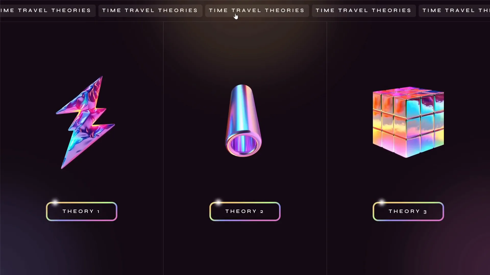
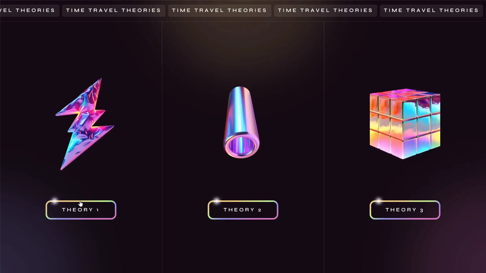
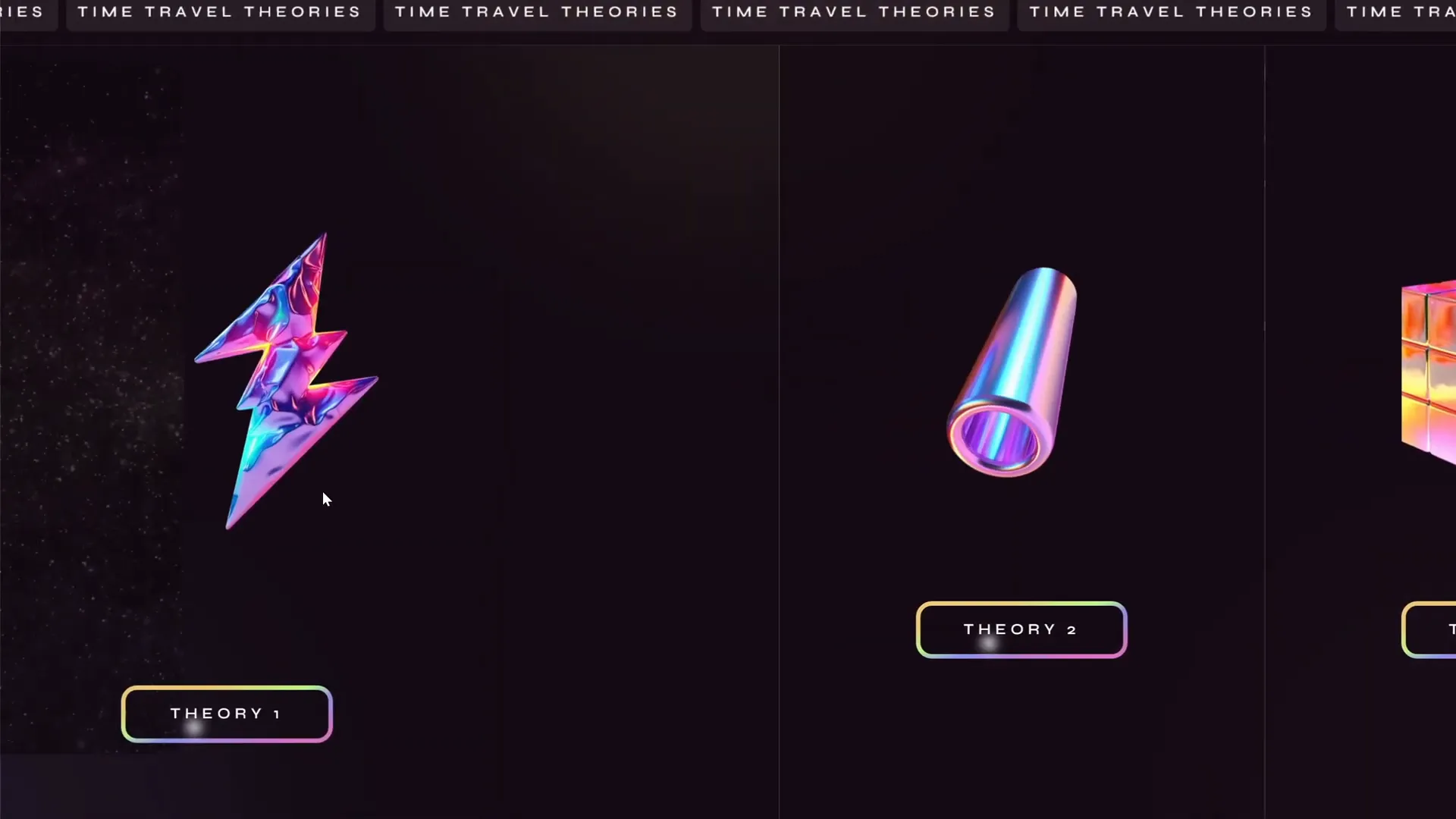
The first step in my PowerPoint slide design was to organize the content clearly and intuitively. Since there were three distinct theories to present, I decided to divide the starting slide into three equal vertical sections. This layout not only balanced the visual weight across the slide but also immediately communicated the structure of the presentation to the audience.
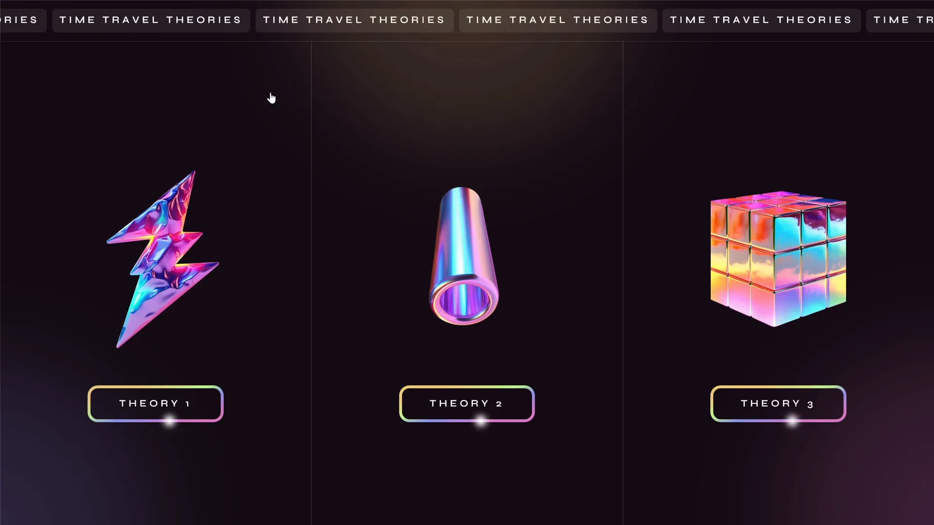
Each section was designed to be clickable, functioning as an interactive menu. Clicking a section would navigate the viewer to a dedicated slide that dives deeper into the respective theory.
This approach ensures:
- Clarity: Viewers see the three main topics at a glance.
- Navigation: Easy access to detailed content without overwhelming the audience.
- Visual Interest: The balanced layout provides a clean and engaging starting point.
On the starting slide, I also added a scrolling text banner at the top, along with subtle animations such as a highlight following a rounded rectangle and holographic illustrations floating gently, adding a futuristic, space-themed vibe fitting for the topic.
Breaking Down Dense Text
One of the biggest challenges was handling the large volume of text from the original slide. To avoid overwhelming the viewer with walls of text, I broke down the information into smaller, manageable pieces. This was done through an interactive menu on each detailed slide, allowing users to navigate through different passages of text one at a time.
This technique enhances readability and engagement by focusing the viewer’s attention on one concept at a time.
Incorporating Interactive Elements and Animations
Interactivity was a key feature in my PowerPoint slide design. To bring the presentation to life, I used several animation techniques and clickable elements:
Clickable Sections and Hyperlinks
On the starting slide, each of the three sections was made clickable via invisible rectangles with hyperlinks attached. These hyperlinks navigate to the corresponding detailed slides.
This method creates a seamless user experience where viewers can explore the content in any order they prefer.
Animations: Entrance, Exit, and Swivel Effects
To create smooth transitions and engaging visual effects, I used a combination of entrance and exit animations triggered by button clicks. This ensures that when new text appears, the old text disappears simultaneously, preventing clutter.
One particularly eye-catching effect was the swivel animation applied to text passages, creating a flickering effect that adds visual interest without distracting from the content.
Floating Holographic Illustrations
The presentation features holographic-style illustrations that float up and down gently, adding a futuristic and immersive feel. These animations help to visually anchor each section and make the scientific concepts more approachable.
Looping Videos Triggered by Clicks
In each detailed slide, clicking on the holographic illustration launches a beautiful looping video related to the topic, such as animations demonstrating time dilation or wormholes. These videos help explain complex theories visually, complementing the textual information.
Using Audio for Accessibility and Engagement
To further enhance engagement and accessibility, I integrated audio narration that reads the text aloud when activated. This is especially helpful for viewers who prefer auditory learning or have visual impairments.
The audio button is positioned conveniently at the bottom of the text area on each detailed slide. Clicking this button triggers a voiceover of the displayed text.
For generating the voiceover, I used the Eleven Labs tool, known for its natural and clear speech synthesis. This tool allowed me to create professional-quality audio narrations without the need for recording my own voice.
While I added audio voiceover only to the first part of the multiverse theory text to keep the design simple, it is easily scalable to include narration for all text passages.
Technical Tips: Hyperlinks, Morph Transitions, and Kiosk Mode
Behind the scenes, several technical PowerPoint features made this interactive presentation possible and seamless.
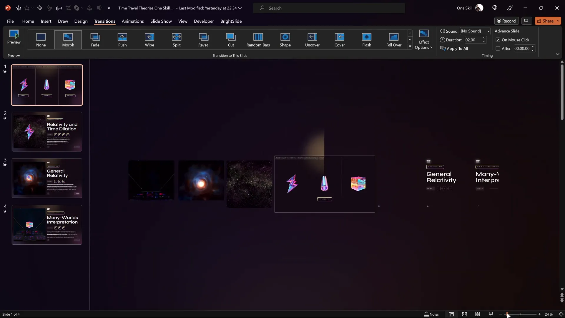
Using Morph Transition for Smooth Animations
All slides in the presentation use the Morph transition, a powerful feature in PowerPoint that creates smooth animations between slides by automatically animating objects that change position, size, or appearance.
This technique was key in:
- Animating elements that move in and out of the slide view.
- Creating seamless transitions between the starting slide and detailed slides.
- Enhancing the floating effect of holographic illustrations.
Invisible Rectangles and Hyperlinking
To make the three sections on the starting slide clickable without interfering with the design, I used invisible rectangles placed over each section. These rectangles have hyperlinks to the corresponding slides.

This trick is a common approach in PowerPoint slide design to add interactivity without visual clutter.
Animation Triggers for Interactive Menus
The interactive text menus on detailed slides use animation triggers, which activate animations based on user clicks. This allows for:
- Switching between different text passages smoothly.
- Ensuring old text exits while new text enters simultaneously.
Careful synchronization of entrance and exit animations with the same triggers is critical to avoid overlapping content.
Kiosk Mode for Controlled Navigation
The presentation is set to run in kiosk mode. This mode disables mouse clicks and keyboard shortcuts for slide navigation, forcing users to navigate exclusively via hyperlinks and buttons.
Kiosk mode is ideal for interactive presentations where you want to control the flow and prevent accidental slide changes.
Resources for Design: Illustrations, Videos, and Voice Generation
Creating a polished and professional PowerPoint slide design is easier when you have access to high-quality design assets and tools. Here are the key resources I used for this project:
| Resource Type | Source | Purpose |
|---|---|---|
| Holographic Illustrations | Figma Community | Futuristic floating shapes and icons to enhance visual appeal |
| Looping Videos | Artlist.io | Space-themed videos illustrating time travel concepts |
| Voice Synthesis | Eleven Labs | Natural-sounding text-to-speech voiceovers for narration |
Final Presentation Walkthrough
Let’s take a detailed tour through the final presentation, highlighting the key features and flow.
1. Starting Slide: Overview of Time Travel Theories
The presentation opens with a dynamic, visually balanced slide divided into three vertical sections representing the three theories. The scrolling text banner sets the tone, while floating holographic illustrations add depth.
Each section is clickable, inviting exploration. Hovering or clicking triggers a subtle highlight animation that follows the rounded rectangle boundary, signaling interactivity.
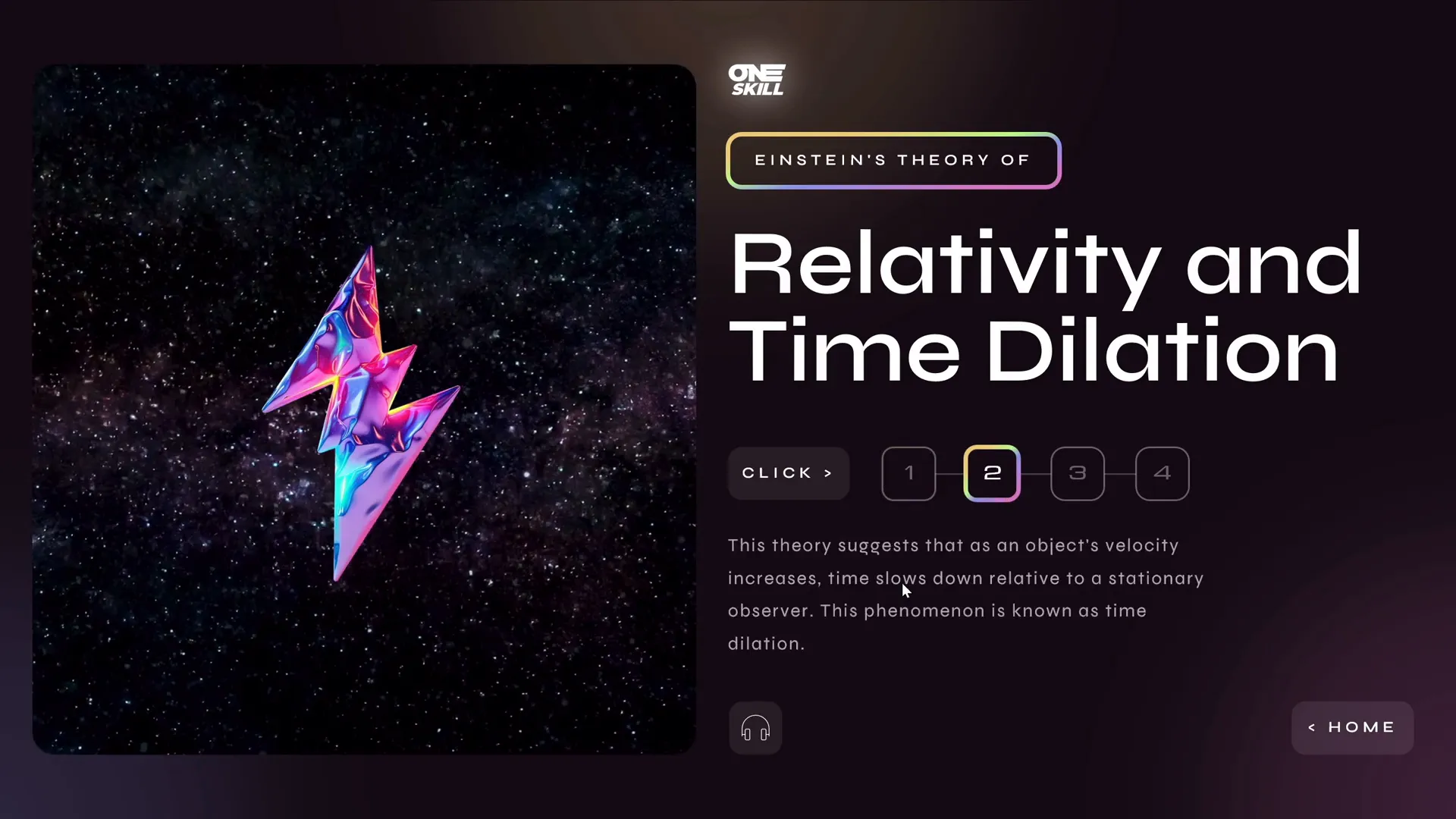
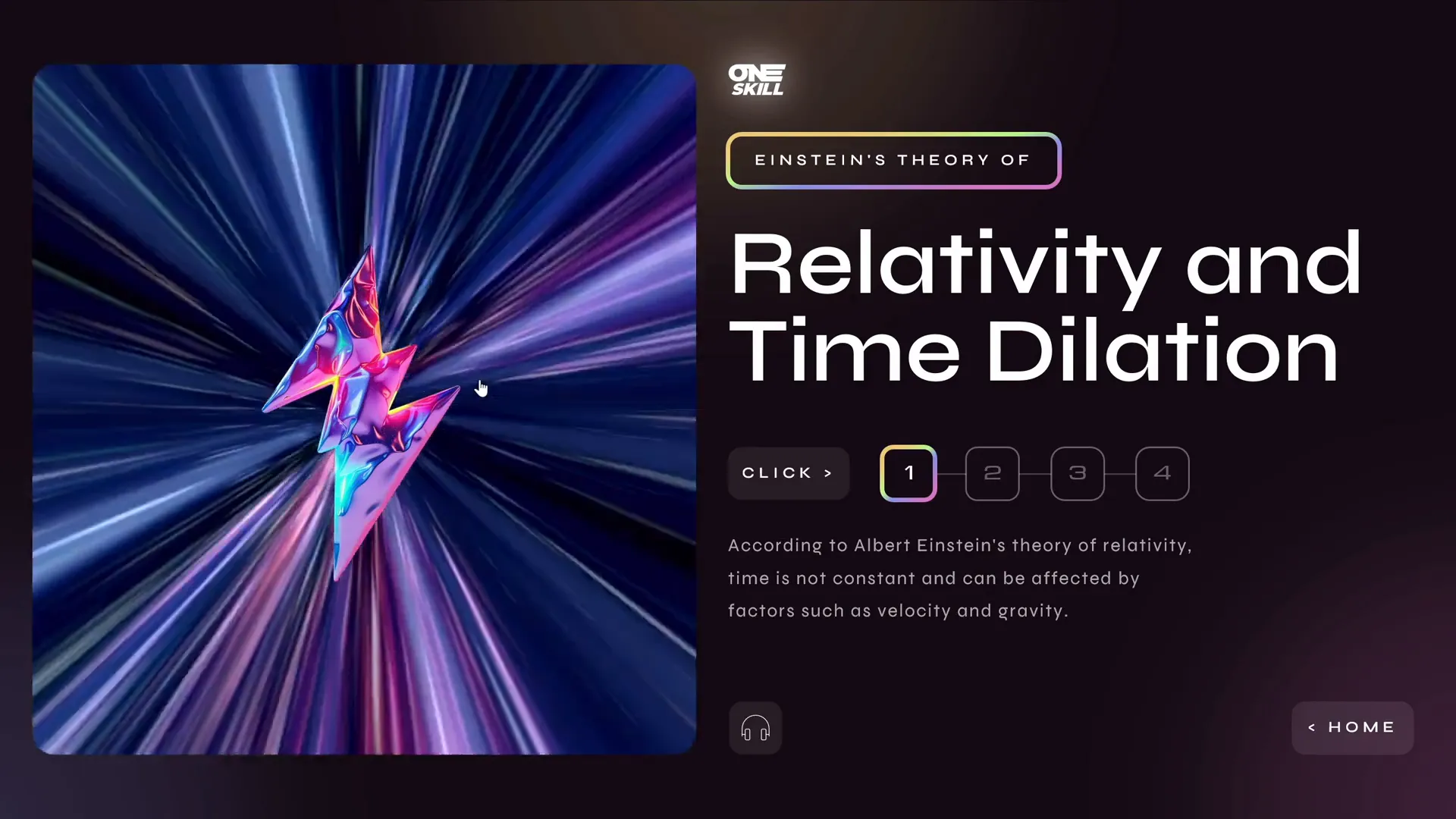
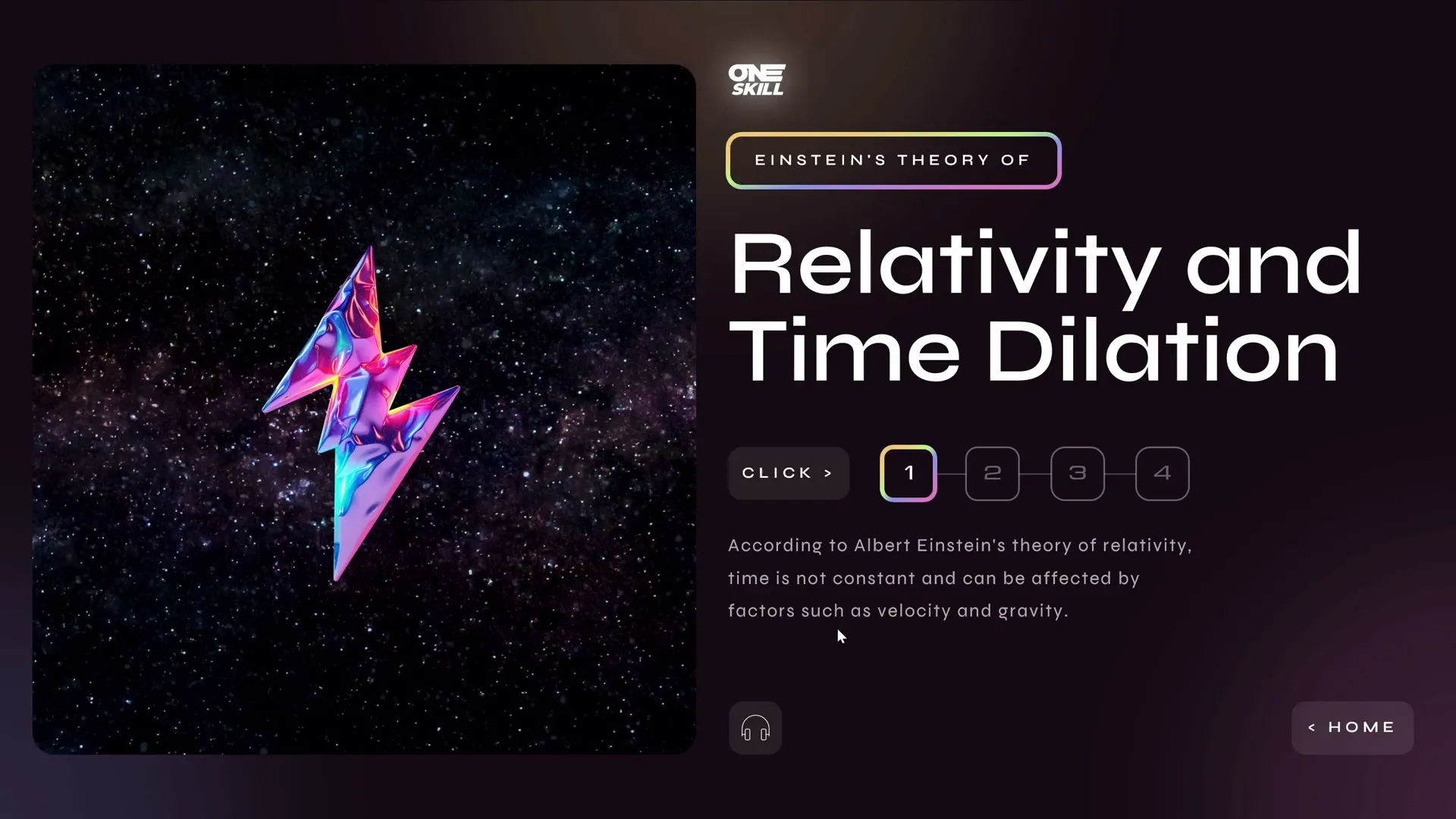
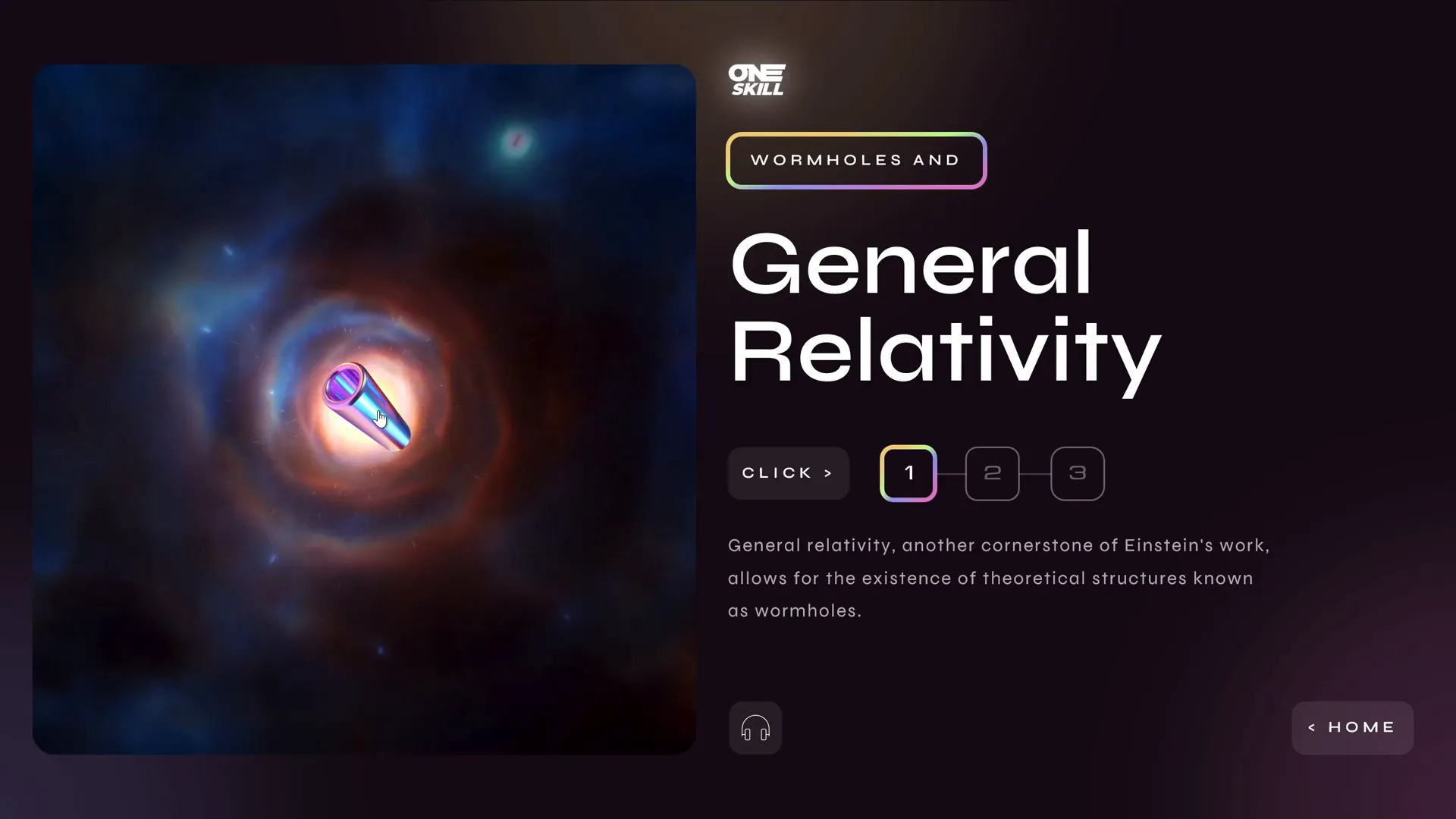
2. Relativity and Time Dilation Slide
Clicking the first section leads to the detailed slide on relativity and time dilation. Here, clicking the holographic illustration launches a looping video illustrating the concept.
The text is broken into smaller paragraphs navigable via an interactive menu with buttons. Clicking a button transitions the text smoothly using swivel animations and entrance/exit triggers.
An audio button reads the text aloud, offering an immersive learning experience.
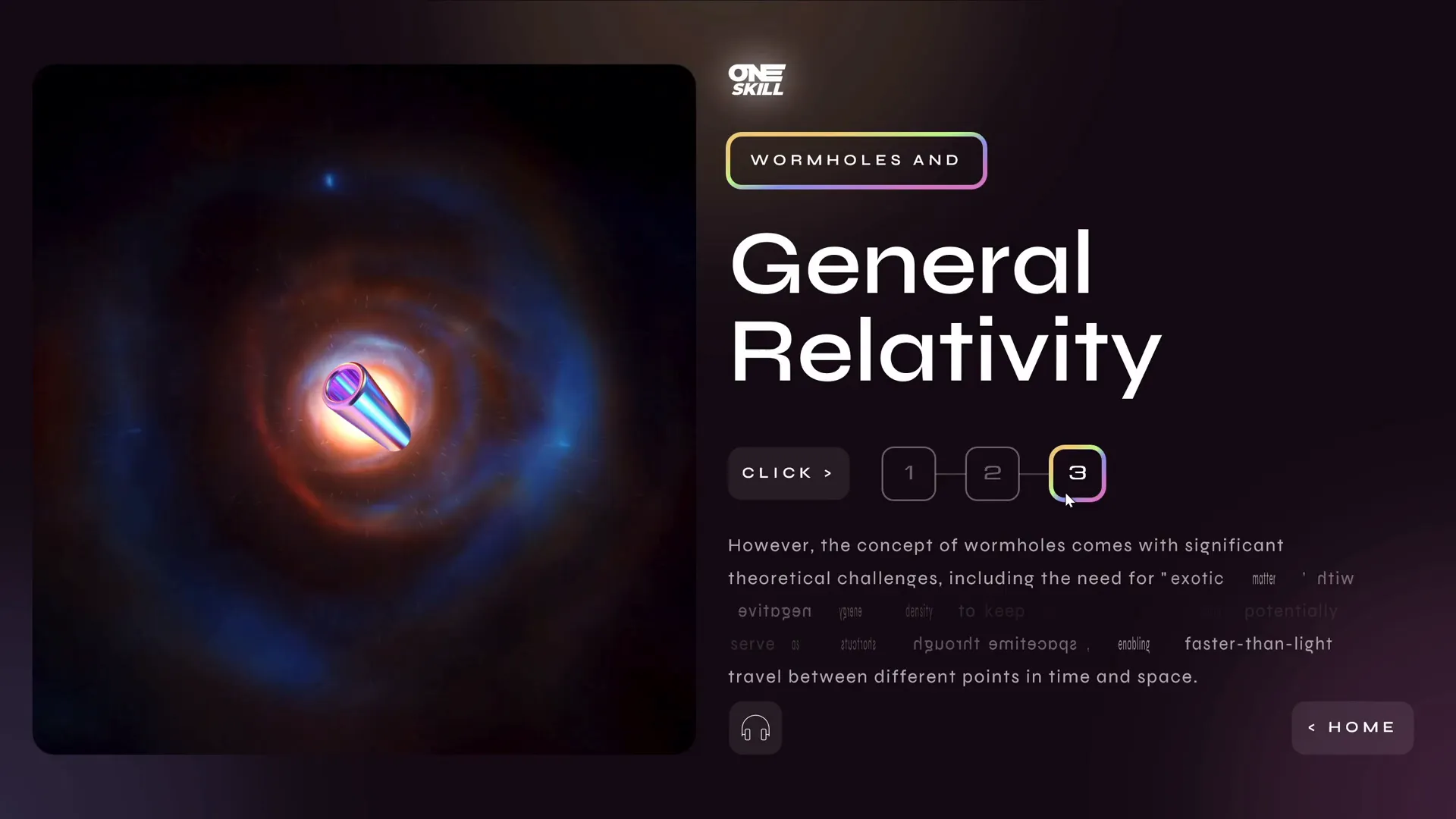
3. Wormholes and General Relativity Slide
The second detailed slide focuses on wormholes. It features a similar layout and interaction model: clickable holographic illustration for video, interactive text menu, swivel animations, and audio narration.
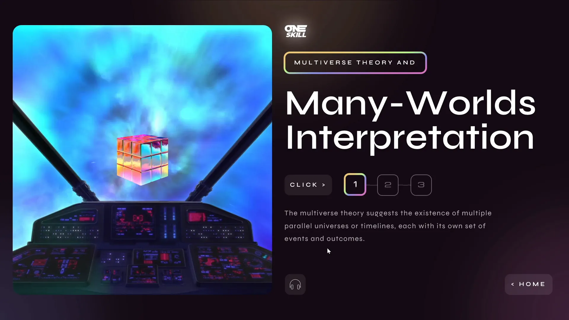
4. Multiverse Theory and Many Worlds Interpretation Slide
The final detailed slide explores the multiverse theory. To keep the design simple, I added audio narration only to the first text passage, but the menu and text navigation remain fully interactive.
5. Returning Home
Each detailed slide includes a home button that returns the viewer to the starting slide. This maintains fluid navigation and encourages exploration.
Frequently Asked Questions
Q1: How can I make my PowerPoint slides interactive like this?
Use hyperlinks on shapes or invisible rectangles to create clickable areas that navigate between slides. Combine this with animation triggers to control content visibility dynamically. Setting your presentation to kiosk mode ensures navigation only through these interactive elements.
Q2: What is the Morph transition, and why is it useful?
The Morph transition animates changes in position, size, and appearance of slide objects between two slides. It creates smooth, professional animations without complex timelines or video editing, making it perfect for interactive presentations.
Q3: How do I add audio narration to my slides?
You can record audio directly in PowerPoint or use text-to-speech tools like Eleven Labs to generate natural-sounding voiceovers. Insert audio files on slides and link them to buttons for user-triggered playback.
Q4: What are some good resources for free illustrations and videos?
Figma Community offers a wide range of free, high-quality illustrations. For videos, platforms like Artlist.io provide royalty-free clips suitable for presentations. Using these resources elevates your slide design without extra cost.
Q5: How do I ensure my animations don’t clutter the slide?
Use entrance and exit animations together with the same triggers to replace old content with new content cleanly. Avoid overlapping animations and keep effects subtle to maintain professionalism and focus.
Conclusion: Elevating Your PowerPoint Slide Design
Transforming a single slide into a dynamic, interactive presentation is a rewarding challenge that combines design, storytelling, and technical skills. By dividing content logically, incorporating smooth animations, adding multimedia elements like videos and audio, and using PowerPoint’s advanced features such as Morph transitions and kiosk mode, you can create presentations that truly engage and educate your audience.
Remember, effective PowerPoint slide design is not just about aesthetics but also about usability and clarity. Breaking down complex text into interactive menus, using voice narration for accessibility, and providing intuitive navigation all contribute to a memorable presentation experience.
Whether you’re presenting scientific theories, business strategies, or creative ideas, applying these principles and techniques will help you stand out and communicate your message powerfully.
Start experimenting with these tips today, and watch your PowerPoint slide design skills soar!
Check out the full video: 3 PowerPoint Designers Transform The Same Slide 😁✨@lourrutiappt @plsfixppt


