PowerPoint Slides Design: Create an Engaging Product Comparison Slide A Step-by-Step PowerPoint Slides Design Guide

Creating visually compelling and informative slides is a cornerstone of effective presentations. If you want to master PowerPoint Slides Design to clearly compare products or options side-by-side, this comprehensive guide will walk you through creating a dynamic comparison slide from scratch. This tutorial is designed to help professionals, marketers, and business owners present product comparisons that highlight key factors such as performance, features, quality, reviews, and support—in a way that your audience can instantly understand.
By the end, you’ll be able to craft a polished, interactive comparison slide that not only looks professional but also effectively conveys data and helps decision-making. Let’s dive into the process and explore how to build this slide step-by-step with practical PowerPoint design tips and tricks.
Table of Contents
- Why Create Comparison Slides?
- Preparing Your Slide and Setting Up Guides
- Building the Comparison Slide Structure
- Designing Product Columns with Shapes and Colors
- Adding Text and Labels for Clarity
- Creating Percentage Bars for Visual Comparison
- Duplicating Options and Adjusting Values
- Applying Animations for Impact
- Final Touches: Shadows, Alignment, and Colors
- Frequently Asked Questions (FAQ)
- Conclusion
Why Create Comparison Slides?
Comparison slides are essential tools in presentations where you need to evaluate two or more products, options, or ideas against each other. Whether you’re pitching to clients, informing stakeholders, or educating teams, a well-designed comparison slide helps convey complex data clearly and quickly.
Here are some key benefits of using comparison slides:
- Visual Clarity: Side-by-side layouts allow audiences to see differences and similarities at a glance.
- Data-Driven Decisions: Quantitative comparisons such as performance percentages provide concrete information for decision-making.
- Engagement: Interactive elements like animations keep your audience focused and make the presentation dynamic.
- Professionalism: Customized slides reflect your attention to detail and improve credibility.
In this guide, we’ll build a comparison slide that pits Product A against Product B, but the techniques apply equally to comparing multiple options or categories.
Preparing Your Slide and Setting Up Guides
Before jumping into design, preparation is key to achieving a clean and balanced layout. Here’s how to get started:
- Add a New Slide: Start with a blank slide in your PowerPoint presentation to give yourself a clean canvas.
- Enable Guides: Go to the View tab and enable Guides. These help align your shapes and text boxes perfectly, ensuring symmetry and professional polish.
Using guides is a best practice in PowerPoint Slides Design, as it helps maintain consistent spacing and alignment throughout your slide.
Building the Comparison Slide Structure
The foundation of your comparison slide is the structure that holds all elements together. We will use PowerPoint shapes to create this structure.
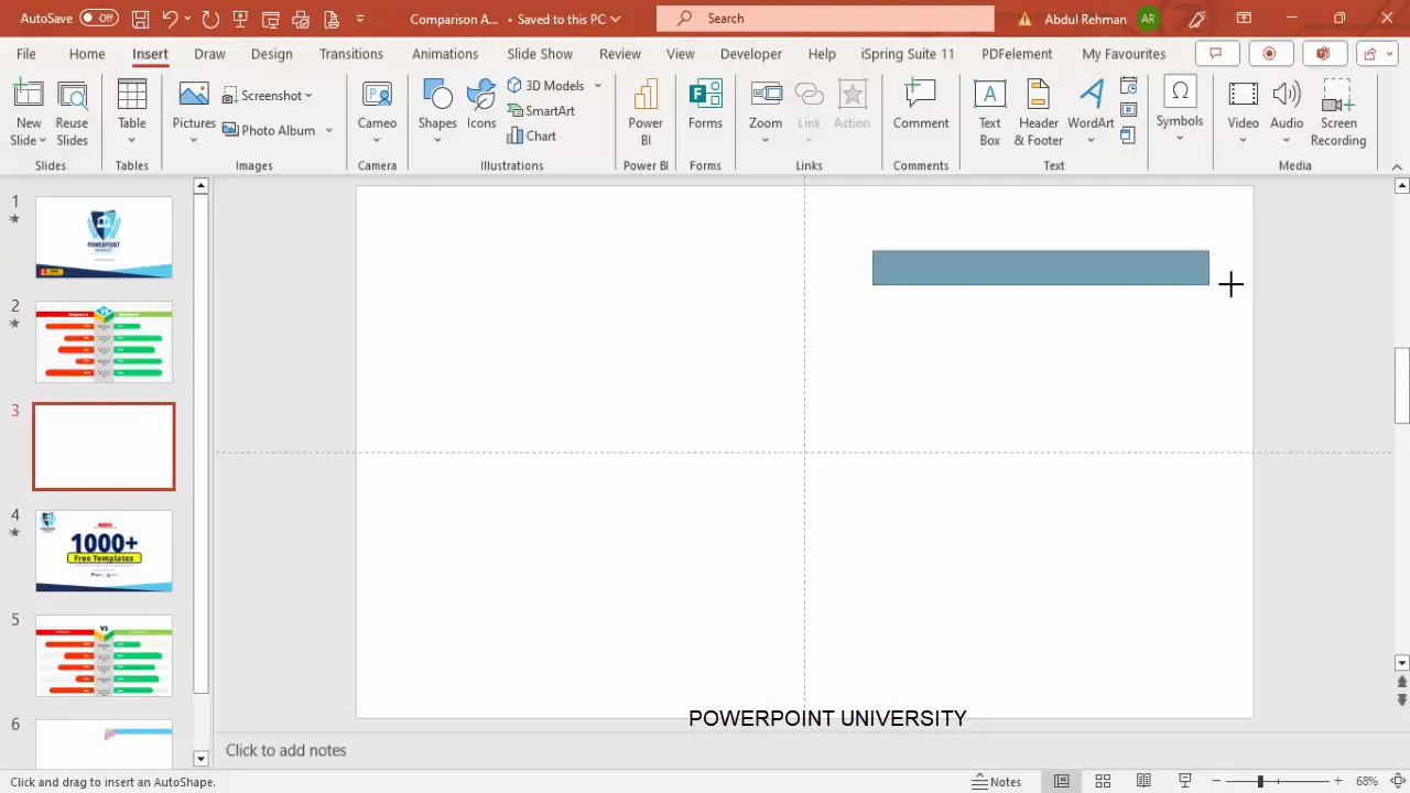
Step 1: Create Base Rectangles
- Insert a rectangle shape from the Insert > Shapes > Rectangles menu.
- Draw the rectangle to cover the left half of the slide, leaving some space on the right for balancing the layout.
- Set the shape outline to No Outline.
- Fill the rectangle with a light color, for example, a soft green shade.
- Duplicate the rectangle (Ctrl + D) and position the copy on the right side of the slide.
- Apply the same outline and fill settings, but choose a contrasting color like light red or pink for differentiation.
This dual-column structure will represent the two products or options you want to compare.
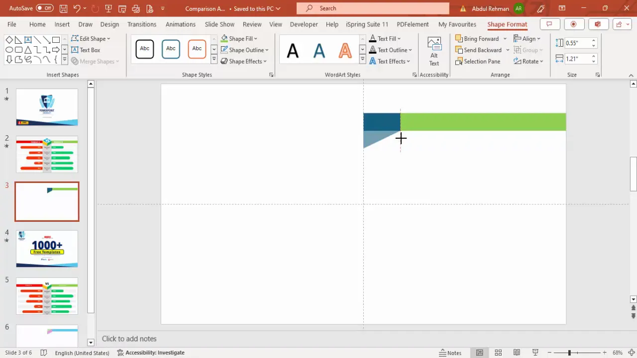
Step 2: Add Decorative Triangles for Visual Interest
- Insert a right triangle shape.
- Make sure it has no outline.
- Flip the triangle vertically and align it with the bottom edge of the left rectangle.
- Duplicate the triangle and flip it horizontally to place on the right side.
- Merge each triangle with its respective rectangle to create a unified shape using Merge Shapes > Union.
- Use the Subtract merge option to cut out a shape or create a layered effect for a 3D look.
These decorative elements give the slide a professional and polished look, creating a sense of depth.
Designing Product Columns with Shapes and Colors
Now that the basic structure is ready, it’s time to add color details and effects to make your columns visually distinct and appealing.
- Assign a darker shade of green to the left product column (Product A).
- Assign a darker shade of red to the right product column (Product B).
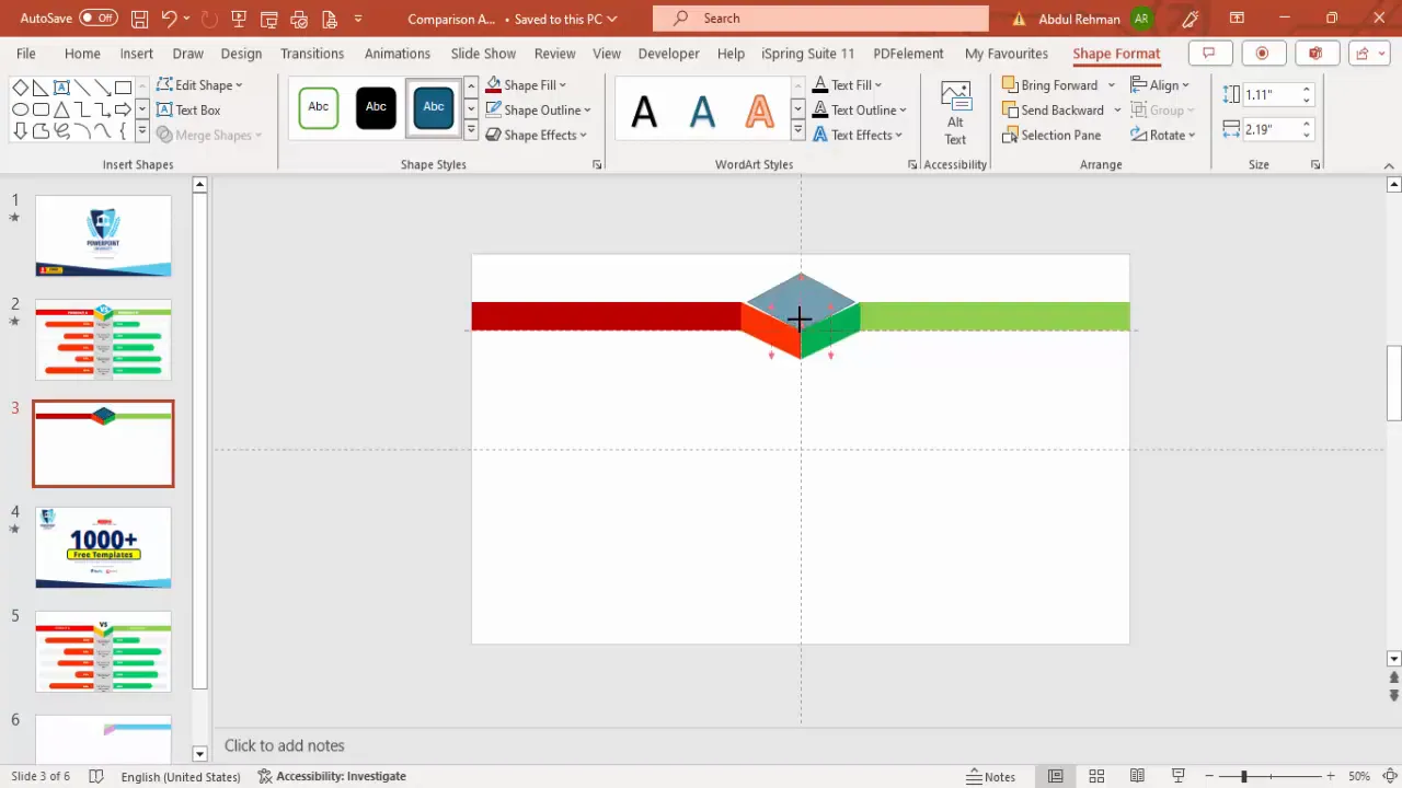
- Insert a diamond shape between the two columns to add a 3D-like centerpiece or divider.
- Resize the diamond to fit neatly and remove its outline for a clean look.
- Fill the diamond with a color that complements the overall palette.
These color choices help users quickly associate each side with its product or option, reinforcing visual memory.
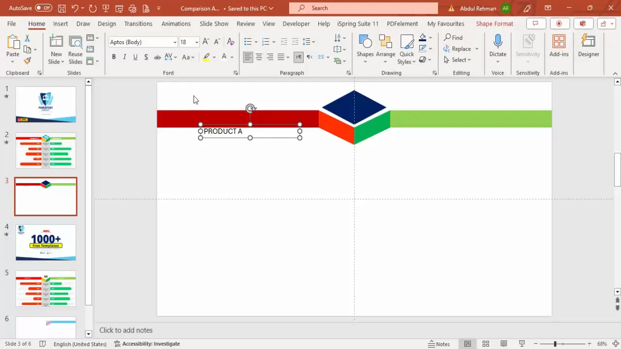
Adding Text and Labels for Clarity
Clear labeling is crucial for your audience to understand what is being compared. Follow these steps to add effective text elements:
- Insert text boxes for the product names. Use a bold font like Open Sans Extra Bold for emphasis.
- Center-align the product names and use a white font color for contrast against the dark backgrounds.
- Position “Product A” on the left column and “Product B” on the right.
- Add a “VS” text box in the middle between the two product names to emphasize the comparison.
- Choose a larger font size for the “VS” to draw attention.
Adding these labels at the top gives your slide structure and immediately informs the viewer about the contents of the comparison.
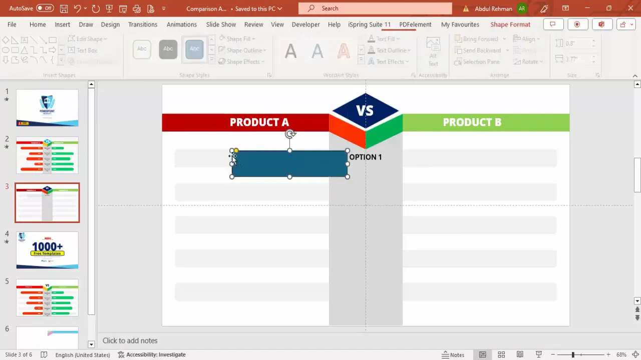
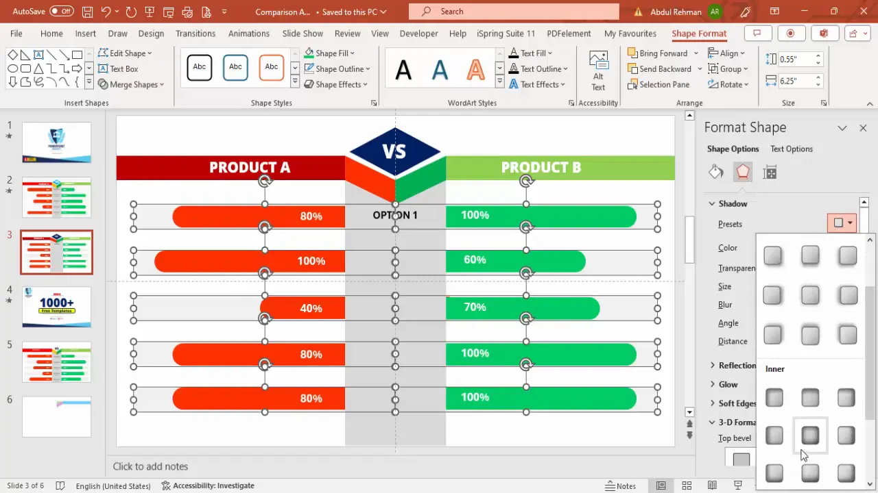
Creating Percentage Bars for Visual Comparison
One of the most effective ways to compare products is through visual bar indicators representing percentages or scores. Here’s how to create them:
Step 1: Add a Gray Background for Options
- Insert a large rectangle behind the comparison bars to serve as a neutral background.
- Fill it with a light gray color and send it to the back (Right-click > Send to Back).
- Ensure it covers the area where you will place your comparison bars.
Step 2: Create Rounded Rectangles for Each Option
- Insert a rounded corner rectangle to represent one comparison factor (e.g., Performance).
- Set the fill color to light gray and remove the outline.
- Duplicate the shape to create multiple rows (typically 4-5 options).
- Use the Align > Distribute Vertically tool to space them evenly.
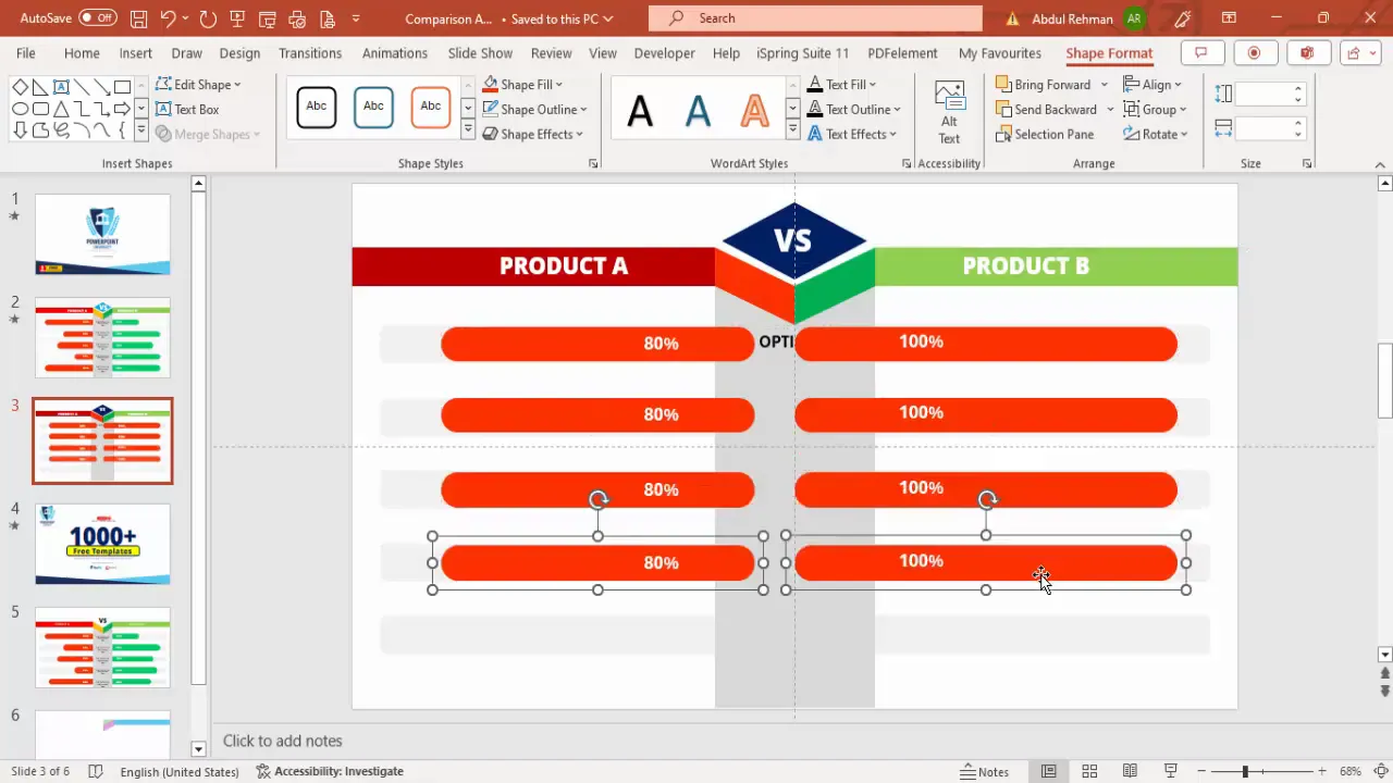
Step 3: Add Colored Percentage Bars
- Insert smaller rounded rectangles on top of the gray bars for Product A and Product B.
- Fill these with the respective product colors (red for Product A, green for Product B).
- Adjust the width of these bars to visually represent percentage values (e.g., 80%, 100%).
- Add percentage text labels on top of these colored bars for clarity.
This layered approach creates a clear visual comparison that is easy to digest.
Duplicating Options and Adjusting Values
Once you have created one set of comparison bars, you can easily duplicate and customize them for other options like Features, Quality, Reviews, and Support.

- Group each set of option labels, gray bars, colored bars, and percentage labels together for easier duplication.
- Duplicate the grouped set and position it below the previous one.
- Adjust the percentage widths and text to reflect the actual data you want to show.
- Change colors if necessary to maintain visual balance and consistency.
- Use the Format Painter tool to quickly apply the same formatting to new elements.
- Apply shadows or inner glow effects via Format Shape > Effects to give the bars depth.
With this method, you can easily scale your comparison slide to include as many options as necessary.
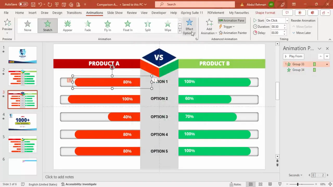
Applying Animations for Impact
Animations can bring your comparison slide to life, making it more engaging and easier to follow during your presentation. Here’s how to add animations:
- Open the Animations tab and enable the Animation Pane to manage effects.
- Select the colored percentage bar for Product A and apply a Stretch animation effect.
- Set the direction of the animation to come from the right side.
- Select the corresponding bar for Product B and apply the Stretch animation from the left.
- Use the Animation Painter tool to copy animation effects to other comparison bars for consistency.
- Sequence the animations so each option appears one after another.
- Adjust timing and delay to ensure smooth transitions without overlapping.
Animations help emphasize differences and guide your audience’s attention to each point.
Final Touches: Shadows, Alignment, and Colors
Before finalizing your slide, add finishing touches to enhance readability and visual appeal:
- Shadows: Right-click on shapes and select Format Shape > Shadow to apply subtle inner shadows or glows for depth.
- Alignment: Use the Align tools to ensure all elements are perfectly lined up.
- Color Consistency: Double-check that color fills and fonts match your brand or presentation theme.
- Text Contrast: Ensure text is legible against background colors; use white font on dark backgrounds and black font on light backgrounds.
- Group Elements: Group related objects to maintain structure and ease future edits.
These steps ensure your slide looks polished and professional.
Frequently Asked Questions (FAQ)
Q1: Can I customize the number of options compared on the slide?
Absolutely! You can increase or decrease the number of options by duplicating or deleting the option rows. The layout is flexible and can be adjusted to fit your content needs.
Q2: How do I change the colors of the bars without affecting the entire grouped object?
Click directly on the specific shape you want to recolor. If you select a grouped object, you may need to enter Group Edit Mode by double-clicking or right-clicking and choosing Edit Group. Then select the individual shape and change its fill color.
Q3: Is it possible to add more than two products or options in this comparison slide?
Yes, but this particular design focuses on two options side-by-side for clarity. To compare more products, you can expand the slide horizontally or create multiple comparison slides for different pairs.
Q4: How can I save this slide as a reusable template?
After designing your slide, save it as a PowerPoint template (.potx) or copy the slide into other presentations. This way, you can reuse your custom comparison slide without rebuilding it each time.
Q5: Can I download free templates similar to this comparison slide?
Yes! Many creators offer free PowerPoint templates online. Using pre-made templates can speed up your design process and ensure professional results. Look for templates that allow customization of colors, text, and animations.
Conclusion
Mastering PowerPoint Slides Design for product comparison slides elevates your presentations by making complex data easy to understand and visually engaging. Through careful structuring, use of shapes, colors, and animations, you can create a slide that not only looks great but also drives your message home effectively.
This step-by-step guide has shown you how to build comparison slides from scratch, including design tips for creating columns, percentage bars, and animations. Whether you’re comparing products, options, or features, these techniques will help you communicate clearly and professionally.
Remember, the key to great slide design is preparation, consistency, and attention to detail. Use guides for alignment, choose colors thoughtfully, and leverage PowerPoint’s animation tools to keep your audience engaged.
Start building your own comparison slides today and watch your presentations become more impactful and memorable!
Check out the full video: Create PowerPoint slide to show comparison


