
Creating effective and engaging PowerPoint slides design is an essential skill for anyone who wants to make a lasting impression during presentations. Too often, we fall into the trap of crafting slides overloaded with bullet points and text, resulting in dull and uninspiring visuals. But it doesn’t have to be that way.
In this comprehensive guide, inspired by a detailed tutorial from POWERPOINT UNIVERSITY, I will walk you through the process of transforming a basic, text-heavy PowerPoint slide into a vibrant, creative, and meaningful presentation. Whether you’re a beginner or someone looking to elevate your slide design skills, this article will provide actionable steps, practical tips, and design techniques to help you create stunning slides that captivate your audience.
Table of Contents
- Why Old PowerPoint Slides Fail
- Principles of Modern Slide Design
- Step-by-Step Guide to Transform Your Slide
- Using Shapes and Effects to Enhance Design
- Adding Icons and Text for Clarity
- Grouping and Animating Elements
- Duplicating and Customizing Options
- Tips for Choosing Colors and Icons
- Final Comparison and Impact
- Frequently Asked Questions (FAQ)
Why Old PowerPoint Slides Fail
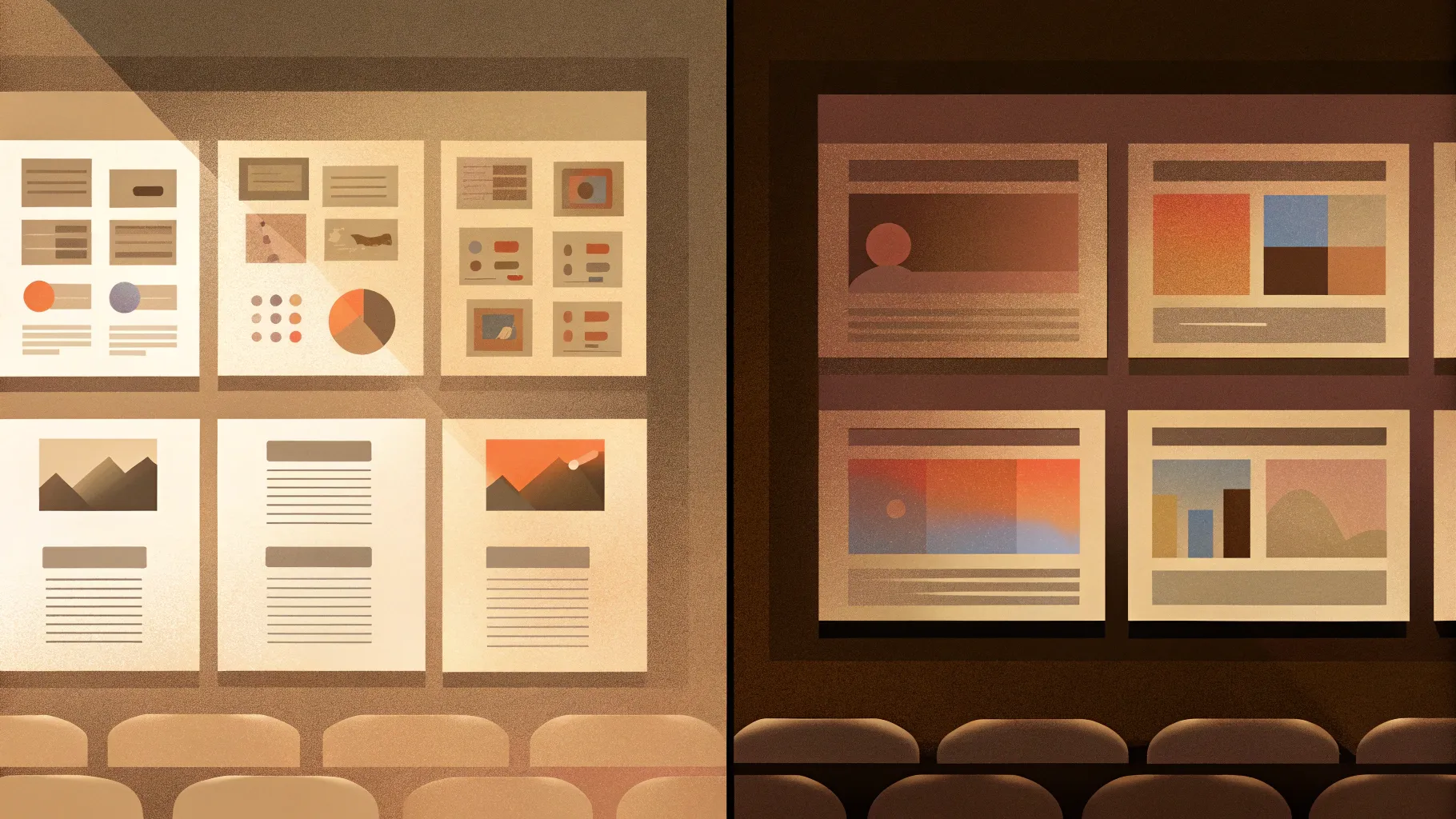
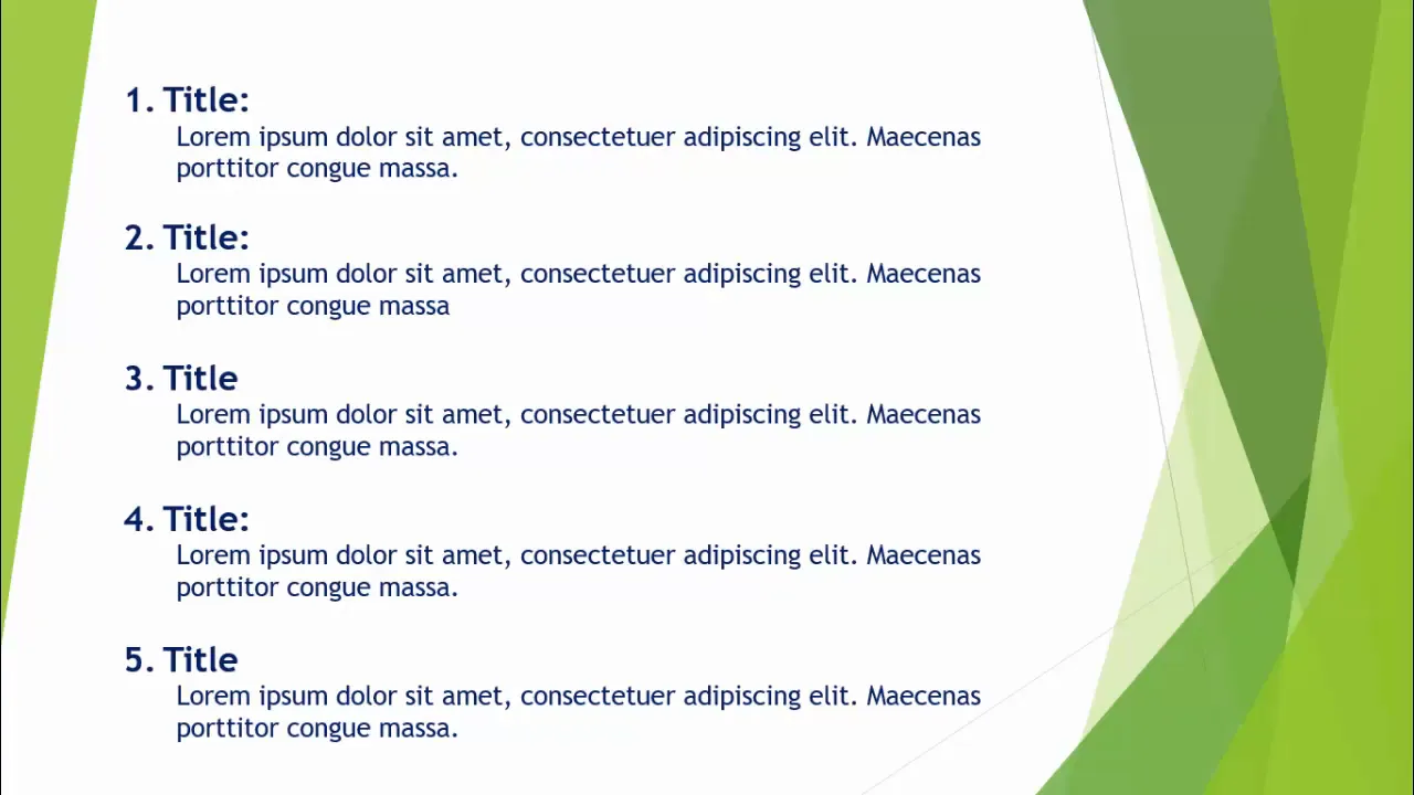
We’ve all been there. You’re asked to prepare a quick presentation, and the easiest route is to open PowerPoint, grab a bullet-point template, and type away. The result? A slide jam-packed with text and bullet points that looks cluttered, boring, and uninspiring.
Here’s why this traditional approach to PowerPoint slides design doesn’t work:
- Information Overload: Slides overloaded with bullet points and dense text overwhelm the audience, making it hard to focus on key messages.
- Lack of Visual Appeal: Plain text slides lack color, icons, or graphics that can make content more engaging and easier to digest.
- Low Retention: Audiences tend to remember visuals much better than text-heavy content, so crucial points get lost.
- Monotonous Flow: Repetitive layouts and formats cause audience disengagement and reduce interest.
Recognizing these pitfalls is the first step toward improving your PowerPoint slides design and delivering presentations that truly resonate.
Principles of Modern Slide Design
Modern PowerPoint slides design emphasizes clarity, visual appeal, and storytelling. Here are some core principles to keep in mind:
- Simplicity: Use minimal text and clear visuals to communicate your message effectively.
- Consistency: Maintain a consistent color scheme, typography, and style throughout your presentation.
- Visual Hierarchy: Guide the viewer’s eye by emphasizing key elements through size, color, and placement.
- Use of Icons and Shapes: Replace bullet points with icons and shapes to add meaning and reduce text.
- Whitespace: Give your content breathing room by avoiding cluttered layouts.
- Animation and Interaction: Use subtle animations to reveal content progressively and keep engagement high.
Applying these principles can instantly elevate your slides from dull to dynamic.
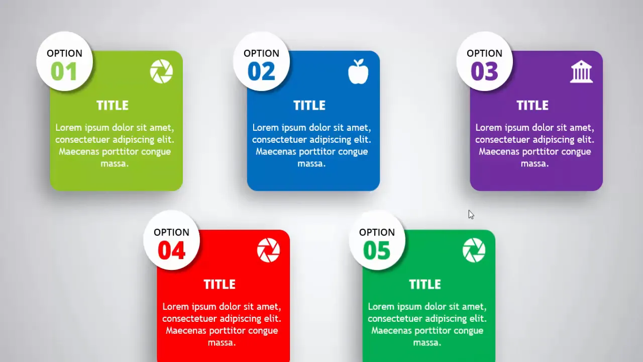
Step-by-Step Guide to Transform Your Slide
Let’s dive into a practical transformation of a typical old slide into a modern, creative design. Follow this detailed walkthrough to learn how to redesign your PowerPoint slides with style and substance.
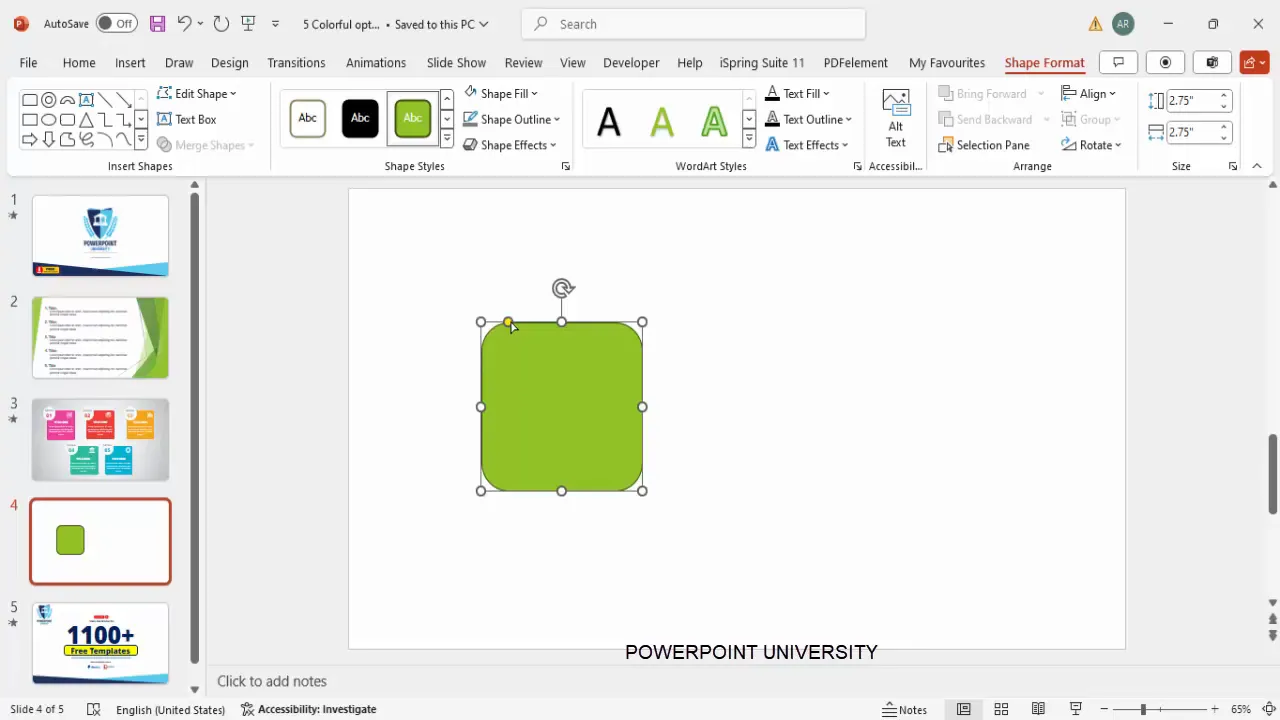
Step 1: Create a New Slide and Insert a Rounded Rectangle
Start by adding a new slide in your presentation. Then:
- Go to Insert > Shapes and select a rounded corner rectangle.
- Draw the shape and set its height and width to approximately 2.75 inches (or the equivalent in your units).
- If you want softer corners, drag the yellow adjustment handle outward to reduce the curve.
- Remove the shape outline by selecting No Outline.
- Fill the shape with a color of your choice that will complement your slide background.
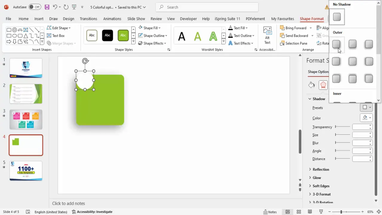
Step 2: Add Shadow Effects for Depth
Next, add some subtle shadow effects to give dimension:
- Right-click the shape and select Format Shape.
- Navigate to the Effects tab and choose Shadow.
- Select a shadow preset such as Offset Bottom Left.
- Adjust the shadow’s distance and blur to your liking — less blur for a sharper shadow.
This step adds depth and makes your shape visually stand out from the slide background.
Step 3: Insert an Oval Shape with Shadow
To add contrast and a design element, insert an oval shape:
- Go to Insert > Shapes and select an oval.
- Draw the oval and remove its outline.
- Fill it with white (or a light color).
- Apply a shadow effect similar to the rectangle, but choose Offset Bottom Right this time.
- Position the oval strategically over or near the rectangle to create layered interest.
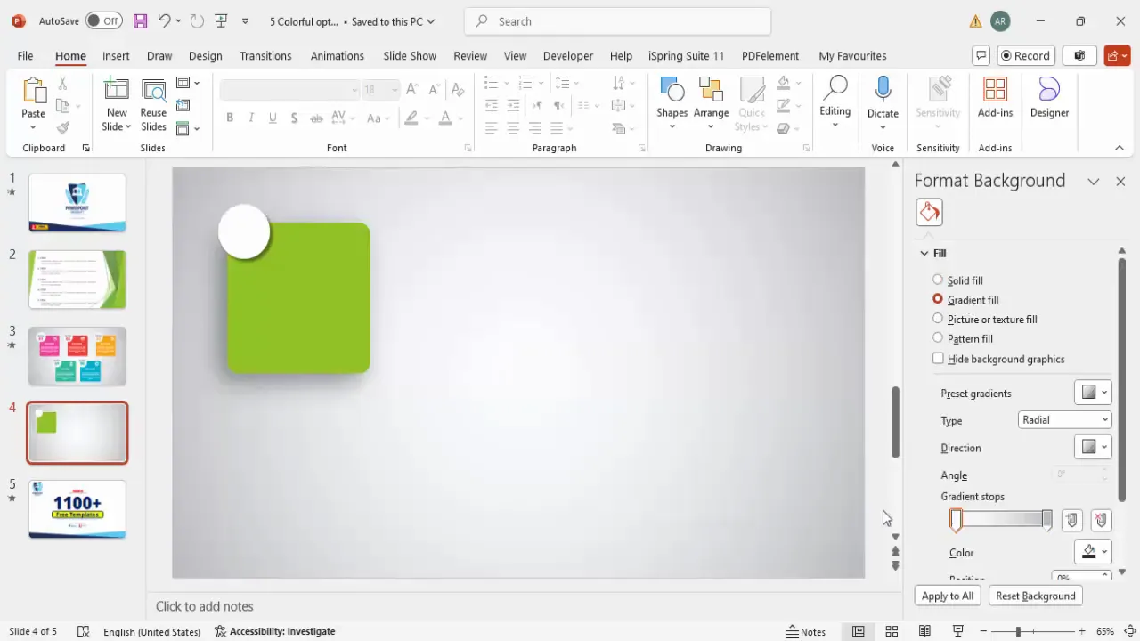
Step 4: Customize the Background with a Gradient Fill
Instead of a flat color background, use a radial gradient for a modern look:
- Right-click on the slide background and select Format Background.
- Choose Gradient Fill.
- Select Radial as the gradient type.
- Set the gradient direction to originate from the center.
- Pick colors that harmonize with your shapes; feel free to experiment.
- You can resize the gradient by holding the Shift key and dragging the handles.
This background approach adds subtle texture and focus to your slide.
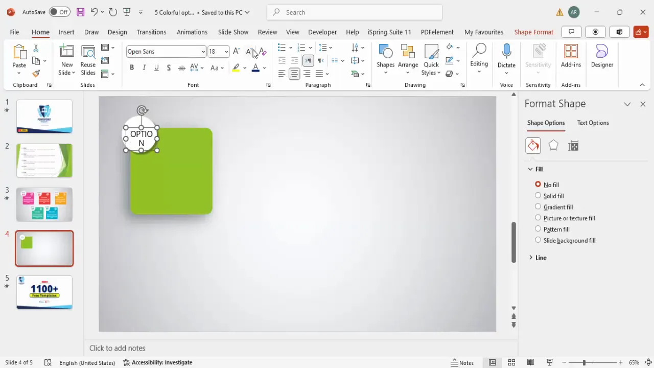
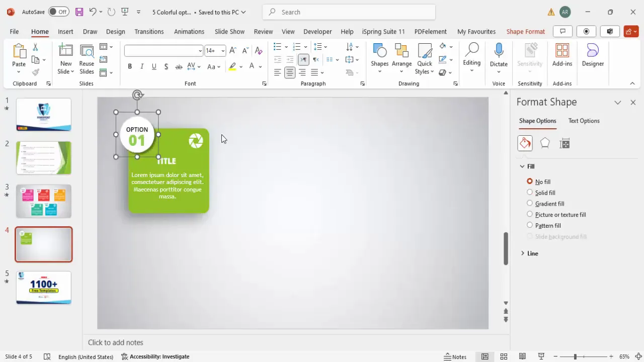
Step 5: Add Text for Options or Steps
Now it’s time to add the textual content that clearly communicates your message:
- Insert a text box and type “Option” or “Step” as a label.
- Use the Open Sans font for a clean, modern look.
- Center-align the text and reduce font size to create a subtle header.
- Make the text bold or semi-bold for emphasis.
- Duplicate this text box and add the number (e.g., “01”) in a larger font size and extra bold weight.
- Color the number to match the background color of your rectangle for cohesion.
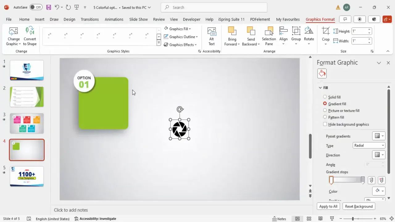
Step 6: Insert Relevant Icons
Icons visually represent your content and reduce the need for lengthy explanations:
- Go to Insert > Icons and search for an icon relevant to your content.
- Insert the icon and resize it to about 0.6 inches in height and width.
- Change the icon color to white or a contrasting color for visibility.
- Position the icon at the top right corner of your rectangle or another prominent spot.
Icons add personality and help your audience quickly grasp the topic.
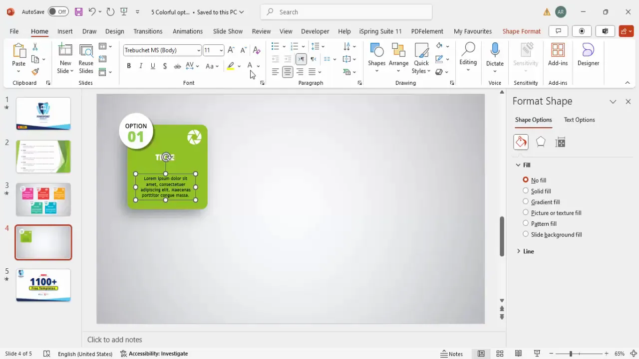
Step 7: Add Titles and Detailed Text
Complete your option box by adding a title and descriptive text:
- Insert a text box for the title using Open Sans Extra Bold, center-aligned, and white font.
- Insert another text box for the detailed description.
- Use placeholder text (such as Lorem Ipsum) initially; reduce the font size and center-align.
- Keep the text concise to avoid overcrowding.
- Adjust the size and position of the text boxes to fit neatly within the rectangle.
Step 8: Group Elements for Easy Management
To handle your design elements efficiently, group related shapes and texts:
- Select the “Option” label and the oval shape, then press Ctrl + G (or Command + G on Mac) to group.
- Select the rectangle, title, and detailed text, and group them as well.
- Send the rectangle group to the back so the oval and label appear on top.
Grouping allows you to move and resize your option box as a single unit.
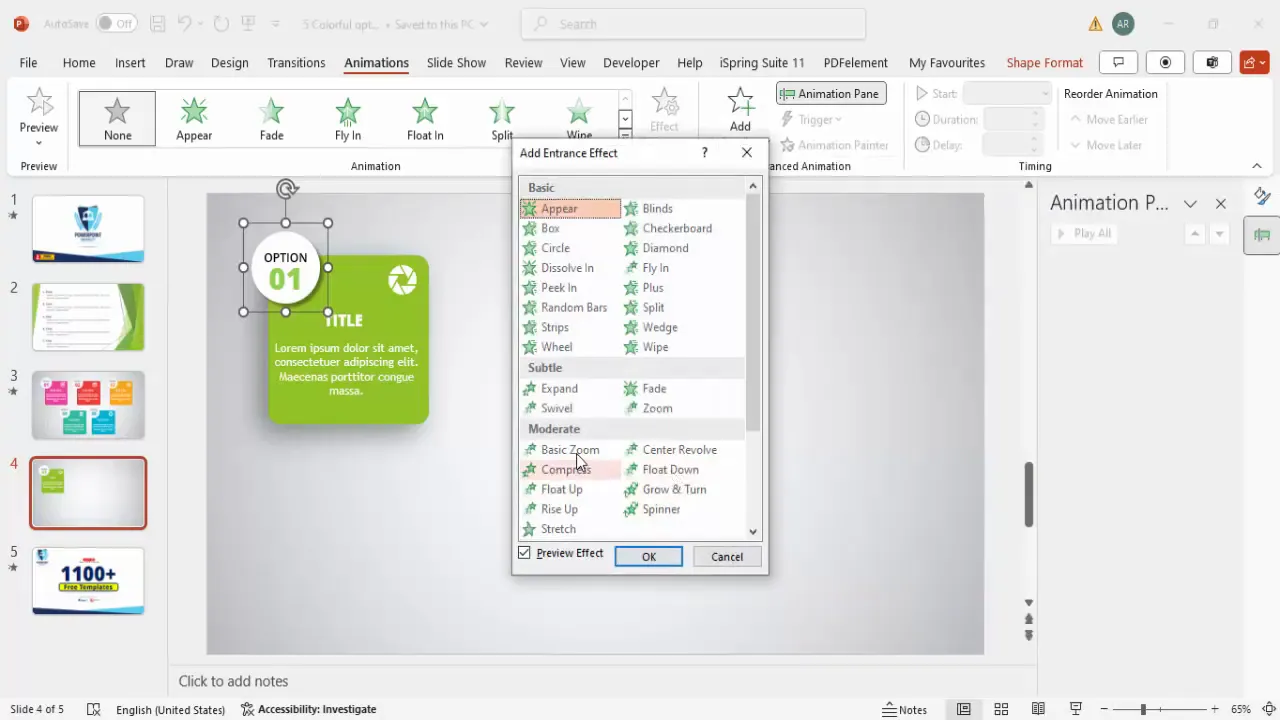
Step 9: Add Animation Effects
Animations can help introduce your content smoothly and keep the audience engaged:
- Open the Animations tab and enable the animation pane.
- Select the rectangle group and add the Basic Zoom entrance effect.
- Set the animation to start With Previous for seamless flow.
- Repeat the animation for the oval and label group.
- Preview the animation to ensure it looks smooth and professional.
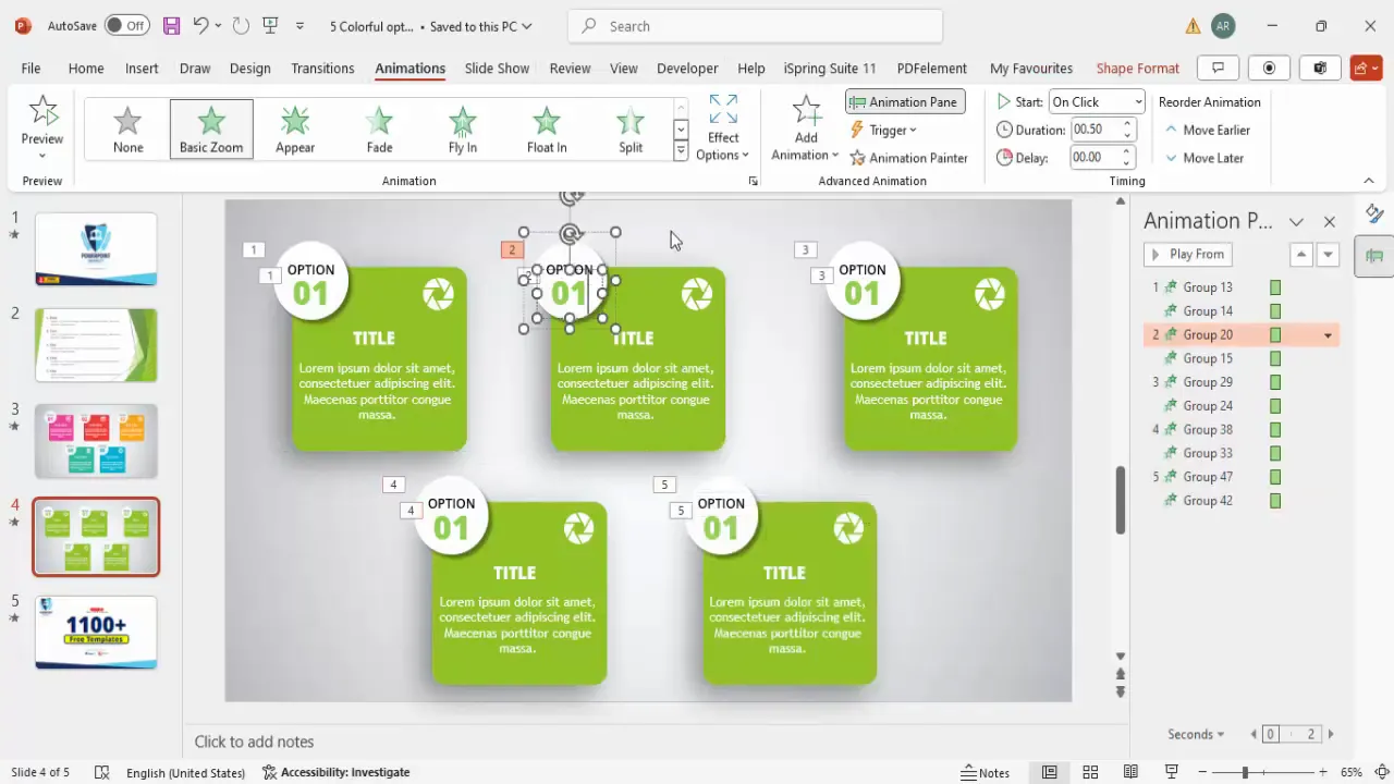
Step 10: Duplicate and Customize Options
Once your first option box is ready, duplicate it to create multiple options or steps:
- Select both grouped elements.
- Hold Ctrl + Shift (or Command + Shift) and drag to duplicate while maintaining alignment.
- Use Ctrl + D to quickly duplicate the last selection.
- Create as many options as needed (e.g., five options).
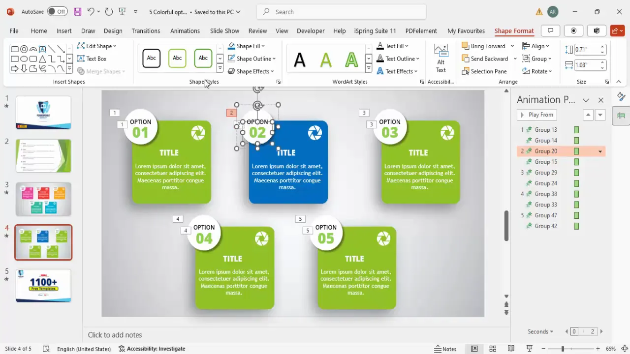
- Customize each duplicated option by changing the fill colors and text colors to create variety.
- Change icons to suit each option’s theme or content.
This method saves time and ensures consistent styling across all options.
Using Shapes and Effects to Enhance Design
Shapes form the backbone of creative PowerPoint slides design. Rounded rectangles, ovals, and other shapes provide structure and help organize content visually. Here’s why and how to use shapes effectively:
- Rounded Corners: Rounded shapes feel modern and friendly compared to sharp corners.
- Shadow Effects: Subtle shadows add depth and separate elements from the background.
- Layering: Overlapping shapes (like an oval over a rectangle) create visual interest and hierarchy.
- Color Fill: Use solid colors or gradients to make shapes pop and convey mood.
- No Outline: Removing outlines keeps shapes clean and focused on color and form.
When combined thoughtfully, shapes transform dull slides into engaging visual stories.
Create Slides in Seconds with ExpertSlides AI |
|
Generate AI Presentations today: |
|
TRY NOW! |
Adding Icons and Text for Clarity
Icons and text work hand-in-hand to communicate your message clearly and effectively:
- Icons: These small graphics represent ideas visually, making content easier to scan and understand.
- Font Choice: Selecting clean, modern fonts like Open Sans enhances readability and professionalism.
- Text Hierarchy: Use size, weight, and color to differentiate between labels, titles, and body text.
- Conciseness: Keep text minimal to avoid clutter and maintain audience focus.
Balancing icons with well-structured text creates slides that are both beautiful and informative.
Grouping and Animating Elements
Grouping shapes and text boxes in PowerPoint is a powerful tool for managing complex designs:
- Grouping: Allows you to treat multiple objects as one, simplifying movement, resizing, and formatting.
- Animation: Animations, like basic zoom, introduce elements dynamically, making presentations more engaging.
- Animation Pane: Use this to control timing and sequence of animations for a polished flow.
- With Previous Setting: Ensures multiple elements animate simultaneously for a cohesive effect.
These techniques elevate your slides from static visuals to interactive experiences.
Duplicating and Customizing Options
Efficiency is key when designing multiple similar slides or slide elements:
- Duplicate: Use Ctrl + D or drag with Ctrl + Shift to copy grouped elements quickly.
- Customize Colors: Change the fill and text colors for each option to differentiate them visually.
- Change Icons: Swap icons to reflect different topics or steps, ensuring relevance.
- Maintain Consistency: Keep font styles and sizes uniform to preserve a cohesive look.
This approach helps you scale your presentation design without losing quality or style.
Tips for Choosing Colors and Icons
Choosing the right colors and icons can make or break your PowerPoint slides design:
| Aspect | Tips | Examples |
|---|---|---|
| Colors |
|
Green, Blue, Purple, Red, Dark Green |
| Icons |
|
Apple icon, Arrow, Folder, Checkmark, Lightbulb |
Thoughtful color and icon choices help reinforce messages and make slides visually appealing.
Final Comparison and Impact
To truly appreciate the power of thoughtful PowerPoint slides design, compare the before and after:
- Before: A plain slide filled with bullet points and dense text that fails to engage.
- After: A vibrant, clean design featuring colorful shapes, icons, concise text, and smooth animations.
This transformation not only enhances visual appeal but also improves communication effectiveness, helping your audience absorb and remember your key points.
By applying these design principles and techniques, your PowerPoint presentations will stand out and deliver a strong impact every time.
Frequently Asked Questions (FAQ)
What font should I use for professional PowerPoint slides design?
Fonts like Open Sans, Calibri, and Arial are popular for their clean and readable appearance. Open Sans is highly recommended for a modern and professional look.
How many bullet points should I include on a slide?
It’s best to limit bullet points to 3-5 per slide with no more than 6-8 lines of text total. Ideally, use visuals and icons to reduce reliance on text.
Can I use animations in business presentations?
Yes, but keep animations subtle and purposeful. Animations like Basic Zoom or Fade can enhance engagement without distracting the audience.
How do I choose the right colors for my slides?
Use colors that align with your brand or presentation topic. Ensure sufficient contrast between text and background for readability. Tools like Adobe Color or Coolors can help you create harmonious palettes.
Where can I find free PowerPoint templates and icons?
There are many online resources offering free templates and icons, such as Microsoft Office’s built-in icons, Flaticon, and sites like POWERPOINT UNIVERSITY which offers free templates and tutorials.
How can I make sure my slide designs are consistent?
Use the Slide Master feature in PowerPoint to create and apply consistent layouts, colors, and fonts across all your slides.
Is grouping elements in PowerPoint necessary?
Grouping elements is highly recommended as it simplifies moving, resizing, and animating multiple objects together, saving time and maintaining design integrity.
What is the best way to practice slide design?
Try redesigning existing slides with the techniques discussed here. Use templates, experiment with colors, shapes, and icons, and solicit feedback to improve.
How do I avoid making slides too cluttered?
Keep content concise, use whitespace effectively, and break information into multiple slides if necessary. Visual aids like icons and shapes help reduce text overload.
Can I use these design techniques for other presentation software?
Yes, while this guide focuses on PowerPoint, many design principles and techniques apply to other tools like Google Slides or Keynote.
Mastering PowerPoint slides design takes practice and creativity, but with the right approach, you can create presentations that not only inform but also inspire and engage your audience.
Check out the full video: Old Vs New Slide Design


