
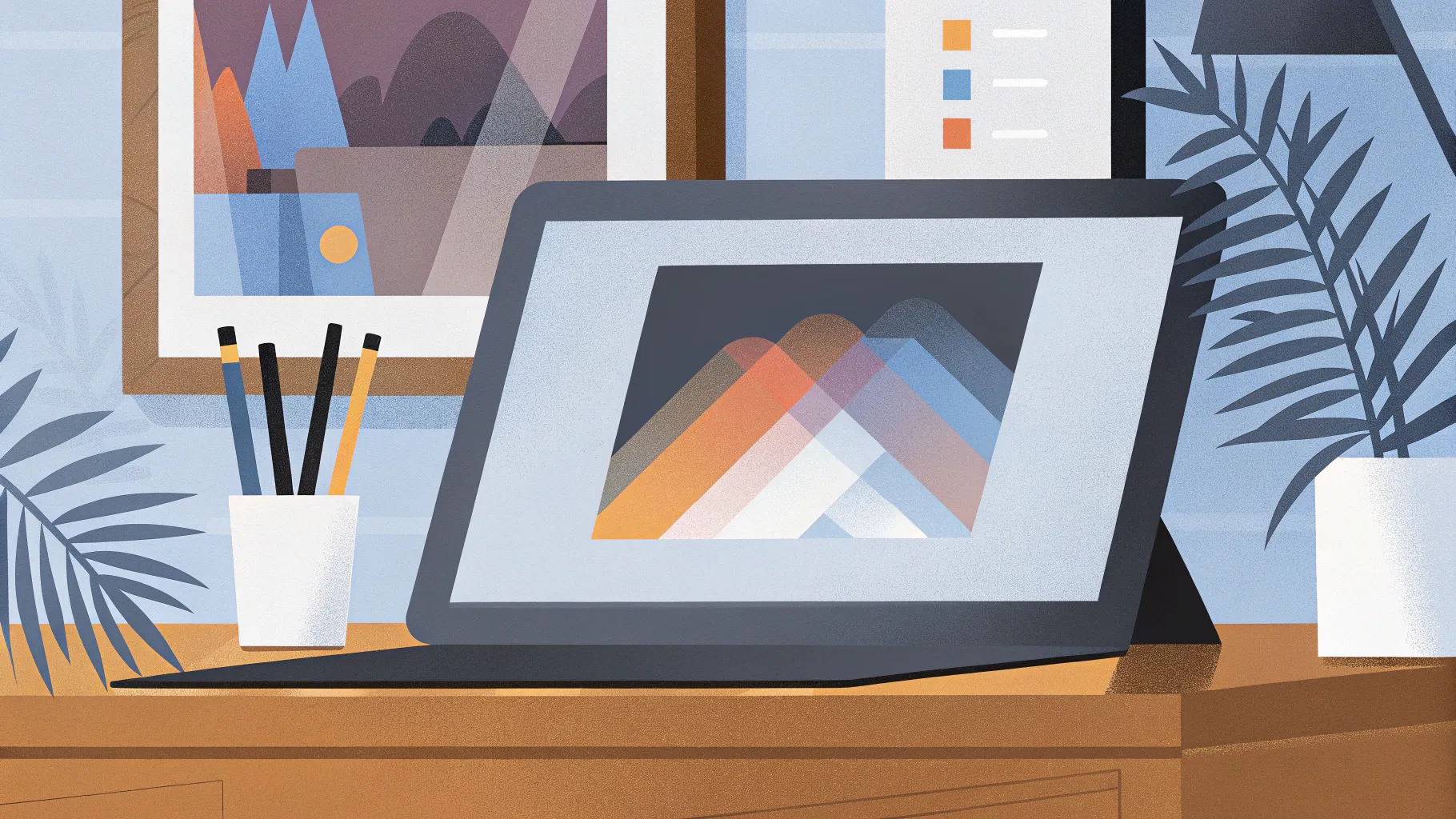
In the fast-paced world of presentation design, staying ahead of the curve is essential. Whether you’re crafting slides for work, school, or social media, fresh and engaging designs can dramatically boost your audience’s attention and retention. Today, we dive deep into three of the hottest PowerPoint presentation trends that are going viral in 2024. These tutorials, created with Microsoft 365 PowerPoint, showcase bold, creative, and interactive slide techniques that will elevate your presentations to the next level.
These designs aren’t just visually appealing—they’re practical and easy to recreate, even if you’re not a professional designer. Plus, I’ll share a fantastic resource to find world-class graphic assets, fonts, and templates, making your workflow smoother and more efficient.
Table of Contents
- Discovering the Best Design Assets: Kittl.com
- Presentation No. 1: The Carousel Effect
- Presentation No. 2: The Timeline
- Presentation No. 3: The Comparison Slide
- Tips for Maximizing Your PowerPoint Presentations in 2024
- Frequently Asked Questions (FAQ)
- Final Thoughts
Discovering the Best Design Assets: Kittl.com
One of the biggest challenges when designing presentations is sourcing high-quality fonts, graphics, and other design elements that truly make your slides pop. To solve this, I use Kittl.com, an incredible online platform filled with professionally designed templates and assets.
Kittl offers a vast gallery with everything from logos and book covers to invitations and presentation templates. What makes it stand out is its fully editable designs: once you select a template, you can customize every element—text, colors, and graphics—directly on the platform without needing to download or install anything.
For example, when working on a Christmas-themed presentation, I started by choosing a stylish title slide template from Kittl’s gallery. Then, I inserted a new artboard with the dimensions set to 1920×1080 pixels, perfect for PowerPoint slides. From there, I copied elements I liked—such as a charming illustration—and pasted them onto the new artboard. The flexibility to change colors or text styles on the fly makes the process incredibly fast and intuitive.
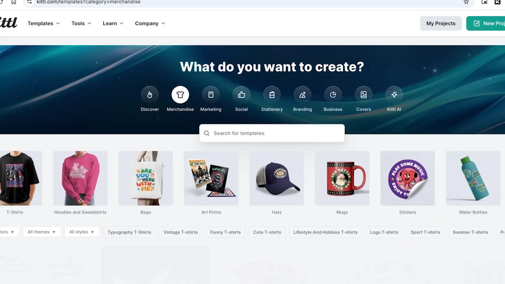
To add more personality, I searched for a paper texture to give the slide an old book-page vibe. Adding a subtle texture overlay helped tie the whole design together, creating a polished look that took me just about five minutes to complete.
Kittl offers a free plan that allows you to work on up to 20 projects, which is perfect for casual users. For those who want commercial licenses or advanced AI features, paid plans start at $10/month. If you decide to try it out, you can use my code LOURRUTIAYT to get 25% off any paid plan.
Using sites like Kittl.com is a game-changer, especially if you want to impress your audience without spending hours hunting for design elements. It’s a resource I recommend to everyone looking to up their presentation game.
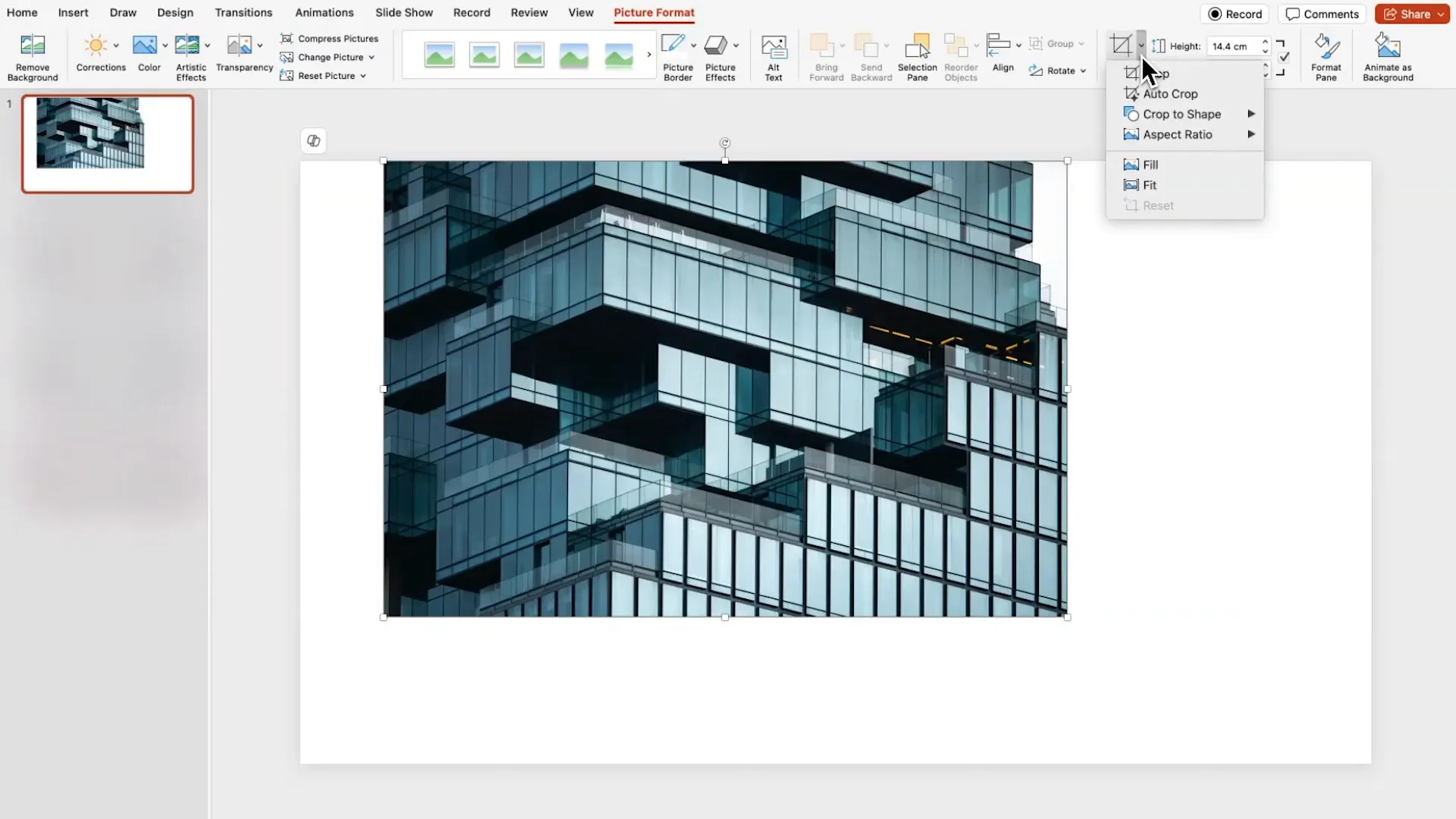
Presentation No. 1: The Carousel Effect
The first trending presentation style I want to share is what I like to call the Carousel Effect. This design features rotating shapes and images that create a dynamic, eye-catching animation when transitioning between slides.
Here’s how you can build it step-by-step:
- Set the Background: Begin by changing your slide background color to black. This dark canvas will make your shapes and images stand out.
- Insert a Donut Shape: Go to the shapes menu and select the donut shape. Click on the center of your slide to place it. Hold
Ctrl + Shiftwhile resizing to keep the shape proportionate. - Create Rectangles: Draw a few rectangles over the donut shape. Don’t worry if they’re not perfectly aligned at first.
- Align Shapes: Select all the shapes, then use the align tools to center them horizontally and vertically on the slide.
- Fragment Shapes: With all shapes selected, navigate to Shape Format > Merge Shapes > Fragment. This will break the shapes into smaller pieces based on their intersections.
- Clean Up: Delete unwanted fragments to create a visually interesting segmented donut shape.
- Group and Style: Group the remaining pieces back together, remove the outline, and fill with a dark gray color.
- Rotate and Resize: Rotate the shape slightly and enlarge it while keeping it centered near the top of the slide.
- Add Text and Texture: Insert your title and description. For a creative touch, right-click the shape, select Format Shape, and fill it with a picture or texture. Adjust the image cropping and disable “rotate with shape” to keep the texture steady during rotations.
- Duplicate and Animate: Duplicate the slide, rotate the donut shape a bit more, and change the texture image to keep the carousel effect fresh. Apply the Morph transition between slides to create smooth animation.
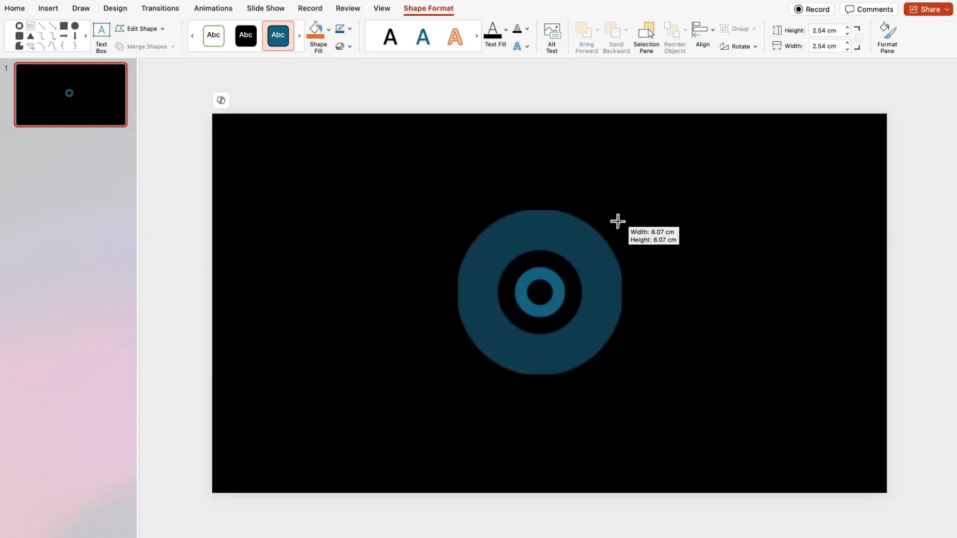
By continuing this process with multiple slides, you’ll achieve a rotating carousel animation that’s so polished, your audience won’t even guess it was made in PowerPoint. This effect is perfect for modern presentations where you want to showcase multiple items or concepts in a sleek, engaging way.
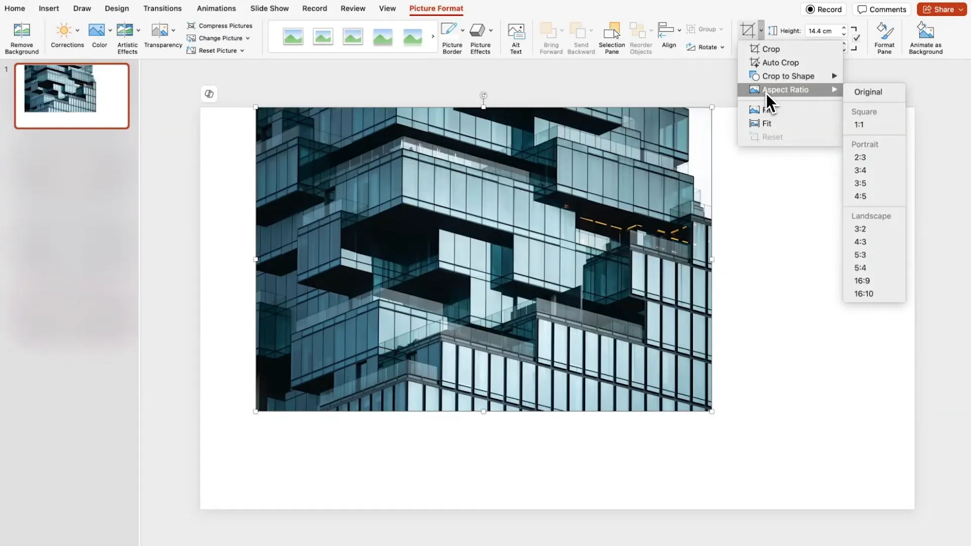
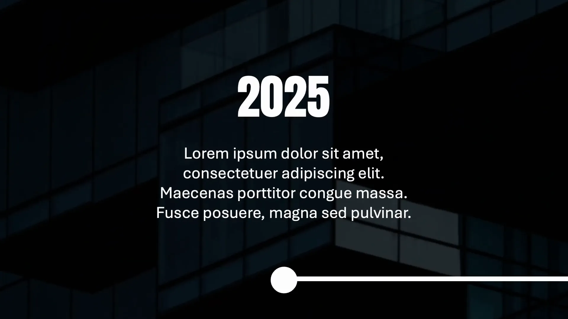
Presentation No. 2: The Timeline
The second trending presentation style is a clean, professional-looking Timeline. This design uses imagery, minimal shapes, and simple text layouts to convey chronological information clearly and stylishly.
Follow these steps to create your own timeline presentation:
- Insert a Stock Image: Start by adding a high-quality stock photo that suits your theme, such as a building or cityscape. Crop it to a 16:9 aspect ratio so it fills the entire slide.
- Adjust Brightness: Right-click the image and select Format Picture. Lower the brightness so white text will pop against the background.
- Add a Line Shape: Insert a straight line shape across the slide using the
Shiftkey to keep it perfectly horizontal. Change the line color to white and increase its weight for prominence. - Add the Title: Add your timeline title above the line using a bold font like Anton.
- Create Date Slides: Add a new slide with a black background. Insert a date using the Anton font and add body text with a clean, readable font like Aptos.
- Add Circles: Insert a white circle centered on the slide to act as a marker for each timeline event. Remove the outline and ensure it’s perfectly centered using the align tools.
- Duplicate and Alternate: Duplicate the date slides. For alternating effect, move the circle and content positions up or down on alternate slides.
- Insert Slide Zooms: Go back to the main timeline slide. Use Insert > Zoom > Slide Zoom to add thumbnails of the date slides onto the timeline line. Remove borders and make the background transparent for a seamless look.
- Align and Distribute: Arrange the zoom thumbnails evenly along the timeline using the align and distribute horizontally tools.
This timeline design is both elegant and highly interactive. The use of slide zooms lets you jump to specific events without breaking the flow, making it an excellent choice for business presentations, project updates, or storytelling.
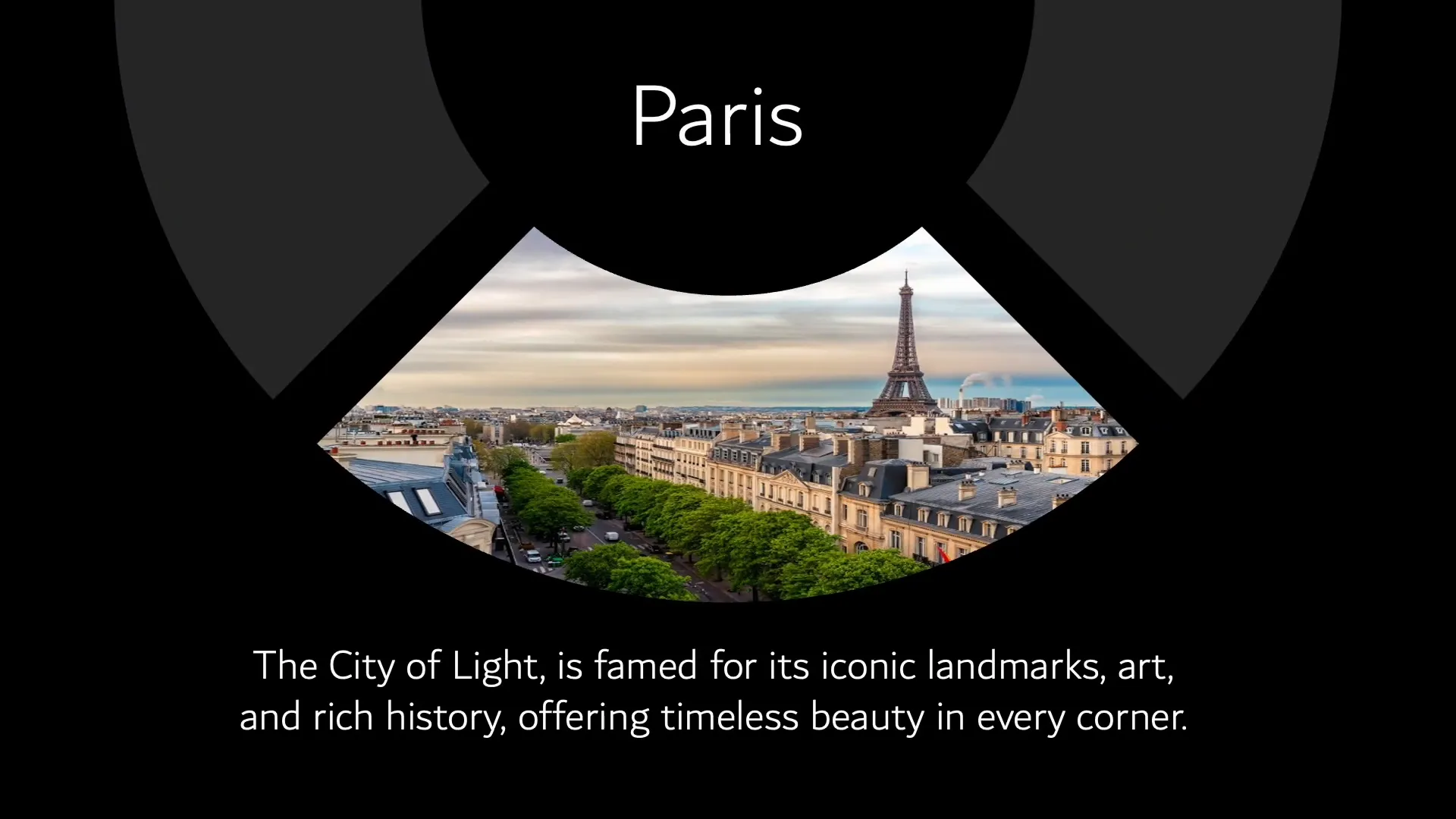
Presentation No. 3: The Comparison Slide
The third trending presentation style is perfect for comparisons or showing contrasting ideas side-by-side. This Comparison Slide uses cropped images, shapes, and colors to create a visually striking effect.

Here’s how to build it:
- Insert Images: Add two images you want to compare. Crop each image so that only half is visible, aligning the crop handles to the center of the slide.
- Add a Pie Shape: Insert a pie shape and center it both horizontally and vertically on the slide. Resize it holding
Ctrl + Shiftto maintain proportions. - Adjust the Pie Gap: Rotate the pie shape and drag its handles to create a gap between the two halves of the images, emphasizing the split.
- Style the Shape: Increase the outline weight and choose complementary colors for the shape fill and outline, such as a dark blue fill with a lighter blue outline.
- Add Text: Place your comparison text on the right side of the slide, aligned with the images.
- Duplicate and Rotate: Duplicate the slide and rotate the pie shape to reveal the other image. Change the fill and outline colors, for example, to red fill and green outline, and move the text to the left side.
- Apply Morph Transition: Add the Morph transition between the two slides to create a smooth animation flipping the comparison.
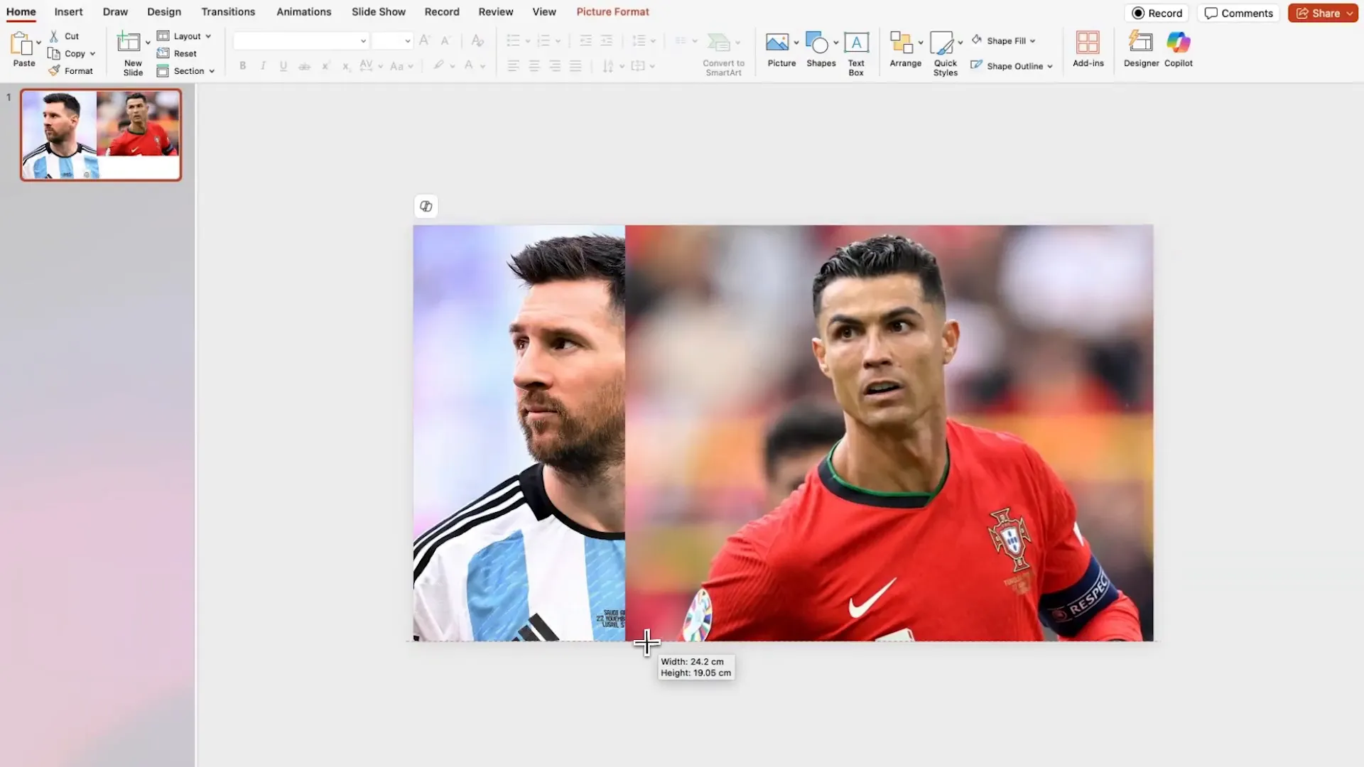
This comparison layout is ideal for product demos, before-and-after showcases, or any scenario where you want to highlight differences clearly and attractively.
Tips for Maximizing Your PowerPoint Presentations in 2024
These three presentation styles showcase some of the top trends in PowerPoint design for 2024, but there are a few overarching tips to keep in mind when applying these techniques or creating your own presentations:
- Use High-Quality Images: Crisp, professional photos instantly elevate your slides. Use stock photo sites or platforms like Kittl.com for curated assets.
- Leverage PowerPoint’s Morph Transition: The Morph transition is a powerful tool to create smooth, cinematic animations without needing complex software.
- Be Consistent with Fonts and Colors: Choose a couple of fonts that complement each other and stick with a coherent color palette to maintain a polished look.
- Utilize Shapes Creatively: Shapes like donuts, rectangles, circles, and pie charts can be merged, fragmented, and styled to create unique visual elements.
- Align and Distribute Elements Precisely: Use PowerPoint’s alignment tools religiously to ensure your design looks intentional and professional.
- Keep Text Minimal and Readable: Let your visuals do the talking. Use concise text with high-contrast colors for easy readability.
Frequently Asked Questions (FAQ)
What version of PowerPoint do I need to create these trending presentations?
You should use PowerPoint from Microsoft 365 (formerly Office 365) to access the latest features like the Morph transition and advanced shape formatting.
Can I use free resources to find templates and graphics?
Absolutely! While I recommend Kittl.com for its professional-grade assets and ease of use, there are many free resources online such as Unsplash for images and Google Fonts for typography.
How do I apply the Morph transition in PowerPoint?
After duplicating your slide and making changes (like moving or rotating objects), select the second slide, go to the Transitions tab, and choose “Morph.” This creates smooth animations between the slides.
Are these designs suitable for business presentations?
Yes! These styles are versatile and can be customized to fit formal business contexts or more creative projects. The timeline design, in particular, works well for professional reports and project updates.
Can I edit the templates after downloading?
Yes, all elements in these designs are customizable. You can edit text, colors, shapes, and images to tailor the presentation to your needs.
What if I want to add more slides or content?
These designs serve as a foundation. Feel free to duplicate slides, add new content, and maintain the style by following the same formatting and alignment principles.
Final Thoughts
Staying current with presentation trends not only impresses your audience but also enhances your communication effectiveness. The three PowerPoint designs shared here—the Carousel Effect, the Timeline, and the Comparison Slide—are powerful tools to make your presentations stand out in 2024.
By combining creative design techniques with resources like Kittl.com and leveraging PowerPoint’s built-in features, you can craft slides that are both visually stunning and highly functional. Whether you’re a student, professional, or content creator, these trends will help you deliver your message with impact and style.
Remember, the key to great presentations is balancing aesthetics with clarity and keeping your audience engaged from start to finish. Experiment with these designs, customize them with your own content, and watch your presentations go viral!
Check out the full video: PowerPoint TRENDS Going Viral in 2024 🔥📈


