

Welcome — I’m the creator behind this guide and the accompanying template, and in this walkthrough I’ll show you how to build a polished, flexible Weather Card Slide Design in PowerPoint that you can reuse across presentations, dashboards, and reports. I made this tutorial as a companion to the free template so you can edit every element easily. The techniques below are practical, fast, and tailored to PowerPoint’s native tools so you don’t need any plugins to create a great-looking Weather Card Slide Design in PowerPoint.
This article covers everything from the blank slide to cloud shapes, raindrop details, icon swaps, color variants, soft-edge background effects, grouping, and exporting. If you want a ready-made file to follow along, I provide a free download for the Weather Card Slide Design in PowerPoint in the description area where the template is hosted.
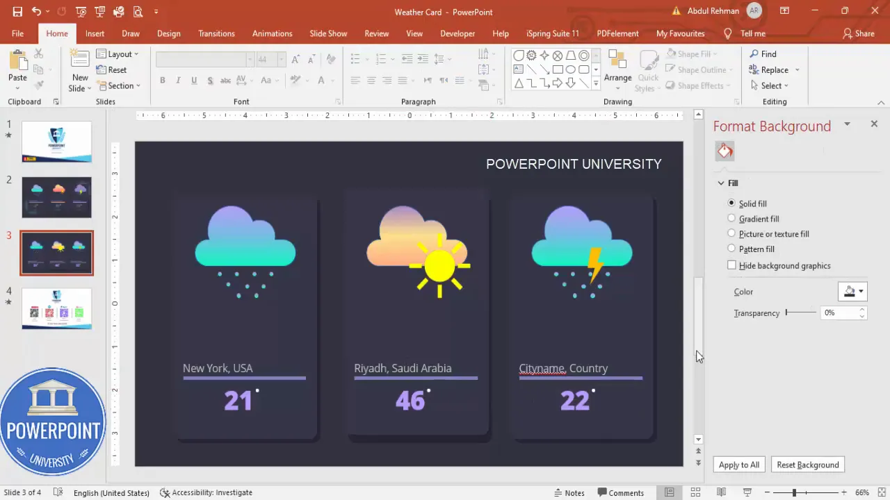
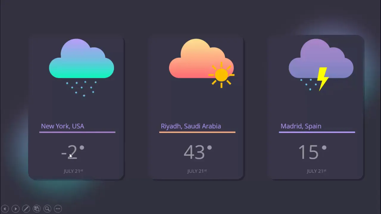
Before we dive in, a short overview: the Weather Card Slide Design in PowerPoint template contains three cards that show different forecast conditions — rain, sunny, and thunderstorm — and the goal of this tutorial is to teach you how to recreate, customize, and reuse these cards inside your presentations.
Quick note: this post uses step-by-step instructions and screenshots tied to timestamps so you can follow along visually while building your Weather Card Slide Design in PowerPoint.
Table of Contents
- Why use a Weather Card Slide Design in PowerPoint?
- What you’ll need
- Step-by-step build (with screenshots and timestamps)
- Typography, colors, and visual rules
- Grouping, duplication, and layout tips
- Iconography and symbols
- Soft-edge background and shadow effects
- Animation suggestions
- Exporting and reusing your Weather Card Slide Design in PowerPoint
- Common mistakes to avoid
- Use cases and examples
- FAQ
- Final checklist and downloadable template
Why use a Weather Card Slide Design in PowerPoint?
The Weather Card Slide Design in PowerPoint is more than a decorative element — it’s a compact way to communicate location-based data, forecast highlights, or comparative metrics. Cards are inherently scannable; they let your audience absorb the most important detail (temperature, condition, city) at a glance. Whether you’re building a dashboard slide for a stakeholder meeting, a travel update, or an app mockup, a Weather Card Slide Design in PowerPoint keeps information organized and attractive.
Designing a Weather Card Slide Design in PowerPoint forces you to think in small, reuseable components. Once you have one card designed, duplicating or adapting it for other cities, dates, or data is fast and consistent.
What you’ll need
- Microsoft PowerPoint (desktop version recommended for full shape controls)
- A basic sans-serif font like Open Sans (used in the original Weather Card Slide Design in PowerPoint)
- Access to PowerPoint icons (Insert > Icons) or SVG icons you prefer
- The free Weather Card Slide Design in PowerPoint template (optional — a link is provided in the video description)
- A willingness to experiment with gradients, shapes, and simple groupings
Step-by-step build: Create the card base (rounded rectangle)
First, we’ll create the card container — a rounded rectangle with a subtle shadow. This simple shape is the foundation of the Weather Card Slide Design in PowerPoint.
Steps:
- Add a new blank slide with a dark background to make the card colors pop.
- Insert > Shapes > Rounded Rectangle. Draw a rectangle sized to your card requirement — one card, three cards, or more.
- Drag the orange control point on the rounded rectangle to adjust the corner radius. Drag outward to reduce curvature or inward to make corners more rounded.
- Format the shape: Shape Outline > No Outline. Shape Fill > choose an indigo or dark gradient color to start.
- Duplicate the rectangle (Ctrl+D). Give the duplicate a darker fill, increase its transparency, and send it behind (Right-click > Send to Back) to create a soft shadow.
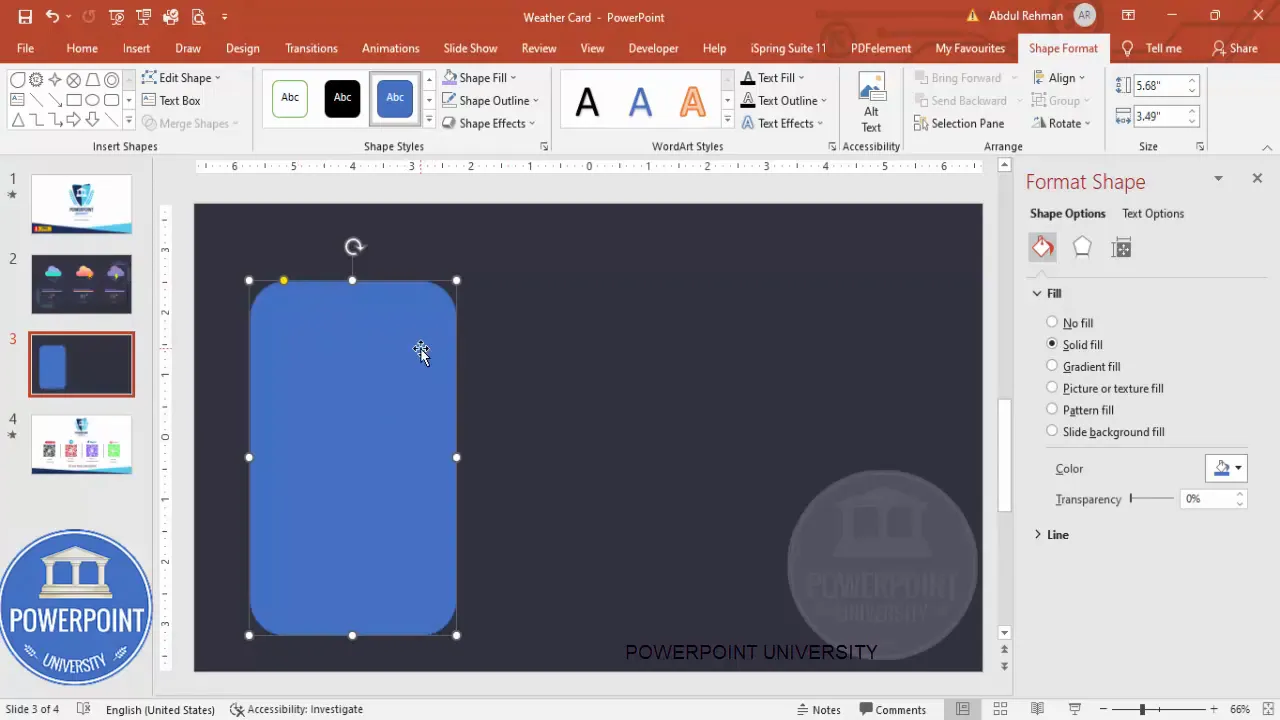
This simple base is the first step toward the Weather Card Slide Design in PowerPoint. The visual depth of the duplicated shape adds realism. Experiment with subtle offsets and transparency so the shadow feels integrated rather than detached.
Tips for sizing and layout
- Decide how many cards per row (three in the example). The card width should be consistent.
- Use guides or the Align tools to ensure even spacing between cards.
- If you plan to print or export as an image, keep a safe margin (10–20 px) around edges.
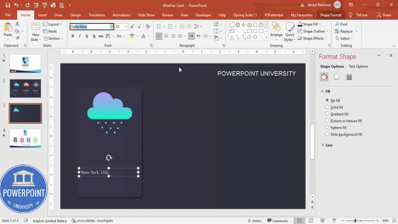
Step-by-step build: Build the cloud shape
The cloud is a compound shape composed of a rounded rectangle and several ovals combined with Merge Shapes > Union. This approach keeps the cloud editable and scalable — perfect for the Weather Card Slide Design in PowerPoint.
- Insert > Shapes > Rounded Rectangle and draw a small rounded rectangle horizontally.
- Insert > Shapes > Oval and draw one or more ovals. Duplicate the ovals (Ctrl+D) and scale down to create the puffy cloud bumps. Position two or three ovals along the top of the rounded rectangle.
- Select all three shapes (rectangle + ovals). On the Shape Format tab choose Merge Shapes > Union. The result is a single cloud shape you can move, resize, and style.
- Fill the cloud with a gradient fill. Adjust gradient stops to create a subtle highlight and shadow within the cloud.

Random placement often looks more natural than a strict grid. Slightly rotate or vary the vertical spacing of drops for a dynamic look. Grouping is essential — it saves time when you duplicate the card.
Adding text: City, country, temperature, and degree symbol
Now we’ll add the textual elements that make the Weather Card Slide Design in PowerPoint functional: city name, country, temperature, and date.
- Insert a text box for the city and country. Choose a light color for contrast with the dark card background. The video uses Open Sans; choose a similar clean sans-serif if that font isn’t available.
- Insert a small rectangle to hold the temperature number or use a text box with a contrasting background. Keep the outline off and the fill subtle.
- Insert another text box for the temperature value. Use a bold weight (ExtraBold if available) and center align. Make the temperature large enough to be the card’s focal point.
- To add a degree symbol, insert > Symbol or use Webdings symbols — or simply insert a small superscript circle and format it visually.
Tip: Keep text sizes consistent across cards. Use style presets (Format Painter or Theme Fonts) so each card follows the same typography rules. When you duplicate cards, the typography will stay consistent.
Switching icons: Sun, thunder, and other weather marks
Instead of crafting every weather icon manually, PowerPoint’s Insert > Icons tool is a fast way to swap icons for different conditions. Icons scale well and are easy to recolor, keeping your Weather Card Slide Design in PowerPoint crisp and consistent.
- Select the card you want to change. Remove or hide the raindrop group if the new condition doesn’t need it.
- Insert > Icons and search terms such as “sun” or “thunder” to find vector icons. Insert the chosen icon and scale it into position near the cloud or inside the card.
- Format the icon: Shape Fill > No Outline. Recolor using Theme colors or custom palette to harmonize with the card.
- If necessary, change the cloud color or card fill to avoid low-contrast combinations (for example, a yellow sun against a very pale cloud).
Because icons are vector shapes, they remain editable: ungroup them if you need to tweak individual parts, or keep them grouped for consistent scaling. The Weather Card Slide Design in PowerPoint benefits from consistent icon scale across cards.
Background accents: Soft-edge ovals and subtle light sources
Adding a soft-edged oval behind cards creates a glow or spotlight effect. This background accent helps cards pop from the slide without relying on high-contrast borders.
- Insert > Shapes > Oval and draw a large circle/ellipse behind the card.
- Format Painter: You can copy the card’s gradient and apply it to the oval, or choose a new gradient for a vignette effect.
- Go to Shape Effects > Soft Edges and increase the soft edge blur to achieve a glowing bleed.
- Send the oval behind the card (Right-click > Send to Back) — place it to subtly highlight a card group or the whole row.
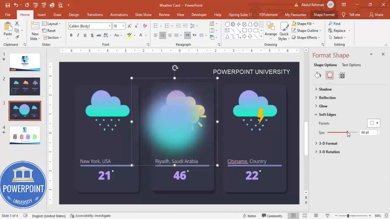
Soft-edge accents are versatile. Use them under a single card to suggest focus or behind a row to provide visual cohesion. They’re easy to tweak; adjust size and transparency until the glow feels natural.
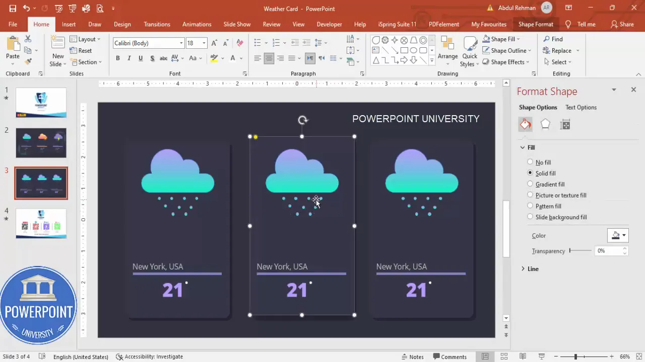
Grouping, alignment, and duplication: Speed up your workflow
Once a single card is complete, duplication and consistent alignment are the keys to creating multiple cards efficiently. Use these PowerPoint features to speed up your Weather Card Slide Design in PowerPoint workflow.
- Group elements: Select related shapes (cloud + raindrops + city text + temperature shape) and press Ctrl+G. Moving, duplicating, and aligning grouped elements keeps everything intact.
- Duplicate instead of recreate: Use Ctrl+D to duplicate the card rather than recreate it. This keeps sizes and spacings identical.
- Align and distribute: Use Align > Align Middle or Align Center and Distribute Horizontally to space cards evenly across the slide.
- Use Format Painter: Copy formatting from one shape to another for rapid color and fill adjustments.
Animations: Bring the Weather Card Slide Design in PowerPoint to life
Subtle animations make the Weather Card Slide Design in PowerPoint feel dynamic without being distracting. Here are several low-effort, high-impact animation ideas:
- Fade In for the entire card: Start by fading the card onto the slide to create a smooth entry.
- Float In for clouds: A slight upward Float In with a short duration mimics a drifting cloud.
- Wipe or Float for raindrops: Use a short, linear Wipe or Float for raindrops, offsetting each drop for a cascading effect.
- Pulse or subtle Grow/Shrink for sun icons: Use this sparingly for emphasis on active weather conditions.
Timing tips: stagger animations by 0.1–0.3 seconds to avoid mechanical uniformity. Keep total animation length for each card under 2 seconds for a crisp appearance during a presentation.
Create Slides in Seconds with ExpertSlides AI |
|
Generate AI Presentations today: |
| TRY NOW! |
Advanced tips: Variants, responsive cards, and data-driven updates
Once you have the Weather Card Slide Design in PowerPoint building blocks, you can extend the template for more advanced uses:
- Color-coded conditions: Create a small palette for conditions (rain = indigo/blue, sun = yellow/orange, thunder = violet/gray) and use it consistently across cards.
- Compact vs. expanded cards: Design a compact card for sidebars or a larger version for the main slide. Keep typography and margins proportionate.
- Automated data updates: If you export slides as a master image for a web app, use external tools to overlay dynamic text. Within PowerPoint, manual updates are straightforward — keep a master copy to edit quickly.
- Multiple resolutions: Test cards at typical screen widths (16:9 and 4:3) and adjust sizes to ensure legibility on mobile or tablet screens if you’ll export images.
Note: For automated weather updates inside PowerPoint, you’d typically integrate with an external script or add-in; PowerPoint’s native capabilities don’t fetch live web data. However, the Weather Card Slide Design in PowerPoint template is structured so manual updates are fast.
Visual rules and accessibility
Design isn’t just about how something looks — it’s about how well your audience can understand it. These visual rules will keep your Weather Card Slide Design in PowerPoint clear and accessible.
- Contrast: Ensure text contrast meets readability standards. Light text on a dark card works well — but check against low-vision considerations.
- Font sizes: Temperature values should be the largest text on the card. City/country should be smaller but legible from a distance if presenting.
- Color alone isn’t enough: Don’t rely solely on color to convey condition — include an icon and clear text label (e.g., “Thunder” or “Mostly Sunny”).
- Whitespace: Give elements breathing room — crowded cards are harder to read and look less professional.
Common mistakes to avoid
- Avoid default shapes left with the default blue fill and shadow — customize immediately to avoid looking “generic.”
- Don’t use tiny fonts for the city and country — they must remain legible when the slide is projected or viewed on smaller screens.
- Don’t group everything too early — keep components separate until you’re satisfied with sizes and spacing, then group for duplication.
- Too many animation effects: Keep motion minimal and purposeful; multiple flashy animations reduce professionalism.
Use cases and examples
The Weather Card Slide Design in PowerPoint is versatile. Here are practical scenarios where these cards shine:
- Executive dashboards: Show conditions for key cities where your organization operates.
- Event planning slides: Display weather predictions for event locations in a condensed, visual way.
- Mockups and UI prototypes: Present a clean card design to stakeholders for app interfaces or web widgets.
- Educational presentations: Use cards to teach students about weather patterns in different regions.
- Internal operations: Display heat warnings or storm advisories for field teams in a daily briefing deck.
Exporting and sharing the Weather Card Slide Design in PowerPoint
When you finish your Weather Card Slide Design in PowerPoint, you may need to export or share it. Here are recommended formats and settings:
- Export as PNG or JPG for web usage or embedding into other documents. Use high resolution (at least 150–300 dpi) if you plan to print.
- Save the PowerPoint file with a clear template name so you can reuse it. Save a master blank version and a working copy.
- Export as PDF for distribution: This preserves layout and fonts; embed fonts when prompted if your presentation will travel across devices.
- Share the template with colleagues and instruct them to use the same theme fonts to avoid layout shifts.
Troubleshooting common layout issues
If elements misalign after duplication or when opened on another device, try these fixes:
- Check your slide master for unexpected formatting overrides.
- Ensure fonts are installed on recipient machines — otherwise substitute fonts will alter layout.
- Use the Align tools to nudge elements back into place if duplicates become uneven.
- Group complex components before moving to prevent accidental displacement.
FAQ — Weather Card Slide Design in PowerPoint
Q: Can I change the size of the Weather Card Slide Design in PowerPoint without breaking the layout?
A: Yes. Because the design is built with PowerPoint shapes and grouped elements, scale the group uniformly using Shift + drag handles to maintain aspect ratios. If you change only the width or height, you may need to tweak font sizes and internal spacing.
Q: What fonts work best for the Weather Card Slide Design in PowerPoint?
A: Use clean, geometric sans-serif fonts like Open Sans, Montserrat, or Lato. These maintain clarity at small sizes and emphasize numeric temperature values. I used Open Sans in the template because it balances readability and modern aesthetics.
Q: How can I add Celsius or Fahrenheit symbols efficiently?
A: Insert a small text box and type the degree symbol (Alt+0176 on numeric keypad for Windows), or use Insert > Symbol. For stylized versions, use Webdings or a small superscript circle as a separate shape near the temperature number.
Q: Are the icons editable?
A: Icons inserted via Insert > Icons are vector shapes and can be recolored and resized. To edit points inside the icon, ungroup (they are often a group of shapes). Keep a copy of the original if you need to revert.
Q: Can I animate the raindrops so they look like falling water?
A: Yes. Apply a short “Float” or “Wipe” animation to individual drops and offset their timings. Group drops for easier timing controls: animate the group with a short path or staggered start times for a cascading effect.
Q: Is it possible to make these cards interactive in slideshow mode?
A: Yes. Use PowerPoint’s Action settings to add hyperlinks to each card (go to Insert > Action). Link to other slides, external URLs, or hidden slides with expanded data for that city.
Q: Will the Weather Card Slide Design in PowerPoint look good on mobile devices?
A: The cards are best viewed on standard presentation screens, but you can export them as images sized for mobile widths. Ensure the text remains legible at smaller sizes by testing small exports and increasing font sizes if necessary.
Q: How should I save a master version to keep styling consistent?
A: Save a master copy named “Weather Card Slide Design in PowerPoint – Master.pptx” and another working file for daily edits. Use Slide Master to lock in fonts and color palettes so each duplicate retains style.
Final checklist before sharing your Weather Card Slide Design in PowerPoint
- All text is legible and uses consistent fonts and sizes across cards.
- Icons are sized and colored consistently for visual balance.
- Grouped components are used for efficient duplication and movement.
- Soft-edge background accents are subtle and don’t overpower card content.
- Animations are tested in Slide Show mode and timed to avoid distraction.
- Exported images are high-resolution if used in other documents or web pages.
Download and reuse
If you want to skip straight to a template: the Weather Card Slide Design in PowerPoint template I used in this guide is available for free; keep it as a master so you can adapt city names, temperatures, and icons quickly.
Remember: the Weather Card Slide Design in PowerPoint is about clarity, consistency, and quick updates. Keep your components modular, use group and duplicate strategically, and your cards will scale from a single slide to an entire presentation with ease.
Sample workflow to adapt the Weather Card Slide Design in PowerPoint for a new set of cities
- Open the master template and duplicate the slide containing the cards.
- Select each card group and click Group > Ungroup if you need to edit internal elements; otherwise keep grouped.
- Update the city and country text boxes with the new names.
- Update the temperature text box and degree symbol as needed.
- Swap icons using Insert > Icons to reflect the correct weather condition.
- Adjust cloud or accent colors if you want a different color theme for the new set.
- Quickly align duplicates and export or present the updated slide.
Troubleshooting and quick fixes
- Fonts substituted on other machines: Save as PDF or embed fonts when saving to avoid layout shifts.
- Icons not appearing: Use vector icons from stock or convert SVG icons into shapes by inserting them and ungrouping.
- Shadow or glow too strong: Reduce the duplicated rectangle’s opacity or the soft-edge blur until subtle.
- Export resolution low: Increase slide size before export or use File > Export > Change File Type > PNG with larger dimensions.
Wrap-up: Key takeaways for the Weather Card Slide Design in PowerPoint
The Weather Card Slide Design in PowerPoint is a small but powerful component that communicates multiple data points quickly. Here are the essential takeaways:
- Start with a consistent card base (rounded rectangle + shadow).
- Create compound shapes for icons like clouds using Merge Shapes > Union.
- Use icons from Insert > Icons for quick swaps and consistent vector imagery.
- Group components and use Ctrl+D to duplicate for rapid, consistent expansion.
- Add subtle soft-edge accents behind cards to anchor them visually on a dark slide.
- Keep animations simple and purposeful to enhance—not distract from—the content.
With these steps you’ll be able to design, customize, and reuse a professional Weather Card Slide Design in PowerPoint for virtually any presentation need.
Design practice: build one card well, then duplicate — consistency beats complexity.
If you follow the steps above and use the tips provided, you’ll have a polished Weather Card Slide Design in PowerPoint that’s ready for presentations, dashboards, or prototypes. Happy designing!
Check out the full video: Weather Card Slide Design in PowerPoint | Tutorial 1109 | Free Template


