Welcome, friends! Today, I’m excited to share with you three indispensable tips that will significantly enhance your slide design skills. Whether you’re creating a presentation for work, school, or any other purpose, mastering these techniques will help your slides look professional, balanced, and visually engaging.
These tips come from years of experience working with PowerPoint, and I’ll guide you through each one step-by-step. We’ll cover the fundamentals of alignment, dive deep into the world of fonts, and explore the powerful impact of colors in your presentations. By the end of this article, you’ll have a solid understanding of how to apply these principles to craft slides that not only look beautiful but also communicate your message effectively.

Table of Contents
- Tip 1: Mastering Alignment for Balanced Slides
- Tip 2: Exploring Fonts to Elevate Your Presentation
- Tip 3: Harness the Power of Colors
- Conclusion: Your Slide Design Toolkit
- Frequently Asked Questions (FAQ)
Tip 1: Mastering Alignment for Balanced Slides
Alignment is the backbone of good slide design. It’s the secret ingredient that makes your slides look well-structured, balanced, and easy to follow. Without proper alignment, your slide elements can appear misplaced, chaotic, and unprofessional.
Think of alignment as the invisible grid that holds your content together. When you align your text, images, icons, and shapes properly, your audience can focus on the message without distraction. Let’s explore how to use alignment tools effectively.
Why Alignment Matters
When elements are randomly placed, the slide feels unsettling and unorganized. Proper alignment creates harmony and flow, helping viewers’ eyes move naturally through the content.
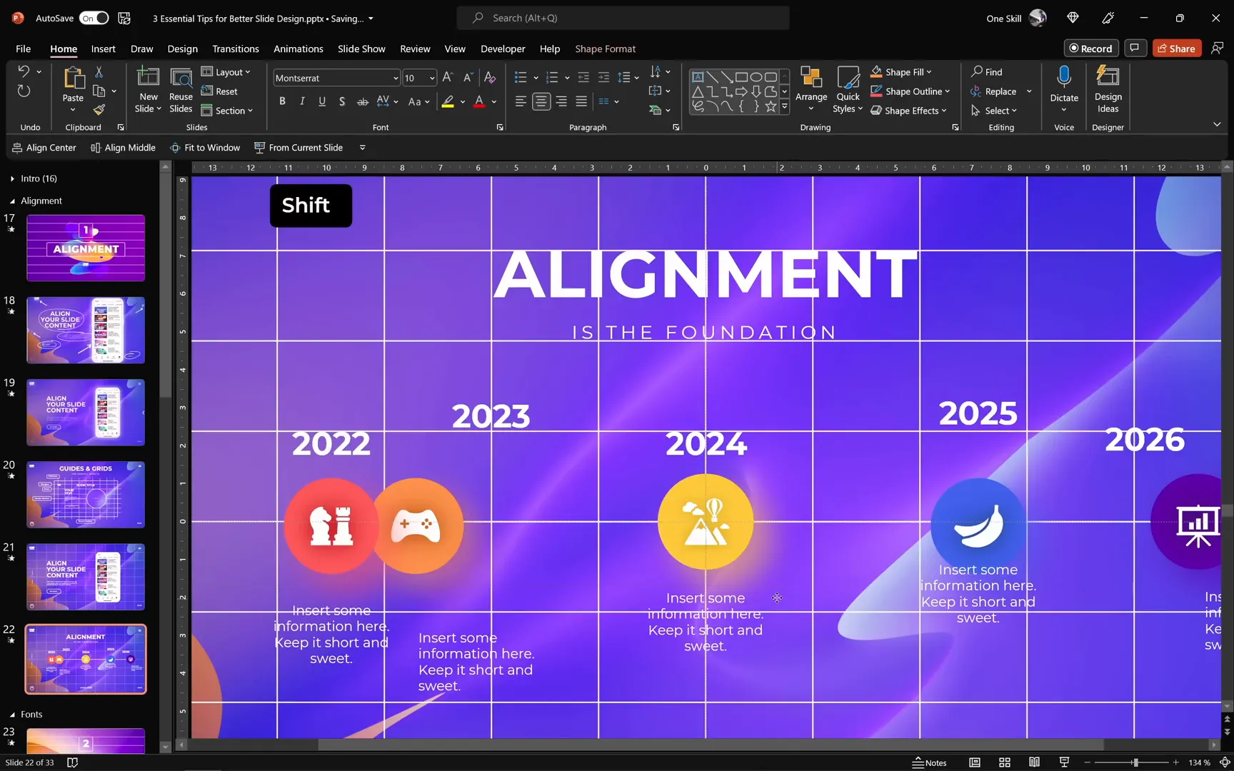
For example, on one slide, you might see a few shapes scattered around with no clear order. By applying alignment techniques, you can transform that slide into a clean, well-organized layout that looks professional and inviting.

Powerful Alignment Tools You Need to Know
Here are some of the best alignment tools available in PowerPoint (and similar presentation software) that will help you create perfect layouts:
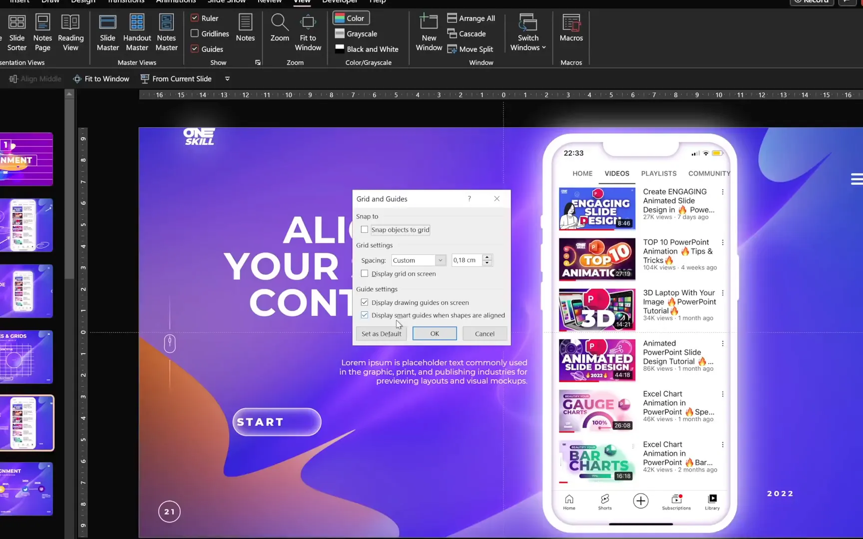
- Center Guides: These show you the exact center of your slide, both vertically and horizontally. They are especially useful when placing slide titles or central elements.
- Margins: Margins create a safe area around the edges of your slide. This is ideal for keeping logos or important content away from the edges to avoid cropping or visual clutter.
- Rows and Columns: Using a grid system with rows and columns helps you position content consistently and proportionally throughout your slide.
- Smart Guides: These dynamic guides appear when you move objects and help you align them relative to other elements on the slide.
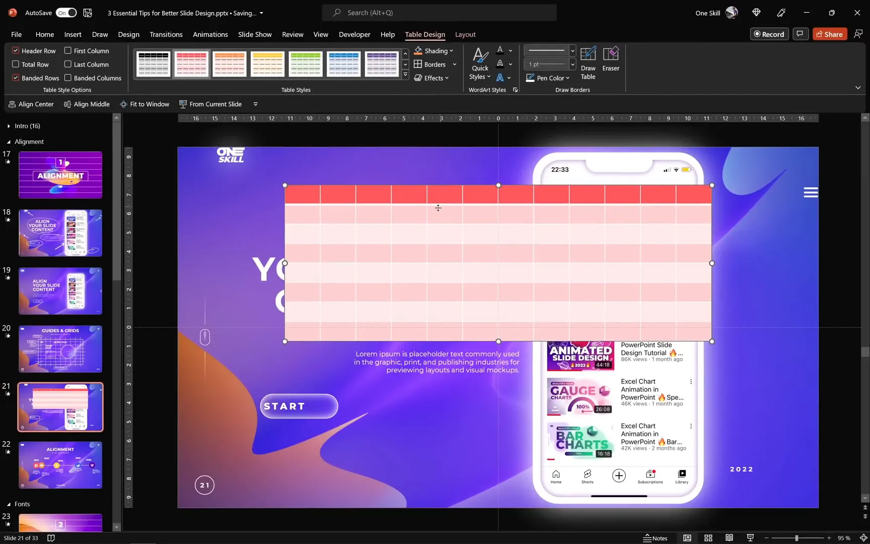
Creating a Grid Using a Table
One of my favorite ways to establish a grid on your slide is by inserting a table. Here’s how you can do it and customize it to serve as your alignment grid:
- Go to Insert > Table and select the number of columns and rows you want. For example, 12 columns and 8 rows work well for many layouts.
- Once inserted, customize the table’s design to make it minimal. Change the border color to white or a very light gray so it doesn’t distract from your content.
- Position the table to cover the entire slide area by stretching it from corner to corner.
- Send the table to the back so you can work freely on your slide elements while keeping the grid visible.
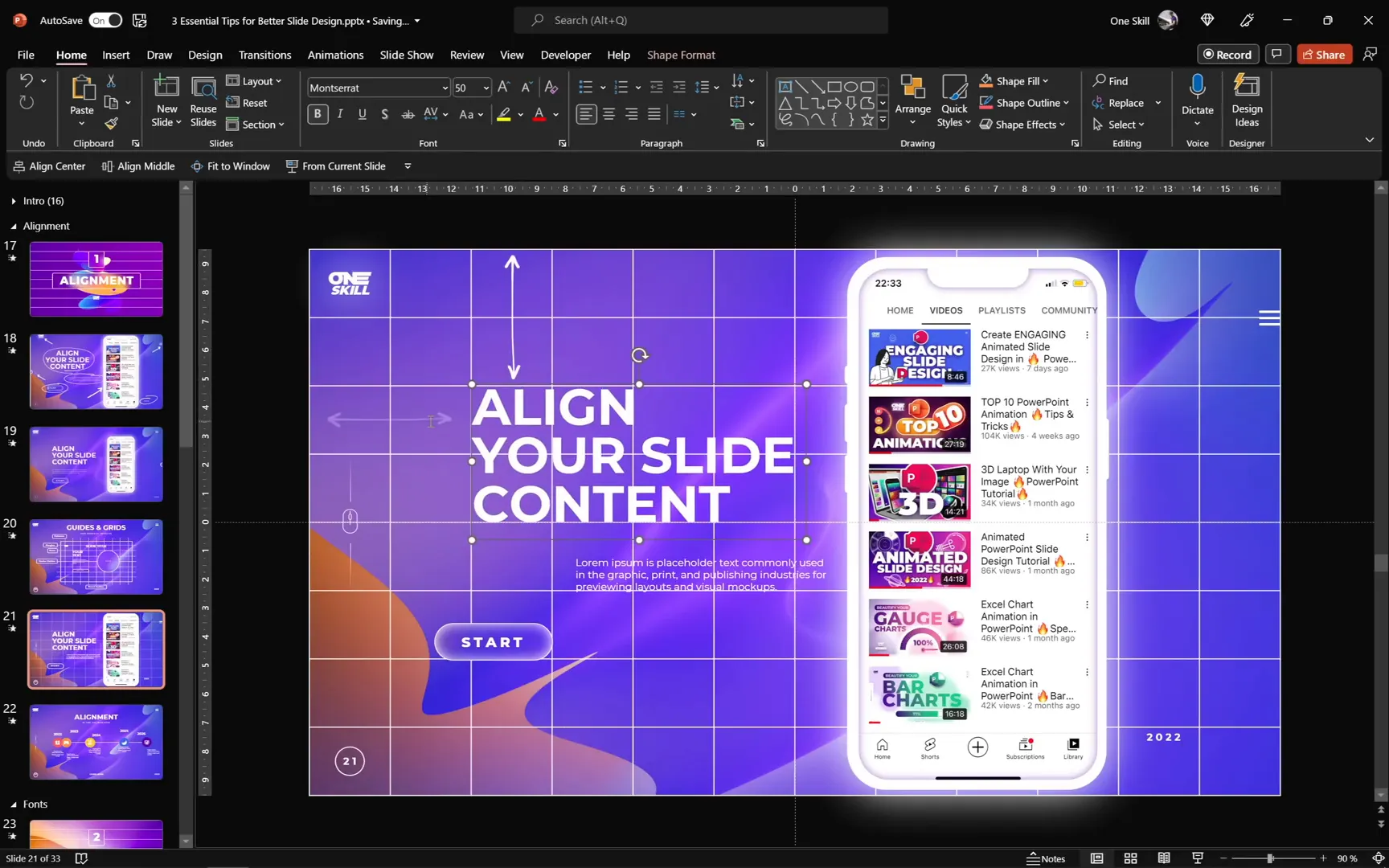
Applying the Grid to Align Slide Elements
With your grid in place, begin positioning your slide elements according to the grid cells. For example:
- Place logos and icons in specific grid squares to keep them consistent across all slides.
- Align text boxes to the left or right margins of the grid to maintain clean edges.
- Ensure that images and shapes are sized and spaced evenly using the grid as a reference.
Adjust the size of large elements, like images, to leave some breathing space around them. For instance, leaving one empty row above and below a smartphone image can improve visual balance.
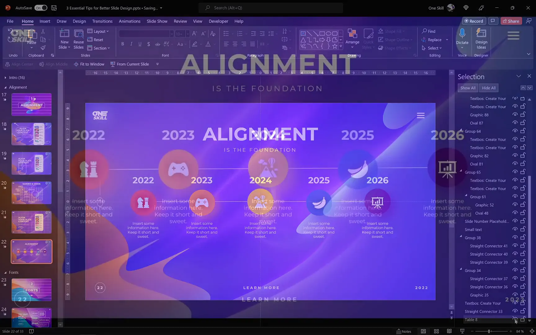
Fine-Tuning and Grouping Elements
Once your elements are aligned to the grid, use PowerPoint’s alignment options to fine-tune their positions:
- Use the Align Center and Align Middle commands to center icons and text boxes precisely.
- Group related elements to keep them together when moving or resizing. Grouping helps maintain your layout integrity.
- Use the Distribute Horizontally function to ensure equal spacing between multiple groups or elements.
Practice Makes Perfect
Try applying these alignment techniques to different slides, such as timelines or content-heavy slides, to bring harmony and structure. Using the grid consistently across your presentation creates a cohesive and professional look.
Tip 2: Exploring Fonts to Elevate Your Presentation
Fonts are more than just letters on a slide — they convey tone, mood, and personality. Choosing the right font can make a huge difference in how your presentation is perceived.
Why Experimenting with Fonts Matters
Changing fonts is one of the quickest ways to refresh your presentation design. The font you pick should complement your content and the message you want to deliver.
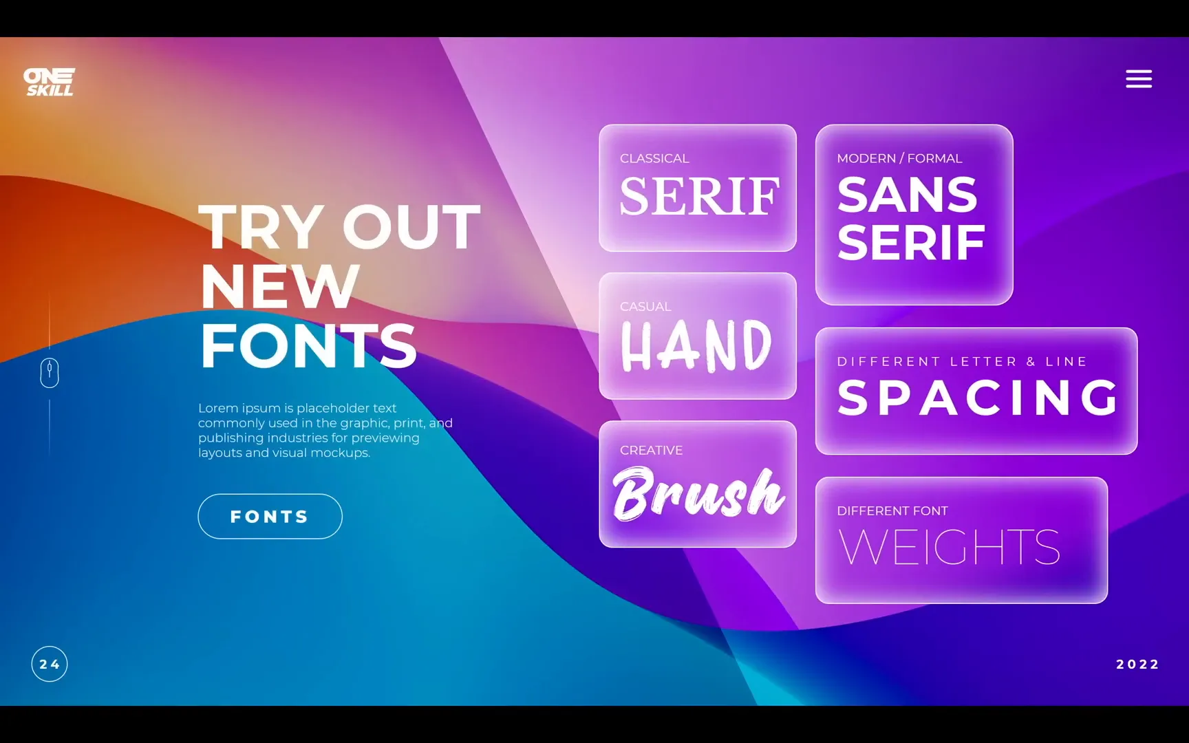
Each font style carries its own emotional weight:
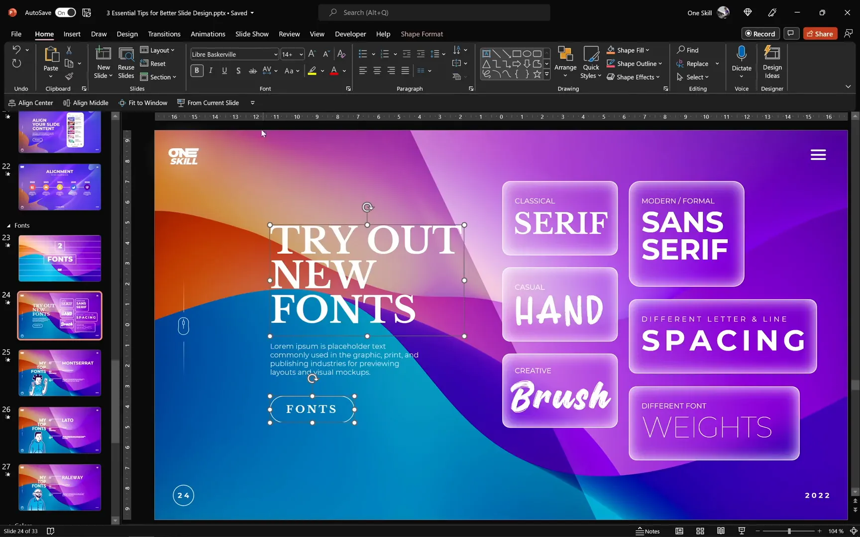
- Serif Fonts: These fonts have small decorative tails on letters and evoke a classical, elegant vibe. Great for formal or traditional presentations.
- Sans Serif Fonts: Clean and modern without the tails, these fonts are perfect for a sleek, professional look.
- Handwritten or Brush Fonts: Casual and creative, these fonts add personality and playfulness but should be used sparingly.
Great Places to Find Fonts
There are many resources online where you can discover beautiful fonts for your slides. Here are two of my favorites:
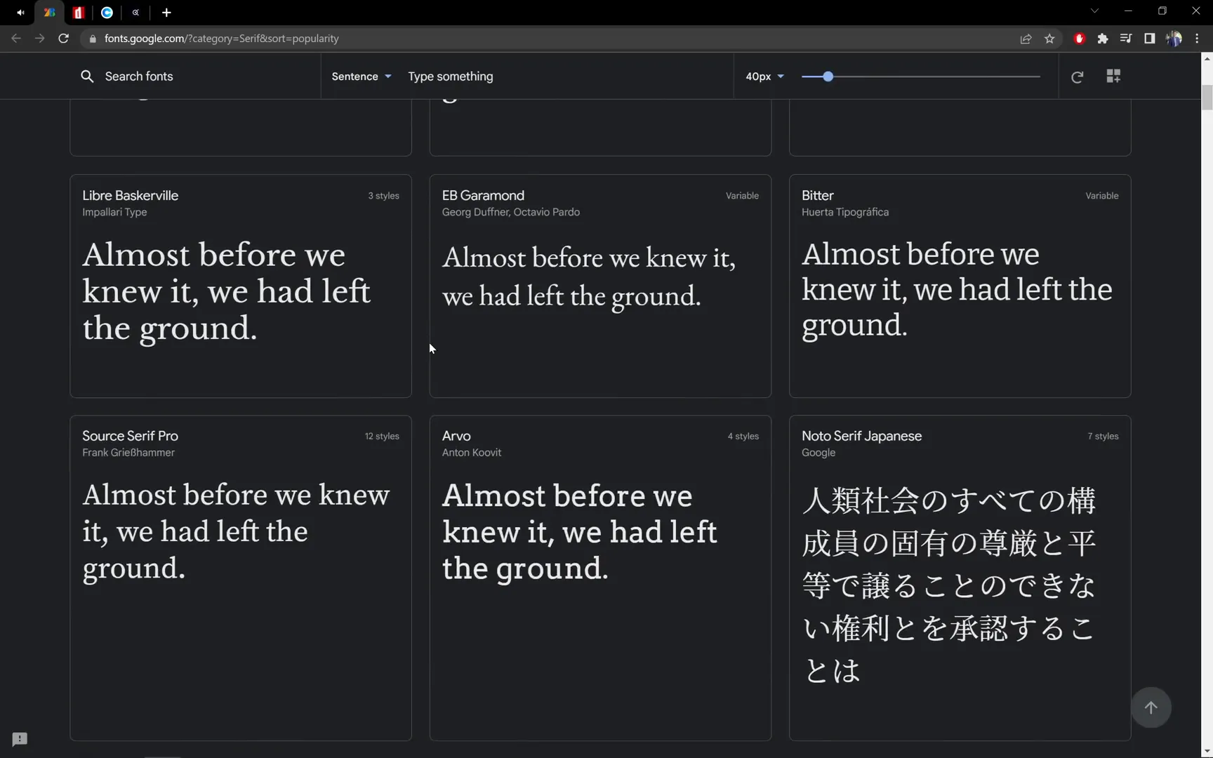
- Google Fonts: An extensive, free library where you can filter fonts by category such as serif, sans serif, display, and more.
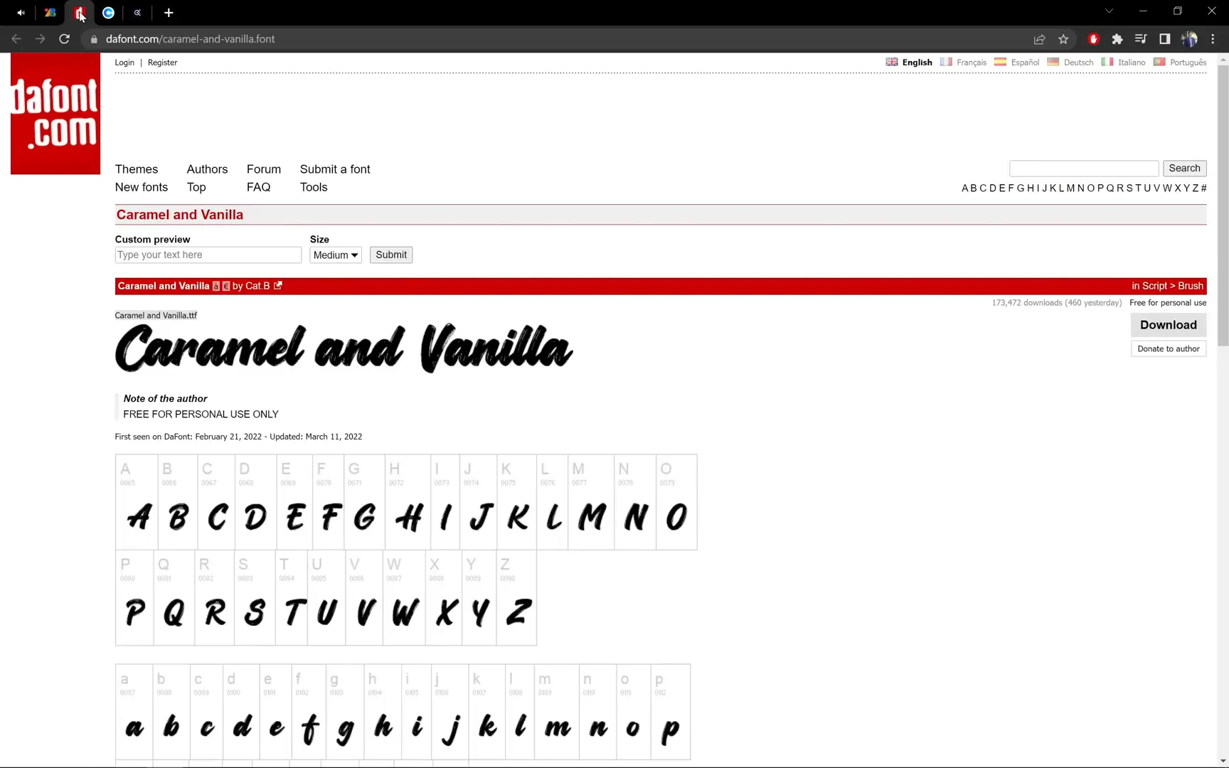
- Dafont.com: Best for creative, handwritten, and brush fonts like Caramel and Vanilla or Dinotopia.
Playing with Fonts in Your Slide
Let’s see how changing fonts can transform your slide’s look and feel:
- Try swapping your slide title font from Montserrat (a sans serif) to Libre Baskerville (a serif). Notice how the mood shifts from modern to elegant, almost like a magazine cover.
- Experiment with playful fonts like Dinotopia (handwritten) or Caramel and Vanilla (brush font) to add a casual or creative touch.
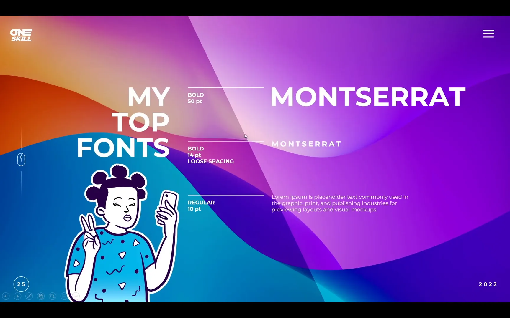
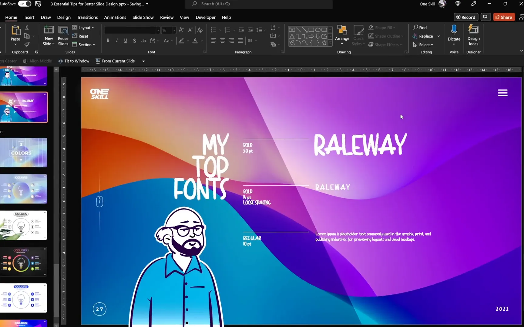
- If your letters feel cramped, adjust the letter spacing using presets like “loose” or “very loose” to increase readability and style.
- Change text case from all uppercase to sentence case to improve legibility and soften the tone.
- Modify line spacing to control the vertical distance between lines, making your paragraph text easier to read. For example, use “single” spacing for more breathing room, or “multiple” with values below 1.0 to tighten lines.
Understanding Font Weights
Font weight is another powerful tool that affects emphasis and hierarchy:
- Heavier weights (bold, extra bold) work well for titles and headers to grab attention.
- Lighter weights (light, thin) suit body text and captions for a subtle, clean appearance.
For example, switching paragraph text from Montserrat Light to Montserrat Thin can create a softer look but always check readability on full screen.
My Favorite Fonts for Presentations
Over the years, I’ve developed a few go-to fonts that consistently deliver great results:
- Montserrat: Bold for titles (~50pt), regular for subtitles (~14pt), and light for paragraphs (~10pt). A modern sans serif with great versatility.
- Lato: Another clean sans serif with excellent readability and a friendly tone.
- Raleway: Elegant and minimal, perfect for sleek, contemporary designs.
All of these fonts are free from Google Fonts and easy to incorporate into your projects.

Quick Font Replacement Across Your Presentation
Want to switch fonts throughout your entire presentation in seconds? Use the “Replace Fonts” feature in PowerPoint:
- Go to the Home tab and select Replace > Replace Fonts.
- Choose the font you want to replace (e.g., Raleway).
- Select the new font you want to apply (e.g., Dinotopia).
- Click Replace and watch your slides update instantly.
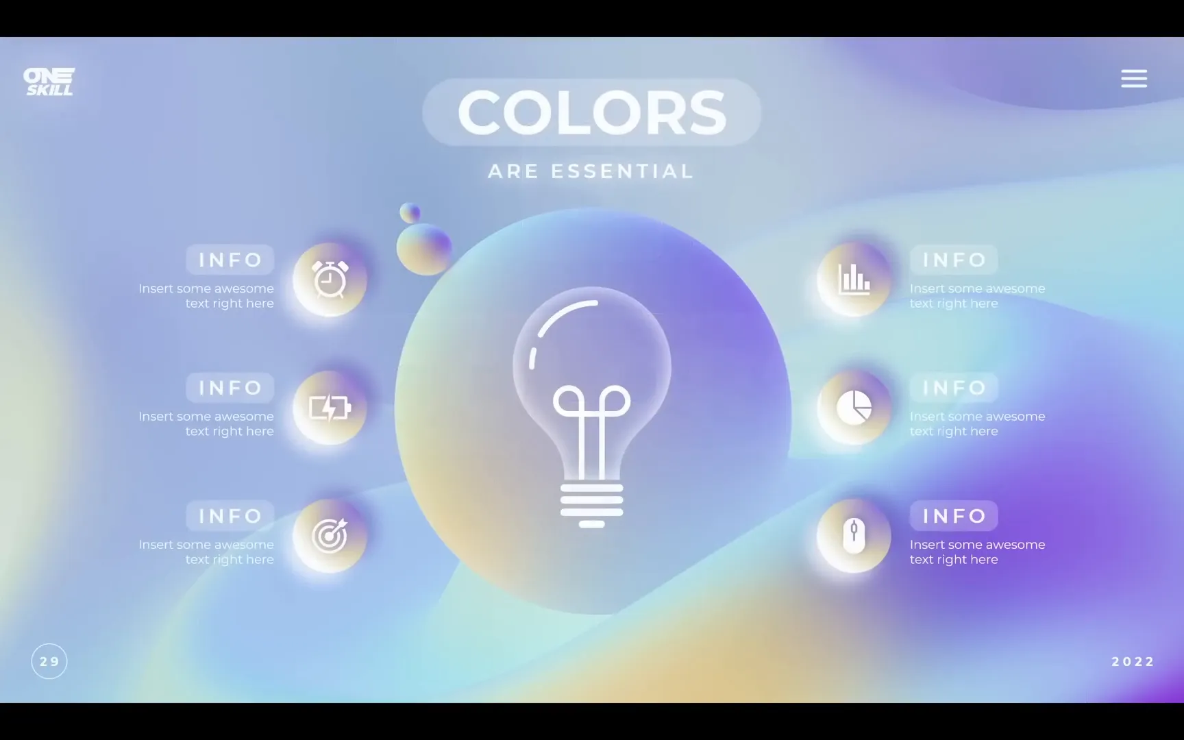
Tip 3: Harness the Power of Colors
Colors are not just decoration — they evoke emotions, set the tone, and can dramatically alter how your audience perceives your slides.
Choosing the Right Colors for Your Presentation Mood
Different colors communicate different feelings, so it’s important to pick a palette that aligns with your message:
- Formal presentations: Use limited colors like black, white, and monochrome palettes to convey professionalism and simplicity.
- Playful or creative presentations: Use a broader range of vibrant colors, but ensure they harmonize well.
- Brand-focused presentations: Stick to company brand colors to maintain consistency and identity.
Discovering Color Palettes and Harmonies
One of the best tools for exploring color palettes is Adobe Color. Here’s why I love it:
- You can explore different color harmonies—analogous, monochrome, complementary, triadic, and more—to see how colors relate on the color wheel.
- Adjust saturation and brightness to customize colors while keeping harmony intact.
- Learn how subtle variations in hue affect the overall palette mood.
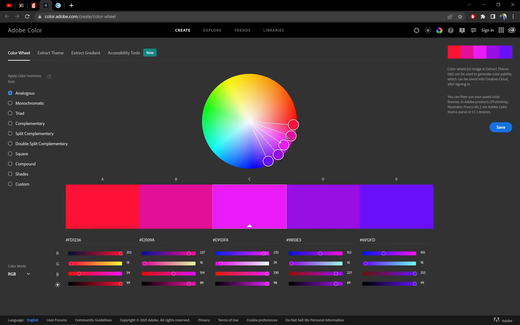
For example, an analogous palette keeps colors close together on the wheel, creating a cohesive and harmonious look, while monochrome palettes use variations of a single hue for a clean and elegant feel.
Another Great Resource: Colors.co
If you want quick inspiration, Colors.co offers beautiful, ready-made palettes that you can screenshot and apply directly to your slides.
To use a color palette from Colors.co in PowerPoint:
- Take a screenshot of the palette you like.
- Paste it onto your slide as a reference.
- Select any shape or text box, go to Fill > Solid Fill, and use the Eyedropper Tool to pick colors from the palette image.
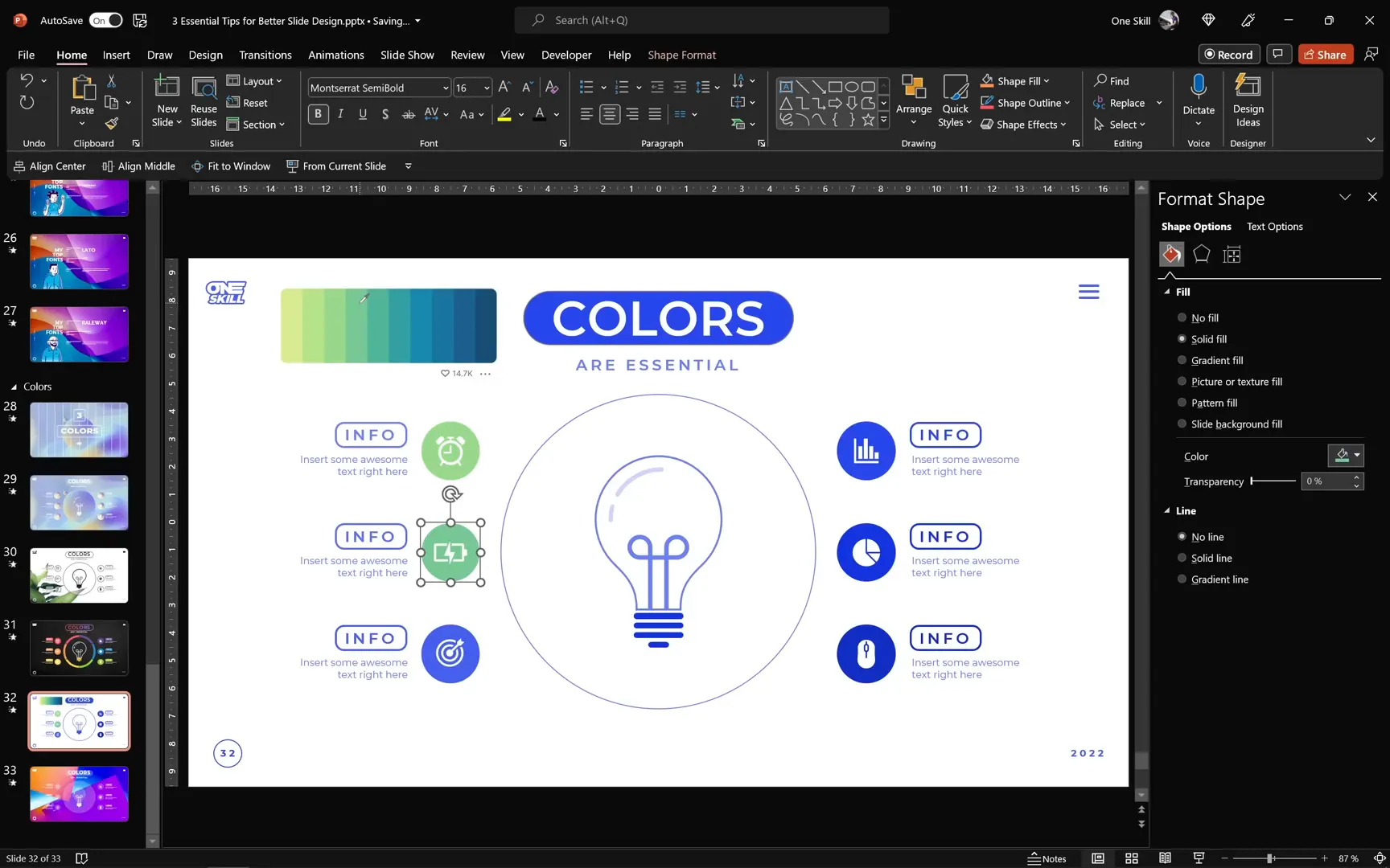
Adding Custom Colors to Your Theme
To save time and keep your colors consistent, add your chosen colors to your PowerPoint theme color swatches:
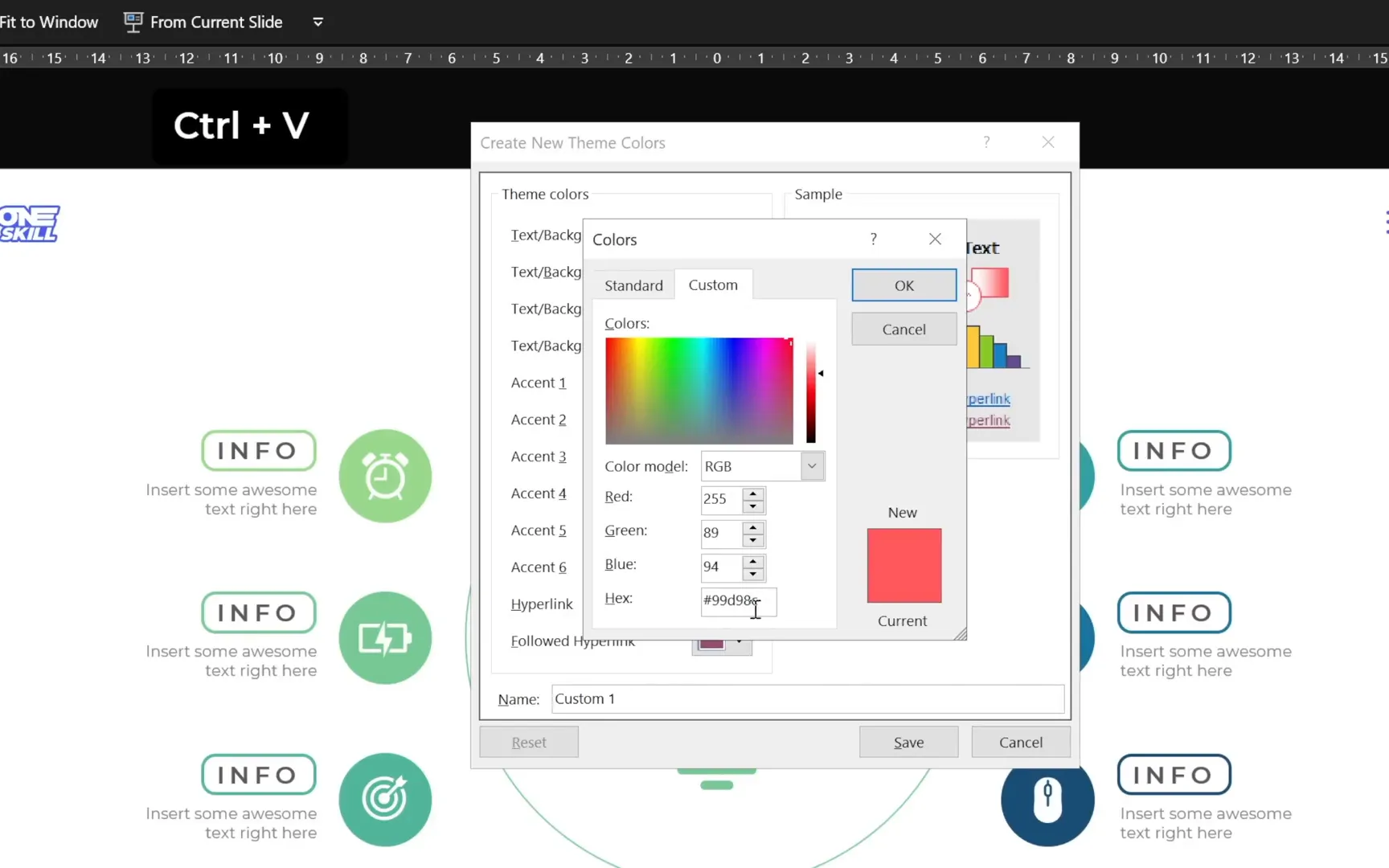
- Copy the hex code of your desired color from Colors.co or Adobe Color.
- Go to the Design tab > Variants > Colors > Customize Colors.
- Click on an accent color, select More Colors, and paste the hex code.
- Save your custom color palette to reuse across your presentation.
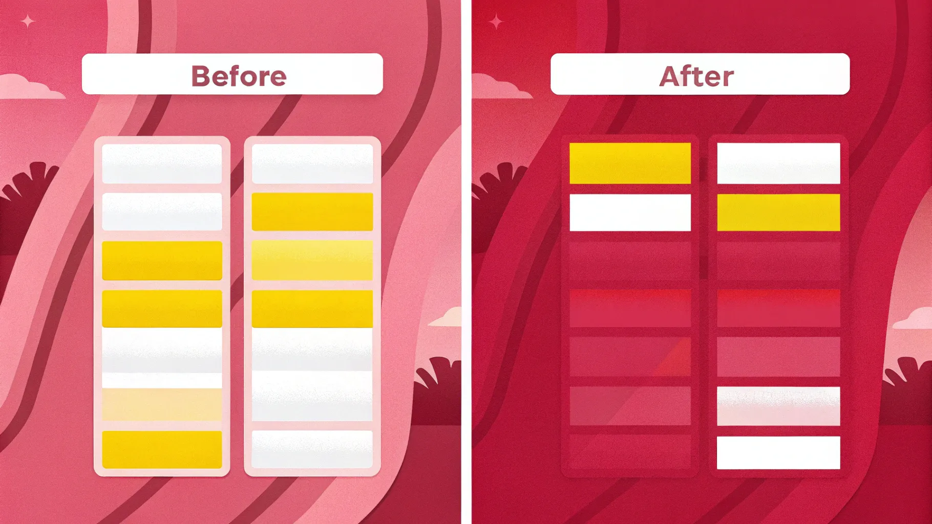
Summary: Colors Can Transform Your Slides
Changing your color palette can make the same content feel dramatic, playful, or serious. Experimentation is key, but always aim for harmony and readability.
Conclusion: Your Slide Design Toolkit
Congratulations! You’ve learned three powerful tips for better slide design:
- Alignment: Use grids, guides, and smart tools to create balanced, harmonious layouts.
- Fonts: Experiment with font categories, letter and line spacing, and font weights to match your presentation’s tone.
- Colors: Choose color palettes thoughtfully to evoke the right emotions and maintain consistency.
These foundational skills will elevate your presentations and make your slides not only look professional but also communicate your ideas clearly and beautifully.
Remember, slide design is a journey. Beyond these three tips, explore other elements like transitions, icons, infographics, animations, 3D models, shadows, illustrations, photos, and videos to keep your presentations engaging and dynamic.
Stay creative, stay curious, and most importantly, enjoy the process of making your slides shine!
Frequently Asked Questions (FAQ)
Q1: How do I create a grid for alignment in PowerPoint?
A: You can create a grid by inserting a table with the desired number of rows and columns, customizing its borders to be subtle, and stretching it across your slide. Alternatively, use built-in gridlines, guides, or margins for alignment assistance.
Q2: What font types work best for professional presentations?
A: Sans serif fonts like Montserrat, Lato, and Raleway offer a clean and modern look suitable for most professional presentations. Serif fonts can add elegance for formal settings, while handwritten or brush fonts are best used sparingly for creative or casual slides.
Q3: How can I ensure my font choices remain consistent throughout my presentation?
A: Use the “Replace Fonts” feature in PowerPoint to quickly swap one font for another across all slides. Also, set your fonts in the Slide Master to maintain uniformity.
Q4: Where can I find good color palettes for presentations?
A: Adobe Color and Colors.co are excellent resources for exploring and choosing harmonious color palettes. You can also use your brand guidelines if applicable.
Q5: How do I add custom colors to my PowerPoint theme?
A: Copy the hex code of your chosen color, go to Design > Variants > Colors > Customize Colors, select an accent color, click More Colors, and paste the hex code. Save your palette to use custom colors throughout your presentation.
Check out the full video: 🔥3 ESSENTIAL Tips🔥 for Better Slide Design


