

- Introduction: What you’ll build and why it matters
- Quick overview: What is the 5 Pie Chart options Slide?
- Step-by-step build: Prepare the slide and draw the base circles
- Cut the circle into five equal parts (the pie slices)
- Style the slices, add icons and labels
- Create the decorative top ovals and center headline
- Add finish touches: background, image fills and 3D center
- Animation and interaction: how to reveal options step-by-step
- Design tips, color advice, and accessibility notes
- Common pitfalls and troubleshooting
- FAQs
- Conclusion and next steps
Introduction
Hi — I’m the creator behind the technique explained here. In this guide I’ll walk you through how to design a clean, modern 5 Pie Chart options Slide that looks professional and is easy to edit. Whether you’re preparing a product roadmap, features slide, or a “five options” decision matrix, the 5 Pie Chart options Slide gives you a visually appealing way to present five related choices around a central headline.
The 5 Pie Chart options Slide is ideal when you want a circular layout with equal emphasis on each option and the ability to reveal titles, descriptions, and icons in sequenced clicks. I’ll show every step I use in PowerPoint — from building the pie slices using built-in shapes to adding icons, labels, and a 3D center chip. Follow along and you’ll be able to recreate, customize, and animate the slide for your next presentation.
Quick overview: What is the 5 Pie Chart options Slide?
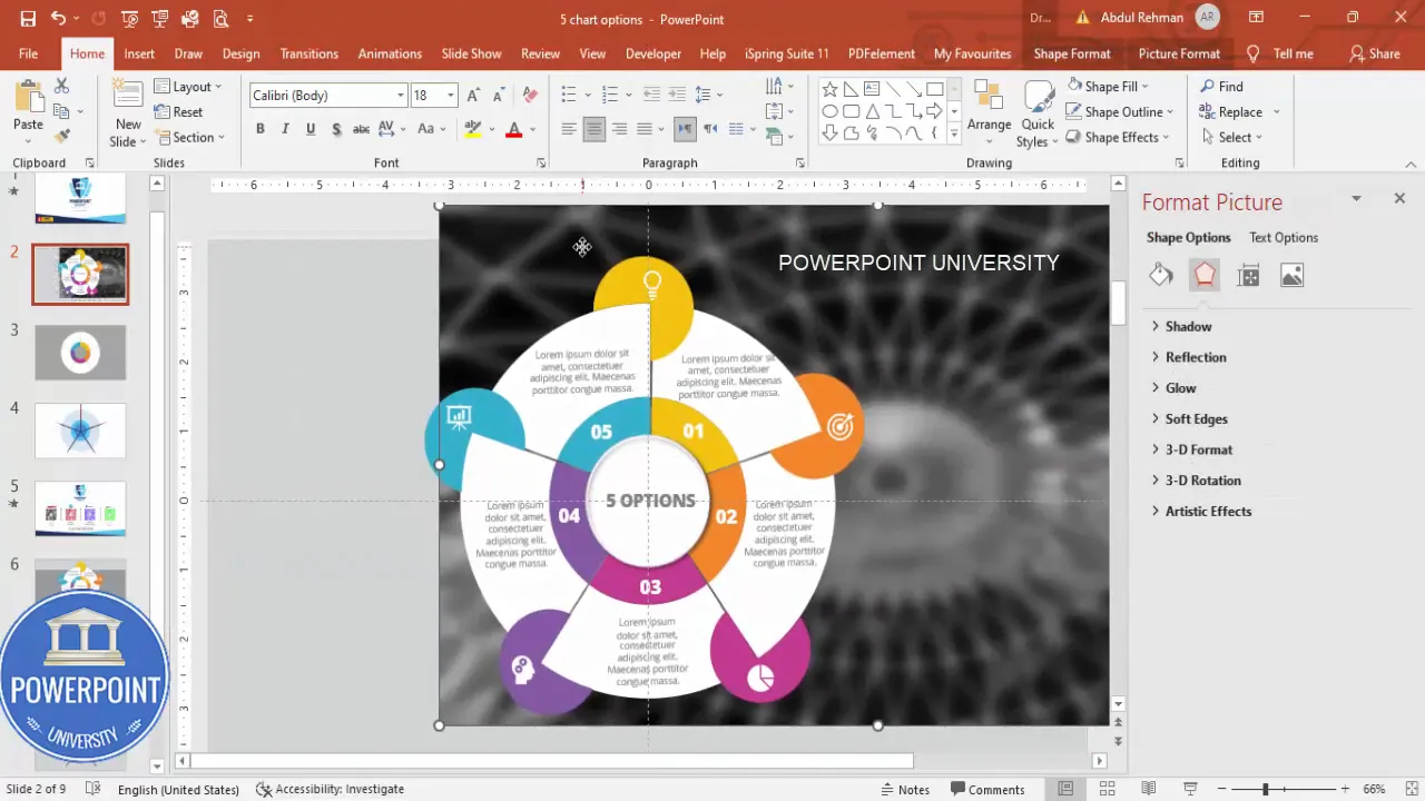
The 5 Pie Chart options Slide is a circular infographic built inside PowerPoint. It uses three concentric circles as a starting point and divides the topmost visible ring into five equal radial slices. Each slice becomes a distinct option area with its own color, short title, icon, and a small description placed beneath the slice. The center holds a bold headline or summary. As you click, the slide reveals the titles, then descriptions, then icons — giving you stepwise control during presentations.
Why use the 5 Pie Chart options Slide?
- Equal visual weight: Five pieces laid out radially create a balanced look.
- Interactivity: Stepwise reveal keeps the audience focused on one option at a time.
- Customization: Colors, icons, and copy are quick to swap to match branding.
- Versatility: Works for feature lists, service options, process steps, or segmented data.
What you’ll need before you start
To follow this walk-through, open PowerPoint (Windows or Mac with standard shape tools). You’ll rely on built-in shapes, alignment tools, the Merge Shapes feature (Fragment), and Insert > Icons. No external plug-ins are required. If you want to use custom images for slice backgrounds, have them ready to paste and set to send backward.
- PowerPoint with Merge Shapes support
- Open Sans or a clean sans-serif font (I use Open Sans Extra Bold)
- Optional: icon set from PowerPoint’s Insert > Icons
- Optional: small images you’d like to place behind slices
Step-by-step build: Prepare the slide and draw the base circles
Follow these steps to create the concentric circular base that becomes the foundation of the 5 Pie Chart options Slide.
-
Add a new slide — Start with a blank slide layout. Then go to View and enable the guides to help center align shapes precisely.
-
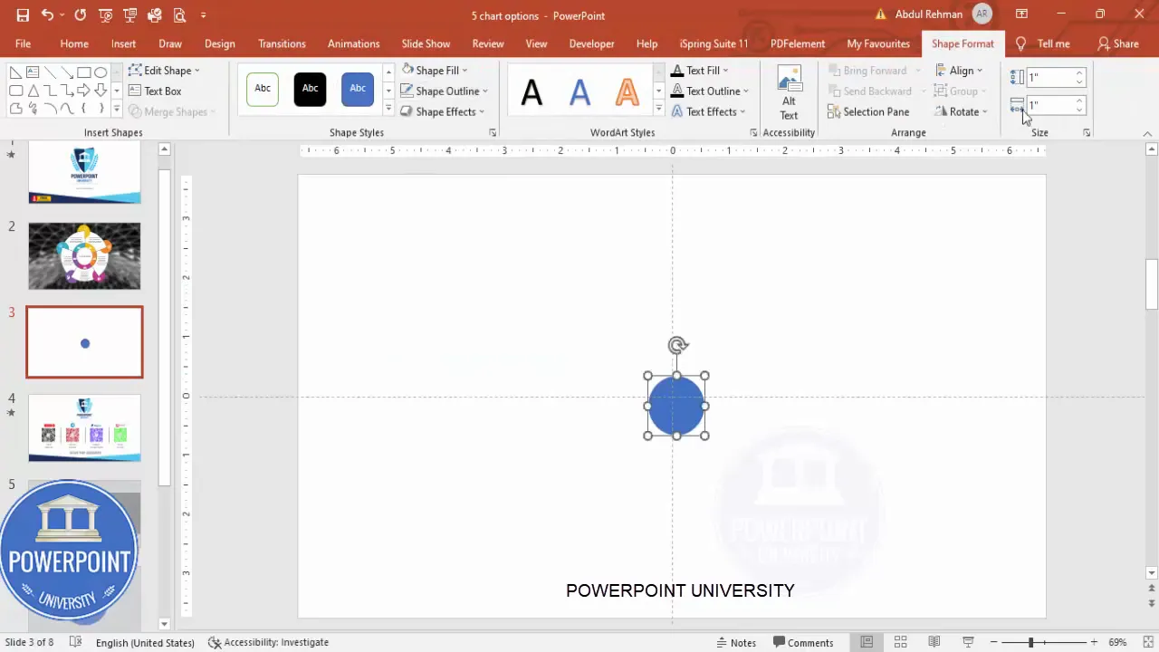
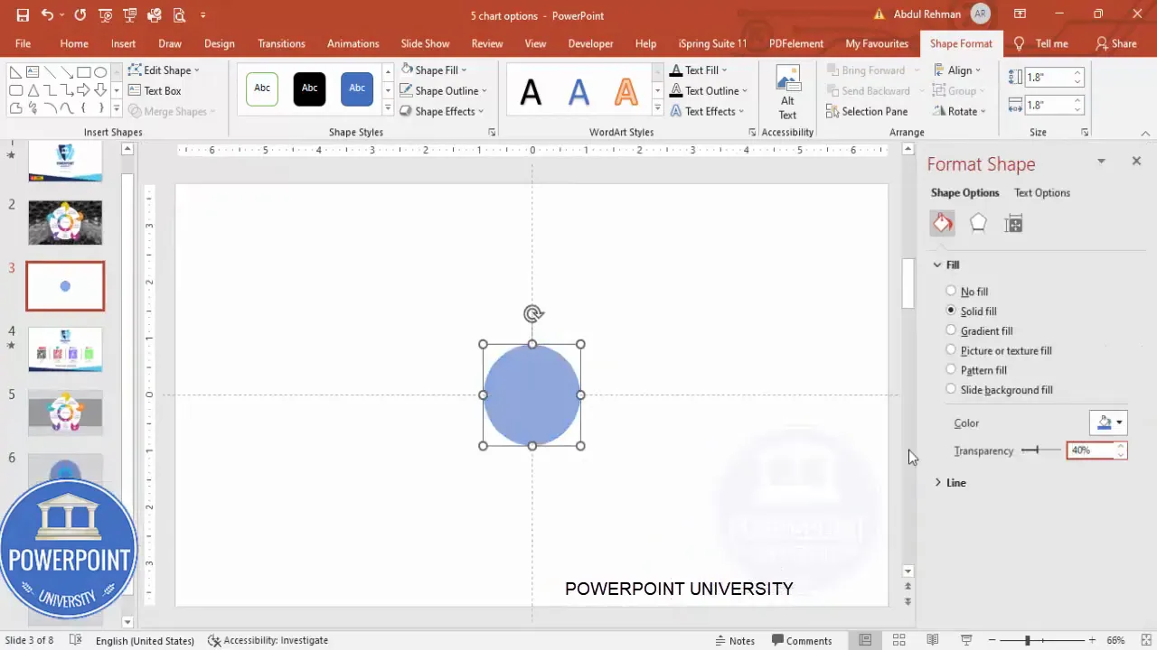
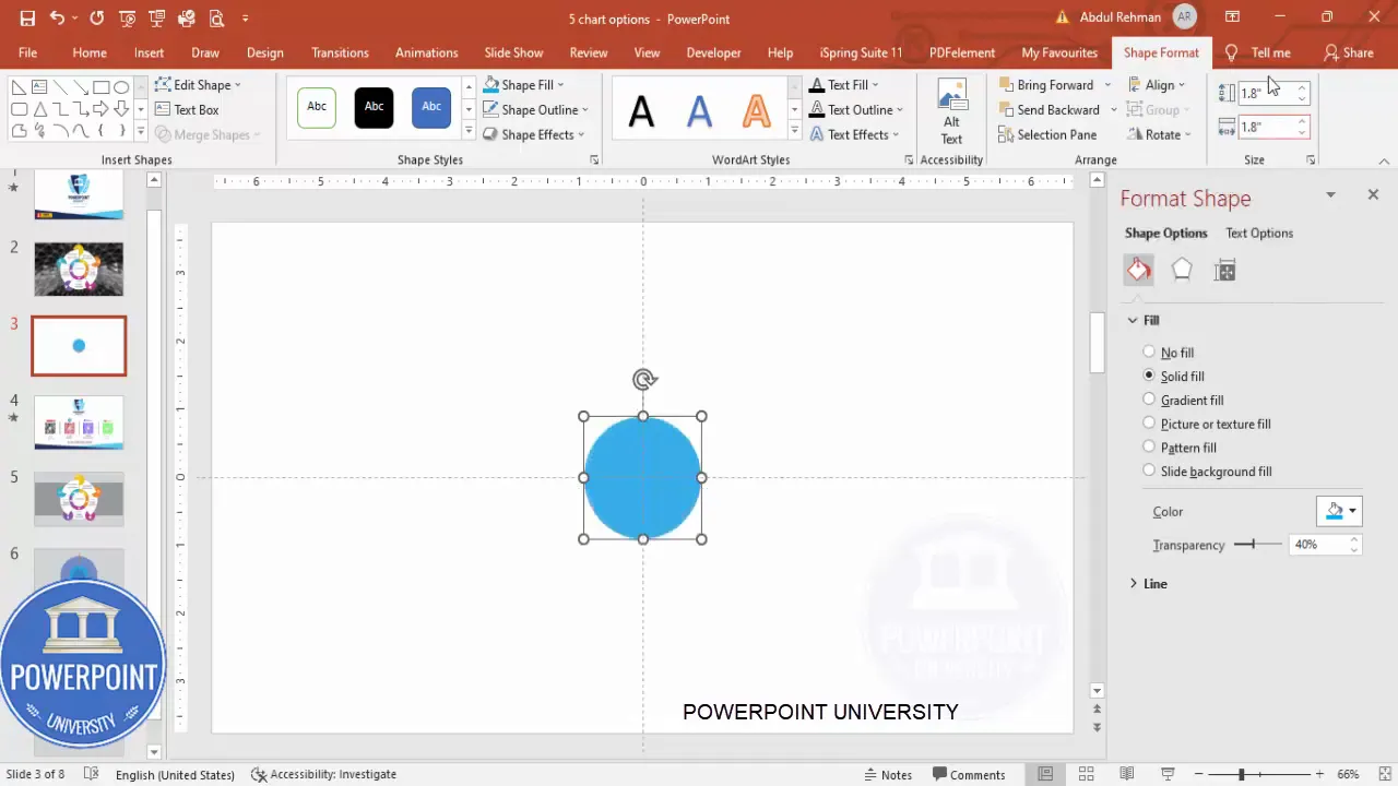
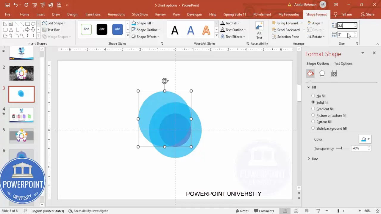
Insert the smallest oval — Insert an oval (Insert > Shapes > Oval). Remove the outline by setting Shape Outline to No Outline. Set both height and width to 1.8 inches (or 1.8 units depending on your PowerPoint settings). Align Center and Align Middle to snap it exactly into the slide center.
-
Format transparency — Right-click the oval, choose Format Shape, and set Transparency to about 40%. This will help later when stacking shapes and adding a center chip.
-
Duplicate for the middle ring — Select the shape and press Ctrl+D to duplicate. Change the new shape’s size to 3.0 (height and width) and choose a different color so you can see the layers. Align center and send to back.
-
Duplicate for the outer ring — Duplicate once more and resize this shape to around 5.8 for height and width. This becomes your outer ring. Choose a contrasting color and send it to back.
At this stage your slide should have three concentric ovals stacked and aligned with each other. These layers make it easy to create the circular ring and to cut the top layer into five equal slices.
Cut the circle into five equal parts (the pie slices)
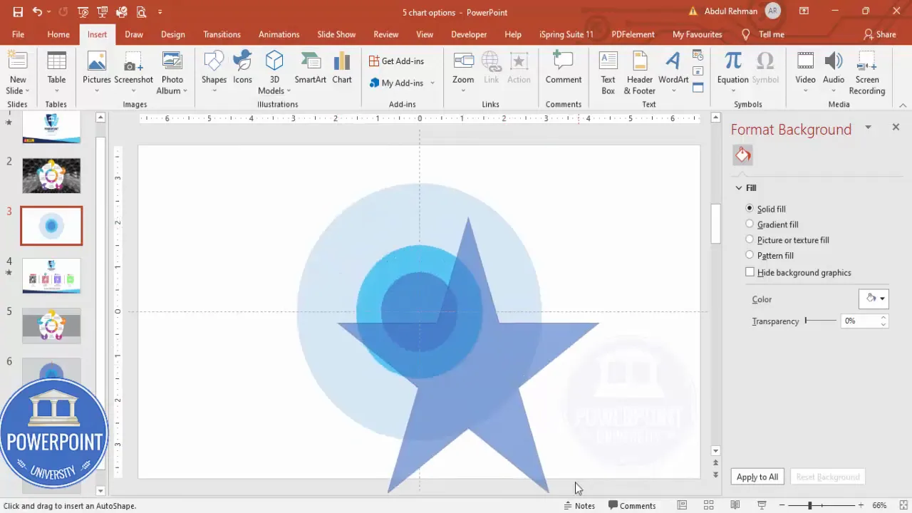
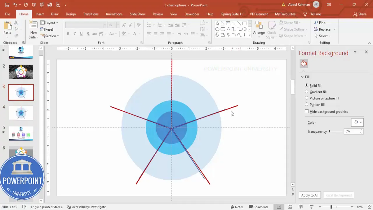
PowerPoint doesn’t have a direct “slice” tool for arbitrary numbers of pieces, but we can use a clever trick with a five-point star and right triangles to create perfectly even 72-degree slices for the 5 Pie Chart options Slide.
-
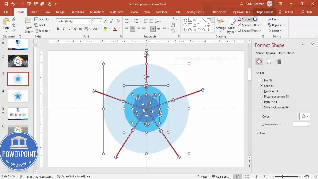
Insert a five-point star — Go to Insert > Shapes > Stars and Banners, choose the five-point star. Draw it while holding Shift, and make sure it’s larger than the outer circle so the star points go beyond the circumference. Align it to center.
-
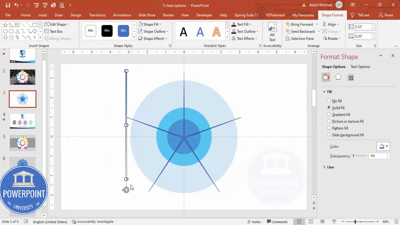
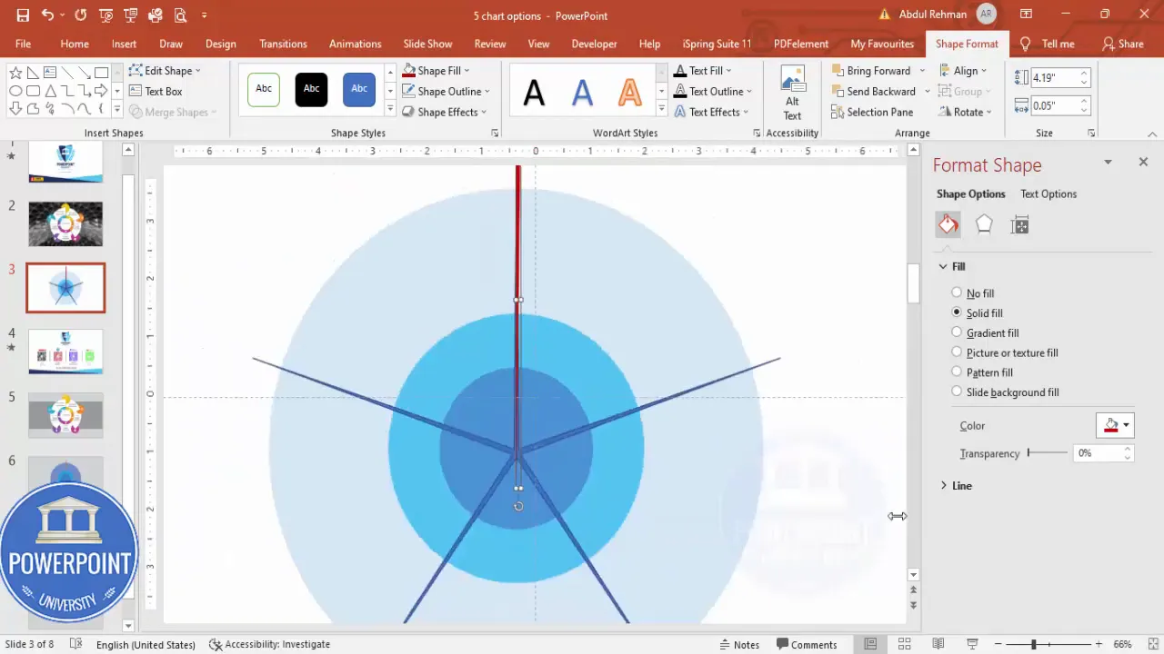
Use a right triangle to define a slice — Insert a right triangle shape (Insert > Shapes > Right Triangle). Remove its outline, flip it vertically, and make it as narrow as possible so it traces a radial wedge from center to perimeter. Color it temporarily darker for visibility and align it with the center and one star point.
-
Duplicate and rotate — With the triangle selected, press Ctrl+D to duplicate. Then hold Alt and use the right-arrow key to rotate small increments (or use the rotation handle). Align each triangle to the five star points to make five radial wedges arranged around the center.
-
Duplicate the slide as a backup — Before merging shapes, duplicate the entire slide so you can roll back if something goes wrong.

-
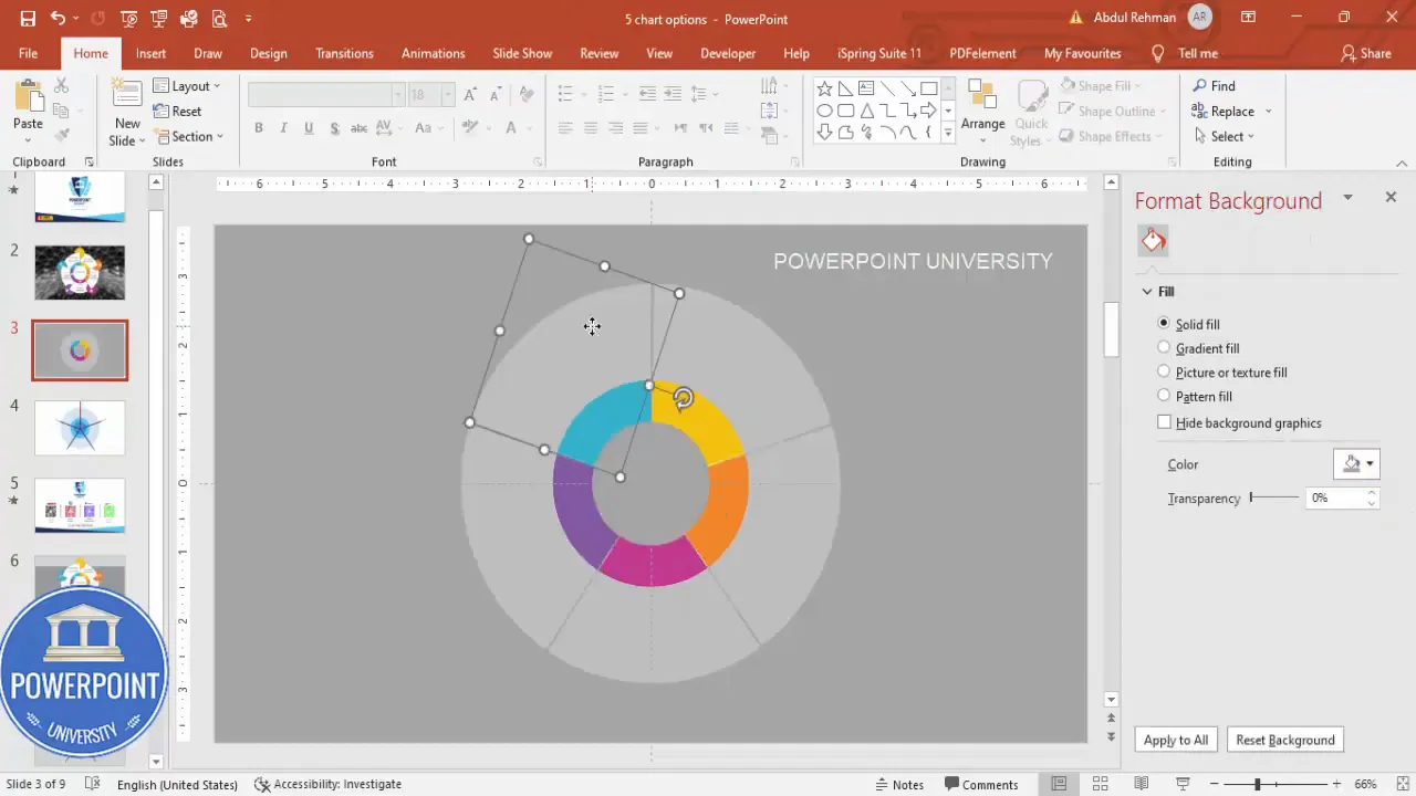
Remove the outer circle and star — Delete the temporary shapes you no longer need (the star and outer circle) to leave only the wedges and the ring you will cut.
-
Merge: Fragment — Select all of the shapes (Ctrl+A) that make up the ring and the wedges. Go to Shape Format > Merge Shapes > Fragment. Fragment will cut the ring using the wedge shapes so you get five equal curved pie slices.

Tip: If the Fragment step gives unexpected splits, undo, re-check alignment of the wedges and ensure they touch the outer perimeter fully. That ensures clean cuts.
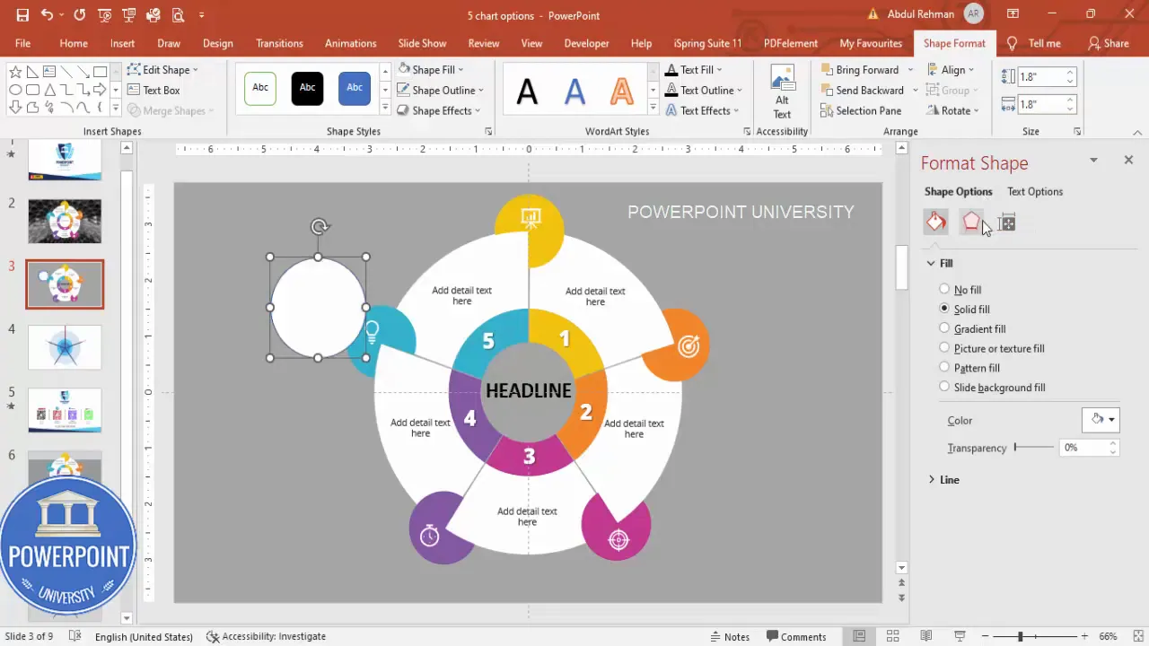
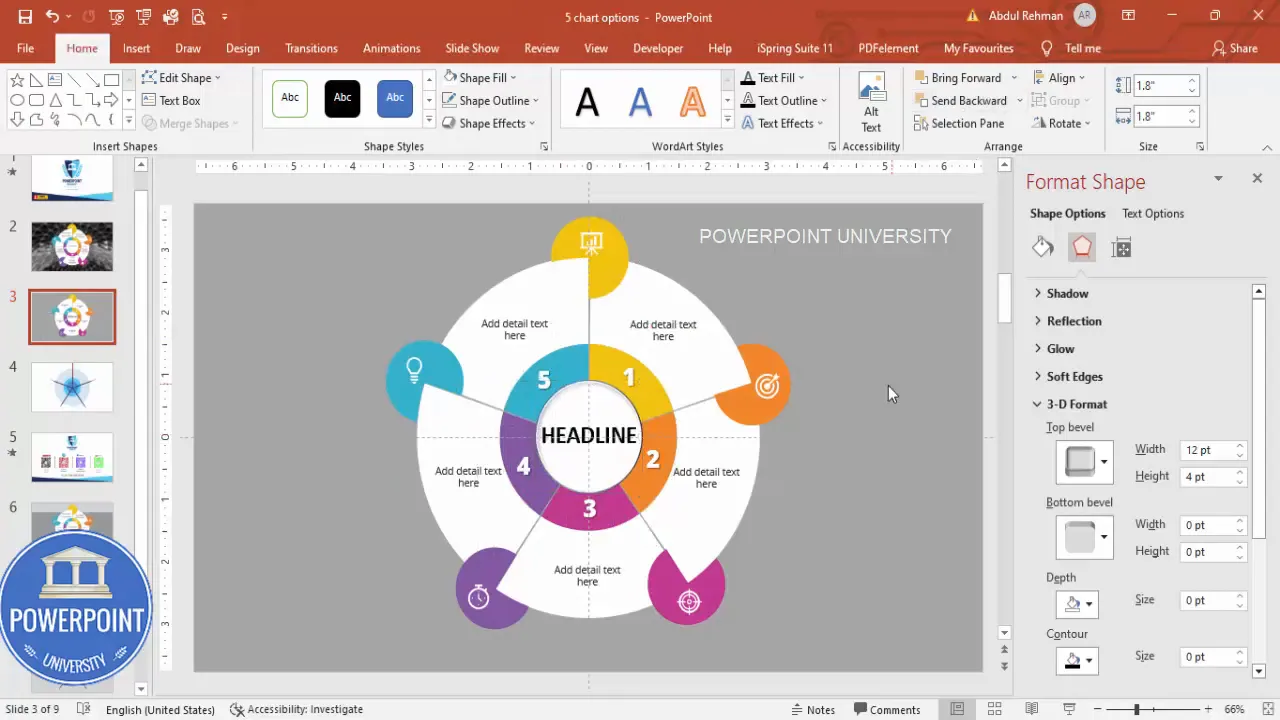
Style the slices, add icons and labels
Now that your outer ring is split into five slices, it’s time to style each slice and add the textual and iconography elements that make the 5 Pie Chart options Slide useful and readable.
- Assign colors — Select each slice and apply a different fill color. Choose colors that are visually distinct but harmonious. I often use a palette like gold, orange, pink, purple, and turquoise — but pick brand-appropriate tones.
-
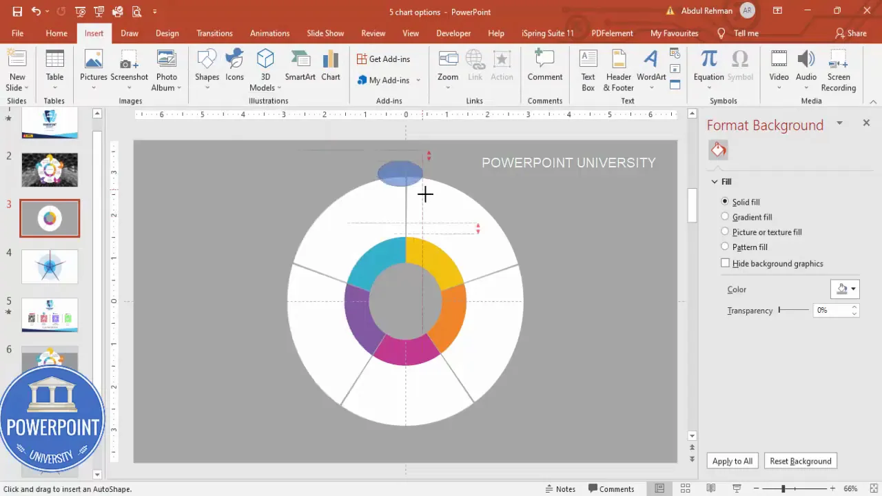
Change background to white — If your center shape is white, make sure the slide background supports contrast. For clarity, set the slide background to a neutral or slightly darker color so white shapes and icons pop. Change the background color if needed.
-
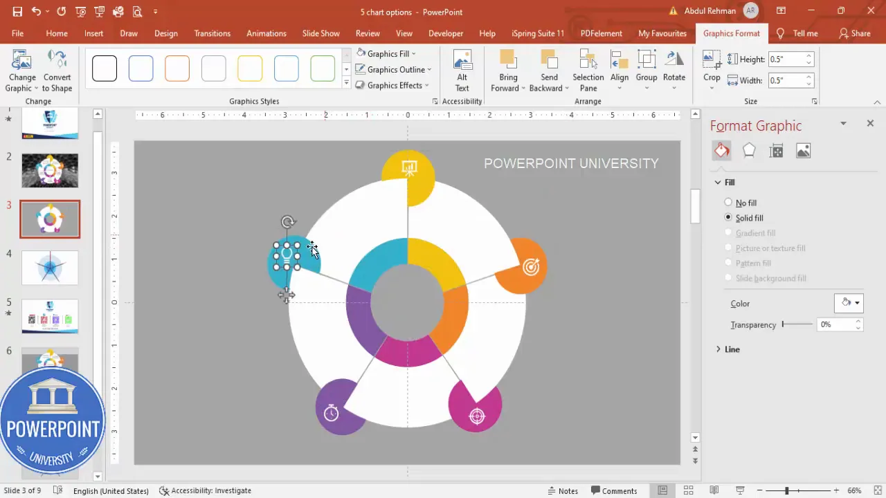
Add icons — Go to Insert > Icons and choose five icons relevant to each option. Insert and size each icon to about 0.5 (height and width) and color them white so they appear clearly against the slice color. Place each icon centered inside the top of each slice.
-
Group slice elements — For easier editing later, group each slice with its icon (Select the slice and icon > right-click > Group). Grouping helps when repositioning or adding animation later.
-
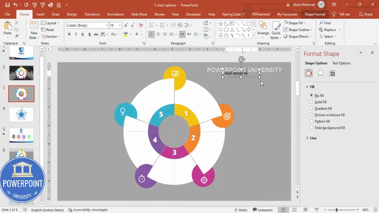
Add titles — Insert a centered text box below each slice (Insert > Text Box). Type short, punchy titles (single words or a couple of words). I use Open Sans Extra Bold in white for strong legibility. Option titles should be short for quick comprehension.
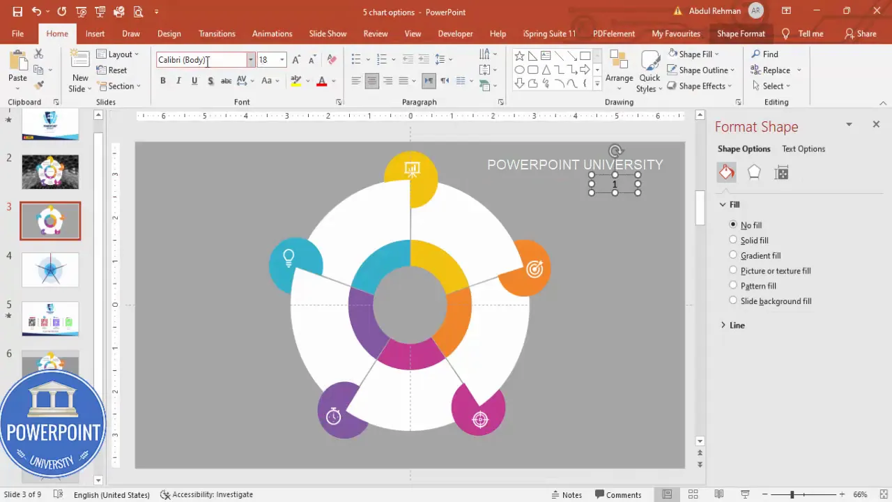
-
Add descriptive text — Add a smaller text box beneath each title for a one-line or two-line description. Use a neutral dark gray color and smaller font size to create a hierarchy between title and description.
When writing titles and descriptions for the 5 Pie Chart options Slide:
- Keep titles short (1–3 words)
- Keep descriptions to one line where possible
- Use action words and measurable outcomes (for business slides)
- Align everything center to keep the composition balanced
Create the decorative top ovals and center headline
Small decorative oval accents near the top of each slice give the design a polished, button-like appearance. The central headline chip provides focus and a place to add a short summary or statistic.
-
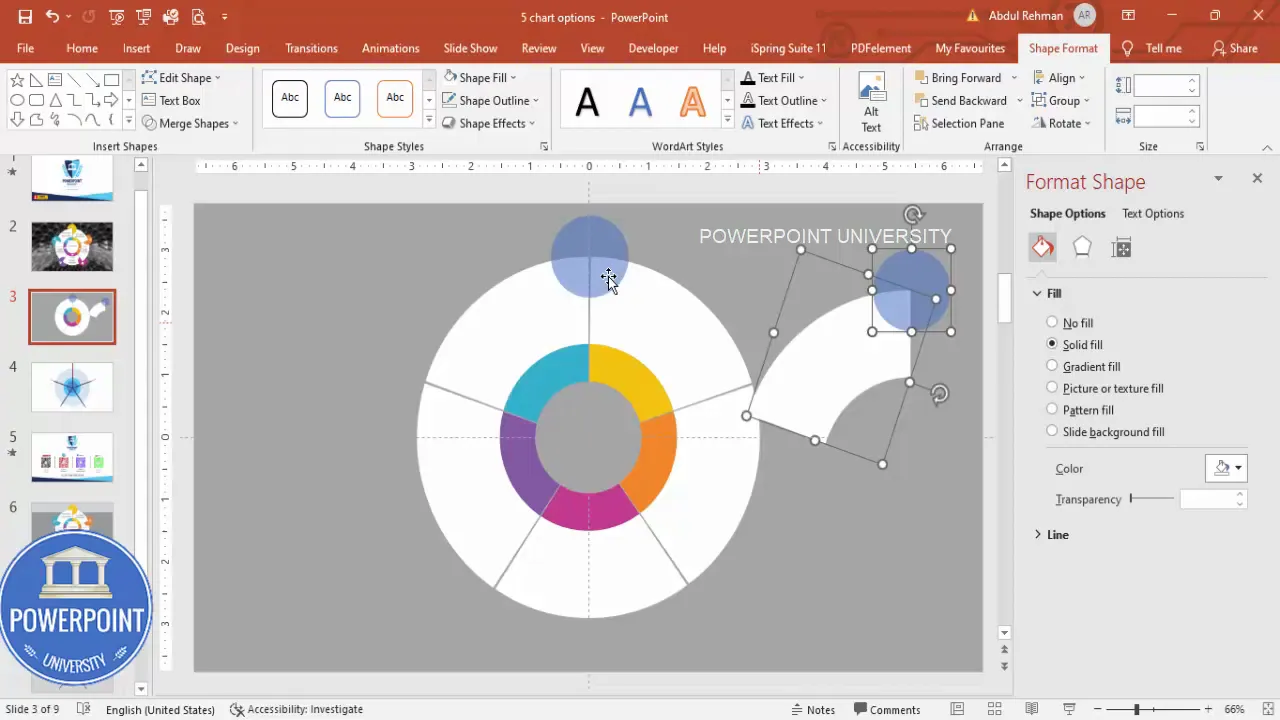
Add a small top oval — Insert a small oval and remove the outline. Position it toward the top of a slice where the icon will sit. Use shape subtraction to trim it so it fits the slice’s curved boundary.
-
Trim the oval to fit the slice — Duplicate both the oval and the slice shape. Select both, then use Shape Format > Merge Shapes > Subtract to cut the oval to the slice’s shape. Repeat for each slice top. This gives clean cropped ovals that sit neatly within the curved edge.
-
Duplicate and rotate — Use Ctrl+D to duplicate each cropped oval and rotate it into the next slice position. Zoom in for precise alignment. This is a manual step but necessary for consistent accents across all five slices.
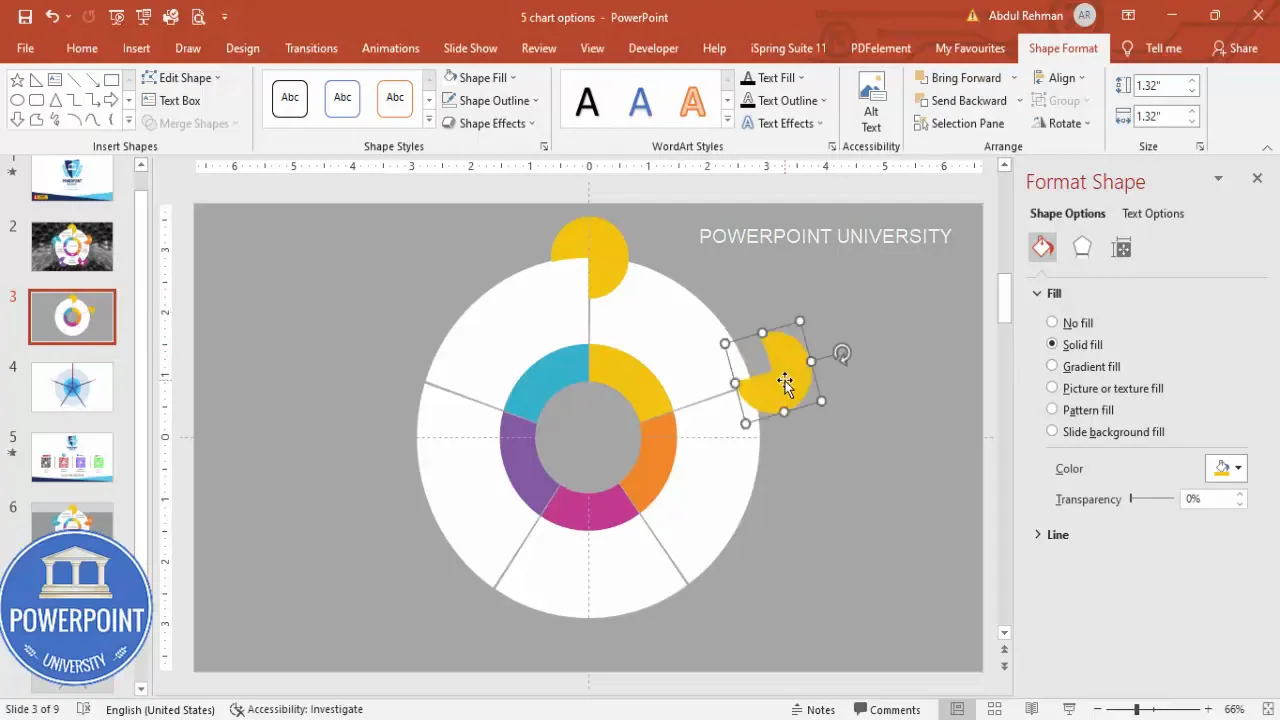
- Color the cropped ovals — Match each cropped oval color to its parent slice or use a gradient/metallic accent. Choose contrast so the white icon inside the oval is clearly legible.
-
Center headline chip — Insert an oval in the center, size it to about 1.8 (height and width), color it white (or slightly off-white), apply a subtle 3D rotation effect for depth, and send it to back so the pie slices sit visually on top. This central chip becomes the title or summary area.
Add finish touches: background, image fills and 3D center
A few small finishing touches lift the slide from good to great.
- Image fills (optional) — If you want photographic texture behind the slices, copy an image from the web or your library, paste it onto the slide, and send it to back. Then adjust transparency of the center chip or slices so textures subtly show through.
- Center 3D rotation — Open the Format Shape pane for the center chip, go to Effects > 3D Rotation, and apply a subtle perspective that makes the center appear slightly elevated.
- Shadows and soft glows — Add very subtle shadow effects to slices to give a layered feel. Use soft shadows with low opacity to avoid harsh contrasts.
- Consistency checks — Check alignment, spacing, and font sizes across slices to ensure a unified look. Group related elements so they move together.
Animation and interaction: reveal titles, descriptions, icons step-by-step
The 5 Pie Chart options Slide is most powerful when you present it interactively. The idea is to reveal one piece of information per click: first the slice labels, then the descriptions, then the icons (or a different order depending on your story). Here’s how to set it up.
- Decide the reveal order — Common sequence: (1) highlight slice color or title, (2) show the title text, (3) show the description, (4) show the icon or accent. Choose the order that supports your spoken flow.
- Apply entrance animations — Select an object (e.g., a title) and apply an Entrance animation such as Fade or Appear. Keep animation style consistent across related elements. For titles and icons, use Fade In. For descriptions, use Fade or Wipe for a slightly different movement cue.
- Sequence the animation timings — In the Animation Pane, set the Start option to «On Click» for each grouped element in the desired order. Ensure each consecutive click reveals the next piece of information from the slide.
- Use animation grouping — If a title and icon should appear together on the same click, group them (or set their Start to With Previous) so they reveal simultaneously.
- Test the flow — Run Slide Show and click through the animations to confirm the pacing feels natural and that elements don’t overlap or jump.
Pro tip: Keep animations subtle. Fast, short fades are unobtrusive and retain audience attention without distraction.
Design tips, color advice, and accessibility notes
A graphics-focused slide like the 5 Pie Chart options Slide still needs to be readable and usable by diverse audiences. Here are best practices and things I do when I build slides for real presentations.
Color and contrast
- Choose colors with sufficient contrast against text and icons; use a contrast-checker if unsure.
- Limit colors to 4–6 harmonious tones. Too many different hues create visual clutter.
- Consider color meanings — e.g., green for success, red for problems, yellow/orange for attention — if labels carry those connotations.
Typography
- Use a bold weight for titles — I use Open Sans Extra Bold for option labels on the 5 Pie Chart options Slide.
- Use a simple body font for descriptions (regular weight) and keep it to one line when possible.
- Maintain consistent font sizes: e.g., Title 20–24 pt, Description 12–14 pt (adjust for slide size).
Accessibility
- Don’t rely on color alone. Add small icons or labels so color-blind viewers can still differentiate options.
- Ensure text is large enough and has sufficient contrast (WCAG AA recommended contrast ratios).
- Provide descriptive alt text for exported images or PDF versions of the slide if you share materials.
Common pitfalls and troubleshooting
When creating a 5 Pie Chart options Slide you may run into a few repeated issues. Here’s how to avoid each one.
Create Slides in Seconds with ExpertSlides AI |
|
Generate AI Presentations today: |
|
TRY NOW! |
- Misaligned wedges — If the Fragment doesn’t produce clean cuts, check that each anchor triangle extends past the outer circle edge and is perfectly centered. Tiny alignment errors cause odd fragments.
- Slice outlines visible — Remove outlines from shapes before merging or set stroke to No Outline. After merge, confirm fragments have no unwanted strokes.
- Icons look fuzzy — Use vector icons (Insert > Icons) rather than pasted bitmap images. Vector icons scale cleanly to any size.
- Animations out of sync — Use the Animation Pane and explicitly set each element’s Start property. Group related items if they should appear together.
- Colors print poorly — If you will print slides, test a monochrome or grayscale version. Some colors lose contrast when printed.
Checklist: Final review before presenting
- All five slices have distinct, accessible colors
- All icons are white or contrasting so they read well on slices
- Each title and description is center-aligned and legible
- Center chip is sized and rotated to balance the composition
- Animation sequence tested and working click-by-click
- Slide exported to PDF to confirm print or handout quality
Frequently Asked Questions (FAQ)
Q: Can I change the number of slices on this slide?
A: Yes. The technique uses geometric shapes and Merge Shapes tools. To create a different number of slices (e.g., 3, 4, 6), replace the five-point star approach with a matching-star or wedge pattern that has as many reference points as slices, or draw wedges spaced at the appropriate angle (360° divided by the number of slices). The 5 Pie Chart options Slide uses five because it’s a common needs case, but the technique is flexible.
Q: How do I keep the 5 Pie Chart options Slide editable for team members?
A: Group related objects (slice + icon + title + description) before saving or handing off the file. Keep a backup duplicate slide before advanced edits like Merge Shapes. Provide a short notes slide or comment explaining which shapes are grouped and which are safe to recolor. Using named shapes (Selection Pane) helps teammates quickly find and edit components.
Q: Will this work on older versions of PowerPoint?
A: Merge Shapes (Fragment and Subtract) is available in modern versions of PowerPoint (Office 365, 2019+). If you have an older version without Merge Shapes, you can approximate the effect by carefully using curve shapes or by preparing the slices in another vector program and importing them as SVGs. However, the step-by-step Merge Shapes technique is the most straightforward inside current PowerPoint versions.
Q: How can I make the 5 Pie Chart options Slide print-friendly?
A: To create a print-friendly version, remove animations, ensure high-contrast colors or convert to grayscale, and expand text so descriptions are readable in print. Export to PDF and preview in grayscale to confirm legibility. For handouts, consider providing a numbered list alongside the slide so viewers can follow along without color cues.
Q: Can I use images inside the wedges instead of flat colors?
A: Yes. Paste an image behind the slices, then use the Fragment step to cut both the slice and image together so each slice contains its own image section. Alternatively, mask images into sliced shapes by creating picture fills for each slice. Note that images make legibility trickier for white icons and text, so you may need to add semi-transparent overlays to each slice so text and icons remain readable.
Q: Are there accessibility considerations for the 5 Pie Chart options Slide?
A: Absolutely. Don’t rely on color alone to convey meaning — use icons and labels. Use high-contrast text and consider supplying an alternate linear list version of the content for screen-reader friendly handouts. When exporting to PDF, set readable alt text for images and charts so assistive technologies can describe the slide content.
Download and reuse
You can save this doc as a template inside PowerPoint or export the slide as an image to reuse in web pages or documents. Save an editable copy with grouped items and a backup duplicate before heavy edits. If you want to share the final slide as an example, export it as a high-resolution PNG or PDF to preserve color fidelity.
Summary and next steps
The 5 Pie Chart options Slide is a versatile and visually compelling way to present five options around a central idea. Use the Fragment approach with wedges and concentric circles to create perfect slices, style each slice with distinct colors and icons, and use subtle animations to reveal content in a controlled way.
To recap the process in one quick flow:
- Create three concentric ovals and align them center.
- Use a five-point star and right triangle wedges to mark cut points.
- Fragment the shapes to produce five equal slices.
- Style each slice with color, add a cropped top-oval accent and white icon.
- Add titles and short descriptions, center a white chip in the middle with subtle 3D rotation.
- Group elements and add simple entrance animations for a click-by-click reveal.
Now that you’ve built your 5 Pie Chart options Slide once, you can reuse the technique for different numbers of options or to create visually matched circular infographics for future slides. Try varying colors, image fills, and animation sequences to suit different presentation tones — from corporate to creative.
Frequently used terms (quick reference)
- Fragment — Merge Shapes option that cuts a shape into fragments based on overlapping shapes.
- Subtract — Merge Shapes option that removes one shape from another.
- Ctrl+D — Duplicate the currently selected shape.
- Align Center / Align Middle — Tools to center objects on slide both horizontally and vertically.
- 3D Rotation — Format Shape effect to add perspective or depth to shapes.
Final tips
- Save a copy of the slide before major operations like Merge Shapes. You can always revert to the duplicate.
- Use the Selection Pane to hide or lock elements while working on other pieces.
- For team slides, create a master template with color swatches so everyone uses the same palette.
- Practice the click sequence during rehearsal so your spoken points align with the reveal of titles, descriptions, and icons on the 5 Pie Chart options Slide.
More help
If you need a downloadable starting file, create a template from the steps above and keep a backup copy that others on your team can reuse. If you work with a design team, they can adapt the slide as a reusable layout inside your PowerPoint template.
FAQs (additional)
Can I animate the slices themselves to expand on click?
Yes. You can animate a slice to scale slightly (Grow/Shrink) to emphasize it when clicked. Keep the scaling subtle (e.g., 105–110%) and synchronize the label/icon reveal to maintain cohesion.
How many words should each description be on the 5 Pie Chart options Slide?
Keep descriptions to 6–12 words if they appear on the slide, or 15–25 words if you plan to hand out printed notes. The slide should act as a visual aid, not as a dense document.
Should I use gradients or flat colors?
Flat colors are modern and print-friendly. Gradients can add depth but may complicate text legibility. If using gradients, ensure adequate contrast where titles and icons sit.
Thanks for following this walkthrough. Use the steps above to build and customize your own 5 Pie Chart options Slide, and remember to test the animation sequence before your presentation. If you want more templates or walkthroughs for similar circular infographics, keep practicing this technique — it’s a fast way to create eye-catching, balanced slides that make complex choices easy to communicate.
Build the 5 Pie Chart options Slide, experiment with color and icons, and adopt the sequence that best supports your story. Good luck — and design something great!
Check out the full video: 5 Pie Chart Options Slide in PowerPoint. Tutorial No.: 999


