

If you want a clean, modern six-option infographic slide that feels polished and professional, this step-by-step guide will walk you through building it from scratch in PowerPoint. I built this walkthrough based on my tutorial and template from POWERPOINT UNIVERSITY, and I’ll show you every formatting trick, alignment tip, and design decision I used so you can reproduce—or customize—this slide for your own presentations.
Whether you’re preparing a product roadmap, outlining a six-step process, or visualizing six service options, this design balances readability and visual interest. You don’t need advanced design skills—just follow the steps, learn a few PowerPoint effects, and use the shortcuts and tips I share along the way.
What you’ll learn in this post:
- How to build a 6-option infographic layout in PowerPoint from scratch
- Exactly which shapes, effects, and settings I used (with sizes and keyboard shortcuts)
- How to style icons, shadows, and 3D bevels to get a refined look
- Design and accessibility tips so your slide reads well for any audience
- How to animate and export your slide for presentations or handouts
Table of Contents
- Introduction
- Why use a six-option infographic?
- Before you start: setup and assets
- Step-by-step build (detailed)
- Color, typography, and iconography choices
- Adding shadows, depth, and polish
- Grouping, alignment, and duplication shortcuts
- Adding icons and text
- Optional animations and export tips
- Accessibility and presentation best practices
- Common mistakes and troubleshooting
- FAQ
- Conclusion and resources
Why use a six-option infographic?
A six-option infographic is a common requirement: teams often want to present six features, six phases, six revenue streams, or six service tiers. The format works because it provides an even visual rhythm across the slide while leaving space for a central headline or focal point. This design uses circular elements radiating from a central oval, which helps keep the center of attention on the headline while supporting the six surrounding options.
Benefits of this layout:
- Clear visual hierarchy: central headline + six options
- Modular: each option is self-contained (icon + short text + detail)
- Adaptable: color-coded options help categorize or prioritize
- Scalable: works for print, handouts, and slide decks
Before you start: setup and assets
Preparation saves time. Here’s what I recommend you have ready before building the slide:
- PowerPoint (desktop version recommended for full effects)
- A set of icons in the Office Icons library or SVGs you can color (the tutorial uses built-in PowerPoint Icons)
- A short headline and 1–2 short descriptive lines per option
- Brand colors / a color palette (6 colors for the options or a consistent set of tones)
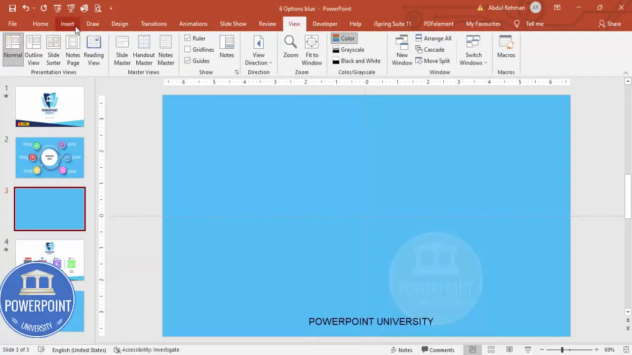
Set up the slide: open PowerPoint, add a new blank slide, and set a light blue background (or another neutral soft color) so white shapes stand out. Turn on the guides to help center and align objects. To enable guides, go to the View tab and check Guides.
Step-by-step build (detailed)
This section reproduces the step-by-step process with extra context and exact settings. I’ve included practical notes where I deviate from defaults for a professional result.
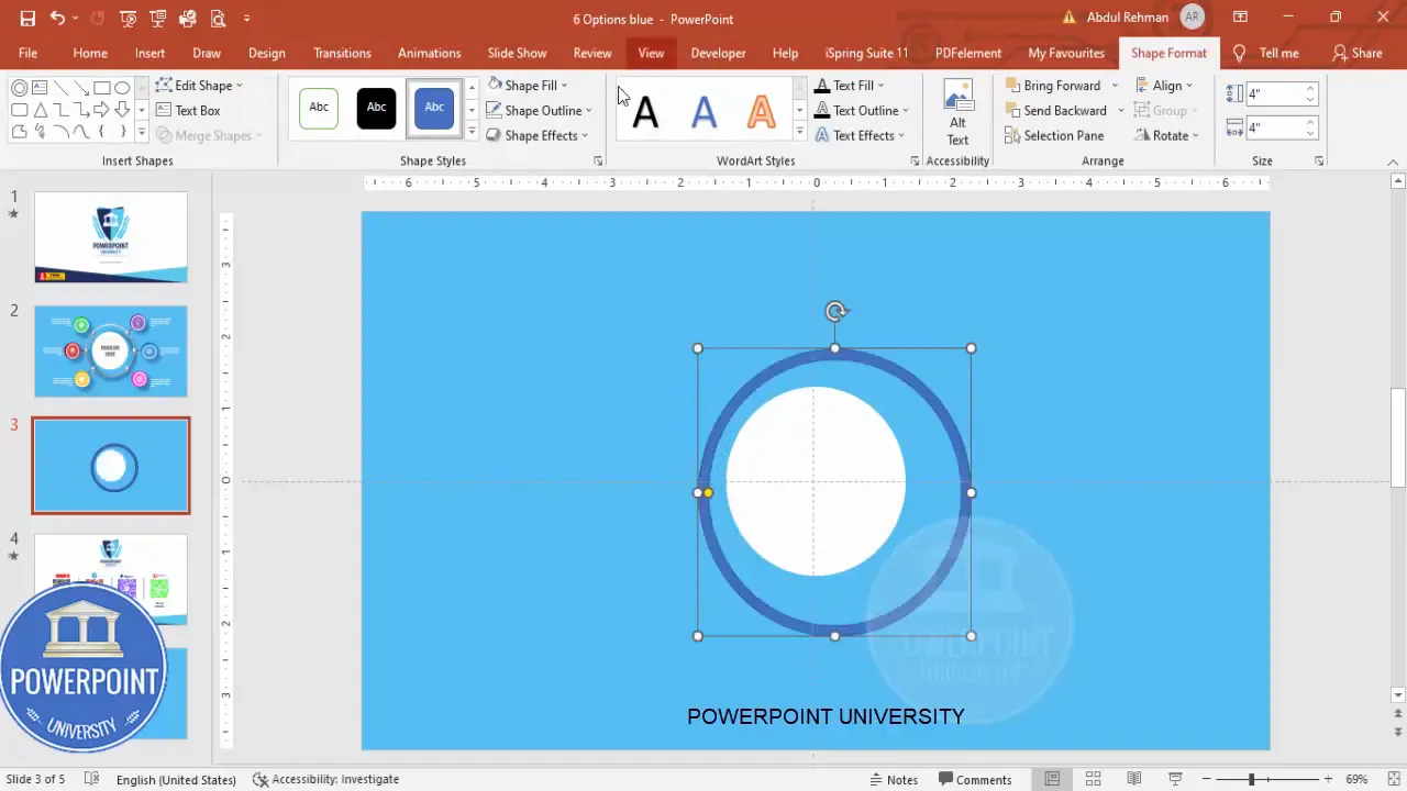
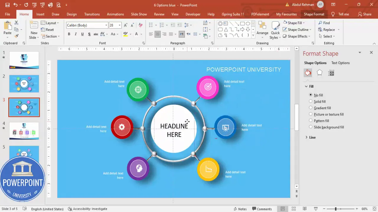
1. Create the central oval (headline container)
- Insert > Shapes > Oval. Draw an oval roughly centered on the slide. Use Align Center and Align Middle (Home > Arrange > Align) to perfectly center.
- Remove the outline: Shape Format > Shape Outline > No Outline.
- Set the fill to white (or a light neutral) as the base for the 3D effect.
This oval will be the main headline container and should sit in the visual center of your slide. Make it large enough to comfortably fit a bold headline but not so large that it dominates the surrounding option elements.
2. Add a hollow circle to create a 3D look
- Insert > Shapes > Oval (Circle Hollow). Hold Shift while drawing to keep it perfectly circular.
- There’s a small yellow/orange adjustment handle on some hollow shapes—drag it outward if needed to adjust ring thickness.
- Remove outline, align the circle to center and middle with the oval.
- Reduce the size by holding Ctrl+Shift and dragging (this keeps proportions and scales from center).
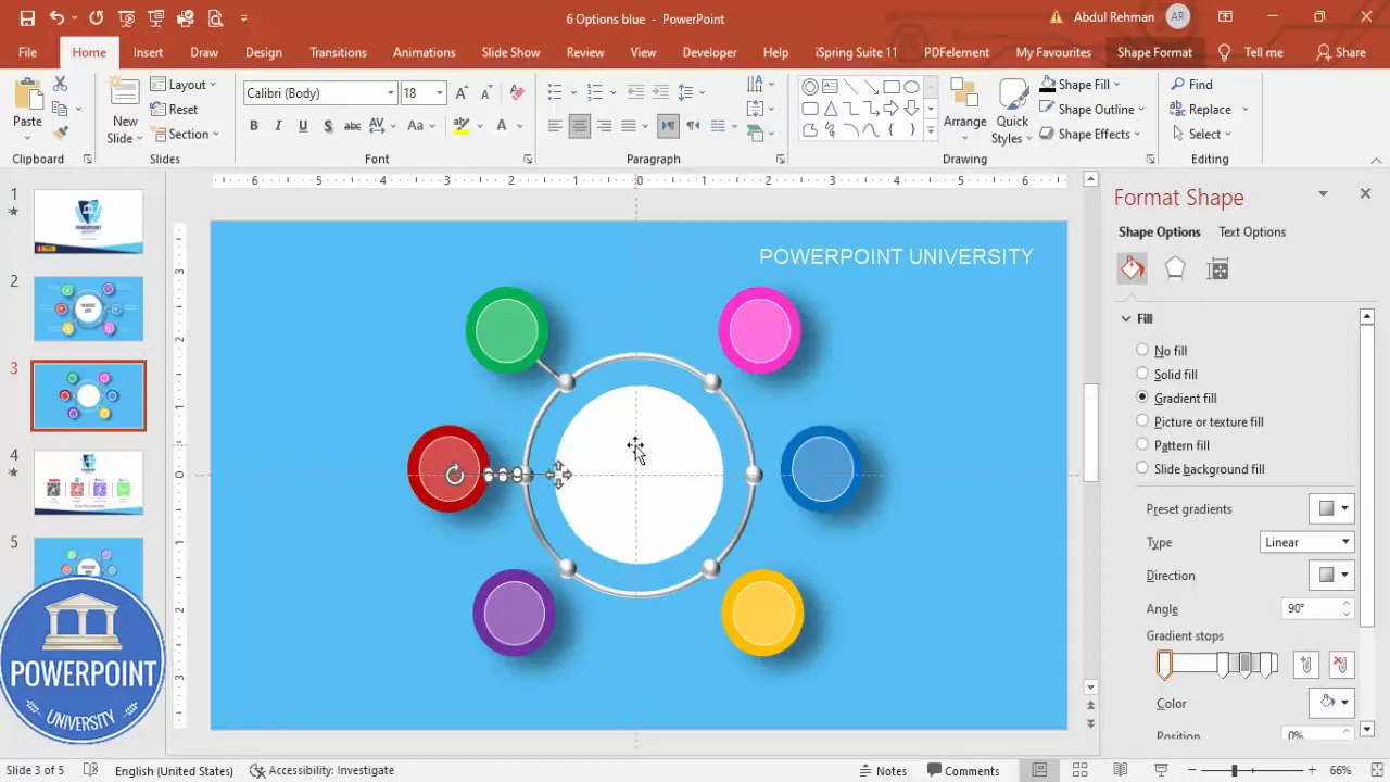
3. Apply the 3D bevel and gradient fill
- Right-click the (outer) shape > Format Shape.
- Under Fill: choose Gradient Fill. Use a white-to-gray gradient to suggest curvature. You can use two or three stops for subtlety—white, light gray, and medium gray work well.
- Under Effects: open 3-D Format and choose Bevel > Round (or a soft bevel setting). Adjust the bevel depth and top/bottom size until it looks like a smooth rounded pill.
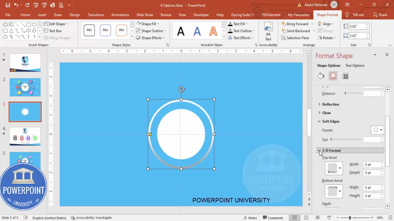
Tip: If the bevel looks too heavy, reduce the depth. If it reads flat, increase the gradient contrast slightly. Small changes make a big difference.
4. Create the small glossy ovals (sphere highlights)
- Insert > Shapes > Oval. Draw a small oval (this becomes the glossy sphere highlight).
- Fill with white, no outline.
- Format Shape > Effects > 3-D Format > Bevel. Choose a small bevel (try 20 pt top), and tweak the bevel size until the shape reads like a tiny glossy sphere.
- Duplicate it and arrange four positions around the main oval: left, top-left, right, bottom-right, etc. Use Ctrl+D to duplicate quickly. Hold Ctrl+Shift while dragging to keep it aligned horizontally/vertically.
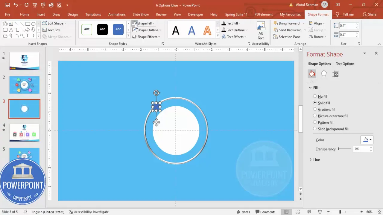
These small shapes add a premium, tactile feel—like buttons or beads sitting on the slide.
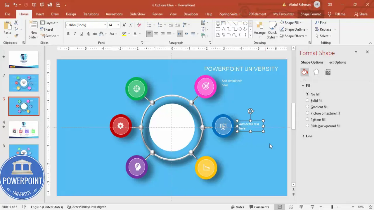
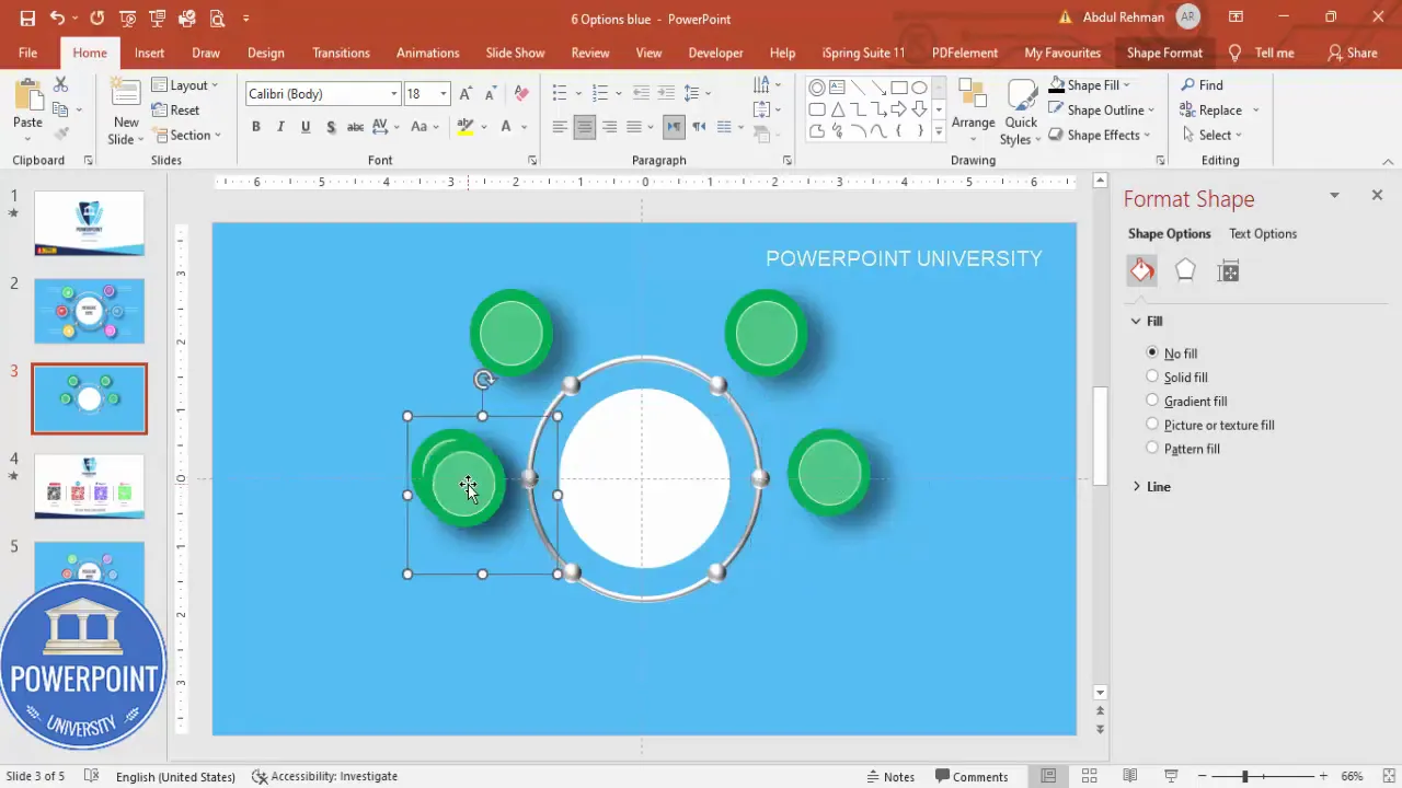
5. Build the option circles
- Insert > Shapes > Oval. Hold Shift and draw a circle for the option container.
- Remove outline (Shape Outline > No Outline).
- Fill with a color of your choice (we’ll use six different tonally-consistent colors for each option).
- Insert a smaller white circle centered inside the colored circle. Set the white circle’s Transparency to about 70% to create a subtle inner ring.
- Now add a larger black-filled oval behind the option circle with increased Transparency and Soft Edges to create a drop shadow. Format > Effects > Soft Edges (increase size) > send the shadow shape behind the colored circle.
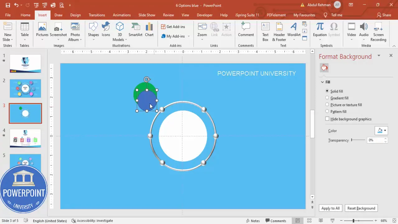
Align everything: select the colored circle and its inner/outer elements and choose Shape Format > Align > Center > Middle to ensure perfect centering. Group the three shapes (Ctrl+G) so they move together.
6. Duplicate the grouped option and arrange six positions
- With the grouped option selected, hold Ctrl+Shift and drag to duplicate and snap into position. Use Ctrl+D to create additional copies.
- Arrange the six option circles roughly in a ring around the central oval. Use the guides and grid to keep spacing consistent. You’ll place them at top-left, top-right, right, bottom-right, bottom-left, and left—forming a balanced layout.
- Fine tune positions by zooming in and nudging with the arrow keys. Keeping them evenly spaced is critical—spend time aligning them visually.

Use the Align tools to distribute horizontally or vertically as needed. If you want exact angles (e.g., perfectly circular distribution), you can place the grouped objects on a circle guide or use rotate/nudge coordinates, but for most presentations, visual placement with consistent spacing is sufficient.
7. Add connecting rectangles (thin lines) to visually connect options to the center
- Insert > Shapes > Rectangle. Draw a thin rectangle that will act like a connector arm.
- Rotate the rectangle using Format > Rotate (or the rotation handle) to angle it so it visually connects the option circle to the central oval.
- Duplicate (Ctrl+D), rotate and place copies to join each option to the center. Spend time aligning and adjusting lengths so they look intentional and balanced.
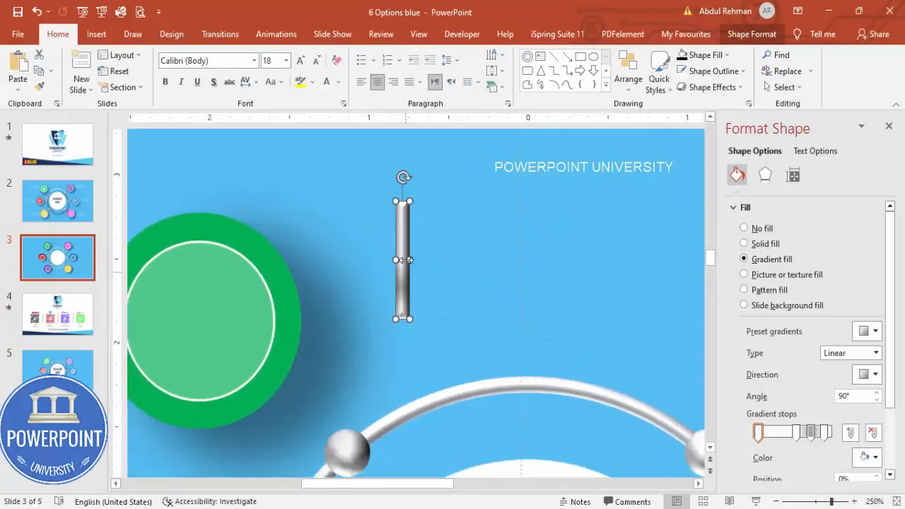
Connector arms help guide the eye from each option back to the central headline, reinforcing the relationship between each element and the main message.
8. Add shadows for extra depth
- Select one of the hollow circle shapes (the “ring” you used earlier). Draw a circle hollow to create a shadow under each option if needed.
- Fill with black, increase transparency, and apply Soft Edges to blur the shadow. Send this shape to Back (Arrange > Send to Back).
- Adjust placement and opacity for subtlety—the shadow should anchor the object, not distract from it.
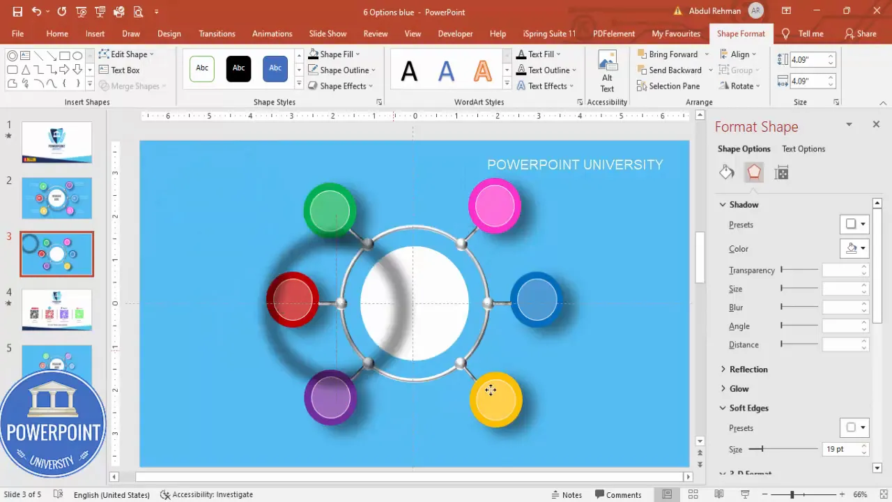
Consistency in shadow direction and softness is important: choose one spot direction (e.g., top-left light source) and keep shadows consistent for all elements.
Color, typography, and icon choices
Design is more than shapes—colors, fonts, and icons communicate and reinforce meaning. Below are my practical recommendations and sample palettes.
Color palette tips
- Use a palette of six colors for the option circles—but keep them within a tonal family (e.g., different hues but similar saturation) to maintain cohesion.
- Alternatively, choose two base brand colors and create three tints of each to create six distinct but harmonious circles.
- Use transparent white inner circles (70% transparency) to add visual hierarchy without adding clutter.
Example palette (feel free to adapt for brand):
- Burgundy / deep red
- Warm pink
- Purple / plum
- Teal
- Blue
- Mustard / warm yellow
Typography
- Headline font: 28–36 pt depending on slide size. Choose a strong geometric sans (e.g., Montserrat, Open Sans, or your brand sans). Center align the headline inside the oval.
- Option title (short): 14–18 pt bold. Keep it short—2–4 words.
- Option detail (supporting text): 10–12 pt regular. Limit to 1–2 lines per option for visual clarity.
- Use white text on colored circles for high contrast. Ensure color contrast passes accessibility standards (WCAG AA recommended).
Icons
- Insert > Icons (PowerPoint built-in) and choose icons relevant to each option (e.g., calendar icon for scheduling, chart icon for metrics).
- Set icons to white and scale them to roughly 0.5″ x 0.5″ or use the icon height/width property set to 0.5 (the tutorial sets height/width to 0.5). Maintain consistent icon size across the six options.
- Center icons inside the colored circle; pair them with a short bold title and a single-line description underneath (or to the right if you prefer a horizontal layout).
Icons are shorthand—they communicate quickly, so pick simple, universally recognized shapes.
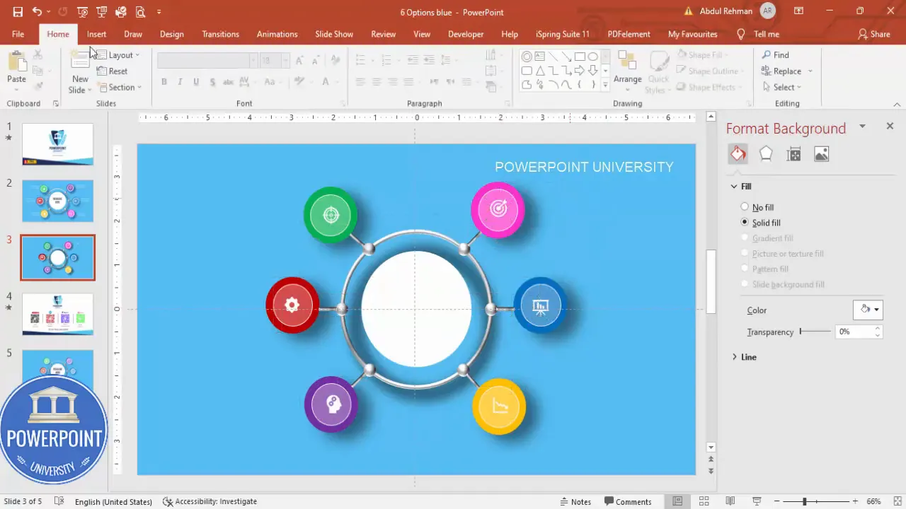
Adding icons and text
Now that all the shapes are in place, add the content that matters. Each option should contain three elements: icon, short title, and a one-line detail. Keep the text concise and scannable.
- Insert > Icons > choose icons > set color to white > set size (height & width to 0.5 or scale visually).
- Place the icon in the center of each colored circle. Use Align options to center precisely.
- Insert > Text Box. Add a short title under or beside each circle (the tutorial places titles to the right of two lines for some options). Use white text on the slide background as needed.
- Duplicate the text boxes with Ctrl+D to preserve formatting. Right-align or center the text consistently depending on your chosen layout.
Pro tip: When duplicating textboxes, use Paste Special or Duplicate (Ctrl+D) so the font and spacing remain consistent. Group the icon + text + circle for easy movement.
Create Slides in Seconds with ExpertSlides AI |
|
Generate AI Presentations today: |
| TRY NOW! |
Grouping, alignment, and duplication shortcuts
Working efficiently in PowerPoint means using a few key shortcuts and best practices:
- Ctrl+D — Duplicate selected object(s). This preserves format and position offset.
- Ctrl+G — Group selected objects (useful to make each option one movable item).
- Ctrl+Shift+drag — Duplicate and maintain the same X/Y offset from the original.
- Home > Arrange > Align > Align Center / Align Middle — precise centering tools.
- Home > Arrange > Align > Distribute Horizontally / Vertically — evenly spreads objects across a space.
- Use arrow keys for nudge; Shift+Arrow for larger nudges; Alt+Drag to snap to gridlines for fine adjustments.
Grouping is especially useful: once each option is grouped (circle + shadow + icon + text), you can copy and rotate or place them without losing internal alignment. This saves a lot of time when building multiple slides with the same layout.
Adding polish: shadows, soft edges, and subtle gradients
Polish separates amateur slides from professional ones. Use subtle effects—never overdo it.
- Soft edge shadows: add slightly transparent black ovals with Soft Edge set to a medium value under each option. Reduce transparency so the shadow is subtle and consistent.
- Gradients on central oval: add a shallow white-to-light-gray gradient to simulate curvature. Keep contrast low to avoid a “raised sticker” look.
- Bevels: small bevels on white highlights and the central shape create a tactile look. Avoid deep bevels; small, rounded ones look most modern.
Optional animations and export tips
If you’ll be presenting this slide, subtle animations can add life and direct audience attention. If the slide is handed out as a PDF or printed, skip animations.
Animation suggestions
- Fade-in or Float-in for each option (set entrance animation). Sequence them in a logical order (clockwise or left-to-right).
- Group the elements and animate the group if you want the whole layout to appear simultaneously.
- Use Delay and Duration to control pacing—don’t exceed 0.5–0.8 seconds per element for entrance; add 0.2–0.4s delays to create a staggered flow.
Export options
- PDF export: File > Export > Create PDF/XPS — ideal for sharing static versions.
- PNG export: Save the slide as PNG if you want to embed it in documents or web pages.
- Animated GIF or MP4: Use Export > Create a Video if you need timed animations exported as video.
Keep in mind: animations don’t translate into printed or static formats. If you rely on sequential reveals, consider creating multiple slides showing staged reveals for handouts or PDF export.
Accessibility and presentation best practices
Good design is inclusive design. Make sure your slide is readable for everyone.
- Contrast: ensure text on colored backgrounds meets contrast ratios. White on darker tones usually passes, but test with a contrast checker.
- Font size: use readable sizes (headline 28–36 pt, titles 14–18 pt, body 10–12 pt) so audiences in a room can read comfortably.
- Alt text: if exporting to PowerPoint files shared digitally, add Alt Text to images and grouped objects for screen reader support (right-click > Edit Alt Text).
- Color blindness: avoid using color alone to convey meaning—pair color codes with icons or text labels.
Common mistakes and troubleshooting
Here are mistakes I see frequently—and how to fix them:
- Misaligned objects: Use the Align and Distribute tools. If things still feel off, create a circular guide using a large invisible circle and place options along it to get even spacing.
- Overuse of effects: Too many bevels, gradients, or shadows look dated. Stick to a single bevel family and one shadow style.
- Low-contrast text: If white text reads poorly on a colored circle, either darken the circle slightly or add a semi-transparent inner ring behind the icon/text.
- Icons of different visual weight: Use icons from the same icon family (same stroke weight and style) to keep a consistent look.
Advanced variations and templates
Once you’ve built the core slide, you can adapt it in many ways:
- Change the center oval into a logo or metric (e.g., “2025 Roadmap”, “$1.2M ARR”)
- Switch to monochrome color schemes for a minimalist aesthetic
- Convert circles to small photos (mask images into circles) for a team slide
- Create animated builds where each option expands into a sub-slide with details
FAQ
Q: What exact settings did you use for bevel and softness?
A: I used a soft Round bevel on the central oval—a shallow depth that suggests curvature without a heavy 3D lift. For the small glossy highlights, I used a top bevel of about 20 pt (adjust to taste) and applied Soft Edges to the shadow ovals between 10–30pts depending on slide scale. Always preview at 100% zoom to ensure values look natural.
Q: How can I make the six options evenly distributed in a perfect circle?
A: One technique is to draw a guide circle (invisible) and place small anchor points at 60-degree increments. Alternatively, create the first option and use Rotate Around Center with copies: select the object, go to Shape Format > Rotate and set rotation increments, or use the Format Pane to precisely rotate duplicates around the center axis. For most slides, visual distribution using Align and Distribute works fine.
Q: What if my icons aren’t visually balanced?
A: Use icons from the same set (same stroke thickness). Resize icons to identical dimensions and center them within their circles. If some icons appear visually heavier, scale them slightly down or adjust stroke weight if using editable SVG icons.
Q: Can I use this slide on mobile or small screens?
A: For mobile, reduce the amount of supporting text and increase icon sizes. Consider reflowing options into two columns of three items each rather than a circular layout for narrow screens. Export multiple slides with zoomed-in views of each option if you need mobile-friendly handouts.
Q: How do I make sure the slide prints well?
A: Avoid very light backgrounds that print poorly. Turn off soft-edge transparency if printing to a printer that can’t reproduce gradients faithfully. Export to PDF and print a test page to confirm colors and contrast are preserved.
Conclusion and resources
You now have a complete blueprint for creating a polished 6-options infographic slide in PowerPoint. The steps above cover every part of the build: shapes, 3D effects, icon placement, text formatting, alignment, and polish. Spend more time on alignment and color consistency than on minute shape tweaks—good spacing and consistent typography make the biggest difference.
If you want a jump start, I provide a downloadable version of this template so you can plug in your content and adjust colors quickly. Use the template as a starting point, and customize fonts, colors, and content to match your brand and audience.
Download the free template here (copy & paste into your browser):
https://www.dropbox.com/scl/fi/d24u3fxxrigr0e9ew9hg6/6-Options-blue.pptx?dl=0&rlkey=830gt0warusfq9q343hwygc0g
Thank you for reading. If you found this walkthrough useful, save the template, experiment with color palettes, and try animating a few elements to see how timing affects your narrative. A great slide not only looks good—it supports a clear story. Now go build something impressive.
Pro tip: Group each option (circle + icon + text + shadow) immediately after creating it—this makes duplication and layout adjustments dramatically easier.
Check out the full video: Create 6 Options Infographic Slide in PowerPoint. Tutorial No.: 984


