Design is everywhere. From the keyboard you’re typing on to the phone in your hand, every element you interact with has been carefully crafted to communicate a message. Yet, many people overlook the power of design, thinking it’s just about making things look pretty or that artificial intelligence can do it all for us. The truth is, understanding basic design principles can elevate your presentations, business materials, and everyday visuals to a whole new level.
As someone deeply involved in teaching presentation skills and business design at Analyst Academy, I’ve seen firsthand how mastering a few key design principles transforms not only the aesthetic quality of slides but also their clarity and impact. Whether you’re creating slides for a corporate presentation, designing a flyer, or just want to improve your visual communication skills, these principles are universal and invaluable.
In this comprehensive guide, I’ll walk you through the five essential design principles that everyone should learn to build PowerPoint slides like a graphic designer. Along the way, I’ll share practical tips, real-world examples, and insights to help you understand not just how to design well, but why good design matters.

Table of Contents
- Why Learn Basic Design Principles?
- The 5 Essential Design Principles for PowerPoint and Beyond
- Additional Design Principles to Explore
- Frequently Asked Questions (FAQ)
- Conclusion
Why Learn Basic Design Principles?
Before diving into the principles themselves, let’s address a common misconception: “AI can do all the design work for me, so why bother learning design?” While it’s true that AI tools can generate designs quickly, they lack the intentionality and nuance that come from understanding design fundamentals. Design isn’t just decoration; it’s a form of communication.
Consider the keyboard you’re using. The placement of text on each key isn’t random—letters are centered, while function keys like “Shift” or “Tab” have their labels aligned differently. This subtle arrangement helps users intuitively understand and interact with the keyboard. Similarly, the logo on your phone wasn’t just slapped on; its size, color, and placement were chosen deliberately to convey brand identity and create a balanced visual experience.
Every element in a design serves a purpose, whether it’s guiding the viewer’s eye, evoking an emotion, or clarifying information. If you understand the basic principles behind these choices, you’ll start to see design everywhere—and more importantly, you’ll be able to create designs that truly connect with your audience.
The 5 Essential Design Principles for PowerPoint and Beyond
Let’s explore the five core design principles that I believe everyone should master. I’ll draw examples from business presentations, corporate slides, advertisements, and websites to demonstrate their broad applicability.
1. Hierarchy: Guiding Your Audience’s Attention
Hierarchy is the backbone of effective design. It’s about establishing a clear visual order that guides your audience through your content in the exact sequence you want them to consume it. Think of it as the roadmap for your design, ensuring your audience understands what to focus on first, second, and so on.
Take Apple’s MacBook Air webpage as an example. The first thing you notice is the stunning photo of two laptops, which immediately grabs your attention. Next, your eyes move to the large, bold title “MacBook Air,” followed by the tagline describing its thinness and speed. Finally, you see the “Buy” button, inviting action. This flow is no accident; Apple uses size, placement, and color to create a hierarchy that directs your attention seamlessly.

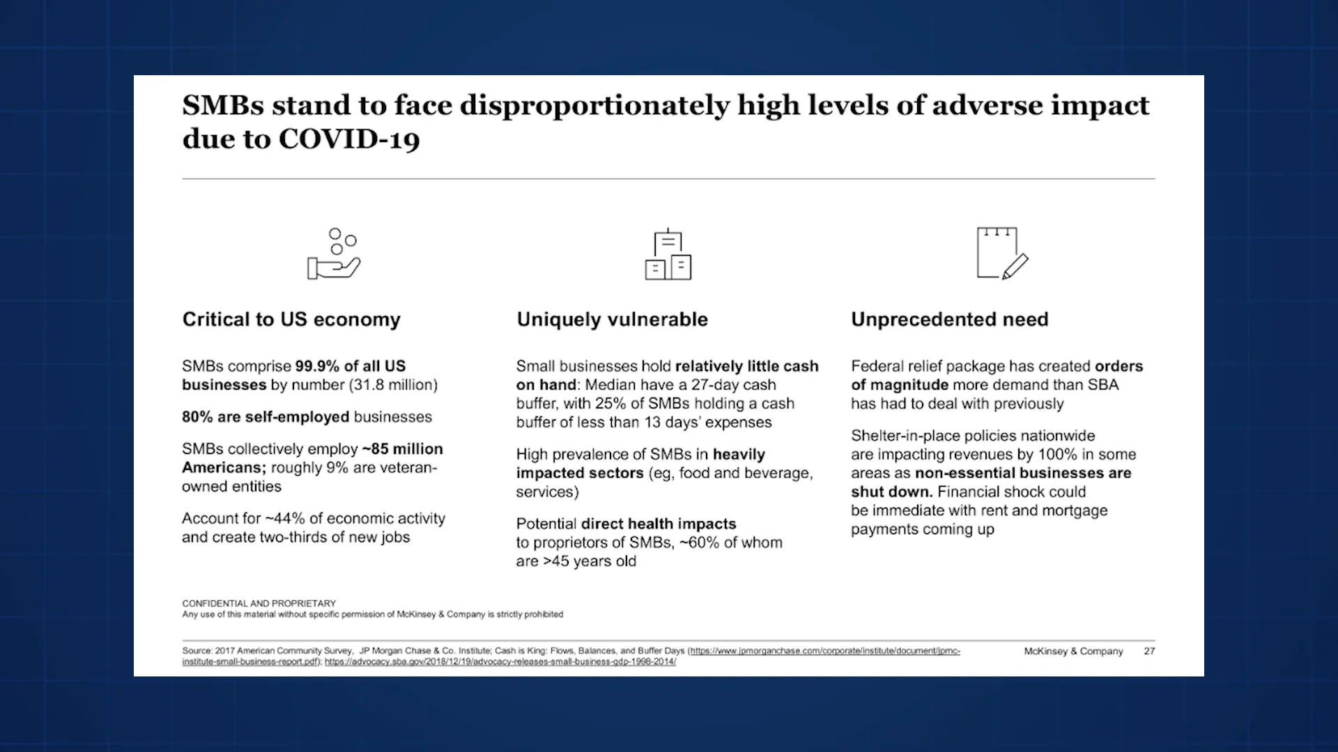
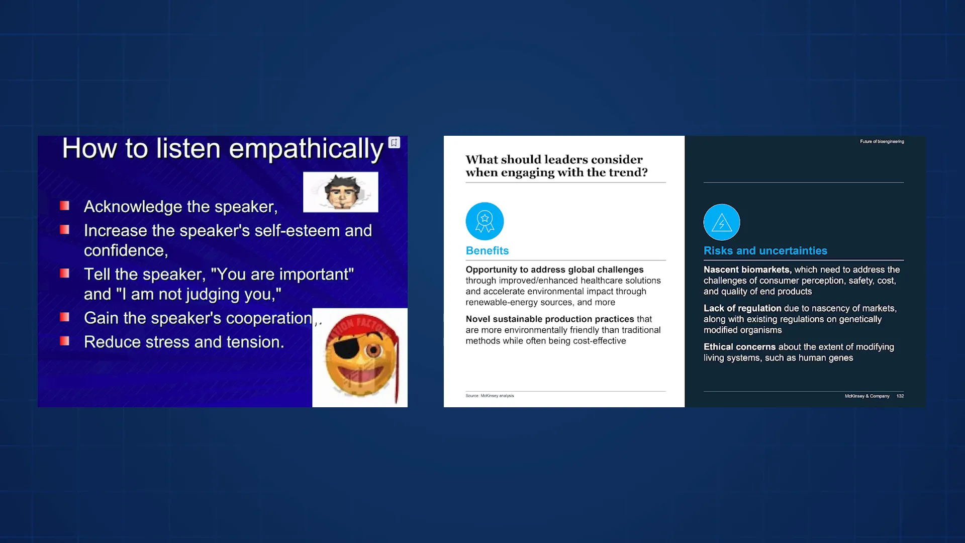
Hierarchy is equally important in PowerPoint slides. Look at this slide from McKinsey: the title is the largest and boldest text, often underlined to emphasize its importance. Below that, icons and bolded subtitles catch your eye next, while blocks of text come last. Even within the text, keywords are bolded to add another layer of hierarchy, making the slide easier to scan and understand quickly.
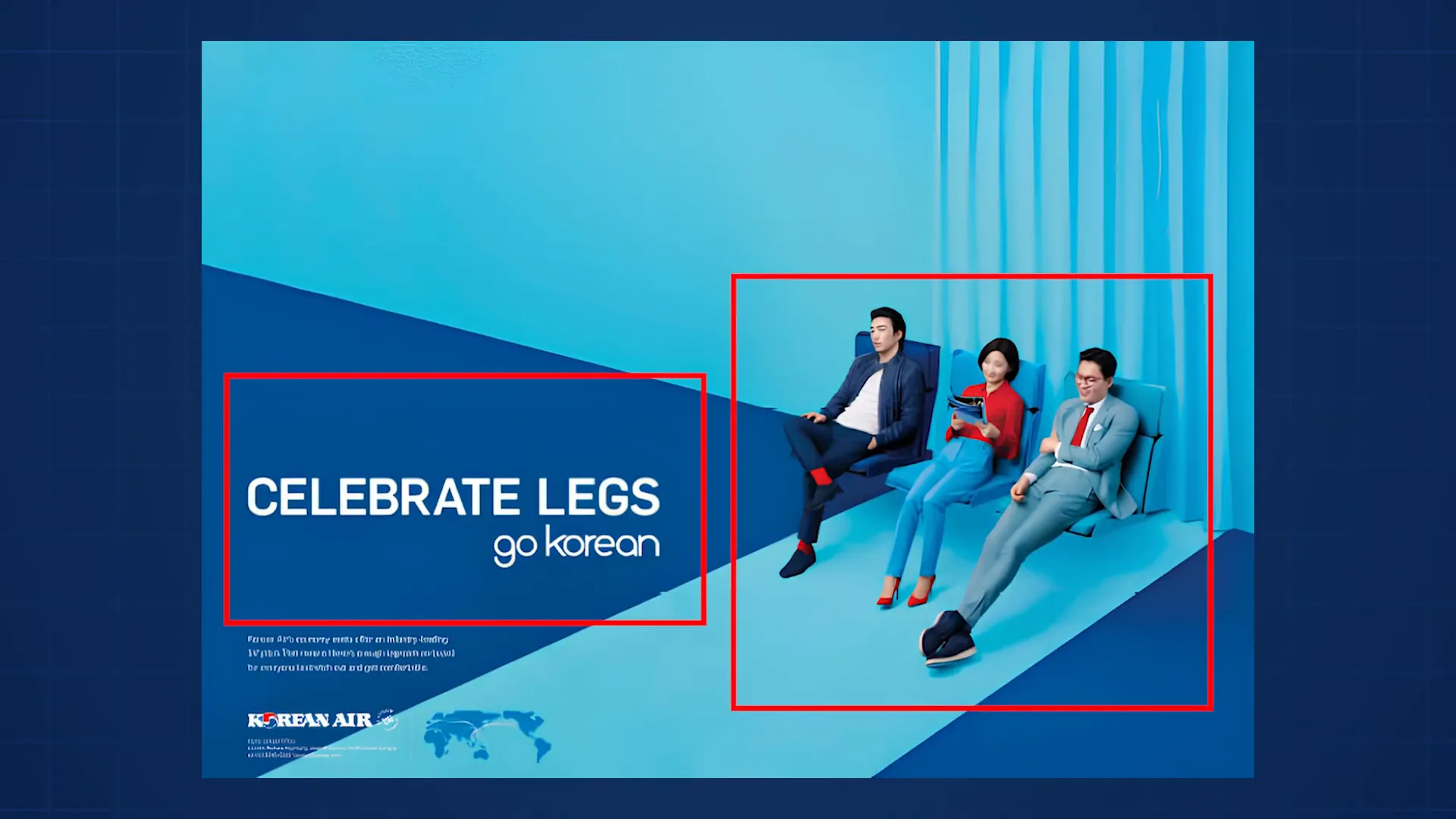
Another example is the Korean Air ad. It has a lot of text, but only two words are in all caps and bold, immediately drawing your attention. The rest of the text is smaller and lowercase, signaling lesser importance. The ad also uses color and positioning to complement the Korean Air logo and reinforce the brand message.

Hierarchy isn’t just about text size and boldness. It can also be about counteracting dominant elements. For instance, in an Accenture slide where a large chart occupies most of the space, the title is made big and bold to ensure it attracts attention first, guiding the viewer’s interpretation of the data.
2. Space: Creating Breathing Room and Emphasis
Space, often referred to as white space or negative space, is a powerful design tool that is frequently underappreciated. It’s about the empty areas around and between elements. Adding space can communicate emotions like elegance, simplicity, or prestige, which is why luxury brands like Aston Martin and Tesla use it so effectively in their ads.
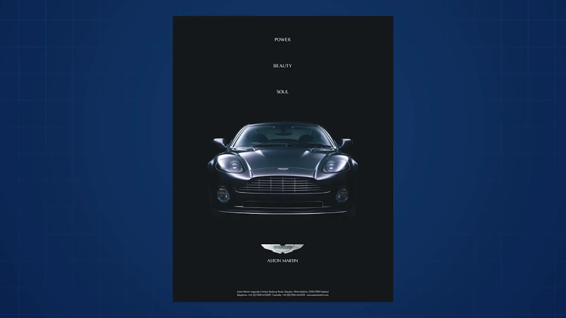
In the Tesla ad, the text isn’t large or bold, but it commands attention because it’s surrounded by empty space. The absence of clutter makes the message stand out. Similarly, in the Aston Martin ad, two texts of the same size receive different levels of attention based on the amount of space around them—the text with more space feels more prominent.
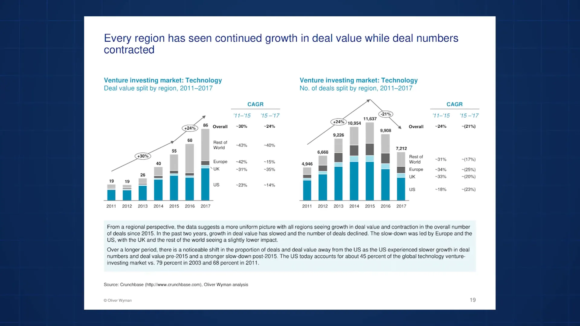
In business presentations, especially corporate slides dense with data and text, space helps reduce clutter and makes the design easier to understand. For example, in a slide from Oliver Wyman packed with text, shapes, and numbers, the author added generous space around the title, making it easier for the audience to find and focus on the key message before diving into details.
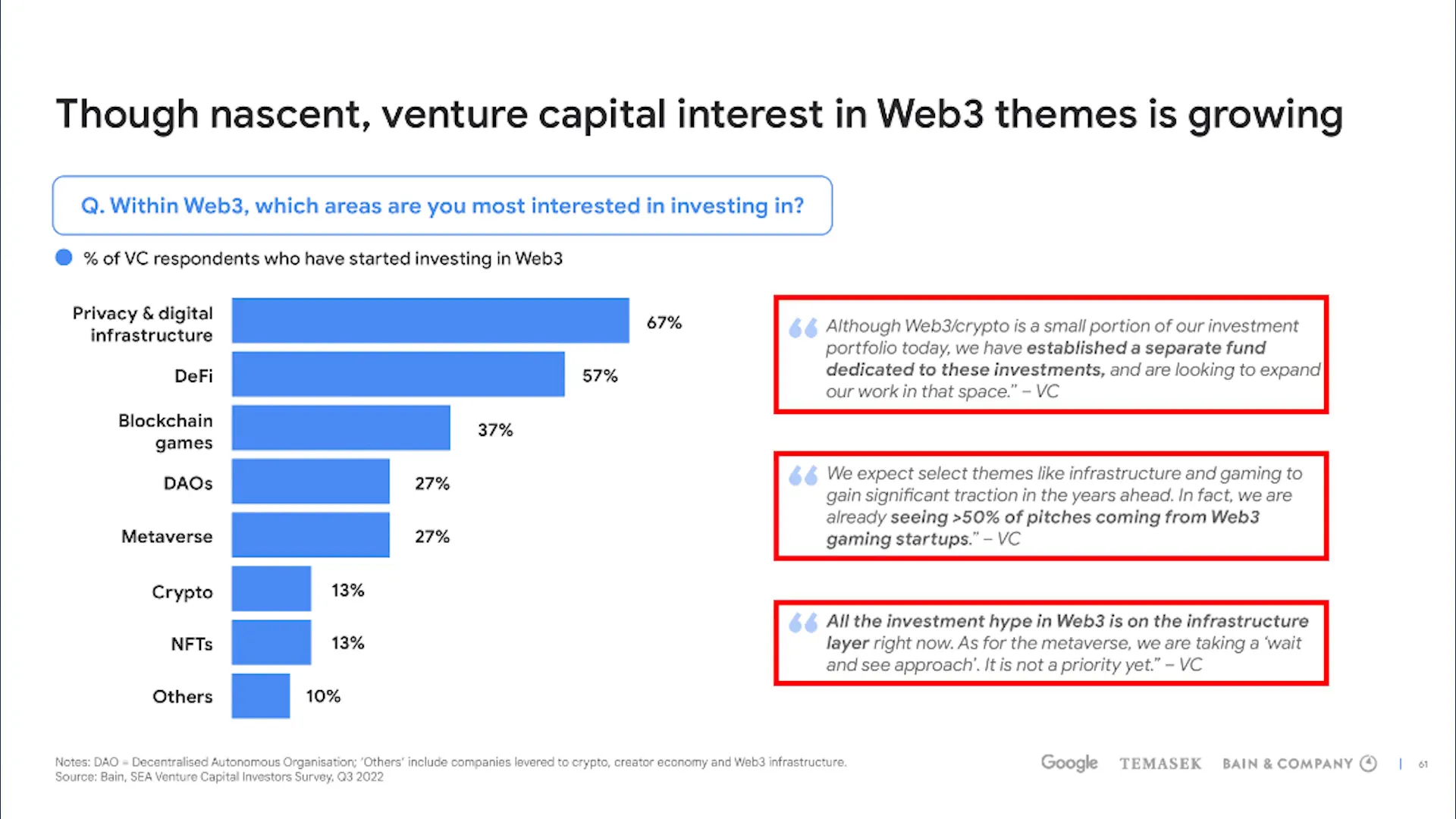
Space also separates and groups ideas. In a Bain slide full of quotes, space is used to separate each quote, making them much easier to read. Similarly, a report-style slide with lots of text uses generous spacing between lines, paragraphs, and blocks of text to transform a potentially overwhelming page into a readable and accessible document.
Going back to the Korean Air ad, the abundant space isn’t just for aesthetics—it reinforces the message of legroom, comfort, and spaciousness. The open areas around the text and imagery help communicate the airline’s promise of comfort effectively.

Practical Tips for Using Space Effectively
- Add margins around your design edges to create a clean, polished look.
- Give your main message plenty of room to breathe, helping your audience focus on it.
- Use generous line spacing to make blocks of text more readable.
- Prefer short, punchy phrases over long, complex sentences to improve clarity.
If you’re looking for inspiration to apply these principles to your slides, I highly recommend checking out SlideStart.com. It’s a vast database of real slides from top companies like McKinsey and Google, searchable by slide type or topic. It’s a resource I personally use often, including for this guide.
3. Alignment: Bringing Order and Professionalism
Alignment is about arranging elements so their edges line up in a clean, organized way. This can be left, right, center, middle, or alignment to the page itself. The main goal of alignment is to create a polished, professional appearance that builds trust with your audience.
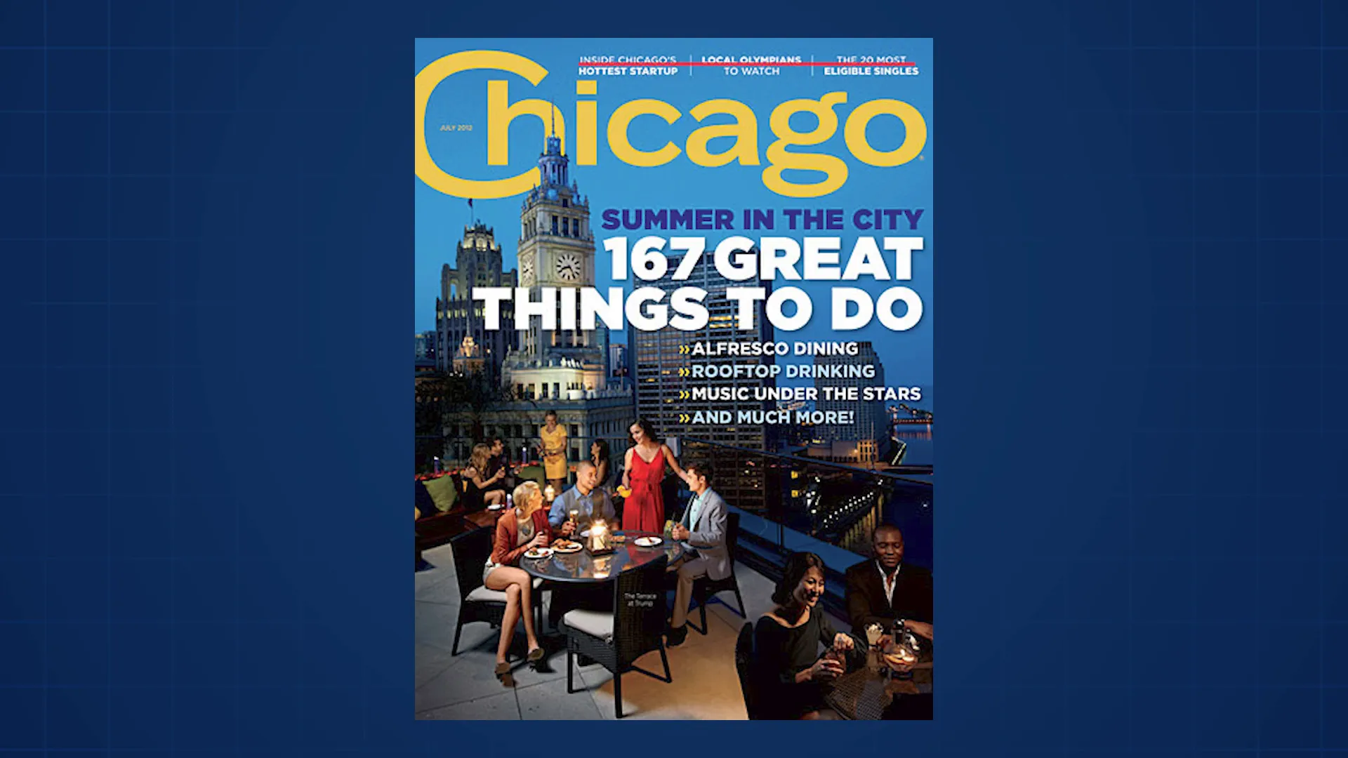
Take this Chicago magazine cover as an example. Despite the busy background image and multiple text styles, alignment keeps everything ordered. Bullet points align on the left edge, the main titles align on the right, and the word “Chicago” is centered. Additional topics are middle aligned, creating a balanced and readable layout.
In presentations, alignment affects how your audience perceives your work. A disorganized slide suggests a rushed or careless project, while well-aligned slides communicate thoughtfulness and professionalism.
Look at these two slides: the first is cluttered and misaligned, giving a chaotic impression. The second is neat and well-aligned, signaling a carefully crafted presentation. This simple difference can influence how much confidence your audience has in your message.
Alignment also builds logical connections. When two objects are aligned, they’re perceived as related. For instance, on Apple’s website, header text is left-aligned to group lines together, while text boxes are center-aligned with images to create a cohesive section. Tables use column alignment to clearly associate features with products.

In a McKinsey slide, subtitles and icons are horizontally and vertically aligned to connect ideas visually. Icons are top-aligned with text blocks, reinforcing their relationship and making the slide easier to follow.
Even in the Korean Air ad, alignment is present: text blocks align on the left and right edges, while the seats in the image line up neatly, enhancing visual order.
4. Proximity: Grouping Related Elements
Proximity is the principle that objects placed close together are perceived as related, while those spaced apart are seen as separate groups. This principle helps organize information logically and makes designs easier to navigate.

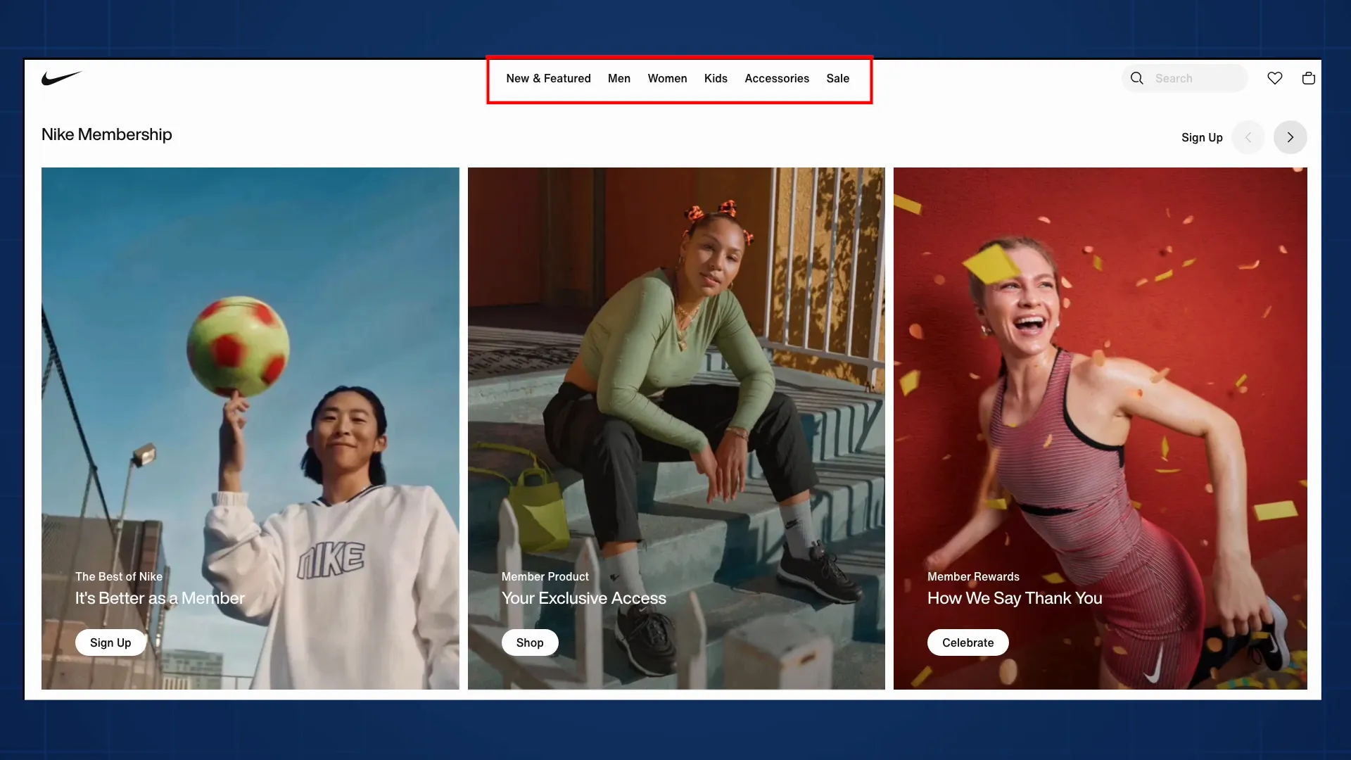
On Nike’s website, navigation links are clustered by category, making the menu intuitive. Category names are spaced slightly apart from their links, indicating they’re related but distinct. This combination of proximity with hierarchy, space, and alignment gives the site a structured, user-friendly feel.
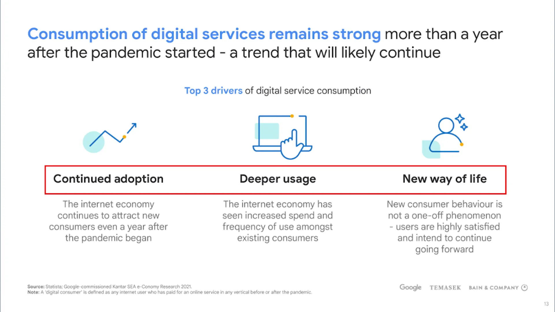
Proximity is especially useful in corporate slides packed with text and data. Grouping related content helps the audience process information without feeling overwhelmed. For example, a Bain slide groups icons representing digital consumption drivers directly above bolded text and descriptions, making it easy to associate each icon with its explanation.
At the bottom of the same slide, sources and logos are clearly separated into their own groups, while the title at the top stands alone as the slide’s main takeaway.
In the Korean Air ad, proximity links the words “legroom” and “Korean Air” by placing them close together, reinforcing the association. The three seats in the image are grouped tightly, visually supporting the message of spaciousness.

Applying Proximity in Charts and Data Visualizations
In business presentations, proximity can improve chart readability. Instead of placing labels in a separate legend, put them right next to the data lines or bars. This makes it easier for viewers to understand what each element represents without shifting their focus away from the data.
This approach works well for line charts, stacked column charts, and waterfall charts, where clear labeling next to data points helps the audience make accurate connections quickly.
5. Balance: Creating Visual Stability and Comfort
Balance ensures that the visual “weight” of your design feels evenly distributed. It’s a subtle but crucial principle that affects how comfortable and stable a design feels.
There are three main types of balance:
- Symmetrical Balance: One half of the design mirrors the other, creating a predictable and formal look.
- Asymmetrical Balance: Different elements balance each other out without mirroring, often making the design more dynamic and interesting.
- Radial Balance: Elements are arranged around a central point, drawing attention inward.
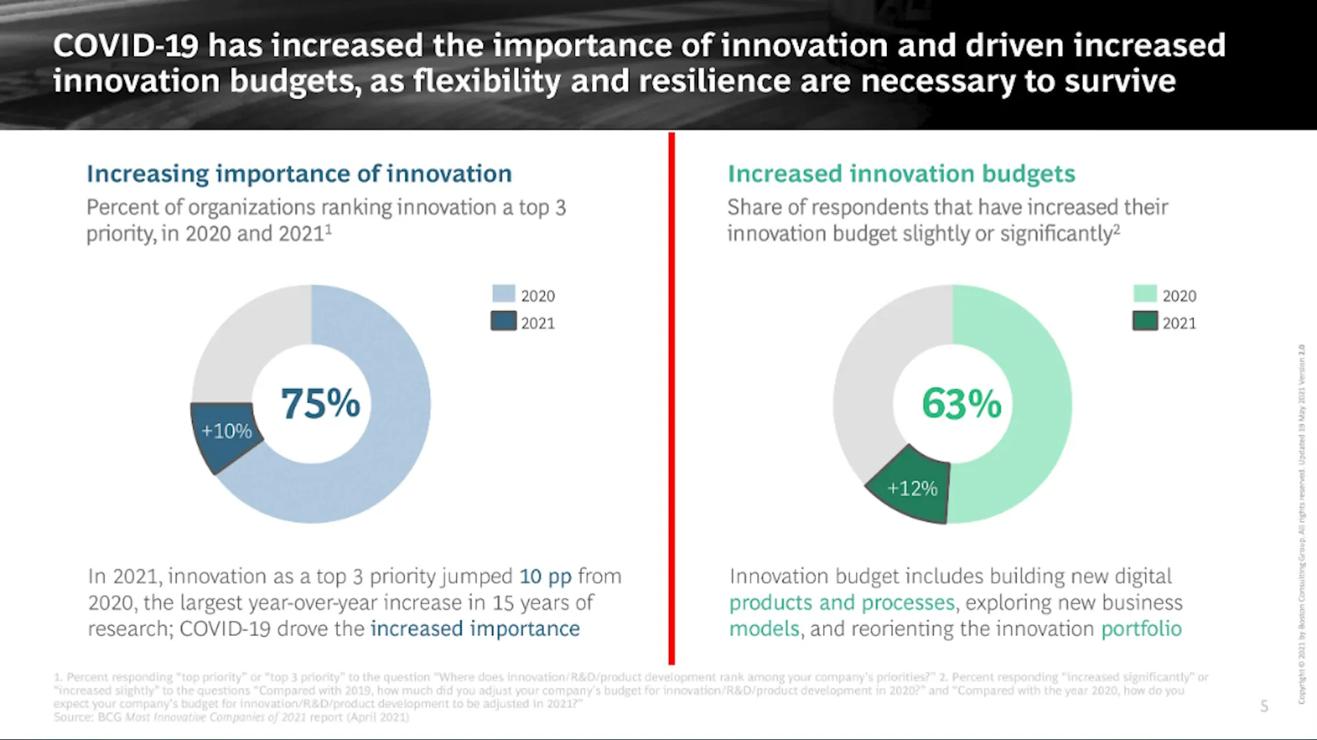
A BCG slide demonstrates symmetrical balance, with the left and right sides mirroring each other. This communicates structure and precision, ideal for data-heavy slides.
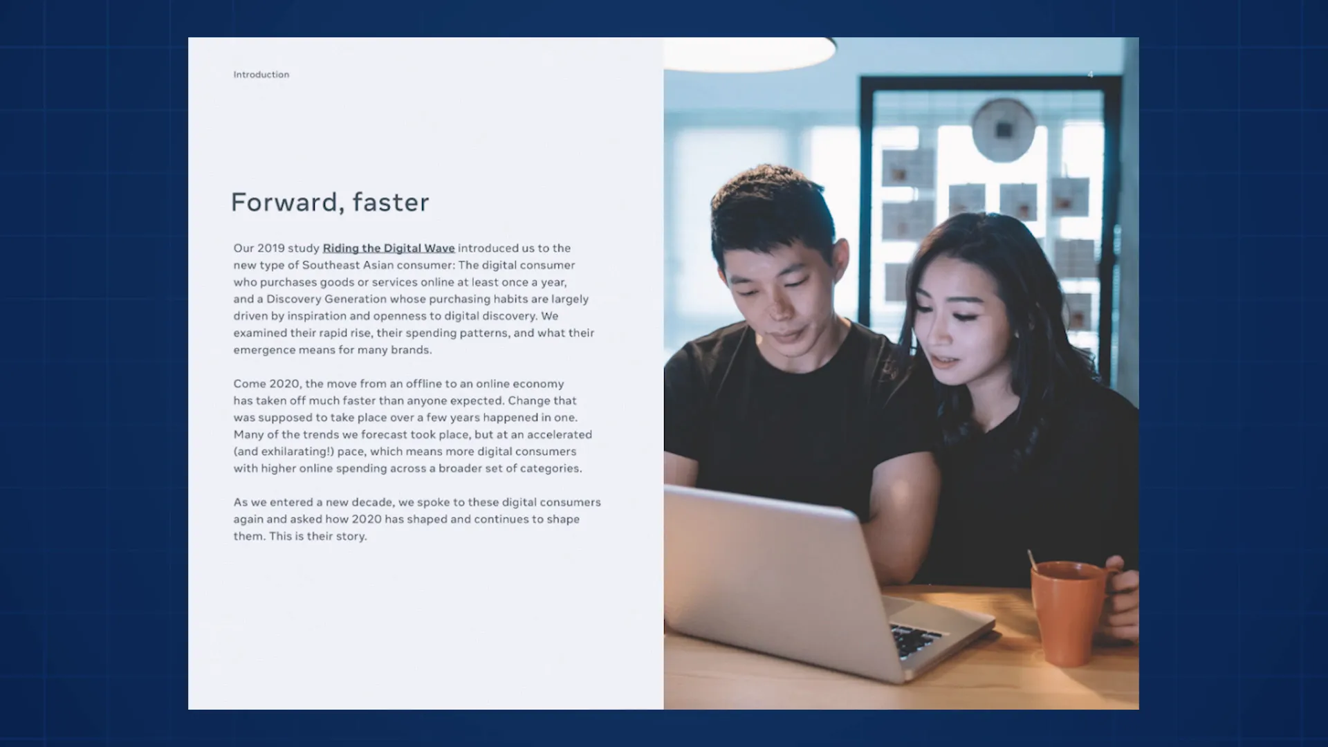
By contrast, a Bain slide uses asymmetrical balance. The structured text on the left balances the visually engaging photo on the right. Without the photo, the slide would be less captivating. This balance keeps the design comfortable and visually appealing.
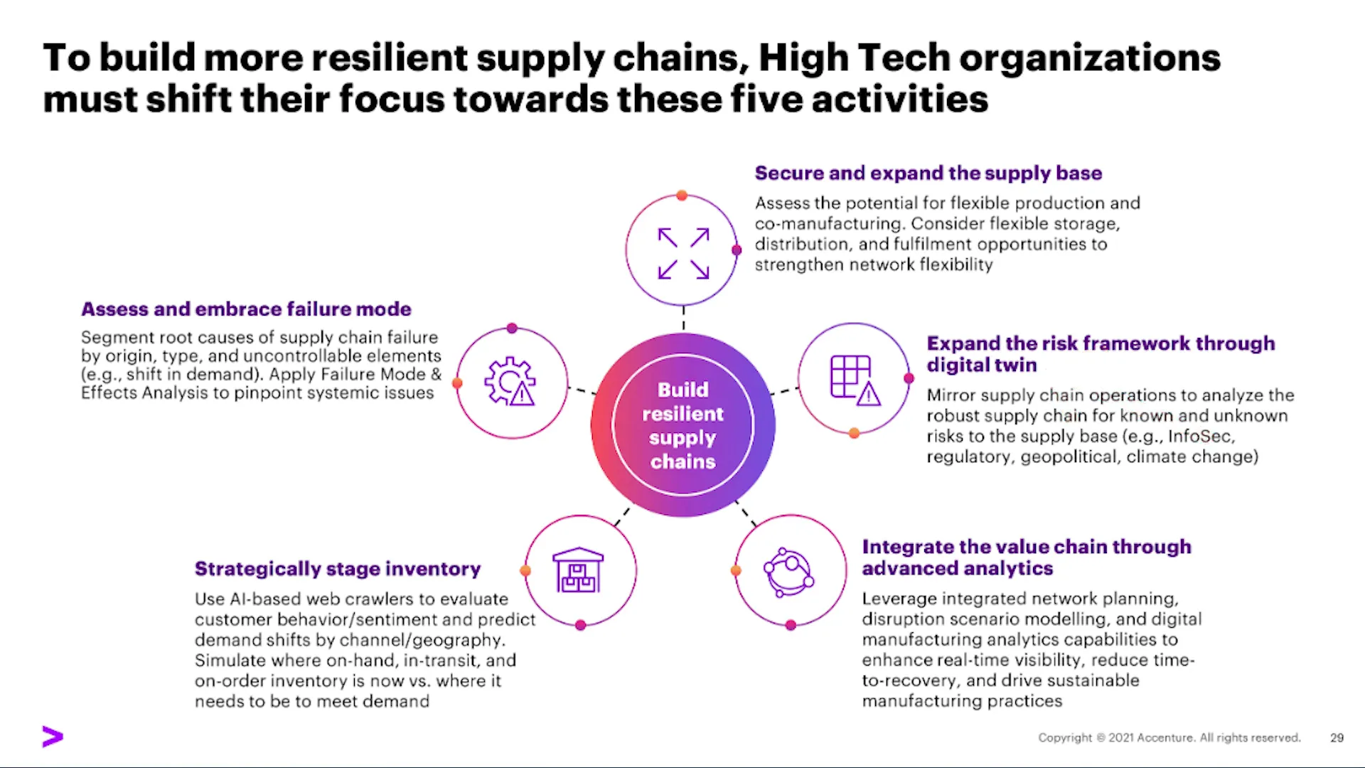
Accenture’s slide shows radial balance centered around a focal point, paired with asymmetrical balance through the use of color. The purple color provides contrast that attracts attention without overwhelming the clean black text. The circles balance with rectangular text boxes, creating a harmonious layout.
Balance is important because unbalanced designs make viewers uneasy, even if they can’t pinpoint why. A balanced slide feels “right,” helping the audience focus on the message rather than the layout.
Looking one last time at the Korean Air ad, the text on the left balances the image on the right. Although I personally think the text could be moved up slightly for better balance, the overall effect is comfortable and stable.
Additional Design Principles to Explore
While this guide covers the five foundational principles—hierarchy, space, alignment, proximity, and balance—there are many more design concepts worth exploring. Repetition, movement, typography, simplicity, and color theory all play critical roles in creating compelling visuals.
If you’re interested in diving deeper into these topics, I encourage you to continue learning and experimenting. Design is a vast field, but mastering even a few principles can transform your presentations and communications.
Frequently Asked Questions (FAQ)
Why is hierarchy important in design?
Hierarchy helps guide the viewer’s eye through your content in a specific order, ensuring the most important information is seen first and the overall message is communicated clearly.
How can I use space effectively in my slides?
Use space to separate ideas, reduce clutter, and give your main message room to breathe. Generous margins, line spacing, and avoiding overcrowding all contribute to better readability and visual appeal.
What is the difference between alignment and proximity?
Alignment arranges elements so they line up along edges or centers, creating order and professionalism. Proximity groups related elements together by placing them close to each other, helping viewers understand relationships between content.
How do I know if my design is balanced?
A balanced design feels stable and comfortable. Symmetrical balance mirrors elements across an axis, asymmetrical balance balances different elements by visual weight, and radial balance arranges elements around a central point. If your design feels “off” or uneasy, it may be unbalanced.
Can I apply these principles to non-PowerPoint designs?
Absolutely! These principles are universal and apply to websites, advertisements, reports, user interfaces, and virtually any form of visual communication.
Conclusion
Design is more than just aesthetics—it’s a powerful language that shapes how your audience understands and interacts with your message. By mastering the five essential principles of hierarchy, space, alignment, proximity, and balance, you can build PowerPoint slides and other visuals that not only look professional but also communicate effectively.
Start by observing the designs you encounter every day. Notice how these principles are applied intentionally, from website layouts to advertisements and corporate presentations. Then, practice applying them in your own work, using resources like SlideStart.com for inspiration and real-world examples.
If you want to take your skills further, there’s a world of design knowledge waiting for you—from typography and color theory to repetition and movement. But even just understanding these five principles will give you a significant advantage in creating compelling, clear, and professional slides that impress your audience.
Remember, good design isn’t about perfection or complexity; it’s about clarity, intentionality, and connection. Start with these basics, and you’ll be well on your way to building PowerPoint slides like a graphic designer.
Check out the full video: How to Build PowerPoint Slides Like a Graphic Designer


