

- Introduction
- What you need before starting
- Step-by-step: Build the Annual Report Cover Slide
- Detailed walkthrough with shortcuts and tips
- Design choices: color, typography, and imagery
- Final polish, variations, and export
- Common mistakes and how to avoid them
- Asset checklist and keyboard shortcuts
- FAQ
- Conclusion
Introduction
If you’re creating a professional Annual Report Cover Slide for your company, stakeholder presentation, or investor deck, you want something that looks modern, clean, and memorable. In this guide I walk you through designing a standout Annual Report Cover Slide step-by-step in PowerPoint, using simple shapes, image fills, and a two-color palette with geometric accents.
This tutorial-style article mirrors how I design the Annual Report Cover Slide: starting with a hexagon focal shape, cutting it into segments, adding image fills, creating layered borders, and finishing with typography and logo placement. Throughout, I explain the why behind each decision so you can adapt the Annual Report Cover Slide to your brand.
What you need before starting
Before you open PowerPoint, gather a few things to speed up the process and keep the Annual Report Cover Slide consistent with your brand.
- Brand colors: Hex codes or swatches for your primary and accent colors (in this example, a dark blue and orange).
- High-resolution images: Business imagery or abstract architecture photos that work well cropped into geometric shapes.
- Company logo: A vector or high-resolution PNG with a transparent background.
- Fonts: Choose a clean sans-serif for titles (I used Open Sans Condensed) and a readable body font.
- PowerPoint basics: Familiarity with Insert > Shapes, Shape Format options, Merge Shapes (Union, Fragment), and Picture Fill.
Step-by-step: Build the Annual Report Cover Slide
Below is a concise overview of the full process. Each item is expanded in the following sections so you can follow along in PowerPoint.
- Insert a hexagon and position it in the center of the slide.
- Use a right triangle and a rectangle to create a background accent that intersects the hexagon.
- Duplicate the hexagon and reduce size multiple times to create nested borders.
- Cut the inner hexagon into six equal parts using rotated rectangles and Merge Shapes > Fragment.
- Group the segmented shape and apply image fills to create a multi-photo hexagon cluster.
- Create a corner accent by assembling triangle + rectangle and filling it with your accent color.
- Add text blocks: year, “Annual Report,” company name, and optional tagline.
- Place an oval or reserved shape for the logo and add small geometric accents around the slide.
- Finalize alignment, grouping, and export as PNG/PDF for printing or sharing.
Detailed walkthrough with screenshots
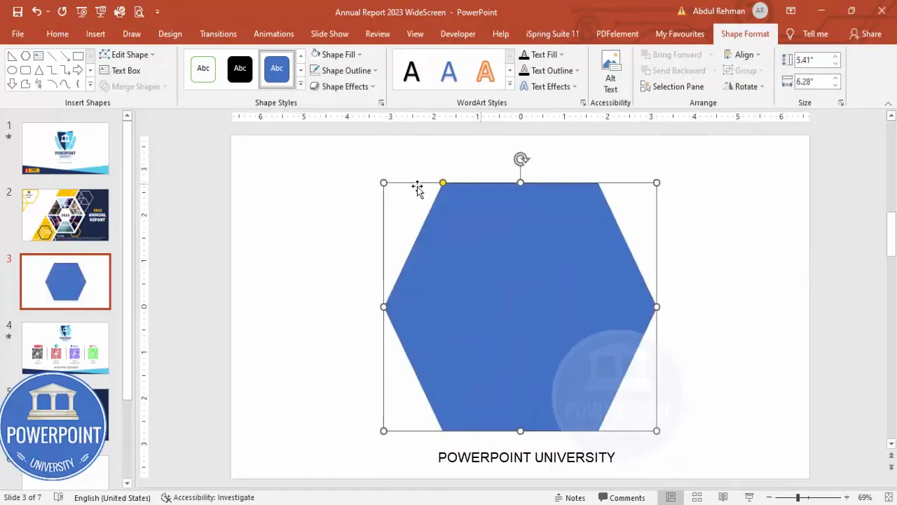
1. Insert and size the hexagon (the focal element)
The hexagon is the visual anchor of this Annual Report Cover Slide. Start by inserting a hexagon from Insert → Shapes → Basic Shapes. I set specific dimensions for consistency: height = 5.41, width = 6.28 (you can adjust to taste or your slide size).
- Insert → Shapes → Hexagon.
- Set Height and Width in the Shape Format panel for consistent sizing across slides.
- Align center and align middle to place it on the slide precisely.
- Adjust the small orange handle inside the hexagon to change its inner aspect if necessary.

Why the hexagon? Hexagons provide a modern, geometric look and contrast with rectangular slides. They’re excellent containers for photos because their multiple sides give a faceted, editorial feel to the Annual Report Cover Slide.
2. Create a background accent using a right triangle
To add depth and brand color to the Annual Report Cover Slide, build an angled accent shape that intersects the hexagon.
- Insert a Right Triangle from Insert → Shapes.
- Remove the outline (Shape Outline → No Outline).
- Rotate and Flip Horizontal so the long edge aligns with the hexagon corner.
- Adjust transparency if you want to preview composition while refining placement.
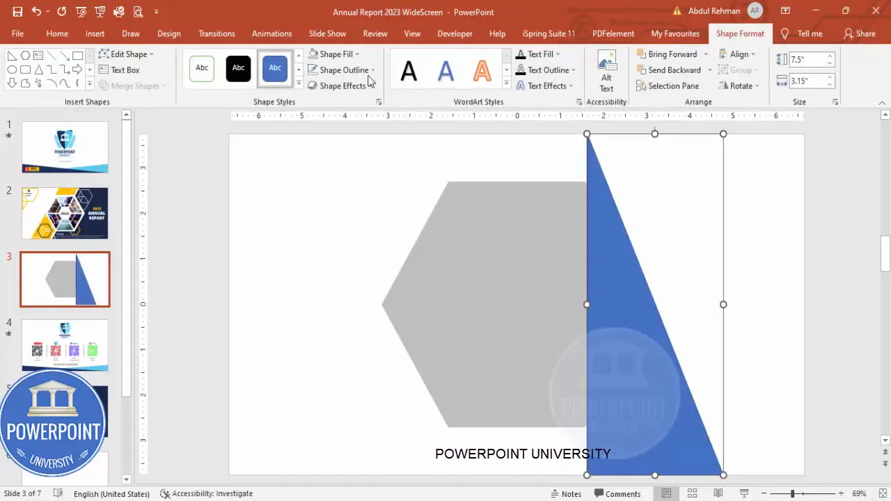
Pro tip: If the corner alignment feels off, use Edit Points (right-click → Edit Points) to nudge corners for pixel-perfect intersection. Small edits make a big difference when you’re layering shapes.
3. Merge the triangle and a rectangle to form a clean accent
Use a rectangle to extend the triangle into a solid accent band that crosses the hexagon from corner to corner. Merge Shapes → Union will combine them into one clean object that you can send to the back of the layout.
- Insert a rectangle to fill the area you want covered.
- Select both triangle and rectangle → Merge Shapes → Union.
- Send the resulting object to back (Right-click → Send to Back).
- Optionally change the color to a darker hue of your accent color.
This accent band visually balances the hexagon and gives you a place to anchor small text or logos without cluttering the center focal element of the Annual Report Cover Slide.
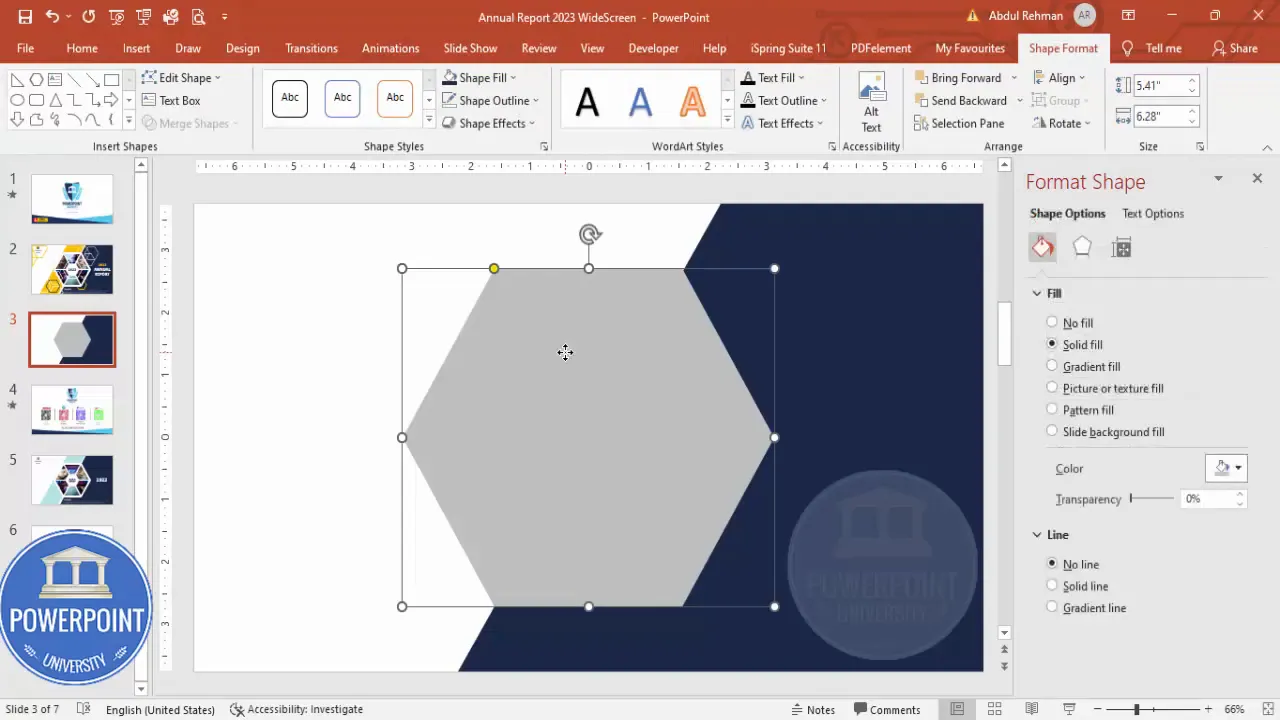
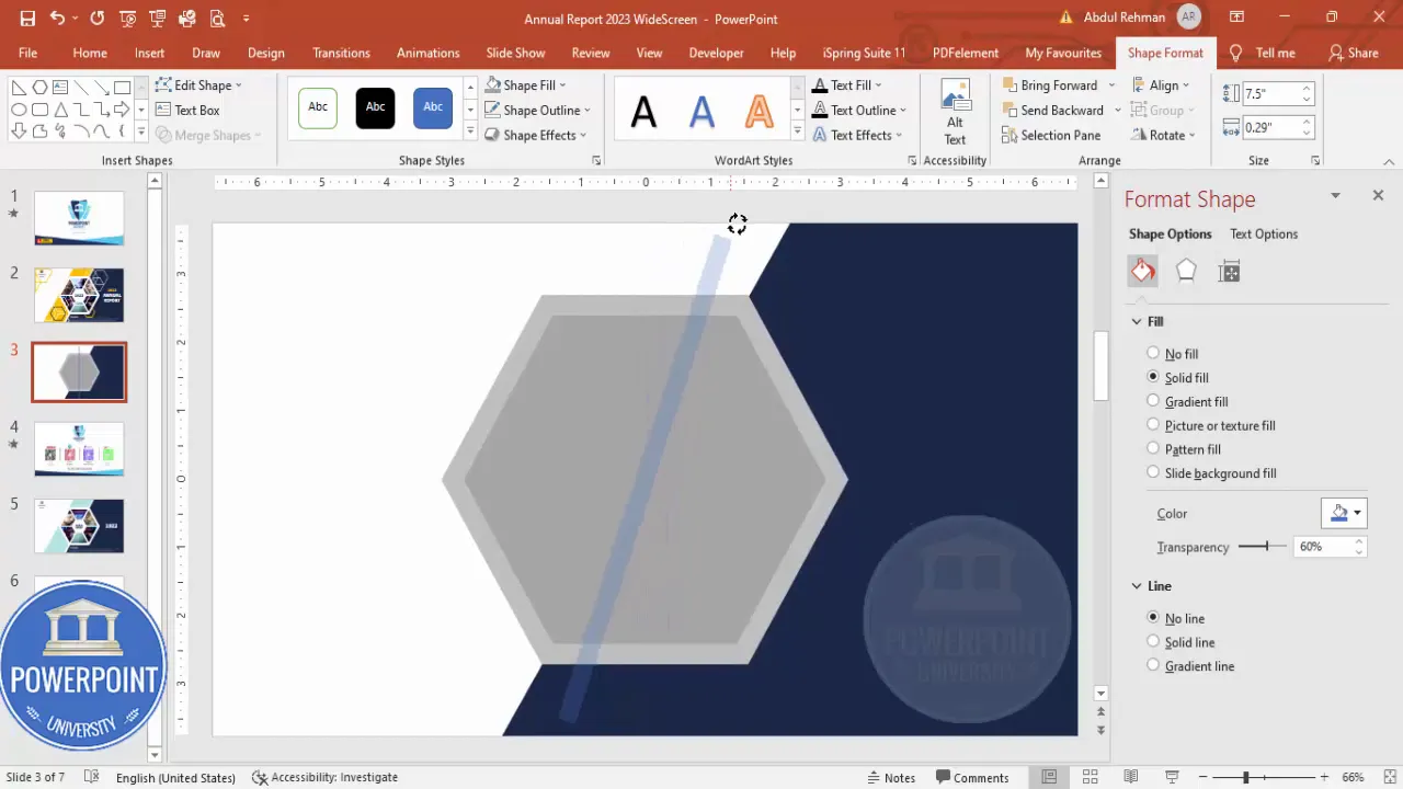
4. Create nested hexagons for borders
Duplicate the original hexagon (Ctrl+D) and scale down while holding Shift to preserve proportions. Repeat this process to create multiple nested hexagons—these act like borders and framing layers for the images you’ll add later.
- Duplicate the hexagon: Ctrl+D.
- Hold Shift and scale down to create a smaller concentric hexagon.
- Align center and align middle for perfect nesting.
- Repeat to create two or three nested outlines; the center will be the image container.
Nested shapes create a layered look that feels intentional and premium—ideal for an Annual Report Cover Slide that needs to look polished at a glance.
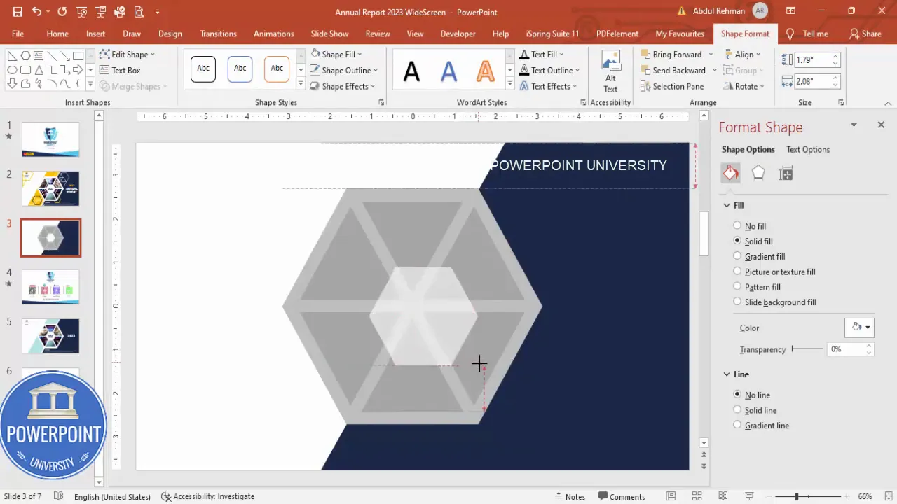
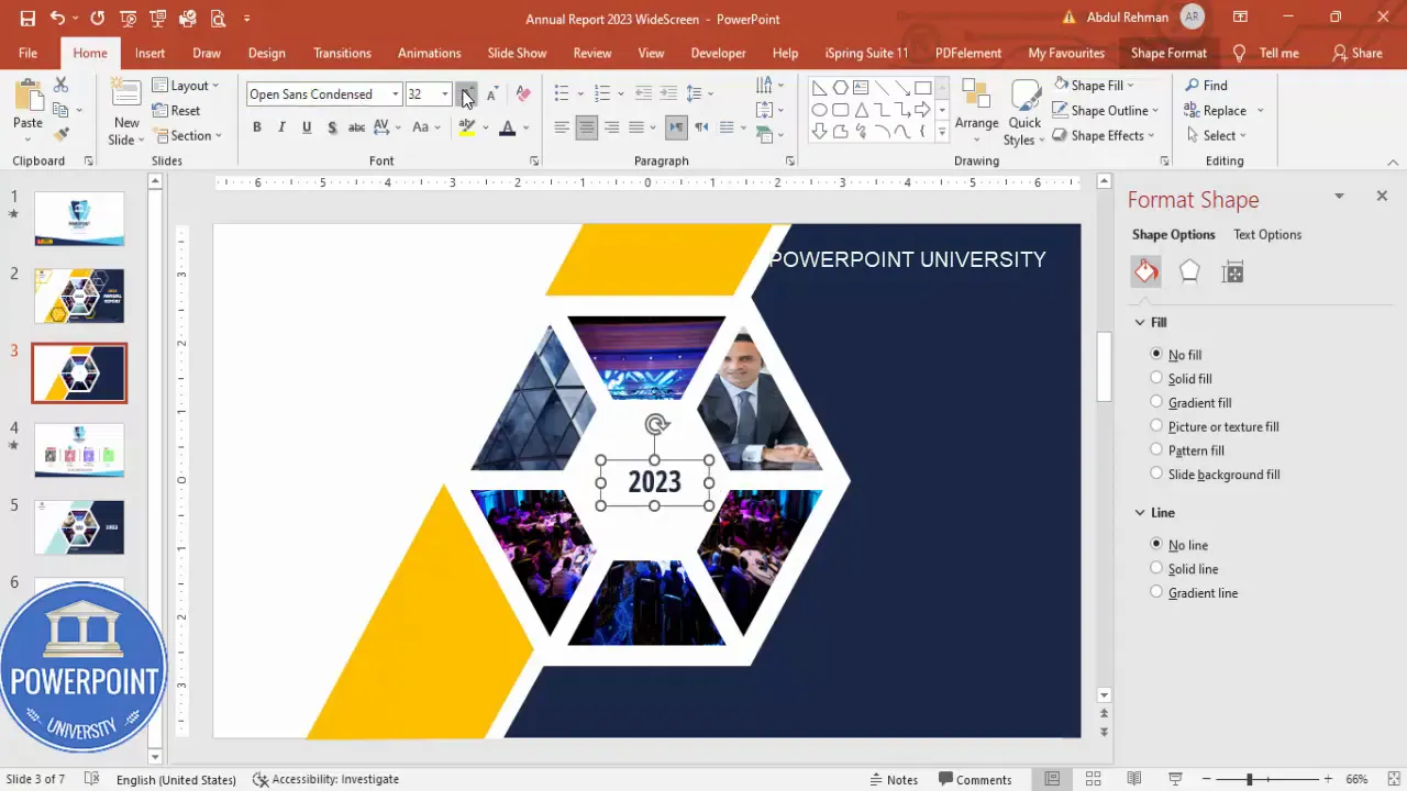
5. Cut the inner hexagon into six equal parts
This is a key design move: dividing the hexagon into segments allows you to fill each facet with a different image, creating a collage-like effect. Here’s how to split the hexagon cleanly into six parts.
- Insert a thin rectangle sized to cross the hexagon across one axis. Make it transparent or low opacity for positioning.
- Rotate the rectangle slightly to align with one axis of the hexagon. Use alt + arrow keys for precise rotations if your version of PowerPoint supports it.
- Duplicate the rectangle five times and rotate each copy around the center so they divide the hexagon into six wedge-like regions.
- Select the hexagon and all rectangles → Merge Shapes → Fragment.
- Delete the unwanted fragments so you’re left with six separate internal pieces arranged as a segmented hexagon.
Fragmenting shapes is powerful. After you fragment, you can style or fill each facet independently—ideal for an Annual Report Cover Slide that showcases multiple images or messages inside the same geometric container.
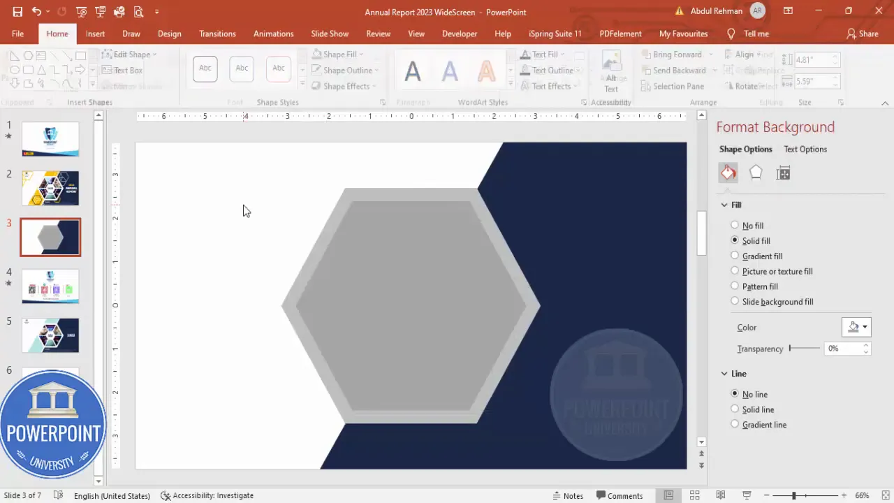
6. Create an inner white hexagon to act as a border
Duplicate the entire segmented shape, shrink it slightly, and fill it with white. Place this white hexagon behind the segmented image cluster to create a crisp internal border or highlight.
- Duplicate the segmented hexagon group → Ctrl+D.
- Reduce its size slightly and fill with white.
- Align center and align middle so it nests perfectly.
This white inset helps images breathe and gives the Annual Report Cover Slide a professional sense of space—especially useful when using darker photographs.
7. Group shapes and insert pictures
Select the segmented pieces you want to fill and group them (Ctrl+G). Then apply image fills to the group or to individual segments for a tailored collage effect.
- Select grouped shapes → Shape Format → Fill → Picture or texture fill.
- Click Insert Online Pictures or Insert From File to choose your photos.
- Adjust the picture settings: position, scale, and crop inside the shape as needed.
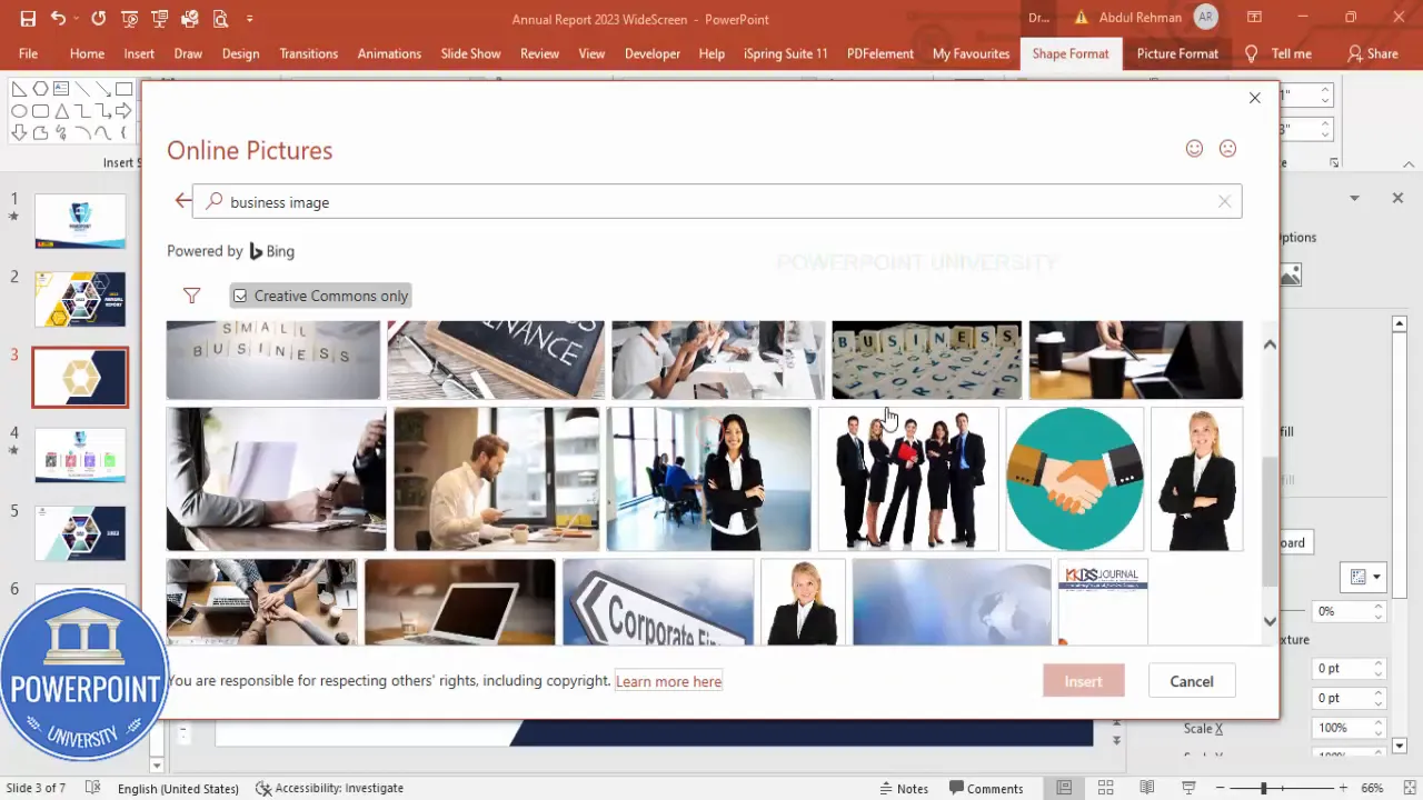
I chose a mix of business images and architectural glass imagery for contrast—one facet with a businessperson, others with abstract architecture—to tell a visual story. You can swap any segment photo later without changing the overall layout of your Annual Report Cover Slide.
8. Add the corner accent on the opposite side
Use the same triangle + rectangle trick to create a corner accent on the opposite side of the hexagon. Merge shapes for a clean single object, fill it with your accent color (orange in this example), and send it behind the hexagon so it peeks around the corner.
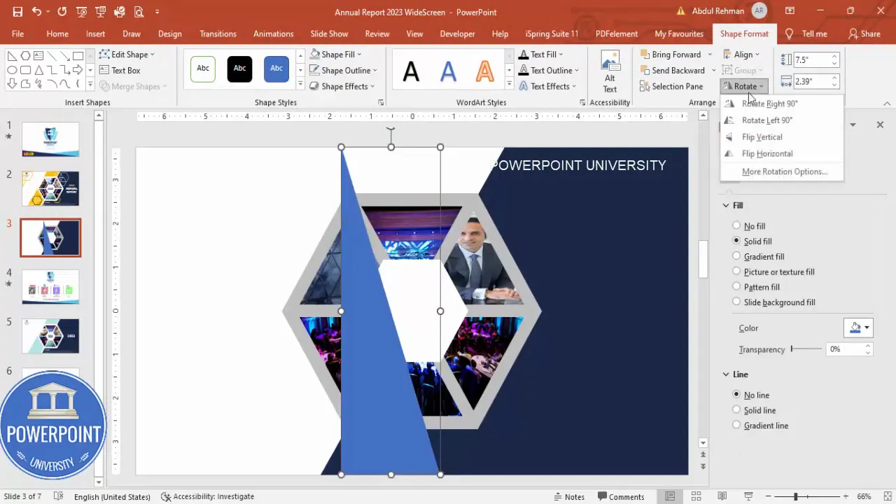
Small accents like this guide the eye and add brand color without overpowering the center focal point of your Annual Report Cover Slide.
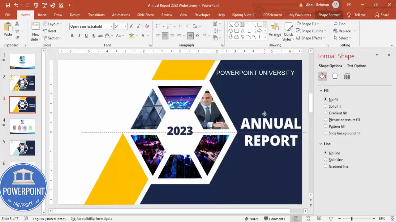
9. Add typography: year, title, and company name
Typography anchors the layout. For the Annual Report Cover Slide, simple hierarchy works best:
- Year (e.g., 2023) — Use a condensed sans-serif; colored in the dark blue to tie to the palette.
- Main title (“Annual Report”) — White or high-contrast; slightly larger and bold to read from a distance.
- Company name and logo — Smaller, placed in the top-left corner with space reserved for the logo inside an oval.
Suggested typography settings:
Create Slides in Seconds with ExpertSlides AI |
|
Generate AI Presentations today: |
| TRY NOW! |
- Font for year: Open Sans Condensed, Extra Bold
- Font for title: Open Sans or another readable sans-serif, 40pt for slide preview (scale up for print)
- Spacing: keep generous line spacing and avoid decorative or condensed fonts for body copy
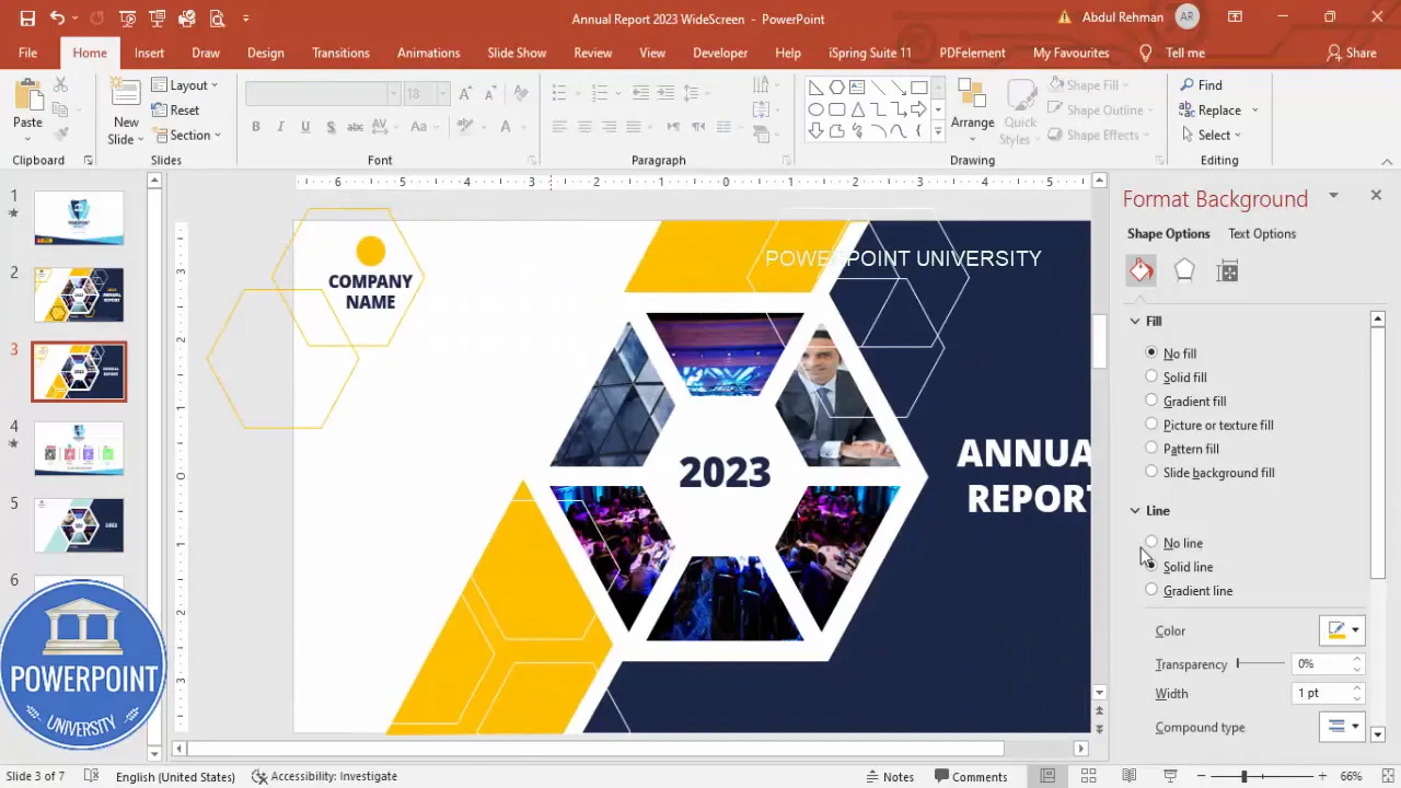
10. Create a reserved logo area and decorative line accents
Use a simple oval with a fill that complements your palette to reserve space for the company logo in the top-left. Add thin outlined hexagons or concentric lines as decorative accents around the edge to create a cohesive design.
- Insert an oval for the logo placeholder and fill with an accent color or white depending on the logo color.
- Duplicate small outline shapes (Ctrl+D) to form a repeating pattern or decorative motif.
- Use white outlines or orange outlines to balance the composition.
11. Final adjustments and slideshow check
Before exporting, preview the slide in Slideshow mode. Check alignment, visual weight, and readability at full-screen size. Make adjustments to contrast and spacing as needed.
At this stage, everything should be grouped logically: grouped image cluster, grouped accents, and grouped header area so you can reuse the composition across multiple slides or templates.
Design choices: color, typography, and imagery
A strong Annual Report Cover Slide uses consistent design choices. Here’s how we approached each element and the reasoning behind it:
Color palette
- Primary color: Dark blue — conveys professionalism and stability. Use it for year, small text, and subtle shapes.
- Accent color: Orange — energetic and modern; use sparingly for highlight accents and decorative outlines.
- Neutral: White — provides breathing room and creates contrast with images and text.
Use your brand hex codes for exact matching. The contrast between dark blue and orange helps important elements stand out on the Annual Report Cover Slide.
Typography
- Title: clean, bold sans-serif; large size to command attention.
- Year: condensed style to occupy less horizontal space while remaining prominent.
- Company name: medium weight, smaller than title but clearly visible in the corner.
Accessibility tip: ensure color contrast ratios meet at least AA standards for body text. White text on a dark image may require a semi-transparent overlay or inner white border to remain legible on your Annual Report Cover Slide.
Images
Choose images with consistent color tones and visual language. If you mix people and architecture, unify them with similar exposure or a subtle filter to maintain cohesion across the segmented hexagon.
- Businessperson image in one facet to convey human leadership.
- Abstract glass or architecture images in other facets to signal growth, structure, and scale.
- Consider converting images to black & white or applying a consistent color overlay if they feel disjointed.
Final polish, variations, and export
Once your Annual Report Cover Slide looks balanced, perform these final steps to polish and create variations for different platforms:
- Group logically: Group related items (image cluster, accent, header) so you can move them together.
- Create alternative color versions: Swap accent colors or invert (dark background vs. light) to create themed variations.
- Check print dimensions: If you’ll print, set slide size to the correct ratio and export at 300 DPI by saving as PNG at a large size.
- Export formats: PowerPoint (.pptx) for editing, PNG for image use, PDF for print-ready distribution.
When exporting for web or email, consider cropping a square or tall version of the Annual Report Cover Slide to fit common social-media aspect ratios while keeping the hexagon focal point centered.
Common mistakes and how to avoid them
Even a well-conceived design can be undermined by small errors. Here are common pitfalls when building an Annual Report Cover Slide and how to avoid them:
- Poor image fit: If image fills are misaligned or pixelated, replace with higher-resolution images and use the crop/position options inside the shape.
- Busy accents: Avoid too many decorative shapes that compete with the main hexagon. Use accents to guide attention, not distract.
- Unreadable text: Maintain contrast between text and background; use white borders or overlays if text overlaps images.
- Unclear hierarchy: Keep the year, title, and company name in a clear visual order—year and title should be prominent; company name and logo secondary.
- Inconsistent spacing: Use Align tools and consistent padding (like 20–30 px equivalents) between elements to make the Annual Report Cover Slide look intentional.
Asset checklist and keyboard shortcuts
Before you begin, here is a quick asset checklist and a list of helpful keyboard shortcuts to speed up creating the Annual Report Cover Slide:
Asset checklist
- High-resolution photos for image fills
- Company logo in PNG or SVG format
- Brand color hex codes (primary and accent)
- Chosen fonts preinstalled in your system
- Slide size/orientation confirmed (16:9 or 4:3)
Useful keyboard and workflow shortcuts
- Ctrl + D — Duplicate selected object
- Shift + drag — Scale proportionally
- Alt + arrow keys — Fine rotate or nudge (depends on PowerPoint version)
- Align → Align Center / Align Middle — Keep shapes perfectly centered
- Right-click → Edit Points — Fine-tune shape corners
- Merge Shapes (Format → Merge Shapes) — Use Union, Fragment, Intersect for precise shape construction
- Send to Back / Bring to Front — Manage stacking order
Design checklist: quick run-through
- Center the main hexagon and confirm size.
- Create corner accent and ensure it interacts visually with the hexagon.
- Fragment the hexagon into six parts, delete unwanted fragments, and create a white inset border.
- Fill segments with a mix of people and architecture photography for narrative contrast.
- Add year and title with clear typographic hierarchy.
- Reserve a space for the logo and add subtle decorative accents.
- Preview in Slideshow mode and finalize export settings.
Alternatives and variations
The same approach can be adapted for different aesthetics or audiences. Here are a few variations to try:
- Monochrome: Convert all images to a single color overlay for a minimalist Annual Report Cover Slide.
- Photo-dominant: Use a single full-slide background photo and inset a transparent hexagon cluster on top for textual focus.
- Icon-driven: Replace some segmented images with icons or charts to highlight themes (growth, sustainability, people).
- Interactive PDF: Export a PDF with clickable areas (logo links to website) for a distributed Annual Report Cover Slide that’s interactive.
FAQ
What size should the slide be for print?
If you intend to print the Annual Report Cover Slide as a cover page, set the slide dimensions to match your intended print size (e.g., A4 or US Letter) and export at 300 DPI. In PowerPoint, go to Design → Slide Size → Custom Slide Size, then set your dimensions and export a large PNG or PDF for print.
Can I replace a single hexagon facet image without redoing the whole layout?
Yes. If you’ve filled individual segments, select the segment you want to change, then go to Shape Format → Fill → Picture or texture fill and replace the picture. Because each segment is an independent shape after Fragment, you can change images independently without affecting other facets of the Annual Report Cover Slide.
How do I ensure text is readable on top of images?
Use any of these strategies:
- Add a semi-transparent overlay behind the text (a rectangle with 20–40% opacity).
- Use inner white borders around image clusters to create separation.
- Choose high-contrast text colors (white on dark images; dark blue on light images).
- Move text to areas of uniform image tone (e.g., sky or negative space).
What file formats should I export for sharing and printing?
- PowerPoint (.pptx) for editable master files.
- PDF for print and distribution.
- PNG or JPEG for image sharing, social media, and thumbnails.
Can I adapt the Annual Report Cover Slide for other reports?
Absolutely. The hexagon + segmented imagery technique works well for many report types: ESG reports, investor decks, marketing summaries, and product catalogs. Swap the images, adjust the palette to suit the audience, and update the title text to match the report type.
Common questions about recreating the design in PowerPoint
- How do I fragment shapes if Merge Shapes is disabled? Ensure you are in a version of PowerPoint that supports Merge Shapes (Windows desktop versions generally support this). On Mac, recent versions also include Merge Shapes. If unavailable, you can simulate fragmentation by carefully overlaying shapes and cropping images to fit, but Merge Shapes is the efficient route for the Annual Report Cover Slide.
- Will this layout work on a 4:3 slide? Yes. Maintain the relative proportions and re-center the hexagon to keep balance when switching slide ratios.
- How can I make the slide accessible? Add alternative text to exported images and ensure color contrast for visually impaired readers. In the PowerPoint file, set alt text for grouped images and logo placeholders so screen readers can provide context for the Annual Report Cover Slide.
Wrap up and next steps
Designing an effective Annual Report Cover Slide doesn’t require advanced tools—just a planned structure and deliberate choices. The hexagon cluster approach offers a striking focal point with the flexibility to present multiple themes or images at once. Use the steps and tips above to build a reusable template you can apply to the rest of your report slides.
Final reminders:
- Always keep alignment and spacing consistent when creating templates for reports.
- Save a master slide version so you can reuse the Annual Report Cover Slide layout for future years with minimal changes.
- Test the slide at full-screen and print sizes to ensure it reads clearly in all contexts.
Example export checklist before distribution
- Grouped main elements and named layers in the file (Group names help future editing).
- Checked color contrast and legibility in Slideshow mode.
- Saved a high-res PNG for web and a PDF for print distribution.
- Exported alternate aspect ratios for social sharing (square, tall, and standard).
Final notes
Use the Annual Report Cover Slide as an opportunity to set the tone for your entire report. A strong, well-designed cover reflects the care you put into the content inside. The geometric, image-driven hexagon approach I described gives you visual impact and editorial flexibility—perfect for modern corporate communications.
If you want a ready-made template to get started more quickly, consider creating one master slide with the grouped hexagon cluster, assigning placeholder images, and locking positions for consistent results across multiple slides. That way your Annual Report Cover Slide becomes a repeatable asset rather than a one-off layout.
Check out the full video: Create Annual Report Cover Slide in PowerPoint. Tutorial No.: 995


