
When designing PowerPoint presentations, one of the most common challenges is achieving a layout that feels balanced, structured, and visually appealing. It’s easy to feel that some elements just don’t quite align or harmonize with the rest of the slide. If you’ve ever experienced this frustration, you’re not alone. The key to overcoming this problem lies in mastering the use of a grid system for your slide layouts.
In this comprehensive guide, I’ll walk you through the process of creating a powerful and flexible grid in PowerPoint that will transform the way you design slides. Drawing from principles I recently learned in a Skillshare course on graphic design basics, I’ll show you step-by-step how to build a grid with margins, columns, gutters, and rows. By the end, you’ll be able to craft balanced, professional slides with ease.
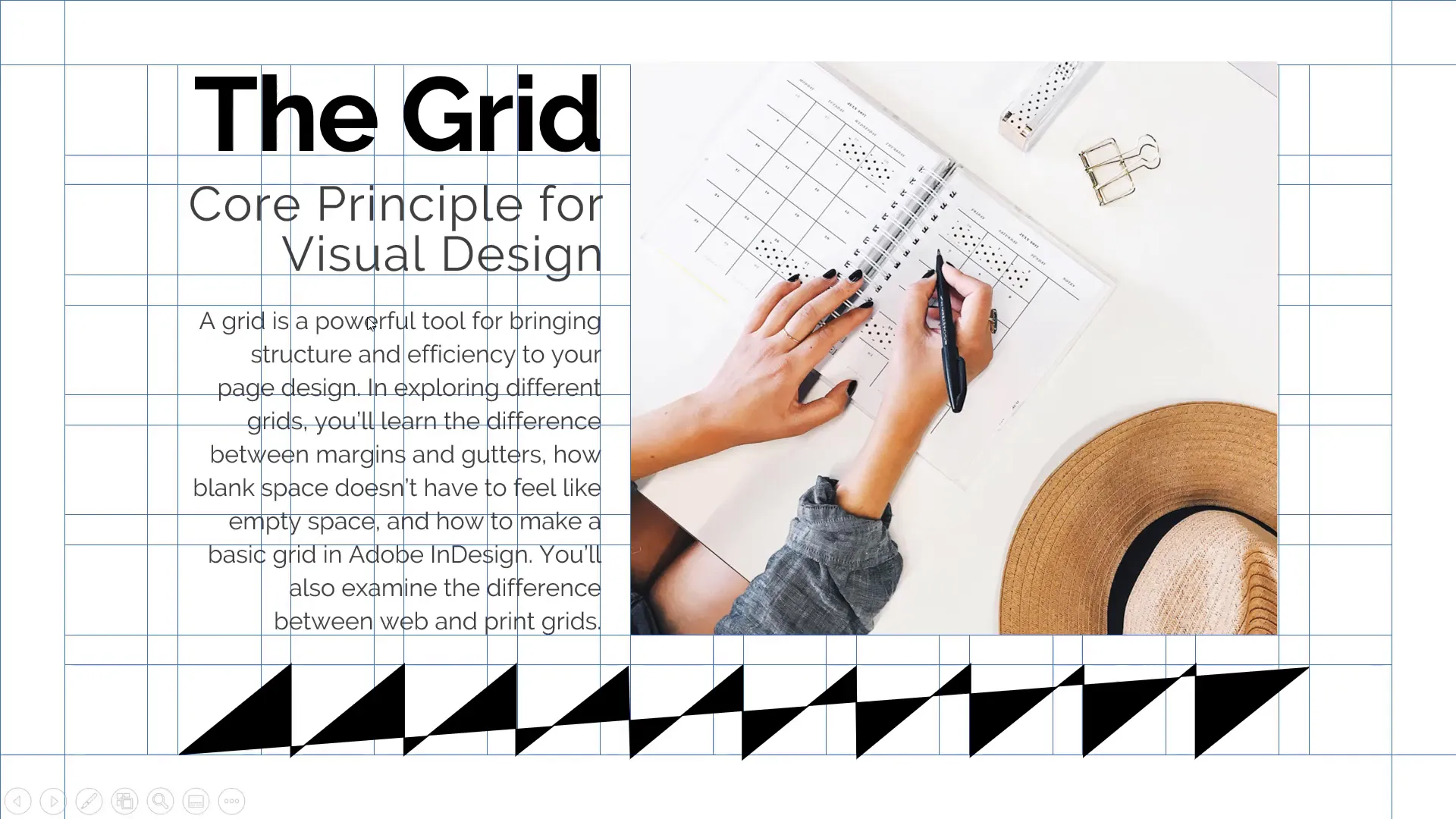
Table of Contents
- Why Use a Grid in Slide Design?
- Understanding the Components of a Slide Grid
- The Origin of This Grid Knowledge
- Why Not Use PowerPoint’s Built-In Grid?
- Step-by-Step Guide to Creating Your Slide Grid in PowerPoint
- Using the Grid to Build Your Slide Layout
- Adding Text Content Within Grid Blocks
- Incorporating Images Using the Grid
- Adding Graphical Elements for Visual Interest
- Tips for Efficient Grid Use
- Conclusion: Mastering Slide Design with Grids
- Frequently Asked Questions (FAQ)
Why Use a Grid in Slide Design?
Before diving into the technical steps, it’s important to understand why grids are so powerful in design. A grid is essentially a framework that helps you organize content in a clean, consistent manner. It ensures that all elements on your slide align properly, providing structure and balance. Without a grid, designs can feel chaotic or uneven, making it harder for your audience to focus on your message.
Think of a grid like the skeleton of your slide layout. It defines safe zones (margins), divides space into manageable sections (columns and rows), and creates breathing room (gutters) between elements. This systematic approach allows you to place text, images, and shapes confidently, knowing that everything will look cohesive.
“Have you ever got this feeling that when you’re creating your slide you see that some of the objects are not coming together with the rest of the slide design? You are missing structure, balance and you just have to do something.” — Wanskeil
Understanding the Components of a Slide Grid
To create a grid that works for PowerPoint, there are a few key components to understand:
- Margins (Safe Area): These are the boundaries around the edges of your slide where no content should be placed. Margins protect your design from appearing cramped or too close to the slide edges.
- Columns: Vertical divisions of your slide that help you organize horizontal space. While you can choose any number, twelve columns offer great flexibility and layout options.
- Column Gutters: The spaces between columns that give your content room to breathe horizontally. For twelve columns, you’ll have eleven gutters.
- Row Gutters: Horizontal spaces between rows that create vertical breathing space. Five row gutters work well for many slide designs.
Imagine your slide as a grid made up of these elements. The margins create a safe boundary, columns divide the slide vertically, column gutters add spacing between those columns, and row gutters divide the slide horizontally. This structure allows you to block out areas where you can place content such as text boxes, images, or shapes, resulting in a balanced and well-organized slide.
The Origin of This Grid Knowledge
You might wonder where these grid principles come from. I recently completed a fantastic class on Skillshare called Graphic Design Basics: Principles for Visual Design. This course covers essential design concepts like scale, framing, hierarchy, and grids. It walks you through creating page layouts from start to finish using any design tool you prefer — from Illustrator to PowerPoint.
Skillshare is an online learning community offering thousands of creative and entrepreneurial classes. With a premium membership, you get unlimited access to classes tailored to fuel your curiosity, creativity, and career growth. Because Skillshare is sponsoring this content, you can sign up via the link in the video description and get two months of Skillshare premium for free.
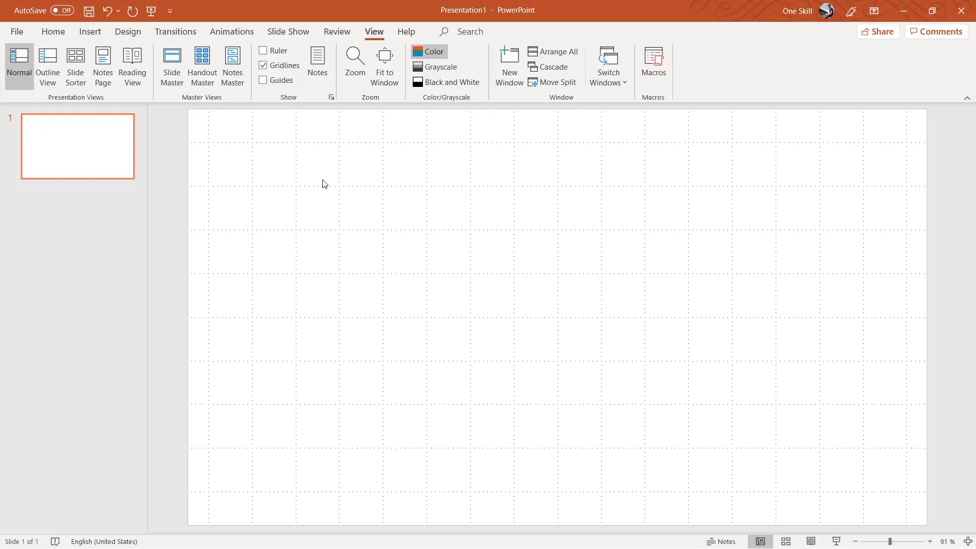
Why Not Use PowerPoint’s Built-In Grid?
PowerPoint does have a built-in grid feature accessible under the View tab as “Gridlines.” However, this default grid has limitations:
- The gridlines are not very visible or customizable.
- You cannot easily adjust the number of rows or columns.
- Spacing between grid points is uniform, which might not suit your layout needs.
Because of these constraints, I recommend creating your own custom grid manually by drawing rectangles and lines. This method gives you full control over the number of columns, gutters, and rows, allowing you to design exactly what you need.
Step-by-Step Guide to Creating Your Slide Grid in PowerPoint
1. Start with a Blank Slide
First, open a new PowerPoint presentation and select a blank slide layout. This gives you a clean slate to work with.
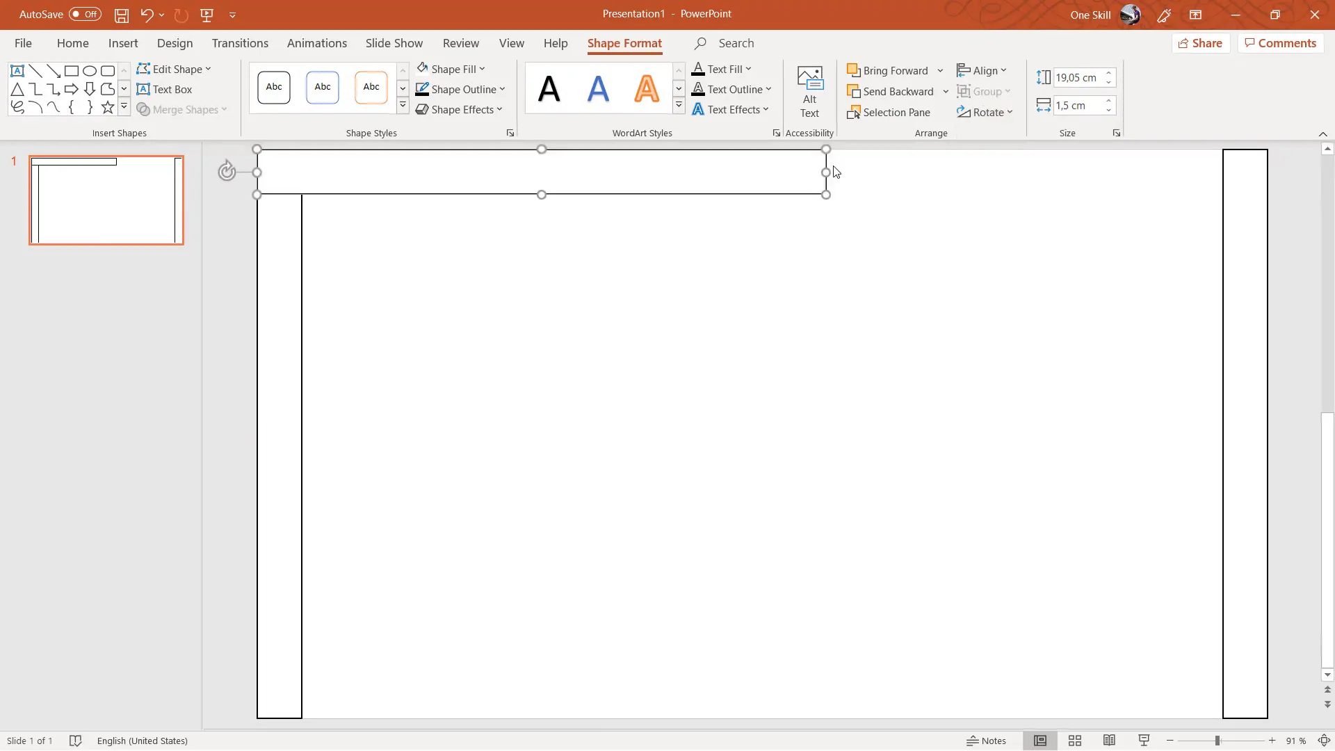
2. Create Margins – Your Safe Area
Margins define the space around the slide edges where no content should go. Here’s how to create them:
- Go to Insert > Shapes and select the rectangle tool.
- Draw a vertical rectangle along the left edge of the slide.
- Make the rectangle white with a black outline so it’s easy to see.
- Set the width to about 1.5 centimeters.
- Make sure the rectangle touches both the top and bottom edges of the slide.
- Duplicate this rectangle (Ctrl + D) and align it to the right edge for the right margin.
- Now, duplicate one of the vertical rectangles, rotate it 90 degrees, and place it at the top to create the top margin.
- Duplicate the top margin and align it to the bottom edge for the bottom margin.
Once done, select all four margin rectangles, fill them with a light blue color, and remove their outlines for a clean look.
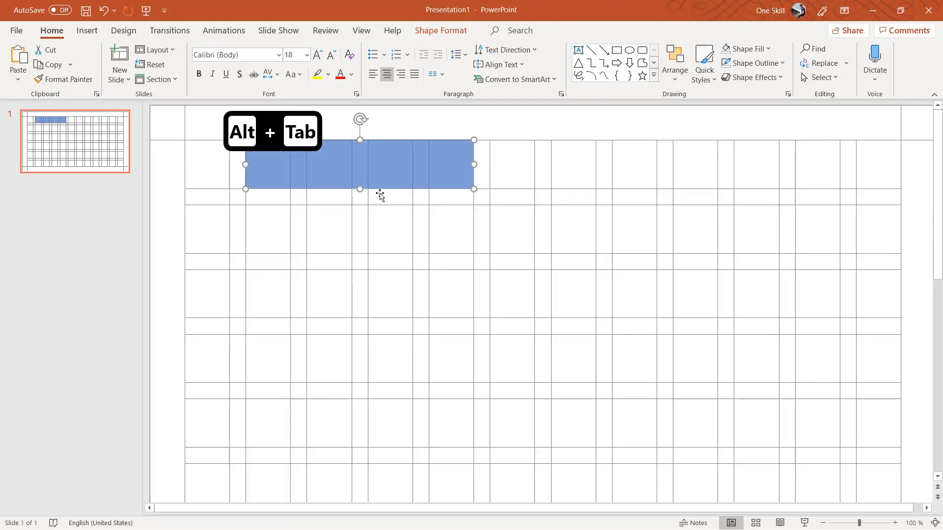
3. Add Column Gutters Between Margins
Next, we add the vertical column gutters that separate the columns:
- Duplicate the left margin rectangle and place it between the margins.
- Adjust its width to about 0.7 centimeters to serve as a gutter.
- Make sure it touches the top and bottom margins.
- Duplicate this gutter 11 times to create eleven gutters between columns.
- Select the right margin and all gutter rectangles (except top and bottom margins) and use Arrange > Align > Distribute Horizontally to space them evenly.
This creates twelve columns separated by eleven gutters, perfectly spaced and aligned.
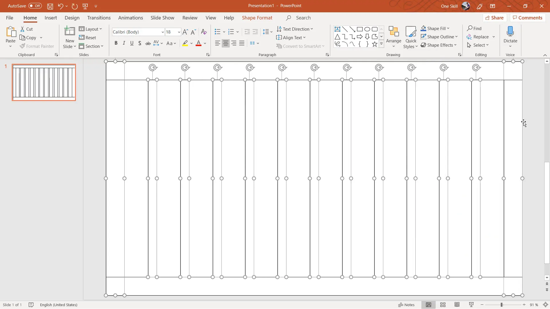
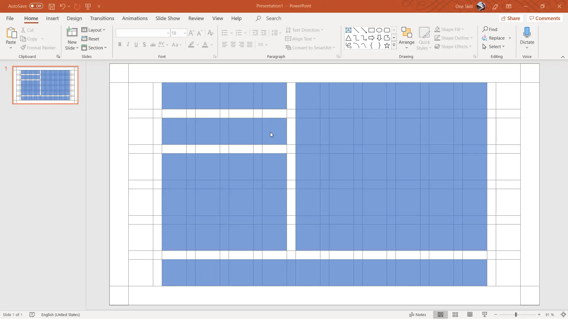
4. Add Row Gutters for Horizontal Spacing
Now, add horizontal gutters to divide the slide into rows:
- Duplicate one of the vertical gutters and rotate it 90 degrees to make a horizontal gutter.
- Place it between the left and right margins, ensuring it spans the entire width.
- Set the height of this gutter to about 0.7 centimeters.
- Duplicate this horizontal gutter 4 more times to create five gutters total.
- Select all row gutters and the top and bottom margins, then distribute them evenly vertically using Arrange > Align > Distribute Vertically.
With these steps, you have a grid made of margins, columns, column gutters, and row gutters ready for use.
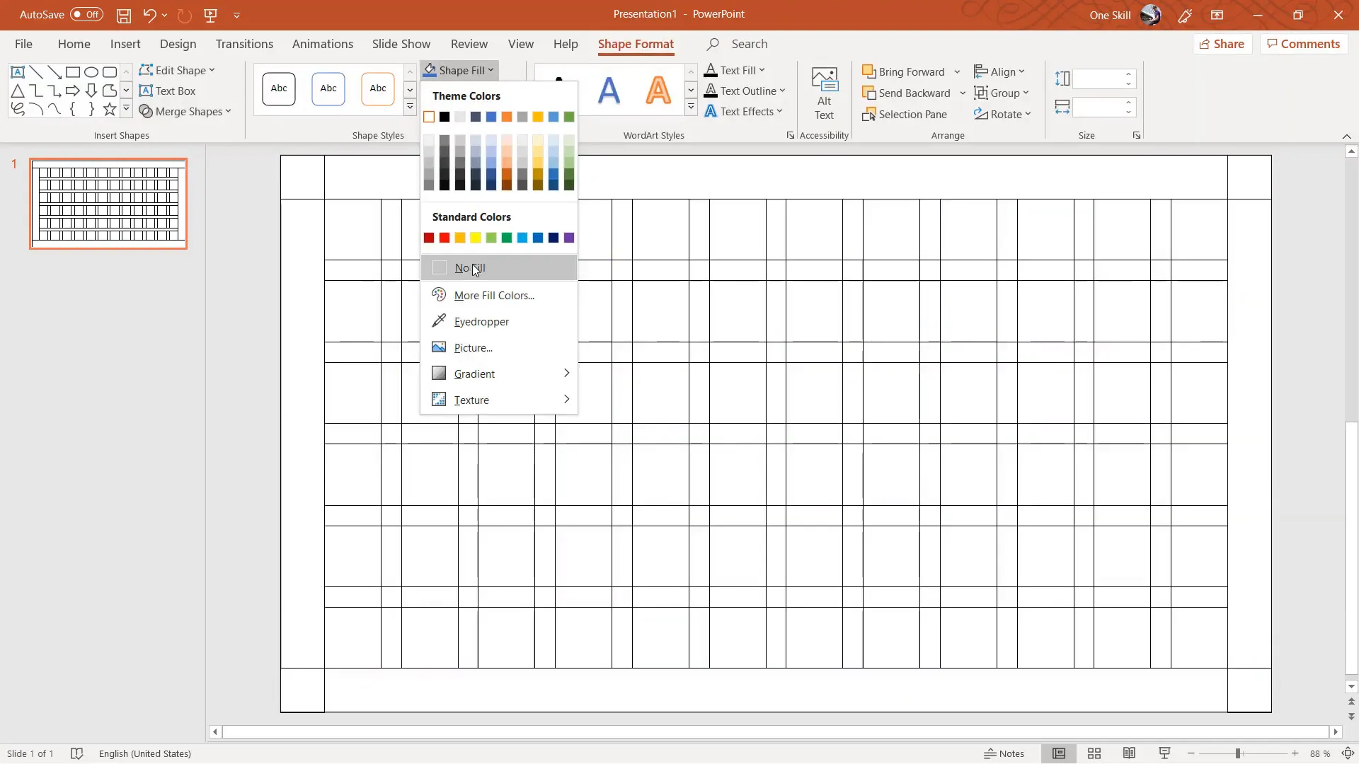
5. Finalize the Grid
Select all grid elements and remove their fill color to keep only the outlines visible. Then group everything (Ctrl + G) for easy management. You can also reduce the outline thickness or change the color to a lighter shade for subtlety.
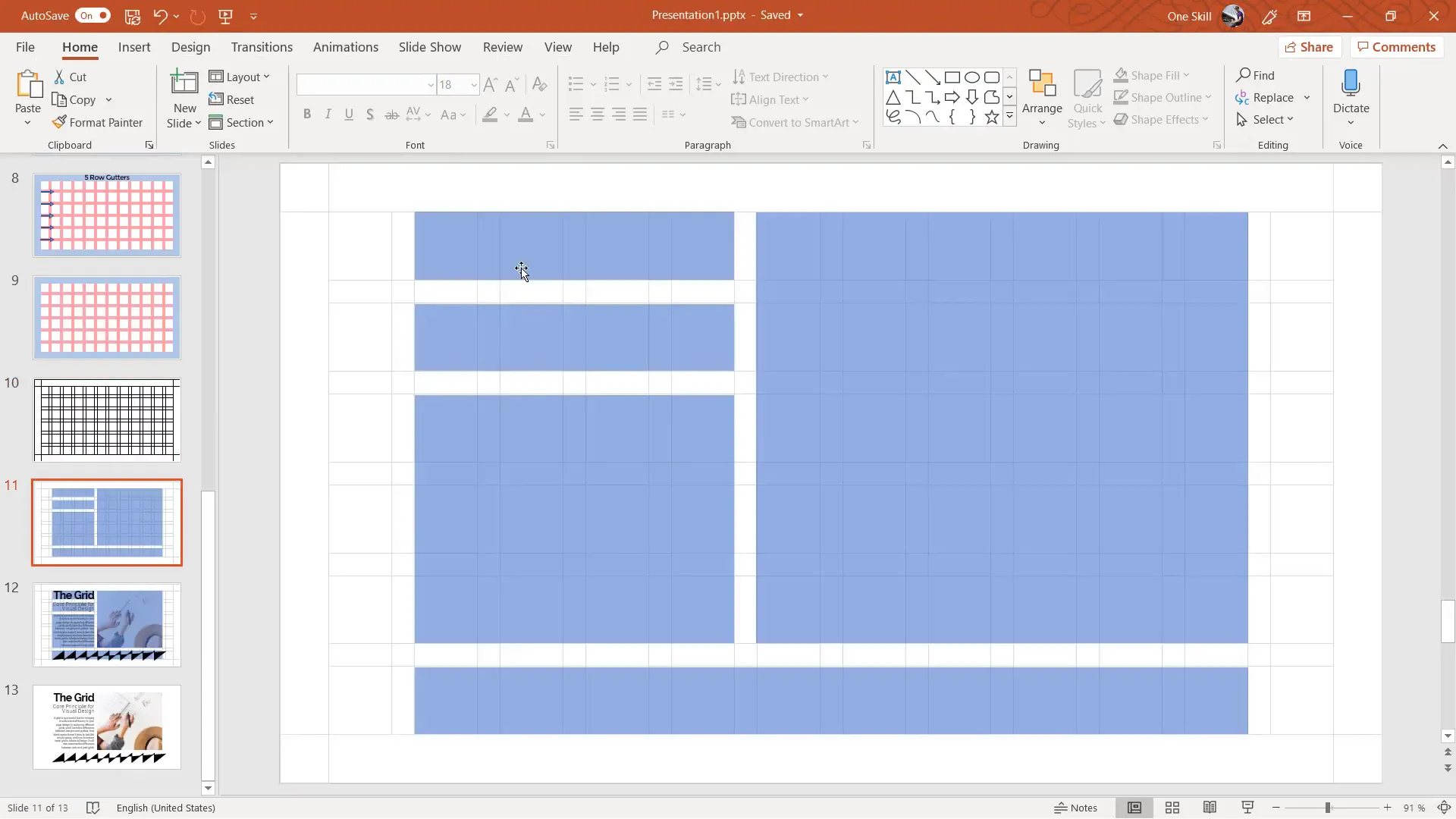
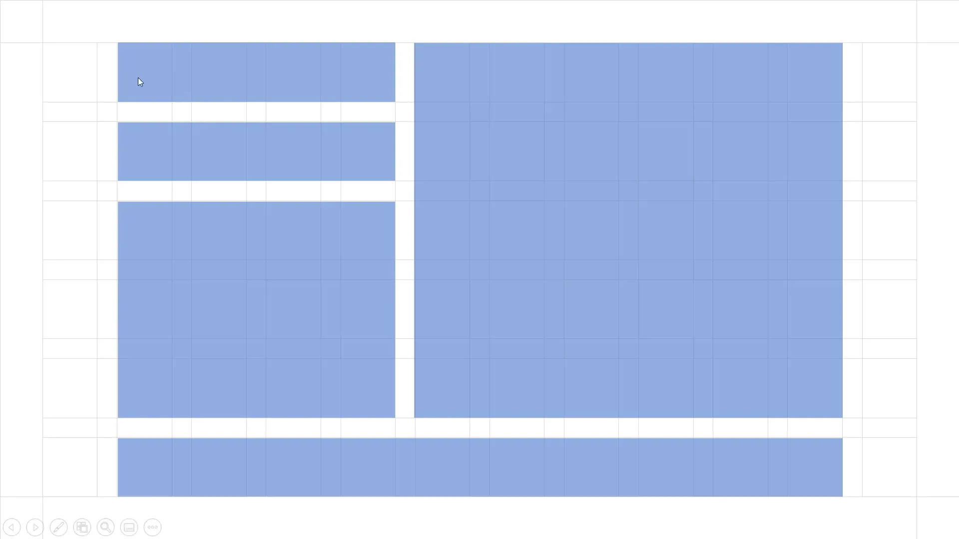
Using the Grid to Build Your Slide Layout
With your grid ready, you can now start designing your slide content. The grid acts as a guide for placing shapes, text, and images in a balanced manner.
Creating Content Blocks
For example, you can create rectangles that span multiple columns and rows to define content areas. Here’s how:
- Insert a rectangle shape.
- Adjust its size so it snaps to the grid lines, spanning the desired number of columns and rows.
- Set the rectangle’s fill color with some transparency so you can see the grid beneath.
- Remove the rectangle’s outline for a cleaner look.
Repeat this process to create multiple blocks of content, such as a large image area on the right, smaller text boxes on the left, and a long horizontal block at the bottom. This modular approach keeps your slide organized and visually appealing.

Managing the Grid and Content Layers
Use the Selection Pane in PowerPoint to rename your grid group to “Grid.” This makes it easy to toggle the grid on and off by clicking the eye icon. When you want to focus on your content, hide the grid; when you need alignment help, show it again.
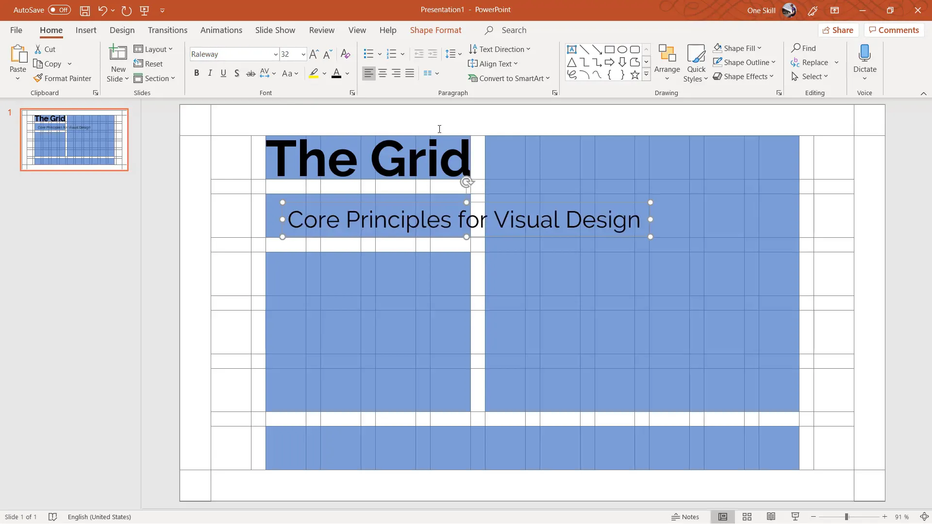
Adding Text Content Within Grid Blocks
Once your content blocks are defined, add text boxes inside them for titles, descriptions, or other information. For example:
- Add a large title in the top block aligned to the right.
- Use a clear, readable font like Raleway, apply bold weight, and adjust font size for balance.
- For descriptive text, use smaller font sizes and control line spacing to improve readability.
Adjust letter spacing and alignment to ensure the text fits well within the blocks and complements the overall slide design.
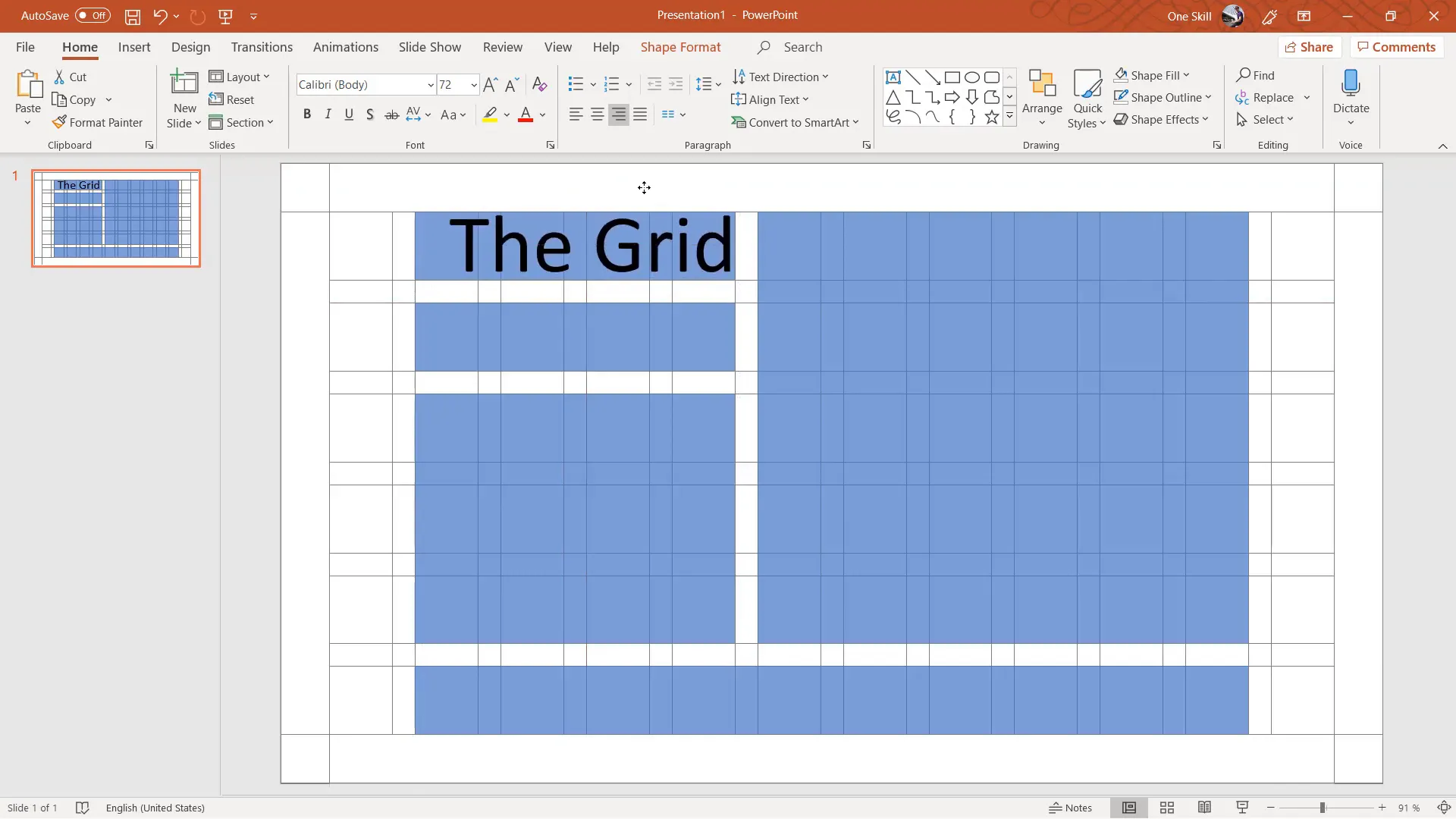
Example Text Content
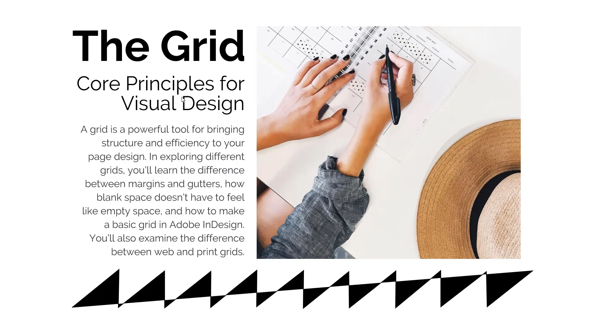
Here’s an example of a title and subtitle you might add:
- Title: The Grid
- Subtitle: Core Principles for Visual Design
These elements work together to communicate your message clearly and attractively.
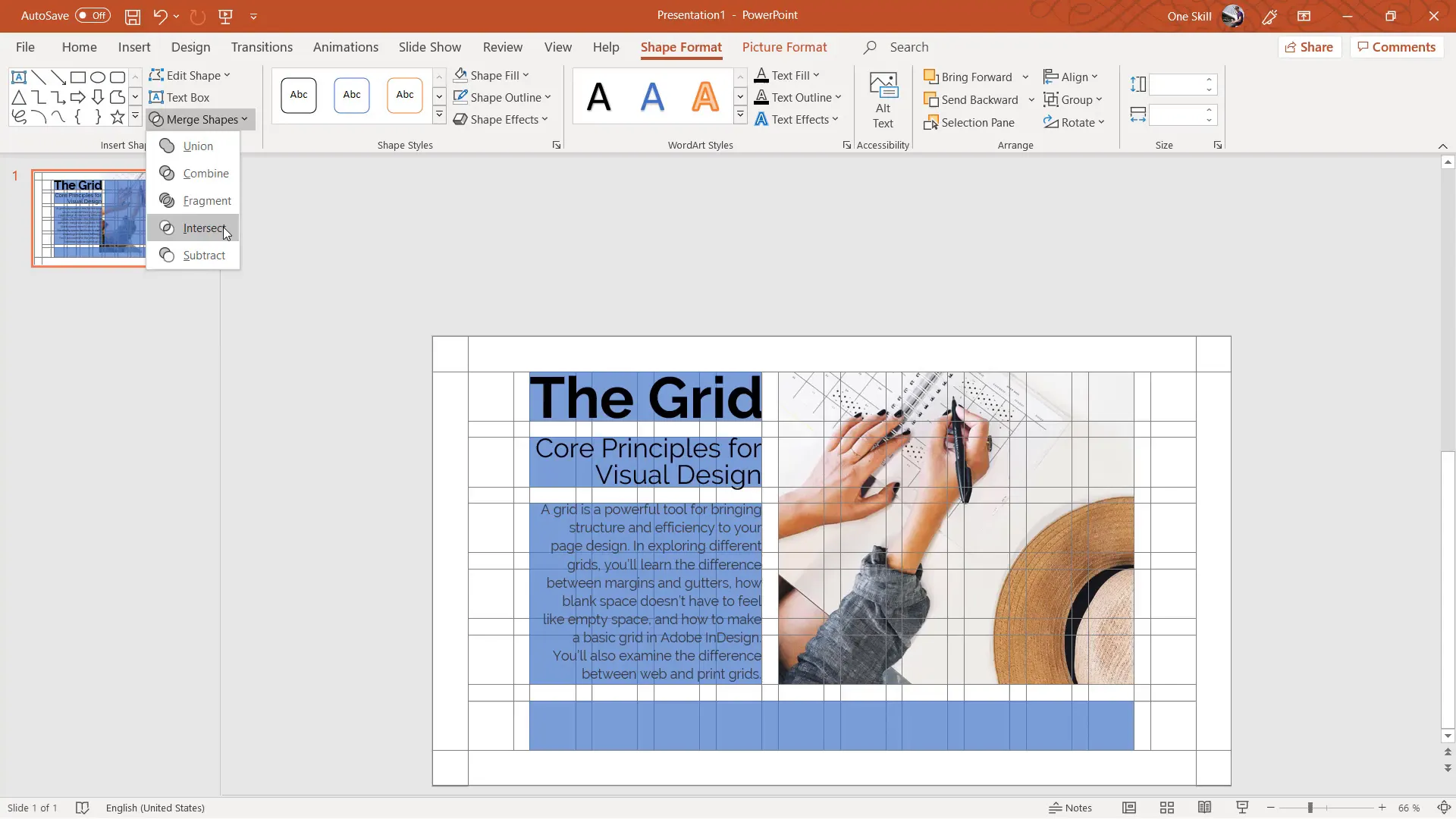
Incorporating Images Using the Grid
Images enhance your slides visually, but their placement and cropping are crucial. Using the grid, you can perfectly crop images to fit within specific blocks:
- Insert an image from a source like Unsplash.
- Resize and position it to cover the desired grid block.
- Select the image and the block shape, then use Shape Format > Merge Shapes > Intersect to crop the image precisely.
- Send the grid to the back layer to keep it visible behind your content.
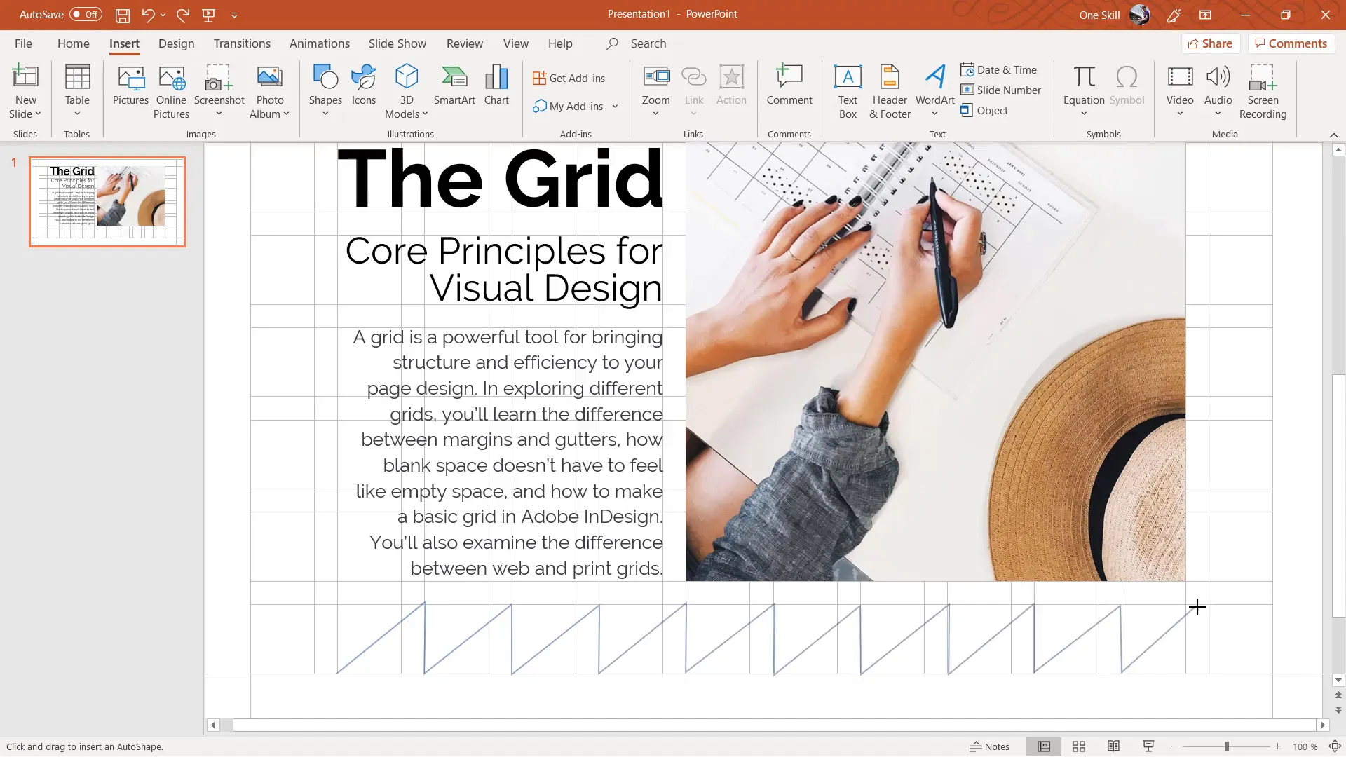
Adding Graphical Elements for Visual Interest
Sometimes, a slide needs a bit more flair to avoid empty space and feel complete. You can add custom graphical elements using PowerPoint’s freeform shape tool:
- Go to Insert > Shapes > Freeform.
- Click multiple points to draw an irregular shape, such as a wave or abstract form.
- Set the shape’s fill and outline color to black or another accent color.
- Position the shape at the bottom or side of the slide to fill empty space.
Tips for Efficient Grid Use
- Save Your Grid: Since creating the grid takes time initially, save it as a template or master slide to reuse in future presentations.
- Toggle Grid Visibility: Use the selection pane to hide and show the grid as needed for easier design workflow.
- Customize Columns and Rows: Feel free to adjust the number of columns, gutters, and rows depending on your content needs.
- Use Transparency: Applying transparency to content blocks helps you see the grid underneath, ensuring precise alignment.
- Explore Fonts and Spacing: Play with font sizes, weights, letter spacing, and line spacing to create balanced and readable text.
Conclusion: Mastering Slide Design with Grids
Using a grid system in PowerPoint is a game-changer for slide design. It brings order, balance, and professionalism to your presentations. Although building a grid from scratch requires some effort, the benefits far outweigh the initial time investment. Once created, your grid becomes a reusable asset that speeds up your design process and improves your final results.
Remember, the principles of margins, columns, gutters, and rows come from timeless graphic design fundamentals that apply to all visual layouts. By incorporating these into your presentations, you elevate your slides from cluttered to classy.
Embrace the grid, and watch your PowerPoint slides transform into beautifully structured works of art.
Frequently Asked Questions (FAQ)
What is a grid in slide design, and why is it important?
A grid is a framework of margins, columns, and gutters that helps organize slide content into a balanced and structured layout. It ensures alignment and consistency, making your slides more professional and easier to follow.
How many columns should I use in my grid?
While you can use any number of columns, twelve columns offer great flexibility for various layout options. You can also use eight or ten columns depending on your design needs.
Can I use PowerPoint’s built-in grid instead of creating my own?
PowerPoint’s built-in gridlines are limited in customization and visibility. Creating your own grid manually allows you to control the number of columns, rows, and gutters for better layout precision.
How do gutters improve slide design?
Gutters are the spaces between columns and rows. They provide breathing room for content, preventing elements from looking cramped and improving overall readability.
Can I reuse the grid in multiple presentations?
Absolutely! Once you create your grid, save it as a template or master slide so you can reuse it in any future presentations, saving time and ensuring consistency.
What fonts work best with grid-based slide designs?
Clean, sans-serif fonts like Raleway work well because they are readable and modern. Adjust font size, weight, and spacing to complement your grid layout.
How can I add images to fit within my grid?
Insert your image, resize it to cover the grid block, then use PowerPoint’s Merge Shapes > Intersect function to crop it perfectly to the grid area.
Is creating a grid time-consuming?
It takes some time initially, but the investment pays off by making your slide creation faster and your designs more polished. Plus, you can reuse your grid multiple times.
Where can I learn more about design principles like grids?
Online platforms like Skillshare offer excellent courses on graphic design basics and visual principles. These courses provide foundational knowledge that can enhance your slide design skills.
Check out the full video: How To Create 🔥 Slide Design with a Grid 🔥


