
Creating visually compelling and animated charts in PowerPoint can elevate your presentations to a whole new level. Whether you are showcasing sales data, project timelines, or performance metrics, a well-designed chart not only communicates your message clearly but also engages your audience effectively. In this comprehensive guide, we’ll learn how to craft custom animated column charts in PowerPoint, both manually and by connecting them to Excel for automatic updates. This tutorial is inspired by the expertise of One Skill PowerPoint, a trusted creator known for making PowerPoint skills accessible and fun.
By the end of this article, you will be able to design beautiful, dynamic column charts that you can animate to captivate your viewers. You’ll also discover how to link your charts to Excel data, so your visuals update automatically as your data changes—saving you time and effort in maintaining your presentations.
Table of Contents
- Why Custom Animated Charts in PowerPoint Matter
- Step 1: Setting Up a Blank PowerPoint Slide
- Step 2: Creating the Custom Column Shape
- Step 3: Choosing and Importing a Color Palette
- Step 4: Adding Gradient Fill to the Shape
- Step 5: Duplicating and Arranging the Shapes to Form a Chart
- Step 6: Manually Resizing Columns and Adding Data Labels
- Step 7: Animating Your Custom Column Chart
- Step 8: Creating an Automatic Column Chart Connected to Excel
- Step 9: Enhancing the Automatic Chart with Data Labels and Axis Adjustments
- Step 10: Editing Excel Data and Seeing Real-Time Updates
- Step 11: Animating Your Excel-Connected Chart
- Tips for Maximizing Your Custom Animated Charts
- Frequently Asked Questions (FAQ)
- Final Thoughts
Why Custom Animated Charts in PowerPoint Matter
Charts are a staple in presentations, but the default templates can sometimes feel uninspired or too generic. Custom animated charts bring several advantages:
- Unique Visual Appeal: Custom shapes and colors help your charts stand out.
- Interactive Flexibility: Manual resizing allows you to tailor charts on the fly.
- Data Integration: Linking charts to Excel ensures your visuals are always up to date.
- Engagement: Animation adds dynamism, keeping your audience’s attention.
Let’s dive into creating these charts step by step.
Step 1: Setting Up a Blank PowerPoint Slide
Start fresh by opening a new PowerPoint presentation and setting the slide layout to blank. This clean canvas approach, or as Bob Ross might say, “liquid white,” allows maximum creative freedom without distractions.
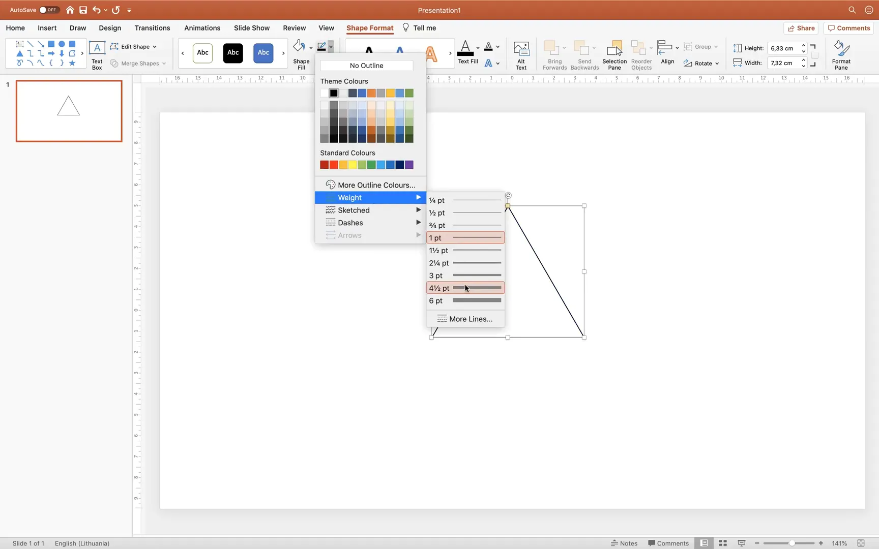
Step 2: Creating the Custom Column Shape
Our custom chart columns will be based on a unique shape that resembles a rounded triangle with a smooth, curved top. Here’s how to create it:
- Go to Insert > Shapes and select the Triangle shape.
- Hold down the Shift key while drawing to create a perfect equilateral triangle.
- Remove the fill color so the shape is transparent and set the outline color to black.
- Make the outline thicker for better visibility.
- Align the triangle to the center of the slide using slide guides.
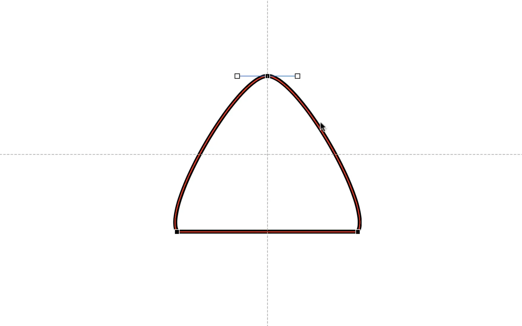
Next, refine the triangle’s points for a smoother, more rounded look:
- Right-click the triangle and select Edit Points.
- Click the top point, then convert it to a Smooth Point.
- Drag the white handles of the top point slightly to round it more.
- Similarly, drag the bottom points inward to adjust the curve and angle.
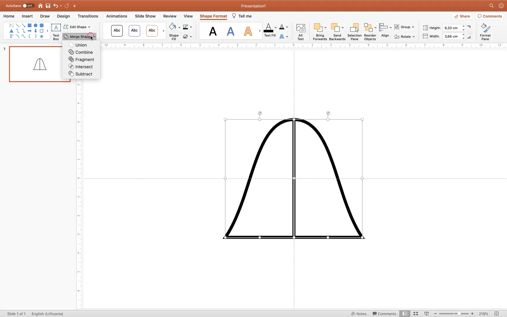
After shaping one side, create the other side by:
- Inserting a Rectangle shape.
- Selecting the triangle first, then holding Shift and selecting the rectangle.
- Using the Subtract option (in the Merge Shapes dropdown) to cut the rectangle out of the triangle.
- Copying this shape with Alt/Option + Drag and flipping it horizontally.
- Positioning the flipped copy next to the original.
- Selecting both shapes and choosing Union to merge them into one smooth, symmetrical shape.
Step 3: Choosing and Importing a Color Palette
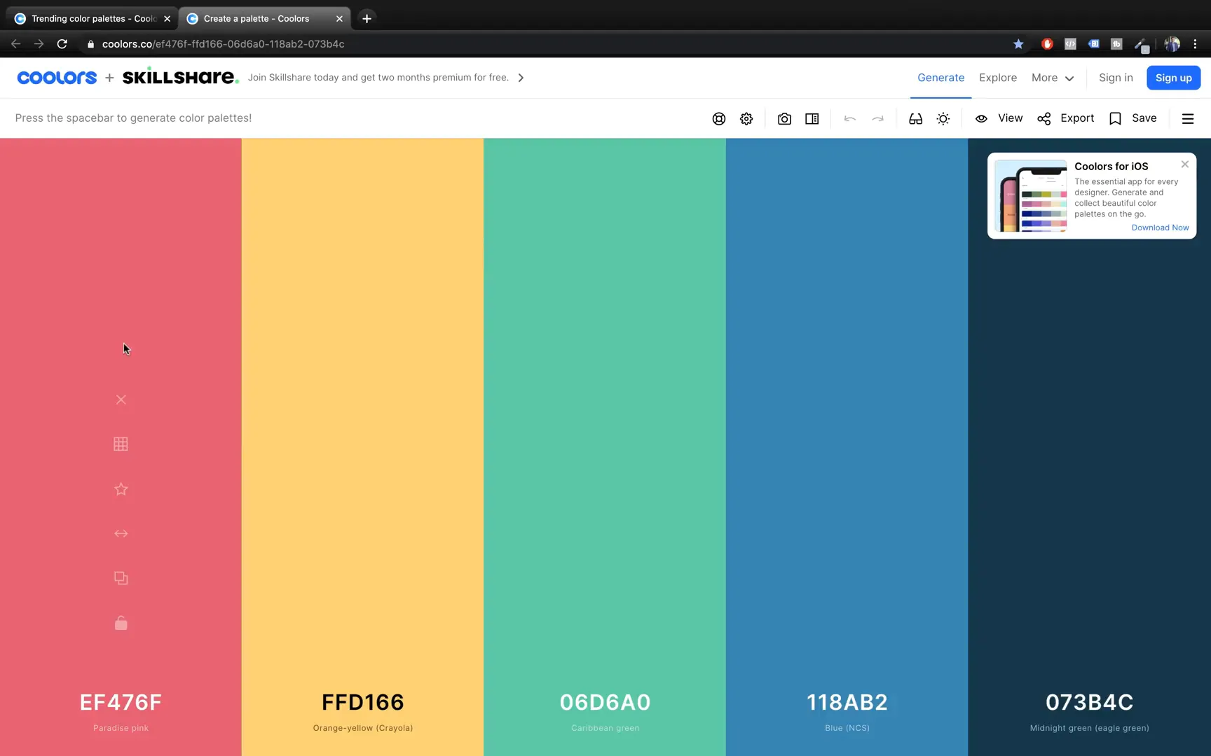
Colors are essential for making your chart visually appealing. Instead of relying on default colors, you can create a custom palette using free online tools like colors.co. Here’s how:
- Visit colors.co and explore the “Explore” tab to find beautiful color palettes.
- Pick a palette with five colors and add a sixth color to fit PowerPoint‘s six accent colors scheme.
- Export the palette as an image and insert it into your PowerPoint slide for easy color reference.
To import these colors into PowerPoint’s color palette:
- Go to the Design tab, click Variants, then Colors > Customize Colors.
- Edit each of the six accent colors by pasting the exact hex codes from your color palette.
- If you are on a Mac, use the Eyedropper tool to pick colors directly from your palette image.
- Name your custom palette (e.g., “Cool Colors”) and save it.
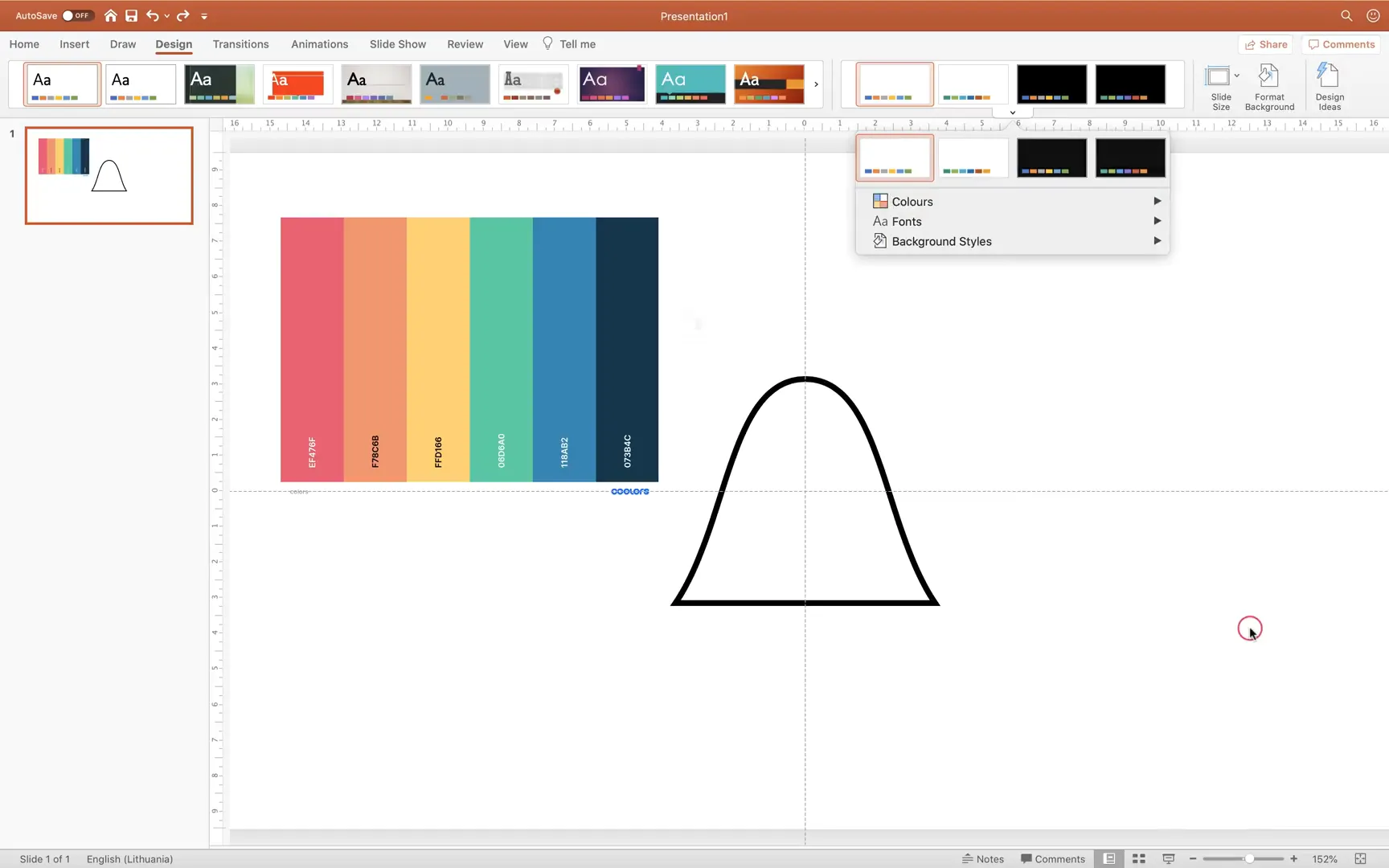
Now, when you select your custom shape and go to Shape Format > Shape Fill, you will see your imported colors ready to be used.
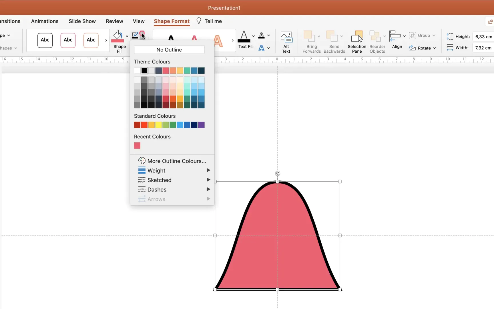
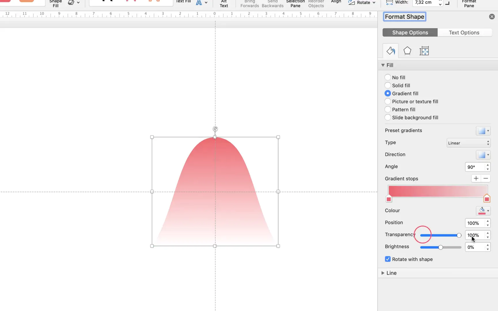
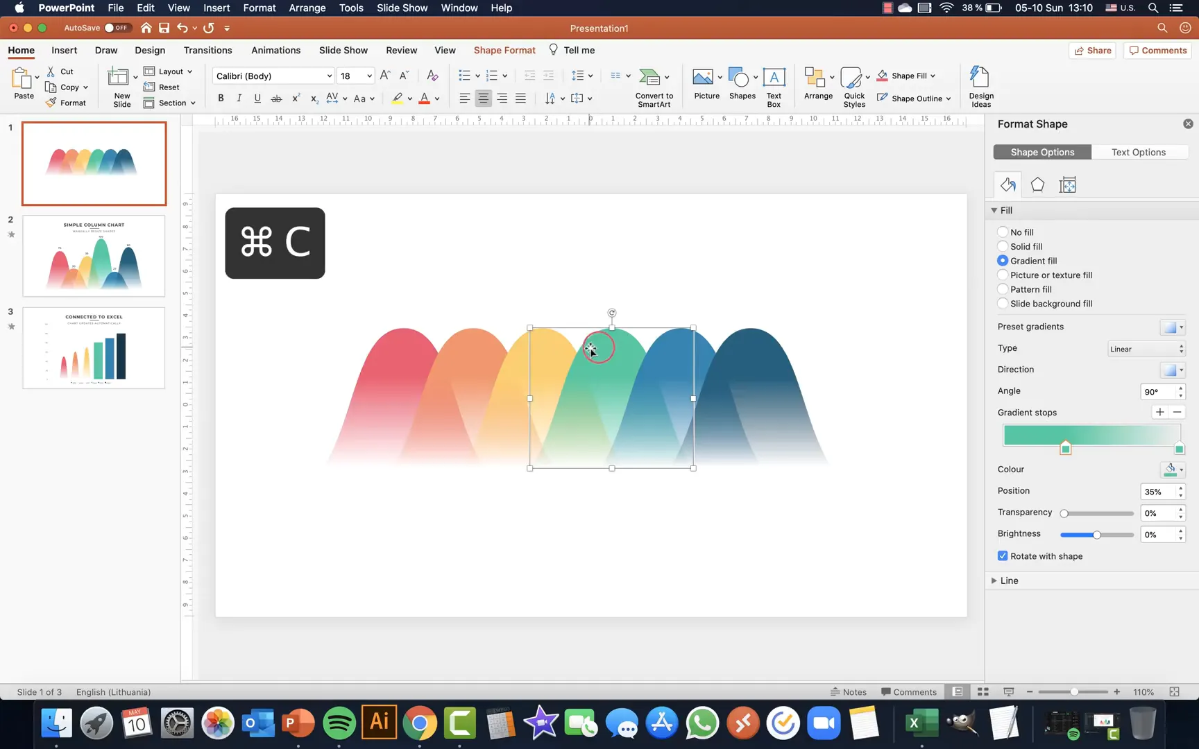
Step 4: Adding Gradient Fill to the Shape
To add depth and a modern look to your columns, apply a gradient fill:
- Right-click your shape and select Format Shape.
- Choose Gradient Fill and keep only two gradient stops.
- Set the first stop to a vibrant color from your palette (e.g., hot pink).
- Set the second stop to fully transparent.
- Adjust the position of the first stop to around 35% to create a smooth gradient effect.
Repeat this process for all six shapes using different colors from your palette. Adjust brightness if necessary to make the colors look vibrant but balanced.
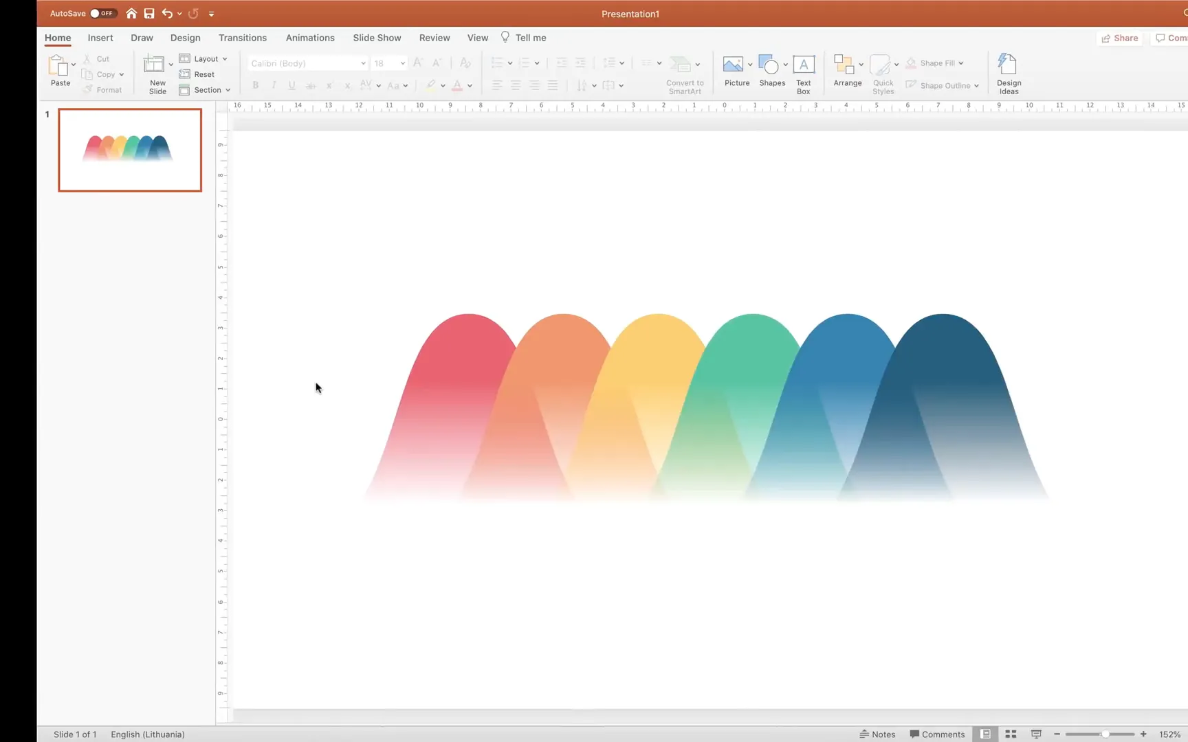
Step 5: Duplicating and Arranging the Shapes to Form a Chart
Duplicate your custom shape six times (CMD/CTRL + D) to create the columns of your chart. Then arrange them horizontally with equal spacing:
- Zoom out and select all shapes.
- Move them slightly downwards to make room for labels.
- Use Align > Distribute Horizontally to space them evenly.
- Group the shapes, align them to the center of the slide, then ungroup to maintain spacing.
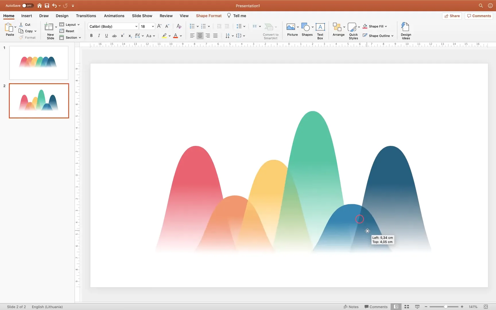
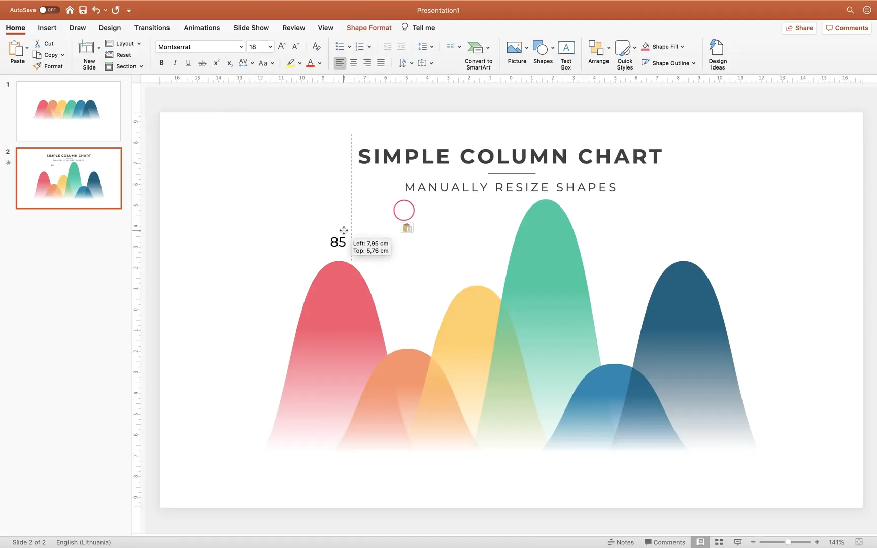
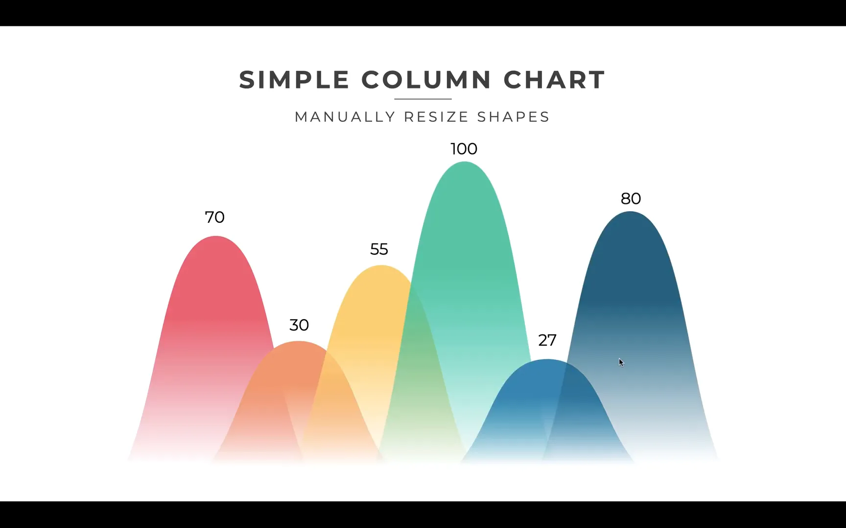
Step 6: Manually Resizing Columns and Adding Data Labels
The beauty of this custom chart is that you can manually resize each column by dragging the top point of the shape. This flexibility allows you to visually represent data values without complex chart tools.
For labeling:
- Copy existing text boxes and lines from your slide template to save time.
- Place text boxes above each column to show values like “70 sales” or any measurement you prefer.
- Duplicate and edit these labels for each column.
Step 7: Animating Your Custom Column Chart
Animation can breathe life into your charts, making them more engaging. Here’s how to animate your slide elements:
- Add a Fly In animation to your slide title from the left with a bounce effect.
- Use the Animation Painter to copy this animation to your subtitle, setting it to come from the right.
- Apply a Fade animation to any decorative lines, starting with the previous animation.
- Select the first column shape and apply a Float In animation starting after the previous animation.
- Set the duration to about 0.4 seconds for smoothness.
- Add a Fade animation to the corresponding data label, starting after previous.
- Use the Animation Painter to apply the same animations to the remaining shapes and labels.
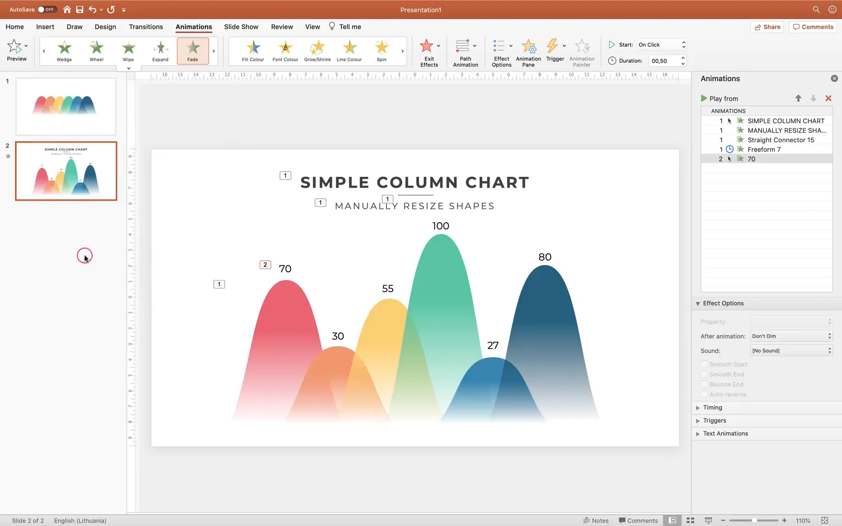
Preview your slide in full screen to see the titles and then the columns with labels animate beautifully in sequence.

Step 8: Creating an Automatic Column Chart Connected to Excel
Manual resizing works well for simple charts, but for dynamic data that changes frequently, linking your chart to Excel is a game-changer. Here’s how to create a custom animated column chart connected to Excel:
- Copy your existing text boxes and labels to a new slide for consistency.
- Exit full screen and go to Insert > Chart > Column Chart.
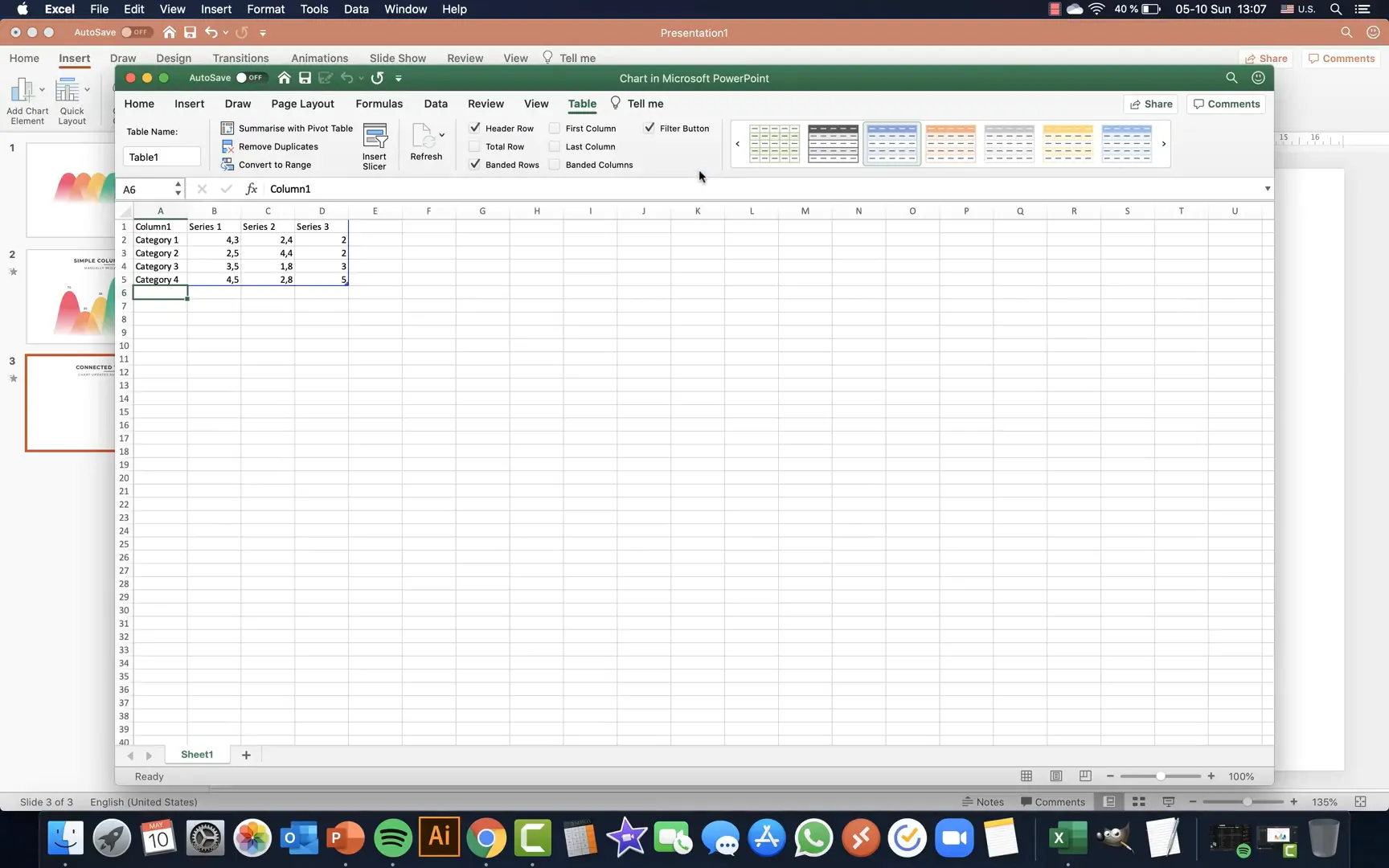
- An Excel window will open automatically. Customize it by:
- Deleting unnecessary categories, leaving only one (e.g., “Sales”).
- Renaming the series as years (e.g., 2015, 2016, …, 2020).
- Entering the values for each year (e.g., 100 for 2020, 90 for 2019, etc.).
- Delete any unwanted chart elements like the chart title or horizontal gridlines to keep your slide clean.
- Change the font of labels to something modern like Montserrat for consistency.
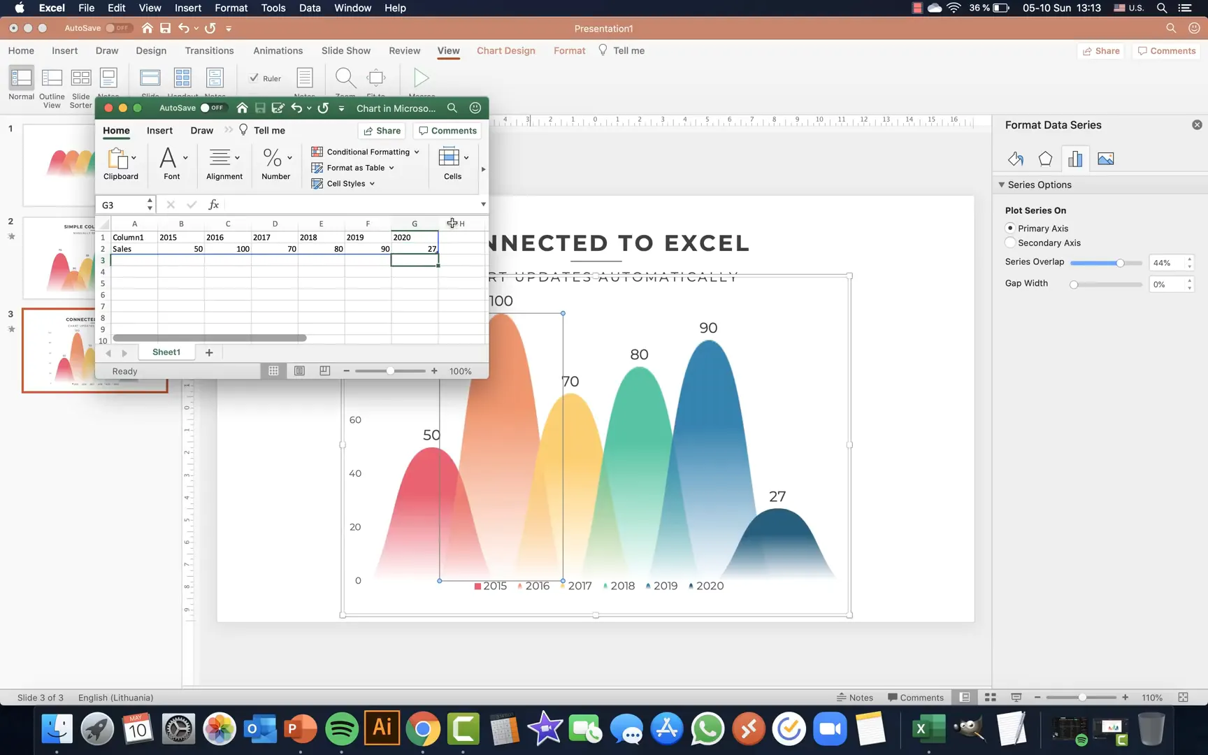
Now, to use your custom shapes as columns:
- Right-click the first column in the chart and select Format Data Series.
- Under Fill options, choose Picture or texture fill.
- Copy your custom shape from the first slide (CMD/CTRL + C).
- Click the clipboard icon in the fill options to paste the shape as a fill.
- Repeat for each column with the other custom shapes.
- If the shapes appear squished, adjust the Gap Width to 0% and tweak the Series Overlap to your liking (around 44% works well).
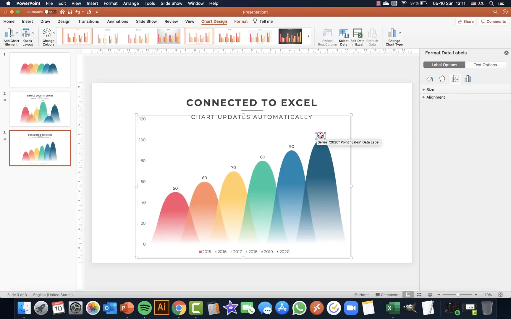
Step 9: Enhancing the Automatic Chart with Data Labels and Axis Adjustments
To make your chart more informative:
- Add Data Labels by selecting the chart and choosing Data Labels > Outside End.
- Adjust font sizes to ensure labels are legible.
- Customize the vertical axis by:
- Setting the maximum value to 110 for some breathing room.
- Setting the minimum value to 0 to avoid negative numbers.
- Move the legend slightly upward to balance the slide layout.
Step 10: Editing Excel Data and Seeing Real-Time Updates
The power of linking to Excel shines when you update data:
- Select your chart and choose Edit Data to open the Excel window.
- Change any value; for example, update 2016 sales to 100.
- Watch as the corresponding column in PowerPoint updates instantly, reflecting new data.
This seamless integration saves time and reduces errors, especially when working with frequently updated datasets.
Step 11: Animating Your Excel-Connected Chart
Animating your automatic chart is straightforward and impactful:
- Clear any existing animations from the slide for a fresh start.
- Add Fly In animations to your slide title and subtitle, coming from left and right respectively, with bounce effects.
- Apply a Fade animation to decorative elements like lines, set to start with previous.
- Select your chart and add a Float In animation.
- Set the animation to start after previous with a duration of about 0.5 seconds.
- Under effect options, choose By Element in Series so each column appears sequentially.
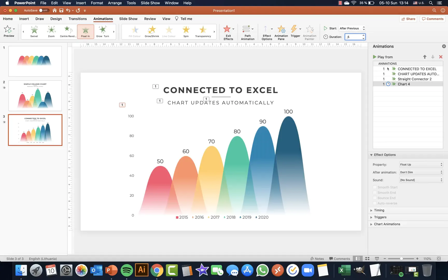
This animation style creates a smooth, professional reveal of your data, enhancing your presentation’s storytelling.
Tips for Maximizing Your Custom Animated Charts
- Use Consistent Fonts and Colors: Stick to your custom palette and font choices for a cohesive look.
- Keep It Simple: Avoid cluttering charts with too much data or too many colors.
- Leverage Animation Wisely: Use animations to highlight key points, not distract.
- Test Your Presentation: Always preview animations and data updates before presenting.
- Save Custom Palettes: Save your color palettes in PowerPoint to reuse in future projects.
Frequently Asked Questions (FAQ)
Can I use other shapes besides triangles for custom columns?
Absolutely! You can create any shape that suits your design style. The key is to ensure the shapes can be duplicated and aligned neatly to form a consistent chart.
Is it possible to link other chart types to Excel for automatic updates?
Yes, PowerPoint supports linking various chart types like line, bar, pie, and area charts to Excel data. The process of linking and updating is similar to what we covered for column charts.
Will animations work when I export my presentation as a PDF?
No, animations do not play in PDF format. They only work within PowerPoint or when exporting as a video or interactive presentation format.
How do I ensure my custom colors appear correctly on other computers?
When sharing your presentation, embed fonts and save the file in a compatible PowerPoint version. Custom colors are part of the presentation and should appear consistently across devices.
Can I automate the manual resizing chart method?
The manual resizing method is designed for quick, flexible adjustments but is not automated. For automation, linking charts to Excel as shown is the best approach.
Final Thoughts
Mastering custom animated charts in PowerPoint is a valuable skill that can dramatically improve your presentations. Whether you prefer manually resizing shapes for quick, bespoke visuals or leveraging Excel integration for dynamic, data-driven charts, these techniques empower you to communicate with clarity and style.
Remember, the key to effective charts lies in simplicity, consistency, and purposeful animation. With the steps outlined here, you can confidently create stunning, professional charts that keep your audience engaged and informed.
Stay creative, keep experimenting, and happy presenting!
Check out the full video: How To Create and Animate Charts in 🔥PowerPoint🔥


